Thanks, Mark … Yes, that’s the point I was attempting to make.
Not with absolute certainty (without being able to inspect the code/logic) - - But, practically, I reckon that’s a reasonable conclusion … as confirmed by this observation;
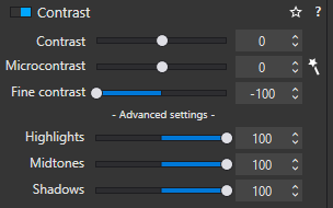
Apply these settings;
ensuring the “Magic Wand” for Microcontrast is deactivated.
Then toggle (activate / deactivate) the overall Contrast tool
… There will be no discernible change in the image.
@John-M you need to export them both and then compare side by side.
Contrast effects and sharpening is only visible at 75% zoom rate.
And denoise and other effects on your image sharpnes is only done wile exporting.
So to get your claim, idea, thought proven or tested you need to export a jpeg or tiff.
Not use internal compare view or toggle tools on/off.
You wouldn’t be so blasé about a car manufacturer incorrectly labelling “brake” and “accelerator”, would you?
Part of a good user experience is that the function of tools is well labelled and understandable.
Not that this is so serious as a mislabelling on a car, but I’d much prefer to know for sure without needing to start a 40+ comment thread on a forum about it to check.
Your demonstration shows, how Microcontrast affects local contrast (useful for structure & texture) and even has a negative impact on the clouds and the background … to be used with care!
And as you experienced, Fine Contrast (comes with FilmPack) gives you softer results.
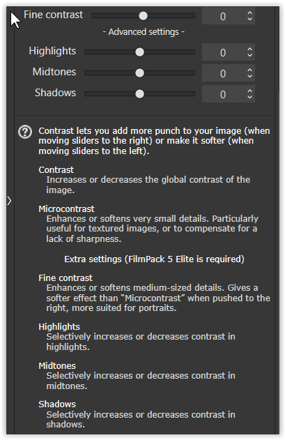
Well, We’ll have to take a look at the manual. Look at the (condensed) statements:
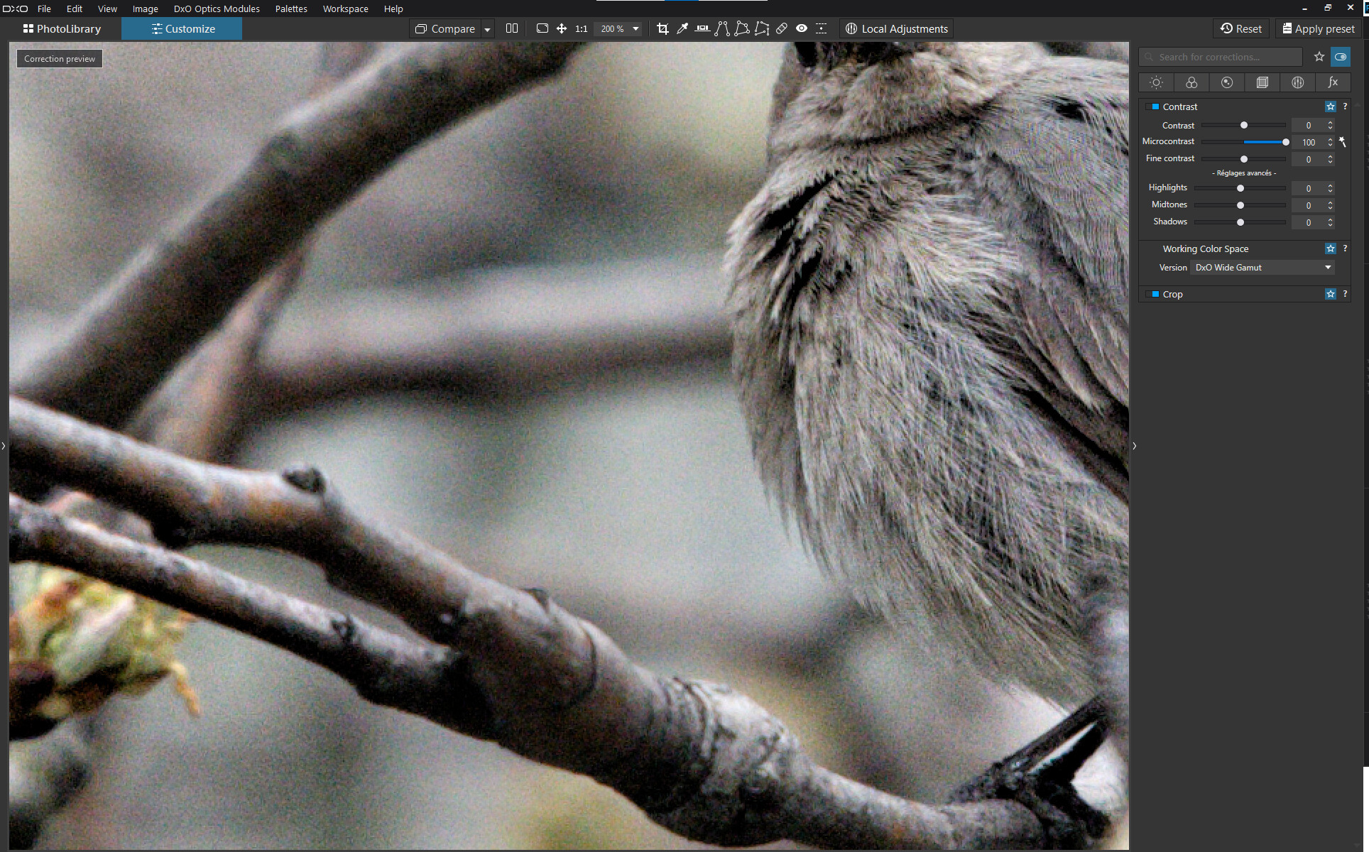
Microcontrast brings out details and gives the image more “bite”
Fine contrast brings out medium-sized details and is gentler than Microcontrast
Imo, this is fairly clear, though I would have used “fine details” instead of “medium-sized details”, but one could argue that, in the realm of details, there are large, medium and small details, all of which are details nonetheless. Anyways, my point is that one has to learn to operate an app - as one has to learn how to drive a car…
For those who learn by reading rather than trying, the manual might be a good starting point, even though the manual and related search could greatly be improved.
From the way it’s worded, I would expect Microcontrast to imply a softer effect than Fine Contrast, when in fact the opposite is what (broadly) actually happens.
To be honest the actual titles of the two are a little ambiguous since both “Micro” and “Fine” could mean very small.
Indeed I’d be tempted to suggest the top three contrast settings (Contrast, Micro… and Fine…) be relabelled Global Contrast, Heavy Contrast and Light Contrast or something similar; better denoting the impact they’ll have if used universally (as you say, you wouldn’t want so much Microcontrast on a creamy background!).
Appreciated you have to mess around with some tools to really see what they do for an image / situation, but in this case I think the labels and descriptions could be a bit clearer
I think they are very well labelled and do what the description tells.
Micro contrast seems to work at higher frequency than Fine contrast (so the “radius of action” is smaller). This is why it seems to produce a visually stronger effect, because the effect is more concentrated on a smaller zone, less spread out in space . It does act on smaller details than fine contrast.
Think of it in split frequency separation terms, and the results should appear more conform to their description.
But then wouldn’t you then expect microcontrast to come closer to enhancing individual grains of sand while fine contrast would enhance larger variations in the ‘texture’ of a beach. But precisely the opposite happens (as per my examples above).
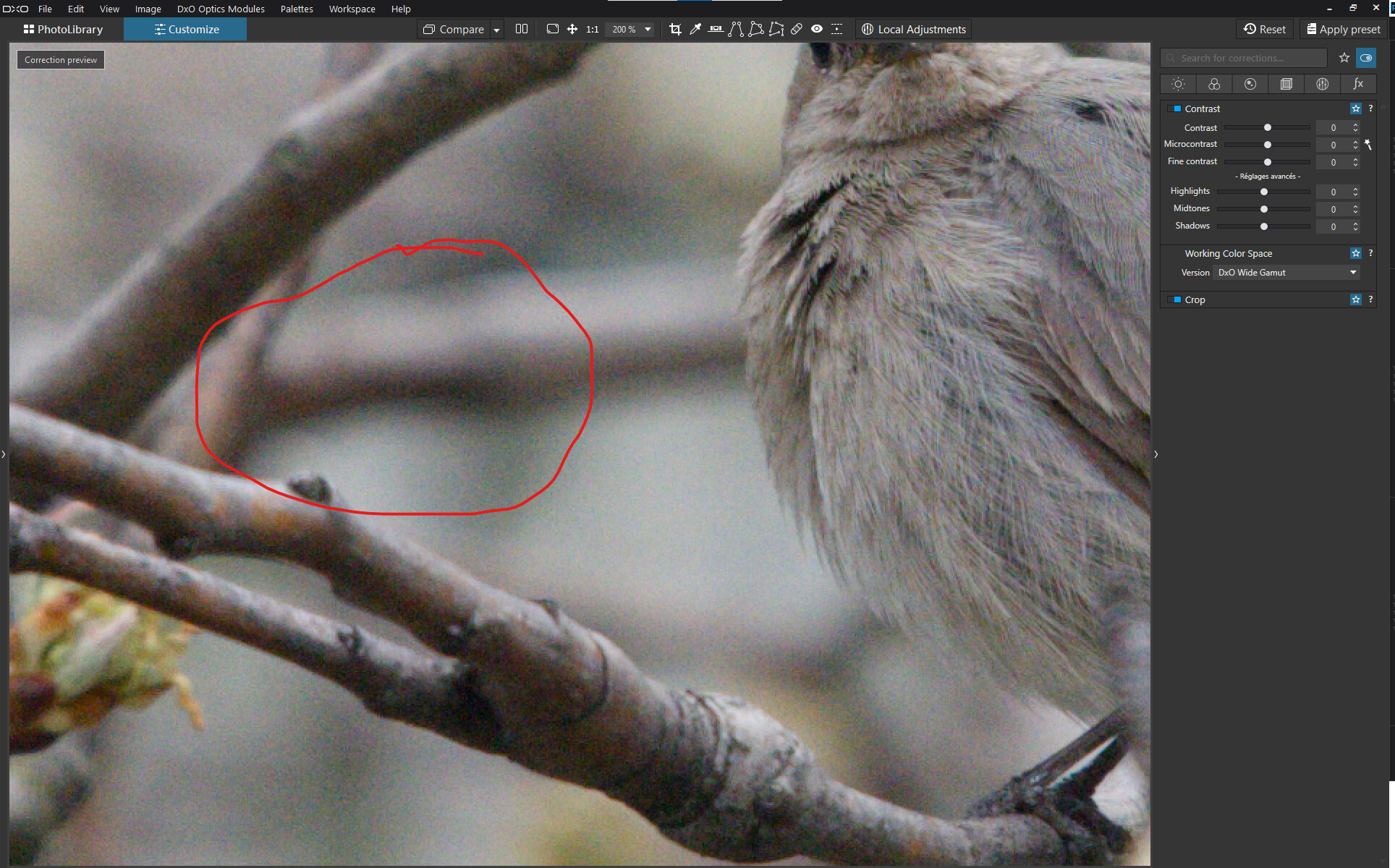
Or look at the images of the golden retriever. Fine contrast brings out individual strands of fur. Microcontrast creates areas of light and dark across strands of fur.
But the rest I agree with. The “impact” of the tool described as impacting very small details seems greater than the tool described as impacting mid-sized ones.
That’s why - for me - renaming these seems the obvious choice. Lightroom can’t be copied OFC but “Clarity” and “Texture” seem less open to speculation, with one signifying an overall heavier approach and the other working on finer details .
Microcontrast is also creating moiré due the overdetailing accentuation.
Your text above explains why.
A strands of fur has 2 or 3 pixels acros? So fine contrast dot covers 3 pixels? (we don’t know the radius)
Microcontrast is 1 pixel? => over edge enhancement causes moiré. When you zoom in at 75% the moiré is gone because the enhancement is added correctly but it’s too hars on the non excisting lining of detail.
And say micro has 0-5 as lumination level and fine has 5-15. (threshold)
Take a image and go 50% or higher with micro contrast, clearviewplus and fine contrast export them with deepprime but not deepprime plus.(which also enhance details more active.)
Then drop those jpegs in a side by side viewer zoom in at 100% compare, then 200% compare , then 400% if it’s possible.
You will see
Blunt microcontrast is deepblack outlining the smallest details pretty hars.
Clearviewplus does at some places the same and hold back at other places to avoid oversharpening if possible.
Wile fine contrast dots are larger in pixelsgroups and less dark/deepblack.
That’s why it’s more gentle on your out linings of edges.
The only “strange sliders” are those of selective and advanged contrast high midtone and shadow and black. Those are to overlapping to see as on area. One effects the other. So not so much as USM works.
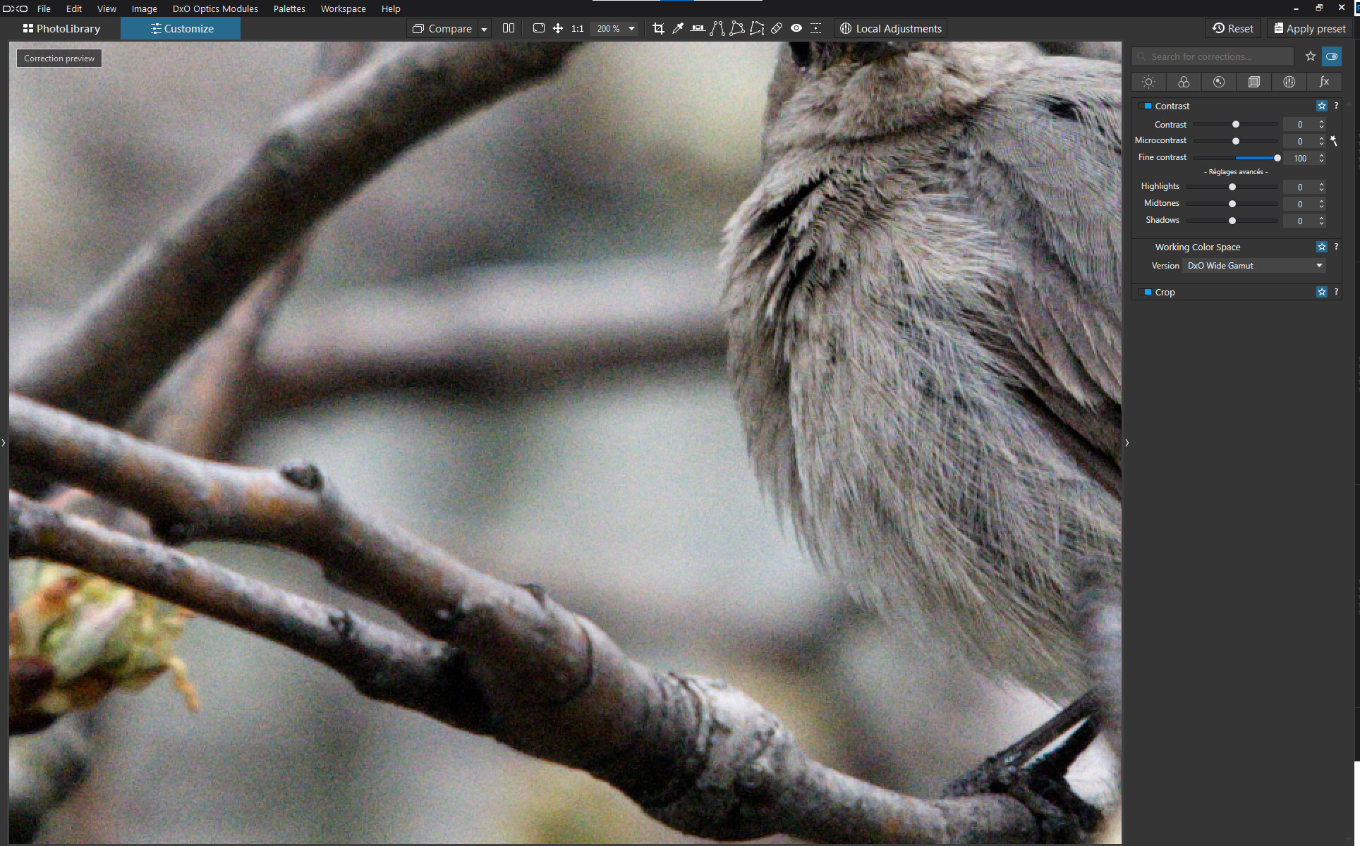
Except, if you look at the dark areas on the bird’s breast, the shadows become darker with fine contrast but even more blocked and larger with microcontrast. Moreover, the fine contrast seems to bring out the finer feathers in the upper right while microcontrast seems to bring out the courser feathers below, with overall blockier shadows and more apparent contrast. At least that’s how I see it…
I agree the descriptions are correct. The apparent effect will vary based on the size and nature of details present in any image.
This is the perfect example. Individual strands of fur are being ‘contrasted’ at Fine and the substructure of strands with Micro. With Fine, we see what we expect to see — detailed fur. With Micro, we see a large amount of detail we don’t expect, so the effect is ‘greater’.
While my interpretation of Micro is “smaller than Fine”, I do agree the names are not ideal.
For my own use, I tend to use Fine because it generally has the preferable effect of the two, but in the end, if I don’t like it on a particular photo, I try the other one and maybe end up using neither.
Returning to my assertion regarding Fine Contrast …
So, I applied the settings above to an image, and exported the result to a JPG.
Then, via a VC, I deactivated the Contrast tool completely and exported the result to a JPG.
With there being absolutely no difference between the two exported images;
… neither visually or structurally (see file-size)
Interesting.
So 3 different masks of grey light, mid and dark, are the same as one.
Makes no sense. I accept your finding but it makes no sense.
Filesize could be, because you keep the same amount of pixels and dont replace any only make them brighter or darker. 005 or 255 takes the same bites.
Things that causes filesize difference.
Denoising? That draws pixels out of it.
Cropping, offious
Cloning repair.
?
I am not at home now so can’t test things myself.
Histogram compare default or fine against high, mid, dark?
Channels?
Different contrast types has different radius, size of the drops, threshold (effected area of brightnes) and different greytone. And your test claims that FINE contrast has the same as the three all together?
What happens when you test it on that bars of white to black tiff file?
Wel maybe this evening.
I am now buzy ripping old gardenstructures apart to dispose it at the dump. (wel exactly now i am having a coffebreak and some food😋,)
moving to an other house is nice but holy mother the amount of old crap you have to move out before the new crap can be carried in….
Wel good for the physical healt i think. Losing weight along the way. Building muscles.
(why do i feel so old every morning then when i step out of bed is a riddle. )