Hopefully the right place to ‘ask’. I was hoping to better understand the way Microcontrast works vs. Fine Contrast (and vs. Lightroom’s Clarity and Texture sliders, which it would seem have some similar impacts).
In Lightroom it seems Clarity impacts heavier contrast where Texture impacts finer contrast.
In Photolab it seems like “Fine contrast” is equivalent to “Clarity” and “Microcontrast” is equivalent to “Texture”.
Is that all there is to it? Do they function slightly differently?
I’m enclosing examples of these in use and interested in feedback on which is generally more pleasing.
I do like that Photolab offers these seemingly more detailed controls (along with contrast control over highlights, mid tones and shadows) vs. Lightroom’s options, but I’m keen to properly understand them to try and get the most pleasing pictures!
I don’t know Lr.
In previous exchanges on this site, it has been suggested otherwise.
Fine contrast is equivalent to “Texture" and
Microcontrast is equivalent to “Clarity”.
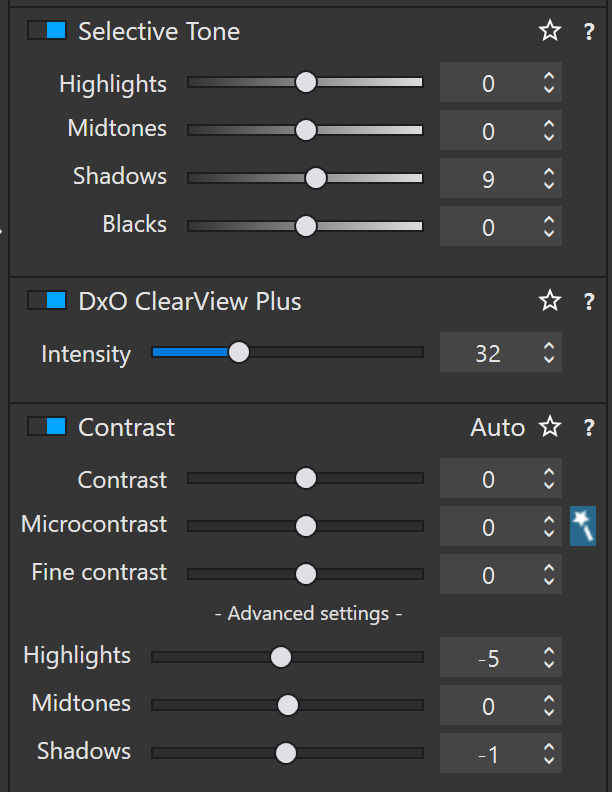
The upshot of whatever the words say is that Microcontrast tends to give “grainier” results than Fine Contrast, especially in plain colour regions. Also, with FilmPack added, you get the selective Fine Contrast for highlights, mid-tones and shadows. These are worth their weight in gold (or, at least, the price of FilmPack)
You might well be right there Joanna (and I do use the highlight / mid-tone / shadow contrast too!).
I guess I wish I had a better understanding of all of these (besides the obvious for H / M-T and S). Sometimes I feel like I’m prodding them to see what looks good rather than intelligently knowing what I need.
Stenis
(Sten-Åke Sändh (Sony, Win 11, PL 6, CO 16, PM Plus 6, XnView))
9
I´m very very careful with the using of Microcontrast. Is there a problem in a sky or some part with unclean parts or a what Joanna is calling plain color areas more Microcontrast will make these problems worse. Often the images gain from a reducement of Microcontrast and if I meet up with maybe 25-35 of Fine Contrast.
I also suspect Clear View Plus uses a great deal of Microcontrast so even that function has to be used carefully.
Photolab also has been in a class by itself I think when postprocessing color slides. I often have had severe problems with uncleanliness in the blue and grey skies and there is nothing like Microcontrast to make that go away completely without needing the use repair or clone at all. Just totally pull the slider to the bottom at the left side and meet up with Fine contrast instead. That process has saved a lot of “impossible” uncleanliness in the skies of my old color slides. Either Lightroom and Capture One has anything like that, I think. The three different variants of contrast I think is unique för Photolab and one of PL:s most important tools and selling point. I love that.
Hi,
We have three kinds of “sharpening” “dehazing” “clarity” kind of contrast sliders.
Clearviewplus, microcontrast, fine contrast
In order to get dehaze working, which is not really sharpening but more adding a form of blackisch dots in the image to drag the feaded image back to max black and max white or get clarity which is enhancing colordept and contrast.
Texure, detail is made by (near)black micro, verysmall dots in a certain row around colorplanes accentuating that colorplanes border which give’s it pronounced edges.
In the dxo’s manual you see that fine contrast is used in portret presets.
Which suggest it’s less agressive then microcontrast which makes peoples skin ugly.
So the most agressive one is the plane microcontrast slider. This one you must use very modest.
Next in line is the smarter version of microcontrast, microcontrast is spreading black microdots everywhere evenly wile clearview plus is having a algorithm which analizing the image in order to determine where microcontrast should help to enhance details and let area’s allone which have no bennefit from that.
Stil don’t use it often above 20-30%.
The last one , fine contrast, has a bit larger dots and less black. Aka it’s effects are softer. Hence the portret use for skinetones.
This slider you can shift much further/higher before it goes ugly.
I did a comparison between dxo’s black,blacklevel, sharpening, dehaze, clarity kind of tools and those of Silkypix v10.
Can’t find it any more.
If i have the time i look at my pc to see if i have still the data and test images.
Best way to test behavior is shift slider to the max plus and min of it’s there and compare it to what you know of how that works.
Stenis
(Sten-Åke Sändh (Sony, Win 11, PL 6, CO 16, PM Plus 6, XnView))
11
Very good that you lifted this Joanna but why did DXO hide them under “Advanced Setting”?? It´s very easy to forget that they are there or just overlook them despite you know they exists.
I suppose because I very rarely use Selective Tone and almost never use ClearView Plus, so I never normally even see those two palettes. Whereas my workspace has the Fine Contrast sliders always visible.
It is because they are actually overlapping subsets of the of the Fine contrast slider. Just adding them at the bottom would suggest that they are unrelated to Fine contrast. There was a thread a couple of years back where the Highlights, Midtones and Shadows sliders, and their relationship to the Fine contrast slider, was discussed in detail. Perhaps @OXiDant can provide us with a link. to it. If I recall correctly he researched much of the relationship between those four sliders.
I had in my head that Fine Contrast was Film Pack only in total? As in, without it, there was only regular Contrast and Micro-contrast.
To lend credence to my understanding, I note that only Contrast and Micro-contrast are available in Local Adjustments, which is one factor in favour of those two.
(it provides lots of info but it go’s deep in theory of colormanagment also and lots of what if’s and does it work like this? Side tracks but good to refresh memory.) @Stenis@Fineus
There is in that thread a TiFf file which provide you a row of white to black columns so you can tsst on that file the action of each slider of selective tone.
It’s acticually a very good file fo test effects on.(see my fooling around video where i slides all kind of sliders to the max just to see what happens.
About fine contrast and the extra advanged ones.
Every kind of contrast creates a form of sharpening like the radius of unsharp masking. A forgotten technique.
https://www.cambridgeincolour.com/tutorials/image-sharpening.htm
And read about the function of the threshold. That’s the key in understanding the advanged contrast sliders in how the effect your image.
Micro contrast isn’t the same as blacklevel in other applications…( near 0 in the 0-255)
And blackslider arn’t blacklevel dots that range is much wider. (use that tiff to test that.)
The advanged contrast sliders are working great together with selective tone.
Agressive use of tonesliders causes artefacts and unwanted effects by combining the contrast slider with the same name you can fade non-existing details (like grey blobs in blown white area’s) or accentuate details from raised shadows)
Minus means fading details and plus means accentuating details.
Test for instance highlight slider tone and contrast both to plus, both to minus and one plus, other minus and viceversa.
Well i am summend by my wife to get buns of bread from the bakery.
And my project (new house) is asking for finising electra wirering finishing walls in the hallway so i am off to the real world.
The important thing is to look at the histogram where, for the master copy, you should only see 11 vertical bars with nothing in between. In fact, there are a couple of small artefacts which must be a minute line between the segments, but not worth worrying about.
The VCs are named after the adjustments applied but let me know if Windows doesn’t show them and I will post named screenshots here.
For each variation, you should see how the tone moves towards lighter before the next, darker, bar; or darker before the next, lighter, bar. This is how the edge contrast is enhanced but it is also why overdoing such adjustments can really mess up an image.
The histogram clearly shows the differing tones between the bars with varying “mounds” of intermediate tones.
VC6 and VC7 show the difference between enhancing contrast with the Tone Curve and the Selective Tone tool. If you look carefully, the Tone Curve makes perfectly smooth transitions, whereas the Selective Tone actually adds a slightly augmented contrast edge to the transitions (a sort of sharpening). This is one reason why I try to avoid Selective Tone if possible.
VC8 shows ClearView Plus and just how much it affects the tones in otherwise plain coloured areas. The histogram shows much larger “mounds” of intermediate tones than any of the other contrast options.
That is a great thread however, I was actually referring to a thread that discussed the relationship between the Fine contrast slider and the highlights, midtones, and shadows sliders. I didn’t see anything related to that in that link you just shared.
Here is the thread on this subject to which I was referring.
I also believe there may have been a second thread on the subject that may have gone into even more detail on the Fine contrast sliders, if I recall correctly.
I’ve been meaning to ask that question again, but I got the impression from something @Joanna wrote that what I’m likely to want is “Fine Contrast”, not “Micro Contrast”. Along with the Contrast slider, that’s all I’ve been using for ages.
I still don’t (didn’t) understand this very well, but the above discussion helped. I usually tried one, then tried the other, and it always seemed to me that “Fine Contrast” was more likely to do my what I was after.
It would be nice if I could click on tools and get a description of what PhotoLab feels that tool does, and maybe why.
It would also be nice if I could click on something to turn on ALL my “advanced settings”, as the dull gray wording on the screen doesn’t really show up on my screen unless I’m already looking for it.
Stenis
(Sten-Åke Sändh (Sony, Win 11, PL 6, CO 16, PM Plus 6, XnView))
20
OK, I use the Selective Tones a lot. We seem to differ there
There are for sure very many different ways to achieve the effects we are looking for in Photolab. That might make some new users a little confused. There are also newer functions that in some cases has replaced older tools. I´m thinking of how many now prefer “Lens sharpness” before the old “Unsharp Mask” if there is a profile for the lens used. “Unsharp mask” is now mostly reduced to a backup function in the case there is no lens profile.
1 Like
Stenis
(Sten-Åke Sändh (Sony, Win 11, PL 6, CO 16, PM Plus 6, XnView))
21
@OXiDant
In fact, I use that technique a lot when processing repro images of color slides (positive film). Unlike for example Capture One Photolabs sharpening tools are totally indifferent when applying them to these kind of images.
Max negative “Microcontrast” is very powerful when it comes to remove unclean areas from these images and “Fine Contrast” is irreplaceable when it comes to achieve something that reminds about sharpness. It´s a very difficult material. Neither any Deep Prime-variant works on these RAW-files. The only sharpening working is using “Bicubic sharpen” when exporting but that is just on/off and gives us no control and in practice it´s unusable when there is “leaves of plants” affected. These often gets over sharpened and ugly.