I also ask why one has to go to the toilet in the middle of the night for such inconsequential amounts? ![]()
3 Likes
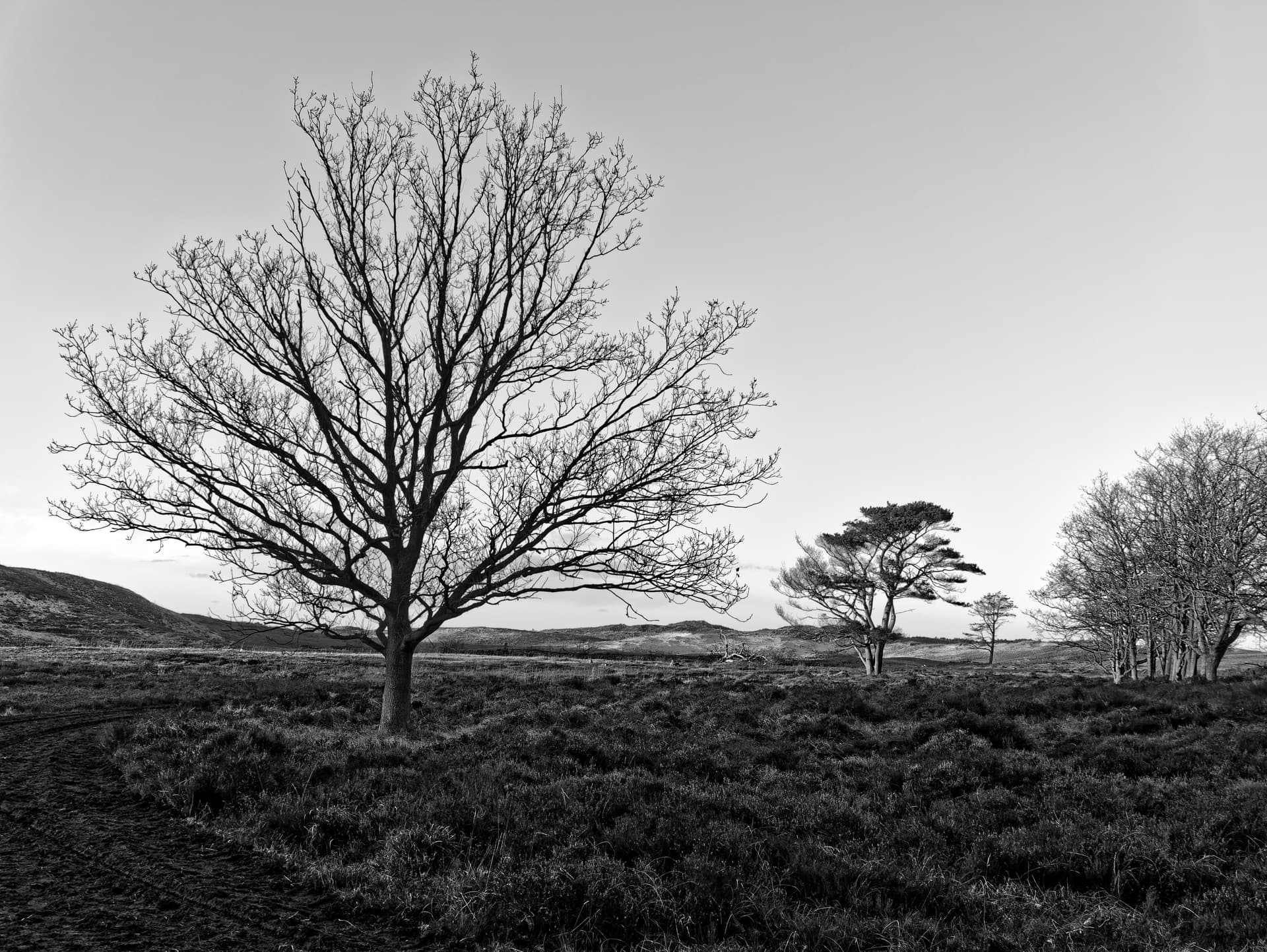
Ok quick test.
Luminosity 255-0 in steps.tif (1,1 MB)
100% fine contrast vs -100% high, mid and shadows right?
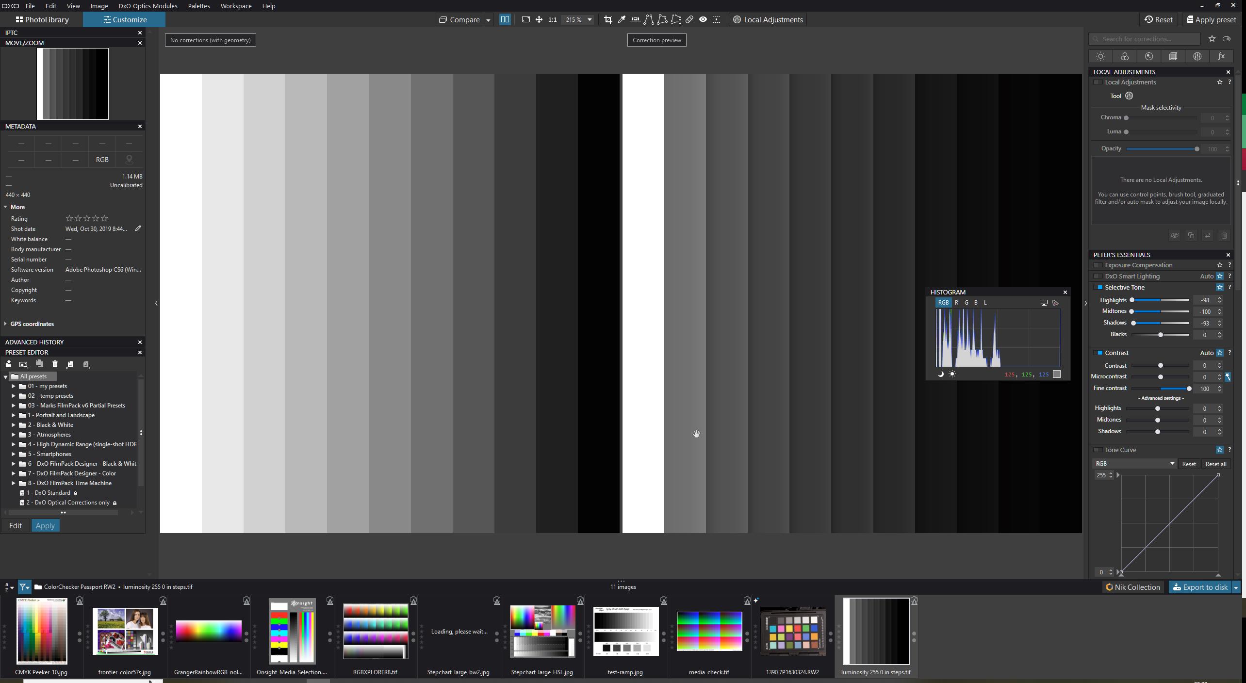
other way around -100% fine contrast and 100% high mid and shadow.
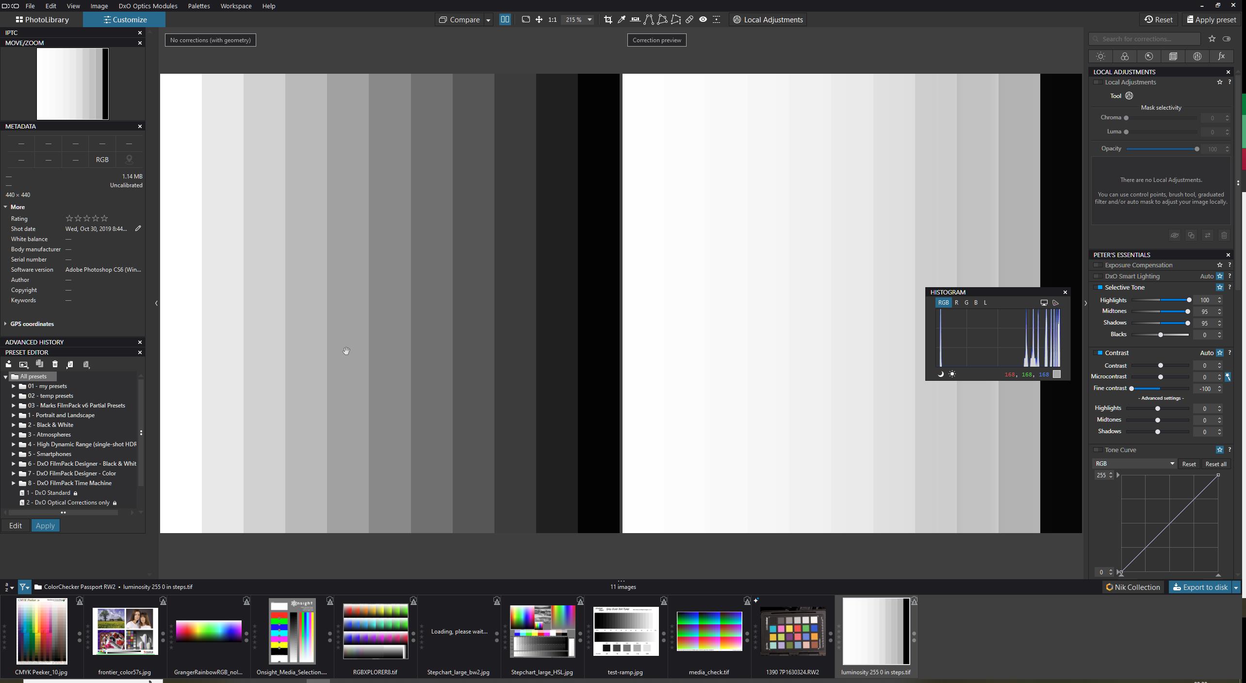
highlights alone:
midtone alone:
shadow alone:
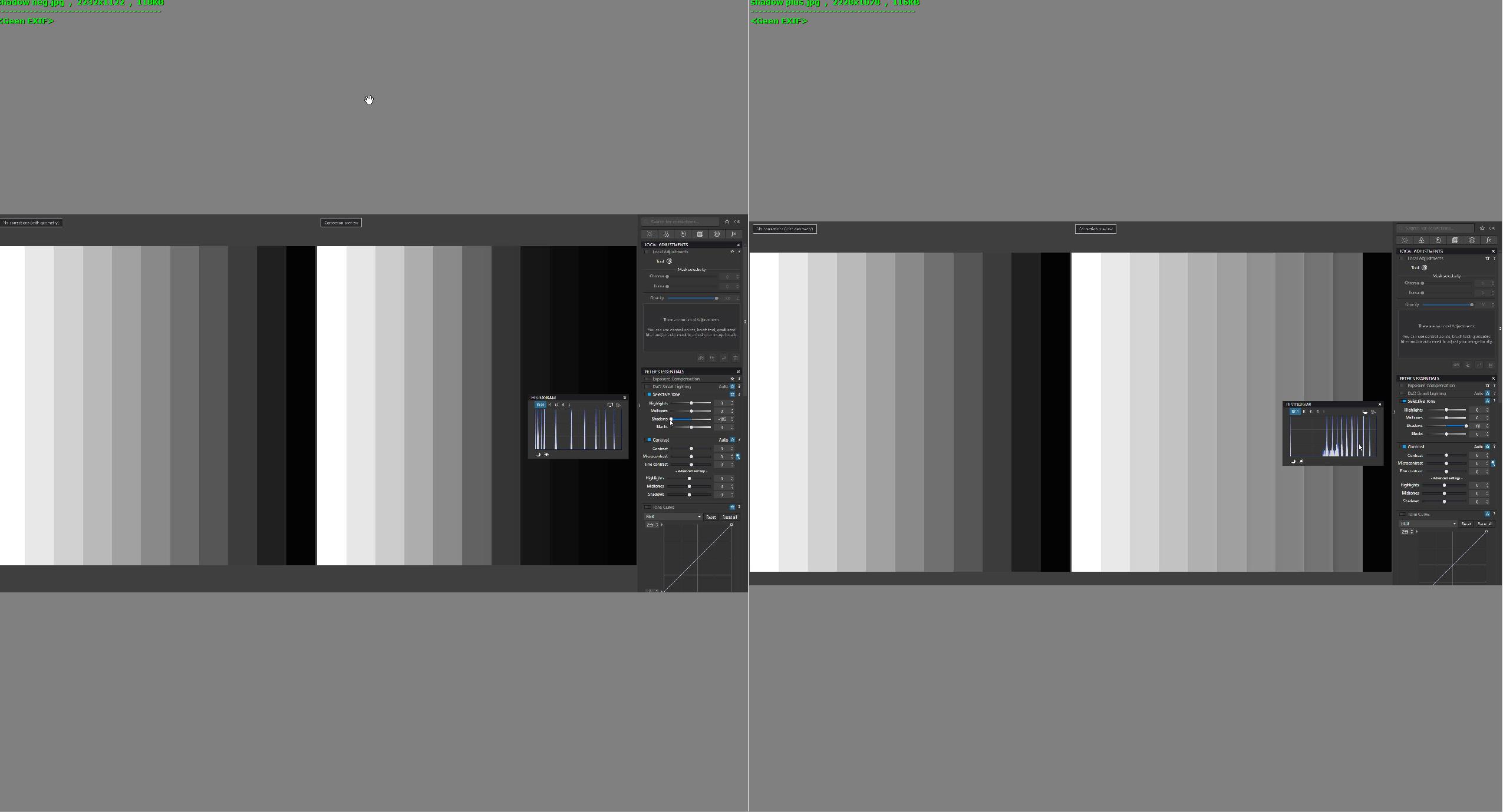
fine alone:

imho it doesn’t eliminate each other.
Hi OXiDant - isn’t John-M comparing fine contrast with the advanced sliders under fine contrast, rather than with the selective tone sliders as you seem to be doing here?
1 Like
Damn did i? Yes your right the screenshots proving that. Only excuse i have is not enough coffee consuption at that time in the morning and stupidity runs in the family if the caffeïnelevel is to low. ![]() (infact i am refilling now at my coffeebreak.)
(infact i am refilling now at my coffeebreak.)
When am back from my task today. Painting a wall, repairing a shedfloorboard and unloading a filled car with stuff i think i try to use the high, mid and shadow contrast sliders. See if it’s better. ![]()
Just before F1 is starting.
1 Like
Ha! Caffeine levels and maybe you’re working too hard this weekend!
Well, i have to listen at the orders from the bosses😅. Didn’t paint but rewired the electra first.(paint will be tomorrow.
Moms wanted a wallsocket in the closet instead only a lightswitch.
So i did a dive in the magic box of stuff i didn’t thrown away and got a switch and two wallsocket unit, but as allways the screwholes are just not there where you wanted them.
New blue wire, made a weld to get three together, moved the lightbulb mount from the wall to the ceiling. Cursed the wrong holes and drilled some new ones.
I had enough coffee apparantly, it worked.
Well it’s almost 21 hour so dinnertime for the tube eh smartscreen.
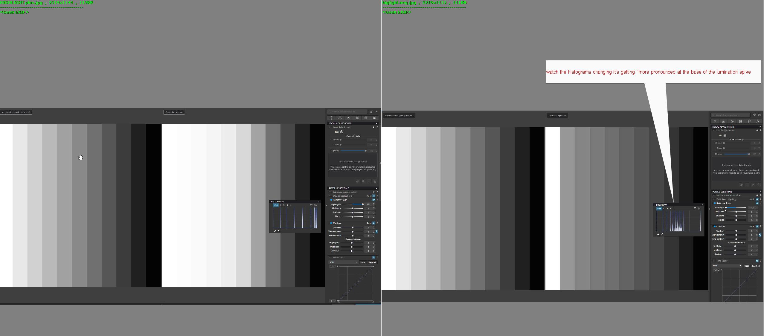
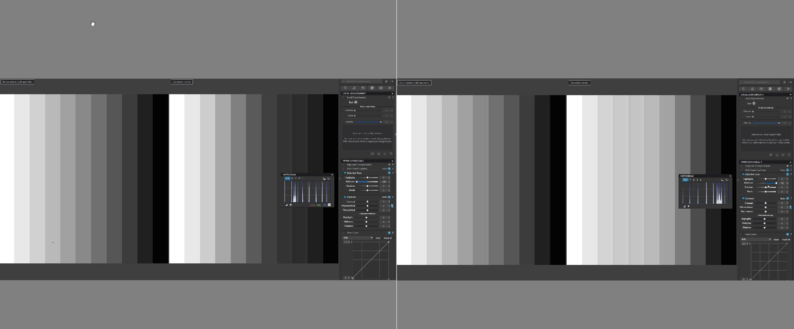
ok small time window.
in the histogram you still see some changes.
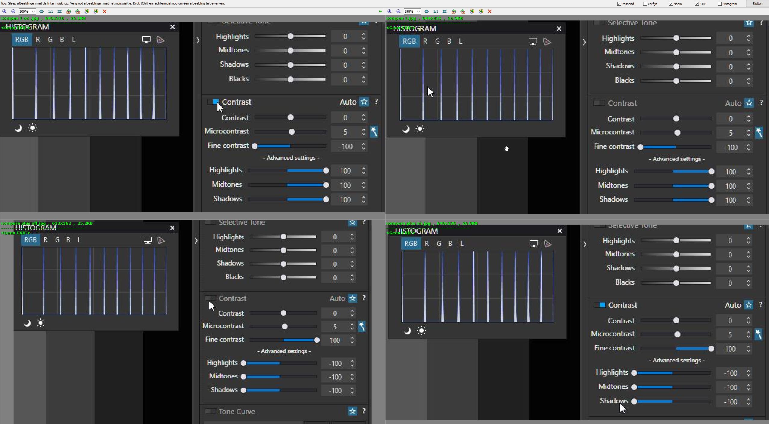
but indeed very slim/small change.
on the tiff file indeed very little change.
on a DPR test file for details indeed again very little till none change.
not enough time to really dive in to this but maybe one of the DxO staff can explain this behaviour?
@sgospodarenko i know your busy with real important things but are you enable to enlighten us in this?
Something about bigger dots cover smaller dots so the effect is hidden?
are the radius of the highlights/midtones/shadows dots the same as fine contrast?
and are the three a selective contrast a fine contrast based on luminoslevels? like selective tone is?
I read up on the new posts in this thread, and paid particular attention to the example photos. When I first open an image in PL, I usually feel it needs more “snap”, or “punch”. Maybe I should just say “sharpness”.
From what I think I’ve learned so far, is that using Clearview Plus is not a good idea for global editing, only for specific parts of an image.
- Improving “SHARPNESS” is very often what I need and the CONTRAST control usually improves this.
- Using MICROCONTRAST is something I’ve learned to avoid.
- Using FINE CONTRAST corrects the things that usually bother me.
Thanks to feedback from Joanna, I now open the image and view it full-size. Then I adjust how much CONTRAST to add, and if the fine details aren’t clear enough, I use the FINE CONTRAST.
Thanks to recent posts, when I think I’m done editing an image, I turn off one edit after another, to be sure I like the effect, and on my last image I found I could reduce several of my changes, specifically SHARPNESS. Over-doing things is often worse than not doing anything. ![]()
An other easy way to compare those images is to put both image in 2 layers in a “pixel processing software”, blend layers with substract mode and add an effect above this (a curve tool for example) to increase differences.
I do this kind of things when creating and checking masks that drive some very sensitive effects in 3DFX softwares and where even indistinguishable values have an effect.
Can you give some examples of “pixel processing software”?
Affinity Photo
What I called pixel processing softwares are software that allow to work on pixels images (in opposition to demosaicers that create a pixel image from no pixel datas, and in oppostion to vector graphic softwares that work on vector images).
Most (all ?) demosaicers have both demosaicing and pixel processing functions.
So Photolab, Capture one, Affinity, etc … perform demosaicing and pixel processing functions.
Photoshop, corel photopaint, gimp, etc … are examples of pixel processing softwares.
Compositing softwares such as nuke, fusion, flame, etc … perform pixel processing functions too (and more).
Just to name some few.
1 Like
This is going too far over my head. I’ll stick with the answer to the original question, and may much more attention to FINE CONTRAST, and for now, ignore MICROCONTRAST, especially so if my image contains people.
From all the texts I read here, I noticed that microcontrast was “satanized” almost to the extreme.
Because I would like to give my testimony about the constant use I make of it.
My photography life has always been in black and white with a little heavy contrast (I’ve been using Silver Efex for years). Faced with this, there were problems with the appearance of a white halo between the darkest and lightest areas when they were borderline. Because the use of microcontrast eliminated this problem, of course, using it with a little care, taking up to + 20% at most. So, don’t be afraid to use it. Just use it lightly. DxoLP itself defaults to a value between 6 and 16% when we enable it.
Indeed some people nailed the slider stuck at zero.![]()
Micro contrast is part of optical module.
Ive microcontrast magic want, that stick and star thing active. So as dxopl algorithm thinks it need some micro contrast i see this by that increased number. It’s often 6 or 8.
Clearviewplus does a fine job if you keep it moderest. Same as Smartlighting.
I use them with care. I stack exposure and selective tone adjustments. Same as contrast sometimes it’s better to “dehaze” with a local brush or mask to clear up/add more color in a foggy part of landscape with out touching the other parts.
Like the HSL, upoint technology does with color and saturation and brightnes.
I am glad to see that the parameters of your adjustments are exactly like mine. As my image treatments will always end up in Black and White, I try to make the best color photo possible in the original photo because I keep in mind that a good black and white always starts from a good color. I don’t believe in miracles or witches. When I go to Black and white then yes, I make my strongest adjustments both in contrasts, luminosity and texture (sharpness)
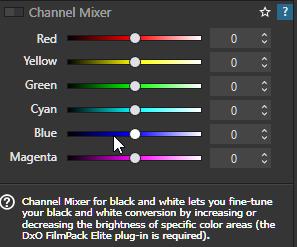
If you aiming for blackandwithe there is a channel tool for adjusting colors for conversion to black and white.
( i need to work but if you can’t find it i will screen shot it this weekend.)
Peter
I have been using Silver efex for many years. Before him, I used Photoshop using color channels and blending with Gradient Map and working with many adjustment layers. My friends call me the King of Layers. There are photos that I make 20 layers. The size of the final file is monstrous, more than 3 Gb. Today, I basically use Silver Efex and then I make adjustments in Photoshop, working with the famous layers. But of course your recommendation will be very welcome. Knowledge is always very good to acquire.
knowledge of making black and white/ monochrome images? as in expert? hahaha no way i am just a master tinkerer and just explore things for fun.
I have NIC old v2(dxo freeware) and use sometimes Silver efex because i like those presets. and if i am seeing something done by an other poster with NIC what i find interesting i try to find out if it’s also interesting for me. ( problem is remembering which preset/taste in which NIC app is for what to use… ![]() )
)
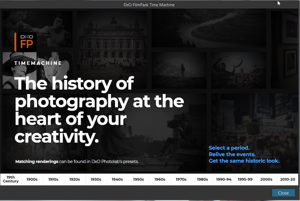
i have also filmpack 6 elite in which some interesting black and white tools are seated. and if you don’t have FPv6 elite (i think your wrote you would buy or did already can’t remember which it was.) you can start a trial of 30 day’s
it’s standalone and embedded. it could be interesting for your purposes.DxO FilmPack - La magie de la photographie argentique
instant 6 masks of color.
and

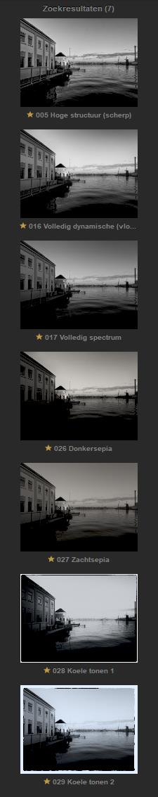
point is i like some presets inside silver efex which has characteristic as name.
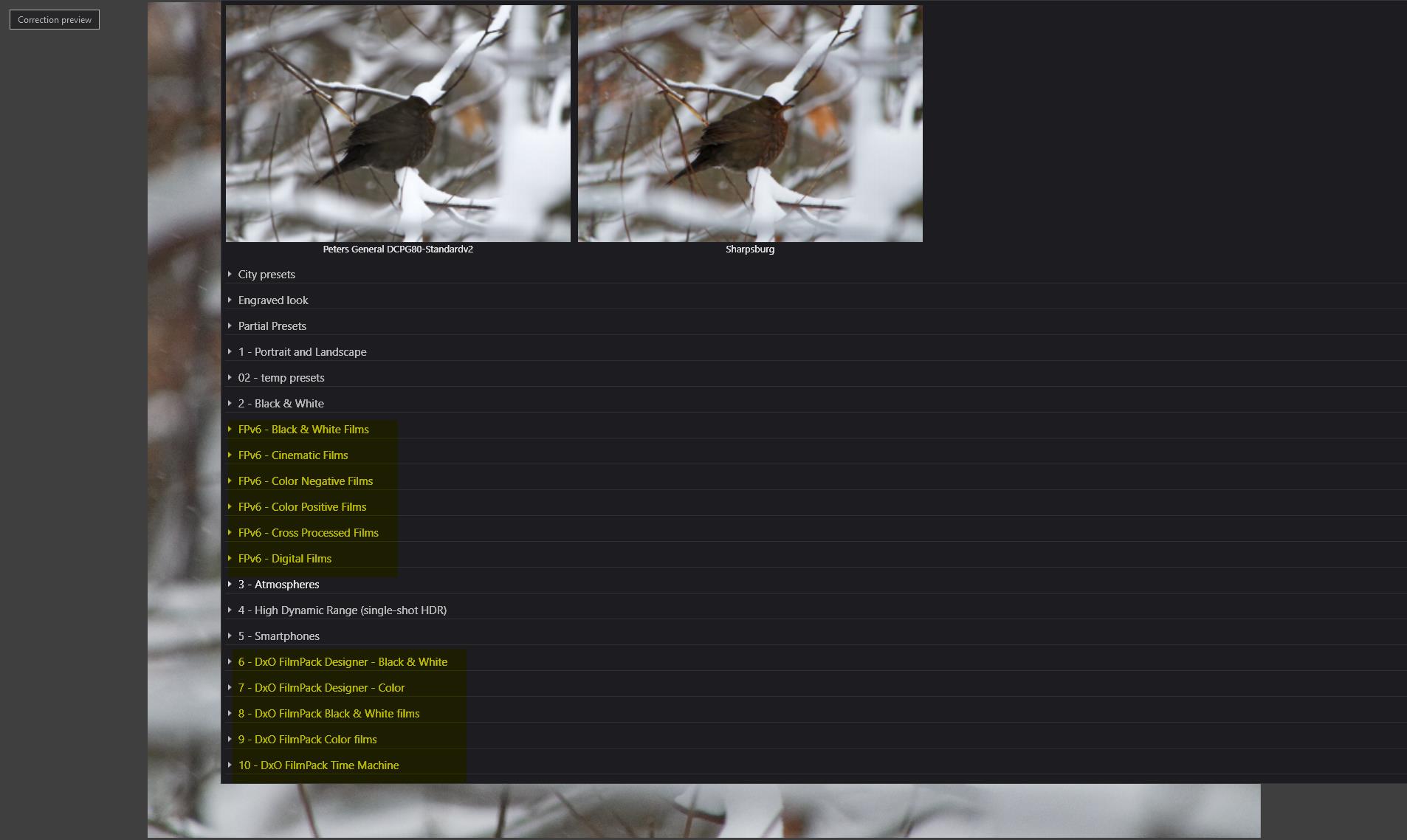
( And i suppose they have a lookalike in Filmpack but the overload of film emulation named after the film means i have to know a name and type which has the right characteristics to find a look i like.
So i almost never use the filmemulations. It would be easier to find things if they have filtering of characteristic of a film, sharp, soft, highdynamic, highcontrast , sepia etc.
Then it would be easier to find the one i seal for the image i have.
Peter
some fooling around stuff:
softer warmer look more sunny feeling

(Note i have edit the post for better reading what i ment to say.)
2 Likes