Towards the end of the video, the comment is made as to adjustments to make the image more believable. As an artist, that is wonderful. It’s painting with light. I’m in a different world, I guess. I want to edit the image to look like what I saw in my mind as I took the photo.
Regardless of that, the video taught me (or reminded me) of all the tools I have at my disposal. I’m now sold on the idea of using Local Adjustments, and watching this video again was very useful. Thanks for the link!
there are some post about it.
Be aware that smartlighting in more strong use can cause artefacts or strange effects in shadows and highlights.
If you use boxes which you can place on a object of interest and on the darkest place and the brightest place (3 boxes) then Smartlighting tries to level exposure to balance all three inside the “dynamic range” of the image.
If you have a under exposed image with a bright spot then you can use to "pin this spot on a place wile lifting the shadows.
i took your image as example in jpeg thus less effective: click for video
i didn’t look for natural look just showing the possible toolcombination
an other full play of all exposure controls video
you see how the boxes are active even when set and replaced.
there are different aproaches to handle this thing. tonecurve can do alot also.
and you can use them in any order you like.
On thing you need to adres to is spotweighted smartlighting is acting “uniform” until you place a box.
i often set it to have a pin of exposure level on a object so my brightnes adjustments are “smoothed” around this object.
The advanged contrast sliders are part of FP. and if you get "greyed spotted places when highlight in selective tone is turned down i use this to level contrast by plitting the amount of hightlight
So -50 highlight is -25 of both same the otherway around, lifting shadow means less contrast so i add contrast in the shadow by splitting the lift.
i can manage the amount of detail and “contrast” by those sliders work among or against each other.
when i have a smeart shadow i lower detail (shadow contrast to minus and raise shadow in tone by plus.
Take some images you want to play with in a seperate folder and just go bongus with the sliders.
take this for watching which slider does what: Luminosity 255-0 in steps.tif (1,1 MB)
For what it’s worth, I believe AA used employees who actually printed many of his images (after he’d worked out the specific printing techniques for each image). That certainly doesn’t detract from his artistry.
After lots of reading here, and trying to learn how to use Local Adjustments instead of global, here is an original image, and my edited version. I’m still not all that sure of what I SHOULD do, but I’m much more sure of what I SHOULD NOT do.
I have also learned to only work with PhotoLab 4 on my iMac. When I work on my external ASUS display, my images always appear to me to be too dark during the day, and too light at night. My iMac does a better job of adjusting for room brightness.
To be honest, I am hard pressed to see any difference between these two images, apart from the cropping and possibly the tiniest of rotations.
This is when you start to realise that you might need to calibrate your displays. It sounds like you are saying your display brightness adapts - this should not happen - you need to fix the brightness because profiling relies on that being constant. The ideal value, if you plan on printing especially, is 80cd/m².
I have my MacBook Pro display plus a 27" Apple display - they are both calibrated so that, whichever I use, the colours, brightness and contrast are as near identical was possible.
Just out of interest, how do you fancy posting your original RAW file so that some of us can have a play with it? Then we can send you the .dop file from our attempts at editing and you will be able to see what changes we have made and the effect they have.
My iMac adjusts according to the lighting in my room. My old Asus doesn’t.
I did go through the calibration procedures, so it should be all set.
The external monitor - not sure how I can get it to adjust for room lighting.
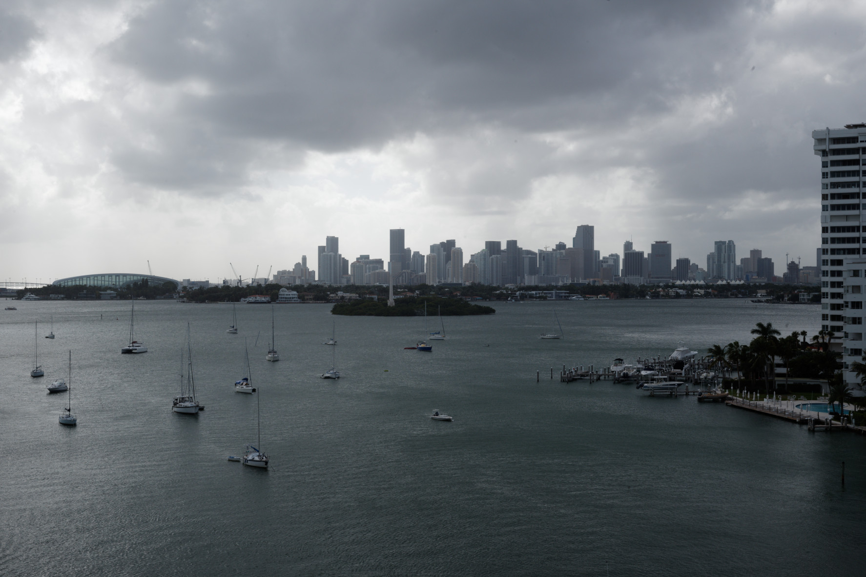
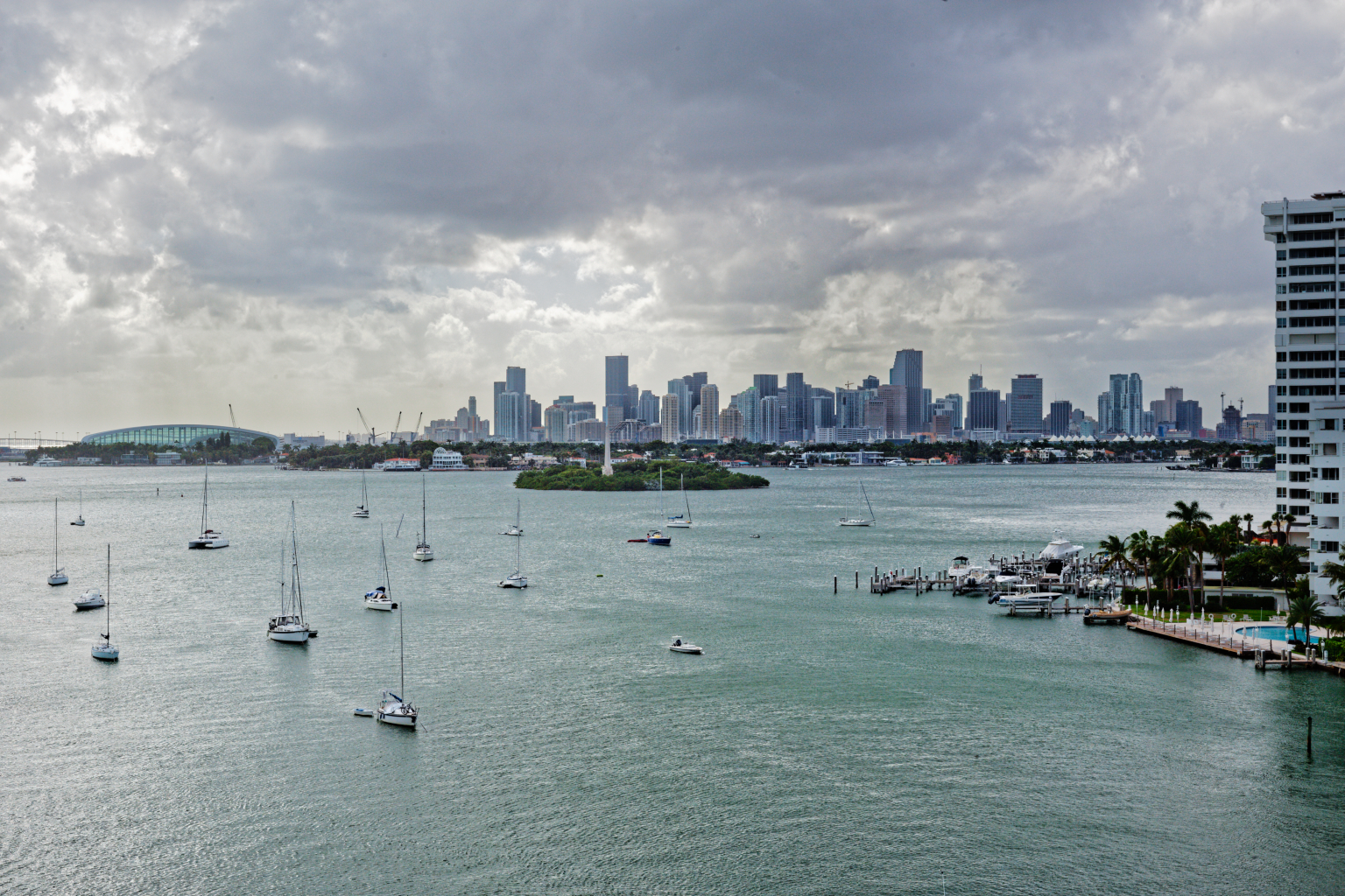
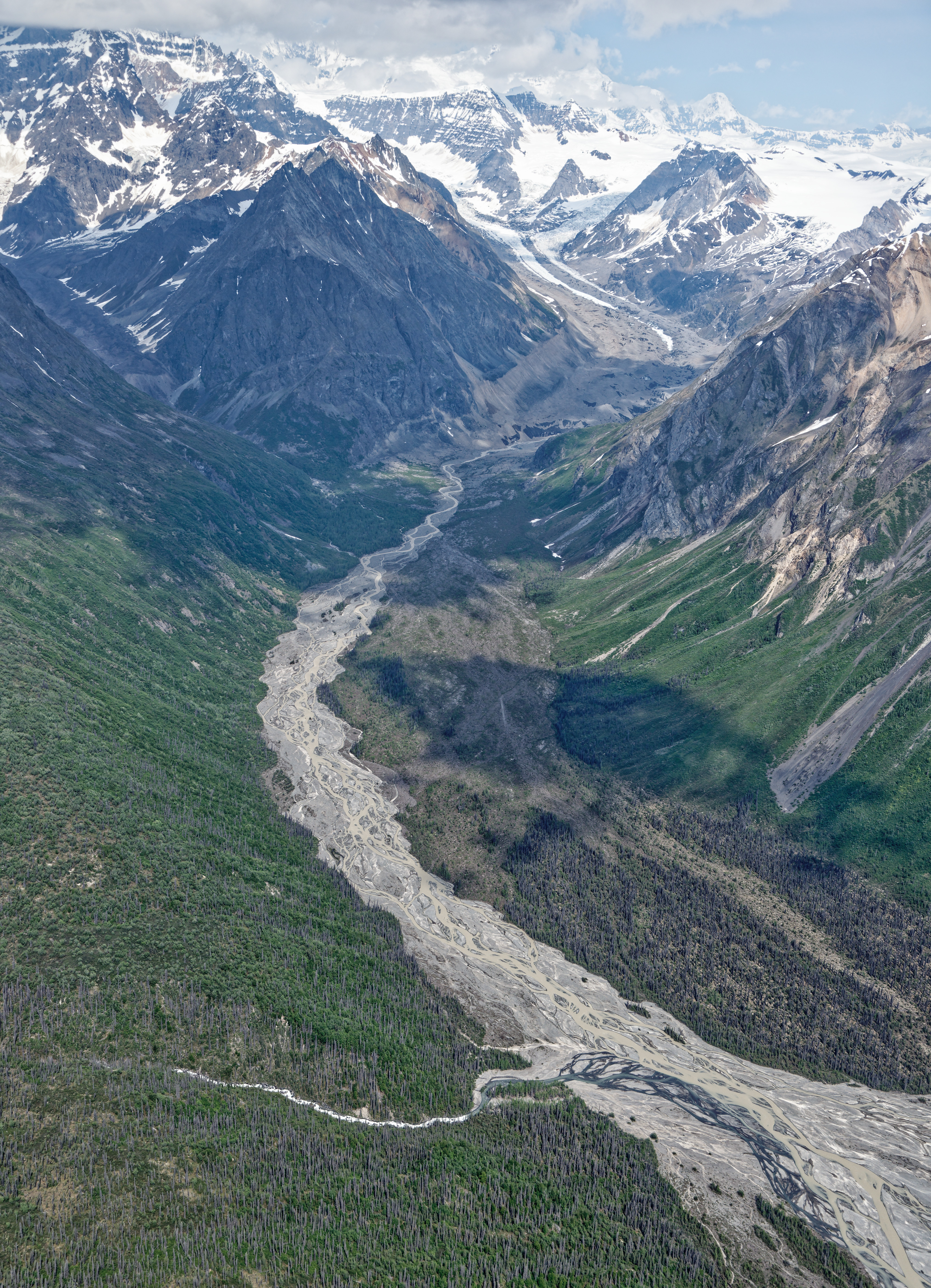
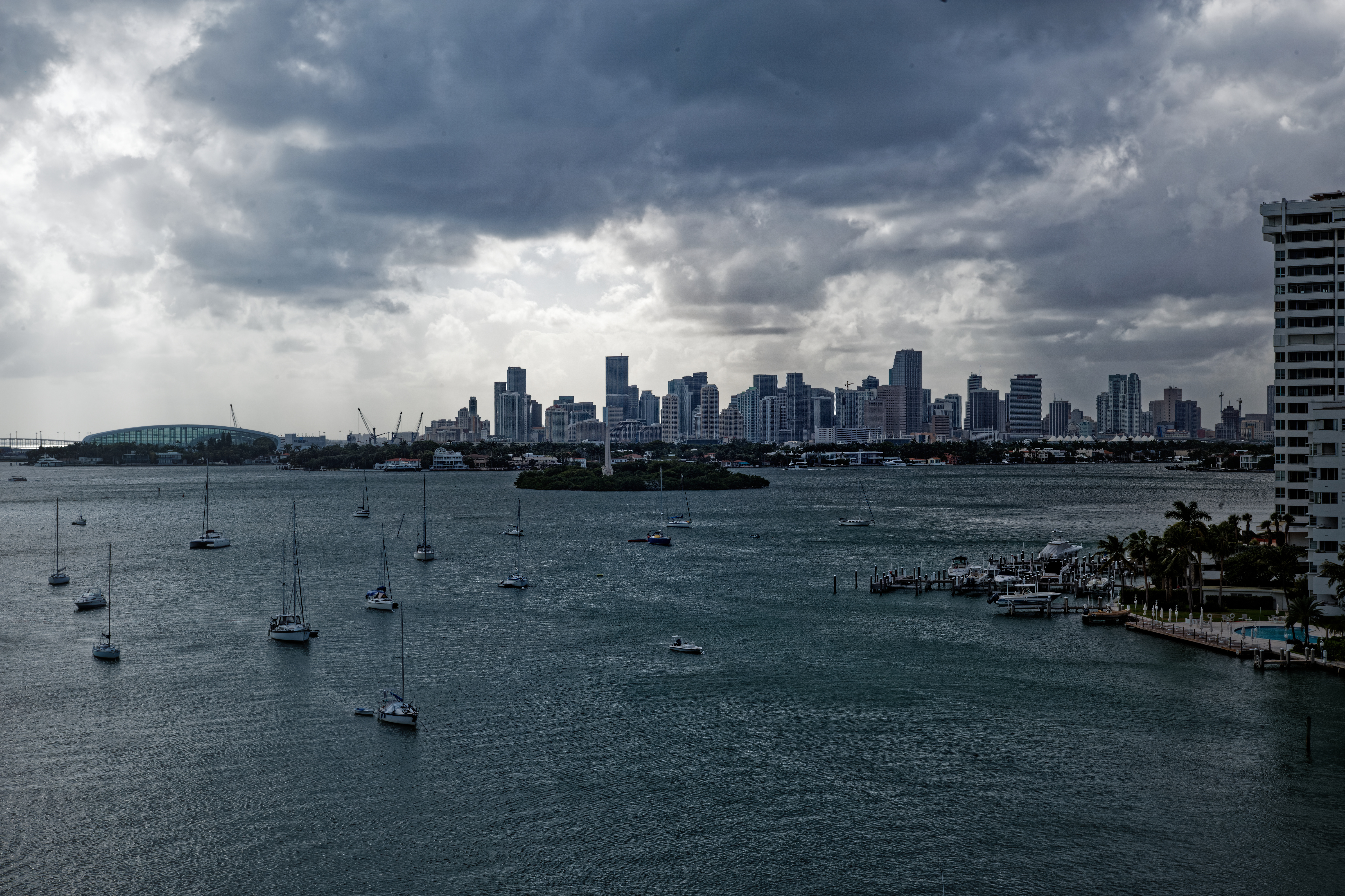
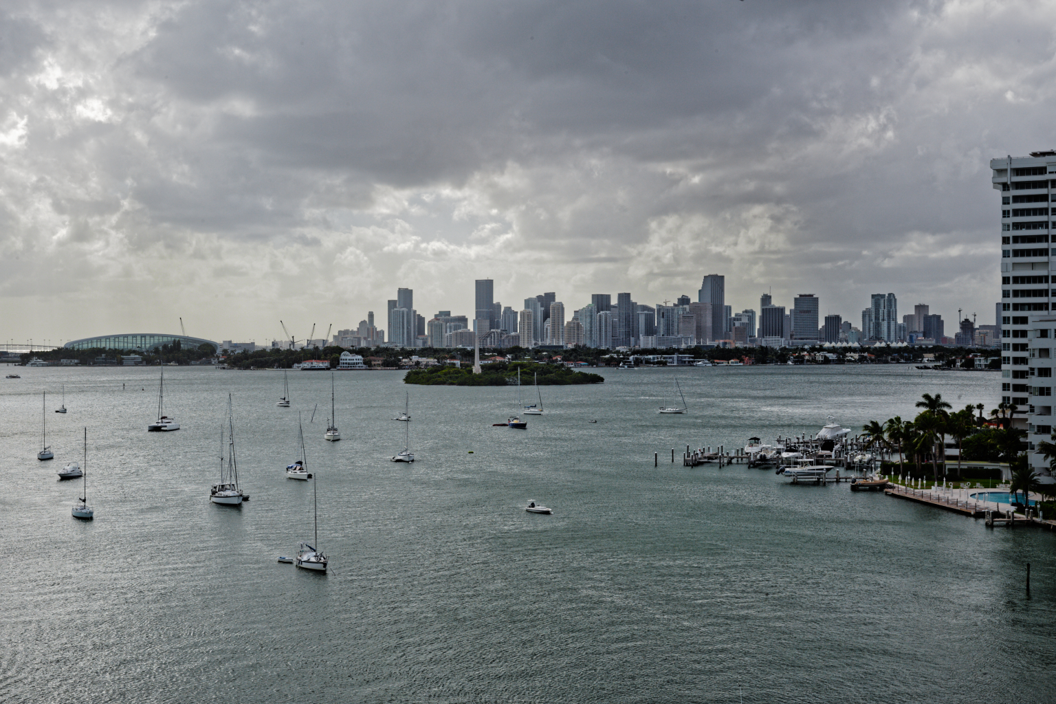
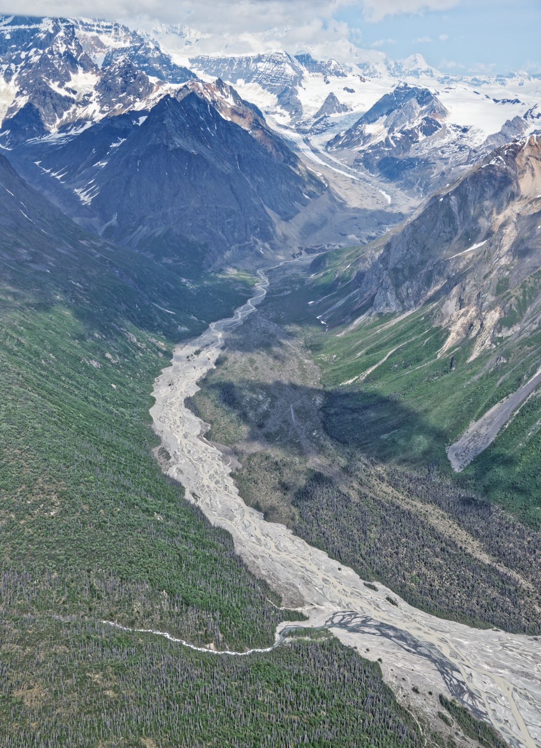
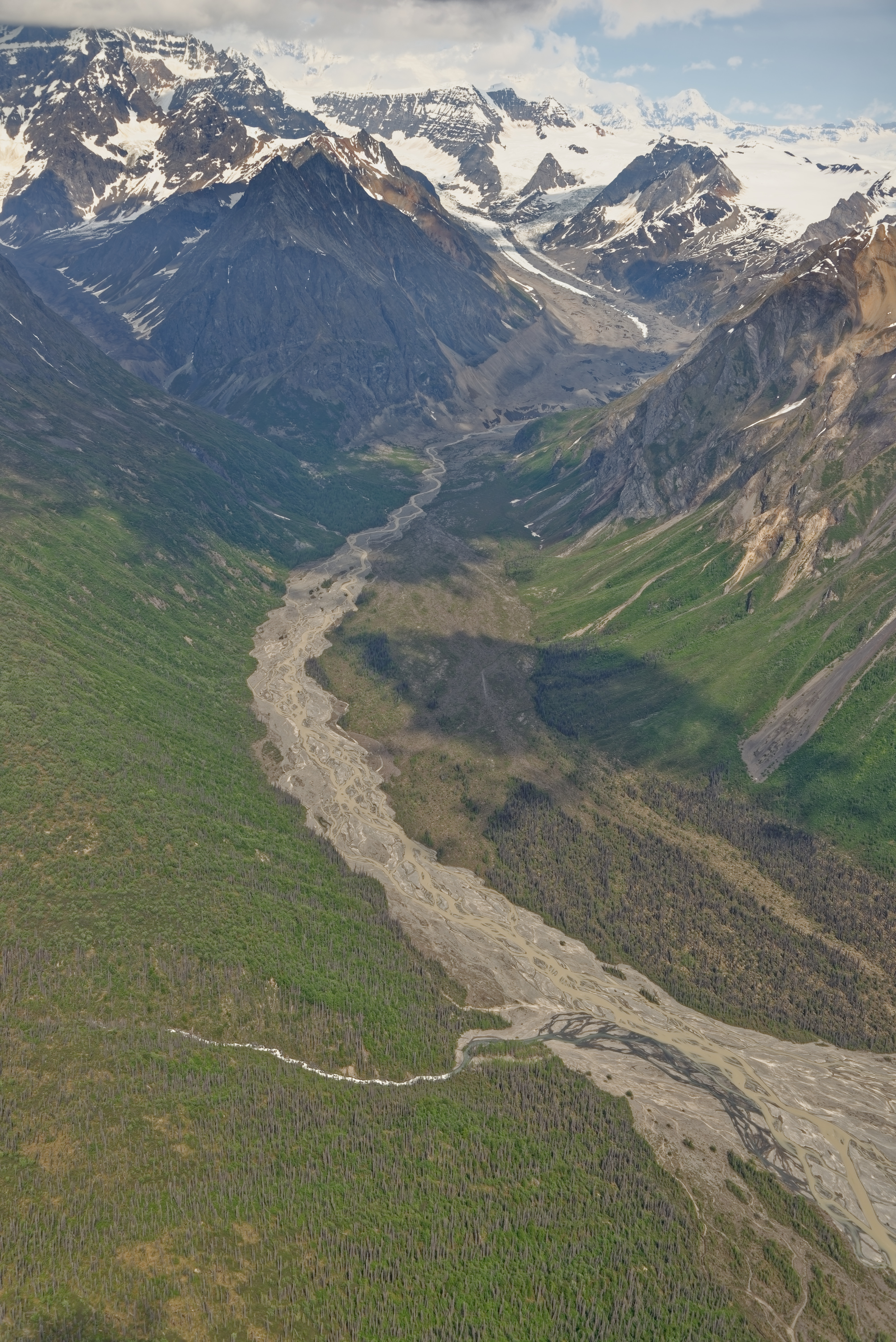
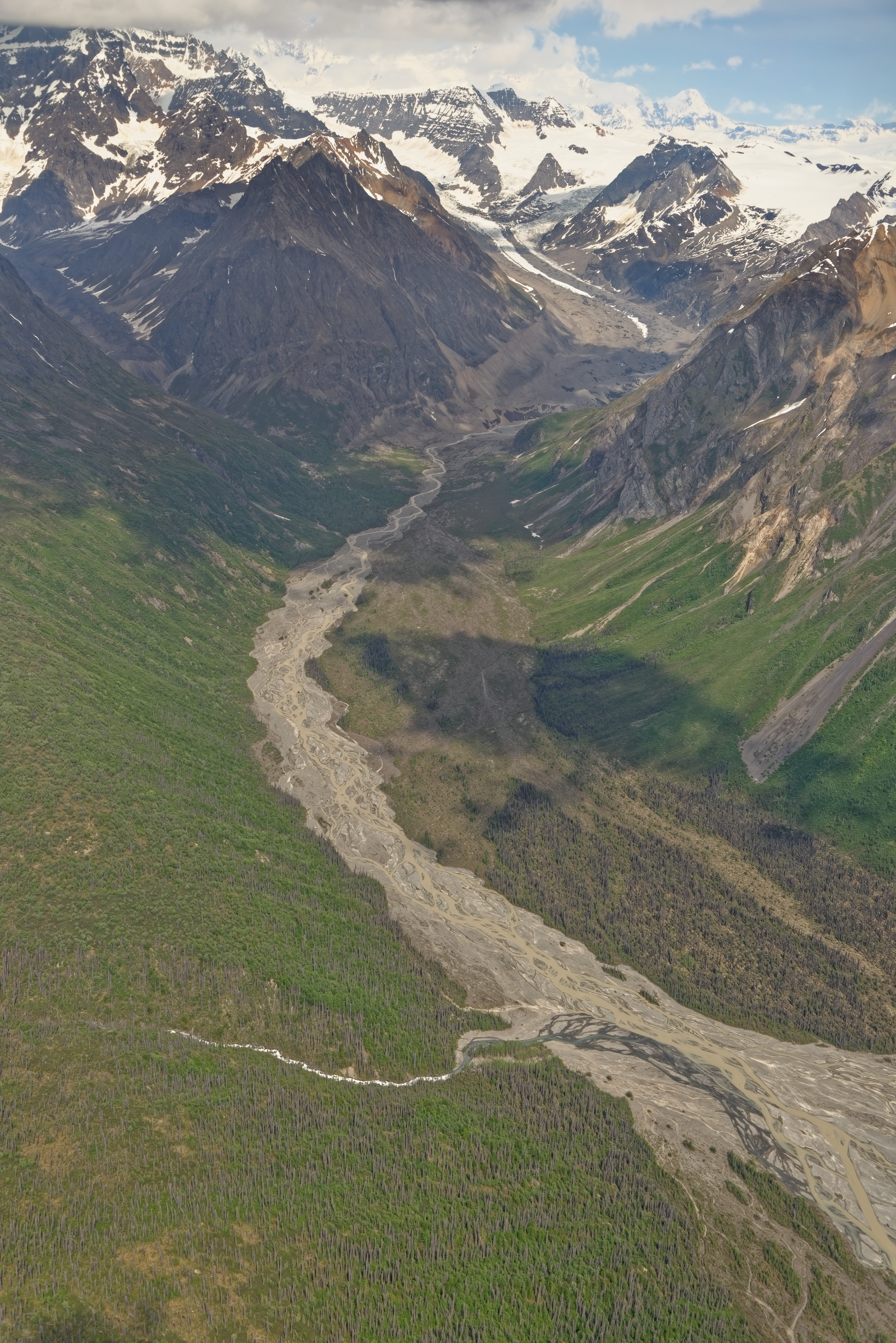
This is a very interesting thread. At the risk of making it even longer and hijacking the topic, I’d appreciate input on an image where I needed to apply more ClearView Plus than usual (50). Background: This was taken from a bush plane over Alaska in the Wrangell St. Elias National Park. The ride was a bit bumpy so framing wasn’t ideal, and I had to shoot through the plane’s windows. And the weather was unusually warm. This is what I’ve done so far in PL 4, but I’m not satisfied yet.
I tried the ‘three rectangles in Smart Lighting’ technique, but the darker parts of the image didn’t look dark enough (and not dark enough in the histogram) to match my memory, so I reduced shadows some more. Any thoughts on a better approach would be appreciated. Link to raw NEF: https://1drv.ms/u/s!AtlBwiIf8wQzgYA9I07T5lBNuPIK5w?e=XHfgXM
My thoughts - on the one hand, the water now has some blue color, which I couldn’t see as I took the photo, but it looks far prettier the way you did it.
On the other hand, the clouds look awful. I didn’t “see” anything remotely like that. What I “saw” looked more like my original image.
With the water now looking so good, the buildings in the background look out of place. I prefer the way you made them lighter, which looks more natural, but they seem to have a color cast, or it’s my eyes playing tricks on me.
I downloaded your “dop” file. How do I use it on my computer? Where does it go? Do I replace my “dop” file with yours?
Which is where artistic interpretation takes over from cold hard facts
And that is because ClearView Plus is very good at finding detail out of hazy areas. Sometimes too good, which is why we need to temper it, but that requires having been there to know how much is too much.
On the other hand, even though it is not as you remember it, does it make a better, more interesting, picture? RAW files tend to look flat and that is how yours looked, so I had to assume the lack of colour and contrast was due to it just being a RAW file.
Please don’t take this the wrong way - I wasn’t there, but as you presented the scene, if that is how it was, is just dull, flat and fairly uninteresting. Which may be as it really was but does it make a good picture? That is where only you can decide how far from “reality” you are willing to stray in the pursuit of a work of art
Without any real sunlight, and at such a distance, you need to consider whether to portray things exactly as you remember them or to make a picture that has more interest. Obviously the detail was there, just obscured by distance haze. Which is where you now need to examine what tools I used and to adjust things to better suit your ideas.
Essentially, just replace your dop file with mine. It contains both of your versions with mine added in.
In my opinion, this image is basically a record shot of a fairly dull day - something that was always going to be hard to get “right”. Anyway, install the dop and start to replace my interpretation with yours. At least you will be better able to see what can be done and how to do it
Although I haven’t actually played with your photo (sorry, I’m having computer problems right now), I think you might get a good improvement in contrast by lowering the midtones in Selective Tone. That will usually improve the shadows, but will also reduce the overall brightness of the image. So try raising shadows and lowering blacks also. That might sound counterproductive, but the result can be striking.
If you have FilmPack Elite, maybe also try lowering highlights and raising highlight contrast.
Raising ClearView Plus will often lower midtones, but will also increase microcontrast considerably. I don’t think your image needs more microcontrast.
You hit the nail on the head. I have two choices - to put on my photojournalist hat, and show what was, or put on my artist’s hat, and show what I imagine.
I won’t take anything the “wrong way”. Most people won’t even consider the difference. As I grew up with photography, at the University of Michigan, and being heavily involved in http://www.sportsshooter.com there were rules as to what can and cannot be done in photojournalism. I followed them. I think I posted those rules here a day or two ago. That website is mostly dead nowadays, but it used to be extremely active.
Now I’m retired, and I’m doing this because I enjoy it. Learning this stuff is very difficult for me, for lots of reasons, but I know I’m getting better day by day. But I also know, and you are now reminding me of it, that “photojournalism” and “art” are completely different. The photos are different, the goals are different, and the technique is different.
My own solution is to do both, and I can decide if I am creating a Photograph or a “Photographic Illustration”.
Oh, and feel free to be as critical as you feel appropriate. That’s the best way for me to improve my skills.
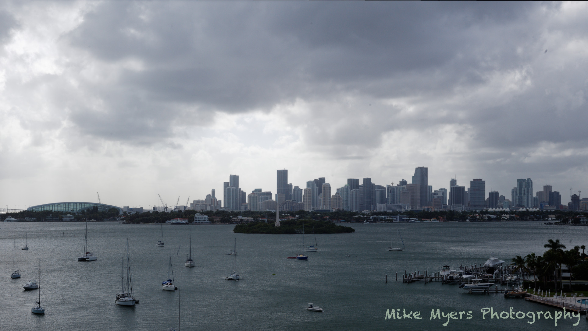
Here is my cut on this. Mine is not at bright and colorful as @Joanna’s. I wanted a darker, moodier feel with a more threatening sky. I also wanted a little more definition for the buildings and changed the overall tonality a bit more towards blue.
You don’t have enough dynamic range in the image for Smart Lighting to work as you might hope. There’s also a lot of haze because of the elevation and distances involved.
I didn’t use ClearView Plus at all. Instead I used the FilmPack highlight, mid-tone and shadow contrast tools.
Here’s my attempt, which doesn’t look too different - I just went about it in a different way.
Mark, your post from 8 hours ago is exactly what I used to want to create. It looks better, and more artistic, than what I saw. But it’s “dark and moody” which is not what I saw. To my eyes, everything was shades of gray, and while I love your sky, that’s not what I remember at all. By making the photo look better as art, it’s no longer a record of what I saw. I’m guilty of that too much of the time - I make photos look better, but they are no longer what I had seen.
Joanna, your No2 photo from the buildings down looks like what I remember. The sky is totally different from what I remember seeing. Using the word people have used about my photos, the sky looks over-processed.
Maybe I should change my camera settings to RAW + JPG, and post an un-edited JPG here - hopefully it will look closest to what I saw. If it’s all dull and gray, so be it. I still have yesterday’s photos to work on, and today or tomorrow I’ll try again.
5300K is the threshold in this image belowe this shadow gets blueisch so a 5300K WB:
i was thinking it’s a bit yellow in the green now so now the fine tuning begins from here and that’s your department you know how it looked then.
colorwise. 2015-05-30 14-06-38 NIKON D600.NEF.dop (10,4 KB)
i layed the detail more to the back the snow.