How much DxO ClearView Plus is enough, or too much

I saw an interesting scene from my balcony this afternoon, and processed it tonight. I thought I was going very easy with the ClearView Plus, because eventually the photo starts to look like a cartoon, but without using those tools, the photo looks “dull” and “flat”.

My question isn’t “how to”, but rather “how much”. Thanks to the people here who taught me how to use the “Snapshot” tool, I can post the original image (third image) and what I first produced (first image), and also the final image with ClearView reduced (second image).

It’s difficult to know when to stop, and how much is too much. I need to look away, and then come back to the image.

Top image is the master file.

Middle image is a version I used too much ClearView

Bottom image has slightly less ClearView - I think this is the one I prefer.

It is simply a judgment call. Each image is different and each of us has our own ideas about what we want to accomplish. As a result, there is no absolutely right maximum or minimum setting of Clearview Plus for any given image. Adjust it until you’re happy with the results. Keep in mind that Clearview is just another one of several different types of contrast tools in PhotoLab. It can also be used for much more than just the removal of atmospheric haze.

Personally, of the three versions you posted, I much prefer the overall look of the middle one with its greater contrast.

Mark

1 Like

I have to do this, too, before I can consider a lot of my editing finished. There are so many details to consider, and what looks good at first might only look good in comparison with the starting point. It’s after taking a break or trying a few different looks (sometimes with virtual copies) that I find the right balance.

My own opinion is that the first image has better balance. In the second, the water has lost its reflectiveness and has gained an unnatural amount of texture and color that resembles noise to me. The horizon shows more color in the second image, but there’s too much contrast along the shoreline for my taste. The third image appears to be identical to the first: did you post one of them twice by accident?

Like Mark, I find that each image presents a different situation. Usually, I only apply a ClearView Plus setting of 8-25. Sometimes, none at all, and only rarely a lot. Often, I will use local adjustments to vary the amount that gets applied to an image. For example, you might try a small amount of CVP globally and use a gradient mask to add more to the sky and buildings.

2 Likes

Yes, the third image was the same file as the first. I removed that image, and put in the one where I used slightly less ClearView.

Sorry - I clicked on the wrong file to upload. I should have done all three at once. Now I’m having trouble finding differences between the middle version and the bottom version. :slight_smile:

Well, they have the same file name. :upside_down_face:

Did you know that you can apply ClearView as a local adjustment also? As a global adjustment I start with 10 and rarely do more than 30.

Edit: Yes, as of now, the second and third image are pixelwise identical.

Don’t forget that you can apply ClearView to parts of the image by using Local Adjustments.

1 Like

When you substantially change the illumination contrast and color values, the best practice is to come back on your image one day later.
Pascal

hi
it is good to blur/lower contrast of clouds after clearview, else too artificial.
Don’t forget to clean your lenses or sensor :wink:

Lesson learned - there was such a tiny difference in file names, I tried to get them in order, but I messed up. Now it is fixed.

In the future, I will re-name the files to make it more obvious, and then upload to the forum. As for me, I saw what I expected to see, and not what was really there. Sorry…

What would the reasons be for using ClearView as a local adjustment? To me, the entire image was better when I applied it to the full image.

I will try it the other way next time. I’ll take one image today, similar to what I did before, and see what difference ClearView makes when I control where it is applied. Specifically, the buildings in this image got much more clear when I used ClearView. The water changed too, but maybe not that nicely. The clouds - ditto - just enough to bring out some more detail was good. Beyond that it looked fake.

Now I know how to “quote”…

Why would I apply ClearView, then blur/lower contrast, instead of just applying less ClearView?

Lens is spotless. Sensor has one speck on it. (Does Leica have a way to eliminate the effect of that spot electronically?)

The middle one has on the skyscrapers a fairly strong “sharpening” so it should be the main object in the image.
What i find strange to my view is the darker beddings infront of the skyscrapers.
Are the buildings shadow lifted and the darker trees not?
And i think i would crop 16/9 (new tv watching)
i hope you didn’t mind:
did a small change:


brought up the shadow, some highlight compresion and some fine contrast and a touch of vibrance.
just to create some colors and details to pop up more.

no local adjustment done at this time.

Just to avoid artificial effect of an over sharpened cloudy sky…
You can be easy on the blur or negative microcontrast sliders. With a Upoint it is quickly done
It is just my view.

What is a “Upoint” ?

I noticed the sky was getting over-done, and also the water, but the buildings got much better with ClearView.

Is a “Upoint” another term for Control Point?

I took a similar photo this morning - will practice with it later this afternoon. So many things to learn!!!

No need to say it’s “just your view” - that’s what I’m hoping for, to get more, and likely different, views. I’m guessing at most of this stuff, but I’m getting better as I keep doing it. It’s like I am learning to see all over again, noticing things I didn’t use to pay enough attention to.

yes same as control point, i think it is in the Nik collection that it is called Upoint. Quicker than painting a mask, but sometimes you will have to paint to be precise. (touch M to see the area affected by the control point, and protect zones (for instance in your case buildings) by ALT+the control point while you have still selected the same negative contrast control point). Of course you can do the opposite, place a control point on buildings with Clearview.

Aha! Yes, I understand, and yes, I learned how to do that with Nik - thanks to all the training videos. I need to learn how to do it with PhotoLab. I am closer - I found a good video, and started watching it earlier today. I need to finish, while following along on my other monitor, doing what I am learning.

All these discussions here are a huge help, both when you guys are helping me, and when I read how others got help. (I’m beginning to feel I have separated myself and my photography from Lightroom.)

If i have a image like above i use virtual copy’s and different aproaches.
Tonecurve,
Sliders of contrast and selective tone
Controlpoints and local masking.
Presets i have to find the angle to get what i want to view / show.

And when i find a good startingpoint that’s the new “master”.
And then fiddle with the other tools to slowly crawl to the desired point.

I know what you mean, and I appreciate everything you said, but for me there is a “catch”. I can do one of two things, but usually not both simultaneously.

I can create an accurate representation of what I saw with my eyes, and capture this in the camera.

Or, I can create a representation of what I saw/felt/experienced, and create an image to show others what I experienced.

What I learned while growing up was that if I see myself as a photojournalist, my photos need to be accurate. I can’t re-adjust reality, and if I create an illusion of something that wasn’t obvious, this is wrong.

As an artist though, I can do anything I want to create an awesome image that stands on its own, regardless of what someone standing next to me might have actually seen. As an artist, anything goes, including removing annoying things from the photo such as overhead wires or garbage on the ground. None of that is acceptable if I’m wearing a cap that says “photojournalist”.

My own solution, and definition, is that I can either create a Photograph, or a Photo Illustration. Once I cross that line, anything goes - even using Luminar and replacing the entire sky. But for most of my photos now, I don’t want to do that - I want to create a photo, not an illustration, and I only want to use the tools available in PhotoLab 4 to approach, but not to cross that dividing line.

I hope that made sense. As a photojournalist, I am very limited in what I can do. If I miss a photo, I can’t ask people to repeat it “for the camera”. If there is something blocking my view, I can’t physically move it. I can’t deliberately make a photo look like something it wasn’t, and I can’t use wide or telephoto lenses to give people a false idea of what was actually being photographed.

1 Like

This part i totally understood. Then your bound to the image you saw through the viewfinder. Only small enhancement is allowed or private information which can’t be showed deleted masked.

(My on the otherhand are a “snapshot shooter”. So all my image’s are for me and my family to see. I allow myself to play around and do what i can to make a image interesting for me. Lose things i don’t want, changing colors all kinds of manipalation.
like this:


or this:

So every tool is allowed aslong as the integrety isn’t broken.
Human eye’s tend to HDR the vision by building parts together.
So that image above if you shoot a exposure bracket and blent them in one that’s allowed?
Or use bracket and test which image holds the best the image to the point you can change?

Is cropping allowed?

I am not judging only finding out the size of the playing ground. :blush:

Image above would be bennefit from tonecurve and clearview.(if that’s inside your play court.
As main tools. Use the tonecurve to bend the shadows and highlights in to place and clearview to sharpen things abit.

From https://www.csus.edu/indiv/g/goffs/135%20photojournalism/associated%20press%20ethics%20code.pdf

Associated Press
Code of Ethics for Photojournalists

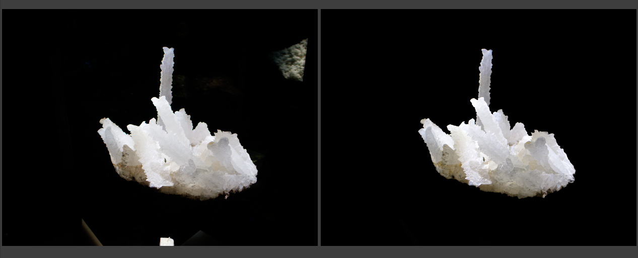
AP pictures must always tell the truth. We do not alter or digitally manipulate the content of a photograph in any way.

The content of a photograph must not be altered in Photoshop or by any other means. No element should be digitally added to or subtracted from any photograph. The faces or identities of individuals must not be obscured by Photoshop or any other editing tool. Only retouching or the use of the cloning tool to eliminate dust on camera sensors and scratches on scanned negatives or scanned prints are acceptable.

Minor adjustments in Photoshop are acceptable. These include cropping, dodging and burning, conversion into gray- scale, and normal toning and color adjustments that should be limited to those minimally necessary for clear and accurate reproduction (analogous to the burning and dodging previously used in darkroom processing of images) and that restore the authentic nature of the photograph. Changes in density, contrast, color and saturation levels that substantially alter the original scene are not acceptable. Backgrounds should not be digitally blurred or eliminated by burning down or by aggressive toning. The removal of “red eye” from photographs is not permissible.

When an employee has questions about the use of such methods or the AP’s requirements and limitations on photo editing, he or she should contact a senior photo editor prior to the transmission of any image.

On those occasions when we transmit images that have been provided and altered by a source — the faces obscured, for example — the caption must clearly explain it. Transmitting such images must be approved by a senior photo editor.

Except as described herein, we do not stage, pose or re-enact events. When we shoot video,
environmental portraits, or photograph subjects in a studio care should be taken to avoid, misleading
viewers to believe that the moment was spontaneously captured in the course of gathering the news. In the cases of portraits, fashion or home design illustrations, any intervention should be revealed in the
caption and special instructions box so it can1t be mistaken as an attempt to deceive.

National Press Photographers Association Code of Ethics

Visual journalists and those who manage visual news productions are accountable for upholding the following standards in their daily work:

Be accurate and comprehensive in the representation of subjects. Resist being manipulated by staged photo opportunities.

Be complete and provide context when photographing or recording subjects. Avoid stereotyping individuals and groups. Recognize and work to avoid presenting one’s own biases in the work.

Treat all subjects with respect and dignity. Give special consideration to vulnerable subjects and compassion to victims of crime or tragedy. Intrude on private moments of grief only when the public has an overriding and justifiable need to see.

While photographing subjects do not intentionally contribute to, alter, or seek to alter or influence events.

Editing should maintain the integrity of the photographic images’ content and context. Do not manipulate images or add or alter sound in any way that can mislead viewers or misrepresent subjects.

Do not pay sources or subjects or reward them materially for information or participation.
Do not accept gifts, favors, or compensation from those who might seek to influence coverage. Do not intentionally sabotage the efforts of other journalists.

2 Likes