PhotoLab 4 with X-rite i1Display Studio display calibrator

If your Asus is calibrated to 80cd/m2, that would explain that because the bottom image was edited at 80cd/m2.

Well, you are finding that under certain conditions, both images have their pluses and minuses. And that is the problem. There is no way you can make an image that is going to please everyone. Although the mythical “average viewer” is likely not to even know that things do not appear as you intended - and they more than likely don’t care either. Don’t forget that the top image was processed with my screen at 182cd/m2!!! …which supposedly is a whole lot brighter than the average of 150.

The best that you can hope for Joe Public is that they appreciate the image, despite the brightness. After all, if they were that particular, they would have calibrated their screens. And if you think your images will appear too bright because you processed them at 80cd/m2, consider that most people’s televisions are far too bright and often the wrong colour but they still watch them every day.

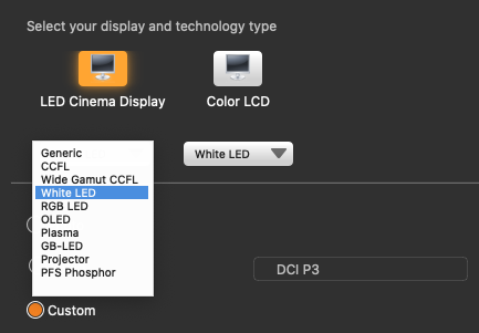
As @platypus says, you can create as many profiles as you like but you are never going to be able to predict what conditions people are going to view your images under. It’s not just brightness that comes into play, it’s also not just colour temperature but which real colours map to which perceived colours. i1Studio takes 118 samples throughout the spectrum and maps those colours to standard colours in order to try and get somewhere near a “true” colour rendition, but that is only going to work on your, or any other, calibrated monitor with the same luminance level.

Have you noticed, consistently, that the images I post here are “too bright”? Or did you accept that is just how I process them? I think that, if you commented on the brightness of an image, someone else would just as likely comment to the contrary.

I think that has to be up to you. Before you discovered calibration, your images were “OK”. Don’t get too hung up on everyone else’s idea of perfection and work towards getting results that you know are technically as perfect as you can get them and that please you.

Seeing as how little difference there is between my images at 80 and 182 cd/m2, why not try 100 as a compromise if it suits you better? just be aware that, should you ever want to print an image, it could start to lose shadow detail and look a bit dull.

Unfortunately, swapping to different screen profiles doesn’t adjust the brightness, so I would give up on that idea and try to settle on a luminance that suits your situation and that won’t look too bad when it is printed - the lower the better.

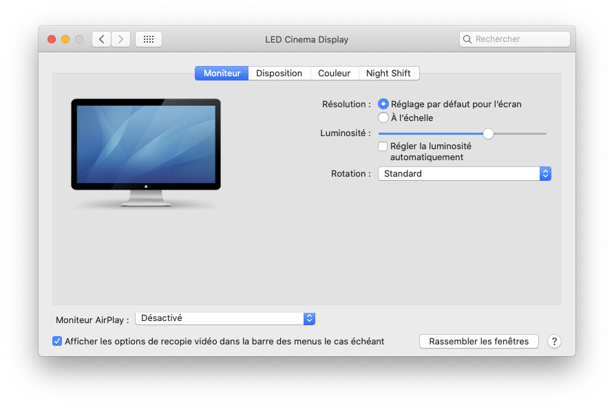
But, whatever you do, I would really strongly advise you to turn off automatic brightness and, if possible set both monitors to the same level all the time.

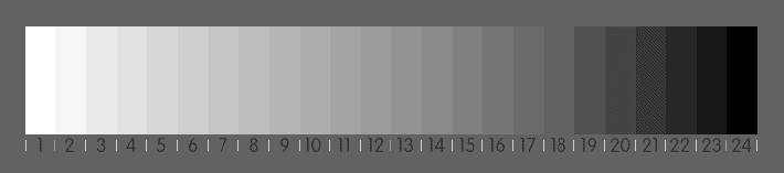
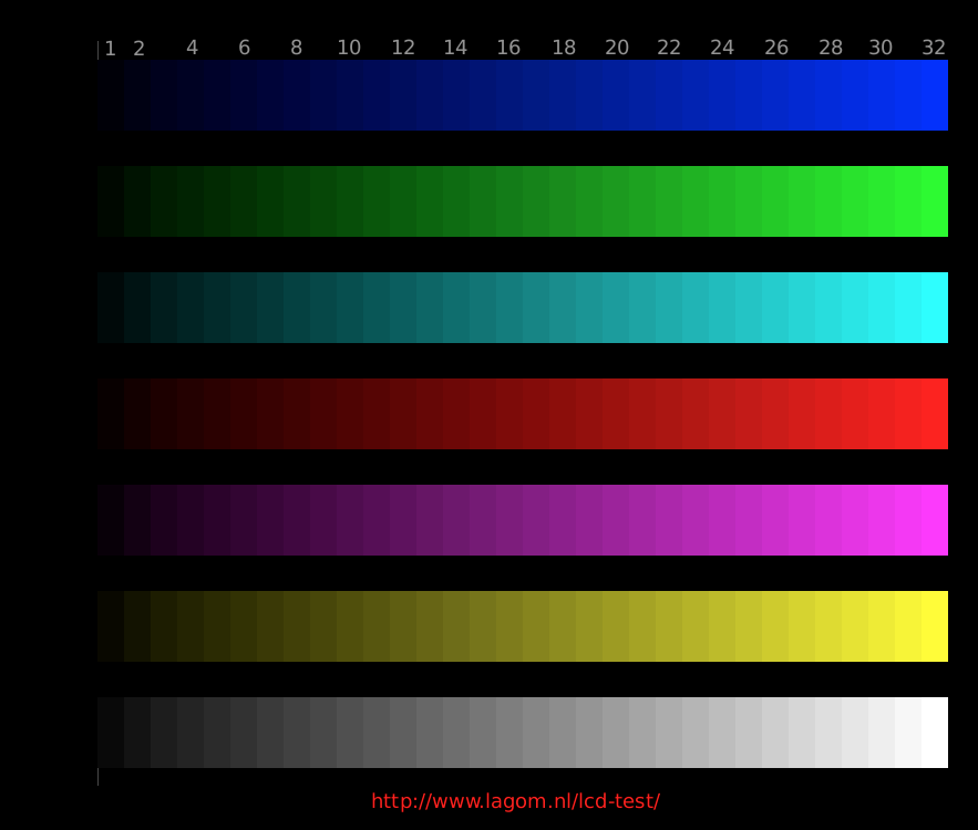
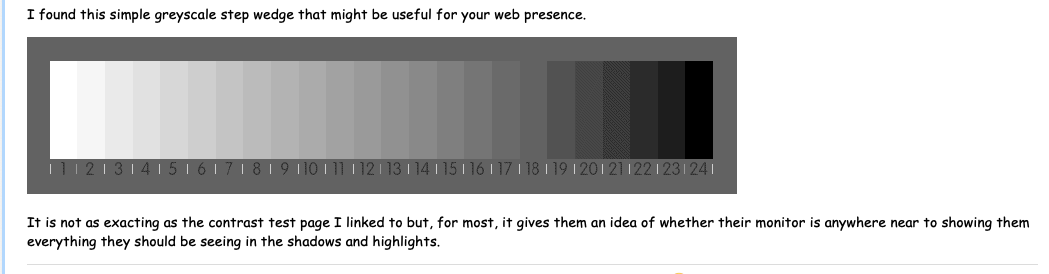
@platypus suggests posting a greyscale wedge alongside your images, which then passes the responsibility to the viewer to adjust their monitor to something approaching a sensible level, even though the colours may still be out of whack :sunglasses:

Sooner or later, I’m pretty sure I’ll buy it. Thanks!

Hello,
I’ve read the whole thread because it’s always instructive and interesting if @Joanna talks about colour management. I’ve learned a lot in the last months and I would like to supplement the discussion with the following from a “lower” technical sight.

x disable all automatic settings on your displays (light sensor, energy management eg.)

x disable all automatic settings from your graphic card driver or control center of the software (I’m on windows don’t know how it looks on Mac)

x create the profiles for a specific light environment ( I use 3 settings …evening with artificial light, cloudy daylight, bright daylight for my two monitors…that give me 6 profiles)

x create the profiles with Joannas suggestion 80 cd/m² maximum 100 cd/m² and don’t forget to warm up the monitors for a minimum of 30 minutes

x after finishing the profile creation take one of the calibration pictures and move it from one to the other monitor and backwards…if for example the greys looks very similar your are on the good way.

Two different monitors will not 100% identical because the technic of the screens differs. In the calibration software Argyl CMS/ Displaycal you are able to choose the mode of the technic. I’ve got the information from the EIZO and DELL support. This increases the accuracy.

Maybe that helps others a little bit without diving to deep into this complex matter

Guenter

i1Display also offers a choice

Capture d’écran 2020-12-28 à 17.54.09

When it comes to colour management, we all need al the help we can get :hugs:

1 - You wrote: I would really strongly advise you to turn off automatic brightness and, if possible set both monitors to the same level all the time." During the day, my room is much too bright to do that, as using the iMac display for anything would also be a problem, UNLESS I were to close the blinds, darkening the room t the point where I could comfortably use my computer. When it gets dark (after sunset, or my closing the blinds) both displays are easy and comfortable to use. I now understand how this affects image editing, so I’ll no longer do that on a bright green during the daytime. Doing what you suggest will benefit my image editing, but make the iMac much less enjoyable to use during the day. It would be like you with your camera, taking a photo in the daytime, and needing to tighten up your screen so you can see it properly. I would need to brighten up the iMac to read mail, and all the other things I do besides image editing.

2 - Since I’m going to re-calibrate my ASUS anyway, I will do that (in a darkened room) with the brightness set to 80 as you first suggested. I will then post some images to my SmugMug gallery, and see if they’re acceptable. I will also post them here, to see if you agree with what I have done. I suspect nobody will say anything - if the images are dark, they’ll just assume I made a mistake.

3 - It would be interesting to post a grayscale wedge alongside my images, or as just one image in the gallery. I’m not sure I’m ready to deal with any questions though. I’ll save that idea for the future.

If I use each of those settings, one at a time, to post an image to my gallery at m.smugmug.com doesn’t this mean that this will create six slightly different images on the gallery page? Why would I want people to see a different image (if this is what happens) because of the different conditions I was working in?

If the image sent to the gallery would NOT change, and all this does is allows me to work on the image in different conditions in my room, maybe this is a good idea for me? I dunno…

No,
the profiles are for you to see the picture under the correct light conditions.
The perfect situation would be a room with never changing light condition…in my case not possible, because I have also a room with windows and changing light the whole day. And i don’t work with boards in front of the windows :smile:
In a perfect world I would see the colours of a picture in the 3 situations I made the profiles for identical without any colour cast. But it can’t happen, because the light temperature has differences with every minute, hour and clouds and so on.
And like some members said if you create a perfect calibrated photo the Receiver of the photo must have the same perfect calibrated environment and software that must support Colour management.
Browsers for example sometimes support CM, but for example Firefox you have to activate it with about:config and make the settings.
Make a test and look the pictures from your gallery on a Pc of a friend without profiling on 3 different browsers, and with the light conditions your friend normally has.
I know photographers, creating the final photo at the printing studio at professional equipment.
It’s a long and stony way
Tutorials on Color Management & Printing (cambridgeincolour.com)
best regards

Actually, my ASUS is/was still calibrated based on 120 cd/m2.
I am recalibrating it now for 80 cd/m2.
Let’s see what happens.
I will close the shades, then do the calibration.
(Is my i1Display Studio influenced by ambient light?)


Recalibration done. New name: ASUS PB278_20201228(80cd).icc
(from now on, I will include the brightness setting in the name)


Joanna - just thinking about what I recently learned from you… One image was from 182 cd/m2, and the other image was from 80 cd/m2 ??? I would have anticipated a huge difference. I was very wrong. They are different, but both would easily pass for “acceptable” on my SmugMug gallery. Prior to the past few days, I would have said they were almost the same.

I’m going to stop thinking about this, and go about using my ASUS for image editing, now that it is based on 80 cd/m2. I’ll post a new photo, edited with the new settings.

THANK YOU!!!

Thanks, but at the risk of burning out my brain on too much new information at once, I need to take this one step at a time. Sounds like your room is like my room - even with the blinds closed, when the sun passes behind clouds, my room lighting changes considerably.

For now, my ASUS is now calibrated based on 80 cd/m2 and I will do some editing on it as best I can, using all the new concepts I’m continually learning about PL4 (what this forum is about). When things settle down, maybe in a week or so, I can expand what I know, and view the tutorials you just posted. To keep myself doing things in an organized manner, I will try to do this one step at a time.

Thank you - will come back to this in a while…

I wrote to the people who make Raw Digger - the following is from their reply:

Also, we have some case studies on our site, one of the most popular studies is a three-par explanation of the histogram
https://www.rawdigger.com/howtouse/rawdigger-histograms-what-is-the-raw-histogram
https://www.rawdigger.com/howtouse/rawdigger-histograms-display-modes
https://www.rawdigger.com/howtouse/rawdigger-histograms-overexposure-shapes

1 Like

No, your images good to me, but yes, often brighter than what I would be aiming for.

I’m stumped now. My ASUS is calibrated to 80 cd/m2, it’s daytime outside, my blinds are closed, the room lights are off, and two of the images that I just took looked great viewing the histogram on the camera, look perfect when viewed on my iMac, but impossible to work with on my ASUS as they are too dark to get a feel for what I’m doing.

I will post both raw files here, along with my ‘dop’ files, and I’ll also add the ‘jpg’ images I have now exported. I straightened them, cropped them, added my name, and did nothing else, as they are too dark to work on. Even with the iMac turned to minimum brightness (very dark) the ASUS isn’t light enough judge what I’m doing. I suspect if I wait until tonight, all will be fine - maybe.

First, the files:
_MJM2195 | 2020-12-28-Biscayne Jet Ski and Miami.nef.dop (11.2 KB)

_MJM2195 | 2020-12-28-Biscayne Jet Ski and Miami.nef (20.3 MB)

_MJM2198 | 2020-12-28-Biscayne Jet Ski and Miami.nef (19.6 MB)

_MJM2198 | 2020-12-28-Biscayne Jet Ski and Miami.nef.dop (11.3 KB)

…and now to attach the jpg images - look very dark on my ASUS, and look reasonable on my iMac screen:

(The images are pretty much straight from the camera - nothing is adjusted, other than cropping.)

Joanna, thank you for this test.
My impression was, that the top image could have been taken in the afternoon, if the cloud only would have been warmer. It looks like a slightly underexposed slide, which I often did for projection. – The brightness of the lower one is much better.

My screens are both set to 80 cd/m² and I remember testing higher brightness levels with my former monitors, but never more than 120 cd/m², which was already bothering my eyes.
Wolfgang

I sure do. Here’s my status report.

1 - It is going on 8pm, so it is now night-time. My ASUS finally looks like I could use it for editing in PL4. White areas on the screen look a little bit brighter than a piece of white paper held in front of the screen. Because of the auto brightness control, my iMac looks like the ASUS. According to “System Preferences > Display” the iMac brightness is now turned up about 1/3. I guess if I do my editing long after sunset, this could work.

2 - I got another email from my new friend Iliah Borg at the company that makes FastRawViewer. Two highlights from what he wrote, leaving out personal advice to me:


Normally one wants to calibrate to luminance of 120 … 150 cd/m2 and contrast ratio of about 1:300, meaning that the black point is 120/300 … 150/300. If the calibration is successful for your lighting conditions you will see a very distinct difference between squares filled with (0,0,0) and (33,33,33). If you don’t, the ambient is way too bright. If the difference is distinct, try to decrease the black point aiming to see the difference between (0,0,0) and (10,10,10), and when the black point is established set x300 for the luminance, but don’t go below 110 cd/m2.

When I calibrate to 80 cd/m2 I work on a CRT (Sony Artisan) in near complete darkness in my studio, painted in neutral grey, fulfilling viewing conditions prescribed for pre-press (meaning, I’m preparing photos for printing presses). I don’t think it is the best approach for your task.

Most important is to check your black point is OK, and your contrast is sane. If you select “custom” for contrast ratio, black point is calculated at given contrast ratio from luminance. Suppose you select 120 for luminance and 287:1 (ICC PCS). Black point will be 120/287; if you can see the difference between (0,0,0) and (10,10,10) RGB - fine. If you can’t try recalibrating for 130 cd/m2.

(I don’t yet know how to do the test Mr. Borg suggested.)

3 - I bought the ASUS in May, 2014. Maybe it is just old, and not as bright as when it was new?

4 - Unless you suggest a better plan, I can:
a) leave my ASUS at 80 cd / m2
b) try the ASUS at 100 cd / m2
c) set the ASUS back to 120 cd / m2 that allowed me to edit with the blinds closed

I suspect maybe my ASUS is old and tired, and that’s why I get different results than all of you.

It is now dark enough to work on the images - here’s what I ended up with, and I’ll also upload the “dop” files:

_MJM2195 | 2020-12-28-Biscayne Jet Ski and Miami.nef.dop (12.4 KB)

_MJM2198 | 2020-12-28-Biscayne Jet Ski and Miami.nef.dop (12.0 KB)

Time to put everything away, and work on something else until I sign in tomorrow morning.

If you all tell me this is good at your end, maybe I just start doing all my editing at night, and leave the brightness at 80. That, or re-calibrate for a brightness of 100, and see if you feel it is good.

I use this test set after calibrating: LCD monitor test images (lagom.nl)

For what it’s worth, here’s how I understand luminance levels. There are several reasons to not have luminance too high. One is to produce images for media with less contrast (difference between black and white) than your screen, such as photo paper. Another is eye comfort. Another is that setting contrast too high on a screen will adversely affect grayscale accuracy and possibly color accuracy due to a problem called clipping.

120 cd/m2 is just a reference luminance. It’s OK, maybe even a bit low, when there is a lot of ambient light in your viewing environment. And it’s a bit high if the room is dark or if you want to see what an image would look like on paper under a modest amount of light. I don’t do my own printing and so far haven’t had trouble with 120 and D65 as long as I’m careful about keeping the overall picture level (amount of light) high. As I understand the problem, switching to media with a smaller difference between white and black - that is, lower luminance - can yield a dimmer and less contrasty image, unless one’s software compensates for that.

These days, I find 120 to be too bright for my eyes. I used to work in a bright room lit from above and all around me, but now it’s pretty dark with much of the ambient light off to the side. When I calibrate, I aim for 90, but it happens that my monitor is one of those that is difficult to make dim. I’m at 96 cd/m2 for now and might push it for 90 next time.

Once in a while, I make sure that my images look good on a calibrated computer monitor, a phone, and a tablet. These represent how most of my photos are seen by other people. I will eventually set up my workstation with a second calibration profile per Joanna’s advice, just to have another reference for processing my images. I will probably need to use my secondary monitor for that. However, I will still primarily process for sRGB screens.

1 Like

With my calibration at 80cd/m2, this is where my brightness ended up

This is not to say that your computer should be the same, just that the position on the scale depends on the video card and actual display panel.

Well, I don’t know exactly and would point out that he is getting far more technical than you or I need to but I believe the gist of it is that you should check whether you can see the difference between all levels in a step wedge, especially at the two extremes. I would suggest you go to this page and verify what your monitor shows you. On both my monitors (80cd/m2), I can clearly see every step as a distinct tone, thus reassuring me that it should show the detail in my photos’ shadows and highlights, once I have edited them and provided such detail exists.

But note the conditions that Iliah mentions when he is preparing images for printing.

No matter what the age of a monitor, calibrating should take care of any differences and “normalise” it.

Have a go with the contrast test page I linked to and see what you get.

One thing I did read is that some monitors can’t accurately cope with lower brightness and don’t calibrate particularly well but my Apple LED Cinema Display dates from 2010 and doesn’t have any problems in this regard.

Well, I don’t see anything particularly wrong with your images as you have edited them (at least not from a brightness point of view). And I have looked at them on my Mac and my iPad without problem.

Although the one thing I did notice in PL4 was that the Vignetting adjustment was activated and set to 100 but the sides/corners were darker than the rest of the image. I deactivated and reactivated it and the sides/corners became too bright. Your export of the first image looks the same as if I disable the Vignetting correction so I assume, despite the tool being set to 100, it was not taken into account either in your version in PL4 or when you exported it. Whether this is something to do with your using an “unconnected” lens fooling PL4 or simply a bug in PL4, I will check out later, but I don’t think it is down to something you have intentionally done.

Other than that, I changed how I achieved a similar result from you, using different tools.

With the first image, apart from adjusting the Vignetting to give a bit more light in the corners, I did the following…

  • used Spot mode Smart Lighting to set the “black point” by drawing a rectangle on the black canopy on the skiff and the “white point” by drawing a rectangle over the white cabin and front deck of the yacht. Then I set the intensity to 25.

  • used the Contrast palette instead of ClearView Plus to give a subtler “sharpening”

Capture d’écran 2020-12-29 à 09.45.37

  • reduced the gradient and adjusted the high and low points on the Tone curve slightly

Capture d’écran 2020-12-29 à 09.55.06

But these are purely how I would edit any picture and comes with experience of the best tools to use to achieve what I, personally, want from an image.

Here is an export of my version with those minor changes…

Not really that different :blush:


As to what luminance level to use, unfortunately, I don’t see a definitive answer for your situation of working in a bright room.

Take note of what @Egregius says in his reply and don’t forget that, in the days of film, we needed a really dark room to develop and print :laughing: :crazy_face: :sunglasses: :stuck_out_tongue_winking_eye:

If you want the best rendition that is suitable for viewing on the web on monitors that have some semblance of being adjusted to a sensible, if not correct, brightness, then stick with the lowest possible luminance you can get away with. Just be aware that, for printing purposes, you may have to reduce the brightness and re-profile if you want to avoid your printer having to rework it.

For those looking at your images on the web with wildly unadjusted monitors, they really aren’t going to think that your images are any different from everything else they are looking at.

I found this simple greyscale step wedge that might be useful for your web presence.

It is not as exacting as the contrast test page I linked to but, for most, it gives them an idea of whether their monitor is anywhere near to showing them everything they should be seeing in the shadows and highlights.


P.S. You aren’t wearing photosensitive glasses that are going slightly darker in your room are you? :sunglasses:

1 Like

Well, I made a screen capture of that page at 9am this morning, using the ASUS. If I view it on my ASUS in this message, having shifted the window to the ASUS, things are very dark. I also did this with the grayscale you sent me. I am creating this post using my iMac, as it is 11am and the ASUS is too dark now to use. The color image has the left side looking much worse than what you see. Here is a list of which rectangles are visible on my ASUS:

blue - #8, and everything to the right
green - #4 and everything to the right
cyan - #5 and everything to the right
red - #5 and everything to the right
purple - 4 and everything to the right
yellow - #2 and everything to the right
white - #2 and everything to the right

For the grayscale, the six bars at the right are all black.

Of course, on my iMac, where I am typing this, I can see all the color rectangles and all the gray rectangles. I suspect, that your computer, set to a value of 80 m/2, you might get an accurate representation of what I am seeing on my ASUS. If my ASUS calibration is correct, and your screen calibration is correct, you should see what I see in the images above. I just slid the window with this post over to the ASUS, and I see everything very dark.

Theoretically, We should see the same post, on your display and on my ASUS which is now set to 80.

This might be my problem. I can call ASUS, or the tech support for i1Display Studio. It would explain the difference.

I didn’t know about this - fascinating… and very useful!!

Hmmm. it sounds like there is something seriously weird with your Asus display :crazy_face:

I just tried lowering the brightness on my Cinema Display and found that, although dull, I could still make out the shades at both ends of both test images. I can’t adjust contrast on my screens, it seems to be done automatically for me

I’m wondering if this is more to do with the contrast on the Asus rather than simply the brightness.

Might I suggest (in a darkened room) you adjust both the brightness and contrast on it to allow you to see all the steps in the test charts as clearly as possible, then start profiling it as far as the “light meter” stage of the process and see what number it tells you the monitor is currently emitting?

Try that and let me know what happens.