…
As an overall photo of the scene, I think the version you just posted is the one I prefer, as I can see more detail on the side of the boat. It is near black, but more things show up.
Gregor used a tool that made the life preserver words more black, making them more clear, but the hull of the boat has more detail in what you just posted. At first glance, Gregor’s looks “sharper” to me, but as I examine the entire image at full size, your photo is best.
I no longer like what my “foliage filter” in Nik Collection did. It made the trees prettier, but the rest of the image suffered.
Just to be clear, everything I’m seeing now (3pm Miami time) is being viewed on my iMac display. The ASUS is too dark, but by 6pm (or if I close the blinds) the ASUS will be just fine. By then, the iMac will be darker, and essentially look just like the ASUS to me.
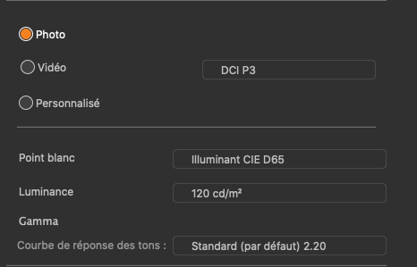
What do you suggest for a new calibration number instead of 120?

Since I’m already in water way over my head, a little more should be OK - I already have Fast Raw Viewer, as recommended by people here - should I purchase Raw Digger too?
Ignoring the crop, which is probably better than what I showed, you accomplished two things that I think are very important. First, you clearly show the name on the life preserver, which I couldn’t figure out how to do, and I don’t know the tools that Gregor used. Second, you have the only image posted that shows all the detail on the bottom of the lifeboat on the front deck!
By showing all that, you don’t show the side of the boat as nicely as what Joanna did, but to me those two things are very important - and I have no clue as to how you did it!
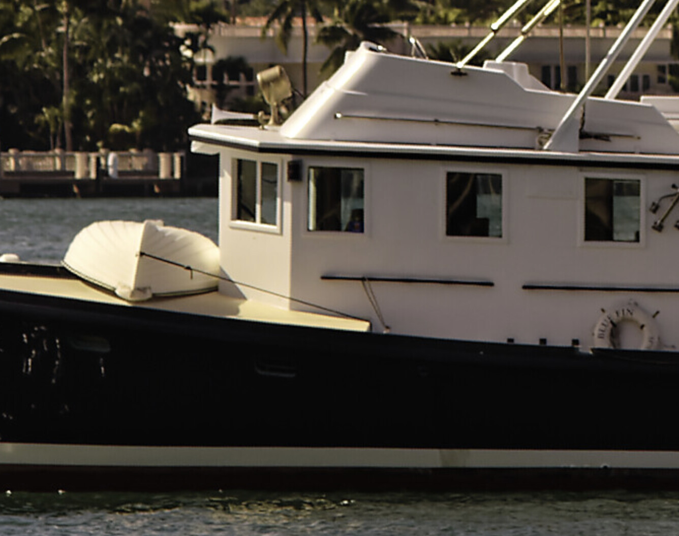
Since the subject of this image is the black boat, I think I made a mistake in showing so much more. This also means I should have zoomed in more, which I could have. I don’t know why I didn’t. But if it has to be a choice of detail on the side of the boat, vs the lifeboat and life preserver, those last two are more important to me.
(I just did a screen capture to show the above image - hope you all can see it the same way I can.)
Here is my version with a bit more hull detail and the .dop file
_MJM2123 _ 2020-12-23-Biscayne Boats.nef.dop (52.7 KB)
Among other things I used control points for the sky and an auto mask to lighten the canton of the flag and bring out the stars. I added more control points to bring out more detail in the hull.
Mark
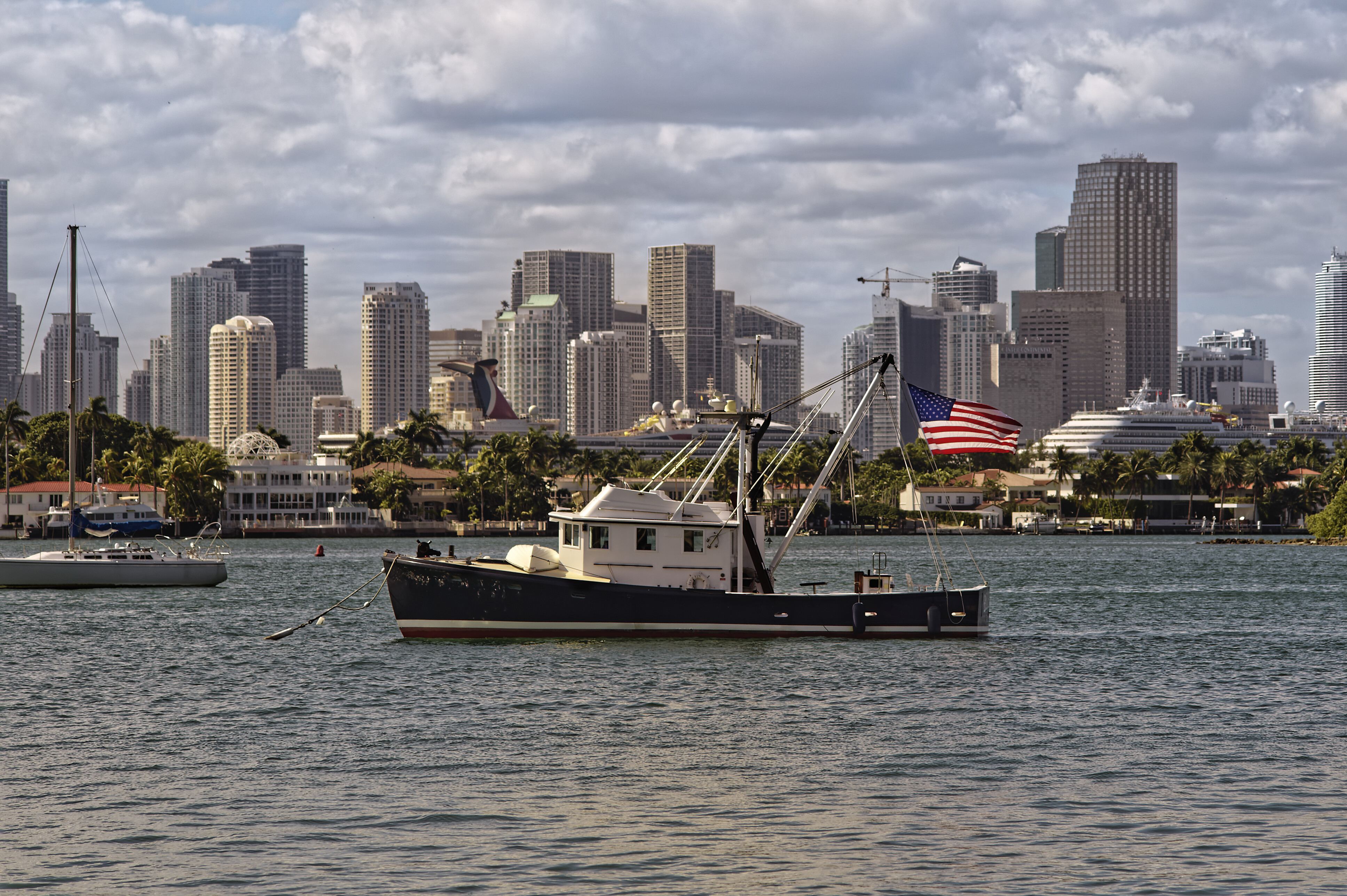
A few thoughts. I didn’t have a polarizer with me, but next time I can use one. I’ve got several, and I think one is in the standard 52mm mount that I think this lens uses. I will check that tonight. Polarizer will also get me a prettier sky.
The lens is 75-150. Since we all seem agree a tighter crop is good, I can crop in tighter next time. I probably ought to bring along a tripod for doing this. There is no “action” to catch. With the tripod everything would be easier. I guess I should skip the Nikon Df and use the D750 instead - 24 megapixels rather than 16. Getting closer - I would need a boat, and then I’d have other issues to deal with. Why is f/7.1 a bad aperture? I’m sure you’re getting that from the EXIF data, but the Nikon has no idea what f stop I used - it’s a totally manual lens, with no coupling to the camera body, not even focus.
Framing - yes, with a tripod I would have done this during setup. Next time I’ll re-consider. I didn’t know what framing I would want, and figured I could decide that later. As to “other crop ratios”, I ignore all of them, and set the crop ratio to something that makes the image look best. Matching some pre-selected ratio is useless for what I’m trying to do. I wish I had a crop ratio of “round” or “oval”. Any idea how to accomplish that? Is there an “add-on” for PL4 that would allow it?
How do I get to see the post numbers?
Are they hidden?
Do I need to set something so they get displayed on my screen?
Mike,
I was sure, you had calibrated to 80 cd/m². But now I see, that you went with 120 cd/m² - post # 43
Don’t understand, why you are not following Joanna’s advice.
1 Like
Wolfgang, in the image I’m looking at, I’m staring at the top (really the bottom) of the small boat upside down on the bow of the boat. Just like what I got, the “left” side of the boat viewing the image, appears to be pure white. Later tonight once it’s dark, I will work on that - now that I know that there is data there, and it’s not all burnt out, there should be a way to retrieve it.
I’ll try to use a control point - I’m getting better at doing that. Maybe I’m too stubborn, but I’d like that to show up, along with the name printed on the life preserver.
I need to re-re-re read what you wrote. The more I learn, the more I realize the more there is yet to learn.
I enjoy comparing the different techniques from you and everyone else. So many different ways to “see” the image. If tomorrow is a bright sunny day, I may go back and take another photo of it, using a tripod, zooming in more, and bracketing (just in case). If I do this early in the morning, the lighting might be much prettier too. Mid-day is a terrible time for taking photos. Still looking for my polarizer - I know I have it - somewhere!!
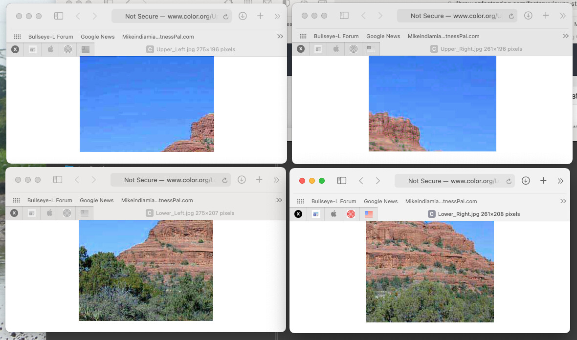
Gregor, I downloaded the four quadrants of the image the link takes me to, and assembled them on my ASUS screen, then did a screen capture of all four of them:
I guess this means my system is acceptable?
Think about it from my perspective. I have no idea what a “cd/m2” is or means.
In retrospect, m2 really means “square meters”, and I’m guessing CD is some kind of measurement of light.
I went through the calibration procedure once, not having any idea what I was doing, and I left my monitor on the default settings.
On my second attempt, something “broke”; to fix it, I believe it was Joanna who suggested I restart my iMac computer. Worked.
So, on my next attempt, I used all the default numbers from the device, but this time learned how to match the brightness on the monitor with the number that the software was after. It was 120, but at that moment I didn’t know what the 120 meant.
Now I’ve got a little more understanding of what is going on. I know 120 is too high according to everyone in this forum.
From what I think I have learned, using 120 on calibrated displays and printers, the print will be too dark.
But, my goal is not to publish photos on m.smugmug.com specifically for expert photographers with calibrated displays and printers - the people who I assume are looking at my Smugmug gallery have phones, and iPads, and basic computer systems, almost certainly NOT calibrated. I doubt if any of them would have a clue as to what a calibrated display even is.
Take me for an example - I have my Apple iMac computer, and this ASUS monitor. Anybody looking at my ASUS monitor during the day would see a very dark, ugly image. But the same image, videoed on my iMac, looks beautiful. I have seen my SmugMug gallery on other people’s computers, and it looks great.
My opinion right now, is that by editing the images in PL4 on my calibrated ASUS monitor, even though they look too dark on the ASUS when viewed during the day, they look perfect on my iMac. If I re-calibrate the ASUS based on say, 80 cd/m2, I suspect they are going to look way too dark on my iMac - and everyone else’s display that is not calibrated. I’m just guessing.
Final thought - if 80 cd/m2 is a better setting, why does the manufacturer of the device say to use 120 cd/m2 ?
Maybe I need two calibrations, one for people in this forum, with calibrated gear to look at and use, and another calibration for “everyone else”?
On Monday (tomorrow) I can call i1Display Studio tech support, and get their take on things. I might also write the people at SmugMug and get their advice.
Or, how about this. Suppose your neighbor asked you to take a photo of his car, and send it to him as email. Suppose he’s got a basic Windows laptop, or maybe a Mac, just an ordinary consumer computer, no special anything. Or more likely, he wants to show it off on his iPad or phone. How would you calibrate the photo before you send it to him? What settings?
I downloaded the PDF file. On both my ASUS and on my iMac, the large image on top is all there, looking good. So I guess that means:
“The system supports these ICC version 4 and version 2 profiles”.
It’s after midnight, and I’m going to put things away for tonight. I tried to read enough about display calibration, so I’d better understand what I am learning here, but for everything I start to feel I’m learning, I find much more that I barely can understand.
One example:
I now feel comfortable in the idea that if I was a professional, I should have a calibrated system so I know what the end result will be before I even start using it. I won’t get random results, I’ll get predictable results.
Here’s a silly example of what I understand, and where it still doesn’t make sense.
Suppose you asked me to pour enough water into a beaker to fill up, one at a time, a drinking glass for 25 people at a table, one at a time. Let’s say I do a quick measure, and let’s say I figure I need 8 ounces of water. So, one by one, I fill up my beaker to 8 ounces and fill the first glass, then repeat for the second, and so on, until all 25 glasses are filled to the brim with water. None or over or under filled. Success. This is what you asked me to do, and I accomplished it.
So, the next night there are again 25 people at the table, and you tell me to do it again. But, it turns out that some people have larger, or smaller glasses. So some I can’t fill up all the way, and others overflow.
This is exactly my problem. Let’s say I follow the proper calibration for creating my images for all the people in this discussion, who have already calibrated their equipment. Chances are I’ll do a pretty good job, as everything is calibrated at my end, AND at your end. So far so good - but how about the overwhelming number of people who can’t even spell calibration, let alone do it, and who have all sorts of displays, maybe computers, maybe phones, maybe tablets, maybe projectors, and maybe even some who are using old television sets. If I make one perfect image, and send it to everyone by email, all of my careful calibration goes out the window. My picture might look light, dark, greenish, who knows what.
This leaves me with a question for all of you - how might I create an image that would be satisfactory for the majority of viewers?
RawDigger is an app that opens the view into technical bowels of your images. It is an explorer’s tool, it can help to understand.
RD’s raw histogram is much better than FRV’s or any other apps’ I know of.
Beware of RD’s many settings, they require some dedication.
1 Like
Do you know something? In all the years of posting images on forums and galleries, nobody has ever said that my images are too bright. When I first calibrated my screen (years ago) I thought it was way too dull, but then I got used to it and now think the “average” screen is blindingly bright.
This is difficult to achieve because you can’t swap brightness like you can a screen profile. You would need to get out the device and re-measure the screen every time.
The numbers you see are not instructions, they are simply their idea of what constitutes their Photo preset. It is not necessarily what is best for everybody.
My setup is…
80 of course 

But seriously, I think that your use of two different luminance levels on your screens is causing visual confusion. If you set both screens to the same luminance level, you will lose any idea of too dark or too bright.
When I use my camera on a bright sunny day, I need to raise the brightness of the screen on the back in order to simply see anything at all. But then I need to remember to reset it to 0 for most of the time. I would never dream of judging the brightness of an image by what I see on the back of the camera; I just use it to confirm the framing and composition. Because I know that what I am seeing is a jpeg rendering, I therefore know that it is a waste of time judging exposure, which, because I have metered the scene to be within limits, is going to be correct enough to give me the opportunity to adjust in PhotoLab.
However, when I am editing my images at home, I know that it is useless trying to adjust the screen to compensate for too much light and so I adjust my environment to allow me to see the calibrated screen properly. As I said in an earlier reply, even having bright objects within eyeshot whilst editing will give you a false sense of how bright things should be on the screen.
Nice 
Even better
Mark, what luminance is your screen set to?
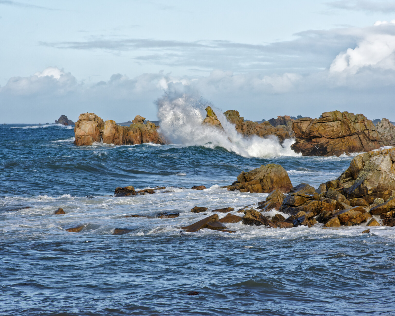
With most full range images, the first thing I edit is the Smart Lighting and I tend to use the Spot Measure mode. here’s a screen shot of where I placed the measuring zones (highlighted in red)
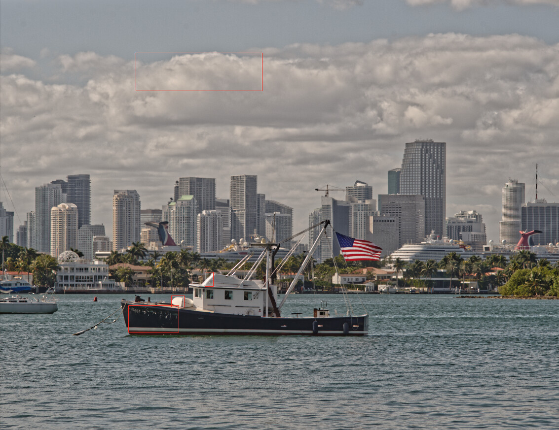
Note that I include a zone for the brightest and darkest areas where I want discernible detail. In this case, that the skirt on the bridge and the font-side of the hull.
Not necessarily - as long as you know how to master the light
There’s an old saying - you can please some of the people all of the time, you can please all of the people some of the time but you can rarely please all of the people all of the time 
In summary, from my point of view, adjust your editing environment to avoid bright light rather than messing around with two monitors of disparate brightness 
If you really insist on increasing the luminance, perhaps try 100?
OK, I’ve been playing 
I deliberately setup my monitor to be brighter than I would normally.
I told i1Studio to take the luminance from the ambient light instead of setting it to my usual 80cd/m2
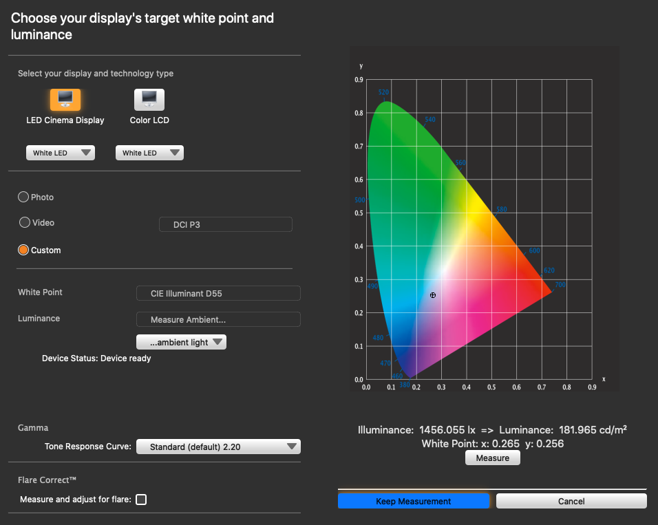
Then I shone a small LED torch onto the device, to simulate a much brighter ambient light, and got a reading of 182cd/m2, from which I made a profile, adjusting my screen brightness to match. That level of illumination I found tolerable in the short term but really too bright for the duller room in which I normally work. I also know from experience that printing would more than likely produce a result that was going to be a bit too dark.
I then proceeded to edit an image in PL4.
Then I reset everything to normal and re-profiled for 80cd/m2.
I then added another virtual copy to the image, reset it and started from scratch.
Here are the two exported jpegs reduced to 1536 x 1024 pixels, as if I were going to post them on a forum.
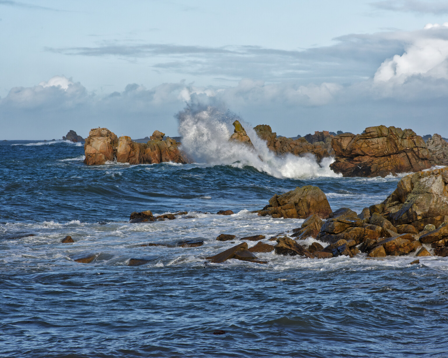
It was very difficult to not let myself be influenced by the first one whilst editing the second but, the question to you lot is… can you tell which is which? And, if you can, is the difference really noticeable to the average viewer of web content?
The top one looks like it has a bit more contrast/Clear View on my screen - calibrated imac.I f I view it on the uncalibrated office computer I have a similar effect. Both look good.
I read your post quickly, need to read again, slowly, and then I just stared at the two images. It is now 9am, my room is bright from daylight, and my ASUS is a little darker than my iMac, but both are useable. On the ASUS, both images are fine, but the rocks show up more clearly on the lower image. The sky almost looks prettier in the top image.
…now, I have shifted the window to my iMac. Now the top image looks beautiful, with the rocks just slightly dark, but the lower image now looks too bright. If these images were within my PL4 screen, I would darken the lower image to get it to look more natural. I definitely prefer the top image now.
Third test - I closed the shades, and turn on my ceiling lights. I’m still looking at the window on the iMac. I prefer the top image - everything really stands out beautifully, and the bottom image looks over exposed, much too bright.
Last test - I moved the window back to the ASUS. Immediate reaction - the top image now looks too dark, and the bottom image looks beautiful.
…this is just to tell you what I observe on my screens. I will now slowly re-read what you wrote, and try to understand my reactions to each image.
To answer your last question, to someone who didn’t do all the shifting around I just did, no, I don’t think the “average viewer” would be aware of any of this, unless given a choice of images.
Sorry to say it, but I was dreaming about this stuff last night, and as I was waking up I reminded me of something to ask you. Can’t I create multiple screen calibrations? One for “the public”, and another for “people with calibrated equipment”? …or Plan B, to switch to a calibration based on a lower luminance, and see if anyone in the forum notices. If I used a luminance level of 100, would that be a better compromise for a single calibration for everyone?
You can create as many profiles as you like. Still, they influence your screen only and all to other screens out there have no idea about how bright and profiled your screen was. You could add, to your presentation site, a greyscale step wedge and some text saying that all steps should be equally visible and therefore brightness and contrast should be adjusted for showing what you intended… At least a few people will try…