Just first look i find the first more realistic, the blue colorcast would be normal.
Your warmer image is off.
Too friendy looking.
I like those mistly clouds and lamdscape underneeth have a deap desolate feeling.
Like those graveyard scene’s of horror movies. That give’s emotions.
But then again as the warmer look the look was you saw it’s fine.
Base of above,
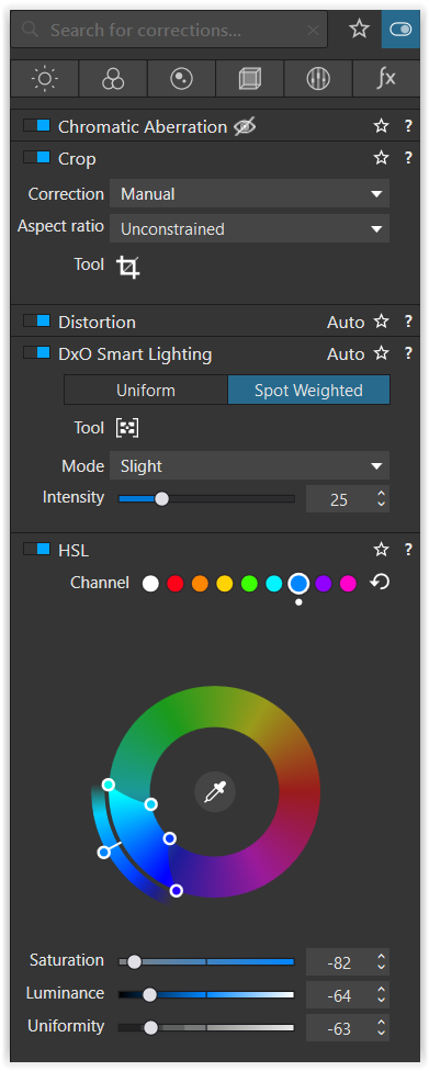
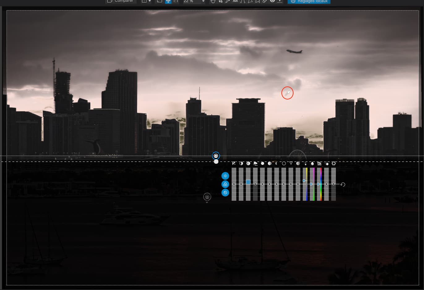
Select (lincontrol)the sun color in the middle, with low feathering, boost that to enhance the “good”.
Then linecontrol the cloud section and the water seperatly.
Enhance details and contrast subtle.
Keep the blue colorcast.
See what happens to this image.
(i think i will give jt a try myself this weekend)
… while your camera simply recorded what came through its lens
The feeling is not triggered by the “mistimage” as long as it is not enlarged to (almost) life size…but maybe it’s misterious (mysterieous) appearance could be amplified in order to trigger some feelings…
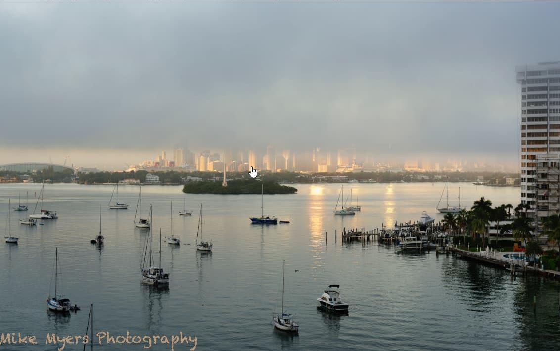
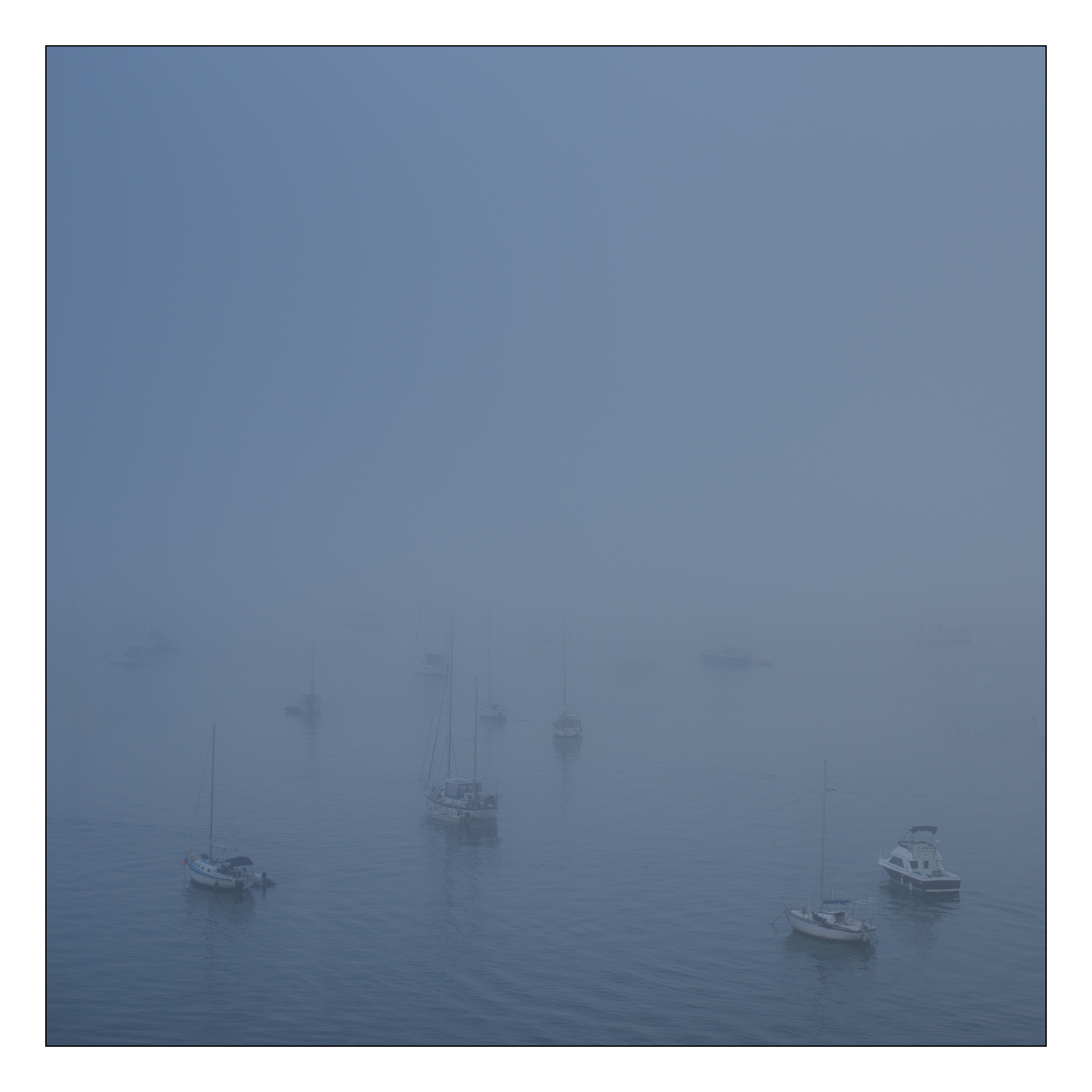
Having read your thoughts, I put the top of the sky back in, as the fog is really the purpose of the photo. I removed the building at the right, which is distracting - I wanted it there because it showed the fog up near the top, but without it, the photo looks better. I set the white balance back to 5600 which brought back the blue color cast for the fog and the reflection in the water, and was pleased th at the city buildings were obviously not blue.
I don’t understand what you meant by using the two control lines. Shouldn’t the water be a reflection of the fog in the sky, so they should be similar?
How to bring out the golden reflection of the sun in the water… I did that with one control line that brought out the golden reflection of the sun, and a negative correction to protect the sky. The buildings looked even more “normal” which was one of my objectives. The reflection in the water really was this bright, but it started fading quickly as the fog got lower. I’m not sure what you suggest I do to the water - to me, that looks natural. Unfortunately, the fog had gotten so low that the part of the buildings that were reflecting the sun were hidden by the fog, so the reflections are still there in the water, but no longer visible on the buildings. Earlier photos showed this, but not the fog, which was still too high to block any of the buildings. Maybe 15 seconds earlier, I could have got both reflections, in the water, and on the building. Next time…
One thing is for sure - for me, seeing it this way does bring back the emotions of how I felt, this very uncomfortable feeling as the world around me was vanishing little by little, and this was just as the buildings were getting decapitated.
The changes I just made seem to amplify what was “upsetting” to me as I was standing there, a tiny “sliver” of reality being obliterated by the fog as it was coming lower and lower. Seeing only half the buildings means something bad is happening (emotionally), at least for me, but I’m not sure if this is because of my photo, or my remembering how I felt as I took the photo. Probably the latter, but the new version “works” in a way the previous images didn’t.
Note #1 - DeepPRIME crashed, so I used PRIME.
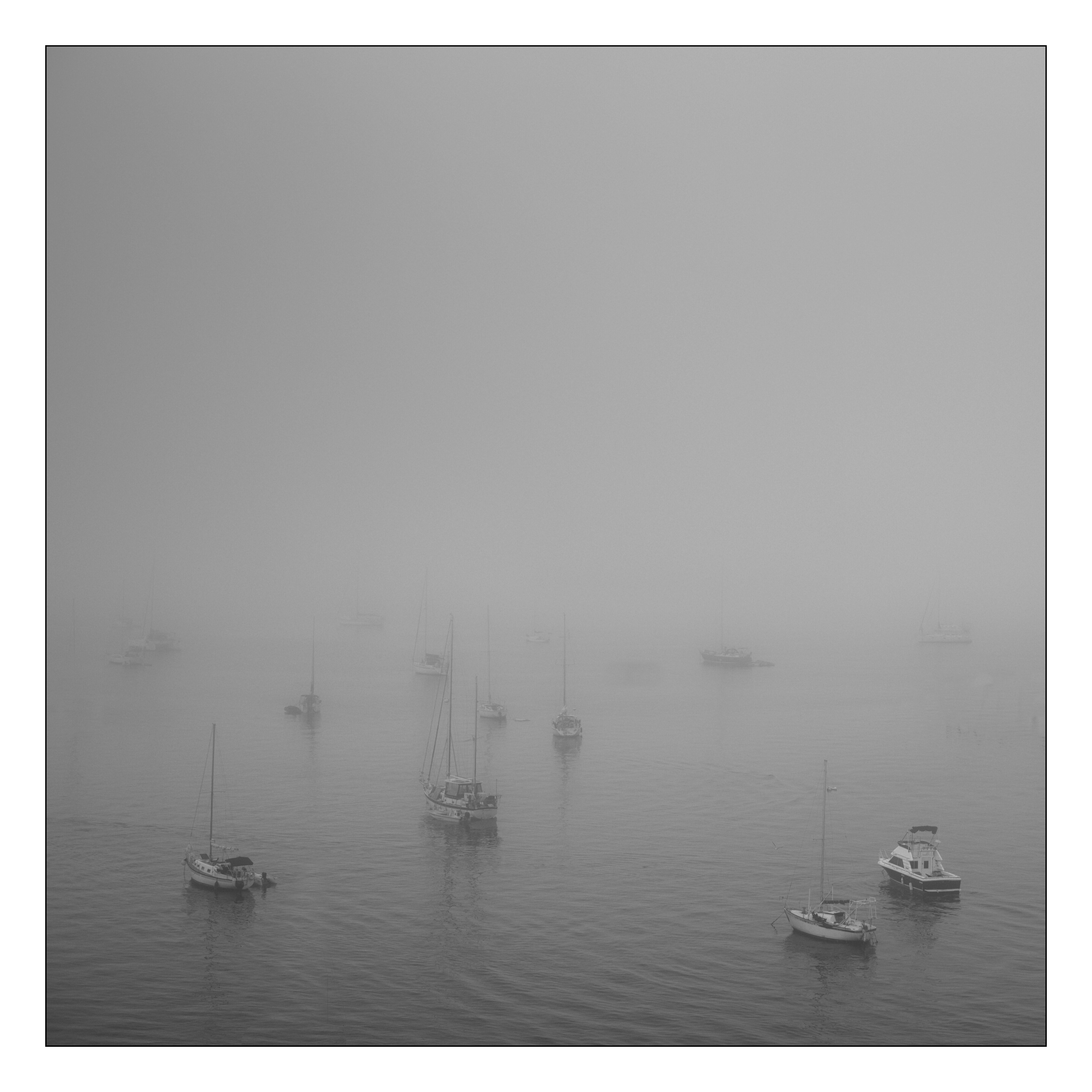
Note #2 - The photo, as usual, looks much better surrounded by black, than surrounded by white.
Note #3 - I’m very curious how Joanna will interpret this…??
One more try, but the burnt out reflection in the middle ruins it. I ought to have realized that reflection needed to be dealt with. My goof. Anyway, I played around with things some more but nothing worked - so I tried the “clone tool” which made for a good band-aid. Some other small adjustments too, including an attempt to prevent any clipping. Since the peninsula was so close to me, I brought out the colors there, as the fog hadn’t yet reached that spot.
more control of the detail enhancement by microcontrast.clearview in the fog wile the water and boats not be effected.
let the dotted lines acros the horizon on each other to blend the effects.
(buildings are getting some detail enhancement but not to much.)
and soften the clear looks in front, the water and boats a small bit.
This emphasize that narrow golden place you just see before it’s “taken over” by the cold blue.
now my eye’s are drawn to the boats in the front and the sunlight beams wile the “fog” is just blurry greyisch chewy.
(i would show you but my trail is just ended, no acces. )
(i wil be back with this shortly. )
oh and crop as latest your pick!
something like this?(more clouds doh)
One quick question - every time I used ClearView a year or two ago, I was told by so many people to avoid it, and to use “fine contrast” instead. So, I more or less ignored it since then. Now you’re suggesting it would be helpful. My mind is more confusabobbled than usual, as I was taught to avoid that tool.
Time to put things away until tomorrow.
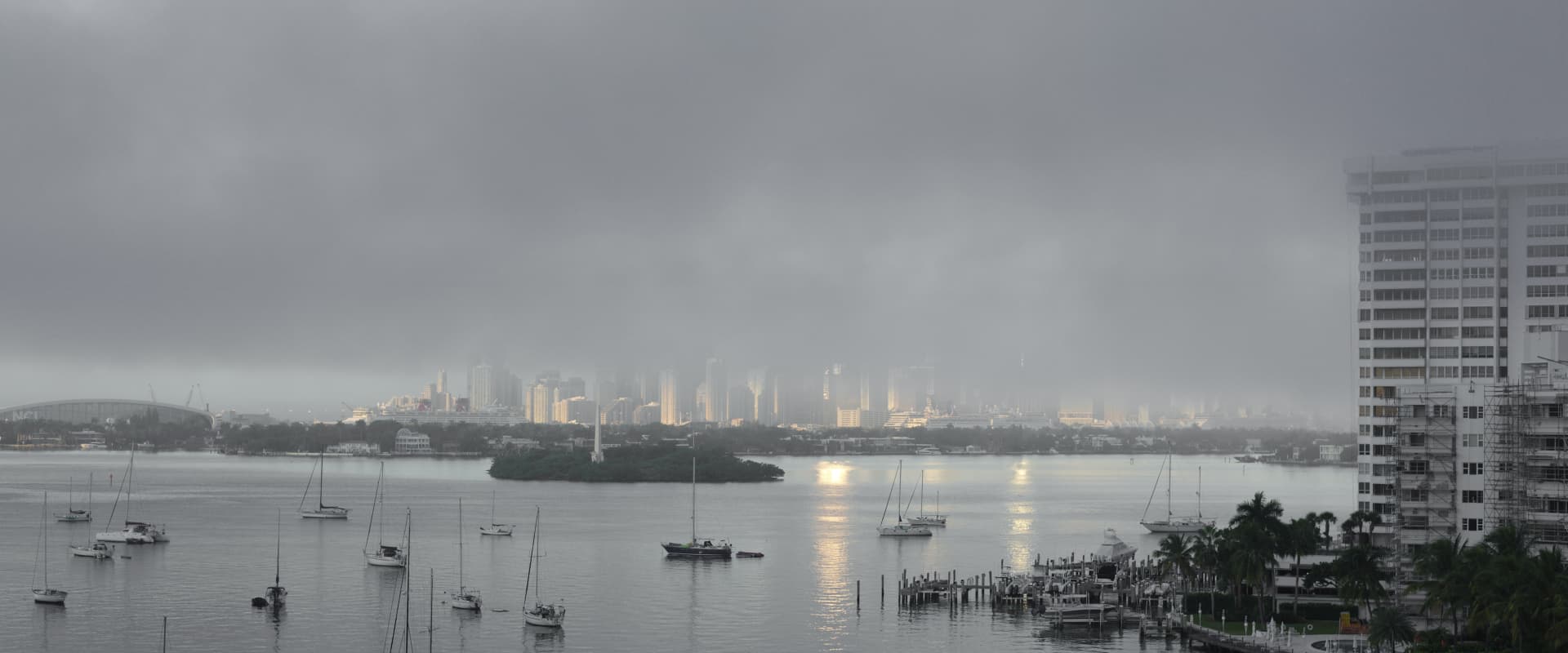
About the building on the right - you know, and I know, that the “fog” at the top of it was/is real, but first of all, people who do know PL5 are likely to think the darker part of the building is an editing mistake by me, and second, I started to feel that the building was distracting. I like that you show less of the building. Does that building help, or detract from the image? (When I chopped it off the right side of the image, I then chopped off the left side of the image too, so the full image felt more “balanced”. IMHO.
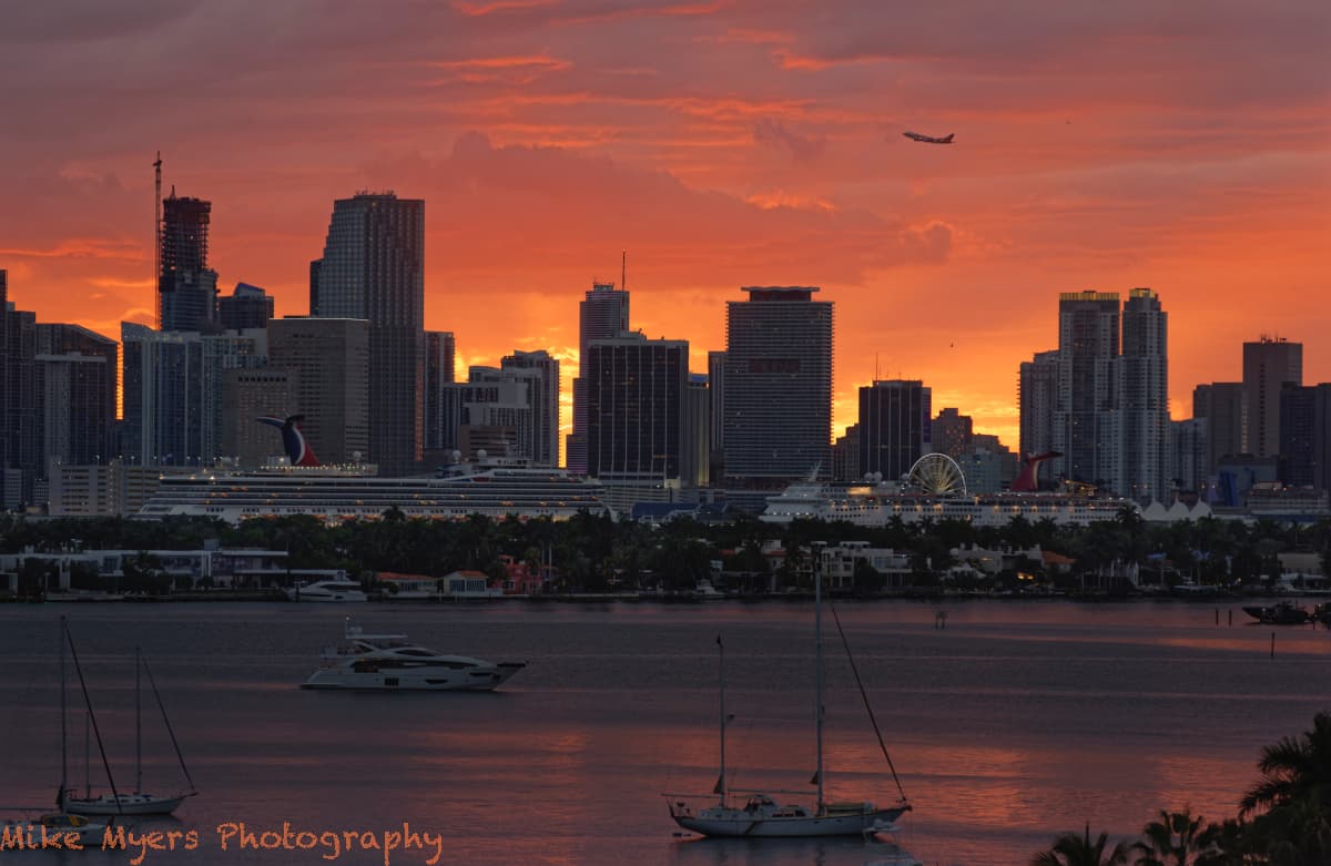
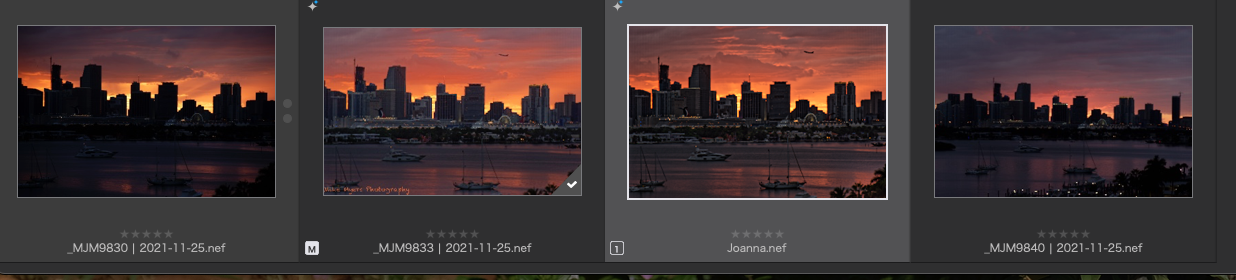
I had a not-so-good sunset tonight, but I thought I would try again using what I (think) I’ve learned. I set up the tripod, mounting my 80-200 Nikkor to the tripod, with my D750 hanging out at the end. From too early until too late, I tried photos at different exposures. For the first time I was using the Nikon ML-L3, remote control for my Nikon. I set it to wait two seconds before taking the photo, but each time I took an image it also checked the focus - I didn’t expect that. Towards the end, a jetliner taking off from the Miami airport flew into my frame, and I was ready. Amazingly (to me) I can even read the name painted on the plane! I then played with control points and control lines, to get the finished image - for which there was a bare minimum of cropping. When everything was done, I used a series of control points to lighten the trees and get them to show up as green. I probably made a mistake by using one too many control lines, but with all three I liked the result, so I left it as-is.
Me? I’m happy. The tripod and remote release and delay made everything sharp, the lights were being turned on, the sky was, well, adequate. Not what I wanted, but at least I didn’t allow any clipping. Hopefully Joanna will approve, but I’m sure she will see things I wasn’t aware of. Every other change I thought of, such as lightening the boats in the foreground, would look un-natural - I think.
Wolfgang, I think I need to sleep on this and come back to it tomorrow. The fog looks realistic, and it does show up covering the top of the building, which I thought I wanted. The bottom is “too tight”, there is no breathing space around the boats, and the peninsula. Not sure what to think now about the color - the blue is what my camera saw, but I didn’t think much of it. In my mind, I probably saw things like your version of the image. It also looks canted down to the right, which I thought I fixed.
The thing I can’t get used to, is once I started cropping to get to what I consider the heart of the image, I thought it made a better composition - but since the photo was intended to show the fog, your version does the more effectively.
I’ve started to use the horizon tool on my D750 now that I’m used to it, and I haven’t yet needed to correct something it has done - but it’s only useful with a tripod (for me). I would like your version a lot more if the cropping was expanded at the bottom - that somehow “hurts my eyes”, with no “breathing room”.
(I ain’t no expert yet, but I do finally feel much more comfortable with Control Lines. My next project is to learn how to use the HSL tool, which is probably how you removed the blue tint?)
Use both.
Clearview in minor amount just to bring the “edges” out in the clouds, then touch vibrance to fill in the clouds structure, and when you are done with the local layers tune the contrast with fine contrast.
Vibrance “lights” the colors wile saturation deepens the colors.
What you want is structure in the clouds so darker edges and lighter filling.
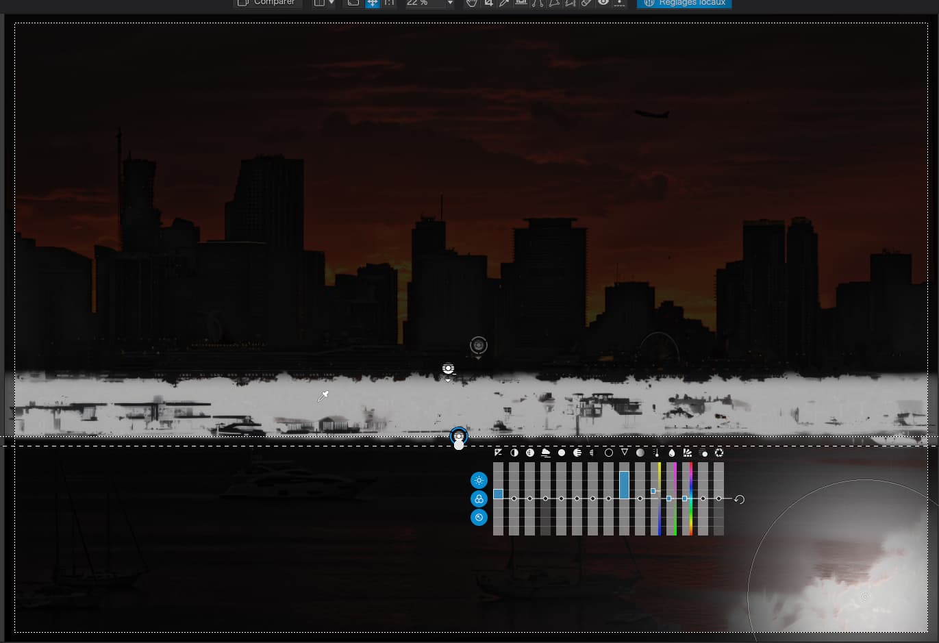
Use FRV and tap show detail (green filter) and show edges (red filter)(or viseversa i never remember) to see if there is any structure or enough structure to enhance.
The more structure FVR shows in those filters the more clearview works in small amounts.
The buildings needed a tad of straightening withe the horizon tool vertically
I like a bit more contrast
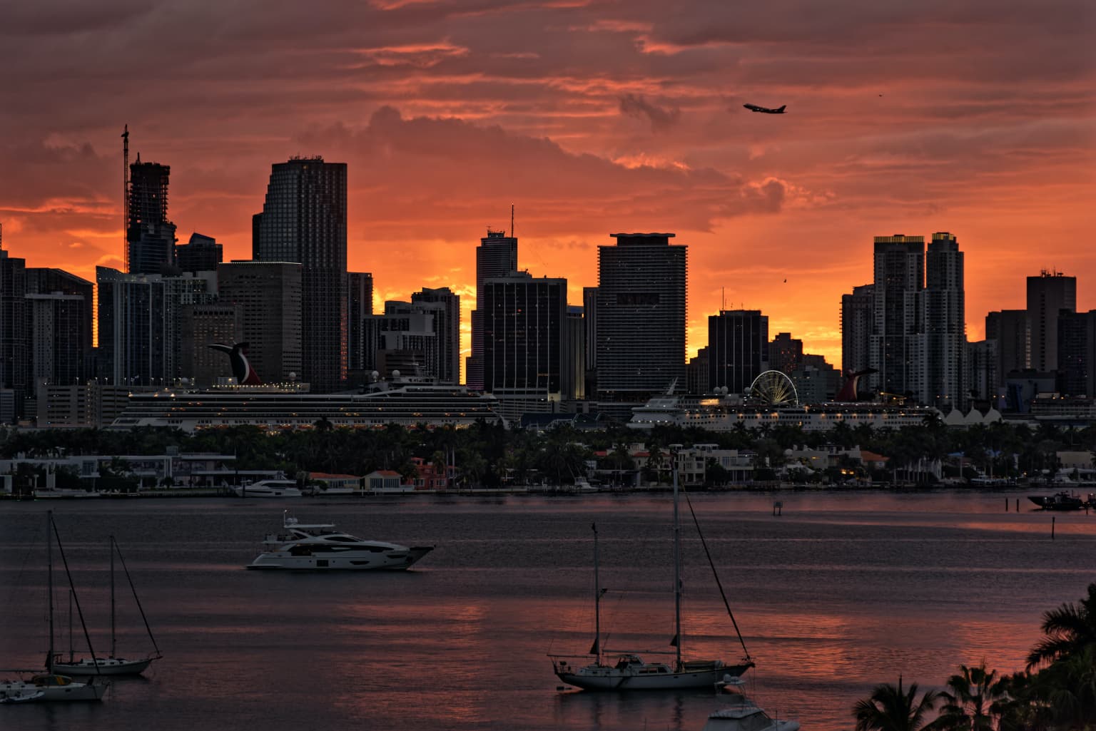
But, apart from that, a perfect exposure that I found needed even less adjustment than you did. Or should I say, I have done less, slightly different, local adjustments.
Thank you, and that you found fewer things to do means I have succeeded in following all the advice you’ve been posting. One other thing - when the D750 played back the image after I took a shot, I had it set to show me the histogram. Even though I know it’s a jpg histogram, I kept fiddling until the histogram was moe in the middle of the image than off to the left side.
I will download your DOP, but I have two immediate questions on what you did - My “sky” looked fine last night, when I finished, but it looks so dull and boring compared to what you did. Also, while I lightened up the reflections in the water at the bottom, that too looks dull and boring compared to what you did. Finally, I did try to lighten up the area beneath the cruise ships, including the cruise ships, but you got the effect I wanted, but didn’t know how to do so.
Fascinating! One way of looking at this is that you knew what I wanted to do, and accomplished it better, which makes total sense. Another way, that makes me feel good, is that I did most of the right things, but didn’t do them enough.
Tripod was rock steady, nothing wiggled. Wolfgang’s concerns about movement were greatly helped by the ML-L3 remote, and I set it with the two-second delay, which also re-focused automatically for every capture. I was out on the balcony for perhaps half an hour. Early shots were not as good, late shots were not as good, but all the middle shots were useable - I picked this one because the light in the sky was still at full intensity, and the jetliner conveniently posed for me in the perfect place (remember, I had to shoot two seconds early to get it where I wanted it to be in the photo). Finally, at 100% a bit of sensor dust is visible, but looking closely, and at other views, it was just a bird. I think there are two birds in this photo.
One final, final thought. Being up high on my balcony, and shooting with a 20mm lens, the city details are much more obvious. I like this view more than the much wider views that I created before.
(Now it’s off to PL5 to figure out how you improved the sky so much!!)
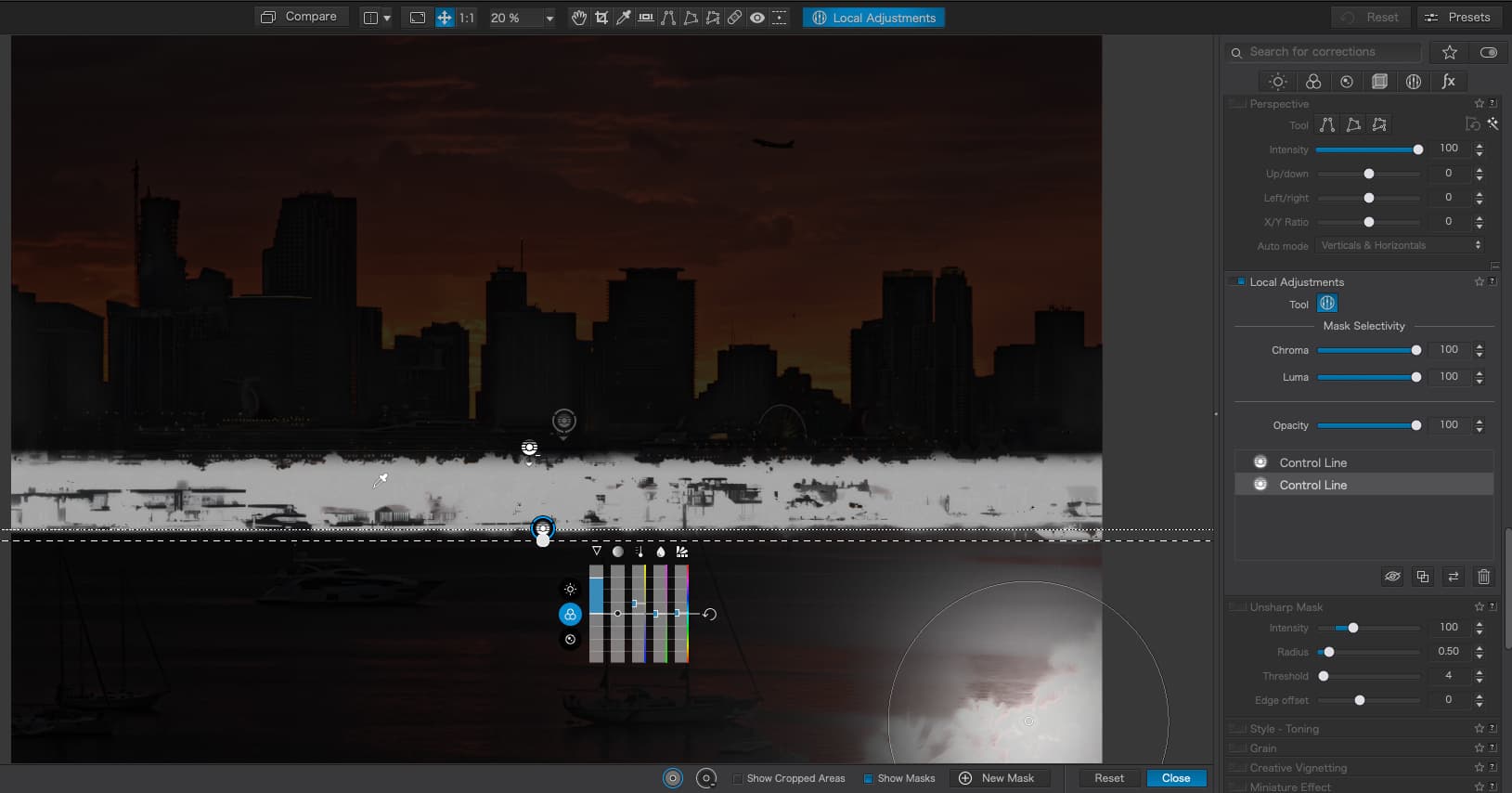
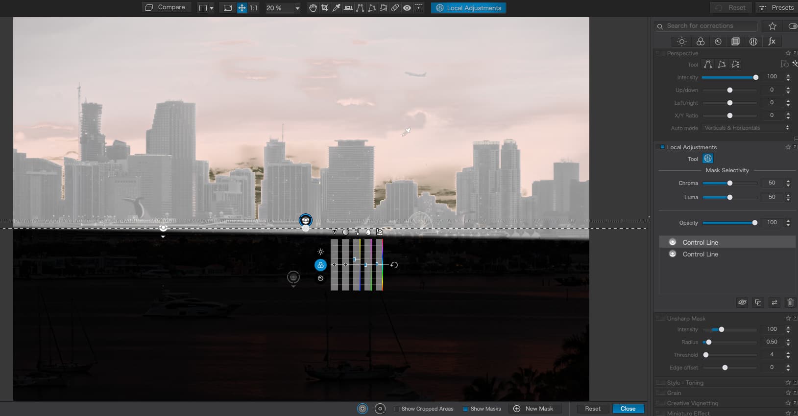
I’m trying to understand what you did.
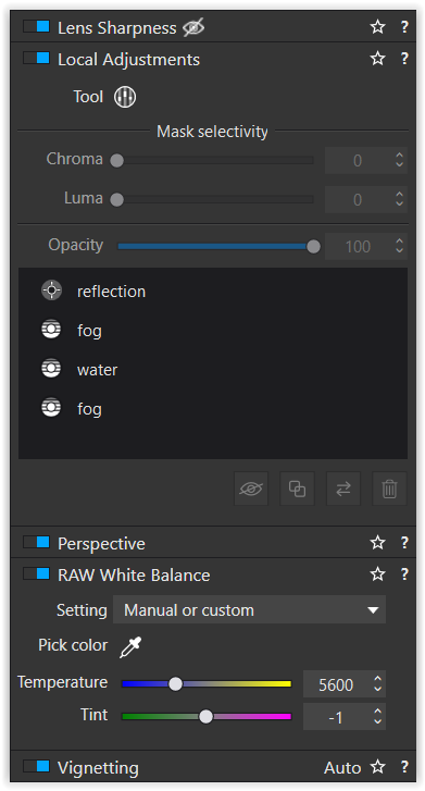
I see you left or adjusted my control point at the bottom right.
I see how you used the negative control point to only light up the “city area” and trees, which I tried to do, but didn’t find a way to do what you did.
One control line brought out the “trees area” (and the bottom right???), and your negative control prevented it from changing anything above the “trees area”. Something very important I now understand much better. THANK YOU!!!
The angled control line is how you brought BOTH the city AND the sky up in brightness and contrast to make them look so much better than I was able to achieve. Placing the line at an angle now seems obvious, but it wasn’t yesterday. Aha!!! Anyone who downloads the image and your DOP can try the same thing on their own, and understand it like I think I do now. (Understanding yesterday’s image isn’t enough - now I need to apply it to today’s, and future images. If I can, then I will have learned.)
One last thing… from left to right, the best image I took just before the plane flew into the photo, my image with plane, your image corrected better, and final shot from when the light show was all over. I might try to edit that first shot later today, as the sky and the reflections are different from the image we both worked on. The earlier image was taken at 1/320th, and the image we’ve been editing was at 1/250th. I thought the sky wasn’t ready yet in the other image, and by the time I took the image at the right, it was far too late.
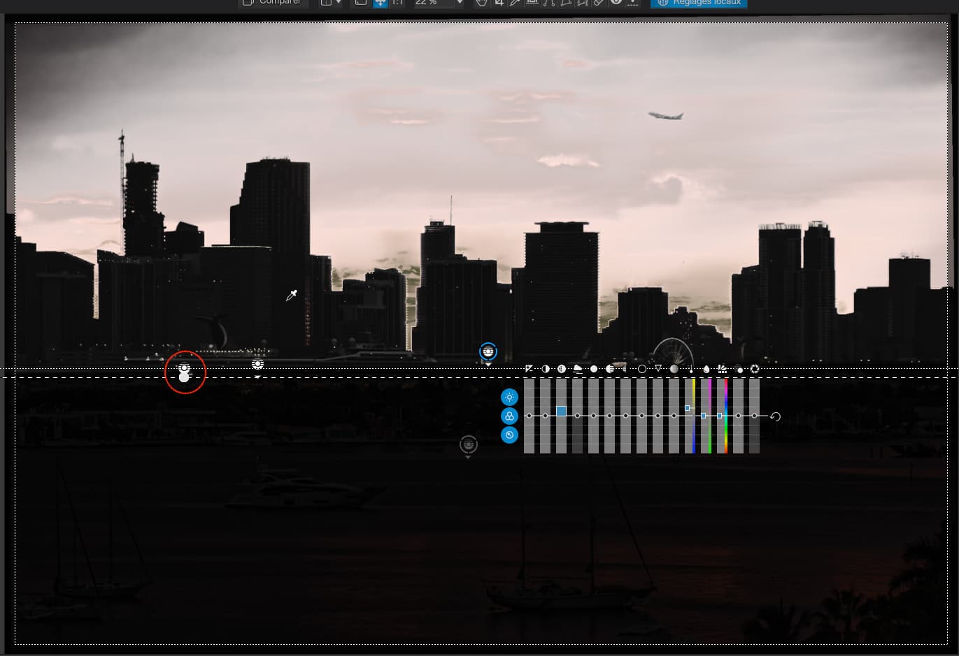
Actually, that a is part of the central control line, with the same settings.
In fact it wasn’t intentionally angled, it’s just that it can sometimes be difficult to get it dead flat - but the angle wasn’t important in this case, as long as it started below the “cracks” in the buildings. But look carefully, that is actually a secondary control line, to select more of the sky…
Just the primary line, with the pipette on the clearer sky…
It does pick up a bit of the buildings but not enough to worry about.
Addenda
I just added a negative control line to the same main control line for the sky and it greatly helped in excluding the buildings from the selected area…

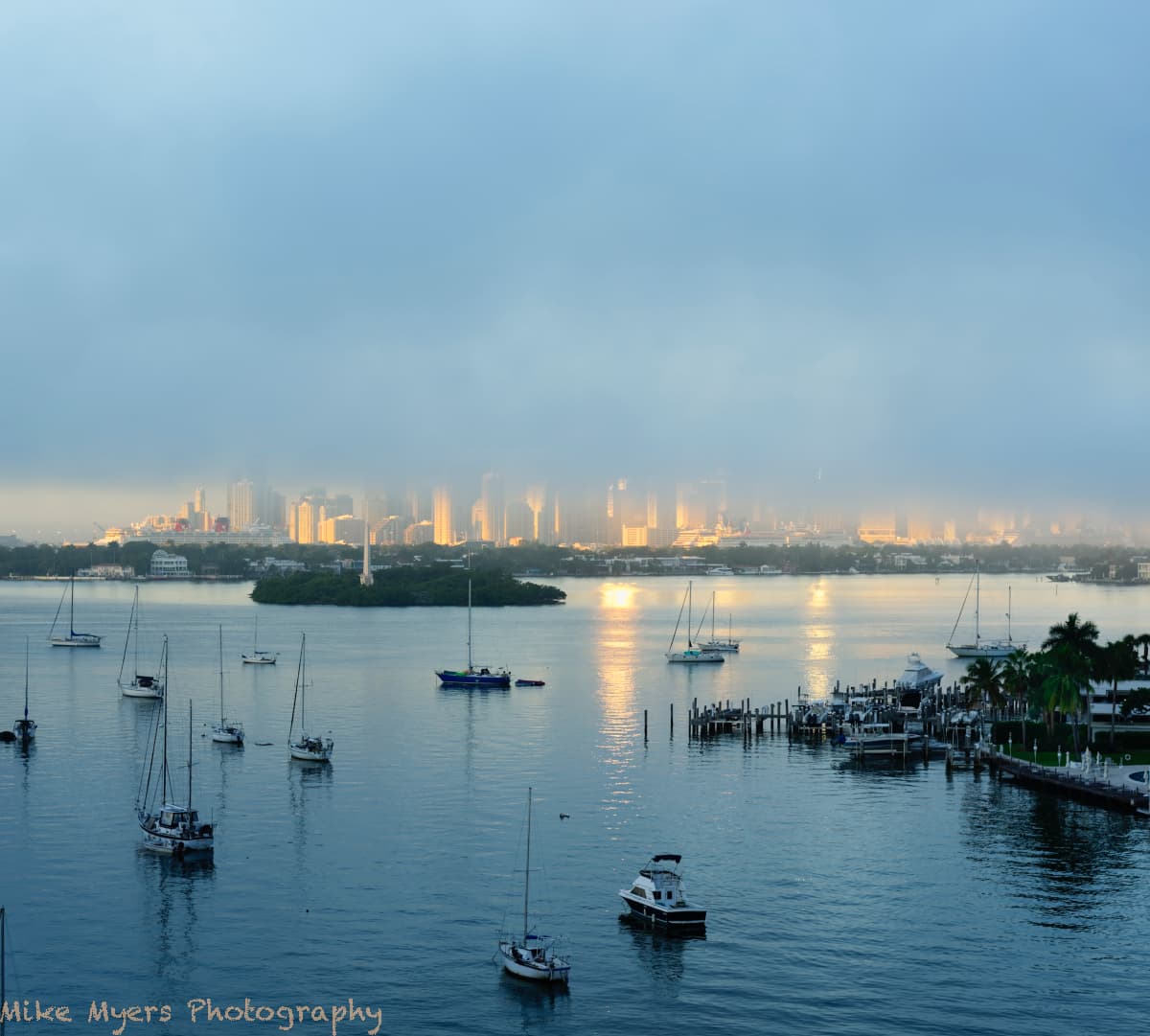
 Some other small adjustments too, including an attempt to prevent any clipping. Since the peninsula was so close to me, I brought out the colors there, as the fog hadn’t yet reached that spot.
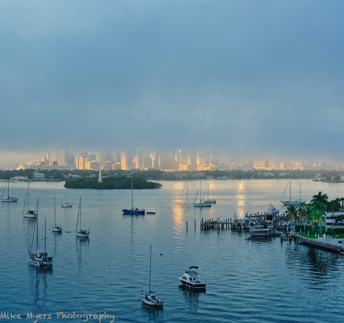
 )
) )
)