Daylight doesn’t have to be white light. I think every converter has its own settings for that. But I think that when you want to see the image as you saw it when you toke it, 5400/0 will be the right value. Again, it’s not hard sience.
George
Daylight doesn’t have to be white light. I think every converter has its own settings for that. But I think that when you want to see the image as you saw it when you toke it, 5400/0 will be the right value. Again, it’s not hard sience.
George
Calibrating for what? The only time you normally need to calibrate shooting temperature is when you are shooting catalogue and product shots where people are relying on what they see to choose a product based on its colour.
As we all know, RAW files only record, but don’t apply, a colour temperature - the reason for setting the WB in camera is to provide a JPEG preview on the back of the camera for chimping purposes.
As you know, adjusting the WB (or using auto WB) for a sunset is going to try and neutralise the warmth in an attempt to make any whites truly white, but the whole purpose, for most sane people, is to portray that glorious warm glow.
The only time I use a manual white balance when shooting is when I have to cope with artificial light or mixed lighting. The worst being fluorescent, which doesn’t so much affect warm/cool but more green/magenta.
But, no matter what you set in camera, what really matters is what you set in post processing.
5600°K for daylight is a standard from colour transparency film but it is still recognised and works for digital.
There is no “should” about it. That just happens to be the temperature that someone has decided should represent “Daylight” as a WB preset. But I have just gone outside on a totally cloud covered day and measured 6500°K, which, according to PL’s idea of cloudy should be 6000°K.
“Daylight” in digital camera terms is a fictional approximation of whatever the camera manufacturer wants it to be or what is “in fashion” at the time.
Indeed. But it is interesting that it always used too be 5600°K until the digital gods decided otherwise. I believe this is mainly because 5400°K gives a slightly warmer feel to an image, which most digi-snappers find more appealing, not because of any science.
Which leads me to state that; although I highly recommend sticking with 5600°K in camera, when it comes to post-processing, it’s all about the look and feel you are after.
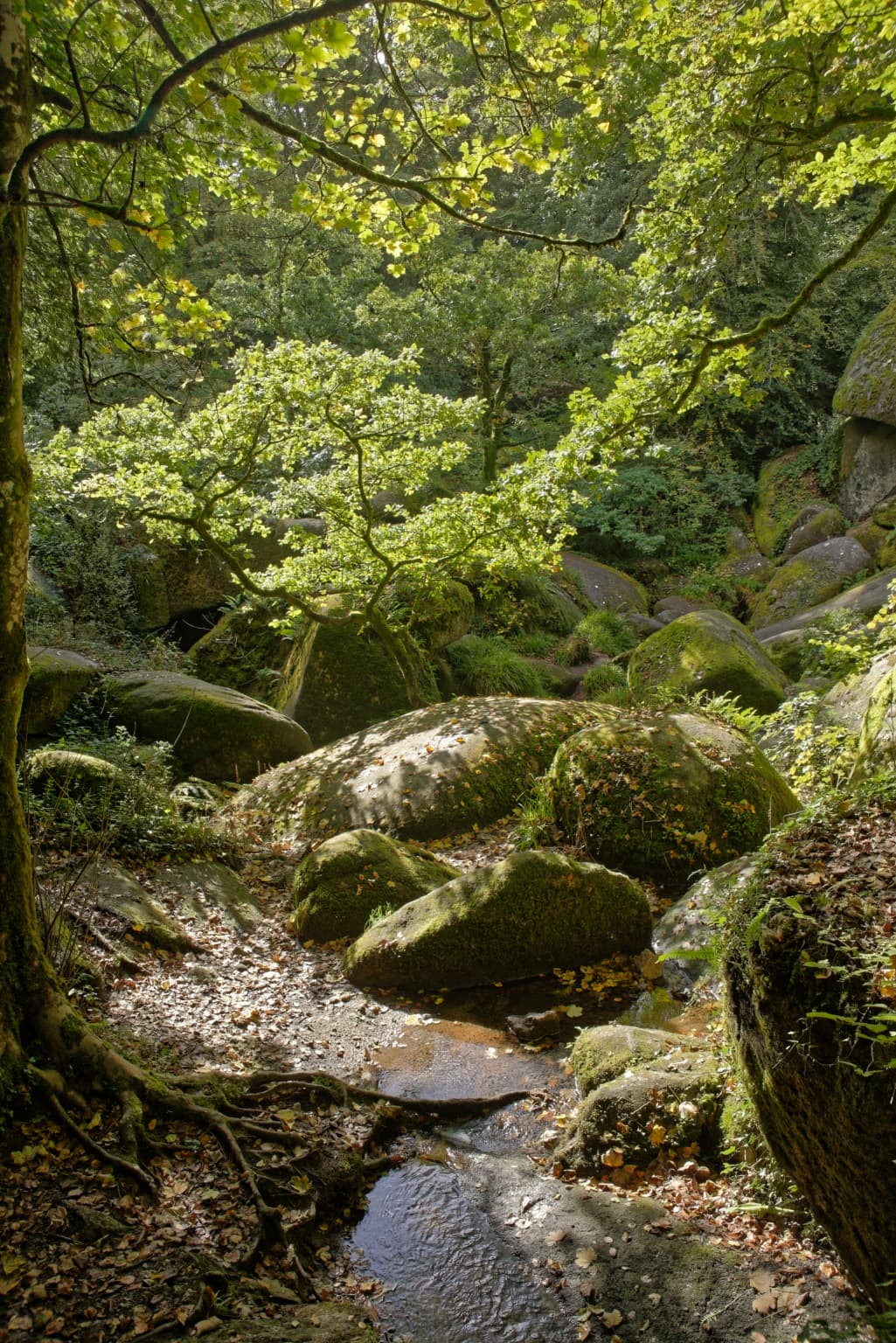
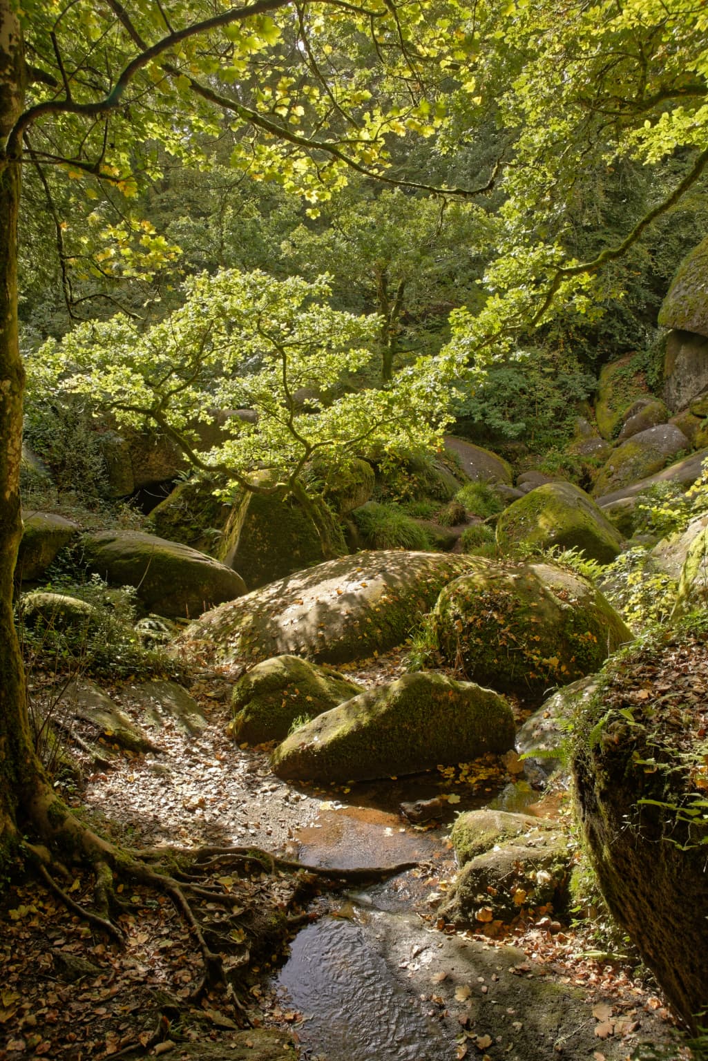
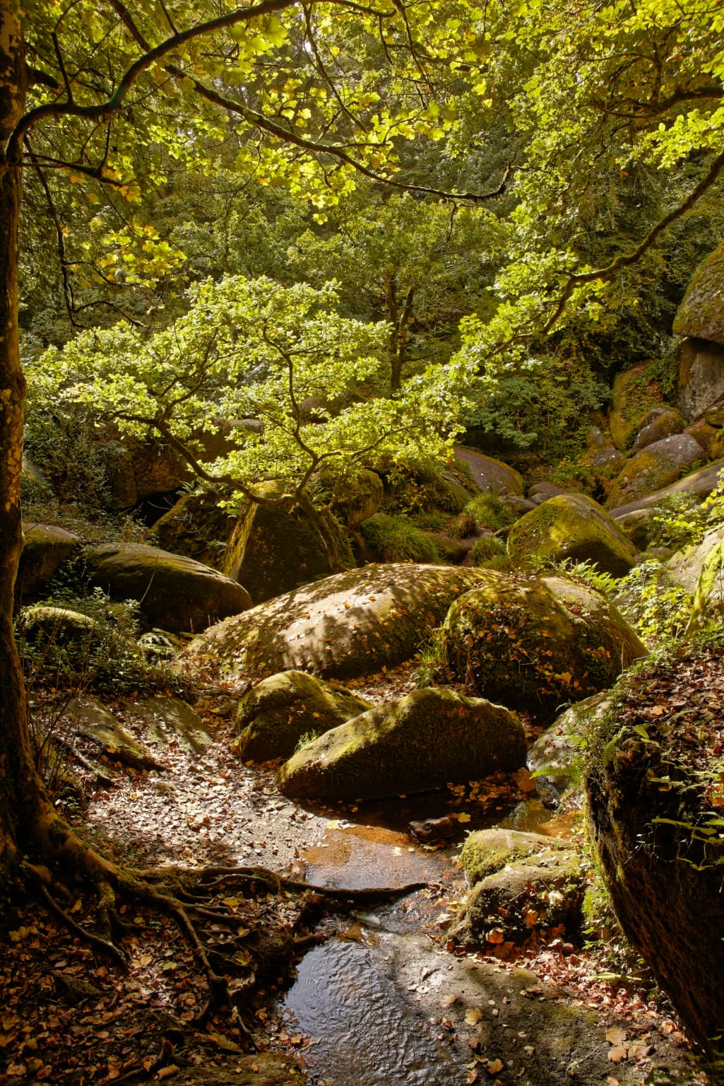
Here is a shot, taken at 5600°K…
Changed to 6800°K…
Finally here it is with the Fuji Velvia preset as well, which warms it up a bit more…
As mentioned by somebody else earlier, daylight films from different brands produced different colors. I still have the examples in my old pictures.
The number 5400 is the number PL corrects the image to. When using 5400/0 no corrections are applied.
Like analogue films had different characteristics so do have converters. Your camera uses a Nikon converter, PL uses it’s own.
It’s also a matter of feeling.
George
Adjusting in post to my liking.
As i see it: AWB is a suggestion that the camera provides for postprosessing in raw.
So when i like the suggestion i don’t have to make a wb adjustment. 1 step less.
It’s not reality because there isn’t a colorcard or greycard to point on for exact measurement.
If not i adjust.
When i set wb to 5600k i need to adjust much more in my general shooting envelope.
So it’s lazyness not accuraty. 
Raw and WB, yes when i walk point and shoot on my trips with family i don’t care about wb i leave it to the camera to give some faint idea how the mood light was.
When i photograph a sunset i switch to manual 5600k (custom wb) whén i am thinking of it and have time to play “photographer” aka only the dog is with me, she has al the time alsong as she can come with me… 
I just set my idea of best WB in post mostly.
And this can be a nuisance. Not all cameras use 5400°K for their WB and this means that PL is sometimes changing the desired appearance of the image.
But I don’t want that double conversion! When I read a RAW image into PL, I expect just that - a RAW image that respects the settings in my camera. If I were to use “Daylight” on the camera, I expect PL to honour the temperature that “Daylight” equates to on the camera, not to decide for itself. I have never had images adjust to 5400°K in PL - if they are daylight (5200°K) in camera, that is what PL uses as daylight and it doesn’t change; however, if I set my camera to 5600/0 manually, PL decides it wants to convert that to 5510/-3. This is plain wrong and is why my default preset for RAW files includes a WB of 5600/0.
Ah, now the truth emerges 
But that actually does the opposite because it is adjusting the whites to be as close to true white as possible, hiding the “reality” from the JPEG preview.
But, since you have a way of working that suits you and you are getting the results that please you, nobody has the right to say you are doing it wrong.
 Busted.
Yes your right, but as i know my brain does the same adjusting to known colors, a white car is white not yellow. Perfect example i have a vuarnet sunglasses with yellow glasses and caoting for driving my brain adjust the yellow colorcast and the sky is still blue. White is stil white. Only when i am thinking of it and look though and over it i see the difference
So the “corrected” version looks like we looked at it not was it actually was. And minor adjustment for personal liking.
Lunch at restaurant du vehikel… 
Gebakken aardappel met koolsla en kaas (at least that’s what Deepl says  )
)
Bread with beemster old cheese and buttermilk. Dessert banana
Nothing fancy.
Some of the above thoughts make sense to me, but not the above paragraph. Until now, I assumed that if I set the WB on my Leica/Fuji/Nikon to some number, say, 5600, and if I went outside in bright sunlight with a printed color card, and selected the same value in PL5, let’s say 5600, the gray square on my color card should look a neutral gray color. …more or less, a good meter might prove otherwise, maybe from other colors reflecting from the gray card, or whatever.
Also, what does this mean? “if I set my camera to 5600/0 manually, PL decides it wants to convert that to 5510/-3. This is plain wrong and is why my default preset for RAW files includes a WB of 5600/0.” …what does “5510/-3”, or "5600/0, mean? There is a “/” and another number after it - what do they even mean?
I have learned to accept Joanna’s suggestion of leaving everything at 5600K, and then adjusting to suit my desires for each photo, along with not trusting the white balance on the camera screen or my (non-existent) jpg images. Maybe I should buy a gray card, or a full color card, and include it in my photos to see how the light has been manipulated?
For what it’s worth, I often ignore the white balance, leave the initial settings on everything at 5600, and adjust the white balance on my calibrated monitor to make the photo look the way I enjoy it looking, just like I adjust composition and what to include/exclude from the image.
(The type of sensor in a camera also makes a difference - there are a lot of people who prefer the CCD sensor in the Leica M8 cameras to the CMOS sensor used in newer Leicas because of the color quality.)
Suggestion - DxO could provide a calibration tool, where a user could take a photo of a gray card, and PL6 could sense the color of that card and adjust the WB to make it a neutral gray. …or does such a tool already exist?
Yes, that should be right, excepting any slight differences in how the camera firmware translates the sensor signals into digital values.
The second number is the Green/Magenta fine tuning which usually makes up the WB along with the main Blue/Yellow component.
My beef with PL is that both my cameras are manually set to 5600/±0, but the D810 files are read in as 5510/-3 and the D850 as 5643/±0. To mind, close but no biscuit.
It’s an interesting exercise but, for the kind of photography you are in to, it’s really not the necessary. Usually, it’s a case of “when it looks right”. If you were shooting colour matched products for a catalogue, then yes.
Don’t forget, I’m a fully qualified, paid up, possibly OCD, perfectionist, nerd  who has a full set of colour correction filters (well, 24 of them) for colour transparency film work and a Minolta Color Meter III F to help me choose which ones to use

And so I should think. I just feel that the “negative” should be a standard WB, that can be relied on as the same starting point for every image.
I must admit this sounds a bit like the “vinyl sounds better than CD” argument
PL already provides the option of using DCP camera profiles, which can be selected from the colour rendering palette. You can either create your own DCP profiles using a Great Macbeth colour chart and Adobe’s free DNG Profile Editor app, or you can download a whole bunch of ready-made ones for all sorts of cameras. I can’t remember where I got them from but I think it was @platypus that told me the URL.
Hang on, I believe they are installed when you install Adobe DNG Profile Editor
Nope just the 80-400mm Nikon at 400mm. But I also used DX mode, which crops the image and gives an effective 600mm.
Heck no. Unless it’s a warm swimming pool, I don’t even go swimming.
I can find a technical explanation here:
https://focus.jenoptik.com/en-gb/blog/2020/02/13/myths-of-digital-microscopy-ccd-better-than-cmos
(The page keeps changing colors, as I’m reading it…)
More, and I think better information here:
https://www.reddotforum.com/content/2015/02/the-great-debate-ccd-vs-cmos-part-1/
In ways I can’t describe, I did find the colors from my M8.2 (CCD) more pleasing than the possibly more realistic images from my M10 (CMOS).
Nowadays, I don’t think about it that much. There are lots of reasons why I may pick my M8.2 or M10 rather than the other, but CCD vs. CMOS isn’t one of them.
As to vinyl vs. digital, my hearing isn’t good enough for me to tell the difference, but I accept that others can, and therefore have a preference.
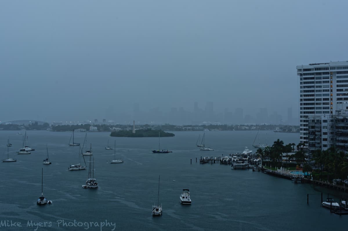
My current thoughts are that PL5 can do just about everything I want, other than infrared photography. Here’s a photo I took yesterday, mostly as a challenge for myself to see if I could do it.
It’s the same view as my sunset photos, but it was rainy and foggy, and I couldn’t even see the Miami skyline. I took the photo as best I can, trying stay dry, using the built-in level in the D750, and ended up raising my ISO to 500, along with f/10 and 1/40th. I thought that the image looked too bright, so I used. -1.0 EV.
I loaded it into PL5, but couldn’t make out the buildings from the fog. I finally raised the micro contrast a little, finding the more I raised it, the more the buildings stood out, but the more the sky turned horribly noisy. So I set that back to zero and set the Fine Contrast to 36, making the buildings barely visible. The city lights and the other lights were just starting to come on, which I liked. Some of the trees actually do have some green in them, which is the only color in the image, along with the swimming pool. I wanted to make it look “cool”, so I raised the saturation and vibrance.
My goal was to show what I saw with my eyes, with the buildings almost invisible unless I strained my eyes to see the little bit of detail that shows in this photo - bug honestly, I thought the buildings were “invisible” in the fog when I took the photo. I may have made the image too dark - by the time I stopped taking photos, this was accurate, but in reality it was brighter than my photo makes it seem - but it was quickly getting darker.
My question is what (if anything) could I have done to make the photo more effective. The buildings need to show up, but just enough so people realize they are there.
_MJM9763 | 2021-11-18.nef (26.4 MB)
_MJM9763 | 2021-11-18.nef.dop (12.3 KB)
Adobe DNG Converter, that is…
https://helpx.adobe.com/camera-raw/using/adobe-dng-converter.html
I have the Adobe DNG Converter, to convert DNG images to TIFF - I didn’t know it does those other things. I just wanted to get my Leica M8.2 DNG images into PL5, but as Joanna pointed out, Apple “Preview” already does that.
Adobe DNG Converter converts RAW to DNG. I’ve never got any TIFFs out of it…
Must be something else that gets you TIFF output…
You’re right - using Adobe Raw Converter was only part of the process. I can post it if you want to see it - the purpose of doing this was to convert Leica M8.2 dng files to new dng files with a much larger jpg image, eventually ending up with TIFF files that PhotoLab accepts (since it doesn’t accept raw dng files from that camera, because PhotoLab doesn’t have the software to accept photos from the M8.2).
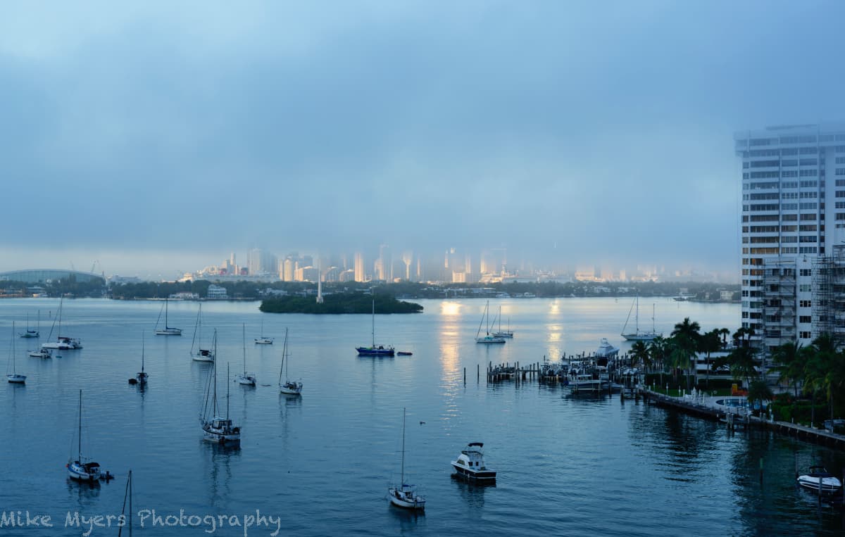
I woke up yesterday to see a beautiful view of Miami from my balcony. The sun was just coming up, and starting to light up the city. I stopped to make breakfast, and when I returned everything was changing, as a huge, thick, dark, cloud of fog was descending over the city, and literally over me! I took a series of photos as the city became more and more invisible, and even the apartment building opposite mine. The air “felt” differently, as if I was inside a humidifier.
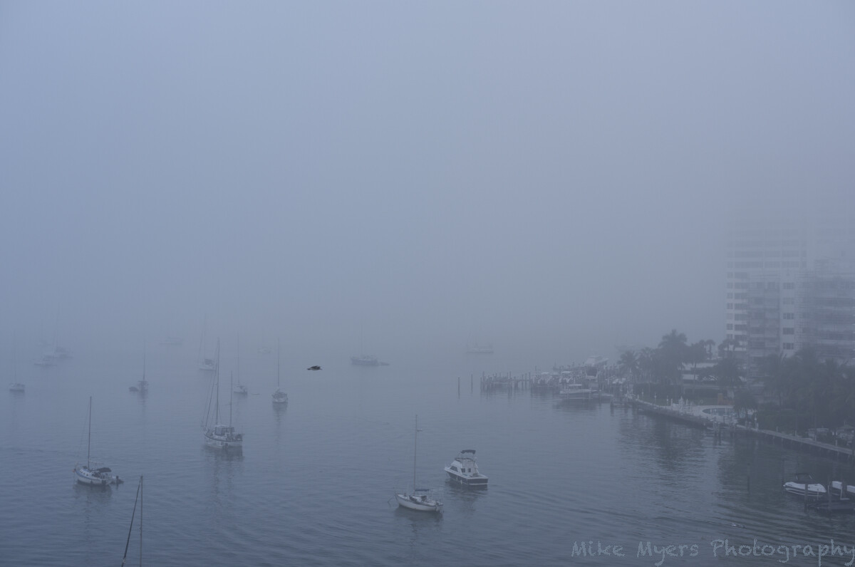
I’ll post my favorite two photos below, but I suspect I’m going to be told I ought to have put my camera away. I’ve never seen this before, and to me it was worth recording, but I suppose there might be a contest for the best photo of fog… A seemingly lost bird flew in front of my camera as I took the second photo - I was ready for it, but hadn’t planed on it, and 1/320th of a second wasn’t enough to get me a sharp image.
Details - camera was set to 9600K, daylight, and I haven’t deliberately changed it for either photo, but the top photo looks too “blue” viewing it now. To me, to my eyes, the fog was gray, not blue, like the second photo. Camera was on my new tripod, with a new camera mounting block to replace the defective one that came with it. For the first photo, I did try to bring out a little more detail and color, but then I started to wonder why I should do this at all? It’s “prettier”, but the fog blocked my seeing these things. Oh, and I left the flying “sensor dust” in the lower photo, just waiting for someone to tell me to clean it. Viewed at 100%, it’s obvious as to what it really is.
So, can anyone in this forum turn either image into something that is both nice, and realistic?
Maybe one of you with a good imagination (Helen?) might know how to take such a nothing image, and make it presentable?
First photo:
_MJM9790 | 2021-11-22.nef (26.6 MB)
_MJM9790 | 2021-11-22.nef.dop (14.9 KB)
Second photo:
_MJM9804 | 2021-11-22.nef (25.1 MB)
_MJM9804 | 2021-11-22.nef.dop (12.0 KB)
Please define nice and realistic…(just kidding - or not?)
You took a shot of Miami’s morning mist, it looks pretty realistic to me.
Well, for a long time now, when I post something here that I think is good, many of you, especially Joanna, show me how it could have been done better. So, my next attempt benefits, but there are usually still ways to improve it.
In this case, the second image is completely realistic, even if it doesn’t look it. I had a very strange feeling looking out over the water, and not seeing anything. Hard to describe, maybe more like a dream than reality - but if this happened more often, maybe then it would look more “real” to me.
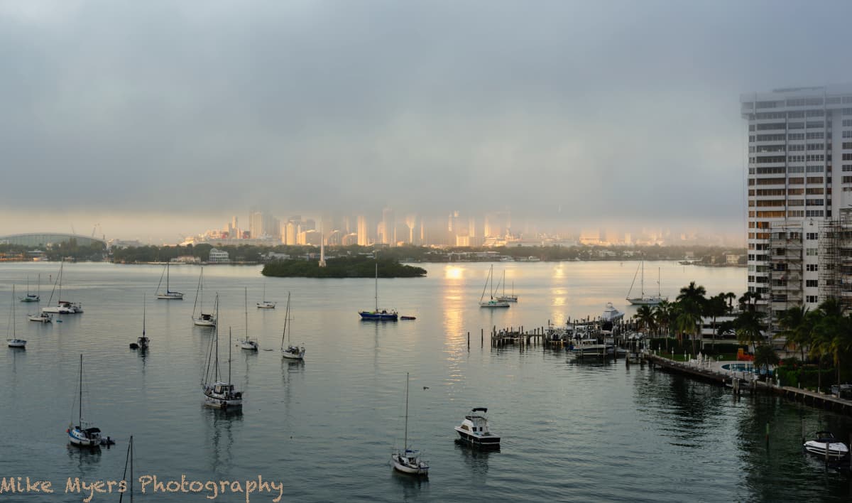
For the first image, I did add more saturation and vibrance, but I didn’t deliberately make the photo so blue, so the colors must have been there already - but thinking about it now, it’s probably because the camera was set to 5600K, and the light was much “cooler” than that. PL5 tells me that the image I posted is 5311K. I tried bumping it up to 8300K, and the buildings started to look the way they did before the fog dropped down. Even the red funnel on the cruise ship looked red again.
If I then make the fog slightly darker, and add a bit of contrast, the image looks a little more real. Then, since the foreground hasn’t yet been blanketed by the fog, I can boost the saturation and vibrance, and then I can break the rules of composition, and have the horizon in the middle of the photo by cutting out a little sky.
Finally, if I use the Compare tool, I like the changes… maybe these are things Joanna would have suggested?
_MJM9790 | 2021-11-22.nef.dop (16.1 KB)
Final thought - maybe I should post images here until the day after I create them, so I can see them from a new perspective? I like today’s version much more than yesterday’s.