Editing high dynamic range images in PhotoLab 5

Very tricky, and very effective!!!

I’m losing track of which VC is which. I suspect this is VC4 now? And the water certainly looks more interesting with the reflections…but to me, the water looks best in the (M)aster with lots of natural reflections.

I’m now looking at the large view in PL5, with the five thumbnails below. On my screen, the (M)aster looks the best out of all of them. The sun looks great, the water shows reflections of the sky, the buildings now look perfect, the sailboat is white, and the sky looks natural.

Oh, and I enjoyed trying to do each step of the editing - I have questions I asked up above, but the end result works beautifully, and while I’m still feeling overwhelmed, it’s not so much as I expected. All the pieces fit together nicely.

I “chimp” one image in a new location and then assume everything will be ‘close enough’. I used to do it every time I changed the battery on a previous camera as it would forget exposure compensation when physically turned off. I took about a dozen shots at an air show before my first battery complained (oops!) and shot the rest of the day quite severely under exposed (and I shot RAW from that day on, too). I still occasionally stuff up because my current camera remembers settings from one session to the next, but usually remember to “chimp” one shot when I start a session.

Actually, yes. PL5 does now support renaming of VCs.

Here is the latest DOP file with renamed VCs. Does this work for you?

_MJM9652 | 2021-11-07.nef.dop (71,4 Ko)

Pah! Easy-peasy-lemon-squeezy :stuck_out_tongue_winking_eye:

Smart Lighting zones…

Smart Lighting settings…

Capture d’écran 2021-11-09 à 11.16.30

Tone curve reduced Gamma…

Capture d’écran 2021-11-09 à 11.17.07

Resulting export…

Variation…


_MJM9669 | 2021-11-08.nef.dop (24.1 KB)

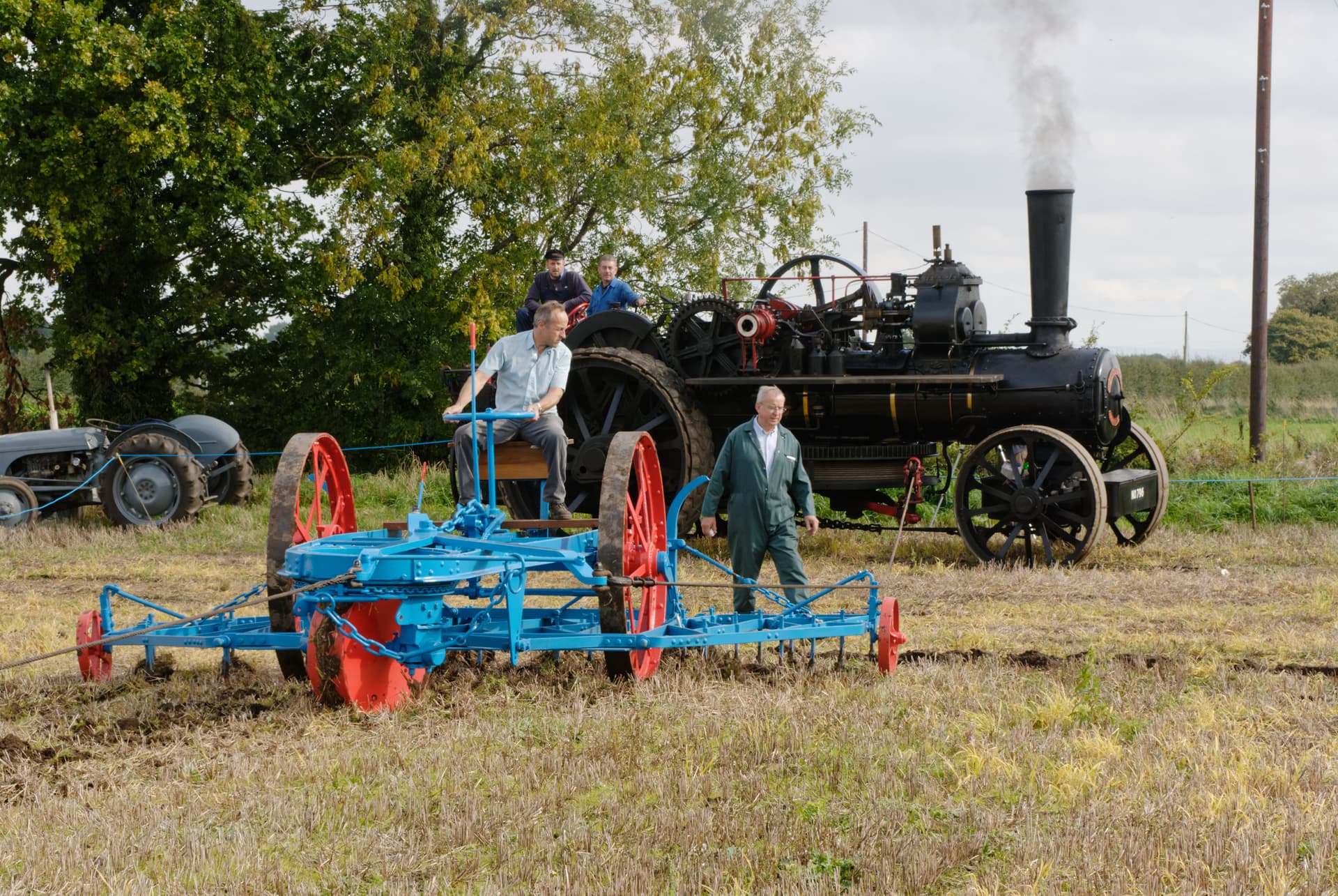
I agree, but thinking about it another way, which image do you spend the most time looking at, for whatever reason? Colors, and contrast, and other “loud” things attract people, but then there’s nothing to “see”, to “explore”, and to “examine”. After all the work that goes into creating an image, do we want something that grabs people’s attention, or something that keeps their attention as they “discover” things in the image? I love the way that photographs taken with quality photo gear, processed as we’ve been discussing here, can look so fascinating that viewers really “look” into them, rather than a quick glance, especially when the image is made so large that all this detail is quickly recognizable. I’m now thinking of Joanna’s photos, and Helen’s photos, which usually capture my imagination and hold it for a while, “exploring” with my eyes.

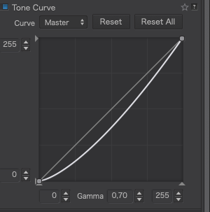
I wonder if I ought to pay attention to the numbers - I just watch the colors change, go a little too far, then back off to where it has the “look” that I’m thinking of.

Yes, that works big-time for me!
So, when I create a VC, I find a way to rename the VC, while it’s open in PL5??
I love the concept of doing this - and no, which I look at those files using Finder, they still have their original names, so you must be doing this from within PL5.

If I right-click on a VC I get a new box showing your change, in this case, “Joanna basic.nef”, and I could rename it as “9652-Joanna basic.neg”. That worked.

Maybe you or DxO could make a post about this - if we all start doing it, anyone looking at the VC image will know who created that VC.

Brilliant!!!

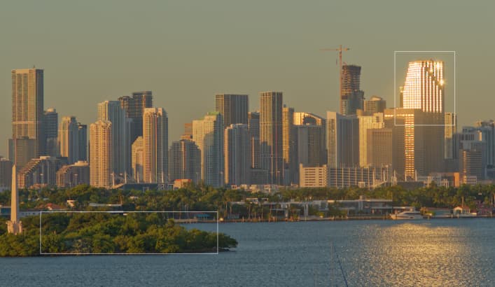
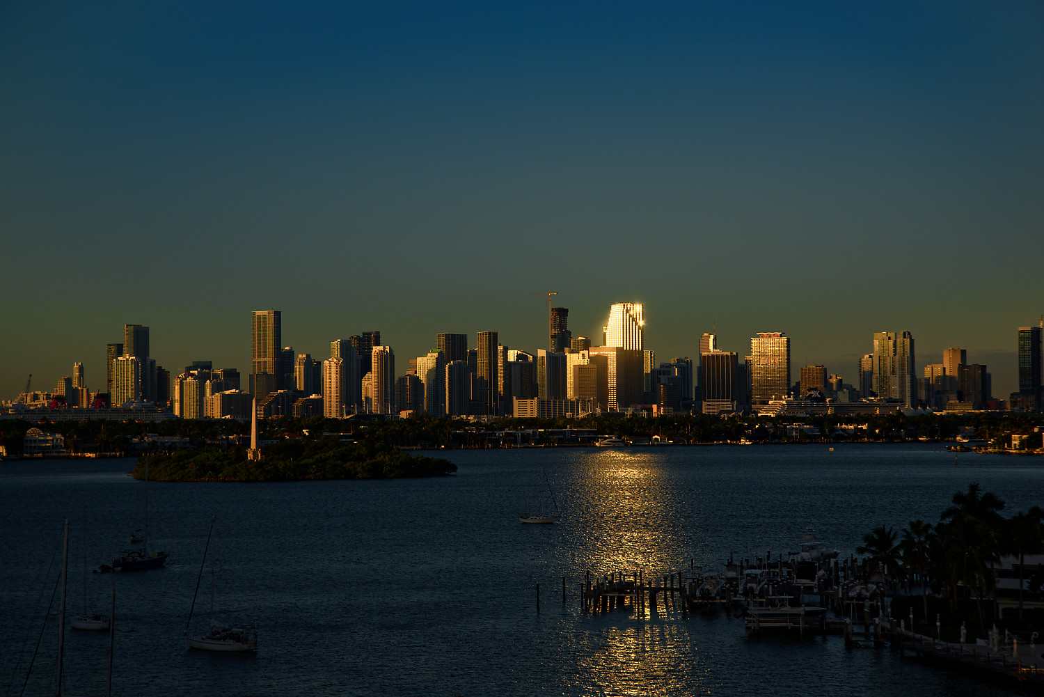
Wow, I saw all the black spots in the windows, which made me think that those spots were burnt out. I didn’t even try to edit, as I wanted to learn how you did the previous edit.

Your post shows a perfectly corrected image that is close to what I saw, looking at the skyline. I guess I need to crop it to show what I find so interesting, but then when I look at the “Variation” by @platypus I see what I felt while looking out my window! On the other hand, I’m looking at his version right now, and both highlights and black areas are “clipped” on my screen. I enjoy the effect, but not the clipping.

My thoughts right now are that both you and @platypus can put band aids on my image, so it looks better/different, but the image still has the flaws I was worried about. Maybe when the sun comes up this morning, I’ll try to meter on the reflections, and then underexpose one or two stops…

One more question - is the best way to “re-set” an image to OOC completely, to delete the .dop file, and re-open the image?

It’s something we learnt when we started with LF gear. One of the reasons for movements is so that you can get everything sharp.

It’s why images like this work; because although you could say the principal subject is the lighthouse, the patterns of the clouds in the sky, the seaweed covered rocks and the way the patterns in them lead the eye are all part of an exploration of the location or context of the subject.

In this case, you need to leave the WB at 5600°K and experiment with saturation and vibrance before resorting to changing it.

I suppose, strictly, they were, but not by much and, in any case, specular highlights like those reflections are entitled to be blown out, as long as they don’t take out the detail next to them.

Noooo!!!

Don’t forget what we said a while back - spot meter for the highlights and then “place” them by adjusting the exposure compensation by +1⅔ to 2 stops.

You could but the settings remain in the database and will be re-written to the new DOP. Just hit the Reset button.

Better create a VC and then reset by button.
So have a backup.
Windows can’t rename yet. :disappointed_relieved:

Awwwhh, mes pauvres :sob:

I would like to add to that - yes, this image works for all those reasons, but it also works because my eyes, were I standing there, probably wouldn’t have noticed all that detail - if anything, the image is “too” good. Everything is absolutely perfect, and brilliantly sharp, and my eye can wander at will, as you noted, over all the details. It isn’t “real”, it is better than “real”. It almost looks like some kind of artwork, as 99.999% of the world’s photographers would be incapable of capturing an image this perfect. It must have taken you hours, perhaps days, to find such a perfect spot to shoot from - and had you taken the photograph earlier or later, the perfect lighting, and shadows, wouldn’t have been so effective. Even the small “stream”, with reflections of the sky helps.

From my little corner of the world, thinking as I think, it only lacks one small detail. I get emails all the time from friends, with small collections of amazing photos, and the ONLY ones that credit the original photographer are the ones that include a “watermark” with the photographer’s name. Some time in the future, a photo this good is bound to end up in one or more of these emails, and nobody will know you took the photo.

(I’m used to this by now - people have been copying my photos for decades, and if the photo is out in the “open”, it’s fair game for these people, ethical or not. I finally decided to put my name in the photo so when it does get copied, chances are my name will still be there.)

Anyway, back to the main point - this photo is like a book - open it, read a little, and I want to read/see more, as there is so much to explore, and it is all so enjoyable to see, explore, and wonder about. It’s a rare pleasure, as most photos I just give a glance to, and move on. The Leica Forum (https://www.l-camera-forum.com/index.php ) is no exception. So many people using what I think of as a wonderful camera, but most of their photo threads just show what I consider to be “snapshots”. (…and while my love for my Leica cameras is still strong, I realize that it has limitations.)

Yes, this your fault. :slight_smile: All my cameras are now set to 5600K - but next time, instead of changing the white balance, I’ll try adjusting saturation and vibrance. By the way, did you mean saturation or vibrancy? …and why?

That’s what I’ll do from now on. I’ve been creating the VC, but from now on, I’ll likely use the reset button and start over agin from scratch. Not sure if it’s just me, but I’ve found that the second time around, I do a better edit. When I want to test the settings that @Joanna and @platypus used this morning, I loaded those images, and made another VC that I could experiment on.

I’m sorry to disillusion you but, in fact, it only took about half an hour to compose and take the shot. I just stumbled across it and the light just happened to be right :roll_eyes: :sunglasses:

Frankly Mike, it’s not worth the effort. I exported your master version of this, complete with watermark. It took me about two minutes to use PhotoLab’s repair tool to remove the watermark from that jpeg export.

I meant the two basic tools in the Colour Accentuation palette. Why? I find I can get a better feel for the changes playing with the two, which do subtly different things.

Absolutely. I make it a practice to make a VC before touching the Master, then work on that. That way, I can simply make another VC from the untouched Master at any time and compare that with the first VC if necessary.

I was very wrong about this until now. I read something somewhere that explained the difference as a “do this, not that” kind of thing, so without giving it a second thought I have mostly been using “vibrance”. I just did another search, and found what I think may be a much better explanation:

https://www.wix.com/blog/photography/2019/12/19/vibrance-vs-saturation/

I’m curious if you agree.

Perhaps one more thing I’ve been doing incorrectly for many years - maybe incorrectly is the wrong word, but I feel very differently about this now…

That sounds like a perfectly reasonable explanation and it certainly puts into words something I, sort of, knew/found out but couldn’t quite put my finger on.

At last, I’ve found a challenge with one of my older Nikon D200 images.

Steam Ploughing.nef (15,9 Mo)

Here is a quick export of the untouched file…

The challenge is to reveal as much detail in the shadows under the trees and traction engine and the clouds in the sky, without looking too HDR.

Joanna, let me be te first this time. very subtle changes, reduced exposure by 0.2, increased Vibrancy , set a group of controlpoints to the black machine for shadow increase and a controlline to the sky with clearview annd microcontrast, use deepprime and repaired a fly or so right beneath the smoke. Doesn’t look overdone to me.
Good imagequality on D200, skintones are spot-on. Steam Ploughing.nef.dop (10,8 KB)

Well, I tried, but I had o get rid of that “ugly” post at the right, and then cut off a little from the bottom.

Steam Ploughing.nef.dop (17.7 KB)

Personally I find I do a better job if I don’t touch anything the day I took it beyond maybe a quick edit if I want to post to social media (very rare if ever tbh these days) and then reset back to base. I should make more use of VC’s I guess in this regard.

Even then when I do sit down to edit when I think I’m done, I don’t export it but leave it and look again the day after to make sure I wasn’t getting carried away on the day.

Its hardly time efficient but as I’m only doing this for me there’s no rush.

Let me try it too.
The danger is to lighten the steam ploughing to much.

Hello all,
Nice challenge here. this is my quick result. Some feedback would be appreciated.
Regard,
Jeroen

Edited: Am rather new here. how to insert the photo on this forum?
Edited : Thanks Fotoguido, found it. image

Okay, my result.

That’s not steam, that’s smoke from coal :sunglasses:

(well, I think I misunderstood…, sorry)