use this 
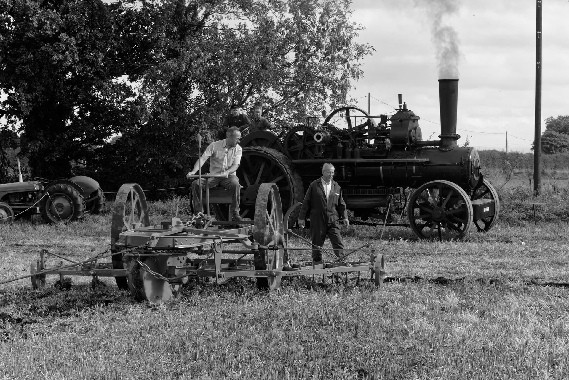
I like the way you blackened the smoke. Nice. I have no idea what color the smoke was, but your version is more effective, and much more effective than the original image.
I’m tempted to make it a LOT blacker, so nobody will ever mistake it for steam, but that might not look “real” since the engine is at rest, and not “working”.
Welcome to the discussion Jeroen!. Oh, and the easy way to copy an image to this discussion is to open up “Finder” on a Mac (and probably on Windows too) locate the image in your Finder window, and drag it to right below where you finished typing, maybe with one blank line between the text and the image. You can then monitor the progress as the copy is done.
Please feel free to post some of your images, with or without questions, and to say what you think about the images the rest of us are posting.
Could you shate the dop please, looks good 
Hi welcome to the forum,
Image looks nice,
I think you enhanced the blue and red and all objects with vibrance and detail/sharpening.
Pulled out the objects and tempered the foilage.
While most of us paid attention to the steam engine and air @GIBF4 paid also attention to the foreground.
It’s a funny picture. Trying to find out what and how they’re doing.
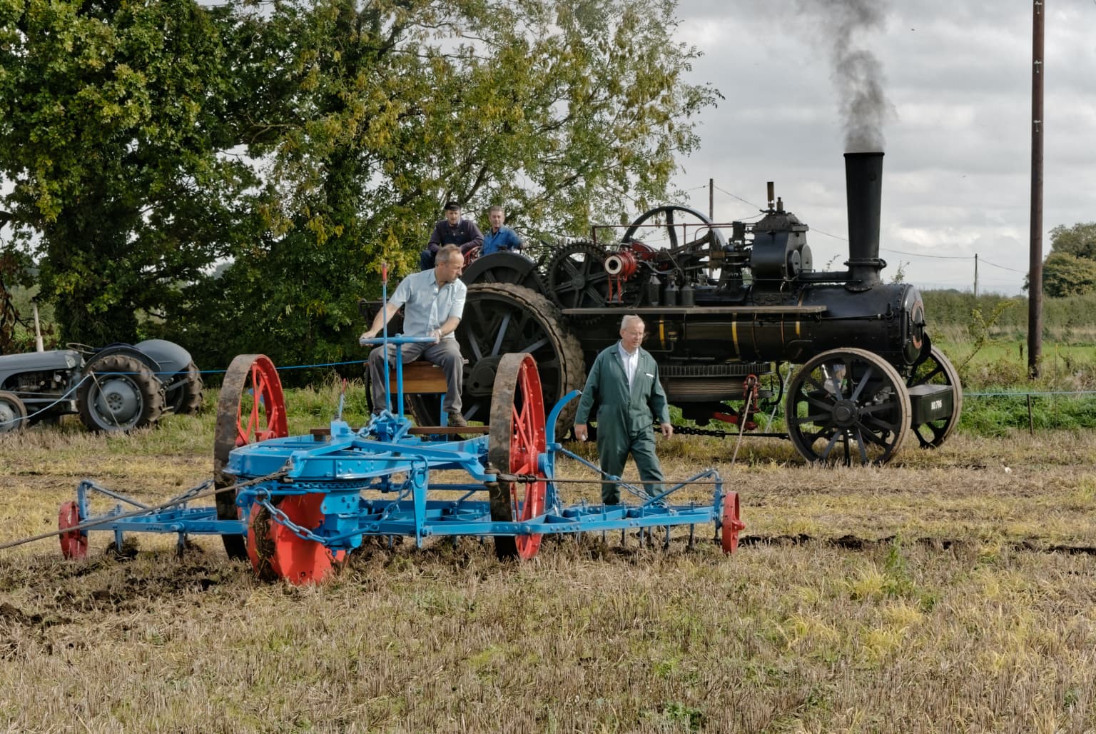
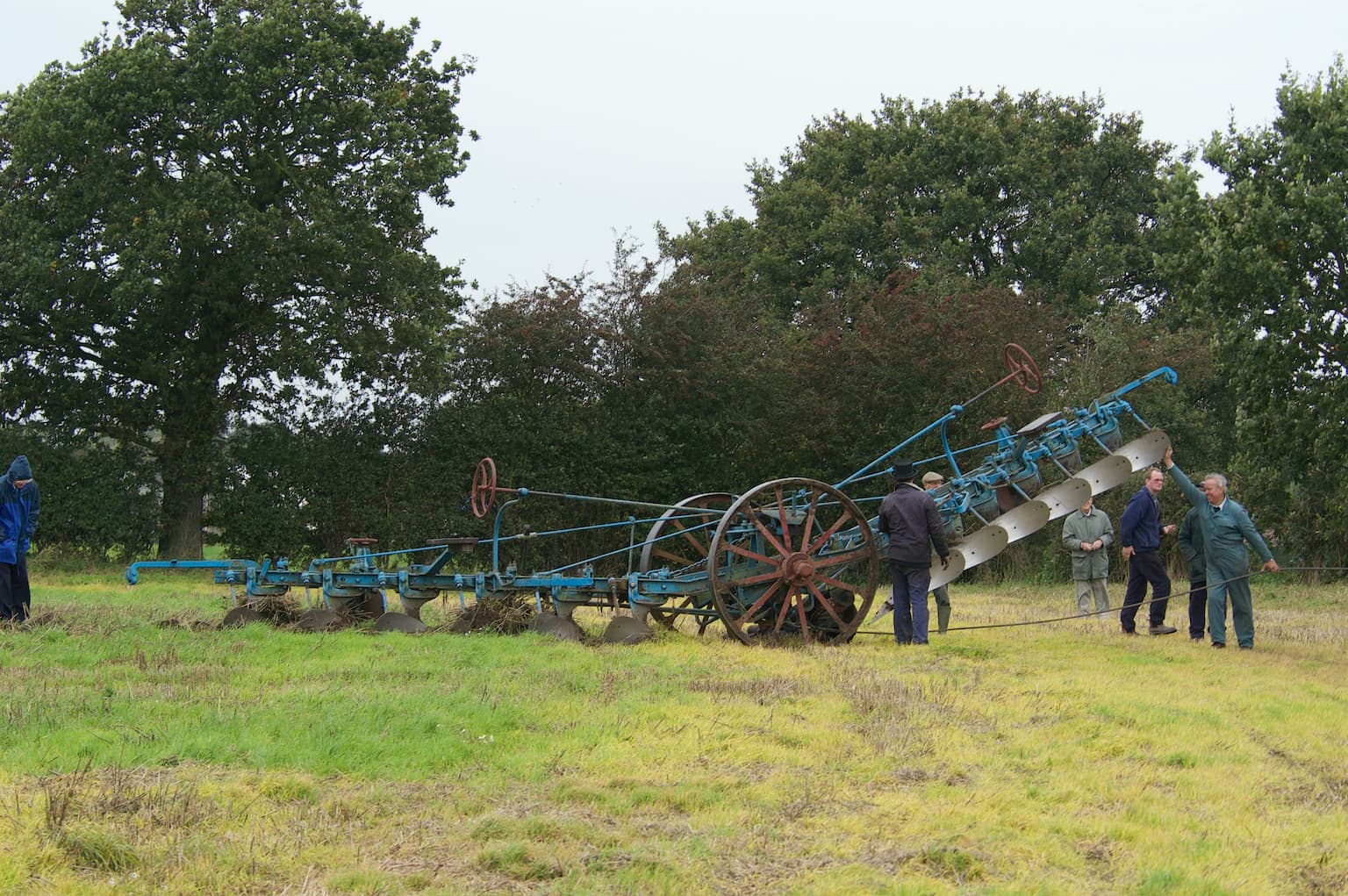
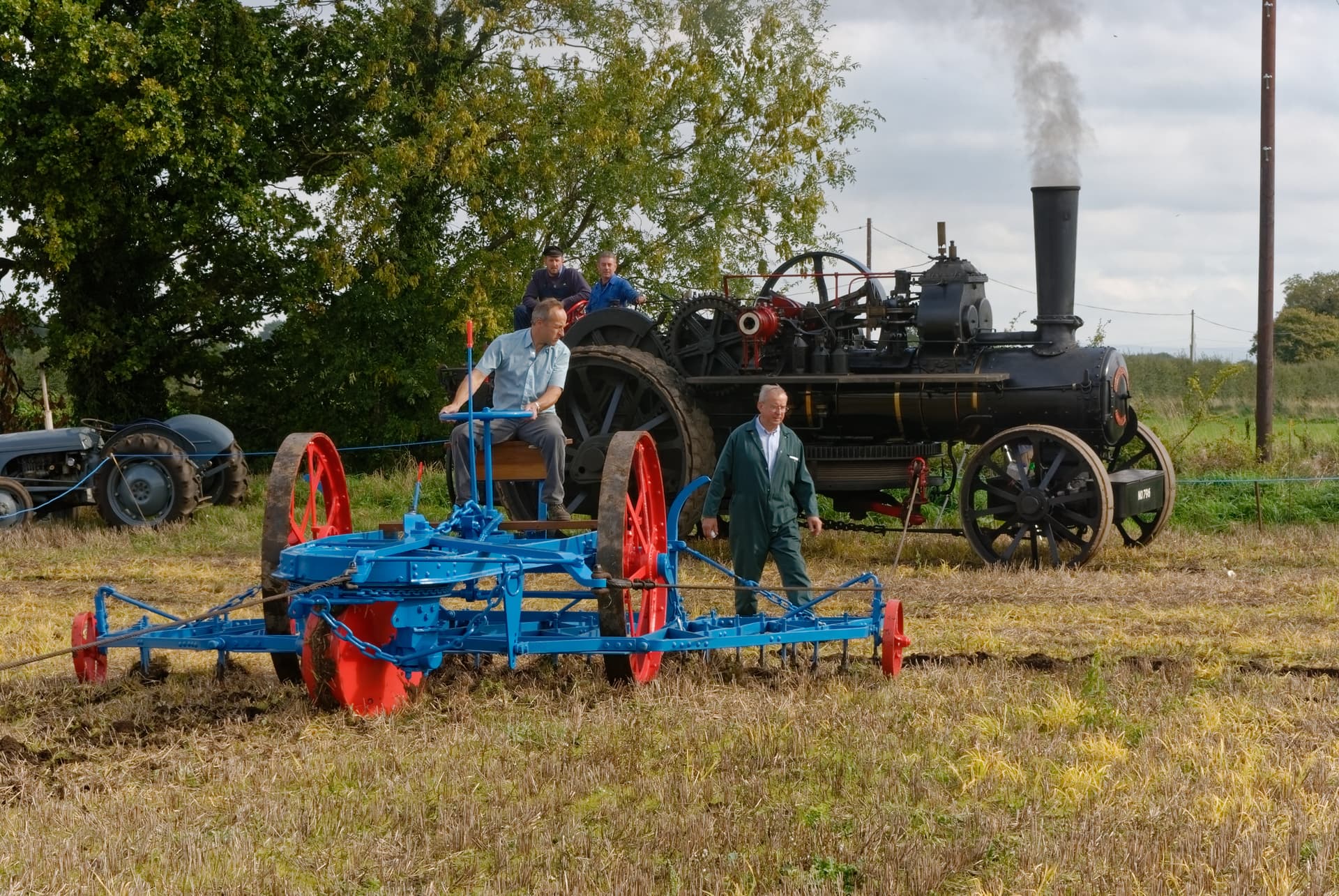
@Fotoguido Steam ploughing is the name Joanna gave to the image. I think there’s another one on the other side of the field. I never have seen this before.
George
Greetings and can I say not a bad version 
Can I ask why?
Interesting. I found myself reducing vibrancy, especially for the blue and red on the plough.
Now this I would like to point out something.
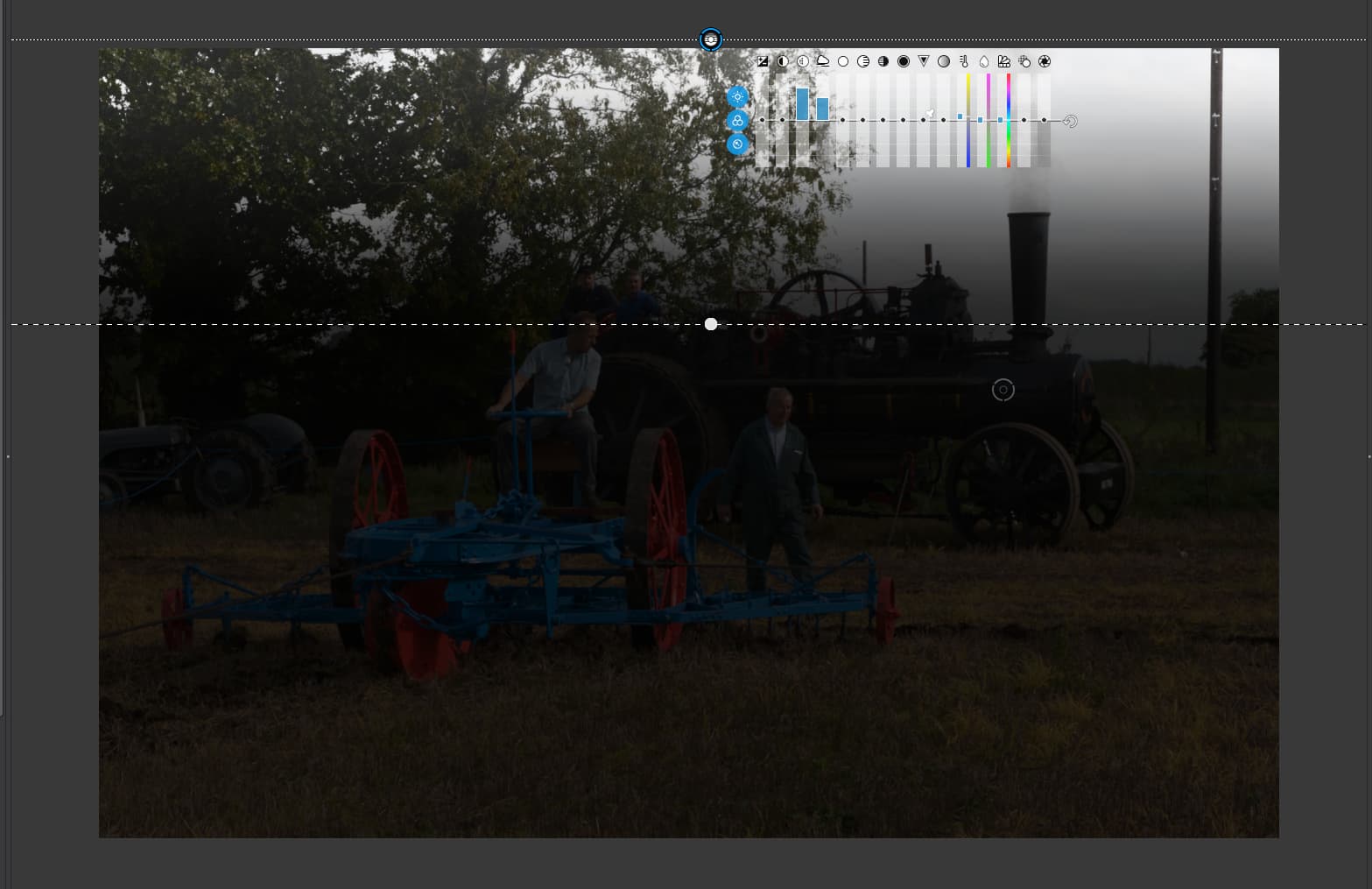
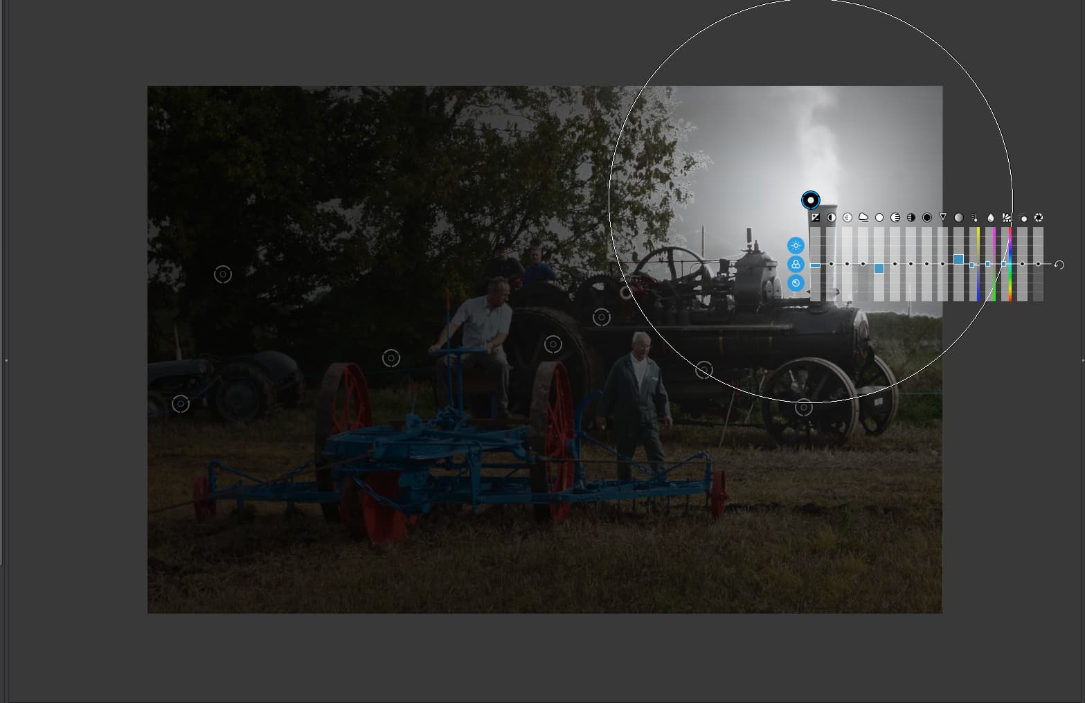
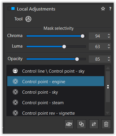
What you’ve done here is applied a graduated mask that only partially covers the sky, mainly the top part. Then it fades away to nothing as it reaches the engine.
It takes some getting used to, but control lines usually need quite a sharp transition to blend them in but they, usually for skies at least, need to fully cover the sky.
Here is my control line…
As you can see, the transition starts below the visible sky and, even then, I had to add a few negative control points, especially on the man’s shirt, which is the same tone as the sky, as well as a few on the trees and the bright area on the front of the engine boiler. This then separates out just the sky and very little else, to which I applied a bit of micro-contrast - I find ClearView can be a bit “strong” for clouds.
For comparison, here’s my finished export…
I will discuss what else I did in replies to other posts.
And I should think so too 
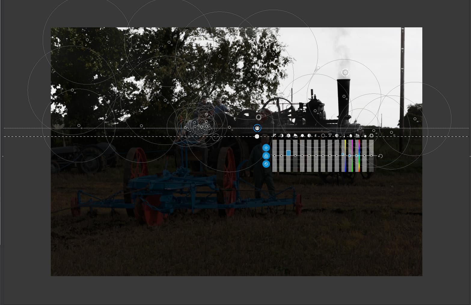
First let me point out that you used a control point rather than a control line for the sky. You also placed it half on/half off the top of the funnel, so it ended up selecting the sky around the point, the smoke and the funnel, but not the rest of the sky visible between the tree branches…
Instead of using something like micro-contrast to increase the definition of the clouds, you went for reducing the highlights and exposure, which darkened the sky and the funnel but didn’t do much for the cloud definition. It also selected the edges of the leaves on the nearest tree more strongly than the rest of the sky. Don’t forget, the lighter the mask, the more effect the adjustment will have. And I’m not sure why you increased saturation?
Not being critical but you added quite a few distinct control points to increase shadow exposure rather than selecting similar areas together and using one adjustment. What was your reasoning for doing this? Did you feel each zone needed a different level? They don’t seem to be that different.
To my eye, the sky seems a bit bland, but that is a personal taste thing. The problem with low resolution images like this one is the they tend to need a bit more “oomph” but not too much. I could see more definite clouds when I was there.
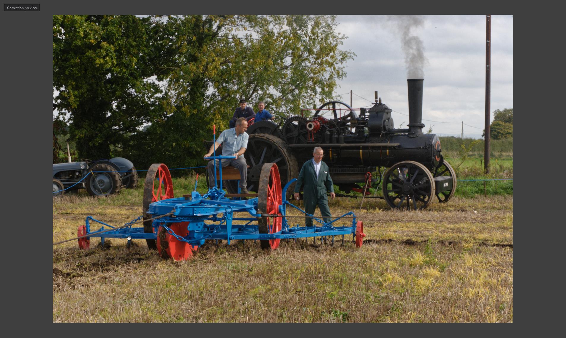
Not bad appearance but it would be useful if you could upload the DOP file so we can see what adjustments you made to achieve it.
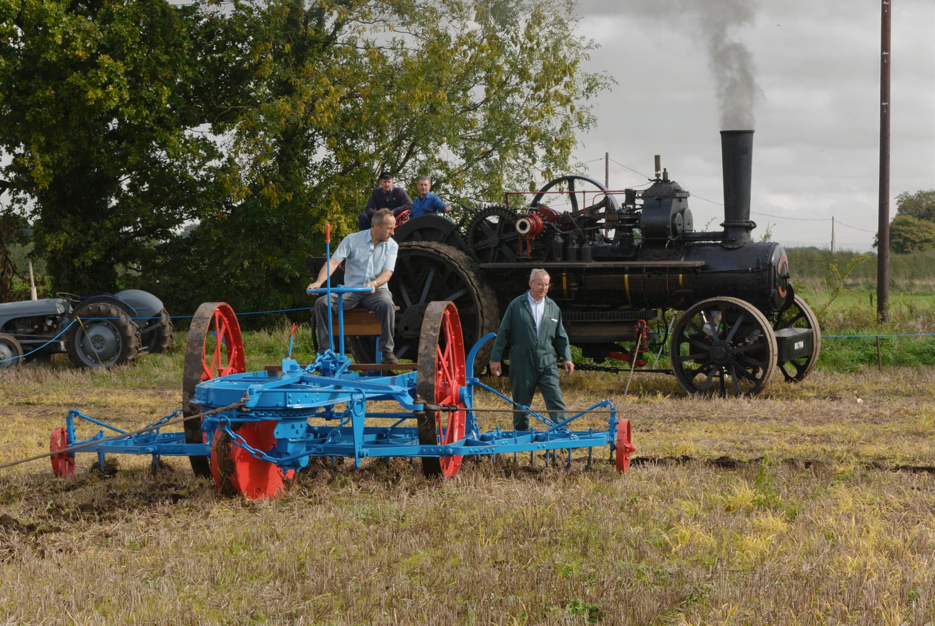
Indeed there are two engines involved. Each engine has a cable drum, which winds in or out the cable, which in turn pulls the plough from one end of the field to the other. Then the engines are moved to the next line and the other engine pulls it back again.
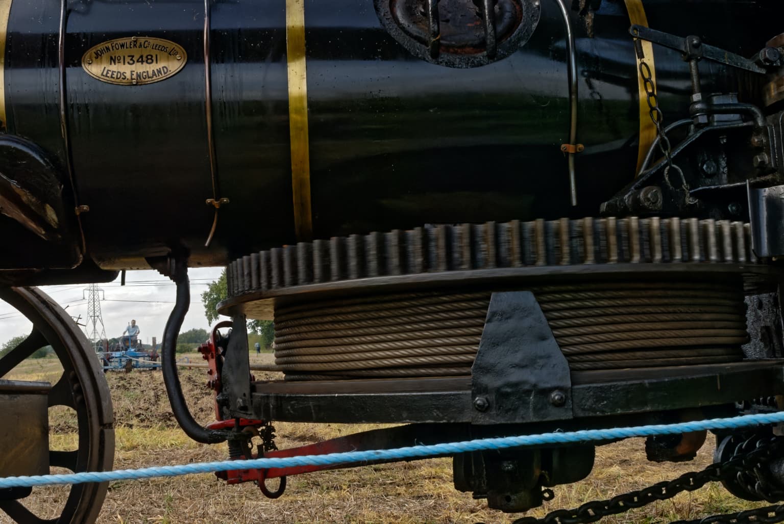
This plough is “uni-directional”, so has to be turned after each pull. But you can also find bi-directional ploughs…
Sorry about the image quality, it was taken on a Nikon D100, which is not yet supported in PL
I wasn’t sure if the “one size fits all” was appropriate, but I looked all over the areas, the spoked wheels, and more of the mechanism, and adjusted each one until I was pleased with the results. From the tractor at the left, to the wheels facing me, to those parts of the boiler, I adjusted each one individually to get it to show up with some detail. I also worked on a tree, but slightly. I hated the distracting pole, and once it was gone, the bottom of the image needed to be cut a little higher. I guess rather than try to adjust the whole image at once, I liked what I saw, but didn’t like those things that I couldn’t see clearly, like the spokes on the tractor wheel (big time), and the front wheels, and the bottom of the boiler. I’m not sure how it was done, but @GIBF4 and you are the only ones that seem to have gotten a similar result to me on those wheels.
I didn’t spend much time on the sky - I tried a Control Line, but for me, it didn’t look real, and my goal was mostly to put some “sky” back into that empty white void. I now see that others managed to bring up a vey nice sky.
As to saturation, I was curious if a little boost would help, and I liked the result. On second thought, maybe it’s out of keeping with the scene, with the old steam powered gear, even if it did look nicer to me.
If we look at landscapes from an elevated point of view, we see that clarity and saturation is reduced with growing distance. This perception of depth can be amplified or attenuated depending on how we set a gradient LA and its micro-contrast and saturation levels.
Although we don’t have a very wide (and far away) horizon, @Fotoguido’s approach does slightly increase the perceived depth of the scene…
1 Like
my take
Steam Ploughing_wolfgang.nef.dop (33,8 KB)
-
control line for the sky / the same result with control points / decided later to double down
→ cut off some brightness etc from the sky to keep attention to the plough and people in the sun -
contol points for the engine and the shady leaves / adjusted the opacity later to fit in the scene
→ didn’t manipulate colour or dynamic / tried to keep the original impression -
control points for the steam
→ while not really necessary I decided to enhance / darken the steam to fit in the scene -
reversed control point (radial filter) to add a vignette
→ to finalize the pic (w/o perspectiv corrections or edits)
at the end, I kept the engine as being part of an interesting background
Photographers being fairly visual beings, the difference between saturation vs. vibrancy can be illustrated like this:
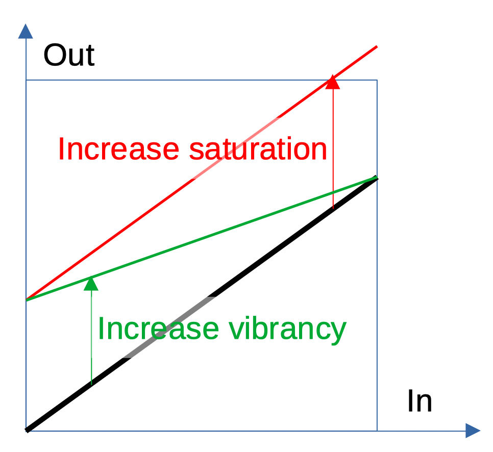
Saturation:
- muted colours get the same boost as vibrant colours
- boosting saturation can lead to clipped colours
Vibrancy:
- muted colours get a boost while vibrant colours don’t
- reduced risk of clipped colours
Note: This is just a model that helps to understand the difference, illustrating it with increase of saturation and vibrancy respectively. The box is in arbitrary units, not 0-255.
1 Like
And thats really interesting, I wanted it to look less contrasty the farther away the sky is, as @platypus thankfully described. But in genereal you are right.
Please note that my changes were made in less than a minute. DXO is so user-friendly 
If I’d further think about I would do the acre a bit more saturated and contrasty 'cause this is what the picture is also about - the acre.
1 Like
Can I ask if everyone commenting on Joanna’s “steam tractor” photo using a calibrated monitor? We ought to be seeing the same thing, before we start editing.
Also, for anyone who doesn’t know about steam engines, what comes out of the smokestack is smoke, which increases and gets darker when the engine works harder. Of course, smoke can be lighter or darker too.
And a question for Joanna - was the original photo you posted up above straight from the camera, or had it already been manipulated?
(I’m not going to do much.in PL5 or here for a while - I just had my eyes dilated for an eye exam.
And I can see your point, but I would still have made the gradient a lot smaller. You are only seeing the part of the sky that is visible above a tall hedge 2+m, so most of the less contrasty stuff isn’t actually visible
Hmmm. I’ll have to play with that, but it was a fairly flat light on the day with 100% cloud cover.
Hey fella - this is an English engine. It’s either a funnel or a chimney 


It was just opened in PL5 and the default optical corrections automatically applied.
So it’s a case of blur, blur, blur instead of blah, blah, blah 
i took some time to make mine:
two of them.
plv5 and filmpack 5 elite.
no clean up of poles or spickles.
sky, shadow steam engine
blue tractor
gras,
front plough blue.
Steam Ploughing.nef.dop (32,6 KB)
(need to say on my benq screen the shadows are open:)
I tried to keep it a bit “soft”. lowered the details in the gras, enhanced tractor left,
lifted shadow and enhanced sky details, two people in front lowered some exposure to blend them in more and as bonus more color and contrast to enhance detail in the rivets
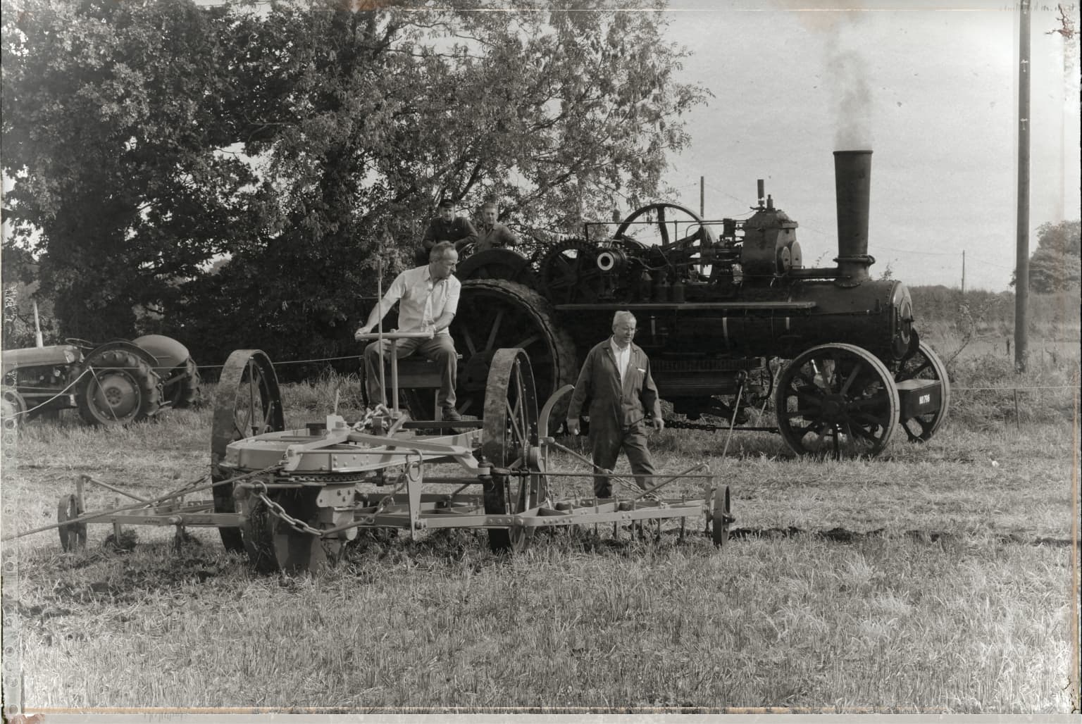
B&W well it seems to fit.
Peter
(ps, from this point i would use exposure compensation to make the hole image shift brighter if needed like this: (histogram centred which gives a more "sunny"day look not worse or better just brighter.)
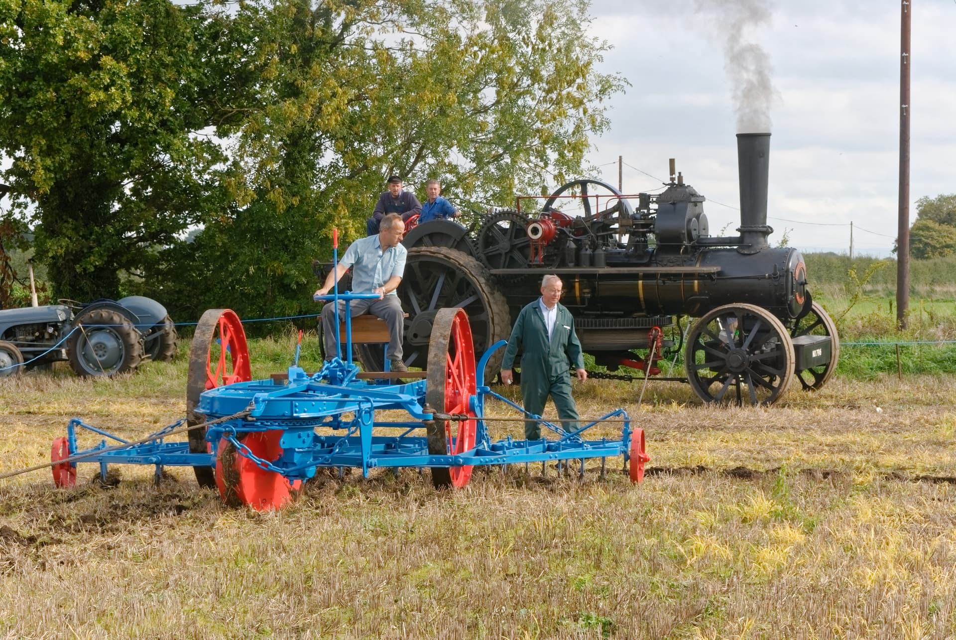
Gosh, to me a funnel is what I use to pour oil into an engine, without spilling it all over, and a chimney is what Santa Claus uses to bring us presents. 
The first time I saw that word, and ploughing, I thought they were typos… Me bad!
(how quaint!) 
I love your black&white version. It looks more real than the color versions, and it could have been created for real by your great grandfather when they were just ordinary machines, that most people saw as just a record of day-to-day life. The color version looks “too pretty” to be “real”.
I think I should turn off my computer for a few hours, and return once I see things better.
1 Like
Very authentic look, as if you found a old sigarbox of granddad with some pictures in it.
Hou did you liked my edit? I was a bit overboard with local adjustments but somehow i find it very easy to globally edit a image in locals.