Editing high dynamic range images in PhotoLab 5

You are right; but for covering the focal lengths from wide angle to telephoto in one lens, no matter what the numbers give, ours both give astounding results when used right.

What’s more, there’s the avoidance of dust on the sensor because you don’t have to keep changing lenses :stuck_out_tongue_winking_eye:

2 Likes

Thanks for your thorough explanation! – It just takes some exercise with Control Points / Lines how and what to include / exclude in the mask / selection.

@StevenL, maybe you can talk to the “webinar masters” to bring this up and show in more detail how to.

Later today, I will need to ignore your .dop at first, and try all the (magical) tricks you manipulated to get that effect. You brought out the buildings in a way that I tried, and failed, and then brought the clouds back to looking realistic.

I’ll be busy for a few hours today, then I can try to repeat what you did, and at some point I then want to study your .dop file and compare it to what you did. I guess I’ll have lots of VC’s.

I see we’re all learning, you included!

Oh yes. Thanks to you, I have to keep on learning :stuck_out_tongue_winking_eye:

That applies to me in so many ways…

Thanks to you, I have no idea what to use for my “carry-around” lens on my D750. Maybe the reason KEH had it for sale, is because the previous owner recognized how blurry it is at the right. I spent the past hour or so on the DxOMark website https://www.dxomark.com/Lenses/ and were I to sell this lens and buy another, I have no idea what I could get that is comfortably small and light, and covers a range of 24ish to 85ish. I got out my very old 35-70mm f/2.8, which is quite heavy, and compared to my new Nikon, this old lens is not sharp, and seems to have greatly reduced contrast. I could bring my 24-85 to my camera repair shop tomorrow, and ask if they can correct it, but I suspect that would involve fully disassembling the lens and rebuilding, and before I do anything I should test it more at other focal length. For years, I just carried around my 50 and 24mm lenses, but I never examined image the way I do now - PhotoLab makes it so effortless!

I suspect the best thing to do for now, is ignore all this, and accept the image I posted here as an example of what I can get out of this lens. Or, put the ultra-light 50 back on the camera, and accept the roughly 45 degree field of view.

1 Like

Joanna, I knew you’d want to see this first thing in the morning, and I’m curious to see what you, and Helen, think about it, and for that matter everyone participating here. First time I’ve walked down to the Baywalk walkway, that wraps around Biscayne Bay, with my new tripod. I followed the suggestion to use my Live View, not my viewfinder. I wasn’t sure about the exposure, but it “felt” right. I started taking photos early, and continued until after the sun went behind the buildings.

PL5 behaved itself long enough to create the Export, then crashed. Again, I got the “crash dump” that nobody is asking me to send them.

I tried two Control Lines, one positive, one negative, like what I see Joanna do, but I’m not sure if what I created made the best use of them. I wanted some details in the buildings, I wanted detail in the boats, I wanted no blown highlights, and while I would have liked some reflection in the water, but with the sun just ready to hide behind a building, this was all I could get. I corrected the distortion from the camera pointing slightly upwards, and I played with the sky to make it blue on the top, and a beautiful orange glow at the bottom, near the sun. Since I used my 24-85 zoomer, the right edges lacks sharpness, but the middle makes up for it. For unknown reasons, the left edge in the un-cropped image is sharper than the right edge. Oh, and the tripod worked perfectly - easy enough to carry there and back, and the camera was rock solid up on top. It didn’t even take a bite out of my finger today. Sorry Mother Nature didn’t bring me many clouds, but for testing this was fine. I did use DeepPRIME, expecting the process to crash - but it was nice enough to not crash until it had done the Export. I guess it was exhausted at the effort.

I’m not satisfied with the buildings - Joanna has a technique to make them stand out more. On the other hand, this is what I saw with my eyes. This is a new spot for me to shoot from - I used to avoid it because the sailboat at the right stands out so much, but it’s a pretty sailboat so I actually like this spot more than the others. I’m pretty sure the exposure was at least acceptable. I never messed with the water, so hopefully it looks real.

I feel like I did in school, when I thought I knew all the answers to a test, only to learn the next day that I mis-understood some of them.

_MJM9652 | 2021-11-07.nef (24.9 MB)

_MJM9652 | 2021-11-07.nef.dop (16.0 KB)

Variation…


_MJM9652 | 2021-11-07.nef.dop (15.7 KB)

First of all, let me say congratulations, the exposure is pretty good and certainly allows for plenty of wiggle room for adjustments at both ends.

Now for the nitty-picky things that I feel would help make it better.

Unfortunately, you’ve not quite got it right yet :wink:

That’s all well and good when you can overcome not seeing detail in shadows by shading your eyes from the bright light but, with an image, whether on screen or printed, you need to make it possible for the viewer to see stuff a bit clearer.

Here’s how you masked the buildings…

The line is a bit too high and the transition too long. Don’t forget the selection is only 100% from above the blue-ringed tool. This is not like a standard grad filter, the effect is determined by the placement of the pipette, the grad is just there to ensure there isn’t a hard line where the filter ends. And here, you have also not placed the pipette in an area of interest, it needs to be more on the subject - in this case one of the buildings.

As you should be able to see from the above image, the mask on the sky is beautifully dark, meaning it is excluded from any adjustment. Instead of adding a negative control line, I just played with the Luma selectivity slider on the primary control line…

Capture d’écran 2021-11-08 à 11.23.51

This is entirely down to the lens. I am guessing it may have taken a knock at some point in its history - this isn’t usual if it were just an inherent softness.


The zone around the sun isn’t necessarily over-exposed but the markers still show…

And if you look more closely, you will see that the edges of the masts, rigging and some buildings are marked even though they are far from over-exposed.

This is more due to over-saturation than simple over-exposure. And here is how to get rid of it.

  1. Go to the Colour Wheel, select the yellow dot and click on the pipette in the middle…

    Capture d’écran 2021-11-08 à 10.56.26

  2. Click the pipette somewhere in the middle off the blown area…

    The selected colour range in the palette will change to reflect the area clicked on…

    Capture d’écran 2021-11-08 à 10.54.30

  3. I reduced the Saturation to get rid of the marker colours - I found it took just -9 on the Saturation slider (sometimes you might need to play with the Luminance slider as well)…

    Capture d’écran 2021-11-08 à 10.58.57

    Sometimes the colour range isn’t large enough to select all tones of the required colour and, as I did, you can move the inner dots to increase or decrease the range…

    Capture d’écran 2021-11-08 à 10.58.57

    The outer dots are for changing how much “overlap” you want to adjacent tones and are useful for making the transition smoother or sharper.

    The single dot on the outer ring allows you to change the colour selected, either subtly or, by doing something like this…

    Capture d’écran 2021-11-08 à 11.06.57

    … you can create something truly horrendous like this…

    Needless to say, unless you are expressly changing a colour on a more definite object, subtle is better :crazy_face: :stuck_out_tongue_winking_eye:

So, you need to do a couple of things:

  1. with the Control Line tool, learn where to place the pipette and make better use of the selectivity sliders instead of going straight for a negative line/point.
  2. with the colour wheel, learn how to manipulate the selection, using the pipette if necessary, and adjusting the range of colours included.

There! That should take you all of half an hour :grin: :nerd_face:

Here’s an export of my version…

And a second with the flare on the buildings nearest to the sun lessened…

And here’s the DOP with your version and both of mine…

_MJM9652 | 2021-11-07.nef.dop (51,9 Ko)

2 Likes

I got up early as I have two appointments this morning. I read everything you posted, and I think we have moved on to a higher level. Before I even look at your .dop, I plan to do everything you did, starting at the beginning, and hopefully work at it, following each step, until I accomplish the same result. There’s a lot that you said that while it makes sense as I’m reading it, I never properly understood it - I knew I was missing something. If I can repeat what you’ve done, I should be able to do it on my own with my next photo. Once I learn it, I’m off to the races!

Only one question - does the reflection of the sun from the buildings add or detract from the image? You minimized it, but I thought it exaggerated the effect of the setting sun. ??

I need to think about this - in a small size, what you did looks awesome, but I prefer capturing some detail in the boats and buildings. I prefer Joanna’s end result, as it improves the sky, but I can still see detail in the other areas. If I was creating a poster for a movie, I would prefer yours - less to think about, and the main effect, the sun, takes the spotlight (literally?).

In a word - yes :rofl:

That has to be up to you. I added the flare reduction to show you how to do it if you wanted. Personally, I like the flare in this image.

@Joanna excellent post and very detailed on the control lines. Haven’t found the time to look into them properly yet but they certainly look useful.

I have a few old sunset and sunrise pictures I may dig out and play with when I have the time.

Feel like I’m having to relearn PL all over again after skipping PL4 but your posts are certainly highlighting the usefulness of some of the features.

@Joanna green blinky shows saturation red channel.


Your green is directly opposite of red.
So not luminance but saturation.
Use the colorrendering slider, saturation protection to correct that and leave exposure as set.
Try to balance contrast and vibrance and such.
Or just keep it 100% saturated and ignore it.
:relaxed:

Interesting. I shall investigate further. Thanks

There’s always a decision to take between details or overall expression.

Imagine a museum hall with pictures on all walls…which image will immediately get your attention? Pay a visit to a museum or art gallery and then remember what took your eye and why, the latter being more difficult to answer.

I tried this, found I needed about 85 to get rid of the green, and just get a very unsatisfactory, insipid, low saturation image…

In the end, I suddenly noticed that Mike had overcooked the Vibrancy at 31. I reduced that and the green marker went away.

However, personally, I like using the Colour Wheel because it allows me to have higher Vibrancy all over and just tame the offending colour (in this case red/orange/yellow). So I reset the Vibrancy back to 31 and kept the Colour Wheel change.

But thanks all the same for yet another tool in the box :sunglasses:

Addenda

I just tried something else.

Mike had also set the colour temperature to around 10,000°K, so I reset that to 5600°K and then I was able to set both the global Vibrancy and Saturation to 100; then I broadened the orange colour wheel section and was able to to get a really strong colour without over-saturating…

All of which led me to wonder if I could improve the reflection of the sun in the water.

Well, I did and here is how I got there.

First I placed a Control Line to cover the water and placed the pipette on an orange bit of water…

… then I tuned the selectivity…

Capture d’écran 2021-11-08 à 16.45.27

Finally, I added another Control Line on the water and selected some darker blueish water with the pipette…

… and set the selectivity…

Capture d’écran 2021-11-08 à 16.51.28

This then gave me the following export…

And here is the DOP with an extra VC for these changes…

_MJM9652 | 2021-11-07.nef.dop (71,4 Ko)

1 Like

I was confused by the colors of the blinkies in shadow and highlight.
Black is all fully saturated rest seems to be opposite color of the colorwheel.
I believe in the manual is some written about the colors of the blinkies.
What i mostly do is use blue want in saturation protection and when i have blinies i check of it’s active. (higher then default. ) this means i pushed colors or contrast too much.
Then see which color it is, check FRV’s channels and, see if i can work around it by local corrections.

inspired by @platypus & @Joanna


VC4 → _MJM9652 2021-11-07.nef.dop (73,1 KB)

Different to Mike & Joanna I used a reversed control point (radial filter) to serve as a vignette
and the skyline in the back light only got a little boost.
Screen Shot 11-08-21 at 09.10 PM

Ha! If I’m lucky, I might finish in half a week. I’m just now downloading your .dop file, and I will study what you wrote, and what you did. If I said I feel overwhelmed, that would be an understatement. But it’s all good.

Before I stop for tonight, I want to process (maybe) and upload (definitely) an image I took at sunrise this morning. It has a whole new set of challenges, with the sun reflecting from windows. I took two images, one at what I felt was a good exposure, and the other one under-exposed to help control the reflections. Even the under-exposed image has blown out reflections in the windows from the rising sun. I underexposed by -1EV, and I’ve just noticed that the right side of the image is really very blurry - I called Nikon today to ask what to do, and I have already sent them one image - need to send this image, but the email limit is only 20 megs…

I have a feeling you’re going to give up on this image as un-fixable - I’ll post it here now, but I’m not going to work on it - I need to study and learn what you did on the previous sunset photo.

_MJM9669 | 2021-11-08.nef (25.9 MB)

Joanna, is there any way that you can add your name and a date, into the .dop file? I now have the (M)aster, VC1, VC2, and VC3. If I look at all these a month from now, how can I tell who did each one? I’m pretty sure your version is VC2, and VC3 is by Wolfgang.

OK, back to work.

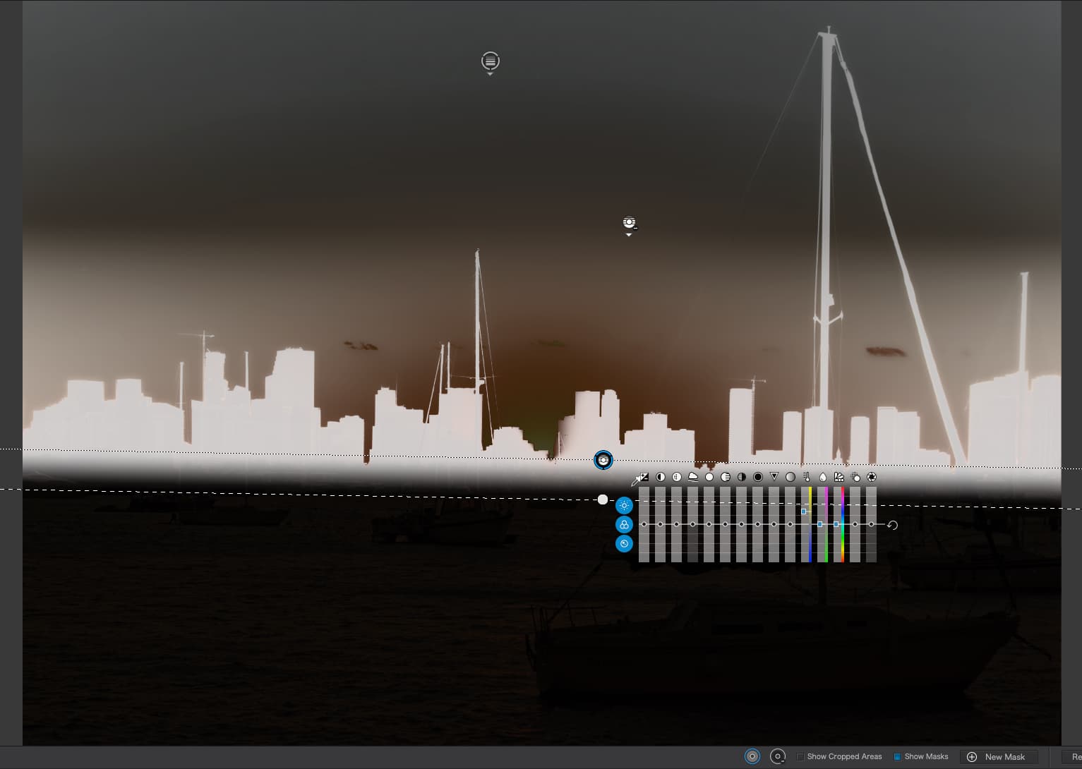
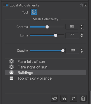
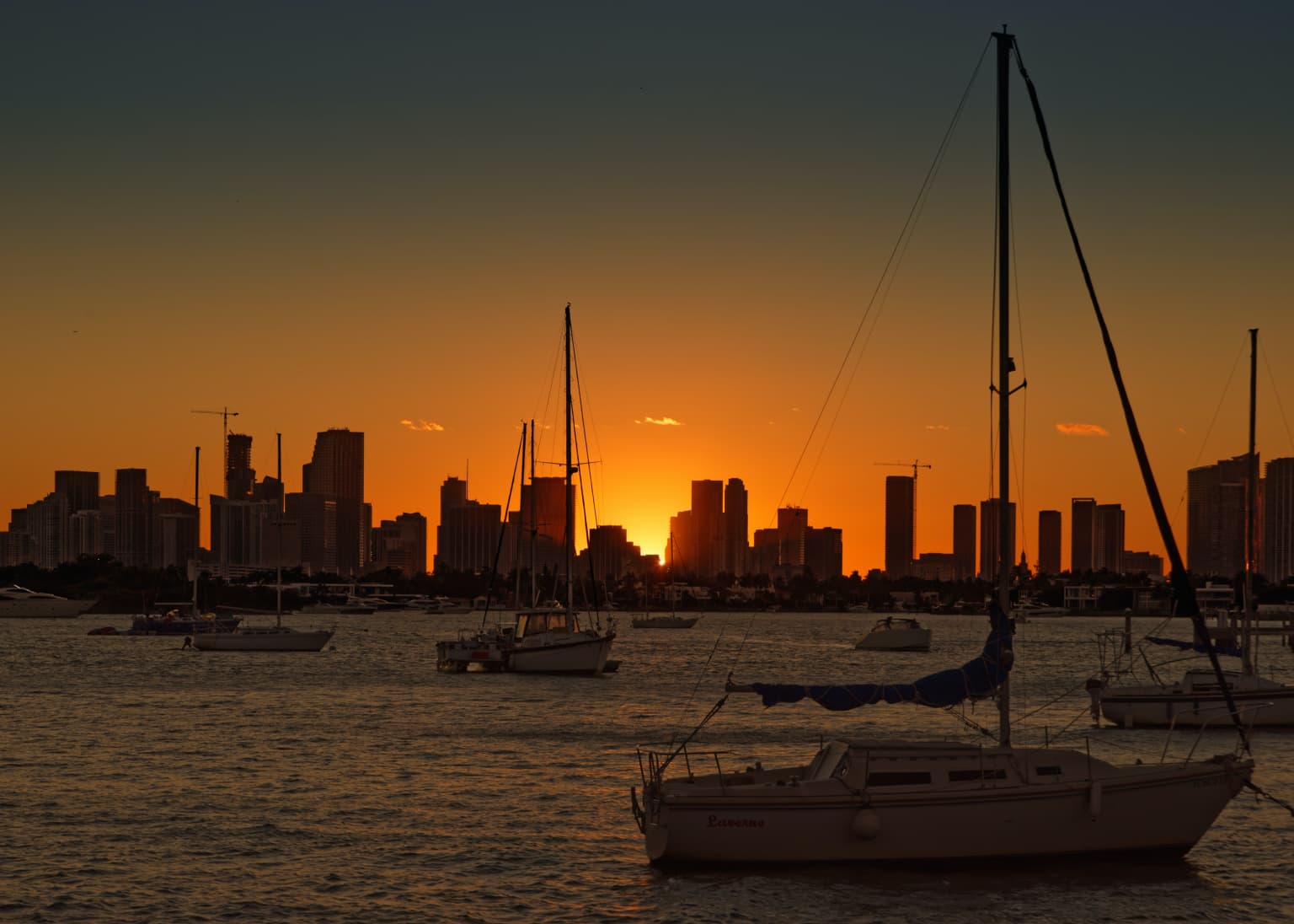
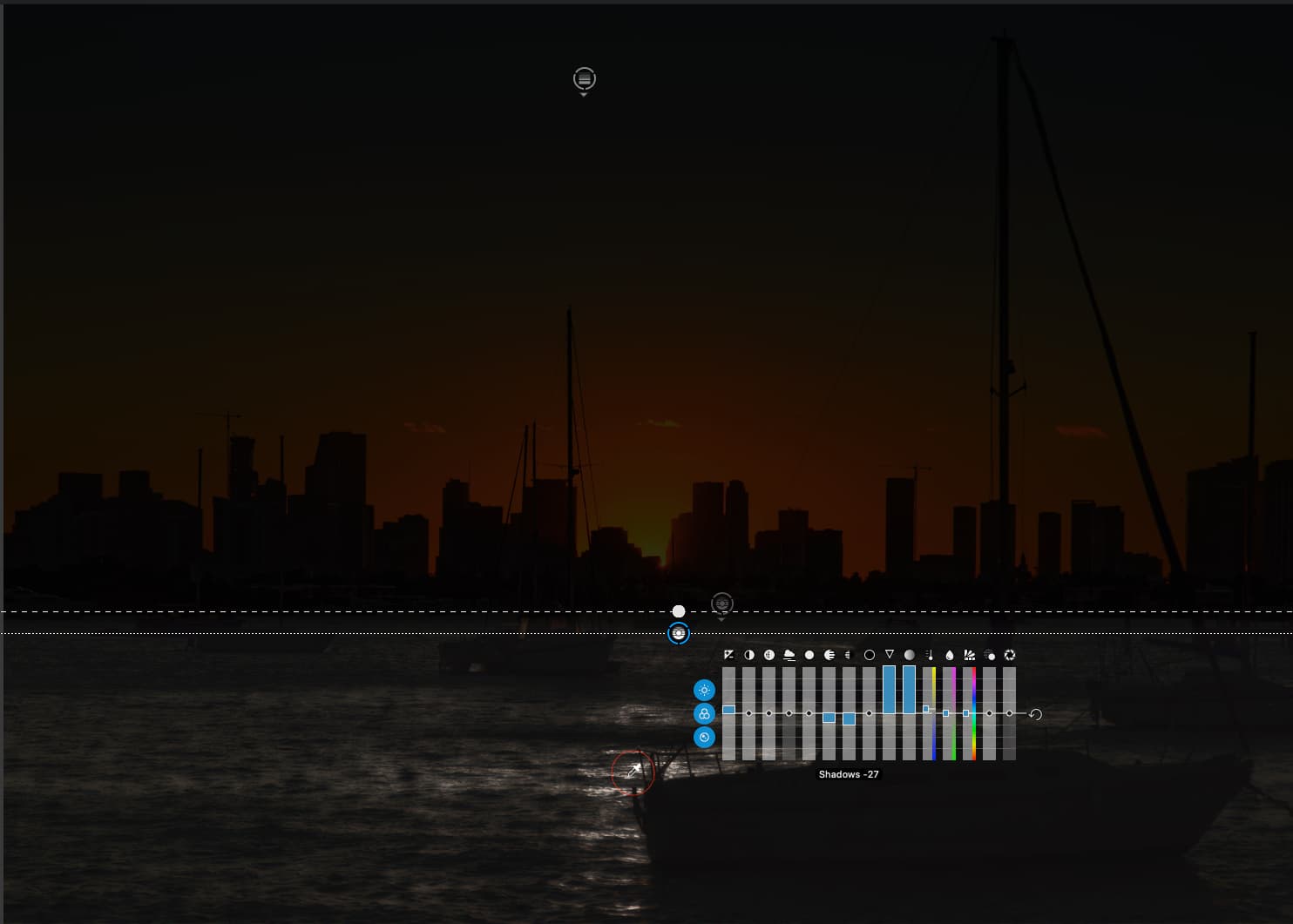
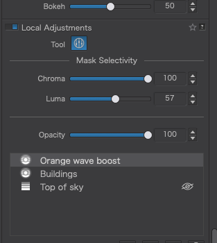
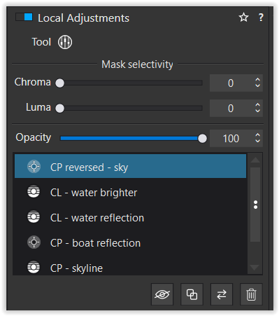
Control line to brighten up the buildings.

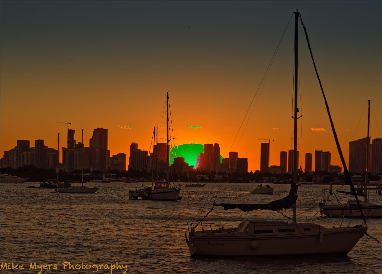
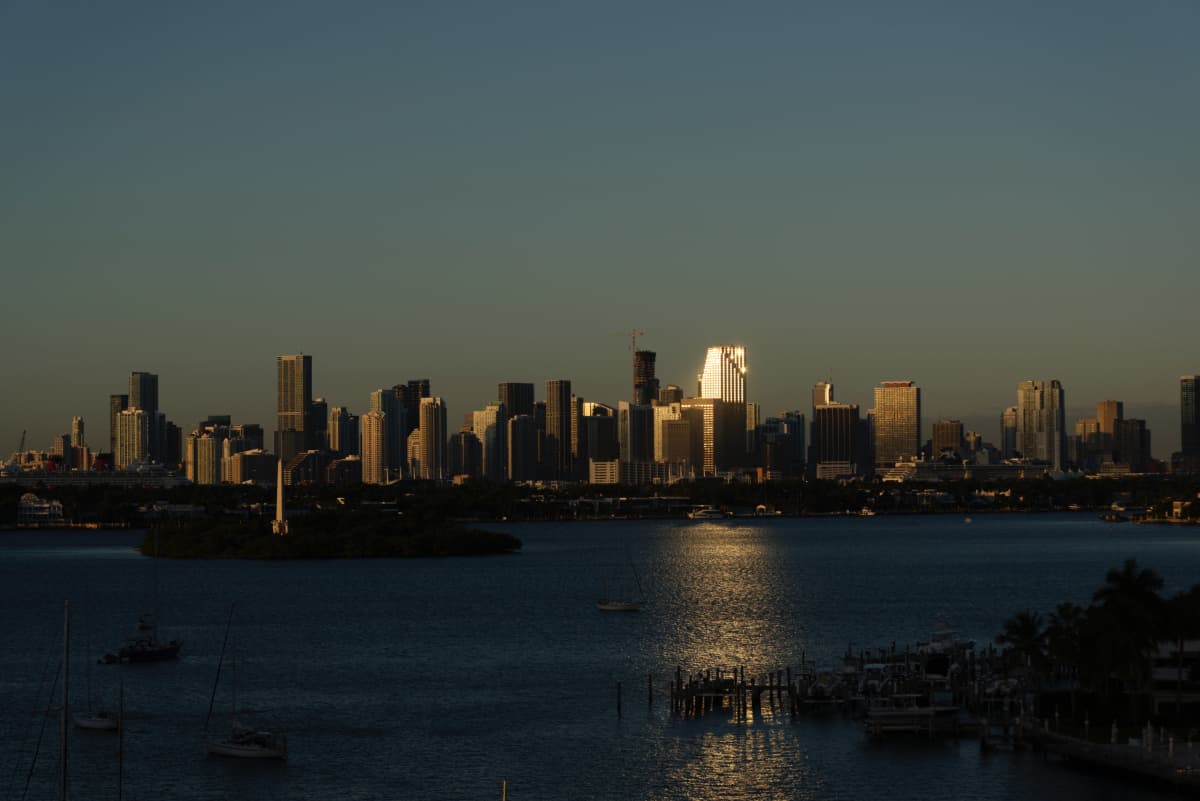
I can start the line just above the shore line, and drag down just a little, so now I have two lines.

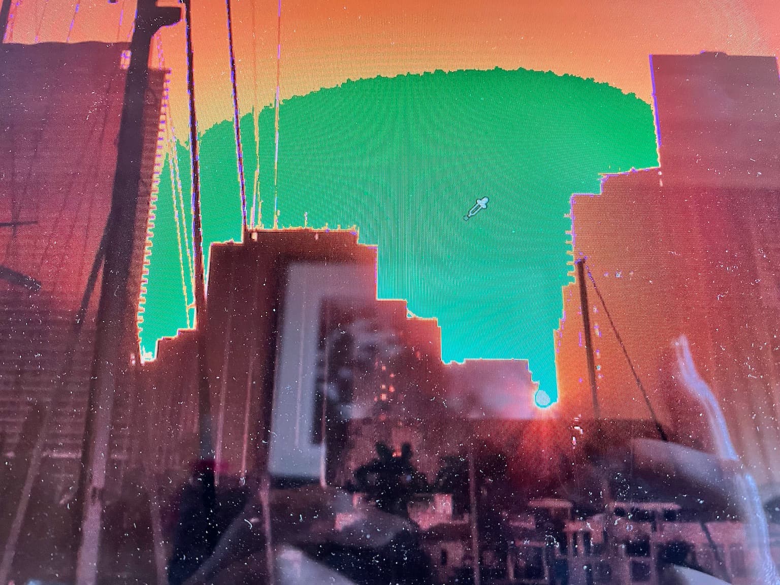
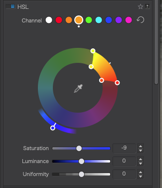
I place the pipette on a dark building.

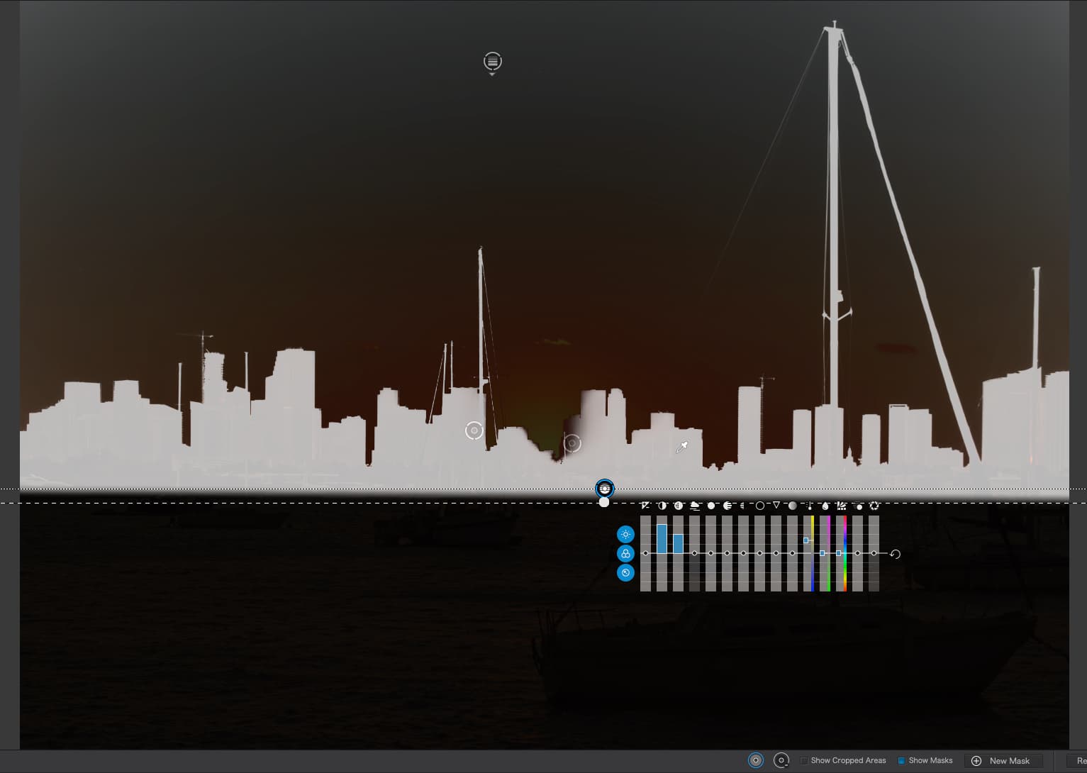
With the mask on, the buildings are white and everything else is dark, so I can change the brightness, or color, or sharpness of all buildings at once.

Question - why did you pick that spot just above the shoreline for the start of the Control Line, and you made the second line appear just a little below the top line. I understand why you placed the pipette as you did, but why did you pick the “start” and “end” of the control line, resulting in both lines just a little apart, appearing under the buildings as you showed?

Once you’ve done that, I understand you can brighten or darken all the buildings at once.

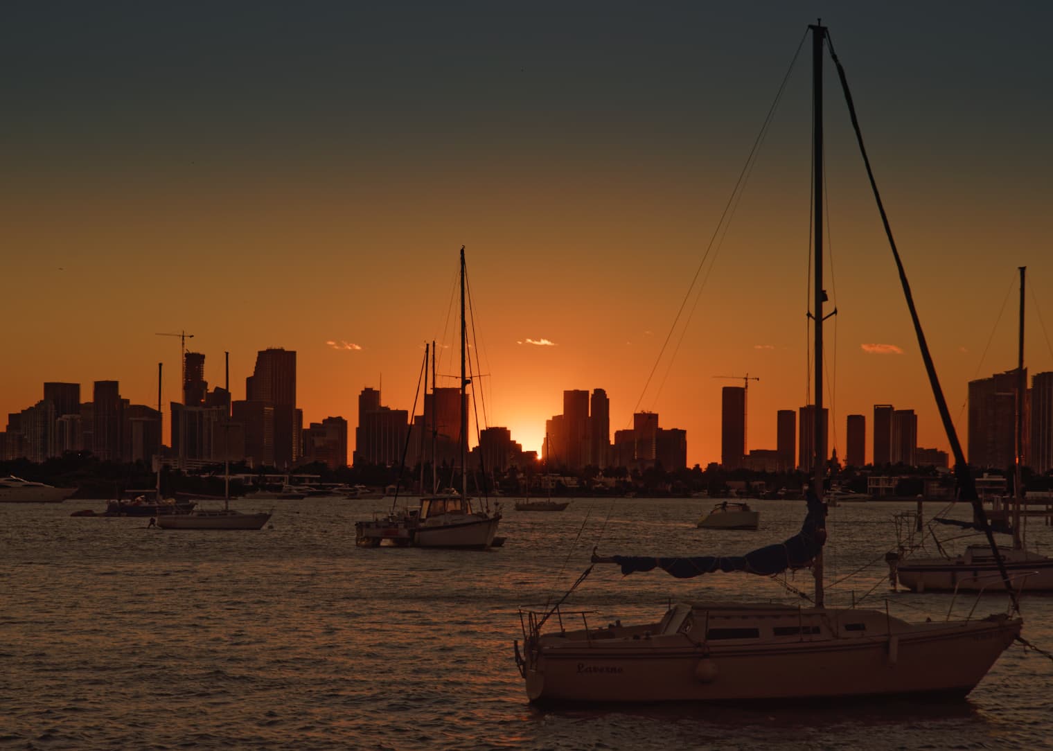
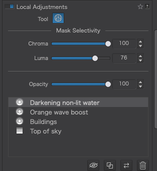
Suppose I wanted to whiten the hull of the sailboat near the bottom. If I’m right, this can not be done wit a Control Line, only Control Points.

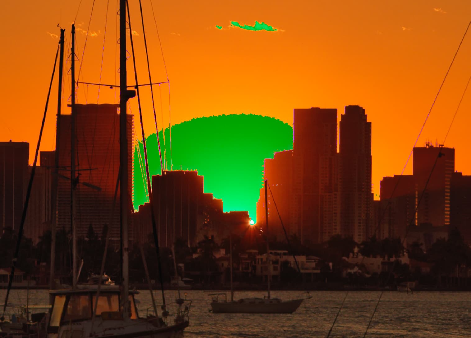
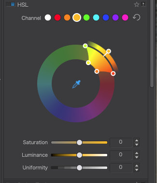
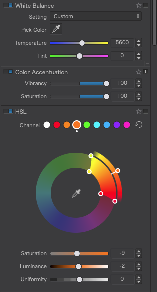
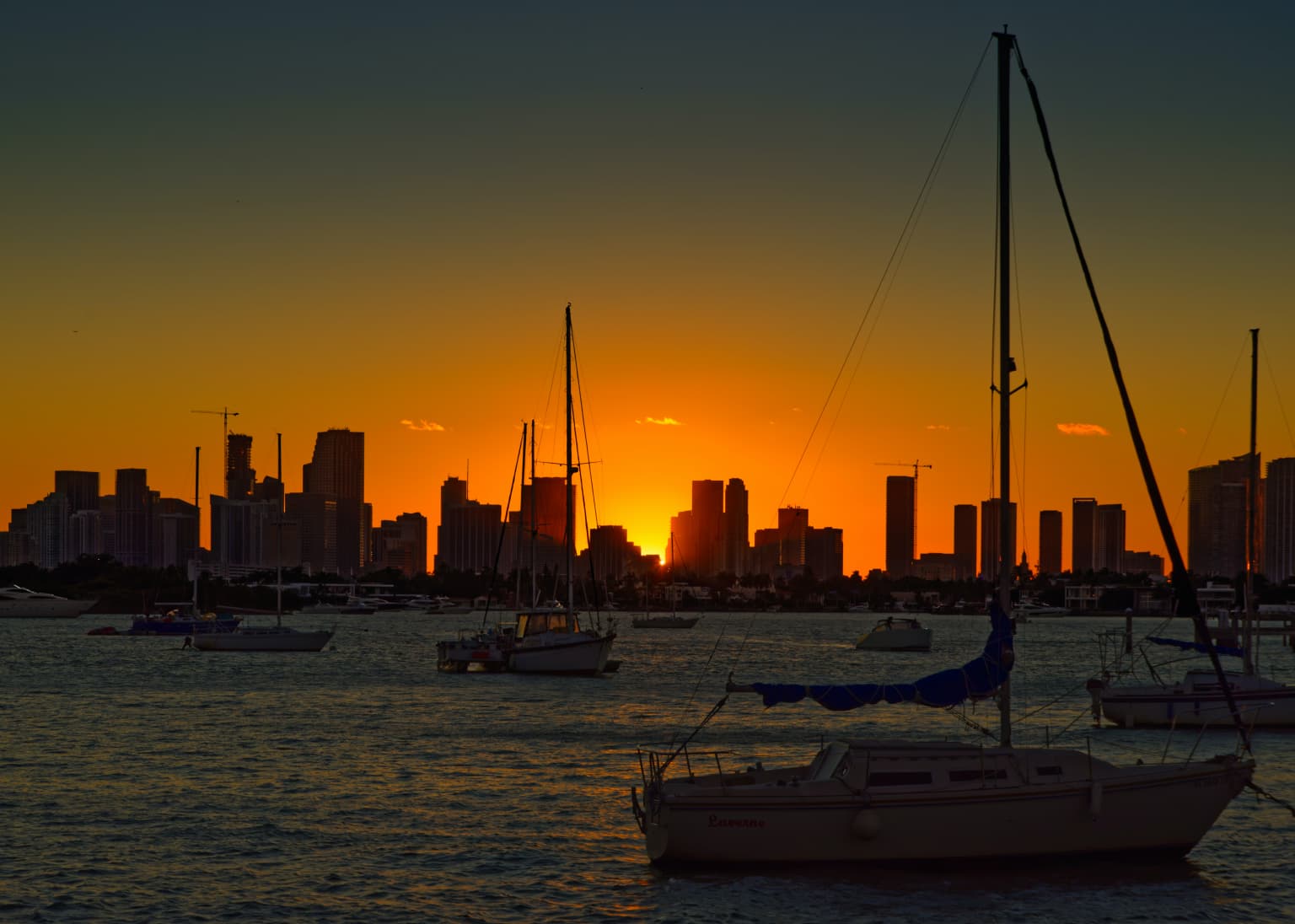
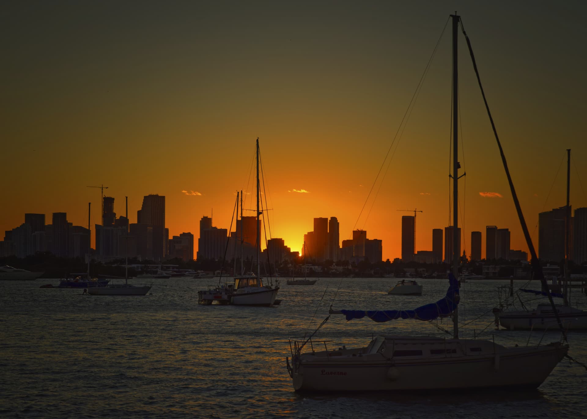
Someplace Wolfgang mentioned a “radial control line”, actually “radial filter” if I remember correctly. His post up above, which I guess is now VC3, looks like it “should” be the most accurate, as it wraps around the sun, but in reality it should be an oval shape, which how the sky looks near the sun (as opposed to round).

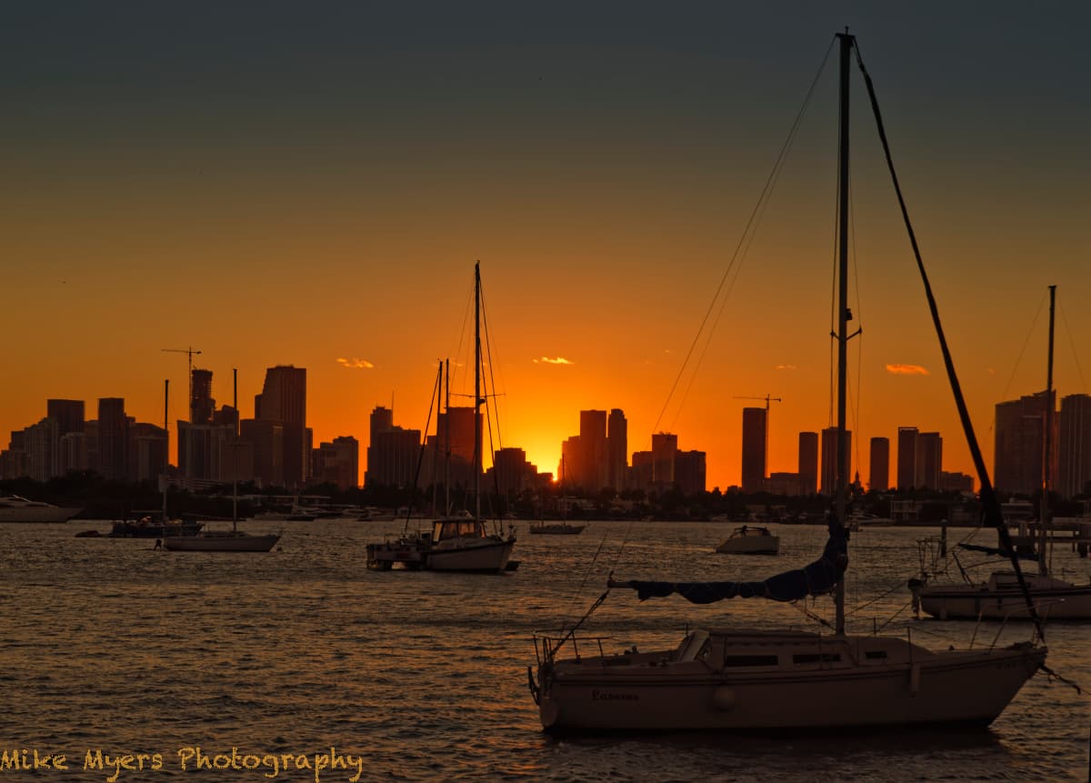
I was thinking a long exposure might make the water more interesting, but the boats and masts would all be blurry, so that’s out.

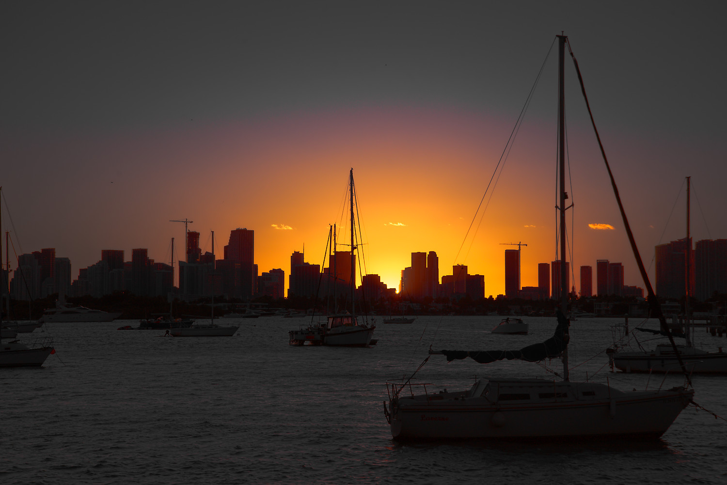
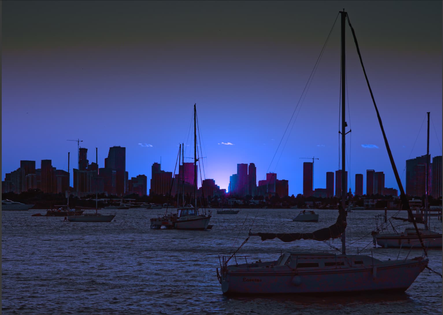
Finally, as I stare at your image (VC2) up above, shown in front of a white background, all the work you went to to bring out the detail in the buildings, and boats, is sort of wasted, as what most people will see is a silhouette. As an exhibition print, what you’ve done is marvelous, but I think it suffers when I sent my images to people using email. The only fix I can think of is a big, wide, dark gray picture frame around the images.

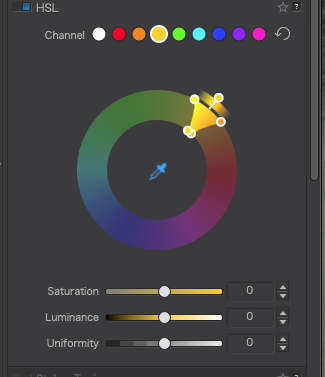
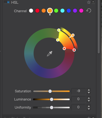
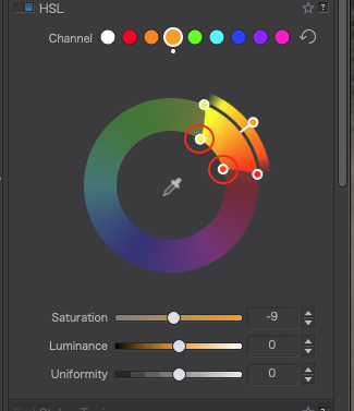
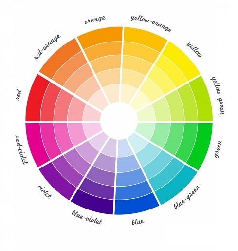
Thanks for spending all the time that you did posting your changes step by step - it eventually mostly started making sense to me. Thanks also for the explanation of the HSL color wheel. It is slowly starting to make sense to me as well.