Please elaborate. My Df and D750 are both full frame.
Nikon D750 was introduced to market in September 2014 and Nikon Df was launched in December 2013.
Detailed comparison:
The D750 is essentially the same as all the recent Nikon DSLR cameras, some of which had far more resolution, others far greater speed, and so on. The Df is one of a kind - using it reminds me of Digital from long ago, but to be truthful, it includes most of the necessary software. The biggest single difference to me is 16 megapixels vs 24 megapixels. In my hands, the D750 feel like a tool, while the Df feels more similar to my Leica.
For this photo, because all the buildings and fine detail, I figured the sensor with 24 megapixels might be preferable. Since I thought I wanted more of a telephoto, my Leica with my 90mm lens didn’t “feel” like enough.
(I can buy a Nikon to Leica adapter, and put all my Nikon lenses on my Leica M8, and shoot in manual mode. I could buy that adapter tomorrow, and I already have the Visoflex device that will allow the Leica to be used as a DSLR. …but why buy it, when I can just use my Nikon??)
I feel the larger the sensor, the better. I can’t afford to think that way, and getting another camera system is probably not one of the brighter things for me to do.
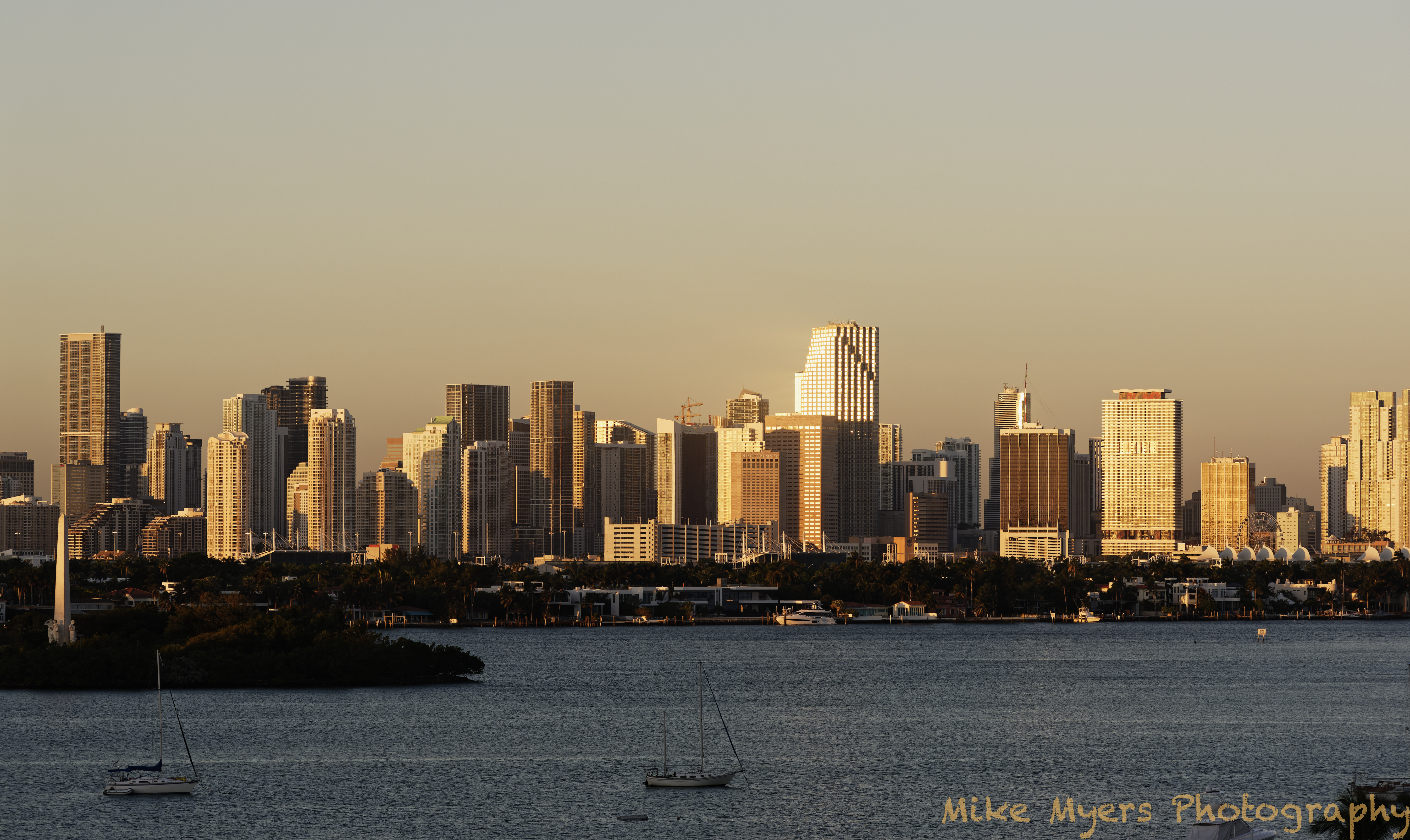
I said I would try to catch the golden lighting of sunrise, and I got my chance this morning. I got up a little before 7, and while it was sort of light outside, the sun hadn’t gotten high enough to light up the city of Miami. I took a series of photos when the sunlight just reached the buildings, but I wasn’t satisfied. Out of 25 images, this one is the only one that caught “the magic”. If you check the tower on the island, the sun wasn’t high enough yet for the sunlight to reach the bottom of the tower, and in the city, the boats have just started to be lit up by the sunlight.
Maybe I am hopeless at this stuff. I am getting much better to use the tools to show what I saw with my eyes, but everything I can think of doing would be fake. The sky color is accurate. Too early for it to be a bright blue. The trees and vegetation hadn’t started to look green yet. I couldn’t get the color of the image to look right, until I set the white balance using the sailboat at the bottom left, and bingo! Just what I saw. The whole image is just a tad darker than what I saw, but what I remember from this morning was only the buildings were brightly lit up. On some of the windows the sunlight was just glaring at me, like a reflection from the sun. Those areas are burnt out, but they were burnt out to my eyes too. Not sure whether to fix them or not, as what the photo shows is quite real, except that the reflected light was more orange/yellow, not white. I lowered the top right of the tone curve just a tiny amount, and PL4 no longer shows them as burnt out.
It seems like everything I might think of doing to make the image prettier, would destroy it as a record of what the city actually looked like to me.
I’ll upload the last photo I took this morning, same scene, a few minutes later, when the light had by then lit up the trees, houses and so on, BUT the beautiful golden glow I saw in my eyes was vanishing. It’s hard to describe, but what attracted me to the early morning sunshine was going away, and it was turning into an ordinary daylight photo. …and if I waited an hour or so longer, I’d have puffy white clouds in a clearly blue sky.
That was by eye. Because it is sometimes difficult to find a source that you want to appear pure white, especially in golden hour shots where everything wants to have that subtle tint.
This is because the eye has the most amazing post-processing software behind it - the brain. But there are times when the eye can be fooled into either seeing or not seeing what was actually there…
And this is why you need to adjust things in post-processing to make sometimes similar tones seem further apart. When you are preparing to take the picture, the brain does this without you thinking about it. But, looking at a captured image, the eye no longer has the full range of light levels to discriminate between and the perceived result can appear flat and dull.
Scanning a sheet of 5" x 4" film at 2400ppi gives roughly 115Mpx, but if you scan at 4800ppi, you then get a 460Mpx image. A RAW file from a DSLR at that size and resolution would weigh in at around a hefty 1GB!
Technically, the two cameras (even though one is theoretical) should produce the same image. The big difference is that, instead of spreading 460Mpx over an area of 20 square inches, the digital full frame has to cram them into 1½ square inches. Which is when you start to find the limitations of just how small you can make a pixel and whether it would be large enough to capture the light in the same way as the crystals of silver on film.
Oh, and then there’s the fact that LF film isn’t available in anywhere near the high ISO that digital cameras offer, which tends to give a certain look and feel to images where anything that moves is inherently “softer” due to the necessary slower shutter speeds, but anything that doesn’t move becomes incredibly sharp.
Indeed. If you need to resolve fine detail then you have to have the megapixels, no two ways about it.
Which is where you are probably already suffering from GAS (gear acquisition syndrome)
@mikemyers,
Do your camera has a timelaps function?
Set up the camera on a tripod aim and manual focus, choose aperture and iso value.
Activate timelapse mode set up a 50/100 image’s or so and the sequense of say every 5 min? mark the floor where the tripod leggs hit the floor. Go inside take camera with you.
Set alarmclock, sleep, replace camera and tripod on the markers, activate timelaps…
Wait for the first click, and then go back to bed… Camera does the work…
The main difference is that I set the colour temperature to 5600°K, which tends to render the tint relative to “daylight” rather than relative to the hull of a boat that is, itself, reflecting a blue light from the water.
Then I reduced the highlights a tad on the tone curve to ensure that the sunlit widows were no longer burnt out but then I added a control point to the bright windows to give a subtle tint of gold, by changing the colour temperature, similar to the rest of the picture; and I boosted the shadow selective tone just to lift the foreground a tiny bit.
I went for a flat tone curve because there was already enough overall contrast but I did increase the shadow contrast to 100 and the mid-tone contrast by a bit just to put a little bit more detail into the darker areas.
Of course, all this sharpening in the lower tones also served to make the water in the foreground look a little “choppy”, so I applied a graduated filter to the water area, reducing the micro-contrast - a sort of “micro-blur” but not noticeable as real blur.
The big problem with “golden hour” shots is not realising that the coloration that you remember seeing is not necessarily the same as how it was, mainly due to the fact that your brain compensates for the tint by making things appear nearer to daylight than they actually were - think how you don’t see tungsten lighting with the horrendously orange tint that it really gives.
Finally, a pet peeve… Don’t use ‘P’ mode on the camera! It leaves far too much out of your control. Although I did notice that you had used exposure compensation to reduce the exposure by one stop, which just about brought the reflections into range.
Another thing your use of ‘P’ mode did was give you an aperture of only f/6.3, which, although it didn’t matter too much at these kind of distances, can limit what is truly sharp when you have something nearer in the foreground. As a general rule, for most everyday photography, I tend to use aperture priority at f/10, which is deemed to be the optimum aperture for maximum depth of field without incurring diffraction. I call it “controlled automatic” mode
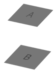
Heheheh. The images come from a presentation I did for our photo club where I animated the disappearance of the rest of the image, so people actually saw the squares didn’t change as the rest of the image disappeared
Since it is obvious that A is darker than B, you must have used special pixels that change their brightness based on their surroundings.
What I really think - it is instantly obvious that I can’t trust what I (think) I see.
Which means that when I write “this what I saw when I took the photo” is a useless statement, as it’s likely not at all what I actually saw, it’s just what I think I saw.
This has all sorts of implications, like maybe I should set my camera to 5600K for daylight, take my sunrise photo in manual mode at f/10, and evaluate the captured image without trying to make it look like what I remember.
Obviously, I don’t “know” what I think I know. If I took paper and pencil, and tried to draw your image, “A” would be darker than “B”, which I now know is incorrect.
Thanks for posting this. I need to do a lot more thinking about how this affects what I (think I) see.
Yeah, it’s all just a dream, or am I just a “program” running in someone’s computer? I love science fiction.
Seriously though, if I can’t see the image Joanna posted realistically, how can I ever write “this is what I saw?” I suppose I can write “this is what I remember seeing”. My mind is stuck on thinking if I can’t see those two squares A and B properly, it is pointless for me to edit one of my photographs to make it “more realistic”. Maybe I should just put the camera on AUTO mode for a while. Maybe it will do a better job of capturing reality. Or, I should get a meter and set the white balance before taking the photo?
I’m wondering why I even edit, if I want a realistic photo. The camera will probably record better than my memory. …but artistically - yeah, the camera has zero ability at that, and you all have been helping me in using PL4 artistically.
Joanna wants me to use (M)anual mode, not §rogram mode. Sounds good, assuming I am capable of setting the camera better than what it is programmed to do. I was happier about this before I saw Joanna’s checkerboard image. Now I don’t know what to think. Maybe I need to measure what I can (metering), set the camera accordingly, and use that for a starting point.
Or, maybe I should accept that the large cylinder in the image is. making a shadow, and accept that THAT is what is throwng my mind off. But for that cylinder and shadow, there would not be any such confusion - so why can’t my mind recognize that when I look at her photo? The whole thing is a “trick”, and a very effective one. It proves to me that I shouldn’t trust what I think I see.
Bottom line, if I know two things are the same color and shade, I sometimes need to deliberately make them NOT the same, so that when viewing the photo, they DO look the same.
Do you have any real-world examples of how you’ve done this?
Ah! It’s taken me this long to realise why we differed on what happens. I thought the filter got flipped from above the lens to in front of it, whereas, it actually pivots. So you are right and I was wrong
Or did you just think you saw what you thought you saw?
I would agree with the first two but the third shouldn’t just be about memory, it should also involve some element of invoking feeling or sentiment, not just cold hard facts, even if they are what you think you remembered.
I wasn’t there but I “felt” the the light reflected in the windows would more than likely have had a tint of gold to it, so that is why I added a control point to give that “feeling”.
It’s the mice I tell you, the mice - and the answer is 42
Noooooohhhh!!! That would be yielding to the machines to tell you what you should be seeing. The trouble with machines is that they are starting to use artificial intelligence; definitely artificial and relying on the intelligence of someone else that told it how to think.
But “thar’s yer prawblem” as a good friend from Tennessee would say. It would only be realistic if you agree with the way the guy who programmed it thought it should look.
Not necessarily manual mode, aperture priority is quite a good compromise because it leaves you in charge of determining aperture and thus depth of field, whilst looking after the shutter speed and you can always let it do automatic focusing. Being able to set the ISO yourself is important because it allows you to decide how much noise you get on an image and white balance - well, you should know by now why setting that yourself is important
You’ve got a perfectly serviceable meter in the D750, which you can use in centre-weighted mode for “snapping” or in spot mode when you want to be more precise in manual mode. That, together with the exposure compensation dial should give you great results once you get used to using them.
Not necessarily but, yes, sometimes.
Not off the top of my head but I’ll think about it.
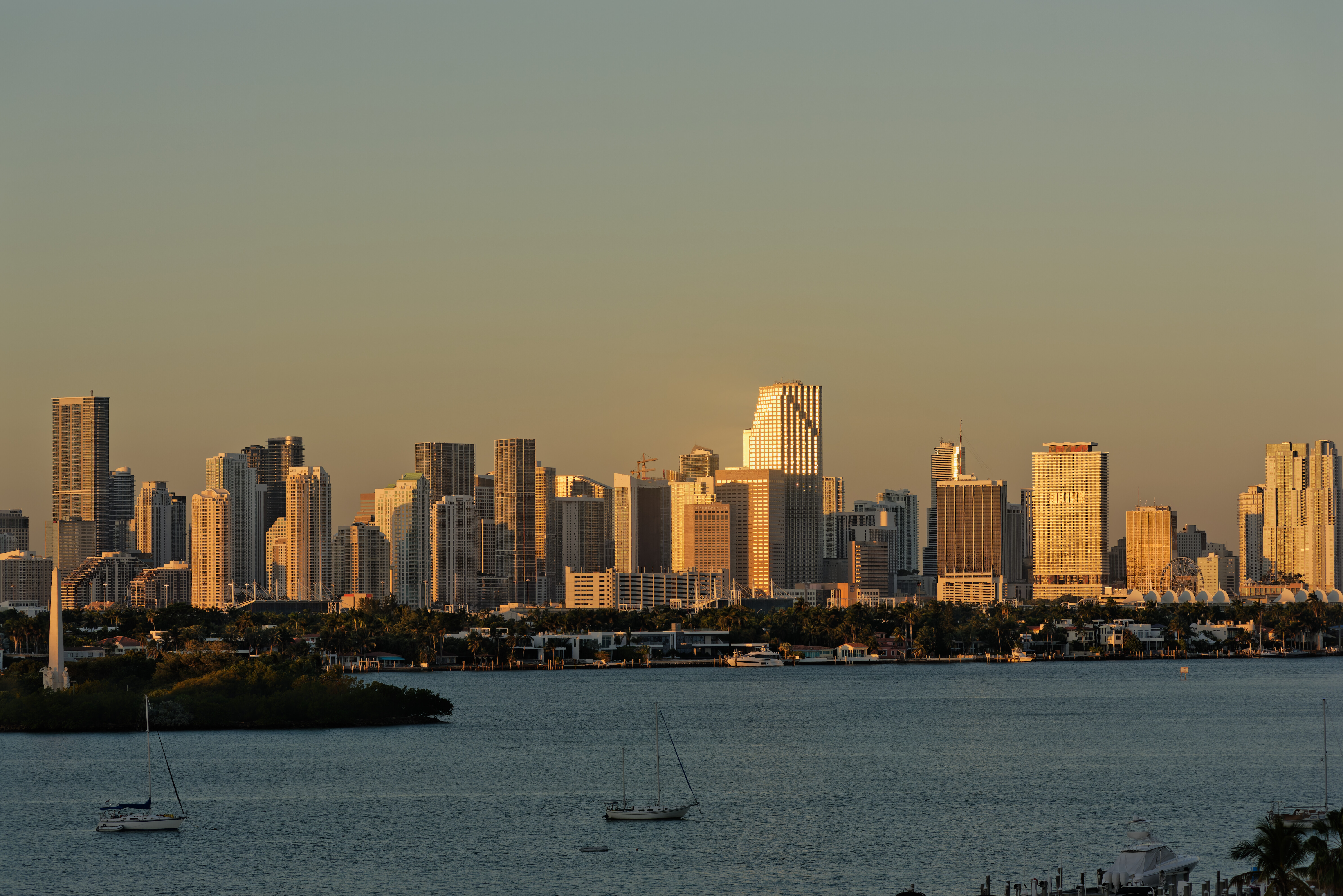
Now, you haven’t yet said what you think of my edit. And if you don’t like something about it, say so. After all, it had to be more imagination than reality for me
I will remember the A/B comparison, but ignore it in my taking photos. If my camera is working properly, A and B will be an accurate representation, and I shouldn’t even think about it.
I will try to capture the way a scene appears to me, even if it isn’t technically accurate.
When I leave my Nikons sitting around, I will leave them in Aperture Priority. I expect to leave the cameras at 5600K. If will select 200 or 400 for ISO, changing it when needed. The camera will select a shutter speed, unless I over-write things. Regardless of the settings, I will evaluate the histogram, and adjust accordingly.
All my cameras are set for center weighted metering, and I check if the histogram looks good, and if not, I adjust accordingly. As I did for the sunrise photo, I took it at the “correct” exposure, then underexposed by one f/stop, because all the glare from the reflections from the sun were probably causing problems. It was just a “gut feeling”.
The lighting in my room is too bright to do this properly, but I’ll try anyway.
The buildings in my photo look too dark. The second, brighter, photo I posted is more like what I saw, so I will brighten up the image tonight. Your buildings appear even darker, which spoils all the golden glow I was trying to capture. Again, the second photo I posted is more like the brightness I remember, but the golden glow was going away by then.
The water in your image looks better.
I can see more detail in the dark areas of your image, which I like.
The buildings - no, too dark, less “gold”, and much less “glow”.
You made the sky prettier, but my “flat” sky is more realistic.
When I put my image side by side on my brighter iMac screen, mine looks brighter than yours, but yours looks more “golden” which is good.
If I was going to post one or the other today on my gallery, I like yours more, but neither image makes the skyline bright enough…