Does PhotoLab 5 have an option which can take a captured raw image, and convert it to a black & white image?
I just did it manually, taking a color image I had taken of the storm weather before Hurricane Ian hits, and using a Preset to convert it into B&W, then using the usual adjustment tools within PL5 to get something I liked.
There are lots of presets I have access to. Or, I suppose I could simply open my raw image, and simply remove the color.
My goal is to create the best B&W image I can, using my Leica M10, rather than spending the multiple thousands of dollars to purchase an M10 Monochrom. I don’t expect the image to be instantly perfect - I assume I’ll be playing with the settings, the way I just did.
I’ll post the image I just worked on, but I’m hoping there is something I can click on, to simply do a basic conversion from color to B&W, which would just be a starting point for any additional editing.
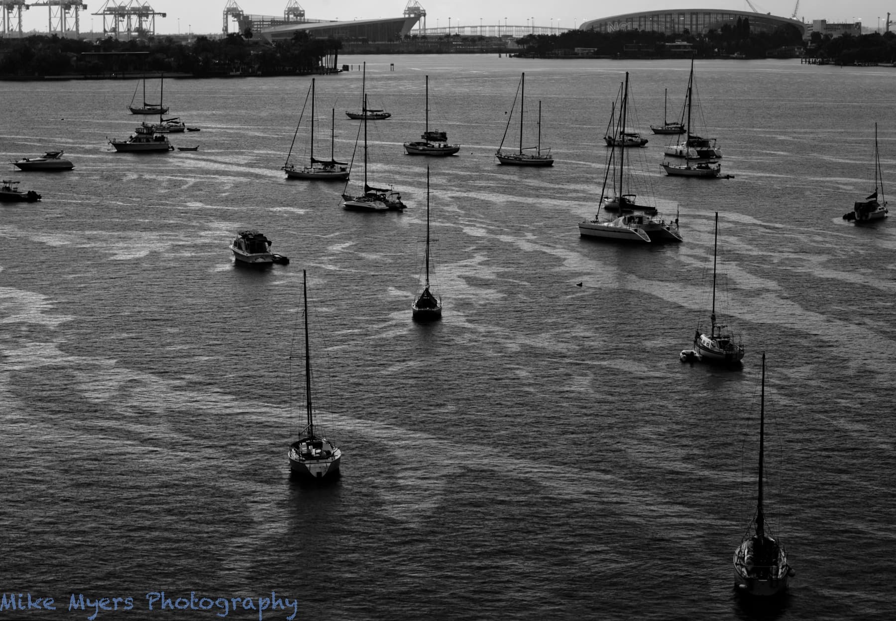
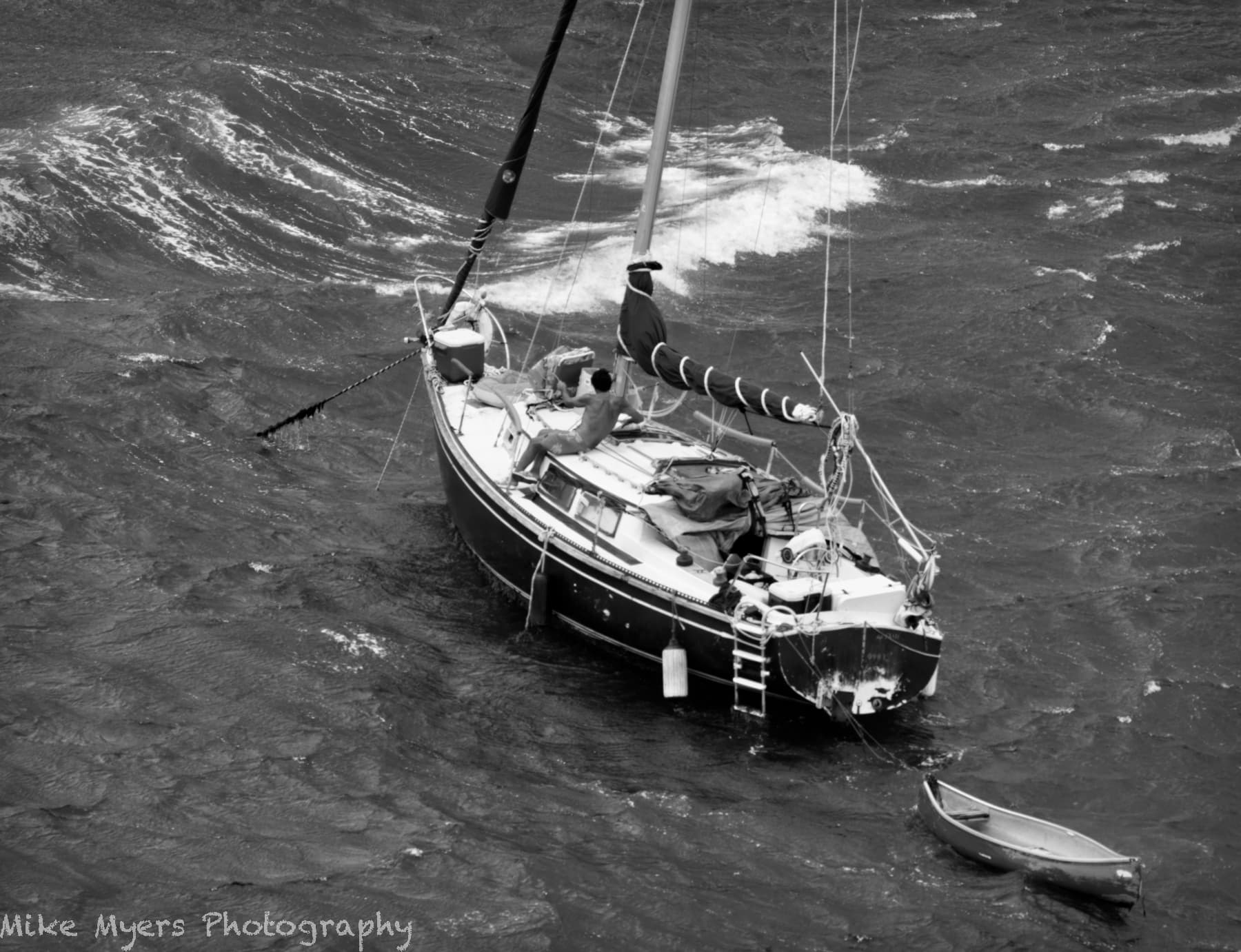
It’s not a very pretty picture, and maybe it’s even ugly, but with this Hurricane Ian ready to tear Florida apart tomorrow, this image does show how I felt. I wanted it to look “dark” and “menacing”, and definitely not “pretty” or “beautiful”.
It took multiple attempts just to capture the patterns in the water, which seemed to vanish just as I was about to take the next photo.
In my case, a standard ‘dng’ file created by my Leica M10. I can change the settings so the M10 shows me the image in B&W, and captures a jpg image in B&W, but none of this changes the standard ‘dng’ image which will always be in full color.
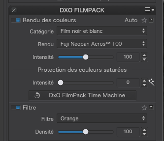
I have a standard procedure to convert to B&W and that is to select the “Fuji Neopan Acros™ 100” preset from FilmPack as a starting point, simply because it is my favourite real film fo MF and LF work.
Then, for this particular image, I added an orange filter, which is what I would have done with a film camera, to bring out the tonal separation.
If I wanted a more “threatening” rendering, I would use the red filter…
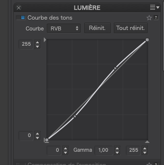
A little work with the tone curve…
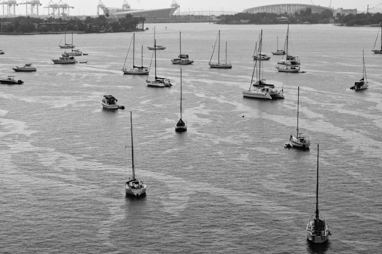
… plus a bit of fine contrast and I get this screenshot…
Stenis
(Sten-Åke Sändh (Sony, Win 11, PL 6, CO 16, PM Plus 6, XnView))
5
Not so long ago somebody gave another example using Color Wheel. Try to klick the White dot and decrease saturation. I think that will give you a BW as a result.
You can also use the curve tool above and select the lower left starting point and drag it to the top a d select the upper right of the curve and pull it right down to the bottom on the right side.
Fine Contrast is also good as Joanna already has suggested.
I remember reading about "Fuji Neon Across 100, both from someone in this forum, most likely you, and someone in the L-Camera-Forum, who had no idea the name referred to a specific black&white film. Besides that, I know nothing about it, but I enjoy “standard procedures”, and I think starting tomorrow, I will leave my Leica M10 settings alone, capture the image in color, and convert it here to this preset.
I assume I should leave “intensite” values to 100 and 0 as you have done. Once I find this on my computer screen, I’ll know what the word means (intensity?).
It’s fascinating that I can add a color filter right there. I still have my color filters from a lifetime ago, but the only two I remember using were yellow and red. I’ll leave it at that for now, and continue on tomorrow, if it’s dry enough to go outside and take one or two photos.
Very much appreciated - I’ll see how this works out. The M10 Monochrom is supposed to be far better at B&W photography than the M10, but that doesn’t mean the M10 isn’t “good enough”.
Thank you. It’s a starting point for me.
By the way, your end result certainly looks like what I would get from b&w film, if developed properly. …but… it lacks the “punch” of your last photo, which reminds me of your other photos, and is exactly what I’d like to be able to create with my M10. I guess that’s back to me, I need to capture an image that when converted to b&w and processed, will have the appeal of your image. I guess that’s the first issue - “GI GO”. Garbage In, Garbage Out. So, I want a nice Sunny day, with nice clouds, and lots of detail. The way you got the water so nice, means this was probably a long exposure. Well, I’ve got to start somewhere, and this has been on my “to-do” list for many years now.
The M10 will always generate a colour RAW, though you can set in camera to render an embedded JPEG in B&W - that’s what I do with the CL, it translates to what I see in the viewfinder, I just prefer to compose my shots like that.
The M10-Monochrome has a fundamentally different sensor, there’s a fair write up here
In my humble opinion, I think you’d be well served to stick with the fantastic camera you already have and explore the fantastic functionality and flexibility DxO offers for the conversion. Of course, if you must have the native B&W reproduction of the monochrome then fair enough though think how many outstanding M lenses you could get for the same money, expanding your possibilities rather than limiting them.
“…think how many outstanding M lenses you could get for the same money…”
On reflection, not many, but you get my drift
Stenis
(Sten-Åke Sändh (Sony, Win 11, PL 6, CO 16, PM Plus 6, XnView))
9
Just noticed that auto-correct has done a number on the name, which should be Neopan. I have corrected my post.
It really doesn’t matter which film you choose, as long as it gives you the tonality, contrast, etc that you want to convey. I use Acros because I love the way it renders, being slightly more sensitive to blue/green than some and giving beautiful smooth tones with minimal discernible grain. Your taste may vary and you might like to run through the different films to see which “floats your boat”.
I have also used other films; for example when wanting a particularly “grungy”, grainy effect like for this image…
The joy of the DxO FilmPack plugin is that you get to try out different films without having to shoot a whole roll and you can also play with different filters and, even, grains, if you don’t like the default amount of grain.
Indeed, intensité does mean intensity. Over 80% of English words come from French, so it’s not surprising to find a fair number of words that look and sound the same - apart from certain “faux amis” (false friends) where the English has a very different meaning, of course.
You may find the contrast or general effect for some films come over a bit strong for some images and you can dial that back using the intensity slider; or if you want a more extreme version, simply dial it up.
Physical colour filters are essential for B&W film work where, because you are creating a negative rather than a RAW file and you can’t change the relative tonal renderings of colours after the fact.
With PhotoLab you have the luxury of not having to lug around a filter holder and a pack of filters when taking the shot - you just choose the filter you would have used in post-processing. The effects are not always exactly like their physical counterparts but, in my opinion, good enough.
Another tool you can use to change rendering of colours in tones of grey is the Channel Mixer, which is like having a set of infinitely variable colour filters. You might like to try that some time, when you’ve got the hang of the basics.
The simple truth is that, if you are using a monochrome digital camera, you are going to need to buy and use a set of physical colour filters to get the tonality right on the sensor - just as you would with B&W film.
So, not only do you have to spend big bucks on a “special” camera, you are also going to have to spend out on that set of filters and brush up on which one to use for which scene before you take the picture.
This is what I was talking about when I mentioned taking a subject that suits B&W.
In the “good old days” when we only had B&W film, pictures of grey low contrast scenes came out as grey low contrast prints, unless you worked a lot of magic in the darkroom. But, even then, there were always some prints that just weren’t worth the paper we used to print them on.
So, why does it appear that Ansel Adams only took “great” B&W pictures? The answer is the he didn’t alway take “great” B&W pictures - he also took a lot of dross, but he never showed those pictures. His archive is extensive but he is known to have said that, if he made just 12 good pictures in a year, he was satisfied.
I have to say (kindly) that a lot of your pictures from your balcony fall into the “dross” category - interesting, but hardly a “great” image.
You have a wealth of Art Deco buildings in Miami that would make superb, graphic, B&W prints. How about going out to do a project of those buildings in B&W? Either that or more close up shots of individual subjects rather than Biscayne Bay with a whole lot of little boats and mast that get in the way of isolating a single subject?
You are so right about GIGO and ideally, to start with, good weather.
Yes, it was about 3⅓ minutes, which also worked a bit of magic by softening the clouds.
The key is to start to see what you are looking at in terms of B&W tonality. For film work, Helen will often look at the scene through an orange or red filter, which tends to obliterate most of the colours and just give her shades of orange or red. Ignoring the colour, it then becomes more obvious if it makes a decent composition of distinct objects rather than just a grey mush.
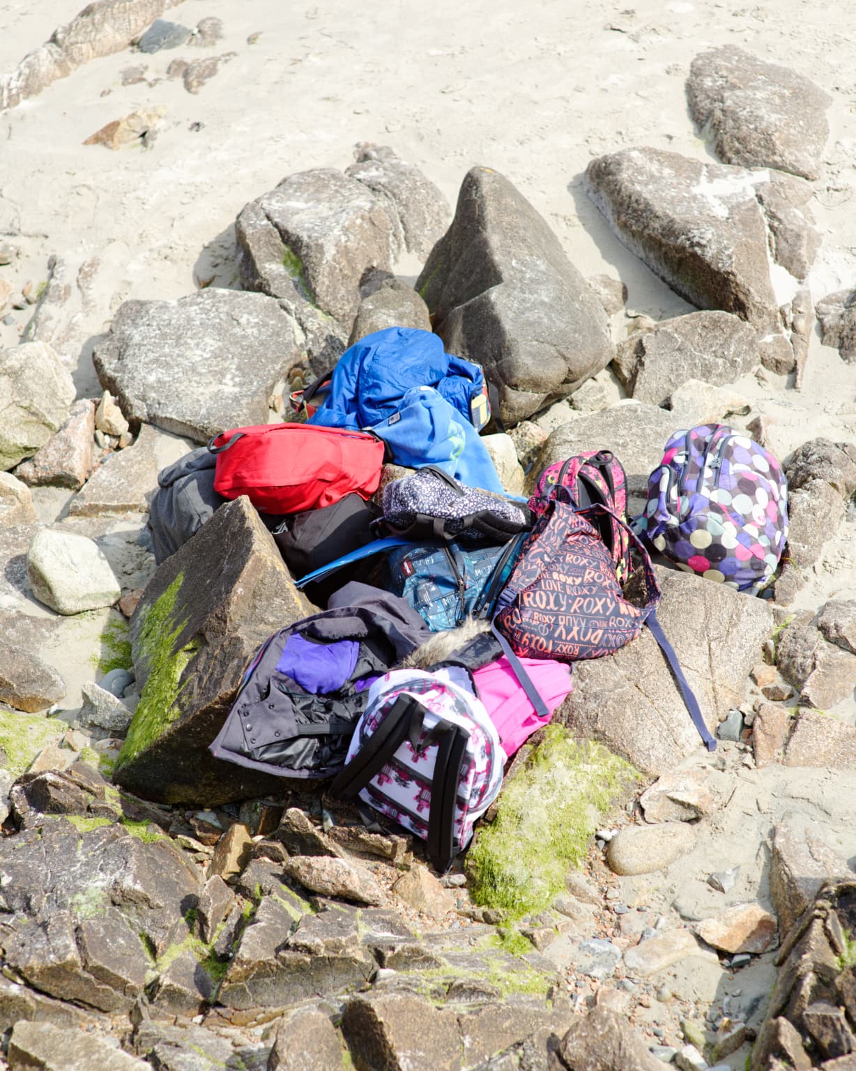
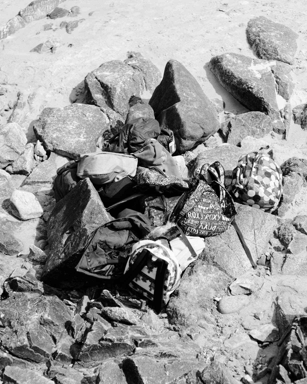
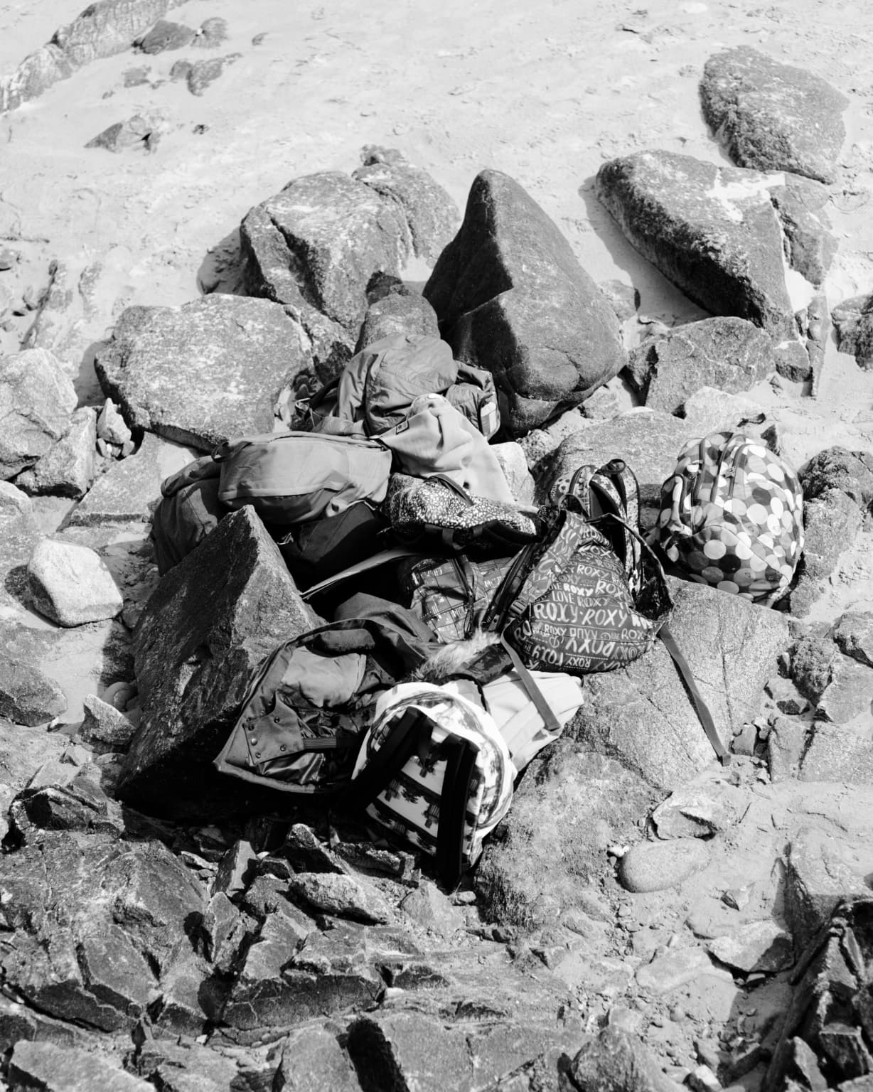
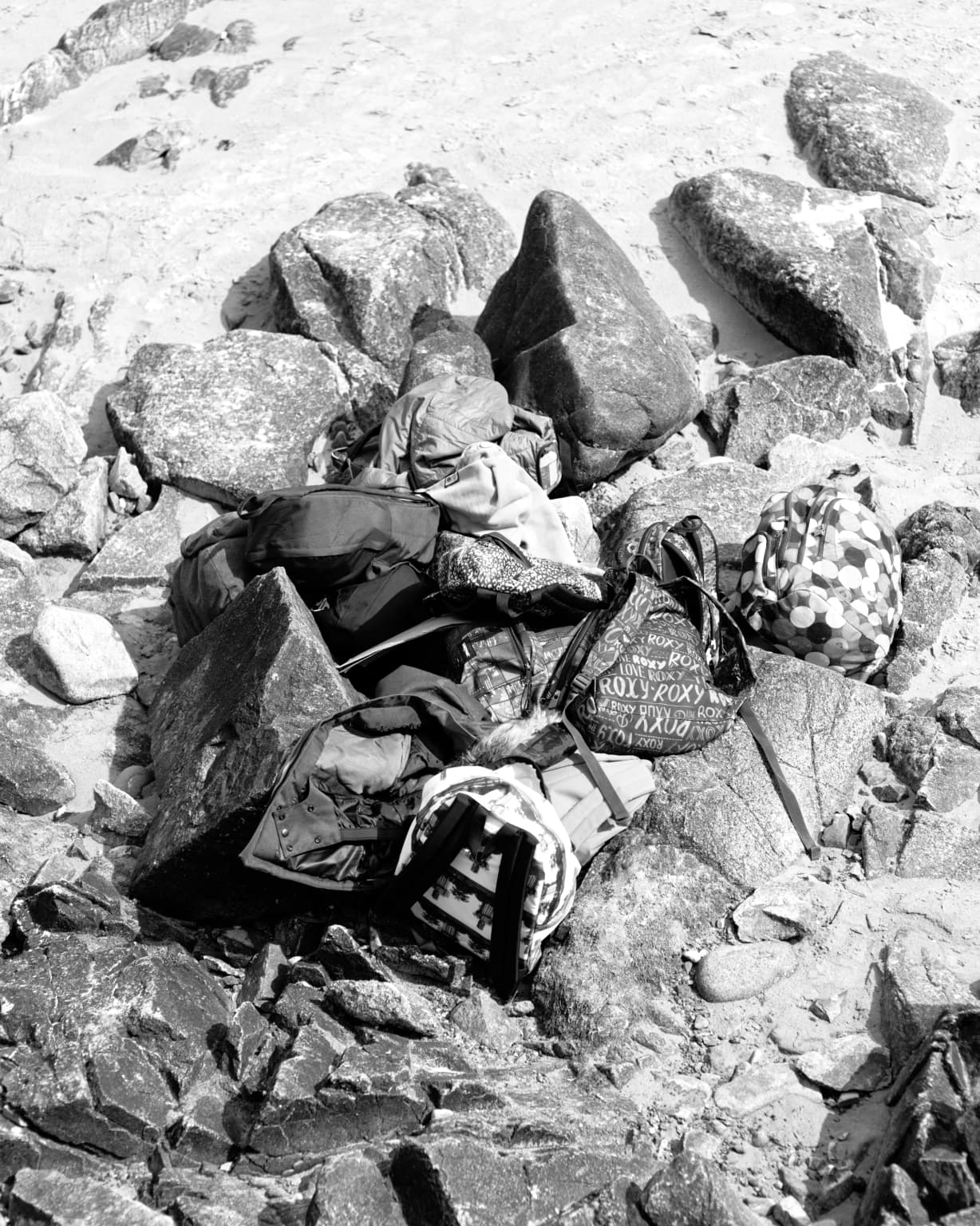
Take this picture of a pile of bags and towels on the beach…
Some filters don’t distinguish some colours in terms of grey, unless you “force” one of those colours to be darker or lighter with the use of an appropriately coloured filter.
Which is where the FilmPack filters come in useful, allowing you to play and compare until you get the best effect.
Above all, you need to find interesting subjects (not yet another view across the bay) and then start to play with the tools in PL5 to see what gives the best results.
Part of why I use the B&W in camera rendered JPEGs in the live viewfinder for everything. It does present some difficulties but all in all it works best for my “vision”
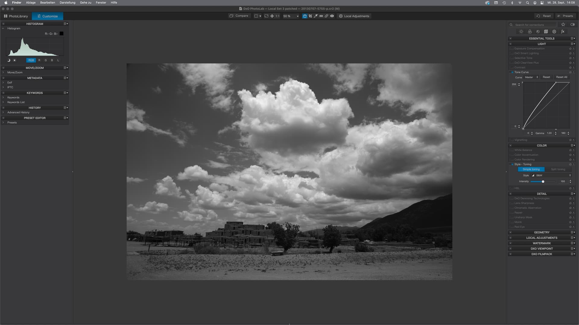
The shot is about clouds & sky and was underexposed due to whatever issue I had then.
→ exposure correction is done with the tone curve in both examples.
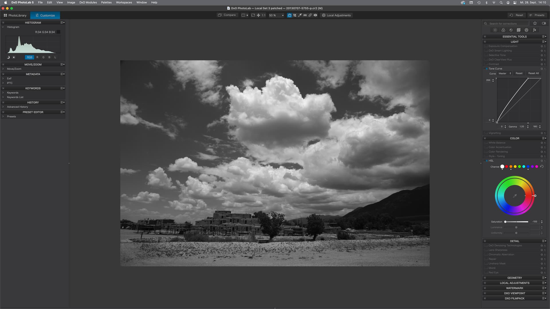
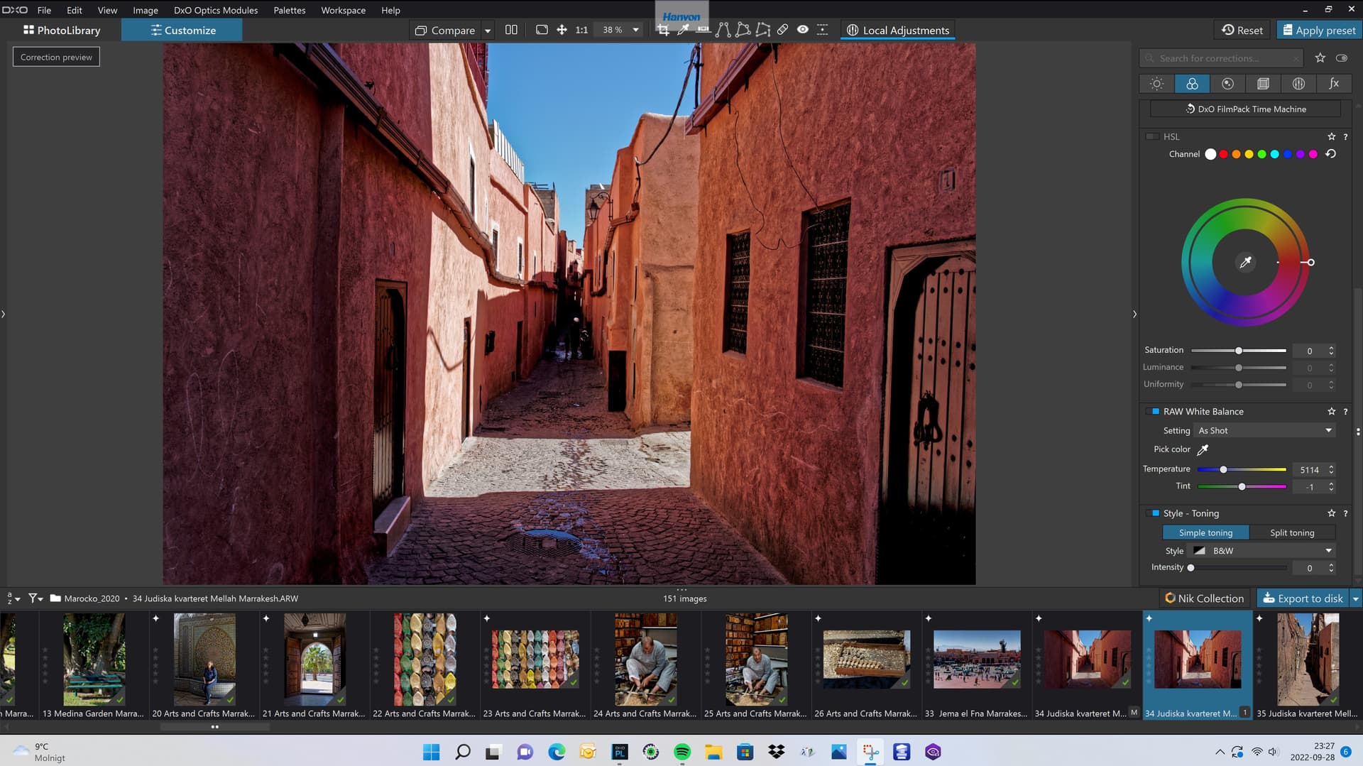
The HSL tools can also be used for conversions and filtering based on the colours in the image
→ B&W conversion: Select the white button and drag saturation to the left
→ darken the sky by lowering the luminance of the blue channel
→ raise the buildings by increasing luminance of the orange channel (use the pickup tool!)
Thanks to all of you for ALL the above information, both regarding this thread, and photography in general.
Thanks also for making me aware of the fact that if I did spend the many thousands of dollars to buy a Leica Monochrom, that would severely limit my ability to edit the images in PL5 (and Filmpack). For each of the lenses I might use, I would need to either buy a set of color filters, or (since I have these filters since 50 years ago) to buy step-up rings to adapt those old (big) filters to my current lenses.
Following the full meaning of what I’ve just read, if I continue to use my M10 for most of my photography, at least until I learn it better, what I’m learning here now will work just as well with my remaining Nikon D750 or any camera I wish to use. I was supposed to be getting ready to ship the camera off to someone who will take it to India…but the only valid reason to sell my D750 would be to replace it with a D780 (which has far more dynamic range than my 2014 D750).
OK, when hurricane Ian moves north, and I can once again go outside without my raincoat, I’ll follow the advice suggested above.
If you own the NIK Collection you might want to experiment with Silver Efex Pro. It has the reputation of being one of the best B & W converters available. It also has lots of presets you might enjoy experimenting with.
My mind wanders off in so many different directions, but it always comes back to what you just wrote. If I was wealthy, I’d already have both the Monochrom and an M11. Being retired, and no working, does two things - gives me much more time to do things, and much less money to do them with. My M10 is already the most “fantastic” camera I own. For now, I will follow @Joanna’s suggestion for a Preset, but for the image above, “Infrared” as a pre-set gave me what I was looking for.
I own both the original Google NIK Collection (which can be downloaded for free on the internet) and the paid DxO version. I keep reading about “Silver Efex Pro”, but I know nothing about it. But - if I use NIK, don’t I end up with a TIFF final result, rather than a DNG raw file with special settings"?
I’m likely to stay indoors for today, but I’m lucky to be in Miami Beach - not that far north of me, Florida is going through a horribly destructive hurricane. It’s going to cut a path from the West coast, going East, and then slowly continue on a path moving North, tearing up everything it touches.
Thanks - something else to remember, and try myself. Hopefully this week.
It is very easy to use Mike. After you develop in PL5 just click on the NIK button in PL. A Plugin selector window will appear, and you select Silver Efex Pro. You will then see your image in B & W. There are a lot of editing tools on the right but I suggest you start with Presets on the upper left. Click on ALL and you will have a LOT of choices. You can further edit using the tools on the right, The few times I have used this I was happy with what my chosen Preset did.
The downside of doing anything in NIK is that you end up with a large TIFF file. With the low cost of storage these days I don’t mind it.
Yes, you have to do all your non-B&W corrections in PL and then export to a TIFF before you can then start making B&W adjustments.
I also have a copy and, honestly, can’t stand it. In my opinion, the UI is shabby and harder to follow than PL and since I have to export from RAW before using it, it means making a lot of fine RAW adjustment before you know what the B&W version is going to look like, including the degree of noise reduction.
Knowing how you have struggled to get to know PL, I would highly recommend that you do not make yet another change in your workflow at this time. PL can do everything that Silver Efex Pro can do, but without having to create a duplicate TIFF file for every RAW file you want to work on as B&W.
The Nik collection is primarily aimed at users of other apps like Photoshop and Lightroom, which don’t contain all the DxO goodness that PL gives you. The SFXPro presets are “particular” and don’t bear any relation to known films, more to do with “feelings” and themes. You also miss out on a whole load of superb film emulations that come with PL+FP.
I know it’s another photo from Biscayne Bay, but when I saw all the small boats being tossed around, and the person on this boat trying to tighten all the lines holding things in place, I waited until all the elements of the photo came together the way I wanted. From that, I got a decent color photo, and then spend two hours trying to find how to make it look good in B&W. I changed my “Workspace” to “Advanced”, as things showed up that long ago I had lost when I simplified PL5. In working on this image, things went from acceptable, to “worse”, and then I struggled to get PL5 to do what I wanted until I liked the result.
I’m not sure if anyone else will see it the same way, or as just another “dross” image - need to look that word up in my dictionary, but I figure it means something between “dull” and “boring”. The final image looks like it came straight from my imagination.
My problem - the image is B&W because my goal was to create a good B&W image. The color version is… well, “different”.
Yes, “have struggled”, and sometimes “continue to struggle”. I was getting frustrated with the b&w image of the boat in the rough water, because I couldn’t make it look like what I wanted without messing up other settings. I then changed my workspace to DxO Advanced, and noticed things I hadn’t seen earlier.
I know a lot of people love NIK, but I haven’t used it now in over two years. Also, when using it, I always get the feeling that I’m making my photo look like someone else’s version of my image, not mine.
I have a LOT more to learn about FilmPack, but it has become a part of PhotoLab to me, and unlike when I used to send my images off to Topaz AI for sharpening, I feel I’'m still working on the same image, in the same program, and I can always go back to the starting point and try again.
Stenis
(Sten-Åke Sändh (Sony, Win 11, PL 6, CO 16, PM Plus 6, XnView))
20
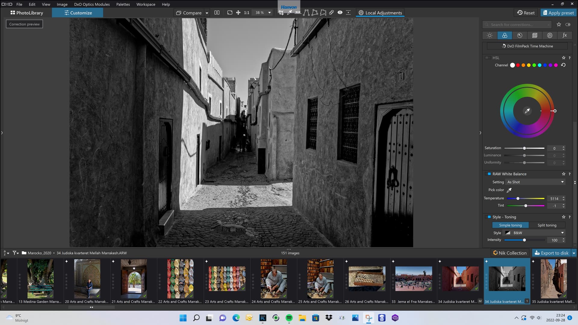
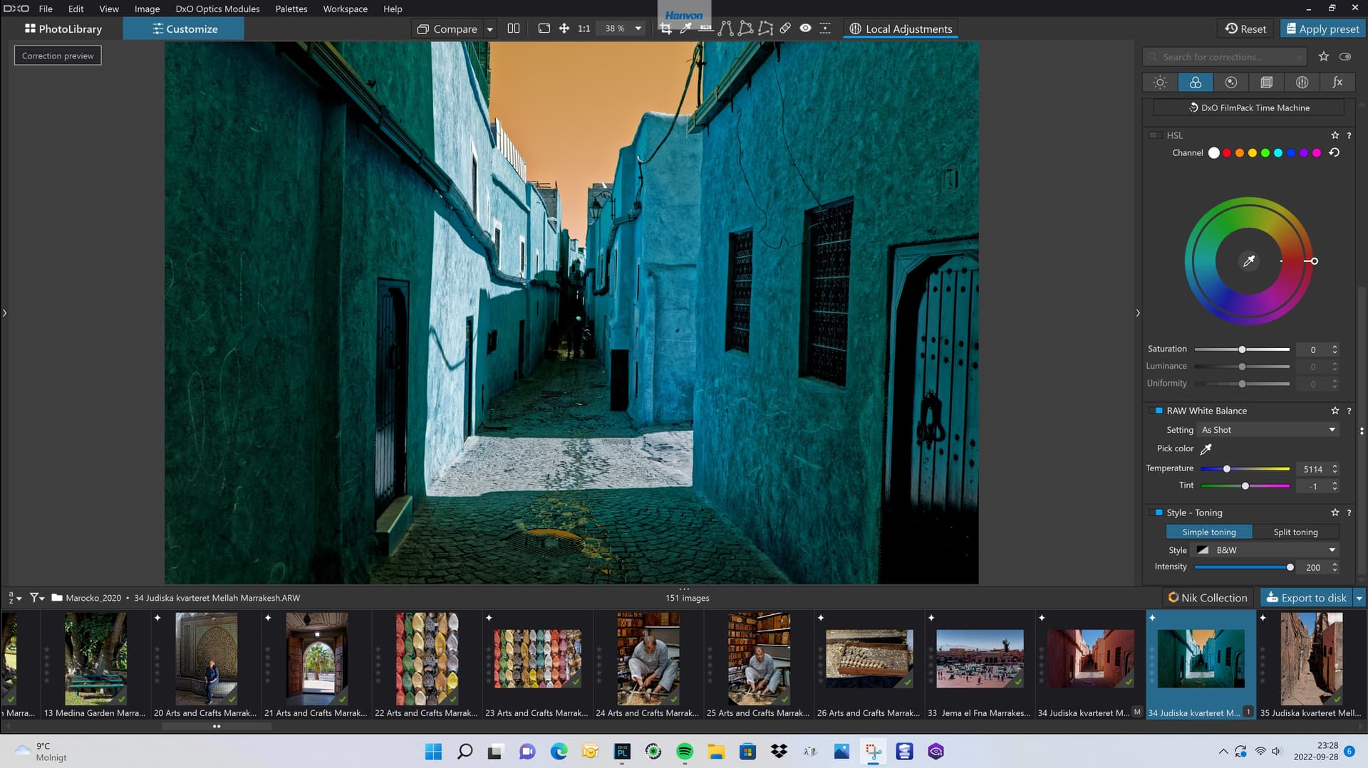
I think Platypus example is the fastest because all you need to do with the “Style - Toning”-tool is to turn it on. It is adjustable between 0 to 200. At 0 your image will look just as your color RAW. At 100 (which is default) you get it BW and at 200 you will get a split tone. This powerful tool is always there even if you don´t have Filmpack and the default is BW or 100 if you want to refer to it that way.
You will find the tool if you scroll all the way down to the bottom of the “Color” menu.
Still I think the DxO Efex Pro styles in the NIK Collection is very convenient and powerful tools even if you always can do it all by yourselves.
I agree with @mikemyers that Leicas monochrome variant of M10 is a very interesting camera. I am far from a Leica-friend and I´m totally uninterested in all their manual feature minimalistic and unmodern M-stuff, except for that fantastic monochrome M 10 camera. What a camera and what fantastic images it produces!