Excellent scan, as is witnessed by the few adjustments you made
Because I’m curious and like a challenge, I managed to get the number of adjustments even lower
You are right but… there are other tools for getting the same effect, just differently and all I’ve done here is to show you possible alternatives, not “this is what to do”. It’s easier to show you the adjustments palettes than to make you delve into a DOP.
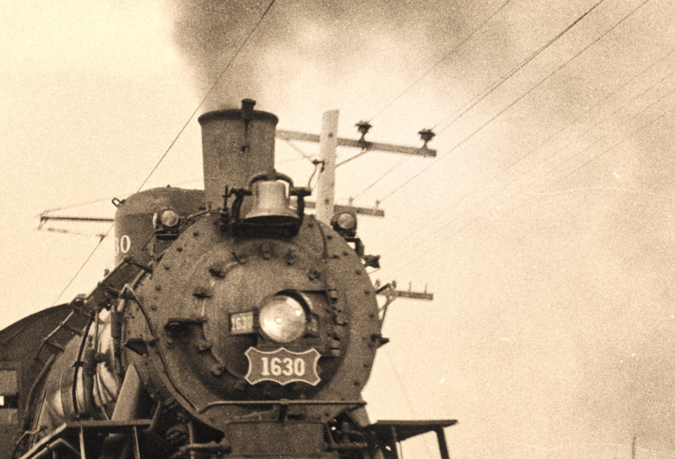
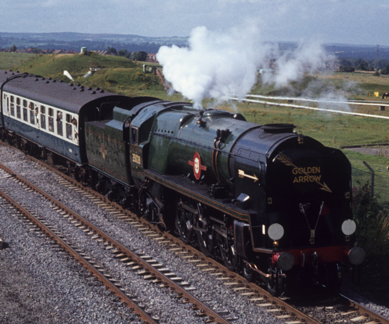
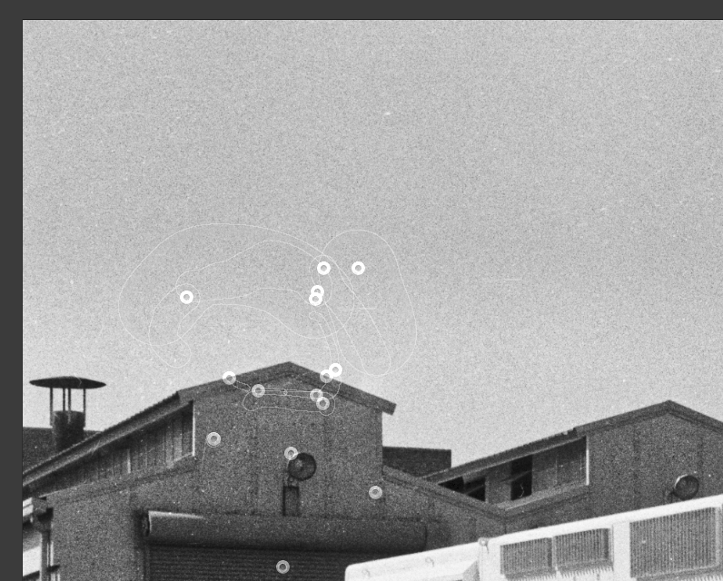
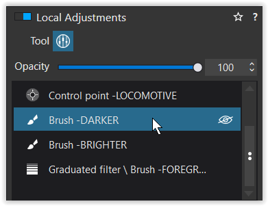
I notice that you used a control point to brighten up the telegraph pole, presumably to separate it more from the engine?
In brightening the telegraph pole, you also ended up brightening the sky - intentional or not. Here’s something you could have done to slightly “improve” on that…
If you check the Show Masks box, you get to see a tone map which shows you which parts of the image will be affected by the adjustment. The brighter areas are those which will be more strongly affected and the darker, this that will be least affected.
What I did was to very carefully place a couple of “positive” control points on the telegraph pole, but then placed a few “negative” control points (press the Option key whilst clicking) on the body of the engine to shield it from the effect applied to the pole.
Here is that part of the image without negative control points…
Hmm, huge improvement in the image. Not appropriate for photojournalism, but far more than just appropriate for a more pleasing image. Photoshop?
I will try that later today, bumping up the “fine contrast” and the “shadows”. I thought I liked the “gritty” effect, but maybe I’ll get the same effect by slowly increasing “fine contrast”?
That makes me wonder what things “Clearview” is changing when I use it. Maybe that’s what you mean by using other controls to capture the good that Clearview does, without any nasty side effects?
I think from now on, when I use control points I will always use “show masks” to look for things such as what you pointed out, and start using “negative” control points for where I don’t want that effect. I “knew” about this, but I haven’t yet been using it. I was always clicking on the tool for negative control points - I wasn’t aware that the “Option key” immediately got me the effect I wanted.
Also - I’ve had these negatives filed away since the 1960’s, but I completely forgot about them. If it wasn’t for how easy the Plustek makes it to scan negatives, along with my new interest in both B&W and scanning, the negatives would have remained buried away forever. I’m also wondering if what I like about this photo is the way film made it look. I doubt it would have the same effect if I took a similar photo today with a digital camera. Maybe.
Understood, about “Presets”. My software is set for “No Corrections”, #5, as the default, so the computer will no longer be doing things behind my back.
I’m slowly learning about the way to make photos “look”. Maybe I’ve graduated from kindergarten to the first grade. Still a lot more to learn. As to the toning, I’ll try it - the problem is my eyes. A few seconds after adding toning, my eyes don’t really notice it. I think I’ll only be able to “see” what you mean, by turning the toning correction on and off.
For me, Clearview is a “quick-fix” that is a left-over from before we had Fine Contrast. A sledgehammer to crack a nut for those who are only interested in turning out “high-impact” jpegs for sharing on social media.
I wouldn’t care whether images like this were from film or digital. Once you’ve scanned film, they are all digital anyway and grain can be emulated.
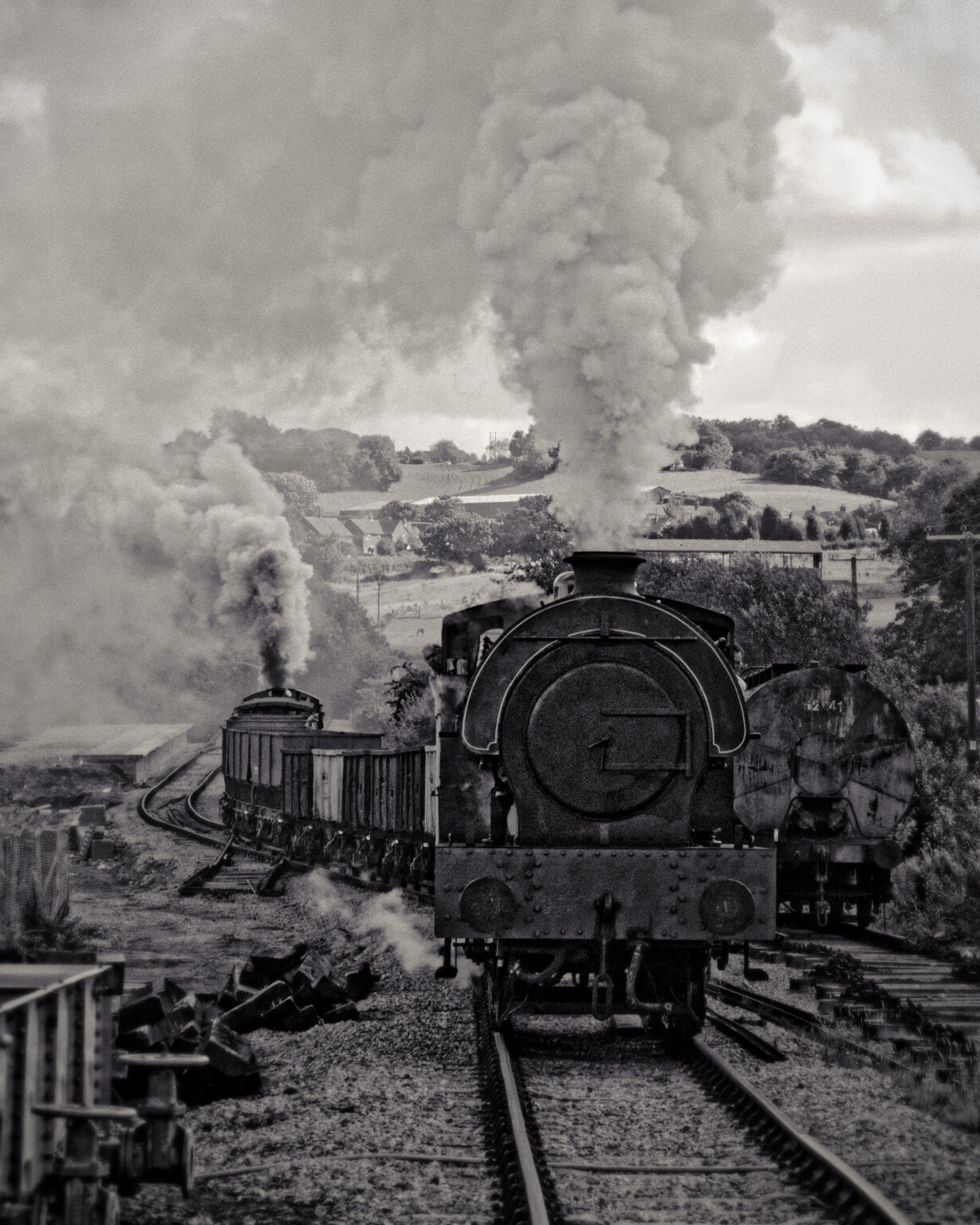
No, what you have here is a dramatic image of a powerful fire-breathing dragon that takes you and me back to our childhood. In my opinion, it’s the nostalgia such images evoke, not what was used to create them.
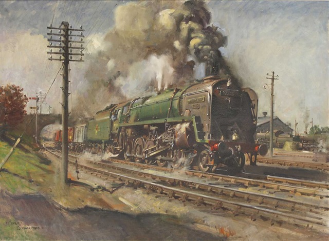
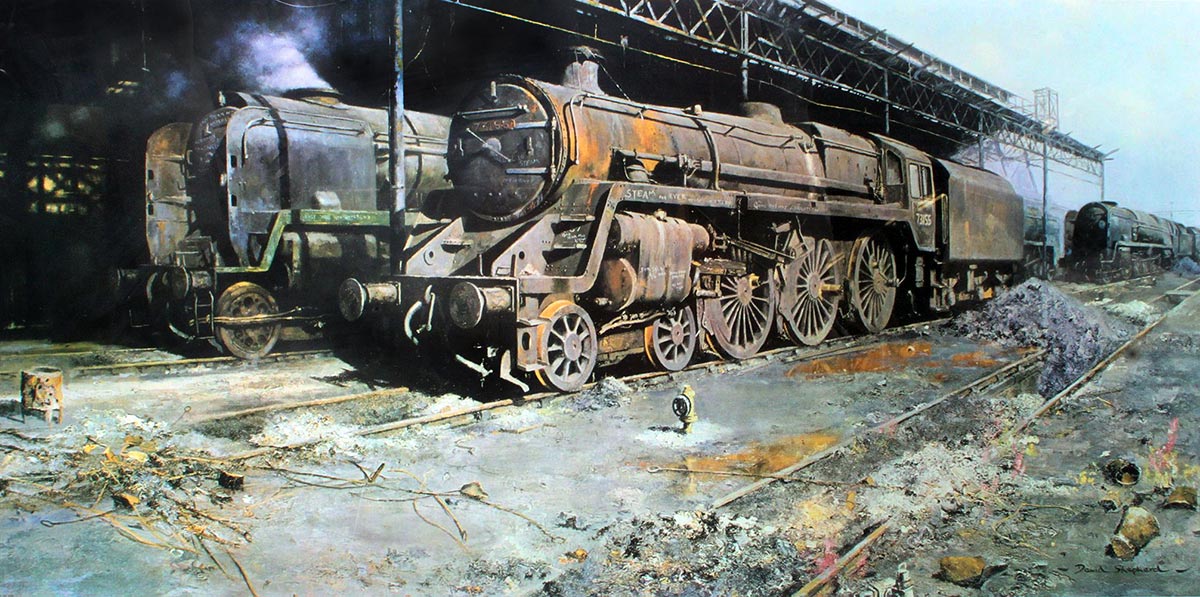
I love stream railway images and remember some amazing paintings by Terence Cuneo…
It’s all about emotion. I doubt if either of these two artists captured exactly what they saw.
Well, it could. It’s all down to how you visualise the final result and how you prepare to: take the photo, process it and present it. It’s all down to getting as familiar with digital techniques as you are with film.
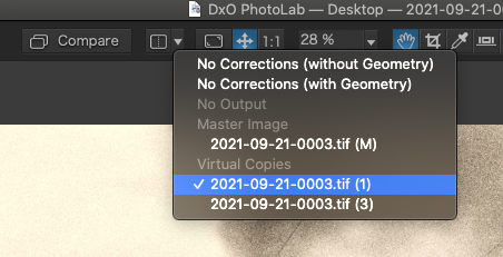
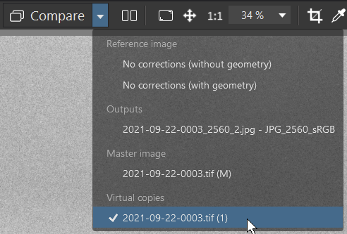
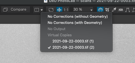
Try making virtual copies, editing one of them and comparing it with the others that you have treated differently.
Then you can either use the Compare button to switch between the current version and the comparison version, or you can click on the “divider” button next to the drop down to get a split-screen view of the two versions.
In that case, I probably ought to “remove” it from my palette, by un-checking it. There are so many tools, and maybe I ought to remove other things I never get to use.
Wow, beautiful and wonderful paintings - the top one I know is a painting, but the bottom one is so “real” it looks more like a photograph.
People talk about the differences between “digital” and “film”, but the separation becomes blurry when programs including PhotoLab and PhotoShop can make either look like the other. I think there needs to be another name, maybe “processed”, when we edit images. My film images do look “different” than my digital images, but sometimes with all this processing, they can start to look more like paintings, and as you just demonstrated, to me, that second image made me think it was a color photograph, if color film was even available way back when. Lovely picture!
If you didn’t already, Cuneo always included a mouse in his paintings. If you zoom in on this one, and you know where to look you, can see it in this image.
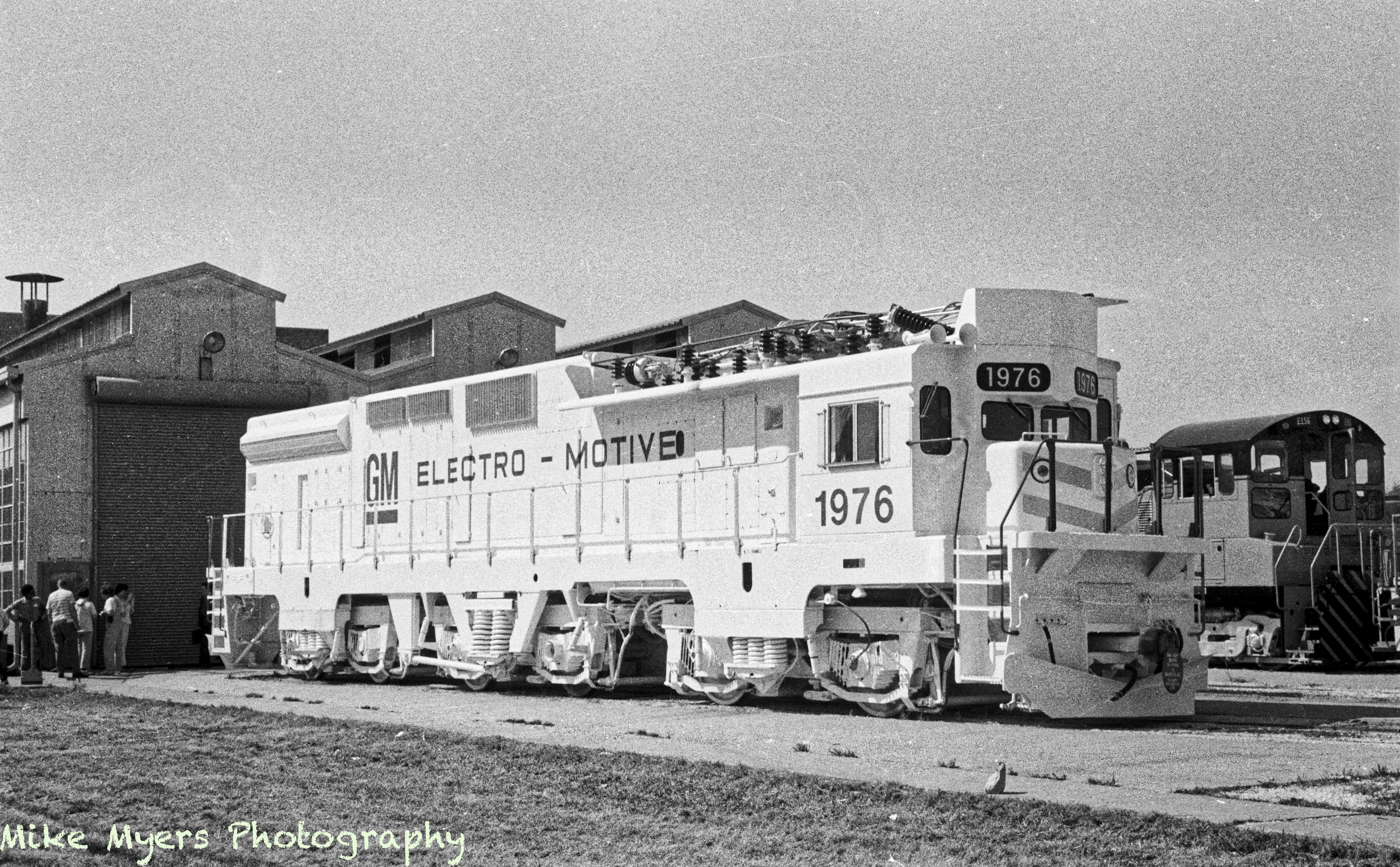
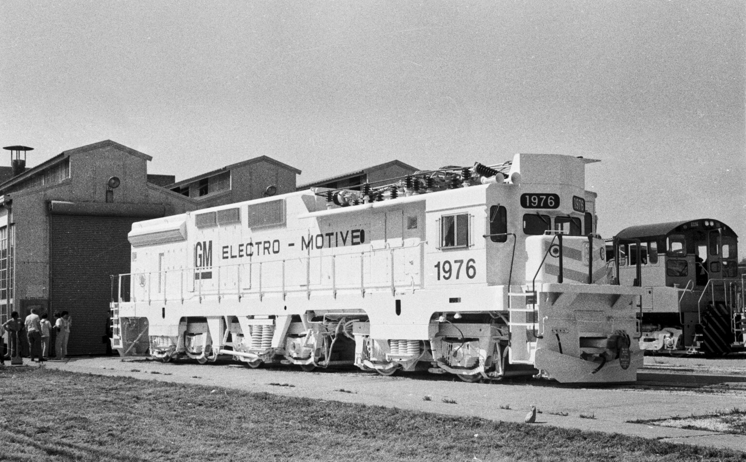
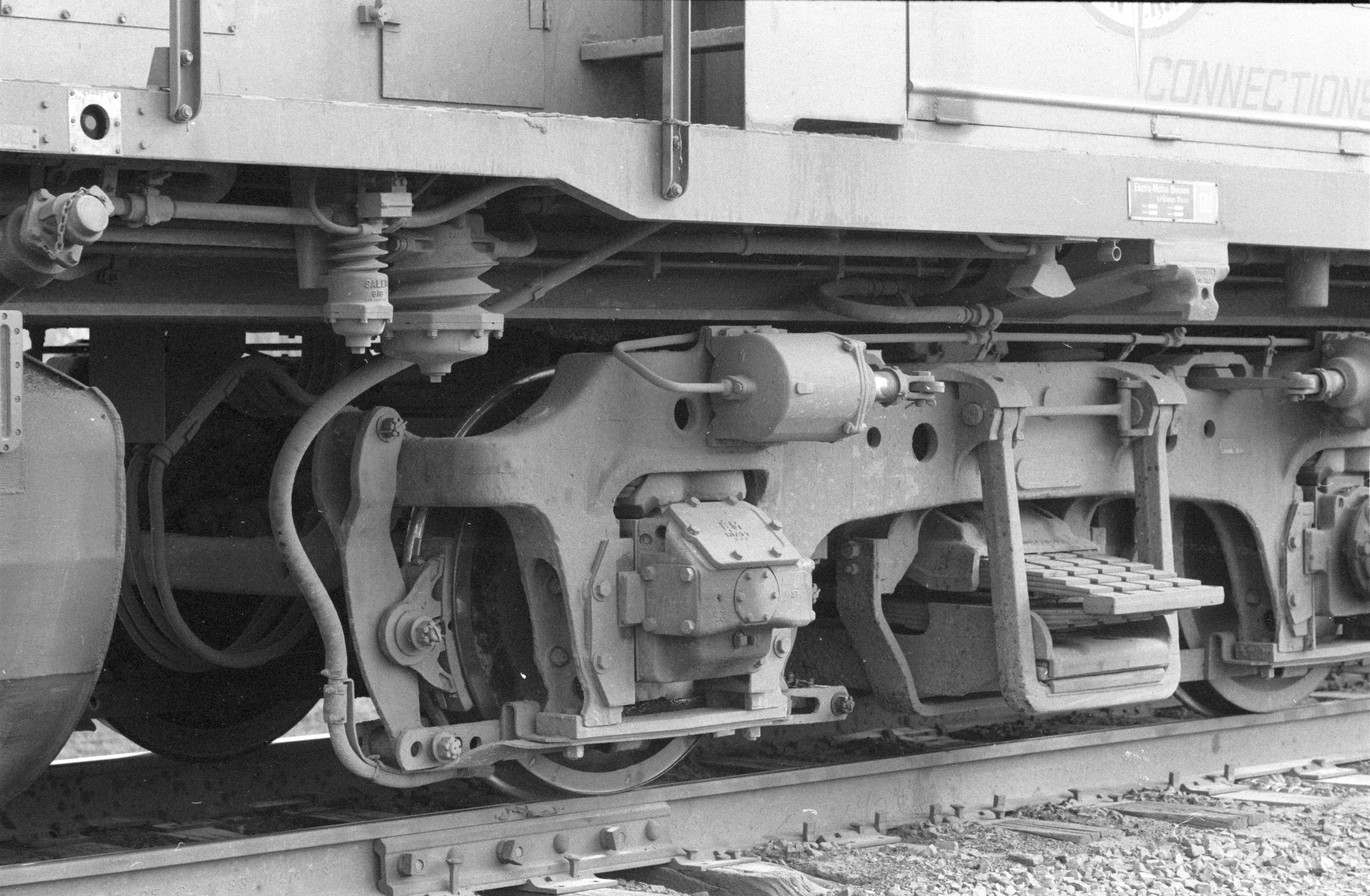
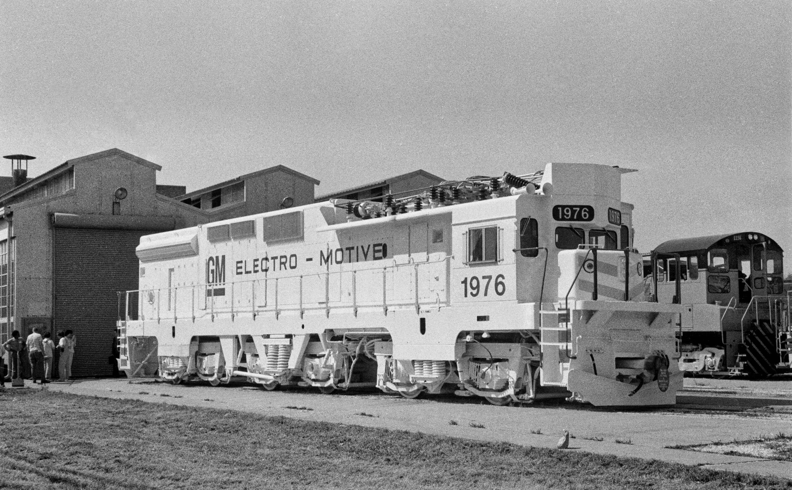
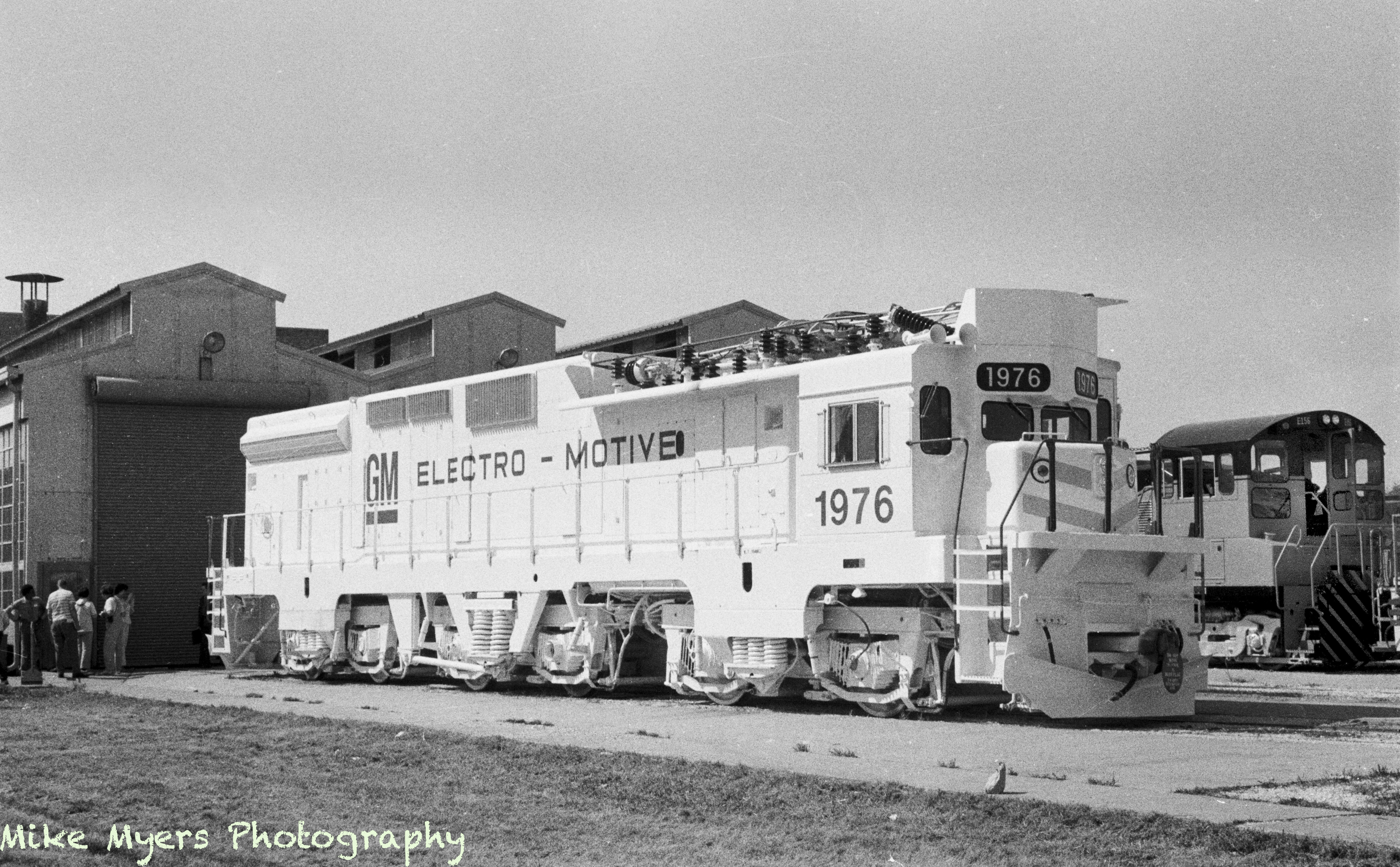
As long as we’re talking about trains, here’s another image I took in the 70’s on a trip to GM ElectroMotive - it was a “work trip”, but I couldn’t resist taking several photos. I don’t think I’ve ever had to work on a photo of a white engine, but the same techniques seemed to work - get the scan close, then fiddle with the “better” controls. Unfortunately there were what I think were “watermarks” on the negative, probably from poor processing technique. I got most of it to look acceptable, but for a white streak on the front of the engine. After an hour or so, I gave up, thinking nobody would notice (but for Joanna). She has laser-eyes that instantly find any flaw in an image. I guess I have the same, as I’m fine tuning my eyes based on what we’ve been doing here.
Actually this engine was rather rare - they only built one of them, in 1976. It was thought at the time that fuel costs were going way up, and this engine was designed to run on tracks with an overhead electrical power line. Oil prices went down, and this engine was brought back to GM Electro Motive, and eventually scrapped.
It’s not a beautiful photograph, suitable for framing, but it will be nice to show it to rail fans, who most likely have never heard of it.
My question here, is how to correct a big, ugly, watermark on a negative.
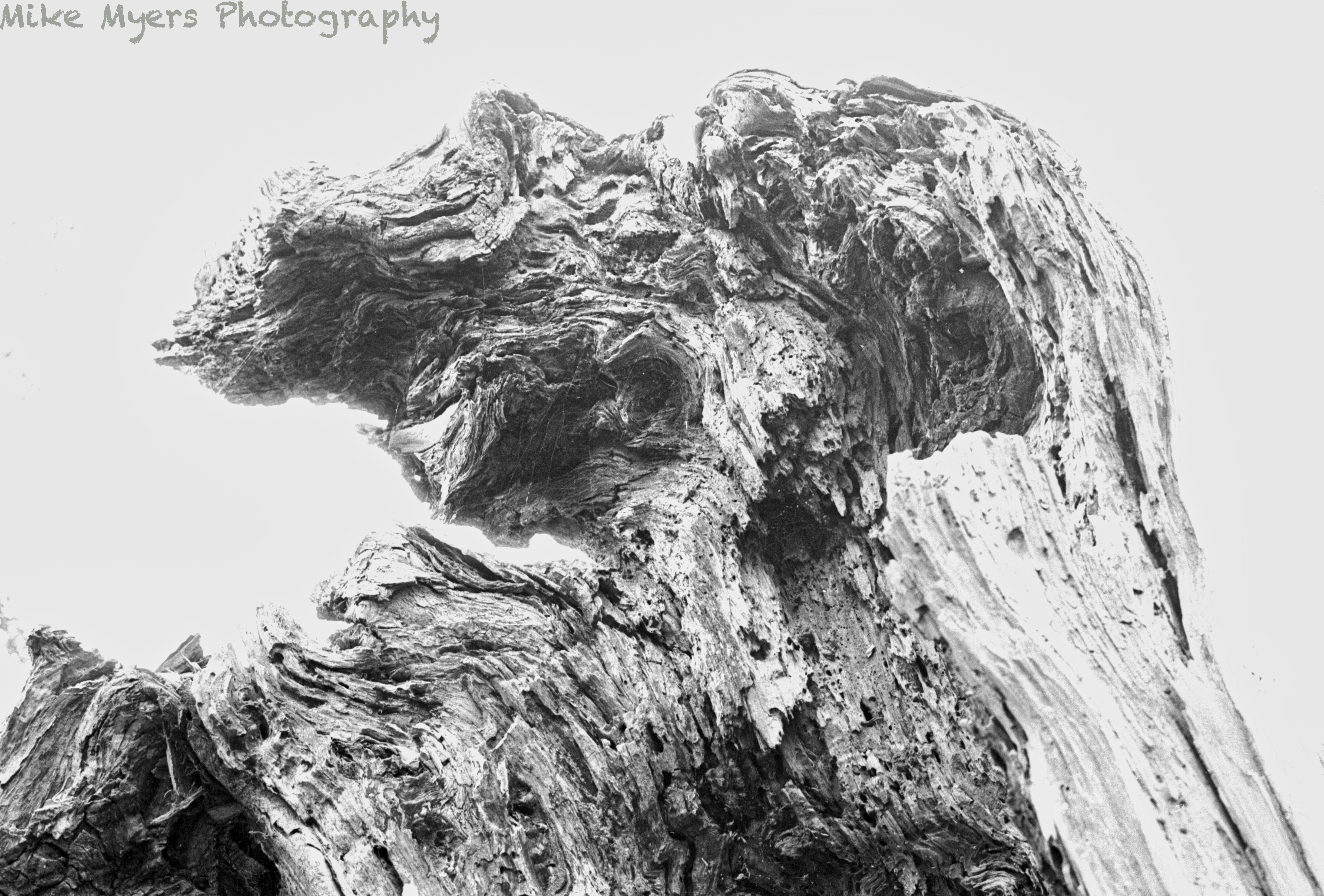
If any of you want to play with it, here’s another image from the same roll of film. I thought it was a photo of a dead, broken-off tree, partly burned maybe. So I stared at it while scanning and developing it.
Anyone here believe in ghosts? I look at it and I see a dog’s face looking at me, with floppy ears, two eyes, and a nose, and the top half of a mouth, disguised to look like a tree. I hope I never see it in a nightmare…
It was a matter of correcting the most obvious marks zoomed in with a relatively small brush (Clone), especially near the join between roof and sky, then zooming back out and using big soft brush (still Clone) to blend in the tonal differences.
I don’t know if you’ve found out yet that you can repair a repair - sort of multi-layer type thing?
Better, but not quite there yet. I did learn your “trick” of varying the image size while using the repair/clone tools. That was helpful.
I have no idea how to repair a repair - what I was about to do, was go to the history list and delete those repairs, which would have then deleted everything that followed. When I was searching, I found this: “edits are stacked in the order you have applied them. If you go back (let’s say to step -5) all the above steps are still there, but grayed out. As soon as you make a new adjustment to your image, all the above lines in the history palette are erased and a new line is added with the last edit you just made…”. So how did you “repair a repair” without losing all the things that were done after that repair?
I must be missing something, as I can’t think of any way to replace my ineffective repairs with new repairs done as you suggest, without re-doing everything else I’ve done in the image.
I think I ought to make a “virtual clone” of the image as it is, then go back to my original, revert to the beginning, and start over again. And unless you tell me a good reason not to do so, I should leave a major repair like this until after I have done everything else, so if I don’t like the repairs I made, I can delete them without having to re-do everything else.
I’m away too stubborn about things like this, so I saved it as-is, and posted it here, and left it alone in case (as usual) I get feedback about things I didn’t know well enough before. I figure if you did it, I can (eventually) do it. Maybe.
Personally, I never touch the history. To my mind, it does more harm than good.
Simply click on and delete any repairs you don’t like, no matter what order they were done in.
Nothing in PL is sequential, apart from the history. simply delete any changes you don’t like at any stage.
Here’s a short video showing how I started by covering the most obvious faults, then zoomed out to cover the “joins” of my initial repairs with a larger, soft-edged, brush.
I always start editing an image by creating a virtual copy and leaving the “master” alone, for if I want to start again from scratch - at which point, I would just make another virtual copy, either from the VC I have already worked on, or from the “clean” master, depending on how far I have got.
Virtual copies are “cheap” and are stored just as a bunch of corrections in the DOP file.
If you get so far with an image and are happy with what you have done, but want to experiment, make another VC and use the VC you made it from as a “snapshot”. You can do this several times if necessary, trying different things each time. Then you can compare VCs against each other to see which you prefer and simply junk any that are no longer worth considering.
When repairing a large clear area like the sky, take care that the source has the same tone as the target area. Which is why you see me move the source a couple of times in the video.
I watched your video a few times, then tried (and succeeded) to find my previous repairs in that part of the image. Silly me - I thought the way to remove a repair was to go to the history list, and go to the previous step. But based on what you wrote, I clicked on the repair point, with “show masks” turned on, and hit the DELETE key, and that specific repair was gone! Now it is so obvious. I had no idea I could do that. I’m even more ignorant about PL4 than I thought I was, but little by little all of you are showing me things that weren’t intuitive before you showed and explained them.
I did what you showed me, and now I have what is a good result - having viewed the image at 100%. Unfortunately, viewing the image that large shows a mine-field of microscopic white dots, which I assume are microscopically small pieces of dust, which I can’t see at all without enlarging the image. But if I wanted to make a huge print, those would all be important, so I guess I will need to spend whatever time it takes to eliminate all that I can notice. (It would be nice if PL4 had a tool to search for these tiny dust particles, and quickly allow me to fix them.) The fixing is easy, but searching a full negative is a huge project. That these negatives are 60 years old, and while I treated them carefully, I wasn’t THAT careful back then, as I never looked at them this closely. PL4 makes for a great image magnifier!
Yep, now that I know how to delete a specific correction, as you showed me, it changes my whole attitude about PL4 history. Until now, if something was wrong, I went to the history and clicked on the thing I did just before that mistake, so the mistake (and everything that followed) were gone. I should have asked this question long ago, but there were always other things that sounded more urgent.
I understand what you’re writing, and at the moment I’m doing this it will all be clear and obvious, but if I come back to this image next year or in ten years, I won’t have any idea of what I did, or why. If it’s an important image I really care about, this sounds like excellent advice to me, but a lot of images I scan, and maybe crop, and other minor changes, are images I don’t really have plans to do anything with. For example, this image, of a friend of mine with his Hands S600, from when he and I went “train hunting” long ago. Seeing this photo brought back lots of good memories, and reminded me of why I was actually there, taking the photo, but my editing was so simple I don’t know why I’d want to make a virtual copy.
Then there are images like this, which I’m fascinated by, but I doubt anyone else would care about. I did very minimal editing last night, and saved it. (I think back in the 1960’s I was already telling myself to “get it right in the camera”, rather than leaving things to be fixed in the darkroom. I hated cropping, as I always thought it decreased my image quality too much.
I think I will take your advice though for any image that I feel is important to me, and not just a record, and make a virtual copy before I start.
I haven’t been doing that - I can see now that it’s extremely important - so many times you and others have shown me that when I repaired something, other “stuff” got copied to where it didn’t belong. I will turn on “show masks” as a default, and try to be much more careful.
Funny, I know I’m improving, but there is always SO MUCH more to learn, and to get in the habit of DOING. There’s no “free lunch”. Anything worth doing, is worth doing right, but this gets easier as I learn the software more.
I opened Joanna’s snapshot, and opened your snapshot, and put them side by side. I noticed two ways in which you’ve improved the image.
First, the “front” of the engine shed, above the rear of the engine, looks less noisy and grainy. So does the sky. Is this because I used the wrong tool to enhance those areas?
More importantly, the front of the smaller diesel “switch engine” behind the white engine now shows all the detail that I forgot about. I remember lightening that area, so the detail still showed. Whatever you have done has improved this.
Joanna never “finished” this image. I thought that other than the watermark, I was done with it, but seeing what you just did is much more pleasing to me, as I look for all these details.
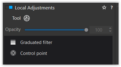
So, I turned off the microcontrast, and all the visible grain vanished. Then I used Local Adjustments to lighten up the front end of the second engine just a little. I also slightly lightened the guys standing at the left.
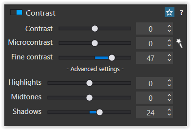
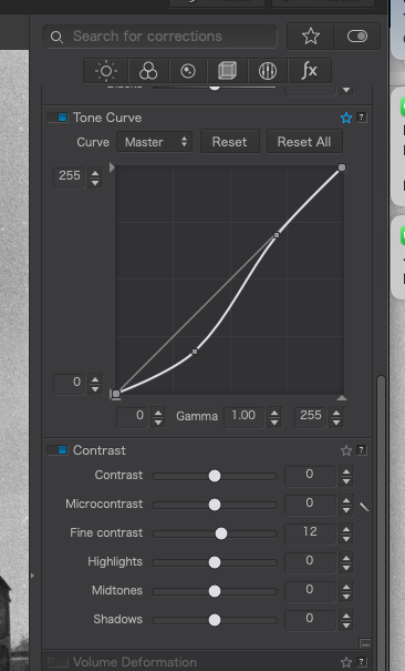
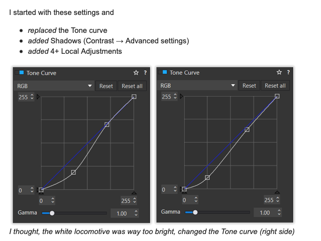
I thought, the white locomotive was way too bright, changed the Tone curve (right side)
and added +24 Shadows contrast (right side).
Furthermore (right side)
I added Control points to ‘balance’ the locomotive’s brightness a bit better
added a very gentle 3D-illusion to the big engine (dodge & burn)
darkened the Foreground
(1), (3), (4)
As @Joanna showed you, Microcontrast enhances the pic’s grain, while Fine contrast has a less negative effect on textures.
ClearView behaves ‘similar’ to Microcontrast and changes brightness & colour, also to cut through haze.
Check the ?-help for more information.
(2), (3)
The changes of overall & Shadows contrast led to a better dark tone separation.
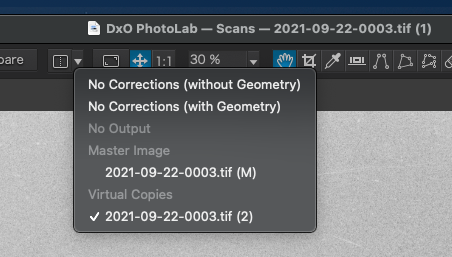
Back to grade school…
I right-clicked on my image, so I now have a virtual image, and a (M)aster image.
Naturally, in Finder I only see the “real” one, not the virtual version.
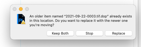
So now I would like to copy your "22-09-0003.tif.dop file into my folder, so it will open with the changes you listed below.
If I simply copy your file into my folder, it will replace my file. I am speculating that your .dop file will contain details for both my original settings, and for you newer settings.
The safest way for me to test this is to add “.old” to my .dop filename, and then copy your .dop to my folder.
What I did long ago was to replace my .dop file with someone else’s .dop file, to understand what they did. With virtual copies, this sounds much better. …if I’m right about how this works.
Hours later. I downloaded your .dop file into my downloads folder, then copied it into my “scans” folder where my .dop was located. Finder asked me what to do with this “duplicate file” and I selected replace mine. I know my current file is the one I downloaded, when I right-clicked on it to get “get info”.
However, my tone curve does not change regardless of which version I select…


