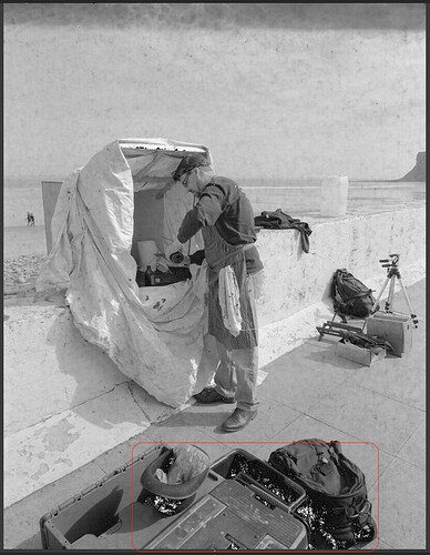
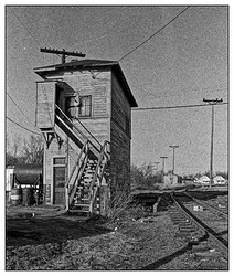
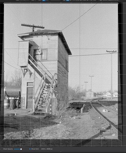
B&W Ilford HPS5 Plus + Plustek Scan, then PL4

Thank you. Until DxO makes it more obvious, the first thing I will do from now on is select a preset. Then, by using your brilliant way of making this obvious, I can always go to the beginning of my advanced history, and see which preset I used.

(For several hours, I’ll probably remember, but weeks, months, and years from now, it will be as rememberable as what I had for lunch on Monday last week.)

Wolfgang, what “preset” does PL4 use, if any, if I never select a preset? Until now, I haven’t been using presets very much.

DPL4 on Mac DOES show the presets we use - unless it is used as default…

…you might find it confusing because it was made with DPL in German. This should not matter as far as tool names go, but the sort order might… Simply drag the tools up or down to sort them to your liking.

Just checked a few of my old negatives and found that all of them had the film type printed along the film edge. Ilford used clear text, Kodak mostly used a code number to identify the type.

Adding a missing film type is something that you cannot do yourself, unless you know exactly what needs to be done and how. Scan a negative with the provided film profiles and see what the differences might be. Using TMAX 400 seems to work for TRI-X as far as I can see in your screenshot and from your guess that it was TRI-X.

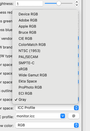
I see that you set the output profile to “Gray”. I recommend to use RGB instead, in spite of larger file sizes. Not all software will handle greyscale files.

As I said, Apple might have broken Epson Scan 2 but they still provide a way to use your scanner via Image Capture.

And now is the time for me to hold up my hands and say that VueScan is better than I thought. That is, if I hadn’t been so tight and not bought the full version.

But I do stand by my feeling that the UI could be easier to work with.

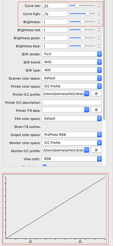
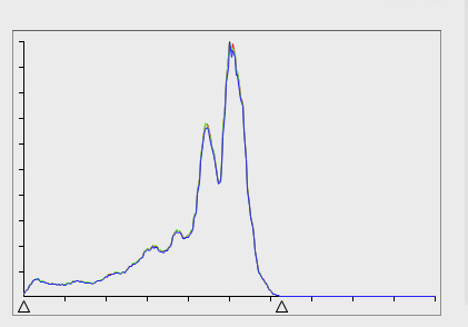
So, now I’ve found the histogram and curve tools, I would recommend using…

… which gives a flat response and…
Capture d’écran 2021-09-20 à 14.07.29

… to ensure the ends of the histogram are right. I’m not happy that I haven’t yet found a way to move the histogram a bit more to the right, to ensure the shadows aren’t blocked, but that might still be possible.

Here’s a screenshot of the result in PL…

… and you can see the shadows at the front are slightly blocked, but only took raising the bottom of the tone curve by +3 to get rid of them - I would call that acceptable.

I’ve just seen the price for a full licence - no thanks :flushed:

… which is odd when you think about it.


Now to your scan Mike.

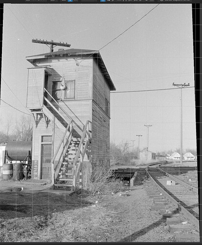
At first look, you have used 13 adjustments, whether you meant to or whether they were part of a default preset. Some of them are fighting each other.

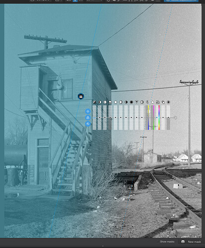
  1. You adjusted the exposure compensation to -1.1 but then you boosted the highlights selective tone by +50 and the midtones by +30. Then you applied a control point on the signal box to bring the highlights down. Do you see what I mean by fighting?

  2. The Smart Lighting was totally unnecessary and I am convinced that the preset you are using is applying stuff that you really don’t need when dealing with scanned images.

  3. You used straightforwards contrast which can be hard to control when compared with adjusting the tone curve and you also used Microcontrast, which can tend to accentuate film grain - Fine contrast is the better option.

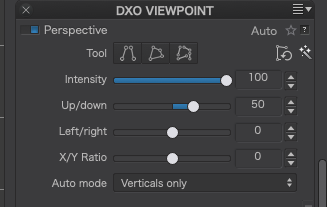
  4. It looks like you used the Horizon tool, without much success :wink: The better option in this case turned out to be the Force Parallels tool, with one line on the front corner of the signal box and the other on the telegraph pole on the right.

  5. I used a very subtle graduated filter on the left side instead of the control points you used, because the control points seemed to be a bit “blotchy”.

  6. You need to take care where the repair tool draws its origin from. Here it borrowed the telegraph wires to cover a scratch in the sky…

Apart from all that, not a bad effort :laughing:


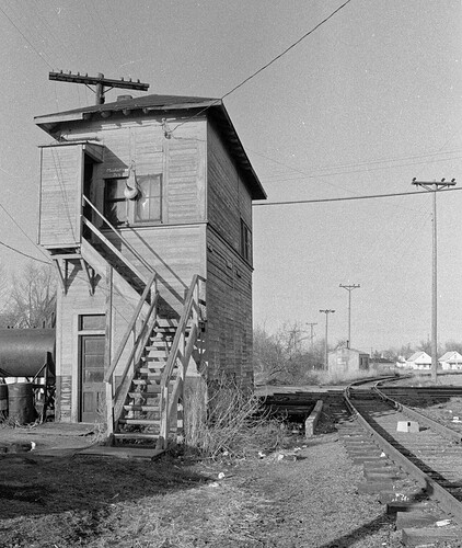
Here’a an export of my effort…

Here is a screenshot of my adjustments (I only used 7)

And the DOP - with the master completely reset to zero, the first VC being yours and the second VC being mine.

2021-09-19-0014.tif.dop (45,6 Ko)
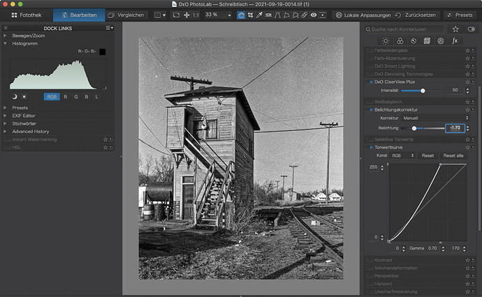
I like the train yard photos to be more gritty:

As you can see, I used some counteracting settings too.

  • ClearView darkens the image and adds the grain back to the image
  • Further darkening by lowering exposure
  • Brighten middle and bright tone with the tone curve
  • Not shown: A -0.1 gradient between the top of image and the top of the roof

Just for fun: Frames (white around fine black - mouseover to see it all)

Hmm, the various websites suggested Gray, so I did so. I now look at my choices and see:

Screen Shot 2021-09-20 at 11.11.03

Which of these choices would you recommend?

Hmm, yes, I’ve noticed that effect from Clear View, and I do think grain can be artistic, but every time I’ve checked, I thought it would annoy people. Nowadays, people have no idea what "grain is, or does, or why. I suspect if I did use it, Joanna would frown.

I thought about using the gradient in the sky, but didn’t - seeing what you did, I like it.

Yes, “train yards” = “gritty”. Personally, I like what you did. I will re-do, from the beginning, using all the advice above as a guide.

I don’t think I’ll do this - it might look better, but these telegraph poles don’t seem to be perfectly vertical in real life. I struggled like crazy to get the building to look like it wasn’t tilted, and the “force parallels” tool, or the 8-points tool would be better for me.

Better yet would be a tool that allowed me to pivot the scene back and forth until I liked the result, but PL4 doesn’t have such a tool - yet.

Ouch! I specifically did NOT select “smart lighting”, but I didn’t think to check that it was still off after selecting a preview. I guess I ought to go down the full list of what is selected before I’m finished, and maybe turn things off that I don’t like - or just re-adjust them for a lesser effect.

Should I even be pre-selecting a preset at all, before I start? I never did before, but I liked the one I selected (and dis-liked the others), so I used it.

I will be more careful with the correction tool - now I can see the problem I caused, but I was oblivious to it last night.

I will try again later today, from the beginning, trying to address all the suggestions that have been posted here.

Sneaky!!! Brilliant idea, I think, if I properly understand what you meant. I will try it later today. I wanted to ring out the “slats” on the side of the building closest to me, but the right side was fine. I see how I can do it with your suggestion - maybe.

…but I’m not sure if what I am imagining is what you meant. I’ll find out.

I tried “Image Capture”, but at the time I missed all the controls available to me in the Epson software, or the VueScan.

By the way, I got the SilverFast for “free”, as something that came with the scanner. If I could have saved $100 by not buying it, I’d have done so, but I’ve now got the latest version, SilverFast 9, installed on my Mac. I started it once to be sure it was working, then closed it.

That would depend on the subject :wink:

Oh yes it does :grin:

Capture d’écran 2021-09-20 à 17.39.56

Just move the slider…

… and when you’re satisfied, crop it…

As long as you’re not planning on working on non-RAW files other than scanning, set the preferences…

Just think soft grad filter on the lens rotated to almost vertical…

Yup. Now I’ve realised that VueScan is “manageable”, it looks like I will be using it when I make the inevitable move to Big Sur. As you say, Image Capture is just a bit basic :crazy_face:

ClearView is ideal for portraits of people you don’t like :grimacing:

4 Likes

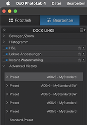
As far as I remember, you will be are asked while or after the installation, what preset(s) you like to use. Myself, I opted for

  • 1 - DxO Standard preset for NEW raw-files
  • 5 - No correction for NEW rgb-files (= JPEGs and TIFFs)
    Screen Shot 09-20-21 at 06.17 PM

resulting in
Screen Shot 09-20-21 at 06.04 PM Screen Shot 09-20-21 at 06.05 PM

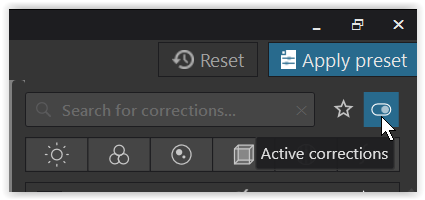
while Active corrections shows, if & what’s applied
Screen Shot 09-20-21 at 06.42 PM

( check comments from @Joanna and @platypus for differences to the MacOS version )

I haven’t noticed any German, but I will follow your advice to change the display order, so the things I do most often are near the top.

1 Like

I must be learning - that’s what I thought you meant. Thanks for the confirmation!

Most of the time, I think in film terms when it comes to things like filters.

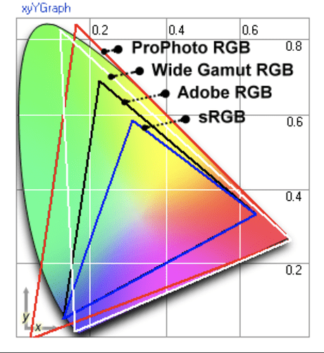
It does not matter much, which of the RGB spaces you use for B&W, nevertheless, I’d opt for a large space like ProPhoto > Wide Gamut > AdobeRGB, also for colour scans. I do not know how your film saw colour and what your scanners are able to discern, but we’d not want to dump potential benefits of better differentiation in the extended areas - even in a B&W image (see image below).

ProPhoto can keep track of a wider variety of green and reds,
Wide Gamut is similarly wide, except for the cyan corner.

For those who think that colour space does not matter in B&W:

Image with pure red, green and blue in ProPhoto RGB, converted to B&W:

Image with pure red, green and blue in AdobeRGB, converted to B&W:

Image with pure red, green and blue in sRGB, converted to B&W:

Done. It is now set to Adobe RGB.