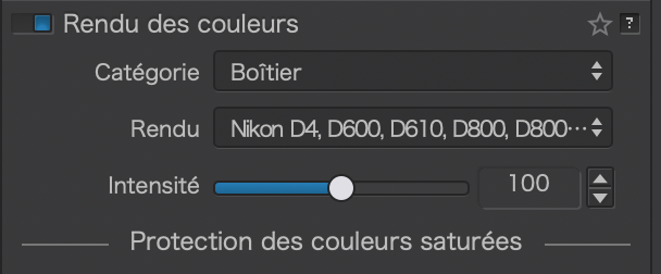
I believe a feature that doesn’t get much attention is the ability to choose the Color Rendering Profile for your images. If you are a Film Pack Elite customer, you can also pick from a list of Camera Manufacturer and Body combinations. It is similar to the Adobe Camera Profiles but less visible in the interface.
Example: I can use the Canon R5 color rending profile for my Nikon cameras. The possibilities here are endless. I believe this also offers a great way to compare stock Camera Manufacturer rendering of colors (and the evolution since different generations tend to have different color and tonality settings).
Some of my tips:
Neutral colors, Neutral tonality preset is good for further post-processing with other applications
Neutral colors, Neutral tonality v2 preset is good if you like neutral and accurate colors with some tonality (but still not much saturation)
Leica M9 preset is good for a more satured look with good skintones. I advice this one if you want to quickly share your images out to friends/family/social.
Fuji GFX preset is good for a natural look with some tonality
Latest Canon, Sony, Panasonic and Nikon looks depending on your preference (pick the one for the latest body: so the one for Z7, Canon R5, Panasonic S1 or Sony A7R Mark IV
A great use of this functionality is to get a unified look across several generation/brands of camera bodies based on your preferences. I also believe that simply selecting the right Color Rendering profile can save you tons of time in post-processing since your bed will be made for you.
What are your favorite Color Rendering presets? And why?
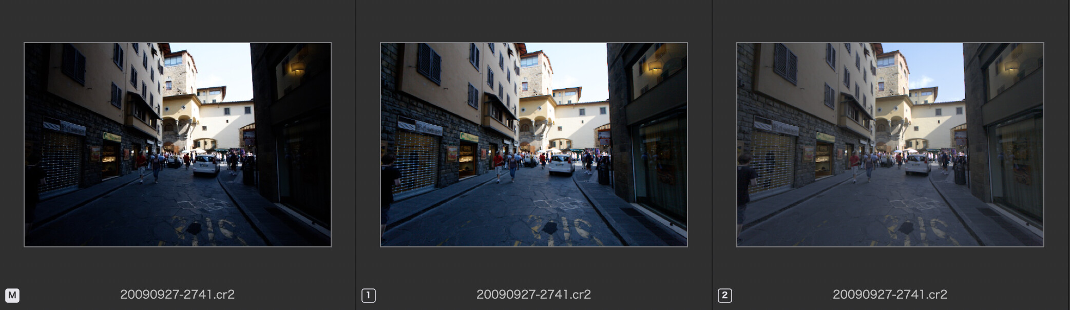
This setting reveals parts of an image that seem either blown or buried in the blacks if treated with DxO Standard (the preset that comes with the app). I most often also switch off Smart Lighting.
From the left: No Correction; DxO Standard; DxO Standard with rendering set as mentioned above.
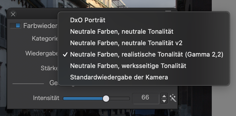
The …(Gamma 2.2) setting creates a kind of cinematic look, which can easily be modified to produce whatever subdued or megapop appearance the image should get.
Try this preset (for DPL4) A01 - Default absolut.preset.zip (2.6 KB)
My RAW files are mostly from Olympus OM-D cameras. Sometimes, I like to start with a film emulation for color rendering. I’ve often used Kodak Portra 160 NC or VC as a starting point. Colors are a bit undersaturated and very distinct from one another.
Fuji emulations are quite pleasing, too. Provia 400X reduces contrast but has great color. Provia 400F adds a nice degree of contrast, generally without crushing blacks or blowing highlights if the image is well-exposed. Fuji Superia Reala 100 gives me something in-between - very nice, particularly for indoor images.
For regular Olympus colors, I prefer the Generic rendering category with Neutral Color / Factory Tonality selected. “Protect saturated colors” must usually be elevated, but not as much as with the Default camera rendering. And tonality is fairly well-preserved.
I use DxO One as my default, starting point; … it’s similar to “Neutral color, neutral tonality v2”, but a bit brighter.
I have 3 bodies; 2 x Sony and an Olympus OM-D - and I find the DxO One rendering works well to provide a common “look” … but I do experiment with other renderings too, from time to time.
mostly this: (part of my own preset which is in preference as default)
i have some handmade profiles bought from huelight.
Those i use for quick tone checks and startingpoints
when turn to black and white i am often go to sliver efex pro 2. just a bit easier to find the right one.
(i tested a wile a go the B&W films and found some interesting, forgot which they where so new change i guess.)
i do like the Leica M9, and the pana S1 does also something but in general i tone manually .
not very static or consequent just as i like to on the fly.
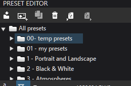
sometimes when i find a certain look i like and want to use more or want to use on a folder of images i make a partial preset and shuf it in the temporaly folder:
when i am done with it i delete it or transfer it to my main partial folder if i want to keep it. much more effective then scrolling around in the camera body’s.
An other trick is find the preset of your liking do some extra fiddling and create a Virtual Copy.
then use selective copy and selecting those settings you want to copy over the others.
constant tonality for starters.
seeing this i really need to make a favorite folder!
If one of the full presets is a good one then apply go to edits turn of everything which isn’t part of the “look” create a partial preset. name it as you like and poof you have your do anytime tonality preset.
one i still like to make is extreme HDR looks.
seems to be not really difficult but i didn’t have the spirit to search fiddle for it yet.
Colorendering is all about settings not really which camera type/style i think. I use to think that the camerabody colorrendering was all albout maximalising the sensor and cameraelectronics to get the most data out of the rawfile. Now i am not so sure anymore. it’s more a “replica of the Out of Camera Jpeg in defaul modes.” which most of us don’t use or modify at least. So i stopped using those camera defaults.
i used a time the DCP’s i bought as default but after a wile i notice that blown highlights and such where more prone to show when active. so i am back to generic and start from there.
note to myself:
make “02 my favorite presets”
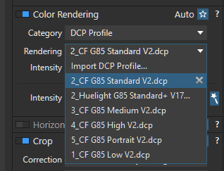
Favorite : DCP profile of the camera, of course
However, I use consistently some presets (Leica M9, Minolta 5D, Agfa Ultracolor, etc.), which I slightly correct…
It depends, every taken picture is different, but usually Generic rendering – Camera default is working well. Its little bit more saturated and with better contrast than DCP profile of the camera.
However, I’m frequently using B&W film profiles from DxO FilmPack 5. Mostly Ilford HP5 Plus 400
I agree about the Leica M9 as offering very good, “Canon-like” skin tones for Nikon shooters. Another cool tip is to vary the intensity of the effect depending on the shot. Sometimes the colour effect is too strong, sometimes it’s too weak. Leica M9 in particular increases contrast (as well as making skin tones rosier and less yellow). Regulating intensity helps ensure the Colour Profile enhances the image rather than overwhelming it.
Is one settings that Im using more then ofen. Turn color profile on, choose thatever value, for ex. Dxo portrait and set intensivity to… ZERO. This settings produce flat image so natural image. Value is 0 but it isnt camera default profile
You can accomplish the same effect by just selecting the Neutral Color, Neutral Tonality color rendering and leaving intensity/color saturation at defaults.
This seems to be the baseline color rendering DxO PL uses under every other rendering profile.
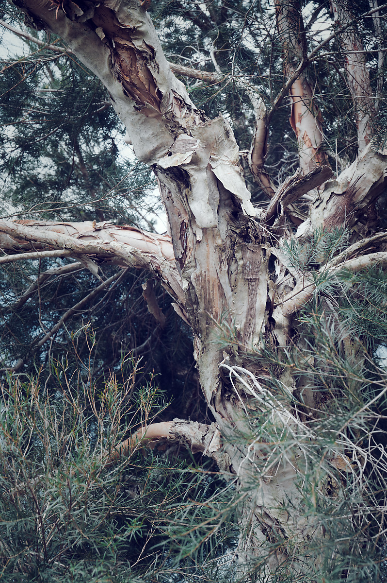
I’ve just created a new preset in PL6.7.0 for Olympus OM-D colors, particularly foliage. It applies the following adjustments:
Color rendering: Category = Camera body; Rendering = Pentax K5 II, K5 IIs…; Intensity = 60; PSC Intensity = 90.
HSL: Red saturation -14, Green saturation -25, Blue hue shifted a bit toward cyan/green.
Vibrancy = 35.
Exposure Compensation: Exposure set to -0.30 (a starting point, adjust as needed)
Smart Lighting off.
Selective tone: Highlights +14, Midtones -8 (a starting point, adjust as needed)
I find adding ClearView Plus = 5 to 15 helps sometimes. I would then raise Midtones back to 0 and adjust Highlights as needed.
Olympus yellows are brighter and more orange, but I like my preset better.
Smart Lighting in PL6 has become barely usable, IMO. At default 25, it makes highlights too bright and contrast a bit too extreme.
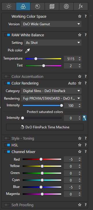
After a lot of experimentation for my Sony I like to use Fuji/Provia Standard from the - DXO Film Pack from the “Digital Film DXO Film Pack” collection.
Why because it gives me the most vibrant, eye pleasing colors that are still life like, in most scenes. At least with my camera. But if I need to I will tweak and change it. I have actually created a default preset that uses that color rendering and bunch of other smaller tweaks that I prefer and I save it all as a preset that I load up on image import, automatically. After that I tweak it if I need to or leave it as is.
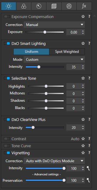
These are my current default settings that I use as preset upon import for every image.
I’ve had PL ‘elite’ since version 3 or 4, but not FP. The option to pick color rendering by camera body has been there all along. I’ve mostly only selected a camera other than the one I’m shooting when I’ve been arm-twisted into being a backup wedding photographer. I pick the main photog’s camera so my shots don’t have a different ‘feel’. Otherwise I just leave it set to what I’m shooting with (because I’m boring, I guess). I’ve noticed in v7 that I can make ‘render using the camera body used’ automatic. No idea if that was in previous versions.
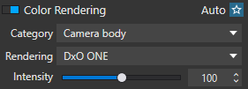 … it’s similar to “Neutral color, neutral tonality v2”, but a bit brighter.