Yep, I know. I was doing sports photography (radio controlled car racing world championships) and got the D2h in the first order from B&H (had to be replaced three times, when I gave up and asked them to send me an in-house used D2x that they knew worked), then got a D3 (great camera), but when I stopped shooting sports, the D3 was too big and heavy, so I got the D750 and still have it.
Thanks - now I have even more reasons not to think about the D5 or 6 or 7 or whatever. The D800 series like what you’ve got is a whole different world - I almost bought the D800, but got the D750 because of size and weight. My other choice back then was a Df.
There’s also the thought “do the best you can with what ya’ got”.
I agree with this, and the weak points in my images are far, far more due to me, than to the equipment.
Seriously speaking, if I do spend more $$, I think it’s more important to improve some of my old lenses. The D750 was intended to get me off the bandwagon of constant updates, and it worked. The Df put the nail on the coffin. I think my Nikon lenses are adequate, but some of my 60-year-old Leica lenses could use some improvement, but at $10,000 each or so, that’s out of the question. Voigtlander makes for a more reasonable upgrade at 1/10th the cost.
Back to this thread, I will try again tonight, and maybe the sky will be a little more cooperative.
Can’t agree at all with this. Landscapes are ruined by high ISO. The fine details grain and blur away.
Keep ISO at 100 and stop down and expose longer. Ideally on a tripod but you can put the camera on top of a table or a ledge or anything stable (hold onto the strap if you have your Nikon the balcony railing). Of course the framing won’t be ideal or perhaps even level but that can be fixed in Photolab if the core of the image is there.
PS. The D750 is more than enough camera for this kind of photography. Even for sports photography. Where the D750 falls down is in buffer. Nikon was aware sports photographers might buy D750 as a second body (costing D810/D850/D5 sales) so the buffer is ridiculously small at 14 RAW frames. As the SD cards are the older slower UHS-I versions capped out at 68 MB/sec, the buffer kills the D750 for any serious sports use.
For image quality the obvious upgrade is the D850 (probably used at this point). Out of this world image quality with incredible dynamic range. For video and new technology, the obvious upgrade is the D780. I own both of these cameras but usually carry around the D780 as I’d like to be able to shoot videos. I shoot both of them for sports. I posted an ISO 16000 file processed in Photolab earlier today. Here it is again.
You would be better to spend your money on glass, although at 24 MP you can safely shoot moderately good older glass. The D850 requires very high quality glass or one is just throwing all that resolution. Nikon offers an affordable and excellent 24mm f1.8 F mount lens. I don’t own this one as I had the chance to pick up a Sigma 24mm f1.4 at half price but if I had to choose again it would be the Nikon, as it’s quite a bit smaller and lighter and not that much darker (not even half a stop in real life).
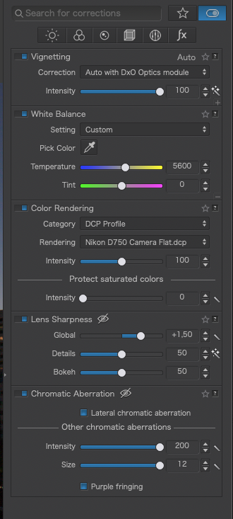
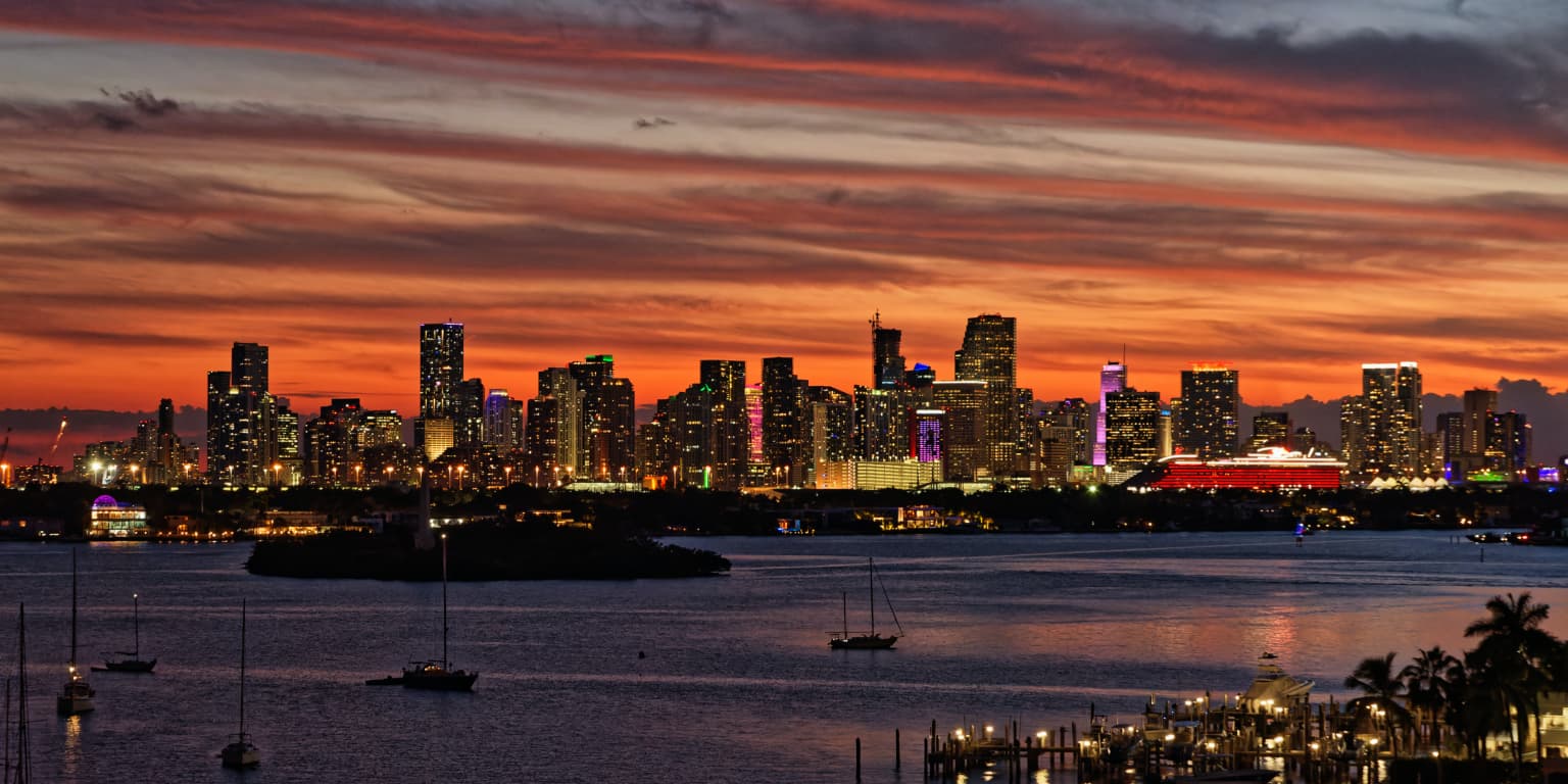
Talking of which, I just reworked this image, using an appropriate DCP profile from the Adobe DNG Converter installation that @platypus talked about here Color behavior - Any answer? - #21 by platypus as a starting point.
It really gives an amazing starting point, with a properly flat rendering that was easier to work with - at least, that’s my opinion.
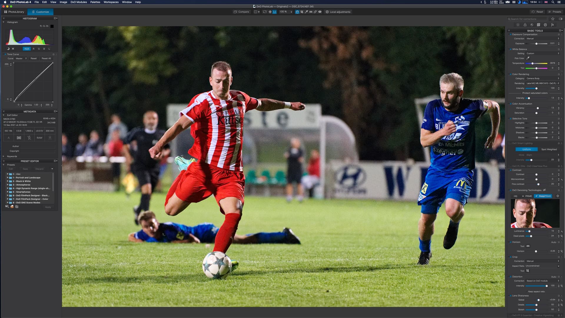
If you’d like to play in this game, p, is it really that difficult to export the file properly and upload a hires image rather than a really shoddy screenshot?
I need to learn to think like you - there is a world of difference.
Your version brings out things that are hidden in mine.
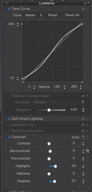
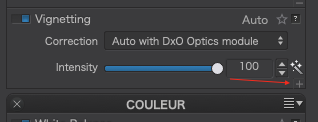
I go to Vignetting, and the “Correction” and “Intensity” look like yours, but I also see a setting for “Preservation”. Why is that on my screen, but not on yours? It’s set to 50%.
I saved a new Workspace which should include all the things you worked on.
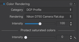
So from now on, I need to go to Color Rendering, use the drop-down tool, and select my camera?
I haven’t been doing this.
What was your reasoning for selecting “flat” rather than the others? Because you were going to do them manually?
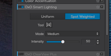
I have never yet used Spot Weighted Smart Lighting. I see what you did.
How does this differ from using a control point?
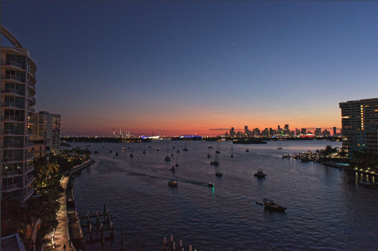
I was wondering how to lighten up the buildings - now I see how you did it. Brilliant!!! …no pun intended.
Yes, I see how clear the lights are - is this because of the exposure being perfect, or from my not shooting wide open at f/2.8 ??
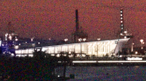
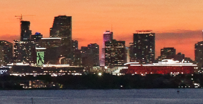
You left the fine contrast at 0, and increased the “Highlights”. Did you mean to increase the Fine Contrast instead? Looking at my screen, the red ship at the middle right looks better when I do what you wrote, not with the settings above. At 100% size, with fine contrast set to 42, not only does the red ship look better, but the crane on top of the buildings shows up in much more detail than the day before. Also, I notice the red fringing on the building at the right is gone.
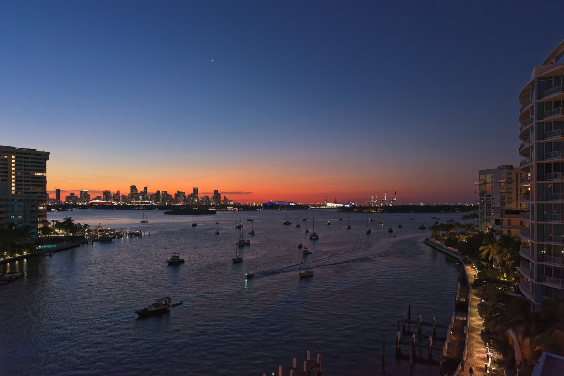
What was the monster? If the lower left corner was made much darker, I think I like it more without this crop… but the right edge has so little. I should have aimed the camera a bit more to the right, but the city of Miami is off to the right, so maybe it’s still “balanced”.
I especially like what you did to the water - it is now almost too visible, confused by the wake from the boat, and I ought to have taken another shot at that boat got to the lower right corner.
Alec, while in general I agree, Mike puts his pics on the web and is not printing. For (t)his purpose it is no problem to up the ISO. Check his older pic from Dec 2020, taken with the DF – no problem with 5000 ISO (and I tormented his pic to get some reflection on the water). The D750 is better in that regard and as you state yourself …
…the D750 takes amazing photos even at high ISO, with excellent autofocus. Here’s an example at ISO 1600.
In fact from my side, it also was to safe him the use of a stable tripod, long shutter speed, mirror slap, remote control, additional menu settings … convenience not over, but without sacrifying quality.
You would be better to spend your money on glass, although at 24 MP you can safely shoot moderately good older glass. The D850 requires very high quality glass or one is just throwing all that resolution. Nikon offers an affordable and excellent 24mm f1.8 F mount lens.
For sure, good (enough) glass is more important, than megapixel (of course some exceptions).
But in case of tripod use and stopping down the lens, there is no need for speed.
A different case is hand-held and low light – and only then I take the heavy AF-S 1,4/24 mm (or AF-S 1,4/35mm for people). Otherwise that convenient AF-S 24-85 mm zoom is my go-to lens.
For landscape (no ‘landscape junkie’ here) I used the 1kg monster AF-S 2,8/14-24 mm
(still have it, but long replaced by the lightweight AFS 1,8/20 mm).
… is the key. If you can really get to grips with the D750, it will return stunning images, as long as you follow the golden rule of never over-exposing but learning by how much you can expose before that happens.
That’s because it was collapsed. There is a little + on the bottom right…
I must admit to not really knowing what that slider does - time to read the manual?
Not necessarily. But, for this shot, with its high dynamic range, it was interesting to apply a totally flat profile to give myself the best chance of selectively doing stuff rather than letting something automatic take a guess at what I was thinking.
Smart Lighting is a global adjustment; not local. It is so useful for giving you a starting point, in an HDR image, by bringing the deepest shadow and brightest highlights into range. it can be used in Uniform mode, where it decides what is important, or in Spot Weighted mode, where you decide which parts of the image are important. Like the flat profile, it’s all about getting the image as flat as possible to allow room for selective contrast enhancements rather then just blitzing the whole image.
A bit of both.
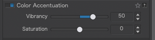
No, I didn’t want to increase the global fine contrast because I didn’t want to make the texture of the water too obvious.
This kind of thing is down to personal taste and you need to do what you think is best - just be aware that changing things like fine contrast globally can can an adverse effect elsewhere.
If you really want a local contrast enhancement, use the micro contrast very sparingly in a local adjustment.
Totally down to whanging up the Chromatic Aberration for that particular lens.
This is where that thing about using global fine contrast carefully comes in. Better to try different combinations of fine contrast: high middle and low before you add in anything global.
If you don’t keep on trying, you’ll never get better. Mistakes are there for learning not for regretting.
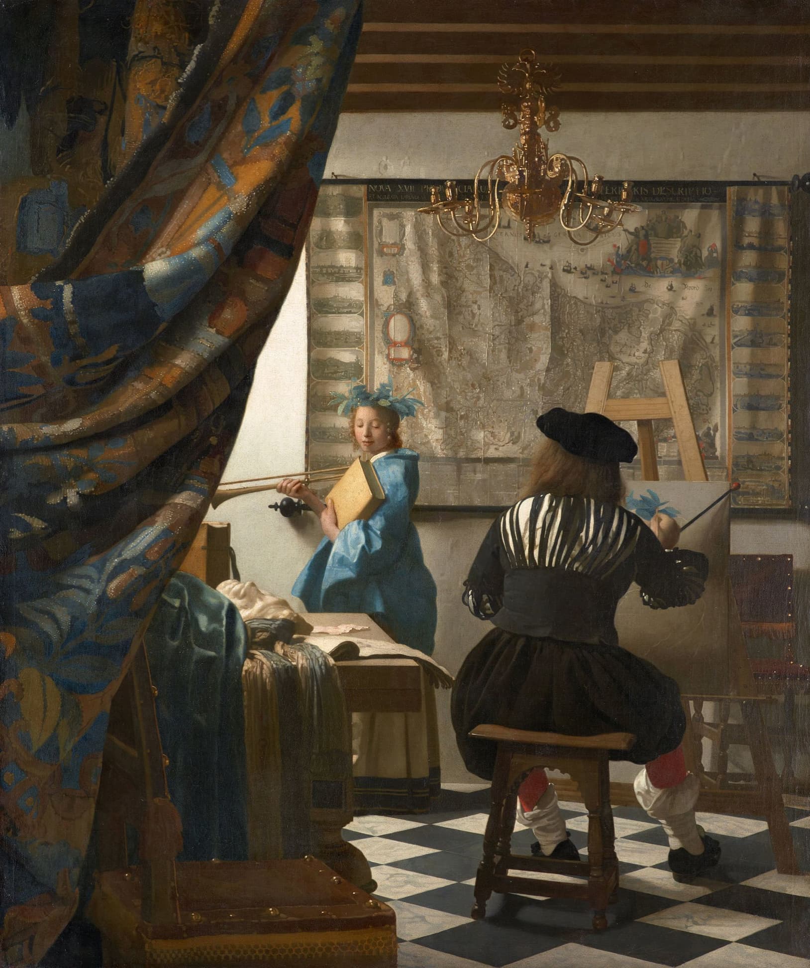
the light, coming from up/left shines on the person in the blue dress.
the dark curtain at left, makes the viewer’s eyes snap to the person in the blue dress
preventing our eyes from wandering off to the right, is the painter, seen from behind and dressed in black (mostly)
floor tiles are oriented in a way that points to the main attraction (in blue dress) as well as cutting said direction in order to keep our eyes from wandering off (again)
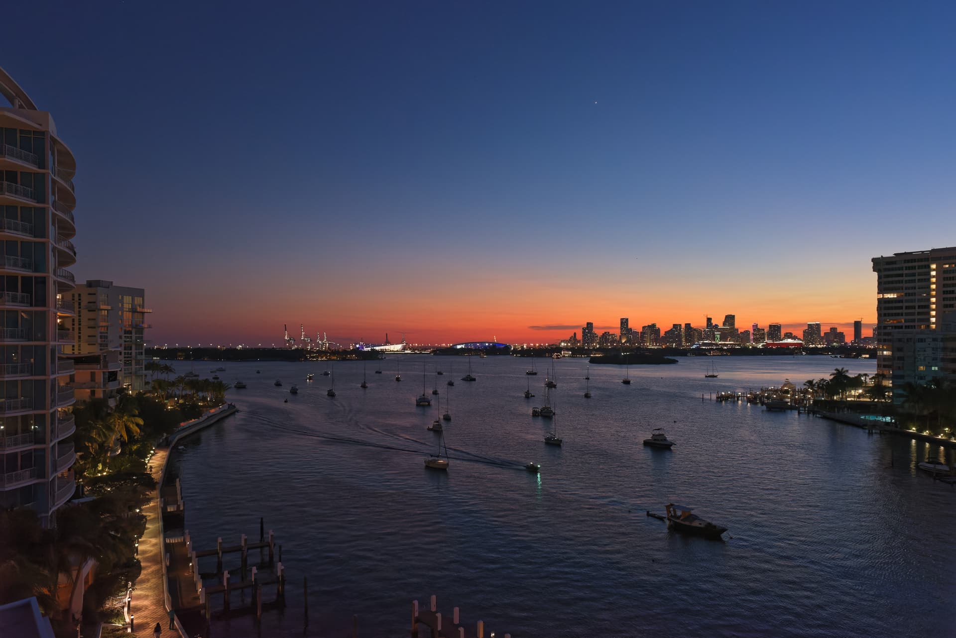
The Biscayne view, although oriented as in reality, has lighting that goes from right to left.
the tall building at the left edge is fairly bright and kind of attracts our eyes with lots of detail, amplified by a relatively bright pathway that attracts the eyes too.
the waves drawn by the boat below the center of the image directs the eyes towards the lefthand bottom corner, which is empty, our eyes are tempted to leave the image
We have a situation, where attention is drawn to the l.h. building and pathway, as well as the sky and sunset colours and nothing blocks the way out at the r.h. bottom corner, making our eyes wander to and fro, not resting on a subject and unhindered to get out for relief.
all things considered, the scene does the opposite of what Vermeer’s image does.
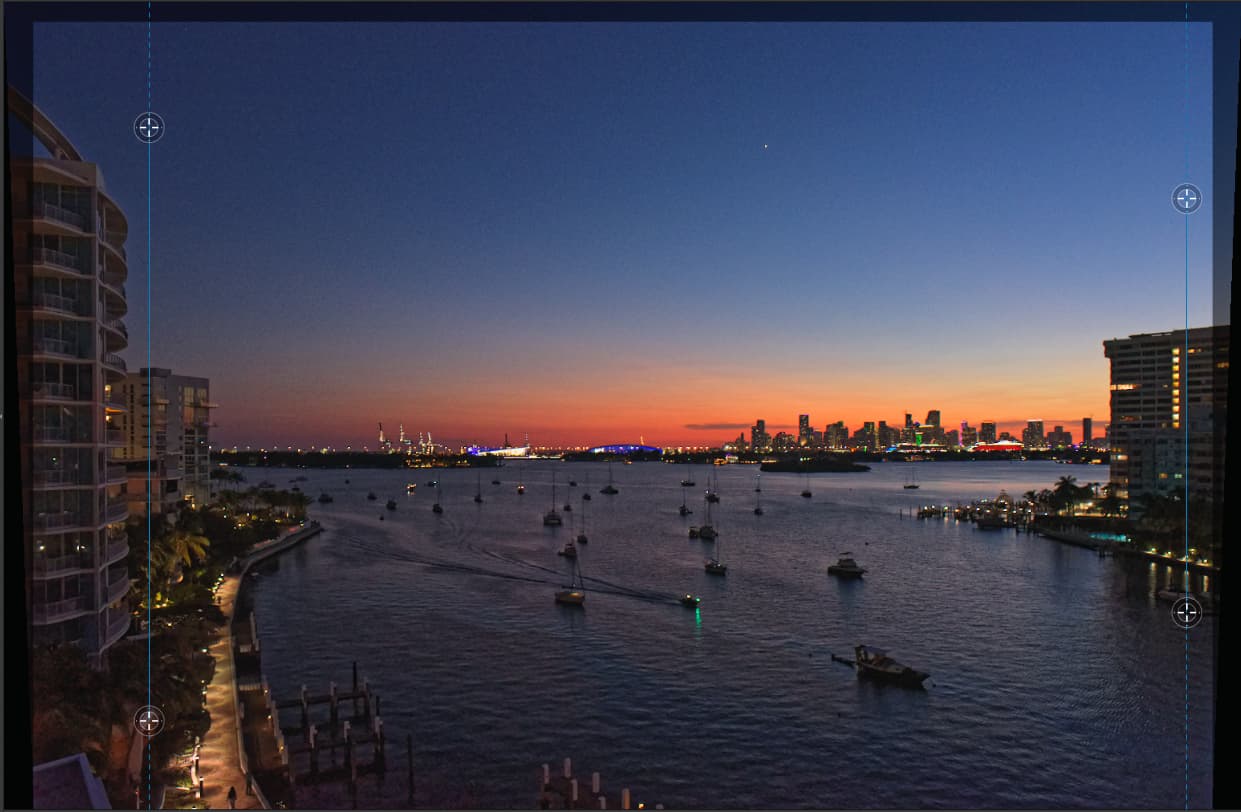
I added the flipped image to illustrate how lighting can make eyes wander, or rest. Removing the l.h. building (the monster) served the same purpose. Alternatively, we could darken the r.h. bottom corner with a similar effect, preventing us from not seeing the forest for the trees…
Note: Left-handed people and those writing from right to left can perceive things differently, in which case the unflipped image would look perfectly okay. Looking through a waist level finder (that flips the image) does creates a similar effect…
Absolutely. For landscape Mike could use one of the better zooms (not faster zooms, better) and just stop down to f6.3 or f8. Use of a tripod or in place substitute is what would make his photography better.
I’m probably overly concerned about fast glass as I’m shooting action in very low light where I need shutter speeds of 1/1000s to hope to stop motion (1/2000s is much better but a trace of motion doesn’t ruin most shots). Even with f1.8 lenses (usually shot at f2 for sharpness, that tiny stop down makes a huge difference) I often find myself at ISO 12800 and higher.
Aha! That sounds reasonable - I will try to test it out. Sounds potentially very useful!!
I have always been fascinated by the “texture of the water”, although I never called it that. I like to show what the water was doing, flat calm, or (better yet) waves and so on.
Understood - there are parts of this image that need it - like the cruise ships and the terminal buildings, where there is useful detail there, and I would prefer to show an accurate view of the side of the ship, if possible.
It’s now cloudy and “yucky” outside - not a good sign for tonight. I’ll be ready, just in case.
Flipping the image, in this case, would get a lot of negative feedback. I understand what you wrote, and how my eye is “controlled” by all these things, and darkening the lower right, while removing the “monster” certainly helps direct my eye right into the middle of the image, where the sky is at its prettiest. I’m surprised by this - it’s obviously very effective in making a better image/painting (at the expense of not showing all the small details, like the boats, that I also find fascinating.
As a photograph, your version works the best, but since everything is now pointing at the bright white terminal building, where ships are tied up, I guess that needs some more work to show the details of that building better - it’s too bright now.
Instead of “capturing a scene”, maybe I need to think more in terms of “creating a picture”.
Joanna got all the elements looking better, and your suggestion makes it more of a “picture”. In a large size though, that building is all burnt out, which I will/would fix.
I need to use all the photo techniques Joanna is teaching, and also things like what you just pointed out, so the picture “works” properly, and directs people’s eyes INTO the picture.
I’m learning this. I’m curious as to which is better at f/8, my relatively inexpensive and old Nikon 24mm, or my much more expensive and newer 24-85 Nikon VR zoom. If I get to try this again tonight, I’ll use the newer lens.
Added later - my friend Krishadas in India wrote me:
“Great. And how will the earth look like in your camera if pictured from the Venus??”
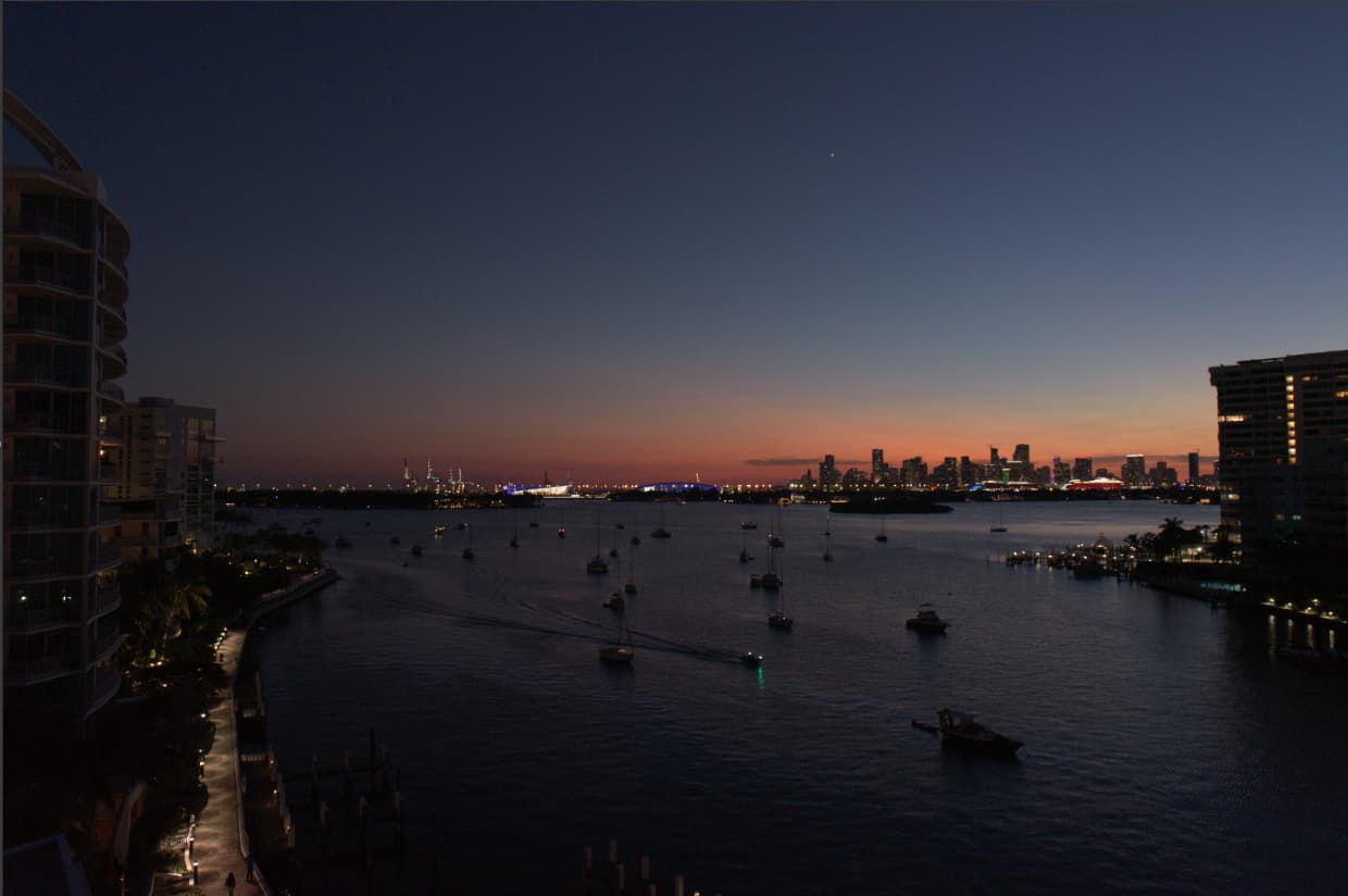
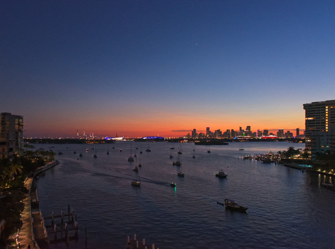
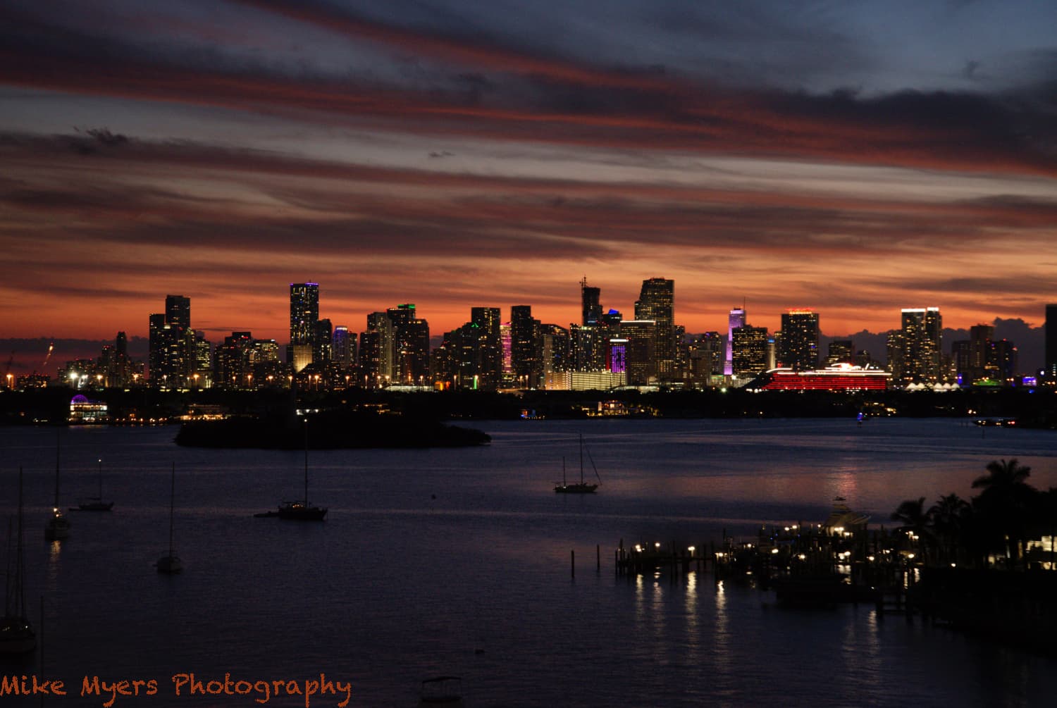
I went outside as the sun was gradually going below the horizon, took a meter reading, and turned off bracketing. Every five minutes or so, sometimes sooner, I took a photo. Very few clouds, and the sky looked totally boring. I kept at this until it was quite dark, and then got an inspiration. The pretty part of the sky was at the right, so I zoomed in to 80mm and continued shooting as the colors rapidly faded away.
For reasons I don’t understand, the somewhat boring image that I saw with my eyes look infinitely better on the viewing screen of the D750. I took around 8 more images, and the sky is dimmer for each one. I selected the first, and then did many of the things you all, especially Joanna, have shown me. On a whim, I tried “Smart Lighting”, and it brightened up the water nicely - probably too much, so I cut it down.
The right side of this image at 100% is not sharp. If I do this tomorrow, I’ll try with my Leica and a Voigtlander lens.
The sky almost looks “fake”, but it is 100% real. The red cruise ship was still there, but it was too bright, so I used Local Adjustments to tone it down.
I am puzzled about something - many of what might be “street lights” have a “tail” under them. I thought it might mean the camera moved, but it is the same in all my photos. The other bright lights don’t have this issue, so I suspect it is “something” real in the photo - no idea what.
As of tonight, I love the way it came out. I can lighten the trees at the lower right, and the island, but why? If the photo has a “focus point” it’s probably the middle of the city with the bright parking structure, but the red cruise ship steals my attention from that. Maybe I should darken the red some more?
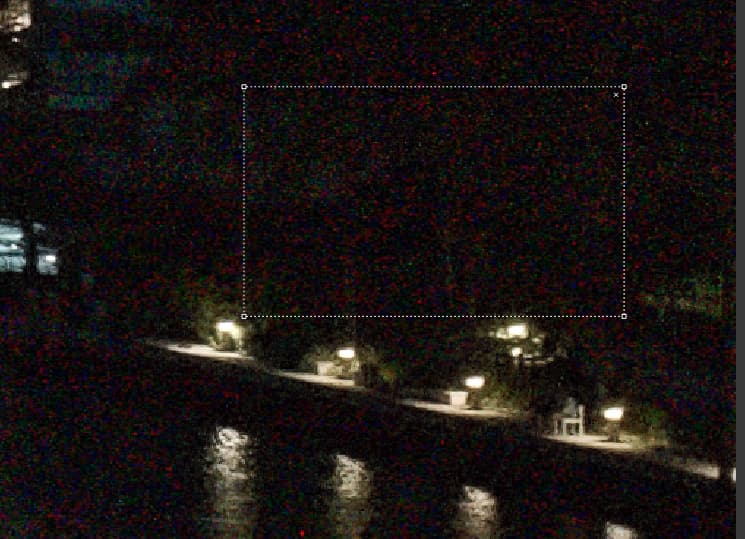
I used the graduated filter to slightly darken the top of the sky, Because of yesterday’s suggestions, I used another graduated filter upside down to darken the bottom of the image. I’m tempted to darken the lights at the bottom right, but haven’t yet done so. Update, that is done too. Pushes a person’s eye toward the city.
This is the full image, as was done for the previous two days. captured with the 24mm setting on my zoom lens. It’s not edited, as the only interesting part of the sky is over the city. Oh, and it does have my Venus sensor dust spot.
Just for comparison, regardless of what sky I’ve got tomorrow, I’ll take a similar shot with my Leica.
Added later - I was wondering what Joanna might do to make this image jump off the paper more, so an hour ago I made a virtual copy and started playing with various tools. Here’s the .dop from when I finished:
Maybe I went too far - it looks like a nice photo to go on a calendar, and it is certainly NOT what the scene looked like to my eyes. I suspect Joanna’s first thought will be YIKES!!! But it was fun, and I rather like it this way.
(…and for anyone reading all this without posting, a year or two ago, I would never have been able to have done this. I hardly can believe that I actually did so!
For a start, you didn’t apply the basic lens corrections
But you didn’t apply any “areas” to the Spot Weighted mode. And, as soon as you apply Smart Lighting, everything “averages out” so you would see darker things getting lighter.
That is because you didn’t apply the lens corrections.
Those will be the poles that supports them, illuminated by the light itself.