Hy i am new to DxO workspace, and one thing i am not fond of are the repeating controls because it uses unnessesary space. I am not started to modify my work space because i need to find out which i don’t need. So i left all sections active for now, what gives a lot of scrolling or folding in out, i would like floating toolboxes on a second screen. Like all which are below screen line.
Is that possible?
Or the essentialstoolbox, is this modifiable so i don’t have so much double 's ?
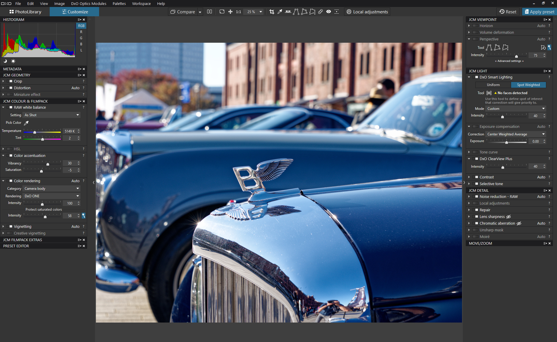
Every now and then, I use a workspace with a palette that contains all control panels except the ones that I put into the left dock (see screenshot wayyy up)
I am used to Silkypix layout which has more a switch tab kind of lay out and floating toolwindows (on a second screen which you can toggle with a button. So all base tools stay in screen one and the extra ones are a floating toggle version.
My confusion is the repeating tools and sliders. I can’t figur out why this would be usefull. its causes you to the need of scrolling or pull up (collaps) and down(expand) tool windows.
One other thing is do find new is the fact that CA correction is working when zoomed in (you see the purple disapear) and zoomed out the purple is there again. So no realtime rendering like in SP.
(not a biggy because after exporting the CA is corrected properly)
Same as sharpening or micro contrast can cause some artifacts or moiré in the exported jpeg wile zoomed in at 100"% all looked fine. I am working on my “see and correct” knowlegde.
That’s why i still have all tools still visible, i am still strolling around in the tools to find the sollution.
How image corrections are displayed depending on zoom level can partially be influenced in the settings.
Again, you can add or delete panels at your own discretion. (Un)select according to taste with the dropdown list at the right side of the palette titlebar.
Create new palettes from the menue and either attach them to a dock or move them to wherever you want. PL is quite customizable. The film strip can be floated from the menue. Try it or check out the manual…
Another excellent and MUCH appreciated feature of PL’s ability to customise one’s own palette layout is that it allows one to change and adapt the layout to match growing experience and preferences, and to accommodate new features, etc.
My layout now looks like this - with the LHS palette (containing less-used tools) usually hidden, until needed;
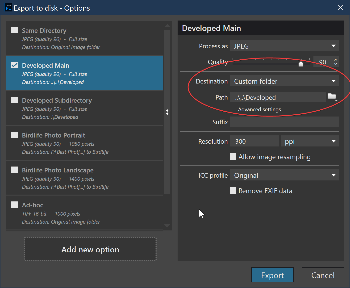
Not really a Workspace Layout but I discovered that you can use relative paths for your exports which I have found to be extremely useful if you have multiple directories of photos and you want all your developed photos to go to a single folder relative to the original file. Now you can use a single export for all your develops and know they will be in a folder relative to the original and you will not have to change destination each time.
I have my photos in folders as shown below with all photos in a date folder:
2019 Photos
     Developed
     Camera1
           Date
             |
           Date
     Camera2
           Date
             |
           Date
2020 Photos
     Developed
     Camera1
           Date
             |
           Date
     Camera2
           Date
             |
           Date
Then if I want all my developed photos for each year to go into the Developed folder in each year’s folder, then I would use the following export settings: