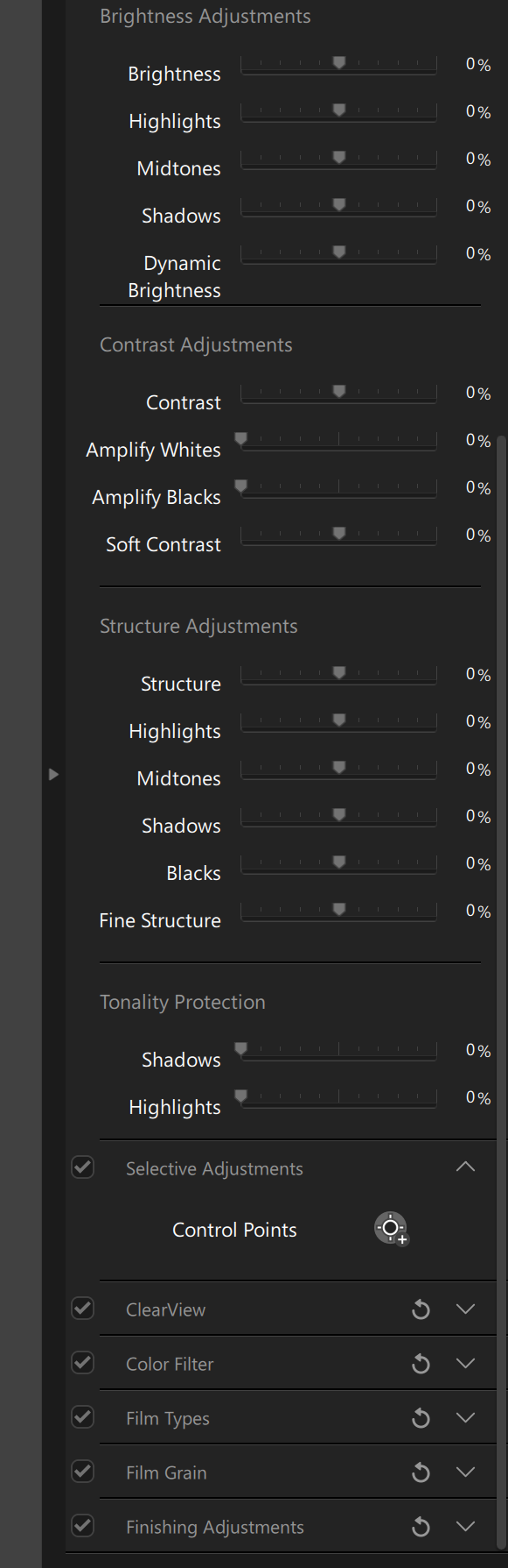
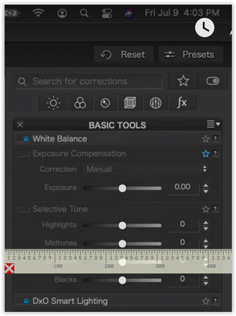
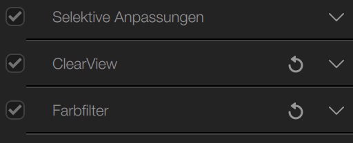
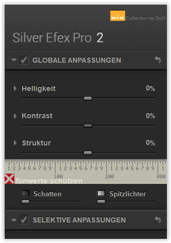
The labeling of the tools in the right panel - almost unreadable:
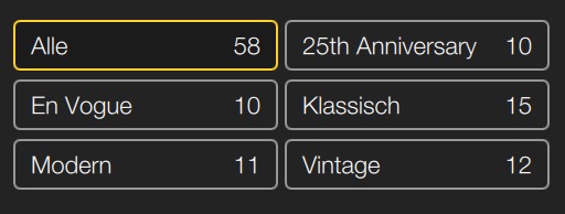
Compared to the labeling of the presets in the left panel:
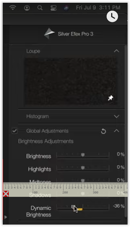
The labeling of the tools in the right panel - almost unreadable:
Compared to the labeling of the presets in the left panel:
@Klick I am on a Mac and it looks like the release they made Friday July 30th corrects the problem. It appears the two panels are now of equal brightness.
Peace
Marvin
@Klick I see what you mean. I was not focused on the collapsed titles. I have now voted.
Peace
Marvin
in Win 10, 125% / Eizo CG2730, 2560x1440
[ pixelruler to compare width → www.pixelruler.de – Win ]
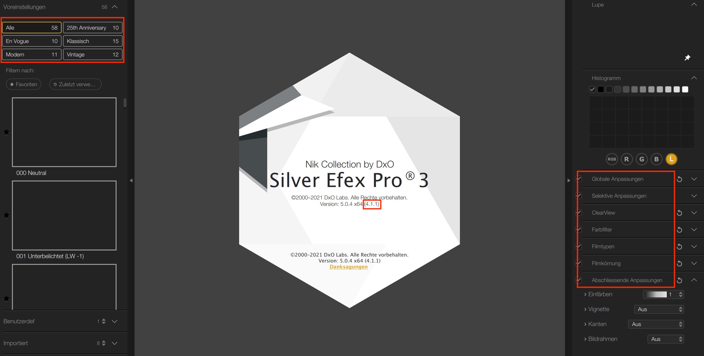
SilverEfexPro 3 (Nik 4.1.1.0) / PlugIn_PL 4.3.1
LHS 330 px
PhotoLab 4.3.1
FilmPack 5.5.27 (Elite)
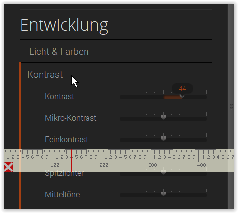
RHS 470 px / slider scale 180 px
= bigger lettering in FP5
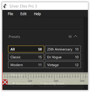
SilverEfexPro 2 / Nik 3.3 / PlugIn_PL 4.3.1
RHS 320 px / slider scale 260 px
= same dimensions in SilverEfexPro2 (Nik 3.3) / PlugIn_AP 1.9.2 / _PS
edited / see further down post #10
@Wolfgang , you are referring to the width of the palette and thus the spacing of the letters, right?
For me, it’s mainly the brightness and contrast of the font.
@Klick
you are absolutely right about brightness and contrast – especially with fonts so small.
Plus, in a wider palette there is more space to structure and organize for quick overview.
– First hand, it’s about usability, not about a whatever slick design.
DxO has already proven e.g. in PL 4, how to do better – wider palette, bigger font, better contrast !
I agree this is one of several things that need changes
As I have been watching several published webinars about SilverEfex Pro 3,
Create Artistic Black-and-White Landscape Images with Nik Silver Efex
2021-07-09 by PhotoJoseph → Create Artistic Black-and-White Landscape Images with Nik Silver Efex - YouTube
Discover Your Unique Style with Nik Silver Efex for Black & White Portraits
2021-07-12 by Dan Hughes → Discover Your Unique Style with Nik Silver Efex for Black & White Portraits - YouTube
Using Nik Silver Efex to Create Dramatic Black & White Cityscape Images
2021-07-24 by Photo Joseph → Using Nik Silver Efex to Create Dramatic Black & White Cityscape Images - YouTube
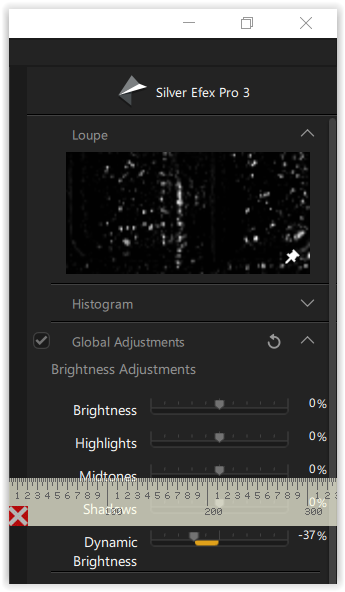
I thought, there is a size difference on the RHS of SEP3 between the Mac versions and Windows.
So, I took screenshots from Dan’s transmitted video, which appears at roughly the same size
as those from PhotoJoseph, and included → www.pixelruler.de to compare width.
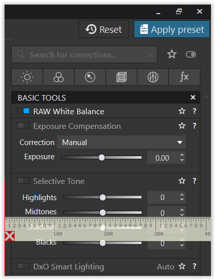
PhotoLab 4.3.1
SilverEfex Pro 3
In comparison to PL 4.3.1, the difference for SEP3 between the transmitted Mac version and Windows is striking … so, what’s wrong?
Apart from obvious requirements to transmit the webinar,
– the Mac version’s RHS panel/menu in SEP3 seems to be (much) wider than in Windows.
Of course, it’s not only the width, but the lacking contrast with labeling so small !
I have really no idea if you can compare screenshots of a YouTube video with your monitor display. Besides, as far as I know, YouTube edits the videos while uploading them.
Hi Manfred & all,
going to Webinars - Nik Collection dy DxO, you can see that webinar by Dan Hughes
→ Discover Your Unique Style with Nik Silver Efex for Black & White Portraits - Nik Collection by DxO
PL 4.3.1 via DxO
SEP3 via DxO
The pixelruler ( www.pixelruler.de – Win ) shows, the screenshots taken from DxO site are almost exactly the same width as those from the YouTube video.
– If you / someone is interested in the real size … (calibrated pixelruler for my screen).
– And, I chose this webinar because PhotoJoseph uses his camera in between (his ‘main frame’ jumps forth and back), while Dan Hughes doesn’t.
So yes from my impression, the Mac version’s RHS panel/menu of SEP3 seems to be (much) wider than in Windows.
– Maybe someone from DxO will let us know and explain, why the Windows version is smaller than the Mac version – or not.
hoping for improvements

Hi @Wolfgang , I understand what you are saying. I’m just not sure if distances that are taken from a YouTube video actually correspond to reality. Because YouTube “optimizes” videos when uploading them. Maybe they are also minimally distorted by this.
Anyway, the fact is that these labels are hard to read. Therefore:
Me too!