What’s the relevance of UI age? No one is disputing the introduction of new technology the issue is how a user chooses to apply it. Sliders on the UI vane are simply a delivery mechanism all I am suggesting is they can be turned on and off at preferences. Now that would be a relevant upgrade… removing them is just lazy on the part of the development team
In your opinion of course.
There is also an opinion that u points are now old tech and that there are better alternatives. I tend to agree with that although I quite like using them. Probably because they are like a pair of comfy slippers.
Yes there is…but it misses the point… U points are not THE TECHNOLOGY they are simply a way of applying it and the sliders are not the technology either they are also a way of applying they are just another panel slider and for some work, particularly on large screens they are the best tool to stop one moving back and forth or trying to look at two places at the same time… a set of chisels is a set of chisels sometimes they are used and other times not they have been around for centuries age has nothing to do with them it a case of the right tool for a job. The code and new ways of manipulating pixels will for ever be evolving how these manipulations are applied is matter of personal preference. If someone is happy to work two feet away from the screen and be able to select dimly lit sliders whilst looking at the subtle changes on the image that is just swell but there are those who work a foot away from a 30" + screen zoomed into the iris of an eye and I defy anyone as how its is physically possible to look at area of manipulation whilst you hand is trying to reach down a list of slider a foot away from the edges of your peripheral vision. U points and the sliders below make for really fast workflow if you are ‘dodging and burning’ on B&W They are the best tool for the job. This is a matter of ergonomics, not opinion and if you have doubts about this, have a look at the direction pilot’s visors and car dashboard information are now increasingly being brought in front of the field of vision of the operator…removing the sliders from the u points was a backward step and nothing to do with old slippers
It only misses the point “in your opinion” and that is the issue here. This is about you and what you want. That is ok but it may not be what others want. You seem obsessed with it to the point where you believe that only you have a valid point of view. Well that is not the case and it is time to move on. What will be will be and you can make decisions on the back of what happens. Simples really. This is not just about you…sorry but that’s life.
My old dad said to me never try and debate with an obsessive. He was spot on there. I’m out but perfectly happy with this development.
Hi there,
I’d like to point out just a few things to further nourish (I hope) the discussion about the UI…
• First of all, everything is constantly changing/evolving (of course, sliders are there for ages now, but UI and UX have evolved quite a bit at the same time in the last years…).
• As human beings, we are deeply “change-averse”. “The NYT has a new layout? The old one was better.”…
• One should never think about a solution rather about the problem to solve
Regarding the last point: what some users are saying here is that “they prefer to have those sliders close to their Control Points.” This can come under many forms and maybe at one point we’ll be able to satisfy both sides (“I want the sliders next to the CP” — “I want the sliders on a palette like other corrections”.
Certainly, keeping both the old UI and the new one cannot be the solution. Evolving, means a certain degree of change. Jumping back & forth between the “past” and the “future” is not what I define as evolution…
• Maybe being able to temporarily "bring out the palette" next to the CP (with a keyboard shortcut for instance) could solve the issue. We'll see…I'm just brainstorming here…There is also another topic to keep in mind: we do offer a product line with different software which do not fully share a common user interface at the moment…Things are slowly converging toward a shared UI language for a common UX experience. This is what we aim for.
Steven.
1 Like
So, if DxO were to add more and more possible local adjustments, you would be happy to see an “equaliser” bar that got longer and longer?

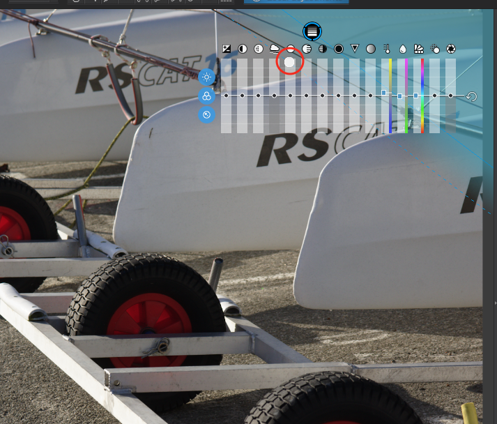
Here’s a screenshot of PL4 and:
- it takes up a lot of screen space and can hide what you are working on
- it can be difficult to see on certain types of image, like this one
If DxO were to offer you the Color Wheel tool as a local adjustment…
… how would you find having that complexity within the working area of an image?
Or are you happy with only the current local adjustments?
1 Like
Spoiler Alert: yes, we want to add new corrections to the Local Adjustments…
4 Likes
That would be a-ma-zing


1 Like
Hi all,
to Joannas post
Light, Color, Detail are visible and it’s also possible to show only one group…I know all knows this 
The hiding of photo details and the visibility of sliders are still a problem
Sometimes I would also like to set the LA point, but move/have the sliders anywhere else apart from point…maybe selectable by user.
The sensitivity of the sliders could be improved
Thanks
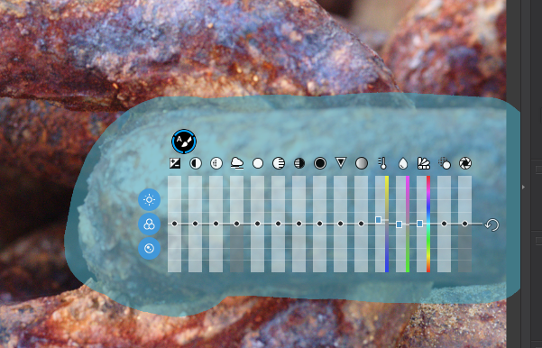
As you can see in your own example the area of influence is clear of sliders they are outside the circle… put that aside for a minute and consider this. We now have more possible adjustments which is great!!! So an intelligent developer would say hmmm possibly too much clutter how do we overcome this? Well not everyone uses all the adjustments all of the time… so let’s allow users to customise the bar to suit their needs…. Not throw the tool in the bin and stick everything on a panel where one has to look for it…. That’s just lazy and turns a professional app with a unique point of difference into a ‘me too’ also run. What worries me most is the ferocity of dislike… if u points are that bad why not use any number of other applications … very strange
Hi Steven, once again this is not an issue of old new, old slippers or dislike of the different. My position has been the same from the unfortunate moment I purchased the new version and it became instantly obvious that the ergonomics of having to hunt for the right slider outside my peripheral vision was hampering my productivity. By all accounts I am an early adopter but only if things work!!! So far I have not come across a compelling opinion which demonstrates that eye to hand coordination particularly on large screens is better with the sliders to the side. If you or anyone else in the organisation is prepared to put out a tutorial on this particular issue and demonstrate that the u point sliders improve productivity I will be the first to change my way of working. I can process 30 images in the older SE in about 1 hour - dodge and burn each one individually With sliders to the side I don’t get anywhere near that number and I constantly have to turn my gaze from the center of the screen to the left and back again to check the results which always need further tweaking… it’s totally unworkable… but by all means show me how the new version deals with this particular issue
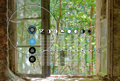
Well, that depend on which tool I am using
Here, with the gradient tool, not only is the part of the image I want to change behind the equaliser, the gradient length adjustment tool (circled) is also behind it.
Here, with the Auto-mask tool, it almost completely covers the area of interest.
Maybe it suits you for the Control point tool but, for others, it can be a real problem
Please read my whole comment Thank you
I did and, obviously, for you, using mainly control points, in-picture, suits you. But that is not true of everybody else using other tools.
Which part of customisation of the control points do you object too? If they are optional at the preferences everyone can use the product to suit their needs
Having an option/toggle to switch between the current implementation vs the previous one is not going to work. As described above, with all the editing needs (AKA more and more local adjustments per image) and a near future with even more local corrections available, the previous UI will not work.
Hence, “switching” between the two versions, is not a matter of “look” rather a matter of functions…
1 Like
I generally agree with @StevenL’ s comments regarding the future of control points and local adjustments in general. This is a difficult subject that has devolved into two very separate camps. Below I’m suggesting a hybrid approach which may, to some degree, satisfy both camps although the jury is still out on whether It is necessary.
Nikon’s NX Studio has both on screen and right panel sliders for control points although it appears the on screen sliders can’t be hidden for those who prefer using the panel sliders only. A similar setup could be implemented in the Nik Collection with the addition of the ability to hide onscreen sliders for those who don’t want to use them
With regard to the question of increased control point functionality making the on screen sliders obselete, one has only to look at the current implementation of Photolab where new control point features are placed in the Local Adjustments panel rather than with the already crowded onscreen slider groups.
Here again a hybrid approach could be designed where the current on-screen sliders would also appear in the local adjustments panel and could be displayed or hidden on screen depending on user preference with the understanding that all new features would appear only in the local adjustments panel.
My point is It would be technically possible to satisfy, to some degree, everyone’s preferences. Wherher DXO should even consider this approach is a separate question
My main argument against such a hybrid approach is whether adding this layer of complication is really necessary. There are already global and local controls in all the Nik Collection modules, The argument regarding being able to adjust control points while keeping your eyes focused on the screen seems to imply that those users don’t also use any global sliders which have always been on the right panel and require a shifting of one’s eyes. In the end, I still believe side panel sliders are better from a usability point of view, although a hybrid approach might satisfy many uses.
Mark
1 Like
No one is asking a switch between old and new. We have new ways to influence the pixels - Great! We have sliders on the side panel to manipulate the new tech - Great! Now all that is required give options in the preferences for the user to chose where the sliders are operated from. It really is not putting a man on the moon … and once again no one is answering the ergonomic functionality which is and has been my key point
1 Like
Yes !!! Hallelujah!!! It’s really very straight forward and I cannot for the life of me comprehend the level of antipathy towards the sliders on the upoint when there are customisation possibilities to cater for all needs… very strange
1 Like
@mwsilvers
Viveza 2 has a clever soluton – showing the controlpoint sliders with the controlpoint and aside.
And the moment one chooses a CP, the RHS global sliders change to function selectively, mirroring the ones at the CP. → So, it only would be necessary to simply hide the CP sliders.
BTW, changing the RHS sliders to also function selectively could be a solution to reduce the amount of visible sliders in Viveza 3 and SEP 3.
2 Likes