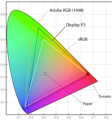
Given that saturated reds / greens are typically in the range of colours that can be outside a particular color-space …
… the choice of red to highlight out-of-gamut colours is (often) not very helpful.
Indeed. Possibly a neutral grey or a checkered pattern might be more useful. Certainly, on the infamous lobster image, the red for printing and the blue for screen both become all but invisible on one lobster or the other.