I find the text in the PhotoLab online help difficult to see; I have to strain my eyes while reading. The typeface is thin and light-gray on a white background. Any chance this could be changed to be more readable? (Okay, I’m in my sixties but I think this may bother younger folks too.) I’m using the latest version of Chrome on Windows 10.
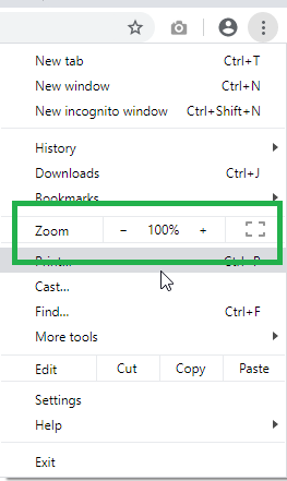
It looks fine to me in my Chrome browser on Windows 10. There are font settings in Windows and Chrome that you can change - but if this is the only web site giving you problems, the easiest way to deal with it might be to click on the three-dot icon in the upper right corner of Chrome to bring up the menu and increase the Zoom setting. If I remember correctly, Chrome will remember the setting you choose for each web site.
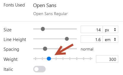
Firefox web developer tools show the font in use for the main text (p3).
I found that if the weight is bumped up one notch from 300 to 400, the problem goes away. I can see the text clearly then.
It shouldn’t be about users figuring out how to fiddle with their settings to make the text readable. This very forum has substantially darker and bolder text than the help does. It’s also slightly bigger. The font used in the help is a very light font to be used at such small sizes and I believe its presence there is one purely of design choice.
I have excellent eyesight and have no trouble reading it but I can absolutely see how it could be a problem for some people. All web sites should be designed for accessibility and readable type is a core component of this. I believe either the font should be a heavier one, or the size should be increased. It’s not like there is a ton of text there that it needs to be squeezed in.
Thanks to everyone for taking the time to reply, I really appreciate it. @zkarj, I could not agree with you more. In fact, you’ve summarized the problem so well that I have almost nothing to add, except that the text makes it look more like marketing material than a technical document. (You alluded to this with “The font used in the help is a very light font to be used at such small sizes and I believe its presence there is one purely of design choice.”)
Perhaps DxO will take action on it. I hope so, we’ll see. Until then, I’ll use the PDF version recommended by @jamhen2. However, I don’t like this approach, as updates often lag behind the HTML version.
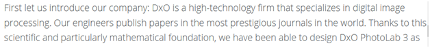
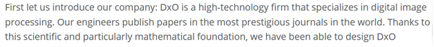
My last post failed to include an example of the weight change. Note that this isn’t a workaround anyone can use; it must be done by DxO on the server.