PhotoLab 4 with X-rite i1Display Studio display calibrator

I remember a job in which I had to correct all images of a book because the person who had done the images first was working with a screen that was too bright…

@mikemyers, if you want to roughly see if an image is going to print well or not, you can hold an unprinted piece of paper next to a white area of an image. You can then possibly see that the screen looks much brighter than the paper… A printed paper has no backlight :wink:
Also, max. contrast is much higher on a screen, say 1000:1, which is roughly 10 stops…

On my calibrated ASUS monitor, this image now looks good to me. On my iMac display, wherever it is at right now, the image looks slightly darker. Sunlight is gone, room lights are on, and window blinds are closed. I would normally have the iMac display a little brighter - doing so now, setting it at 50% matches the ASUS, and both look fine. I’ll attach the raw file, and my exported image.

_MJM2123 | 2020-12-23-Biscayne Boats.nef (18.7 MB)

_MJM2123 | 2020-12-23-Biscayne Boats.nef.dop (11.8 KB)

There is no data about processing etc, but a detailed description about each individual pic.

While I use (print) the Datacolor test image to check a new paper profil, you can watch the very same image on your newly calibrated monitor to see (control) if it looks good – I keep it simple :slightly_smiling_face: .

1 Like

Anyone who wants to is free to play with this image - I made the sky a little darker, but more than what I show here looked fake. I tried to make the trees just a bit more green. Cropping fixed my terribly tilted horizon - I had been looking at the middle of the image, but wasn’t sure how much more to show. No people = no action = static. I sharpened up the buildings slightly, but originally I wanted them out of focus to make the boat stand out more. I hadn’t even noticed the two cruise ships - I was focused on the boat. My eye ended up watching the flag, taking the image when the flag looked best. It’s not my favorite of this series, but I’m still happy with it. I was thinking of using control points on the sky to bring it out more, but I wasn’t sure how to do it without it looking fake. :frowning:

Wondering if it will look any different to you now, after the display calibration.

tried both again – they work here

I downloaded this a few hours ago - it was daytime, and on my calibrated ASUS, all the images looked dark, when my room was so bright. Now they look fine, they look like the image I just uploaded.

Mike … you got it!

In general, the monitor’s brightness ‘has’ to match the viewing condition. When the room is very bright the monitor should be up as well, but in the correct relation. When there is a mismatch, your edit will most probably be wrong (to bright / to dark).
Problem is, the eye (brain) is easy to deceive, as we ‘know’ how it should look like, and when you concentrate on a pic for some time, it will look alright (if it’s not far out). Therefore, get up after some time of editing, walk around and come back to check …
Keep your calibration at least for a while, work with it and find out, if you can ‘regulate’ your viewing condition. And wait for feedback from Joanna (I guess, she was asking for something finished, like TIFF or JPEG).
BTW, if you enclose the dop-file we also might be able to ‘see’ your picture’s brightness.:slight_smile:

have fun, Wolfgang
(long passed my bedtime)


edit:
I was sure, you had calibrated to 80 cd/m². But now I see, that you went with 120 cd/m² - post # 43

Don’t understand, why you are not following Joanna’s advice.

Done - I added it. Not sure how you will “see” the picture’s brightness - do you mean the final brightness after editing?

Beautiful improvement over what I captured.

Ain’t nobody gonna believe that this was taken with a 40 year old lens that is now on sale for $25, from KEH. No automatic nothing. As manual as it gets.

On the side of the life-ring hanging on the side of the boat, the name is clearly legible, as is the rest of the detail. Is this from the “Detail extractor”, or the Nik sharpener, or both? I never realized this was even possible.

Very, very nice!

What you posted reminded me of Nik Collection, and the “Foliage” tool that allowed me to bring out the green in the trees a little more. I started with 10% in Detail Enhancer, as beyond that the name on the life preserver didn’t get more detailed. I did a few more small things.

I don’t like cutting off the boat at the left, but at least it takes away my desire to see that boat. I like the cruise ships though, with their painted funnels.

I left the sky intact, as that brings the dividing line between water and land up to the 1/3 mark. It also keeps what little blue there is in the sky.

I originally wanted the buildings out of focus - not sure which tool you used, but it’s beautiful how it sharpened up the details on the tops of the cruise ships. I have no idea how you did that, considering how out of focus they were. Amazing.

OK. Here’s how I would edit that image if I wanted to make a good print, or even if I personally were distributing it on the web.

_MJM2123 | 2020-12-23-Biscayne Boats.nef.dop (38,8 Ko)

I’ve tried to respect the “look and feel” of your version but I found that, even though the overall picture is fairly bright, the shadows were lacking in detail, especially for committing to paper.

I have posted the .dop file that you posted but with my version added. Take a look at the adjustments I made, especially the Smart Lighting, tone curve and contrast palettes, for which I used the advanced contrast settings…

Capture d’écran 2020-12-27 à 06.17.08

The untouched original was definitely too dark to make a good print but I notice that you had raised the exposure a tad. With such a full range picture this is not normally the best thing to do as it starts to push the highlights into over-exposure.

The version that you created is typical of images that are difficult to print, not because they are too dark overall, but that the shadows are lacking in detail and they are overall just a little “dull” or “flat”. By using too bright a screen, your eye is fooled into thinking that the shadow detail is there because the backlighting punches it through in a way that cannot happen with reflected light on paper.


Does my version seem excessively bright on your iMac when its brightness is raised? Or do you simply see the extra detail in the shadows?

I’m looking at all of these on my iMac screen, as it’s daytime and everything on the ASUS looks too dark.

That being the case, I see where the detail on the side of the boat does show up on your image, where in mine it’s all just “dark”, but the whole image looks way too light, and the sky goes “over the edge” to where it no longer looks real. My version is right up to that limit - on my screen, the cloud detail barely looks real. Maybe I went too far too, but on yours, it is so exaggerated it no longer looks like a photograph.

For whatever reason, the image you posted almost looks “blurry”. My image looks acceptably sharp, unless/until I look at Gregor’s version which looks better. Somehow he made many of the out of focus areas appear like they were almost in focus. My test is the life preserver on the side of the boat. In his image, the name is perfectly clear. In my version (after seeing what he had done) the life preserver name is reasonably clear. In the image you just posted, it’s blurry.

My main question right now, is how I can make the life preserver as sharp and clear as what Gregor did. Your image is smaller, so I can’t tell how sharp it really is… I also copied the gear on the top of the cruise ship to the right - Gregor’s image makes it appear sharper than what I created.

Last thing - I like the enhanced tree color from Nik Collection, but it’s a little “greener” than what I see with my eyes. Even though I like the effect, maybe I went too far??

Gregor:
Screen Shot 2020-12-27 at 10.48.52

Mike:
Screen Shot 2020-12-27 at 10.49.41

Joanna:
Screen Shot 2020-12-27 at 10.50.22

Gregor:

Mike:

I was guessing at the exposure - I guess I didn’t do so well. If I do this again, I’ll bracket the exposure. The black hull was so dark I didn’t even notice the detail at the front, which shows up nicely in your image.

I’m also looking at the lifeboat, on the front of the boat, upside down. On all these images, that part of the lifeboat (at the left) is burnt out, meaning it’s over-exposed. I guess I should check if there is any detail in the original image which can be brought out, or if it’s just gone. So, did I under expose the hull, or over expose the lifeboat?

That’s what I thought might happen and is why I was advising to use a lower luminance when editing photos. Anyone with a calibrated workflow will see you pictures as too dark and, if you send them to a printer, they are going to have to kludge a non-RAW file to get them to look anything like reasonable.

And yet, if you could see it on my calibrated screen, the clouds might be a little too defined for your taste but there is no sharpening involved, only a bit of contrast, which could be altered.

That’ll be because I exported it at only 1536 x 1024 pixels. here’s the full sized version…

And here is a screenshot of the life preserver zoomed in.

Capture d’écran 2020-12-27 à 18.13.28

Gregor did a lot of processing including using a dedicated sharpener. To my mind, it is over-sharpens, as witnessed by the slight pixelisation and “echos” on transitions.

I could more than likely sharpen it up but my first concern was to demonstrate the light/dark situation rather than a full edit.

Now that you have a larger exported version, what do you think now?

Neither! Well the lifeboat was marginally over but not beyond recovery - see what I did at the top end of the tone curve, reducing the maximum to 250. All in all, a well exposed image, it’s just the processing using a too-bright screen that has made you think there was something wrong with the exposure.

Let me know what you think when you see it on the Asus.


The main purpose of this version is to show you what an image should look like if you want to print it to a calibrated printer, without having to do any special editing just for the printing. This version should require absolutely no intervention on the behalf of the printing company.

Oh, and here’s a slightly more sharpened view of the life preserver…

Capture d’écran 2020-12-27 à 18.28.32

Hi Mike,
inspite of being trapped by PL4 (had to erase cache and database for the first time), I could follow, what you and Joanna did and also compare it to Gregor’s version.
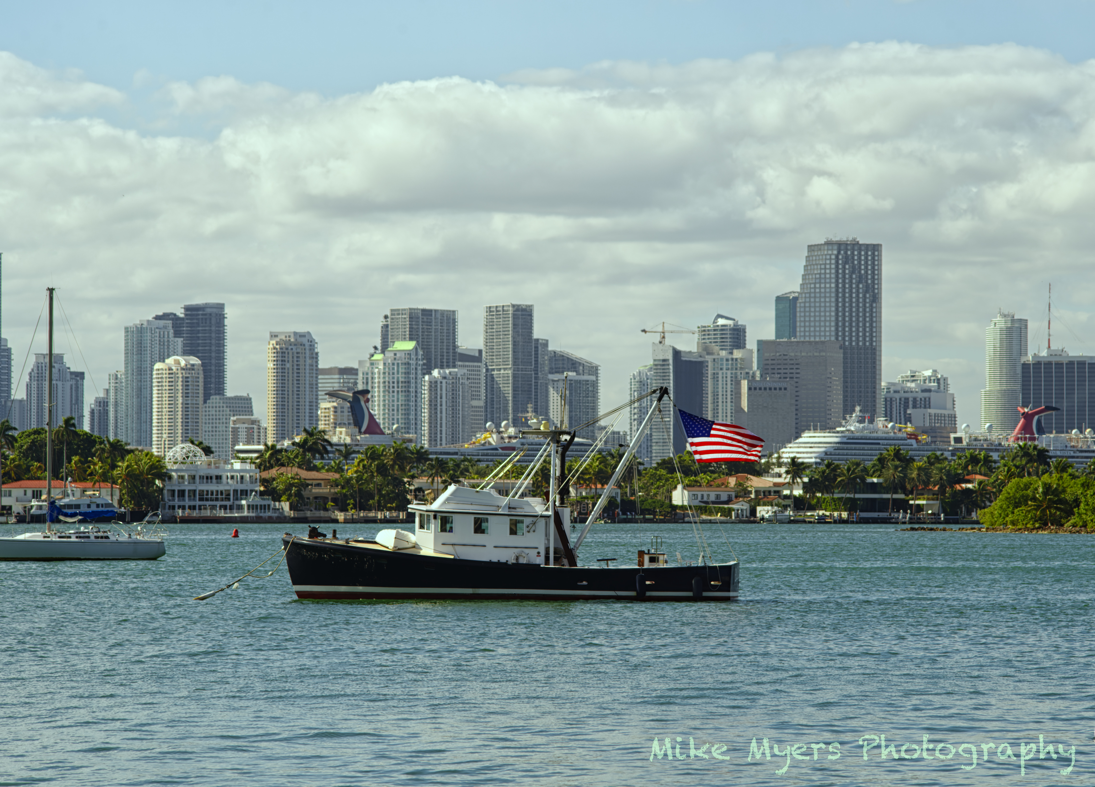
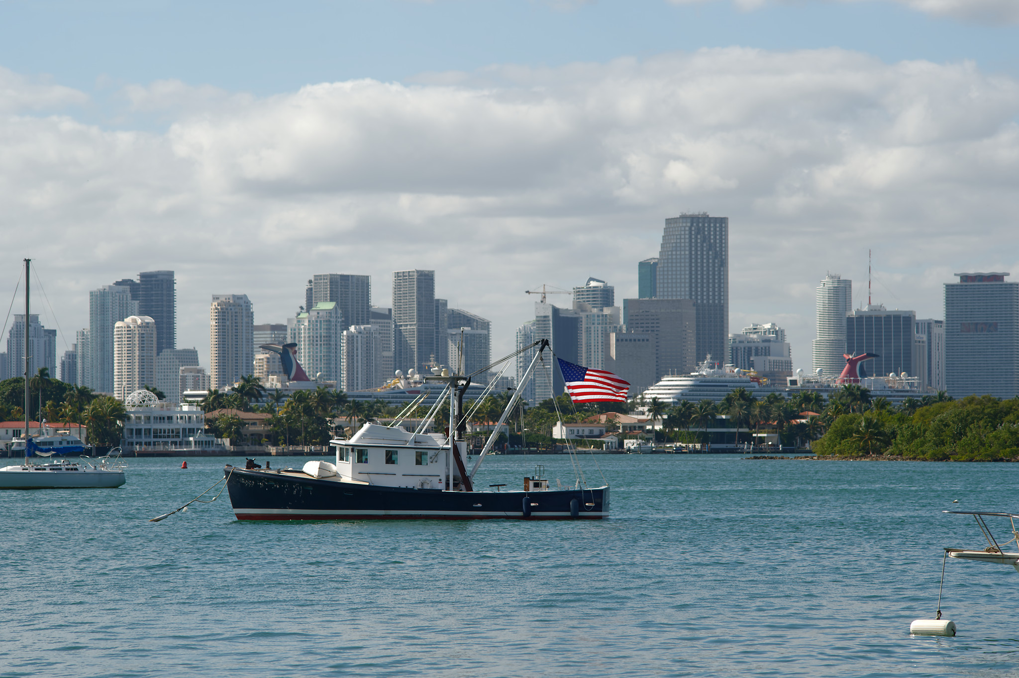
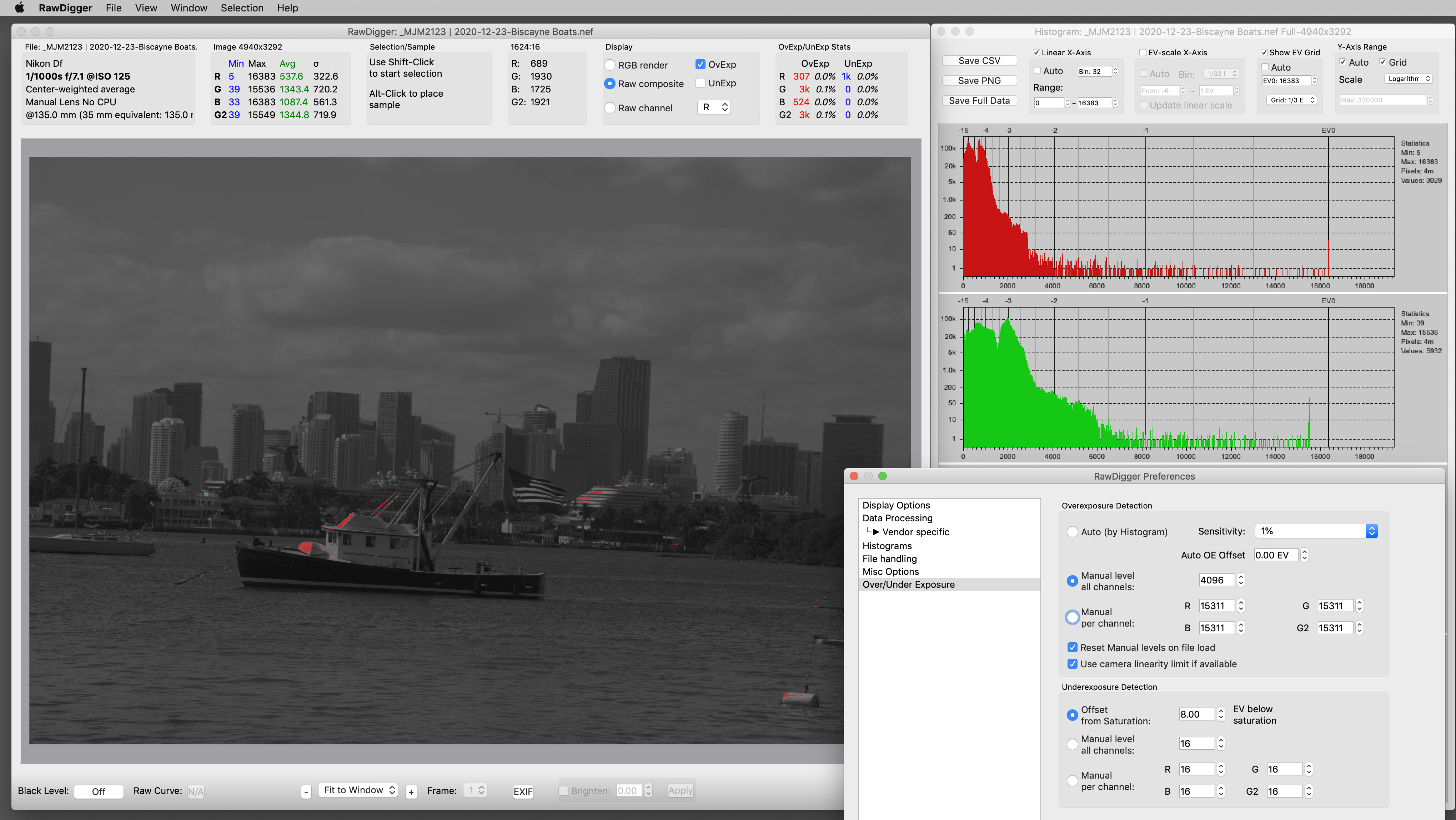
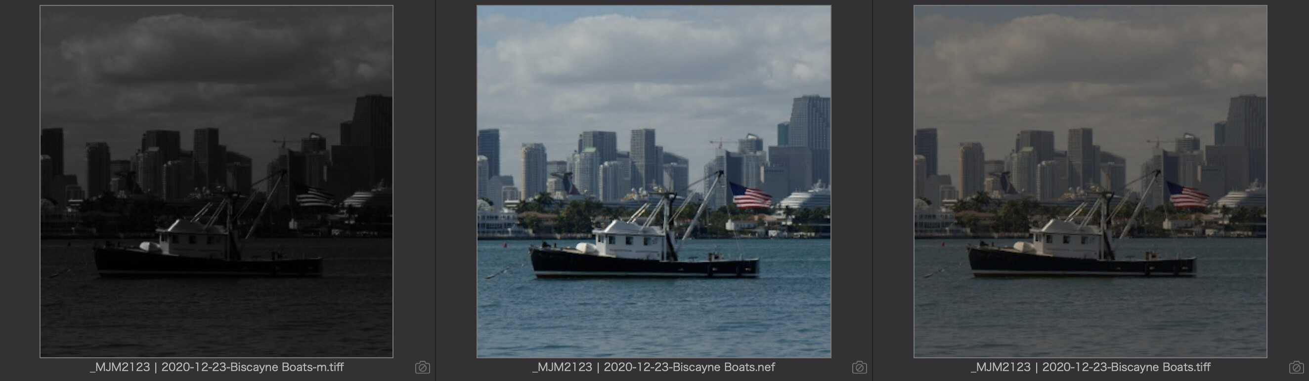
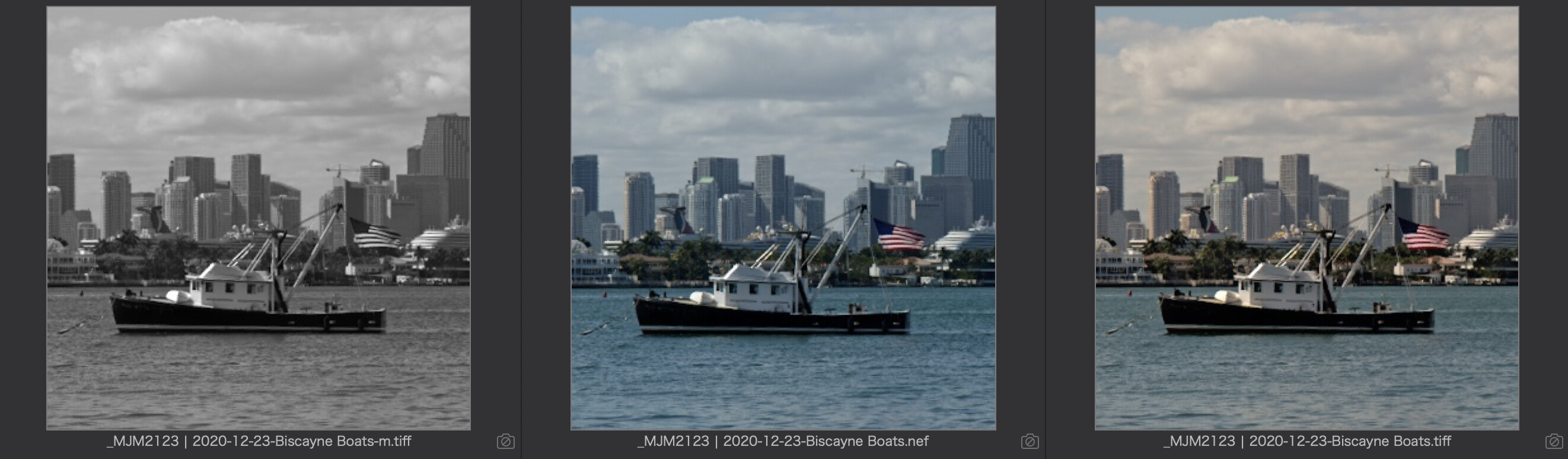
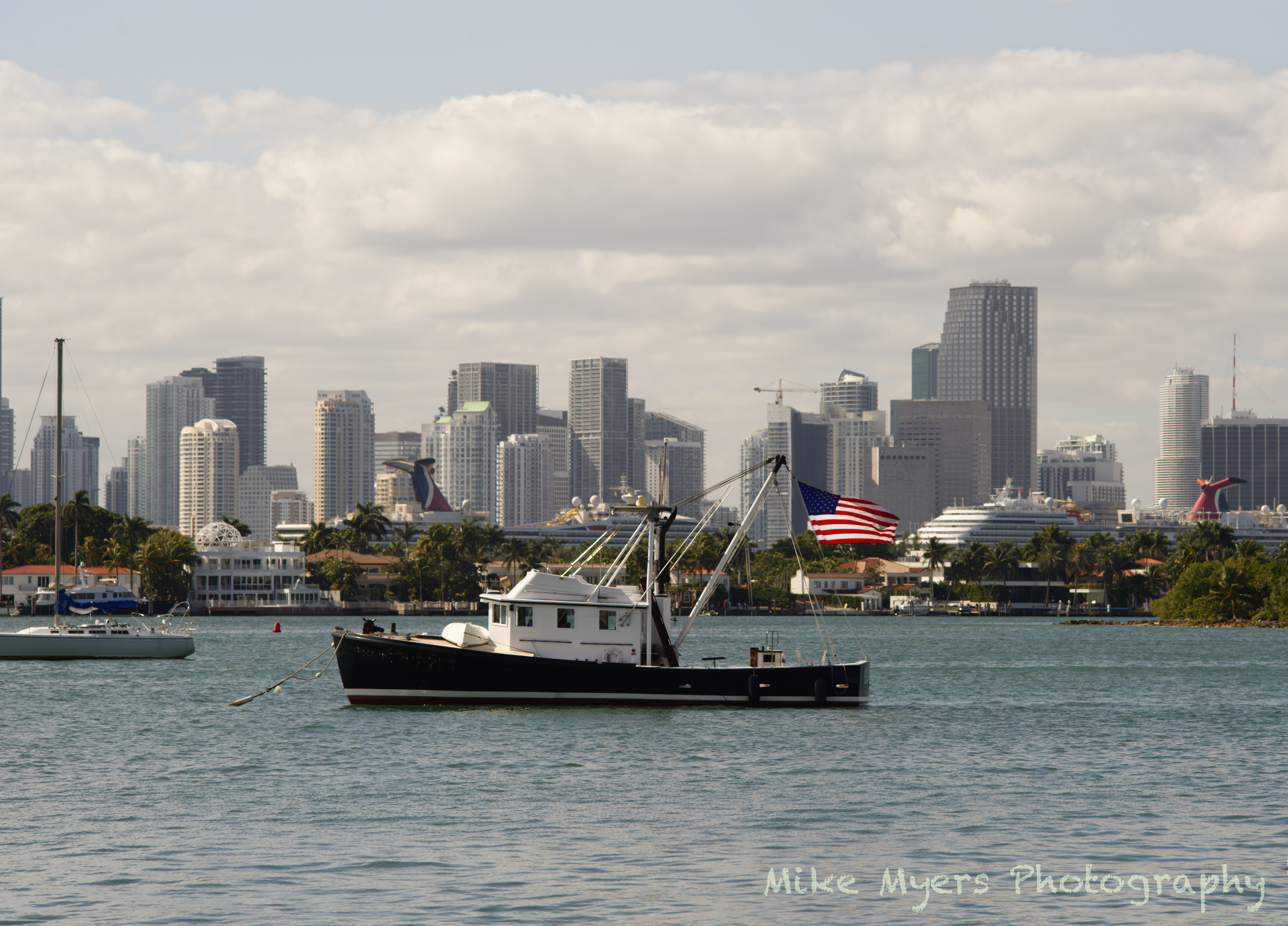
picture # 2123
post # 52
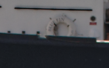
While the ooc picture seemed to dark at first glance, the histogram showed that you avoided ‘blinkies’. As from exif-data the picture was taken around midday, I suppose you added some warmth to counteract the harsh lighting + overcast.

post #61
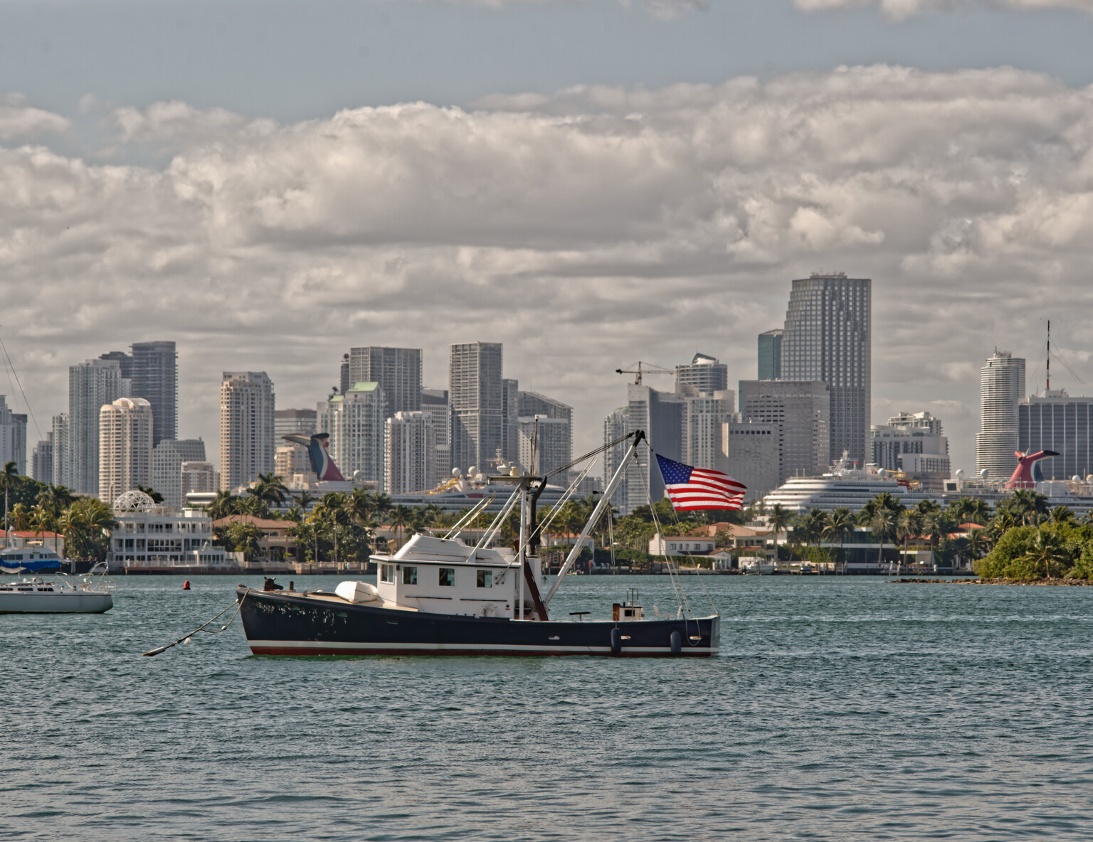
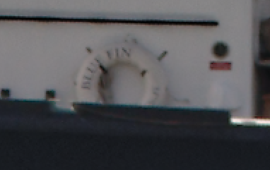
Gregor’s version is more the opposite – high contrast, much cooler, very clear (only a bit too much for me). But you can see what’s possible, if you are for that.

post # 63
Your attempt with Nik Collection / Foliage to enhance the green in the trees changed the whole image
not for the better. You could have done that easily in PL4 with control points and I guess also with the enhanced HSL tool.

post # 64
Joanna transferred the print version to later afternoon – a painterly impression, that I would
have printed on a matte paper like Tecco PCR 310, also to suit the flatter contrast.

– Personally, I work a little different and put changes referring to printing after I’ve finished my edits in a separate version (if necessary little adjustments while in softproof, optimized sharpening for printing, last minute check for contrast etc and lastly to add frames, ‘passepartout’ and signature).


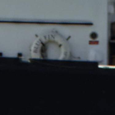
With your ooc pic, I straightend the horizon only, adjusted with Smart Lighting, Clear View Plus and Tone curve, rised the colour temperature only a little, but added skylight filter (DxO Filmpack >> warm tone) AND did some local adjustments (cut some otherwise overblown highlights // enhanced visibility of the boat’s body).
– To judge the local adjustments, activate them in the top menu before toggling the compare button.

_MJM2123 2020-12-23-Biscayne Boats.nef.dop (25,9 KB)


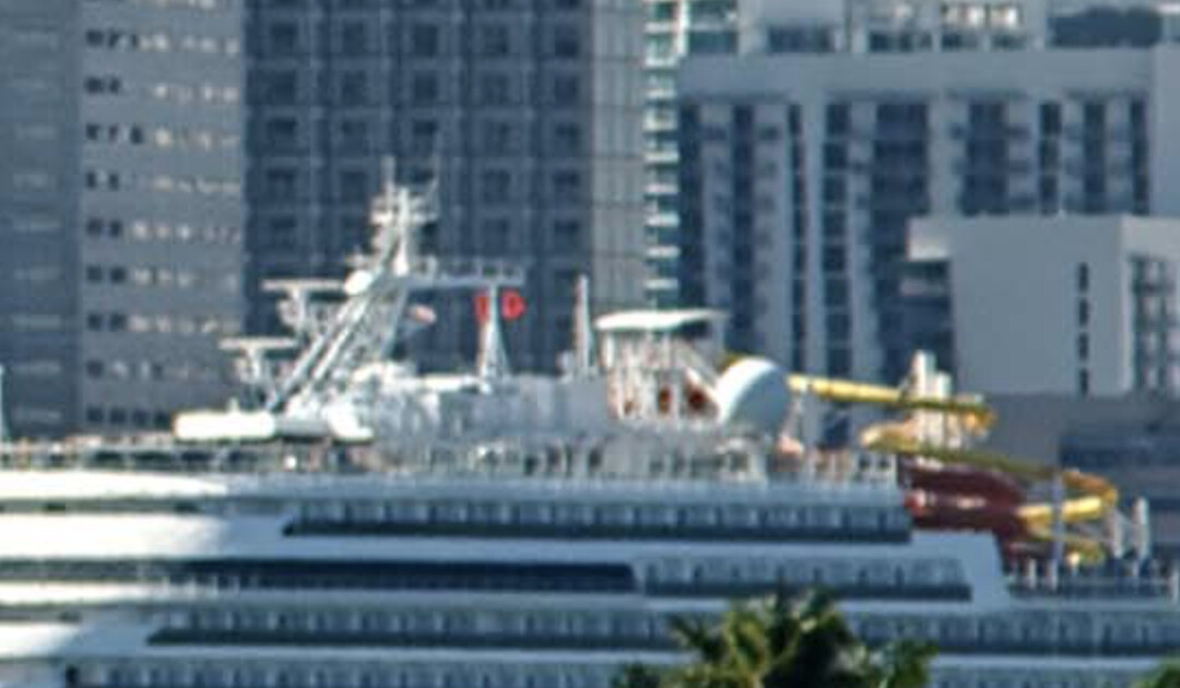
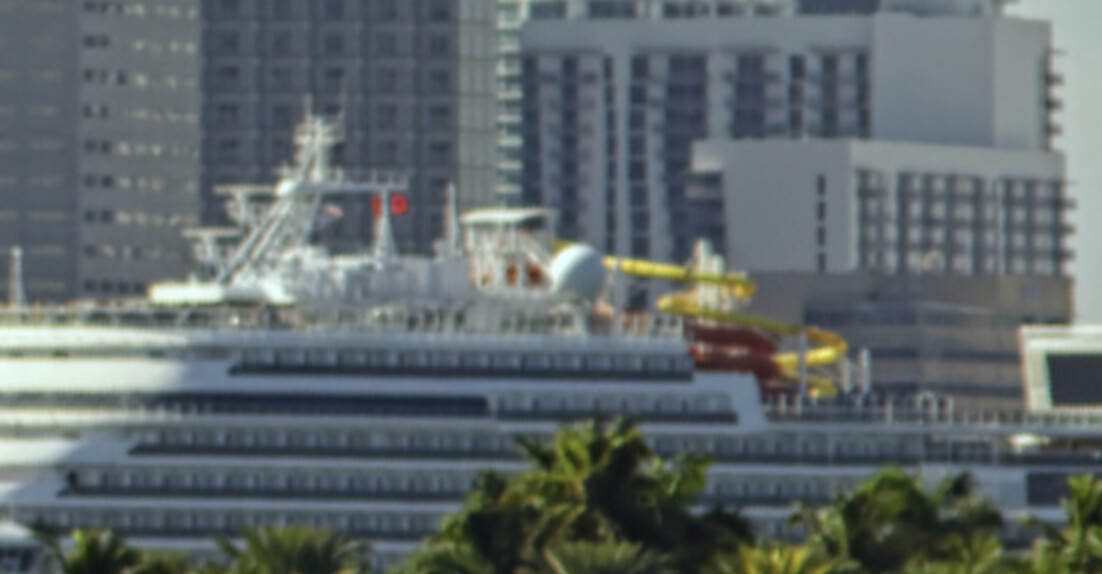
I also wanted to show you a different solution ref to your pic # 2161, but unfortunately all my work got lost … The scenery was reduced onto the 2 boats with some more background than Joanna’s version, https://forum.dxo.com/t/todays-attempt-at-a-daytime-photo-to-be-edited-in-pl4/17147/6
while I ‘dimmed’ the background and many more to bring attention to the boats …
BTW, the sailor is looking at you, the photographer, while the little dog (wearing a life jacket !) is watching the sailor. That could have been something interesting, but is far to small.


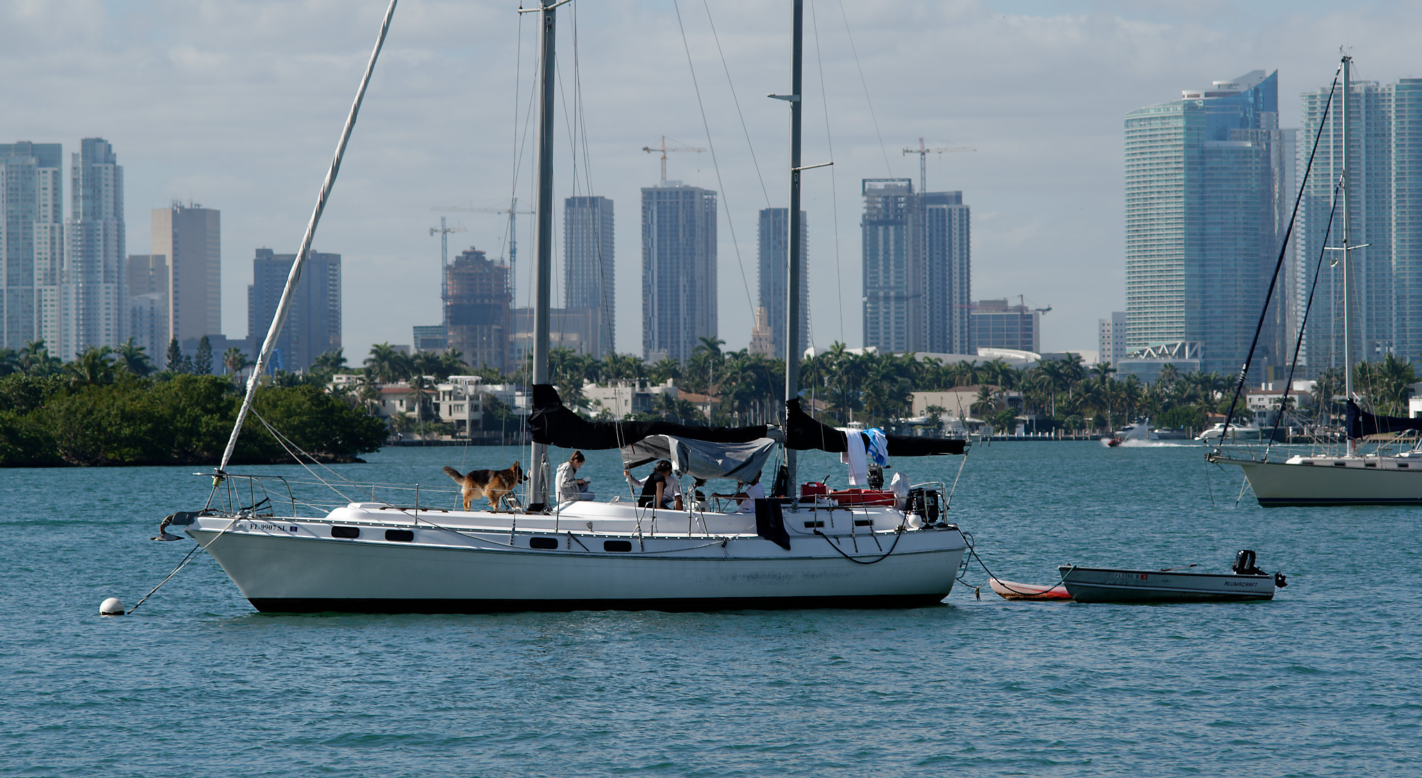
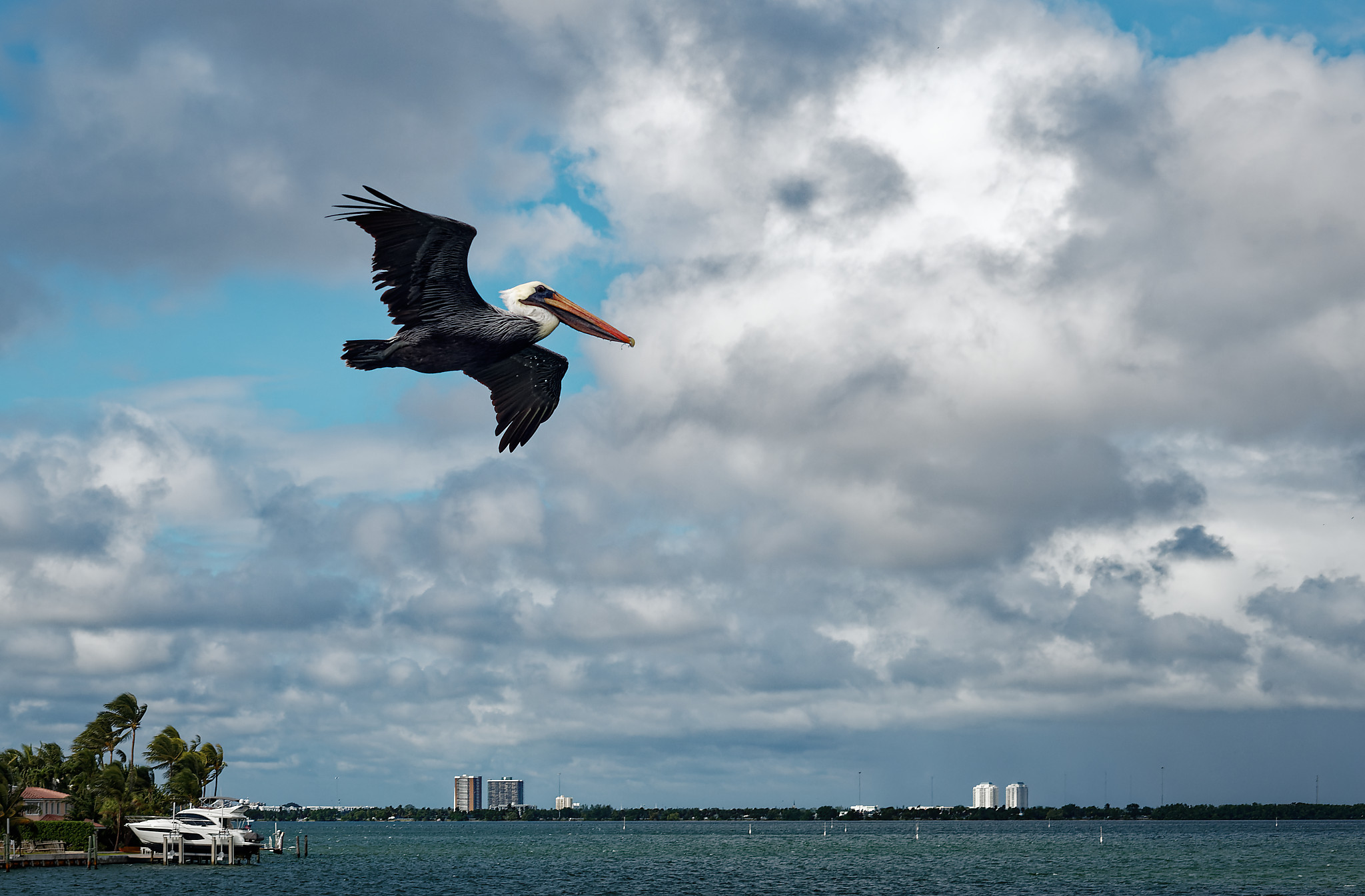
I enclose another picture # 2119 from the very same day and would like you to find out yourself …
– like before >> top menu >> Local Adjustments >> compare button

[Tipp: slight changes can already give a more 3D impression].

_MJM2119 2020-12-23-Biscayne Boats.nef.dop (200,6 KB)


And the same you might do with picture # 1248 from the pelican (check also crop tool).

11-20-2020-Nature Walk_L1001248.dng.dop (32,9 KB)


There are so many ways to show, what is important to you and what YOU like to convey.

have fun, Wolfgang

Ouch! How did that happen, and how do we avoid it? How much work did you lose, and have to re-do? Only this one image, or if it’s the database was it all your data? I would have no idea how to recover from something like this - is it a fault within PL4?

Should I re-do the calibration, and set the desired goal to be 80, or 100, or 110? Following the on-screen instructions, I used 120.

Am I correct that if I use a lower number, let’s say 100, my images will appear to me on my ASUS as being darker, so I’ll be making them lighter? If the rest of the world (those using calibrated displays) sees my images as too dark, that would make sense.

On the other hand, if the rest of the world (those using un-calibrated displays) now sees my images correctly, won’t my images then look too bright to them?

It would not be a very smart thing to change my images so the perhaps 5% of people will see my images properly, rather than dark, at the expense of the remaining 95% of people to see them too bright rather than looking “good”. My main “audience” is average people, who just happen to look at photos and stuff on their phones and computer screens. If they want to get a print, they can buy one from Smugmug who I believe will compensate as needed to get a good print.

I don’t follow - what am I supposed to do?

– like before >> top menu >> Local Adjustments >> compare button ???

Had a look at your “Biscayne Boats” image with RawDigger and found this:

What we see is

  • an untreated image displayed in b/w (4 raw pixels combined for one preview pixel without colour)
  • the R and one G parts of the histograms based on raw data (not the embedded preview)
  • an overexposure warning set 2 stops below saturation: Only small parts blow out - even in this case

What does it mean? The image looks underexposed and if it should NOT contain any blown out parts, bracketing would have been needed. Maybe, a polarizer could have helped with the haze. As for the buildings in the background: f/7.1 is too small an aperture for the focal length used. If you want the background to be less sharp as was said in an earlier post, a longer focal length and/or getting closer to the boat might have helped. Framing a bit to the left would have gotten get rid of that bow in the foreground, no worries though, it can always be cropped off if you accept other crop ratios. I tried square…

Left to right: Monochrome2DNG, PhotoLab, DCRAW, all without further changes for exposure, contrast, color etc. Left and right images look dark because I set gamma to 1.
With just a bit of tuning, we get: