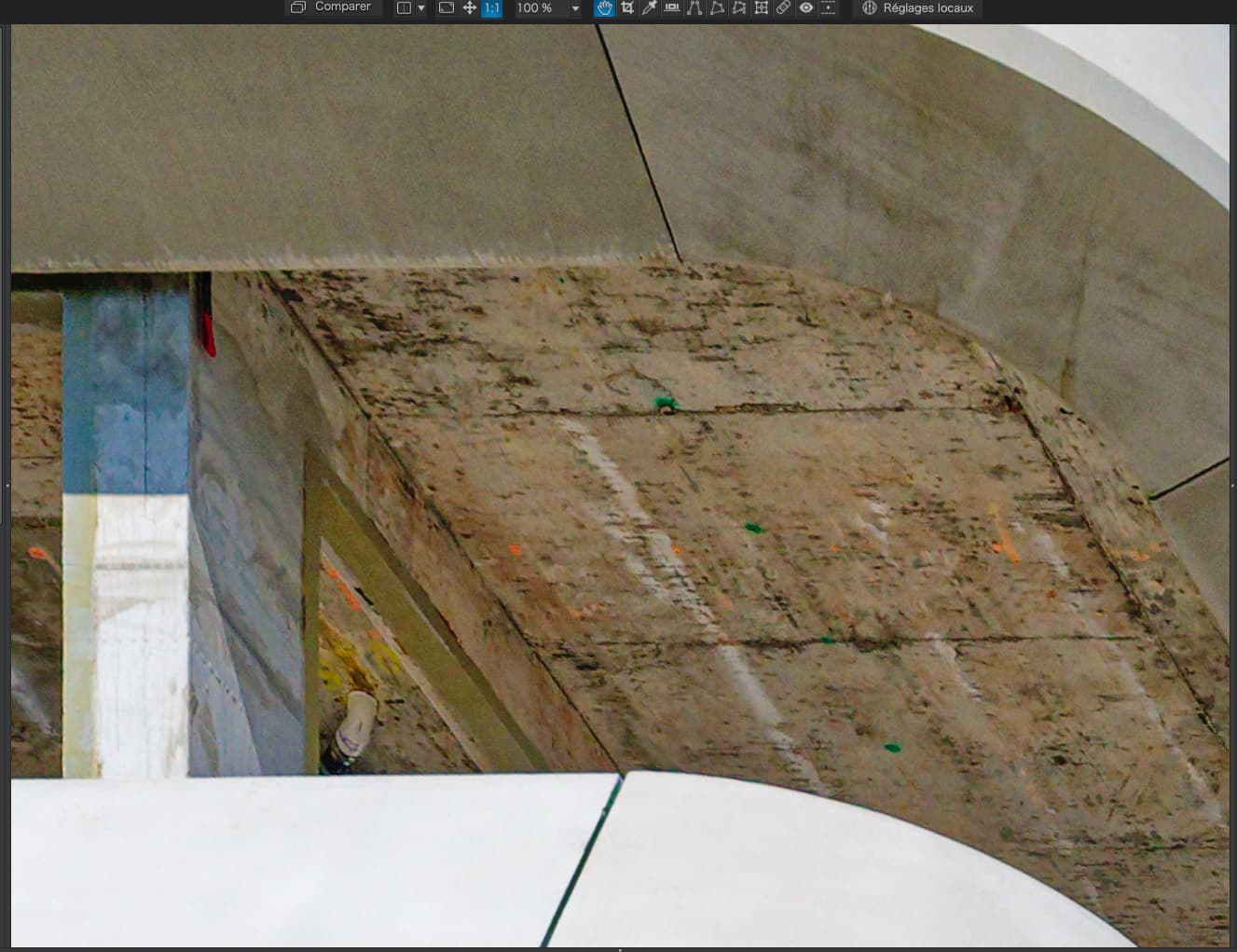
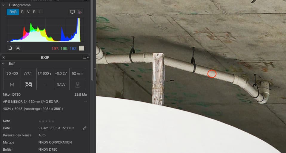
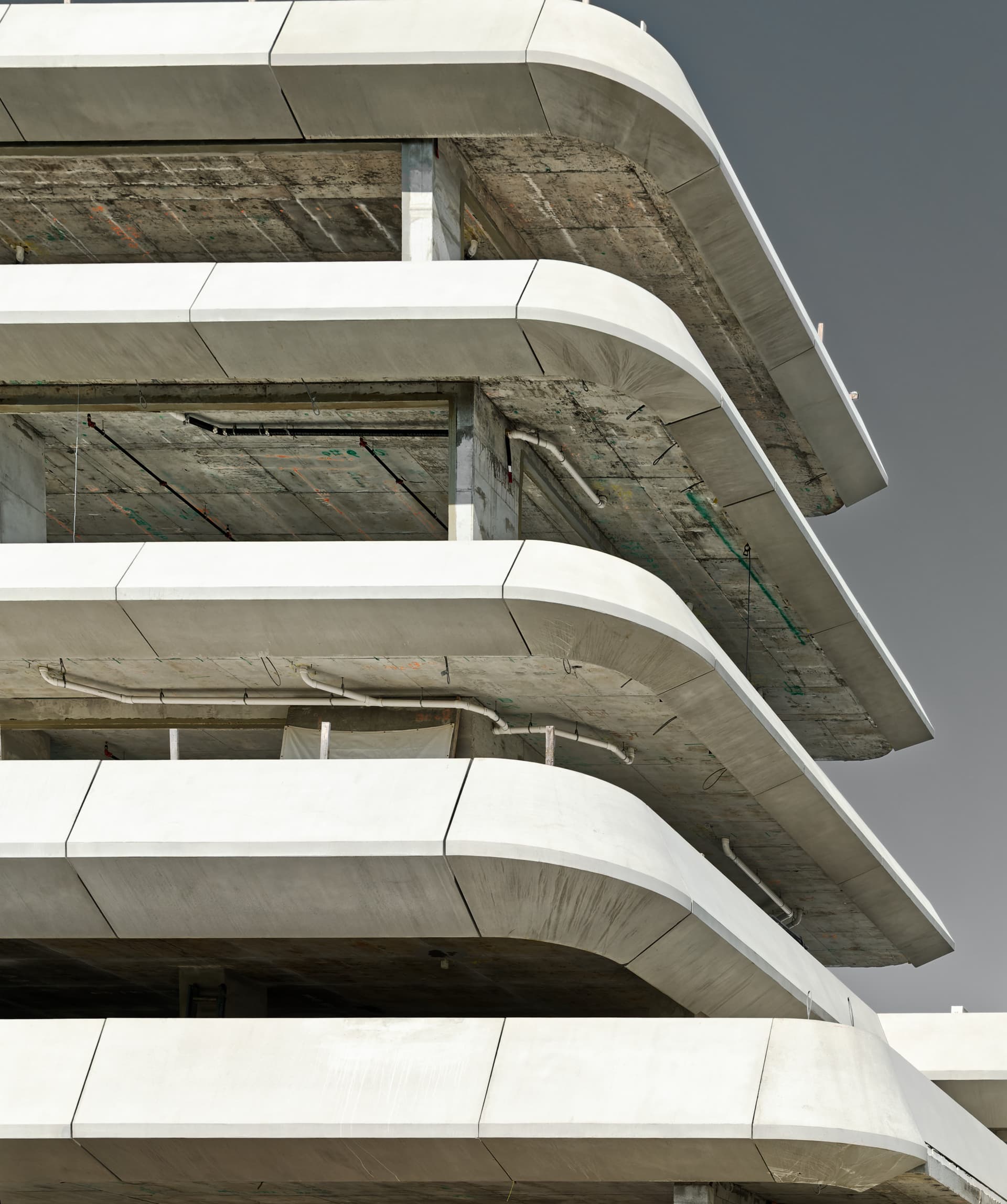
Most obvious is that you unnecessarily used both Smart Lighting and ClearView Plus. The former lowered the contrast and the latter raised it, whilst also adding considerably to noise, especially on the polished concrete.
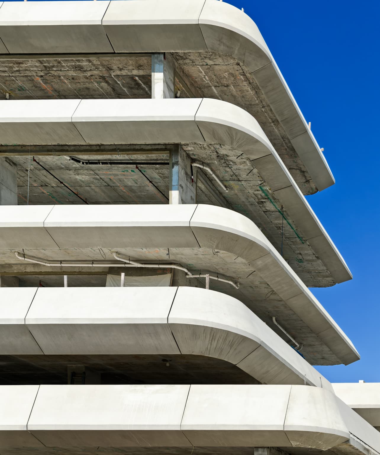
You used the “sledgehammer” of both global Saturation and Vibrance, whereas you could have just affected the sky by using the Colour Wheel for just the blue of the sky. I also slightly raised the Colour Temperature to warm things up just a tad.
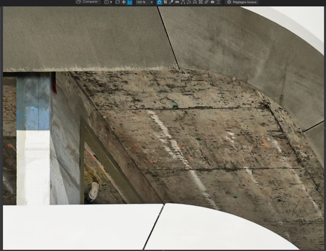
Due to the difficulty of raising contrast in the right place with the Tone Curve, I found the global Contrast slider worked fine, along with Fine Contrast - both global and mid-tone.
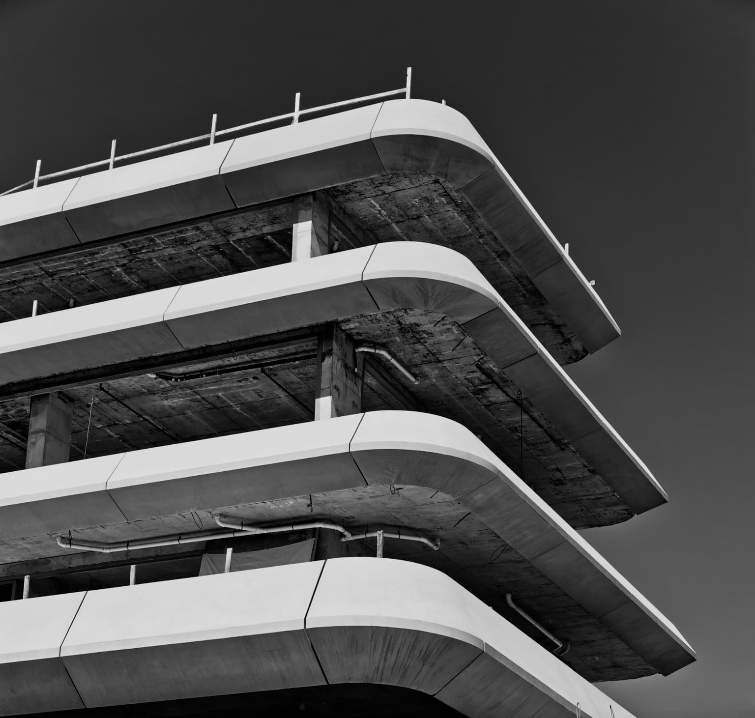
Apart from those things, I really like the perspective corrections and framing. In fact, the whole abstract idea of the image.
And if you were a photojournalist with a view camera with movements? This is nothing different from what I would expect were I using mine.
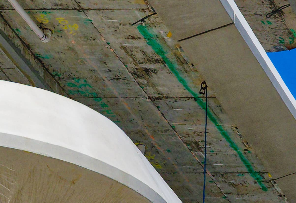
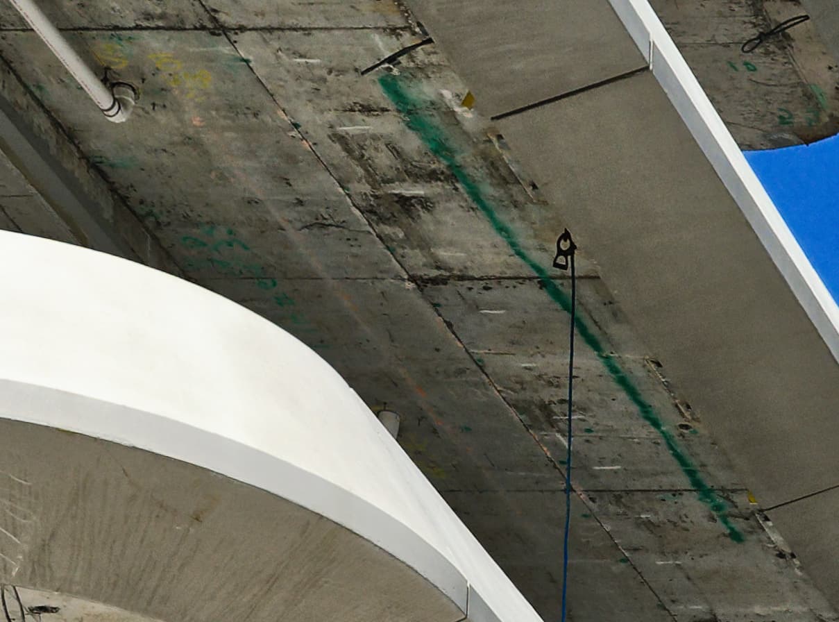
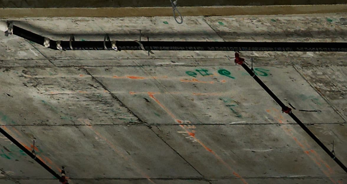
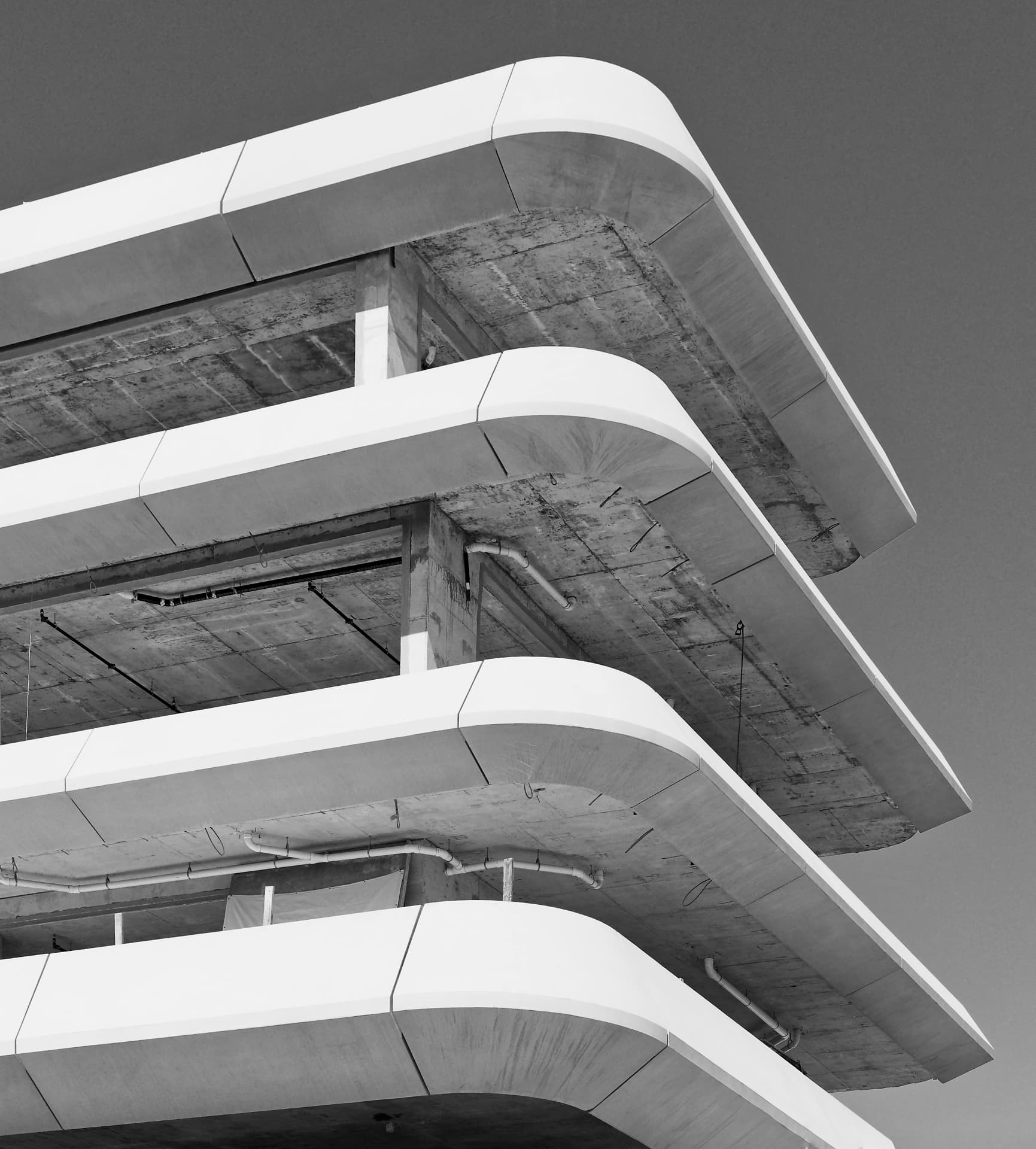
In my opinion, the (interesting) white pipes are cleaner and sharper in Mike’s interpretation. Usually this kind of details of a building (what’s underneath [or overneath?] the ceiling covers) can be as intersting as the outside structure, which doesn’t give me more information than “another boring concrete house”. I feel the details under the ceilings are important and deserve some care.
You’re right! I just compared Mike’s JPG and yours and the pipes looked a bit softer in yours.
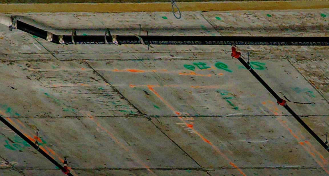
Interesting details. Make for me the whole picture rather intersting as some of them could also tell a bit of a story of the construction workers, like some little graffitis or marks.
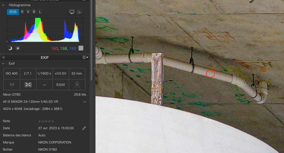
Seeing the EXIF I really wonder what’s the reason for 1/1600 shutter speed, raising the ISO a bit unnecessarily?
When I used the smart lighting, it didn’t do much to the image, and maybe I should have just turned it back off.
When I used the Clearview Plus (just a little) it brought out all the details on the under-side of the floors, which is what I was after.
At that moment in time, I thought they were two separate corrections, and wasn’t aware that they were fighting against each other. From the two photos you posted, the lower one is certainly better, and what I wanted.
The Smart Lighting seemed like a very subtle edit, but you’ve proved it was detrimental to the overall image. Interesting.
To me, it definitely does not remind me of HDR, but the lower version is what I wanted to achieve.
In retrospect, the smart lighting wasn’t necessary, and I should have turned it back off. By looking at the full-size image, it is so, so obvious - now.
I’m rarely sure which one to use, and I often use both. In terms of the end result, what is the difference?
I did use the color wheel to make the blue more intense, and I expected to be told I over-did it. I thought about that, and then decided that with the way I was distorting the whole image anyway, why not emphasize the blue sky a lot. I thought about changing the white balance to warm up the image, but didn’t. I should have tried, rather than just thought about it.
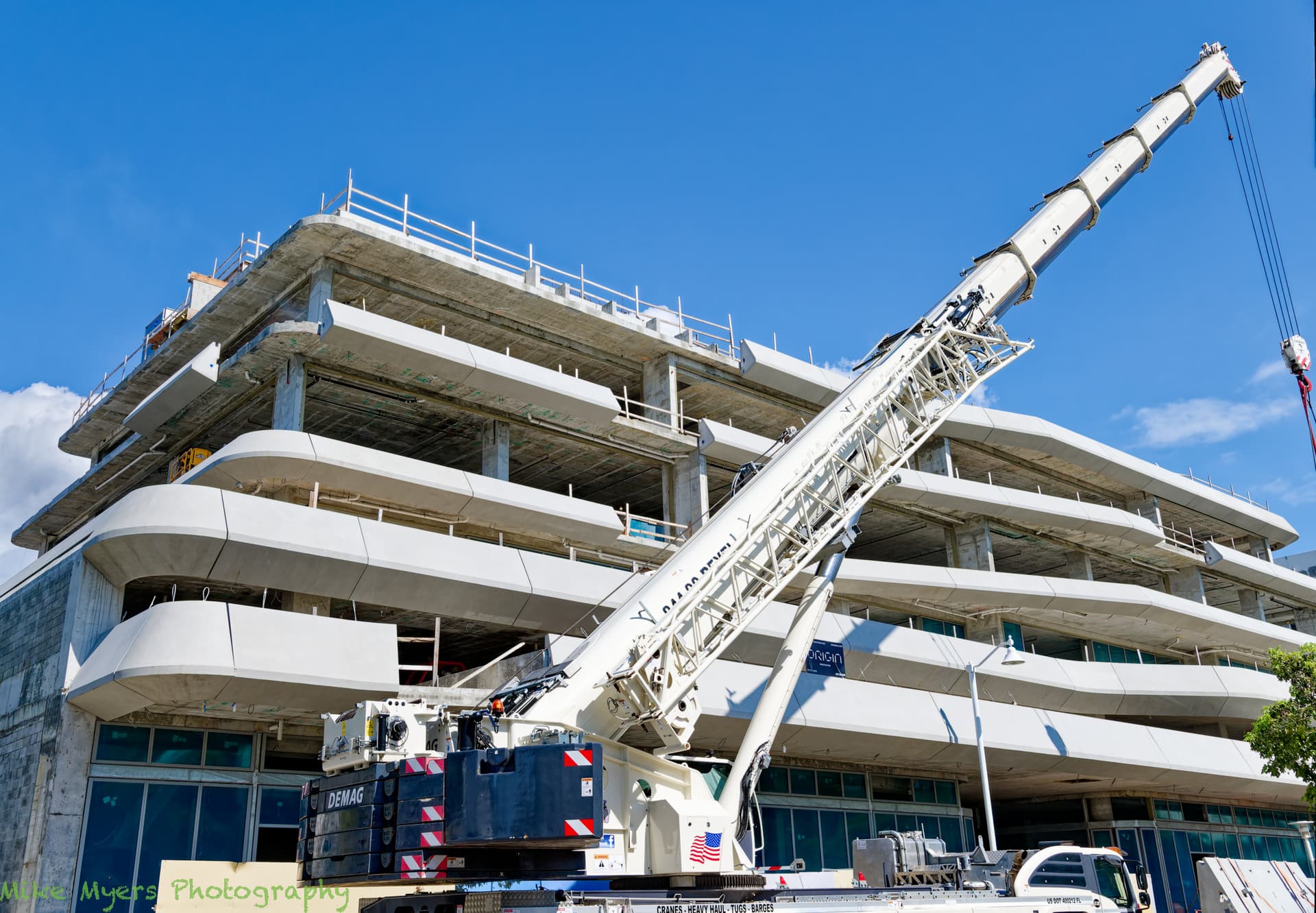
These pipes were all over the building, and in some places much more so than the area I photographed. I thought they were fascinating, and maybe I should capture an areal where they were used much more. I didn’t expect to see them at all - but I don’t know much about construction. I did have a long discussion with the “trainee” crane operator, who told me so much more about that crane, and how it worked, and what the different parts did. I wanted to try to get a good photo of the crane, butI wanted to show it doing some serious work, not just sitting there.
I wanted a reasonable aperture, and a high enough shutter speed that would minimize movement blur if I wan’t so steady. As Joanna explained, I’ve learned that with PhotoLab I don’t need to worry that much about ISO. I picked what I thought was a reasonable compromise.
With (only) my D780 and M10, I’ve mostly stopped worrying much about high ISO settings, but by force of habit, I try to keep the ISO more reasonable. I was going to head down Lincoln Road for some night shots, no flash, just natural light, but haven’t yet gotten around to it.
My plan was to take more construction shots after 7:30am when they start work (noise regulations), but I’m supposed to go to a psychology lecture in a few hours, so that will wait until Monday.
Wow, I love it! And cutting off the bottom simplifies the composition, along with adding more sky on top. It barely resembles the original image from the camera. I never would have ‘thunk’ of that! I liked the “distortion” yesterday, but the image has more “life” now that you’ve brought it back closer to the reality of what I saw through the viewfinder.
I will have to remember the red filter idea for the future.
Please post your .dop file when you have time.
That was @Wolfgang’s idea. I just erased a bit at the bottom right, which allowed me to enlarge the framing.
Old B&W film trick to bring out detail in the sky. Anything from yellow, through orange to red is good, depending on the blueness of the sky and the presence of clouds.
I agree with @JoJu about all the small, interesting, and sometimes colorful details. I love taking an image, viewing it at 100%, and seeing so many of the “small things” that aren’t obvious in the rather small images we get to see in this forum.
Looking at the image at 100%, and paying attention to both the colors and the details, I find all that “small stuff” fascinating. As an image of the building posted here in the forum, all that “small stuff” is irrelevant I guess, and not needed. I think @Wolfgang and @Joanna “saw” (or envisioned) a similar view, which is the full image viewed at a scale and distance that obliterates all that “small stuff”.
I do this all the time with everyone’s images, viewing them as large as I can, studying them, and learning what’s all there when I’m essentially viewing them with a magnifying glass. I need to think about this some more, but when possible, I like to include all that “extra stuff” to see, if one wishes to…
Before coming home yesterday, I wanted to get a photo of the whole building under construction, but wondered if it would make for an interesting photo. The lens was set to 31mm focal length, as all the “stuff” below this view looked ugly. I especially wanted to show the Rotator Crane, which is capable of extending three times as far as in this photo. Work was stopping for the day, so I could stand wherever I wanted (within limits).
I very much like that when viewed full-size, so many of the details JoJu noted become perfectly clear, plumbing, painted areas, the lower surface of each floor. There is far too much to see, so this photo is overwhelmed by too much “stuff”. Being late in the day, the lighting was perfect. I wish the sky was more interesting, but they were stopping work for the day, and I thought they would be “parking” the crane for the night. I look at this now, and think I should have included more space to the right, but that would just have included more “tree”. Actually, the photo I wanted to capture was one of them raising those huge concrete pieces up and into position, as the workers struggled to align the concrete piece properly. (The reason for “gaps” in the concrete is that the concrete pieces were not sized correctly - there is no “wiggle room”, either they fit, or not.)
Sadly, only one control point. No need for a control line. I was going to darken the sky, but decided not to. I thought about converting to B&W, but didn’t.
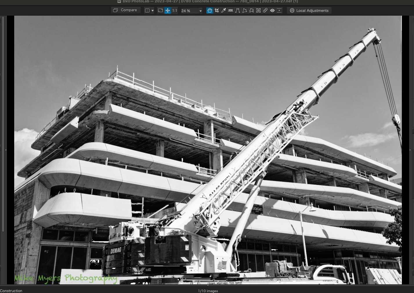
The B&W version/s above base on analyzing the pic … and from there the decision to strengthen the inherent graphic representation (e.g. by reducing distractions like the blue sky, controlling the composition, necessary retouching and such).
The composition of your new pic with the crane in front of the construction is not ‘satisfying’.
To show the whole / most of the building, you should capture it / not crop it so tight.
The crane misses the bottom part (it’s ‘foundation’) and the rope & hook are almost out of the pic.
And of course I want to know / see what’s hanging from the crane.
You saw everything when you took the pic, but then show it to others too who lack that information.
Agreed, as they were packing up and putting things away for the weekend. There was nothing hanging from the crane, but I could have shown that. The “stuff” below the crane was not very photogenic, but ditto. I ought to have opened the lens to full wide-angle, and captured a record shot. I intended to come back at 7:30am this morning, but I had a commitment photograph an event somewhere else, and the weather was lousy.
I sort of like the photo anyway, but I agree with you, it’s not “satisfying”. Something else I need to remember for the future.
Something inside me tells me to “do the best that you can regardless of any limitations”. At full size, I find lots of things to look at, and figure out. It’s almost like a “treasure hunt” exploring around the building. When I click on/off on the “Compare” button, I enjoy how PhotoLab helped improve the image, which right now is my own most important goal, learning.
In your words, when does “color” become a distraction? I know it helped in the earlier photo, but here is a very quick conversion to B&W of this most recent photo - and to me, the small amount of color in the original made it more interesting, or maybe I should say removing that small amount of color made the resulting image boring, like a clipping from a newspaper:
Why do so many of you feel that excluding the color improves the image? How do you recognize an image that would be “better” in B&W ? Or, worded better, how can I recognize this when it’s appropriate?
(When I was young, I shot B&W because I couldn’t afford color, and didn’t know how to process color. Once color became so easy to use, I mostly stopped doing B&W, except with my Leica camera when I was living in my past. What qualities in an image might suggest that B&W would be a better choice?)
Mike,
when you want to know / try yourself about the ‘necessity’ of the blue sky, check with the pic in question (and my enclosed dop-file).
The pic with the crane in front of is so far from a convincing composition, that I didn’t touch / downloaded it. Looks like you were quickly passing the scene while randomly having a wideangle lens at hand, but not like a shot from a seasoned photographer. – Your B&W rendition doesn’t improve it.