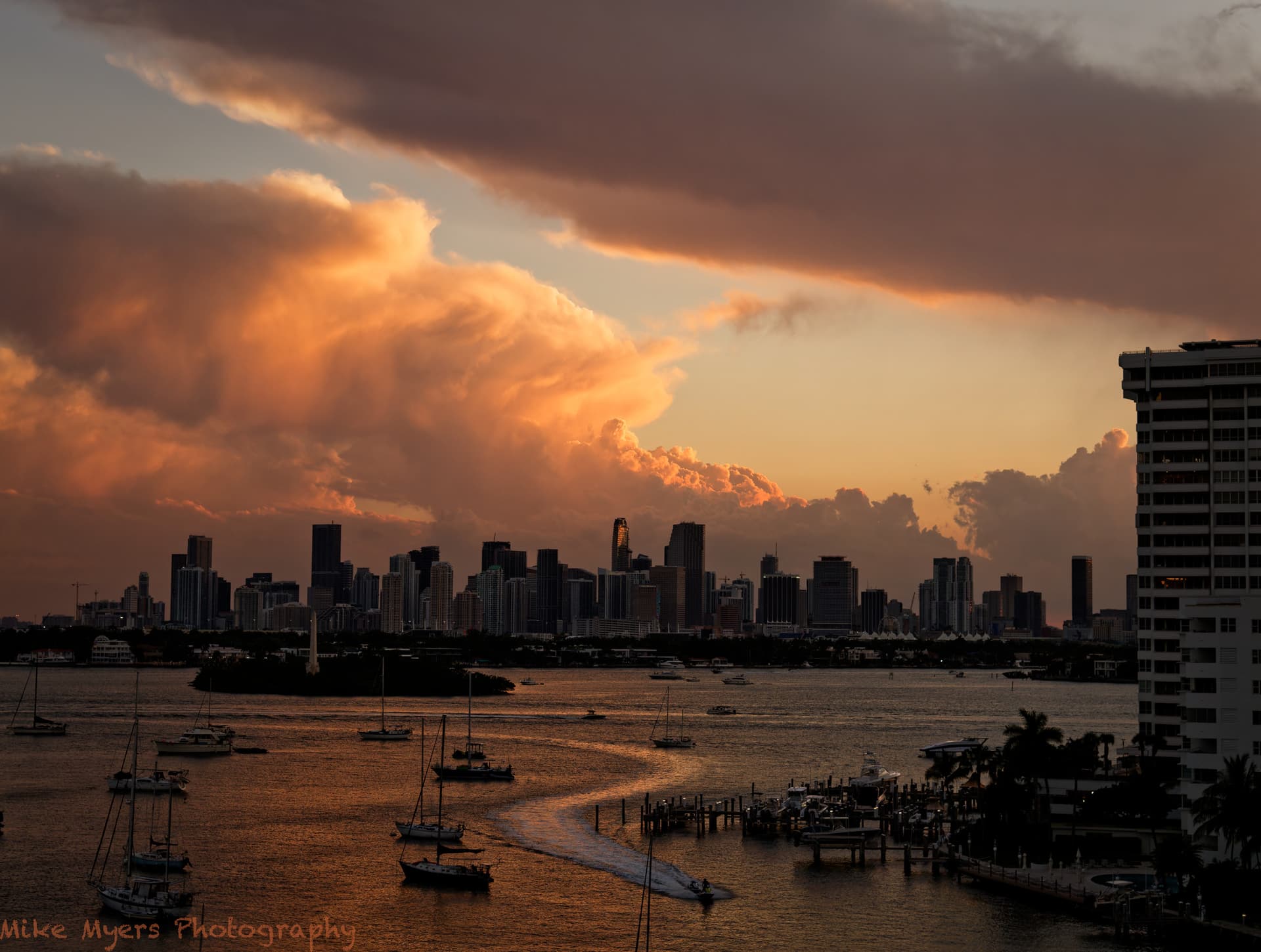
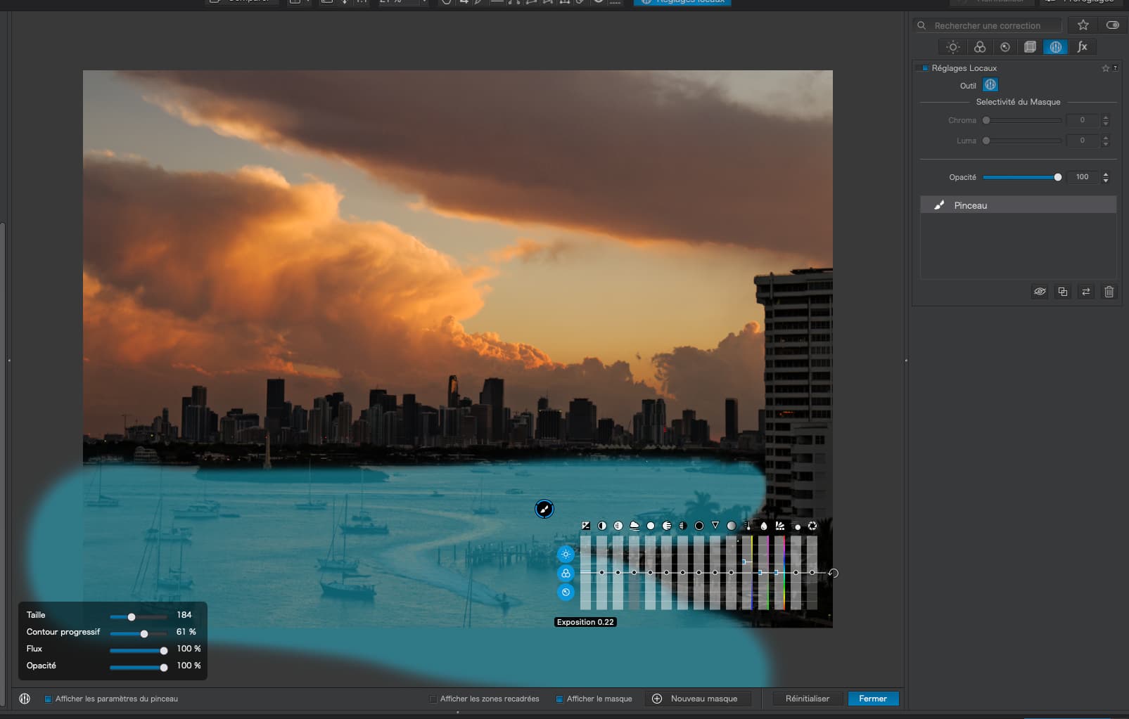
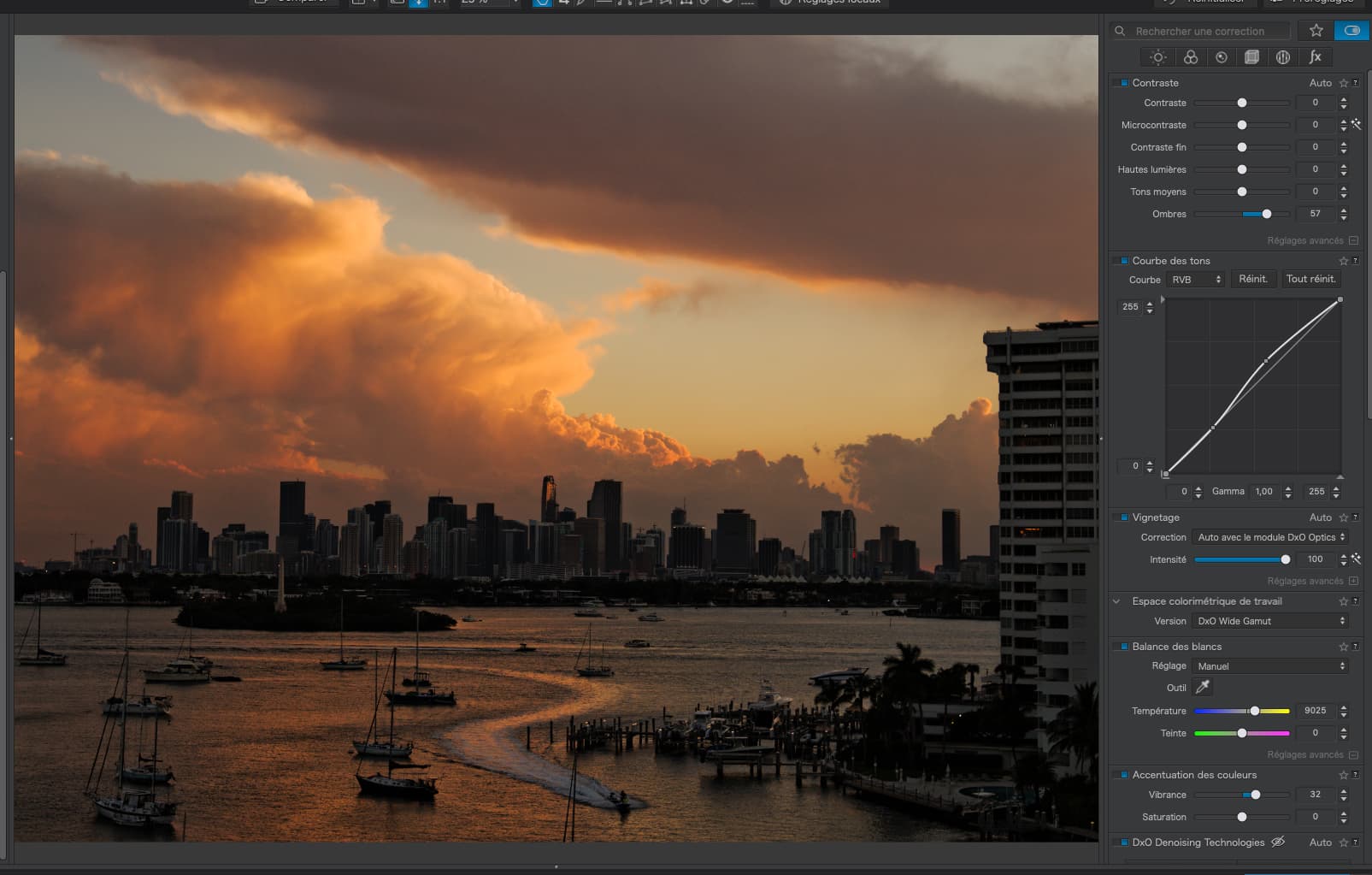
Starting to read that long article - will take more than one reading. In the meantime, I realized I no longer like the image we’ve been playing around with, with me trying learn how to do things better. As the sun was setting tonight, I set up my tripod with my D780, (M) mode of course, my “best” lens, and used spot metering on the brightest part of the cloud in the middle. The first image was too “bright”, but a few minutes later I liked what I saw, and waited for something to give the photo a little more interest - the boats speeding by seemed great, and I waited until it was where I wanted it, and took one image.
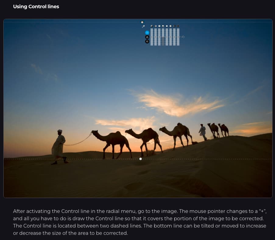
I tried lots of the things we’ve been discussing, with the control line upside down, as the sky was perfect but I wanted to adjust the lowest part of the image.
I see it as a photo of downtown Miami, without too much of Biscayne Bay overwhelming the image.
Maybe this will at least get me a grade of “C+” from all of you. As for me, I like it much more now than when I captured the image. I don’t see anything more to change, and on a whim, I added just a bit of ‘vignetting’ to help bring people’s eyes to the middle of the image.
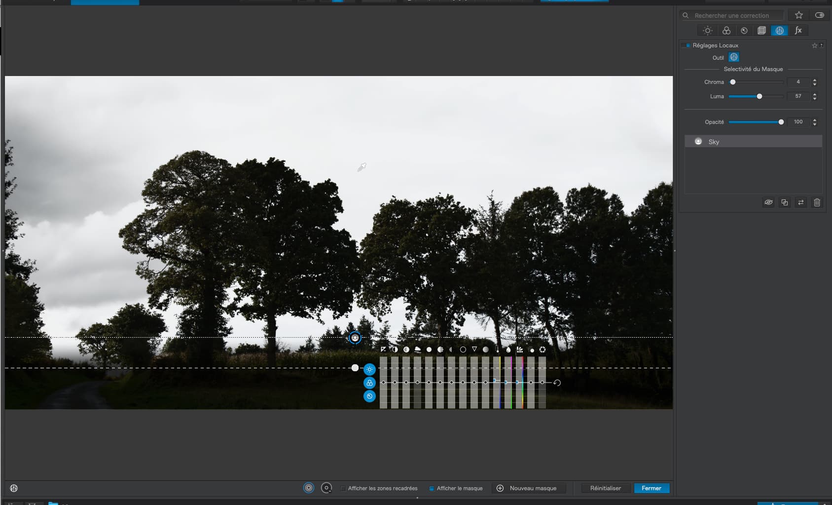
The Control line is located between two dashed lines. The bottom line can be tilted or moved to increase or decrease the size of the area to be corrected.
Absolute rubbish! The two lines form the boundaries of a graduated application of the effect…
And what you have ended up with is exactly the same as a graduated filter. There is no advantage to using a Control Line because you haven’t used the edge detection that is the main reason for using a Control Line over a graduated filter.
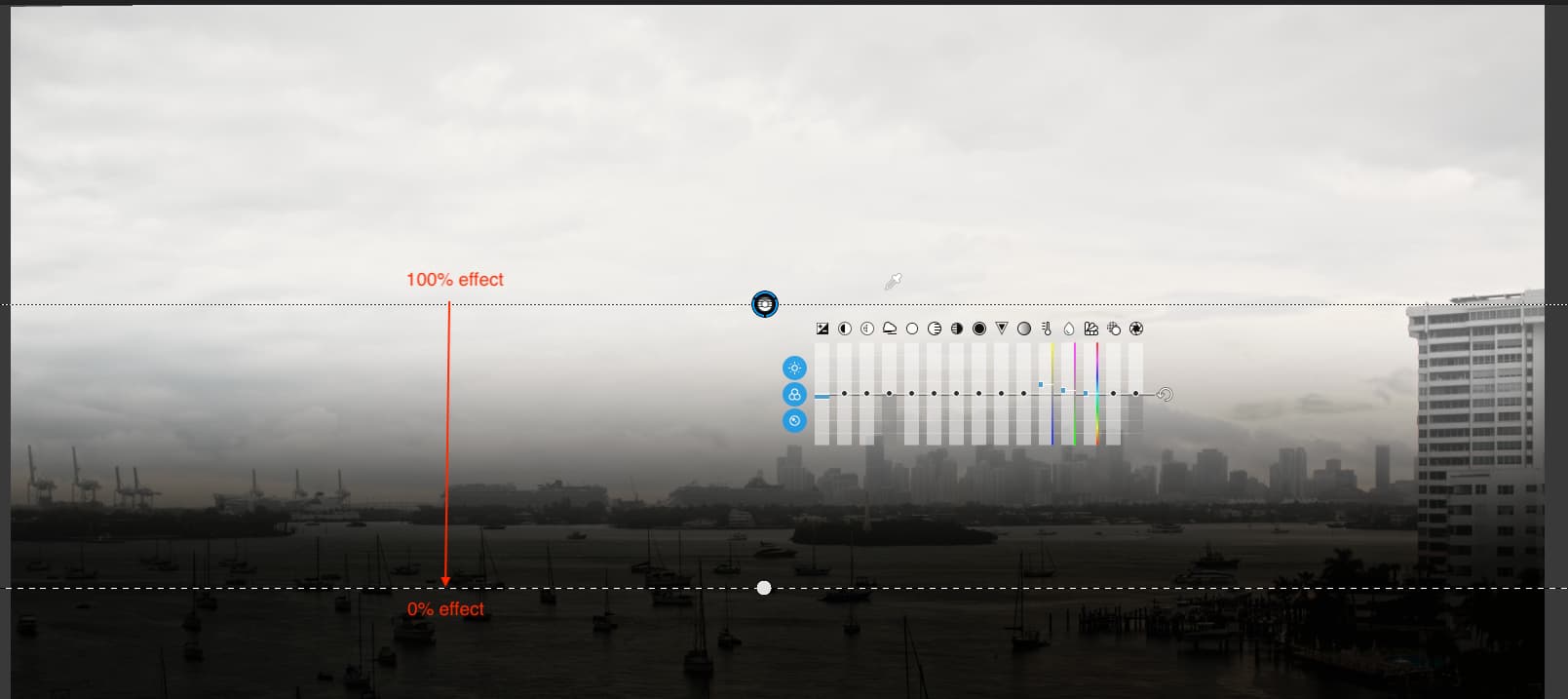
You can see clearly that the mask (light area) only affects the sky, even though it clearly covers the trees as well. Also note that the graduation covers the join between the “horizon” and the sky, because cloud detail gets less pronounced with distance and the graduation “fades out” the correction as it approaches the horizon.
Now, to hide the mask and adjust the texture to suit. See how beautifully the Control Line picks out the detail in the clouds between the trees without changing the trees at all…
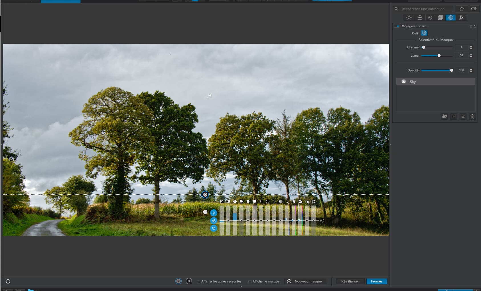
… where you can see that the trees were also darkened and “crisper” due to the Micro-contrast.
Now, to your image.
Given that the Control Line is less than useless for lightening the foreground, since it also lightens the bottom part of the building and the entire skyline as well, you would be better off using a very soft brush just to paint in the water…
Much the same as yours but with a sharper rendering due to the lens corrections and judicious use of shadow fine contrast.
I notice that you are being very formulaic in the adjustments you are making (same S curve, duplicating with selective tonality, etc), rather than properly evaluating what really needs doing for each individual image. I added in the brush on the water but I could equally well have got away with no local adjustments at all for this particular image.
By the way, next time you think of using a Control Line or Control Point, think if it really has any advantage over any of the other tools which don’t rely on having a distinct separation between two areas.
Oops - I’ll stick with information and people here for feedback, and ignore that long article.
What you all have been teaching me is that the two “lines” when using a control line, represent the boundaries, your word, of how much of the effect and where, will be applied.
Outside of the fine dashed line, there will be no effect on the image
Outside of the “solid” line, the effect will be applied at 100%
The amount of effect will vary, between those two lines, from 0% up to 100%.
Is “@StevenL” a person who can get the document I linked to, either removed or updated, so more “gullible” people like me get even more confused? That was to be my reading material for today.
I’m going to need to read the rest of your post very slowly, to understand it properly. By the way, “lens corrections” were already done, which is why I had to crop out the top of the image which got distorted into a curve because of the lens corrections. Every time I went back to the beginning, to start over, I made sure that initial correction was still there.
Temporarily, I sort of disagree - I want to use them as much as possible, to get familiar with them, including all the additional things you mention.
Somewhere in the process, I look at my image, and use the S curve to make it look more like what I want. Maybe I’ll get better at doing this as time goes by, but you see things, and aware of things, that I don’t yet see/notice.
Hmm, as I’m writing this, I’m not sure what you mean by “edge detection”. I’ve got to leave for a doctor’s appointment now, but when I return, that is the very first thing I will try to understand. I’m guessing you mean by “edge” where, and how much, correction is applied by my control line?
Summary:
I’m comparing my result next to your result. The single most important difference is that in your version, the water, especially near the bottom of the image is a bit lighter, with a bit more contrast. I don’t see a difference in the clouds, the blue sky, or the buildings of downtown Miami. You made the large building at the extreme right upper a little lighter, and you brought out more detail in the small “peninsula” to the left of that building. I have to struggle to find the differences, which to me means I’m getting closer than before.
Thinking back over the past few days, I’m “moving on” a lot more than what is obvious. More and more of it is starting to make sense. Moving on, to me, means slowly reading that last response from @Joanna, and with a new VC, re-do things more like what she suggests. As I see things, there’s no point in starting on a new chapter, until I have finished and understood the previous chapter, in this case, control lines.
I disagree. When I barely understand this stuff at all, I likely have no idea if the image is or isn’t suitable yet. That’s something else that needs to be learned.
I think you meant “appropriate”, not “suitable”. The control line worked on my un-suitable image, but as you pointed out, there were better options.
I think you are trying to say that the control-line was “over-kill”, as a simple mask would have achieved the same result, and you showed the example. Using a control line, I selected “too much”, so I would have needed to de-select some areas where it was not appropriate.
But moving on, how does one determine if a control line is or is not an appropriate tool, especially for a person just learning about control lines?
Hint - those two images, viewed simultaneously, would make it obvious that the control line was not the best way to edit that image. It means seeing the image as it is being edited, AND the results of the edit next to each other, as the edit is being done.
Right now, “show masks” is either on or off. Why not another choice, to display the masks in another window, while still working on the image in the main PhotoLab window?
Why would you think I’m arguing?
It is certainly not intentional.
Yes, I’m already involved in that discussion, and have now watched, and understood, the first of the three links you posted. Thanks for doing so - the video by PhotoJoseph (webinar) was invaluable!!! I’ve been rewinding and re-playing parts I needed to understand better. Finally it all makes sense to me!
Oops, in that case, I apologize. It wasn’t intended to sound that way. I just went back and re-read that part of the discussion, and in retrospect, I should have said things differently.
We are all different, and we see things differently, and at some point I need to start doing what I think >I< need to do, but for a while now, I’ve been doing things the way other people here want me to do, maybe, and maybe not because I agree, but mostly because I want to learn. Quite often I feel that I “disagree”, but usually that’s because I mis-understood what someone else meant. Specifically, regarding @Joanna and @Wolfgang, I often don’t have an opinion - I want to do things their way, so I will learn.
Oh yeah, and it would be pointless to say I agree or disagree with others here, until I learn enough that I actually do have an opinion. For several people here, I try to put myself into their shoes, and do what I think they’re suggesting I do, as that’s one of the best ways to learn. Wolfgang has concepts, and Joanna has details. For a while, I TRY to do what I think they want me to do. Almost every time, with rare exceptions, once I understand for myself, then I KNOW it’s the right thing to do. On rare occasions, I end up disagreeing. …as in right now, if I want to LEARN, I durn well better be using my D780, even if I might enjoy using another camera more. I hope you don’t ask me to elaborate, as when “feelings” get mixed in with “facts”, doing the “right” thing can have too many possible meanings. I hope this makes at least a little sense…
Funny story - in school, then college, the teachers or professors said something I thought was silly. But once I learned a bit more, I realized they were right, and my own thoughts were not right.
Gee, I wish more people in this thread were posting their own work, and explaining things, and why they did what they did, to the rest of us. I feel I’m hogging the spotlight way too much. I figure either I’m the only one here is so confused, or I’m the only one who doesn’t mind showing everyone else how confused I am.
Am I incorrect in thinking that the best way to get good at using control lines, is to use them as often as I can, wherever I can, until you verify that I’m doing so correctly? To me, it’s not like using a micrometer as a glue clamp - it’s like a camera, that I want to make part of my body, and I can use it without having to think about how to make it work? Even if I could use a graduated filter, and get the same result, I am stubbornly forcing myself how to learn this new tool, until I can use it effectively?
I now realize I’m making another mistake. I use all the PhotoLab tools by looking at the image, and stopping when I like what I see. That’s obviously not working with control lines, as you can instantly show me that I didn’t apply them properly, or that my pipette is technically in the wrong spot. Getting an image to look the way I want is not enough - I obviously need to work more at HOW I am using every tool. It’s not at all like cooking, where the “taste test” trumps everything else.
I’ve got to where I am with photo editing by a combination of trial and error and referring to manuals / tutorials / reading lots of posts on Cambridge in Colour / etc. I’ve been doing that since I first acquired a DSLR at the end of 2010. However, I’ve owned a camera since 1972 so I already understood the importance of composition and how to exploit the ‘exposure triangle’.
I still don’t claim to be that good at editing (or even capturing a decent image in the first place) but about a year ago I struck silver with this one. I created the image by using the HSL tool in PL to desaturate the reg, orange and green channels and then boosting the saturation of the yellow channel. The vignette was done in an ancient version of Photoshop and I added it because it compliments the framing of another photo that hangs above this one on the wall in my house.
Not really. It’s a matter of deciding which images would benefit and, especially, getting used to placing the pipette and adjusting the selectivity of the masks. Most pictures without a clear delineation between different parts are not really suitable.
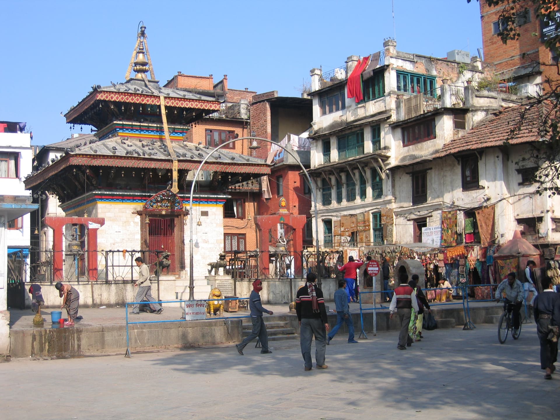
I went through my folder of photos in Kathmandu, Nepal in 2006. I had some photos from my Nikon, and many more taken with my very old Canon S100 (I think). I went looking through them, and out of a hundred or so photos, I only found one that I like well enough to show off to my friends and family. It had errors, but I thought PhotoLab could fix all of them. I’ll post it here, mostly to see if I’m missing out on something I didn’t do, or did correctly. From my point of view, it’s finished.
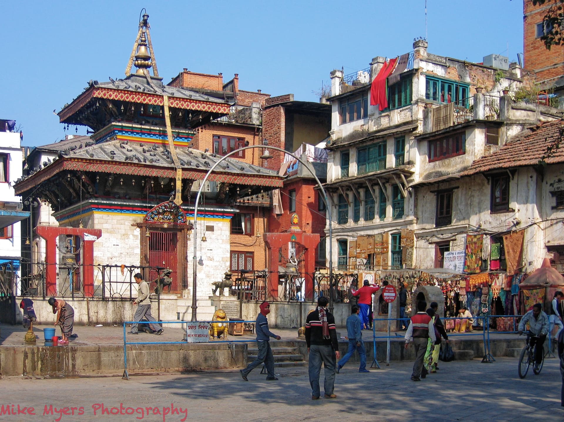
It’s one of the three photos that looked like a good composition, showed one of the ancient buildings that Kathmandu is famous for, and had people in the photo, but out of the way - oh, and a nice blue sky. @Joanna has a perfect record for always finding things I could have done better, but I think this edit is as perfect as I know how to do.
And the edited version, not all that many changes.
I guess I was too overwhelmed at being a tourist - far too many snapshots, and only three images I will call a photograph.
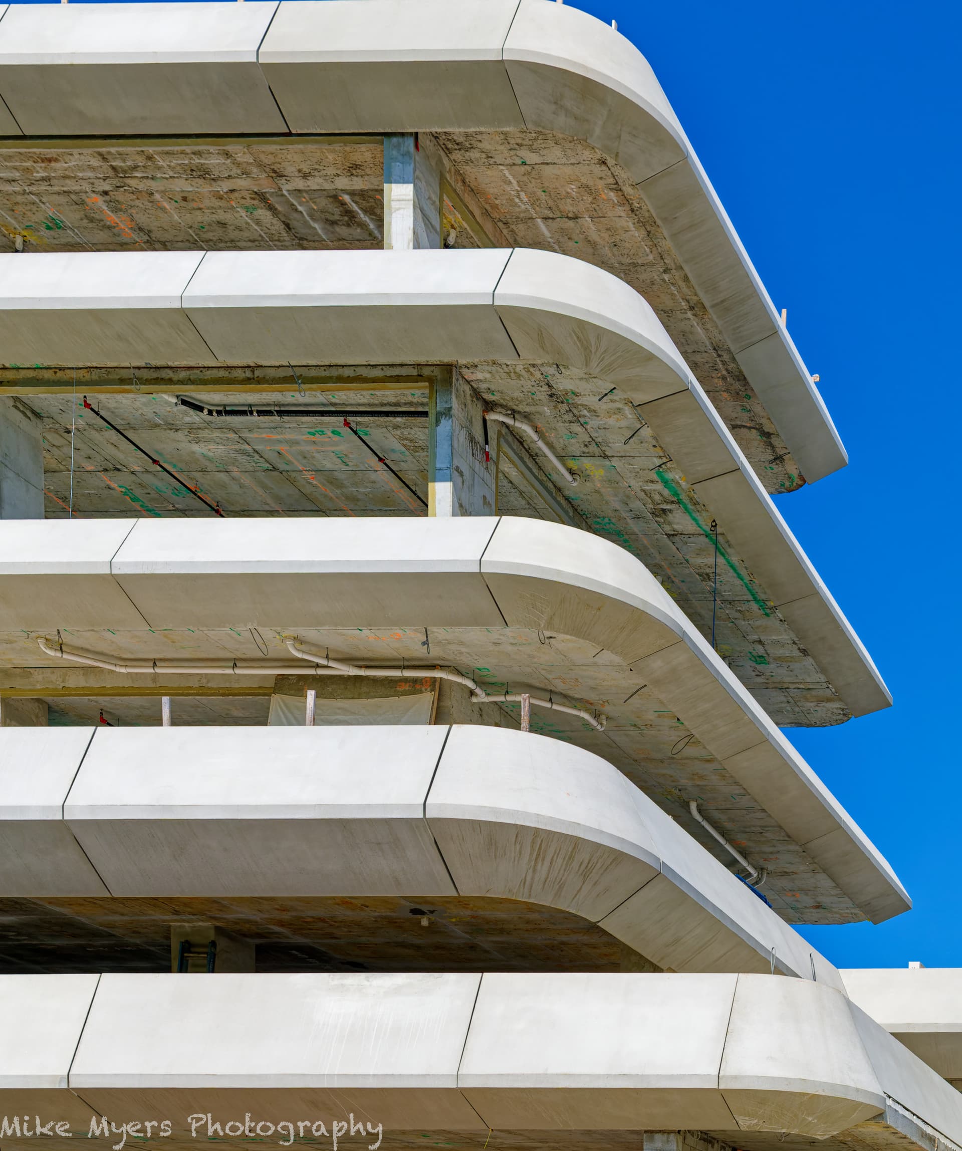
No more old photos - if the sun comes out again today, I know what and where I want to take the photo, and it does not include any part of Biscayne Bay.
I knew what photo I wanted to take, but everything was wrong - I’ll have to wait for 7:30am tomorrow to get what I wanted. So, with the D780, I took six or so photos of the building under construction. There is a huge crane lifting huge concrete structures in place, where they are attached to the building, with several workers positioning them. I wanted another photo of this happening, captured with a good camera - and the D780 felt like my only choice, along with my now-favorite lens.
I got a photo that I wanted, but my mind saw it differently than my camera - and PL6 is a wonderful way to shape reality into what I was paying attention to. No people, just structure, in front of a boring blue sky - which I also “fixed”. Sadly, no need for a control line.
PhotoLab allowed my imagionation to run wild (my word). Good thing I wasn’t wearing my photojournalist hat, as I would be excommunicated from that world if they saw this…