Voilà…
_DSC0043.ARW.dop (37,2 Ko)
chronologically the setting of exposure compensation has to happen before metering, not after.
Oh, sorry, didn’t want to interrupt your advising chat with MikeMyers. ![]()
The metering system on the Leica is rather crude - but still effective most of the time. The metering system on the Nikon is much more precise. I have printed out your suggestion, and plan to try this tomorrow morning with the D780.
Ian.
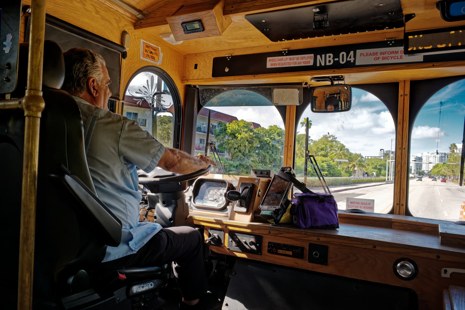
PS/ there is something fascinating about this trolley: it looks like every ten years or so, they added a new layer of technology, while keeping all the previous ones…
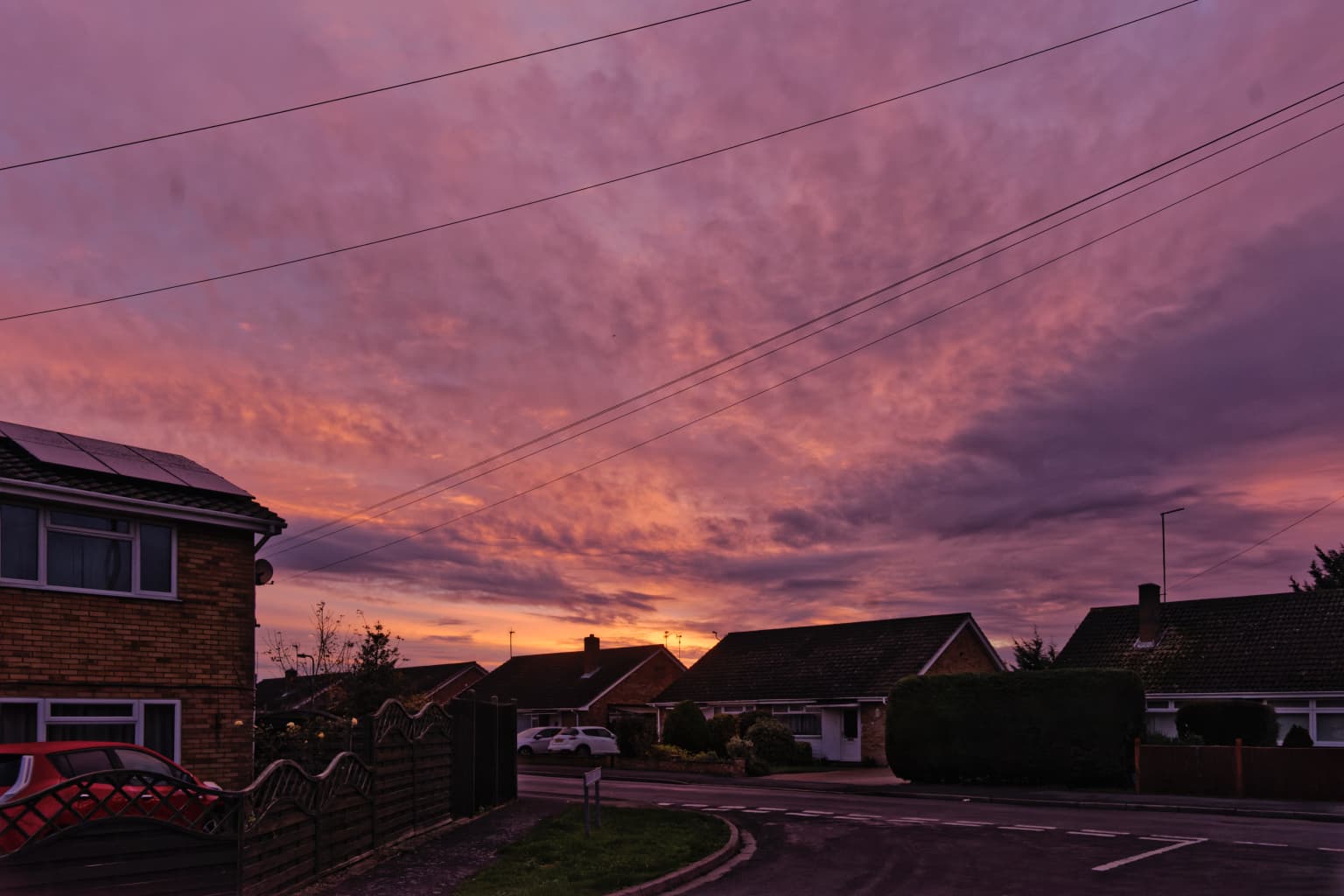
I think those results are far better than just “satisfactory”. If I had been able to do that long ago, I’d have been thrilled. Part of me still wishes for more green in the trees, and more blue in the sky, but that might make the whole image seem “fake”. How does that saying go, “Be careful what you wish for, as you might get it”.
I will try Joanna’s suggestion tomorrow, and hopefully be better able to edit these images in the future, using the new things I have learned.
Can you please explain why you do this? How does it help to increase the vibrancy, but then reduce the saturation?
@Joanna. I still have quite a bit more to do on it. But I thought I would put it up for Mike and anybody else to play with.
One of the things I will do is to remove the telephone wires and lighten the foreground a lot more than it is. I want to try and keep the sky as it is, as that is the same colours as at the time of taking.
I do have another picture that I’m going to put up especially for Mike mainly because I did almost everything you and I have been trying to stop Mike doing. this was a flower (hollyhocks) with the sun behind it first seeing it while out shopping with the wife. I decided my 24 to 70 mm lens would be suitable ‘wrong’ to get close enough I would have had to trespass on the people’s property and I rather suspect they would not have liked all the wheel marks from my mobility scooter across the front garden so I got as close as I could and the lent over as far as I could, without ending up face down in his front garden.
The next day it rained but the following day lovely sunshine so armed with my 75 to 300 mm, only to find they have cut down all their flowers.
This one’s for you Mike.
_DSC0037.ARW (23.9 MB)
_DSC0037.ARW.dop (35.1 KB)
Taste, well, it’s a matter of taste…
I boosted the sky a bit, but not too much…
Here you have the .dop file, if you are interested.
L1004582 | 2022-11-03.dng.dop.zip (685.3 KB)
Ah yes. A few years ago, we used to keep paying a storm felled tree and kept on saying to ourselves, we really must stop and take a photo. Of course, when we finally got around to having the time and the opportunity, it had all been “neatly” removed.
Vibrancy boosts a certain range of colors, and each color is boosted differently. Also, vibrancy should preserve skin tones. On the other hand, saturation boosts all colors using the same value…
So, boosting vibrancy you have some “pop” while preserving your skin tones…Reducing a bit the overall saturation dials back a bit the whole image, while giving the vibrancy-affected colors a bit more “separation” from other colors…I don’t know if it’s clear enough.
I think Photo Joseph has a tutorial on this, have a look at his YT channel.
Ian.
Ouch!!! I have been doing this wrongly for a long time. In a photo with a face, from what you suggest, increasing the vibrancy will boost the colors but not mess up the facial tones, but from what I’ve been doing, mostly working with the saturation, while I did see the difference in many parts of the image, I was oblivious as to what it was doing to skin tones.
Something new, and very important that I have just learned. I wasn’t sure I knew the difference between vibrancy and saturation, but I’m much better aware of it now. It is a warning, for how I use PhotoLab from now on. I used to make a bee-line for saturation. Used to. Thank you.
So the way you deal with this is to over-boost the vibrancy, then lower the saturation? It sounds very reasonable - will need to try it.
Ça depend. Il faut jouer.
@mikemyers Fix Tone & Color Using Advanced Adjustments with DxO PhotoLab 5 - YouTube
This is the tutorial I was talking about earlier.
I thought you might find this photo interesting. I took it yesterday, just so you all know what this trolley looks like from the outside:
Thanks for reminding me of the link - time to watch it again, from the beginning.
I’ve always had a bad memory, and if I don’t continually use tools, I tend to forget a lot.
This forum is continually reminding me of things I either forgot, or I didn’t learn well enough long ago.
It certainly looks very different from the inside…It’s basically like an RC car, you have the motor + body frame, then you just swap the plastic shell ![]()
What @Ian78 already mentioned, vibrancy lifts some colors up.
But just raising the vibrancy can be too much of a punch so I lower the saturation. By setting +40/-15 the general image remains similar but some colors get a bit more punch. For instance blue skies get a little bluer.
Two examples
Click to enlarge, then use the next/previous buttons to see the subtle differences
But as with everything, it isn’t a one size fits all. Some images don’t get this treatment, others get a finetuned treatment.
@mikemyers My take on the original image
@Ian78 This isn’t a lot different from your edit but I am intrigued by the change in colour of the bag. I reduced the vibrancy of the whole image and set saturation to 0 but the bag is much brighter than yours. That makes it more distracting but I personally tend to favour being closer to the original if possible (if that was the original colour!?), hence no cropping but the colour of the bag intrigues me!?
@mikemyers what colour was the interior wood, if pine then it tends to go more golden with age and exposure to light and my edit might have made it too light!?
PS when uploaded it still looks a bit too HDR at least of one of my monitors but a bit less so on the monitor I did the edit on!
@BHAYT
Good job, I just find the sky in the upper right corner a bit too much.
If this topic learns us one thing is that there isn’t one universal way to process photos ![]()