Working with an image with lots of sky (above Grand Canyon) I thought I’d go for the famous (or infamous) Kodachrome blue skies. Instead, I got a dull, and hardly enhanced, blue sky. Ektachrome was no help, either.
Working with another image, a carolina wren, the original bokeh background field above the bush the wren was sitting in, and the wren itself, shifted from a blue-grey to a warm brown. Hardly what I expected Kodachrome to do. NTL in this case I accepted the result.
Either I’m mis-remembering how Kodachrome color appeared, I’m using it incorrectly in PL 3, or something’s off about the way it exists in FP.
If you still got some Kodachrome slides hanging around, you can easily verify how they look, unless the colours have changed due to effects of time, chemicals or storage… On the other hand, you could add an image to your post to better illustrate what you get and how, by adding the respective sidecar file.
Hi, Richard! Your inquiry made me wonder what Kodachrome skies should look like. A quick search turned up some saturated, contrasty results. Same as you, this isn’t what I get with the Kodachrome film emulations - unless I reduce the Intensity slider. Not what I thought I’d have to do. However, increasing Intensity turns the image pink.
Thanks for the note. I took on some more Grand Crayon shots. Invariably Kodachrome was a dead loss. In my film days Kodachrome was occasionally derided for its skies, etc. Whatever this emulsion simulation is, unless I’m totally brain dead, it’s simply not Kodachrome. Ektachrome VS-100 appears to be a fair approximation of Kodachrome. I could be wrong about this, but my recollection is Ektachrome was a little better behaved than Kodachrome.
Since I’m a forum (and PL) newbie, there’s a time delay between writing a post and its appearance here. I’m going to put up the original JPEG and sidecar and hope that’s OK.
This is a quick snapshot, but it’s as good a test image as any. According to the shadows, the sun is high and past max elevation. I’m facing north. The time stamp could be an hour off after moving back and forth between (Anglo) Arizona and Navajo Nation.
Kodachrome was (is?) notorious for deeply saturated blue sky and generally excessive saturation.
Before I post, in this case a JPEG, what are the rules about file size?
In the interim, please refer to this Wikipedia article. There are sample images well into the text. The World’s Fair sample, in particular, shows a very good example of “Kodachrome sky”, oh my yes it does…
It’s enough to make someone write a song about it. Oh wait, Paul Simon did that.
BUMP
This topic died waiting to be moderated. This is a tickler to a) see if I’m still moderated and b) raise the topic up to “almost a new topic” instead of buried “long, long ago, in a queue far, far away…”
I’ve put all files related to the image DSCF3758 in a ZIP. That includes sidecars for each image file.
The original file has been rotated and cropped, and went through Unsharp by mistake (I’m too lazy to redo all of the files without it and it appears to have little or no influence, anyway). Otherwise, it’s effectively unaltered.
I ran that file through NiK to get as noise and grain-free an image as practical. I used manual mode to sample anything that might be noisy.
Finally, I used Kodachrome 25 emulation. The result, on a reasonably accurate flat screen monitor, is… nothing I’d put my name to. I don’t recall Kodachrome as being as bad as I see it here. Or is my recollection faulty? (It has happened, but I can’t remember when…)
Had a look at the images you uploaded and found that they resemble the ones I took on Kodacolor in the late 1970s. I remember the deception I had when I got the 8x10 prints from the lab. The prints were less crisp and saturated than I remembered of what I had seen and the sky was not as blue too. I also noticed that the photos showed the haze from all the dust in the dry, windy air, not only in the sky as in your photos, but also in the canyon. I also remember what some of my colleagues had shot on Kodachrome in other locations. Their photos had all the bang! colors, specially when a polarizer was used. Downside was e.g. that lakes would look like blue velvet instead of water because reflections had been canceled by the polarizer…
DxO film emulations do like they say: emulate. This means that, under optimal circumstances, you can get a look that is close to what you’d have gotten if you had shot the scene on the respective film. And while the foregrounds in your photos look Kodachrome-ish, the sky does not and it probably would not have been “better” on Kodachrome itself because of all the dust.
You can try local adjustments to change the sky to your liking. Try it on your raw files or 16 bit tiffs instead of jpegs which only have limited wiggle room.
Looking back through the sequence of files, it appears that noise reduction damaged the fine detail of bushes and low growth on the far side of the canyon. I suppose noise reduction treated it as grain and very helpfully fixed that “problem”. Time to work on DxO proficiency. Oh my yes it is.
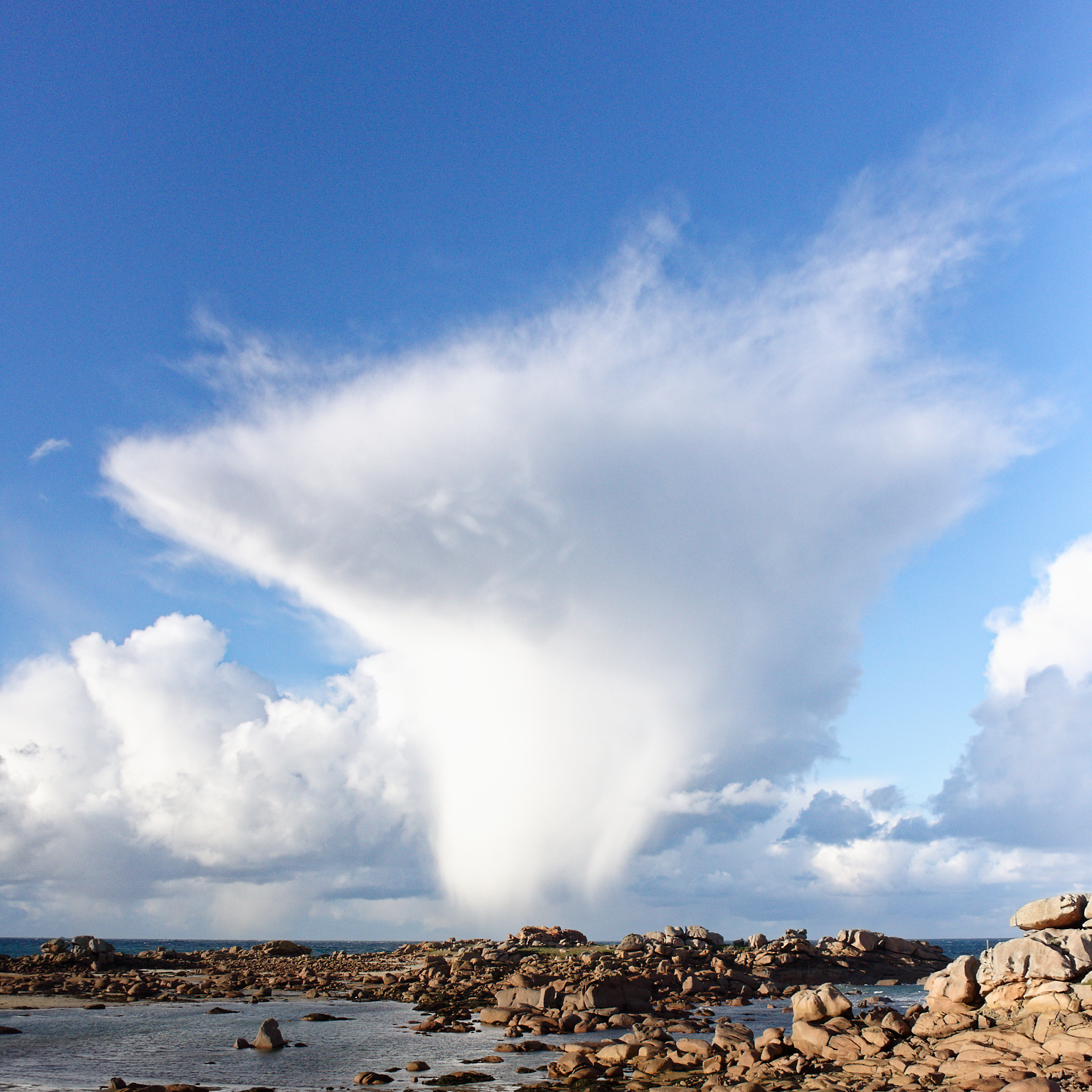
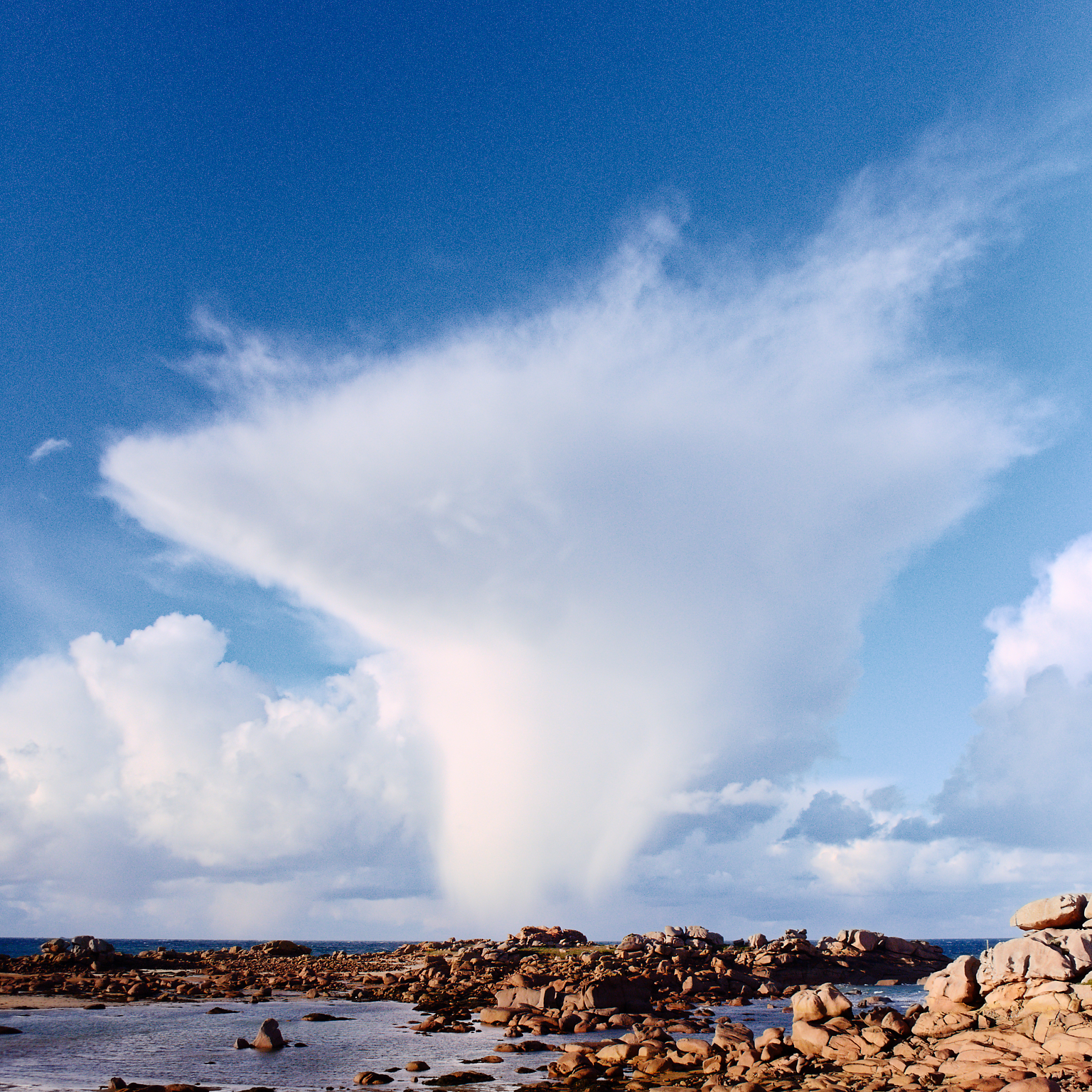
BTW, Joanna, very nice catch on the unusual cloud formation. Not quite CuNim but certainly has signs of an icy anvil at the top. Aside from growing convection to the left, friendly Cu everywhere else. Interesting!
Great thanks for the help. I think the problem boils down picking the wrong place to use Kodachrome emulation. Sobeit. As Joanna says, there are alternatives to get much of the “Kodachrome” effect. Guess I’ll work more on those skills. [/ big grin]
Apologies for delays in posting and responses. Such are the wages of being a newbie. Maybe I need to ask more questions, eh.
In fact, if you look at the blue sea in the bottom left of my image, you will see the typical reddening much more obviously.
When I shoot large format film, I usually use a colour meter to determine the colour temperature of the light coming from behind me and use correction filters to compensate. It’s quite surprising the difference shooting with or against the light to the temperature the film will record.
No surprise about temperature varying relative to the sun angle. IIRC Rayleigh scattering (why the sky is blue) plays a roll in changing the blue component in the sky’s color. That’s strictly a semi-informed guess, but probably closer to right than not. Maybe.
Also, IIRC, in the RGB balance tool, the color temperature slider displays a value somewhere. The value decreased when shifting to the blue and rose shifting in the yellow. If that number is supposed to be the overall temperature, in degrees Kelvin, it is utterly 180 deg. wrong. Hotter = bluer Quick example = LED lighting. “daylight” bulbs are typically 5000K while close to incandescent is somewhere south of 3000K. Am I mis-reading something?
IMNSHO it’s a little like turning the steering wheel to the right to turn the car to the left. Insisting the wheel should go left to turn left would be …um… counter-productive.