Some of us have noticed that using PhotoLab’s “Neutral color, neutral tonality” setting, even after otherwise white-balancing to taste, leaves reds looking too magenta. Recently (maybe the last year or two? going back to PL 3?) To make reds look correct, I’ve frequently found myself forced to go into HSL, choose the red channel, and rotate it counterclockwise (toward yellow and away from magenta).
And it’s not only me. Here’s a recent thread at DPReview:
Has anyone else experienced this?
FWIW, I have a Dell U2415 monitor that I calibrate and profile with an X-Rite ColorMunki Display, and I also print my photos on both an Epson R280 (at home, with CcMmYK Claria inks) and a Canon Pro-100 (at work). The problem persists across all outputs.
Reds can shift off their expected hue under the circumstances you mention, @NAwlins_Contrarian.
I get the effect quite often, as my default preset contains the neutral, gamma 2.2 colour rendering.
The colour shift can mostly be removed with the tone curve (see note below) or the HSL tool. I consider this to be a necessary consequence of the math involved rather than something odd or wrong.
Note: Neutral rendering often produces images that look too bright. I correct this with the tone curve, which often moves purple-red hues away from magenta.
NAwlins, I’d recommend you pick an alternative neutral preset if you don’t like the built-in preset. It’s very easy to roll your own. My main preset includes switching the rendering to Leica M-E, M9, M10 (for Nikon Z6, D850, Z9; D4 used Leica M-10D preset) which has higher contrast and more vivid reds. It’s a better starting point for me. In certain environments, my starting point preset includes Fuji Pro 400 which adds quite a bit brightness in the mid-tones, more contrast and improves greens.
If you don’t like to the colour profiles, you can roll your own neutral by adjusting HLS the way you like and include that HLS setting in your own neutral profile.
Neutral at the end of the day is either 1. math or 2. subjective. Pick your poison. At least PhotoLab give us the option to very easily create our own neutral or starting point presets which suit our work and our perceptions.
1 Like
Photo-DKO
(Dirk Offringa, Windows 10, RX570, PL6E-VP3-FP6, Fujifilm shooter)
4
I have the same problem and have reported this as a bug to no avail.
Yes, this looks like a bit of a bug.
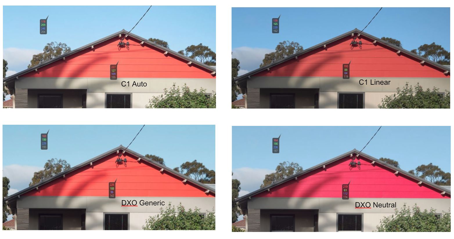
I opened the raw with DXO Generic and neutral tonalities and exported a jpg. I then did the same with C1 using Auto and Linear tone curves.
I then opened each of the 4 images in C1 and dropped a colour picker on the red wood,
This gave the following readouts:
Test R G B L
C1 Auto 227 127 109 155
C1 Linear 193 88 84 119
DXO Generic 225 108 96 142
DXO Neutral 219 61 112 114
What strikes me is that in C1 you get the shift in values that you expect i.e. as luminance decreases RGB values decrease.
In DXO as Luma decreases the Red value only shifts down a little, the Green goes down but the Blue value increases.
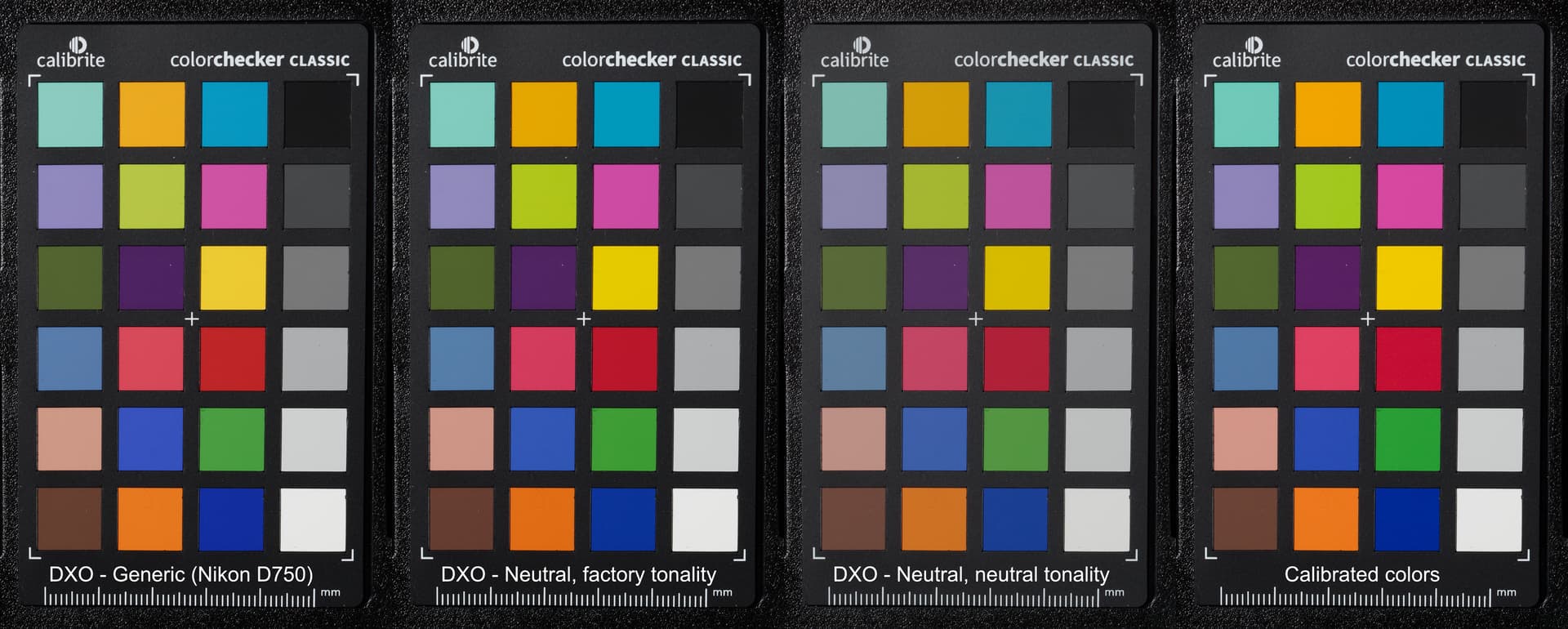
@maderafunk Thanks for that image. I saved your image, opened it in C1 and dropped some colour readouts on the patches.
You don’t see such a large shift in colours with your D750 image, suggesting that it is camera dependant, although you do still get an increase in the Blue channel as the luma goes down. This does not happen with the other colours and suggests that maybe DXO Staff could comment?
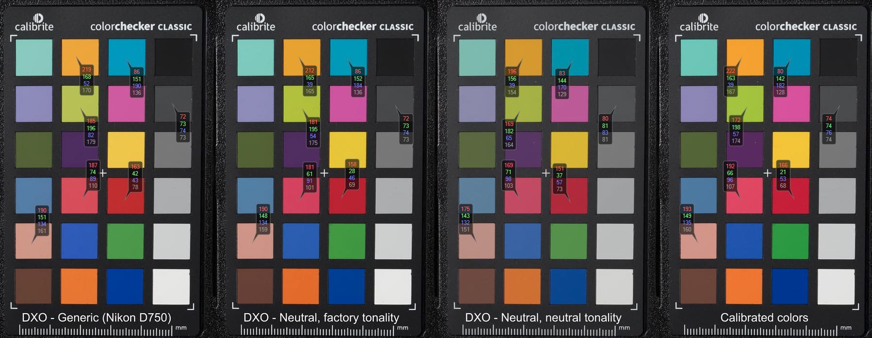
A noticeable colour channel shift (very noticeable on the Panasonic G9) for one colour,
It might indeed be the case that some color profiles are not correct. I have noticed for example, that for some cameras (Canon 1DMK3, Leica M9) there is a noticeable shift in White Balance in comparison to other color profiles.
You could try to calibrate a profile for the G9 based on this studio picture by Dpreview. It might not be the best image, as sometimes there studio scene becomes a bit old and the colors of their color checker might have faded, but maybe it is good enough.