How I feel after about a year of using PL4 as my go-to image editor

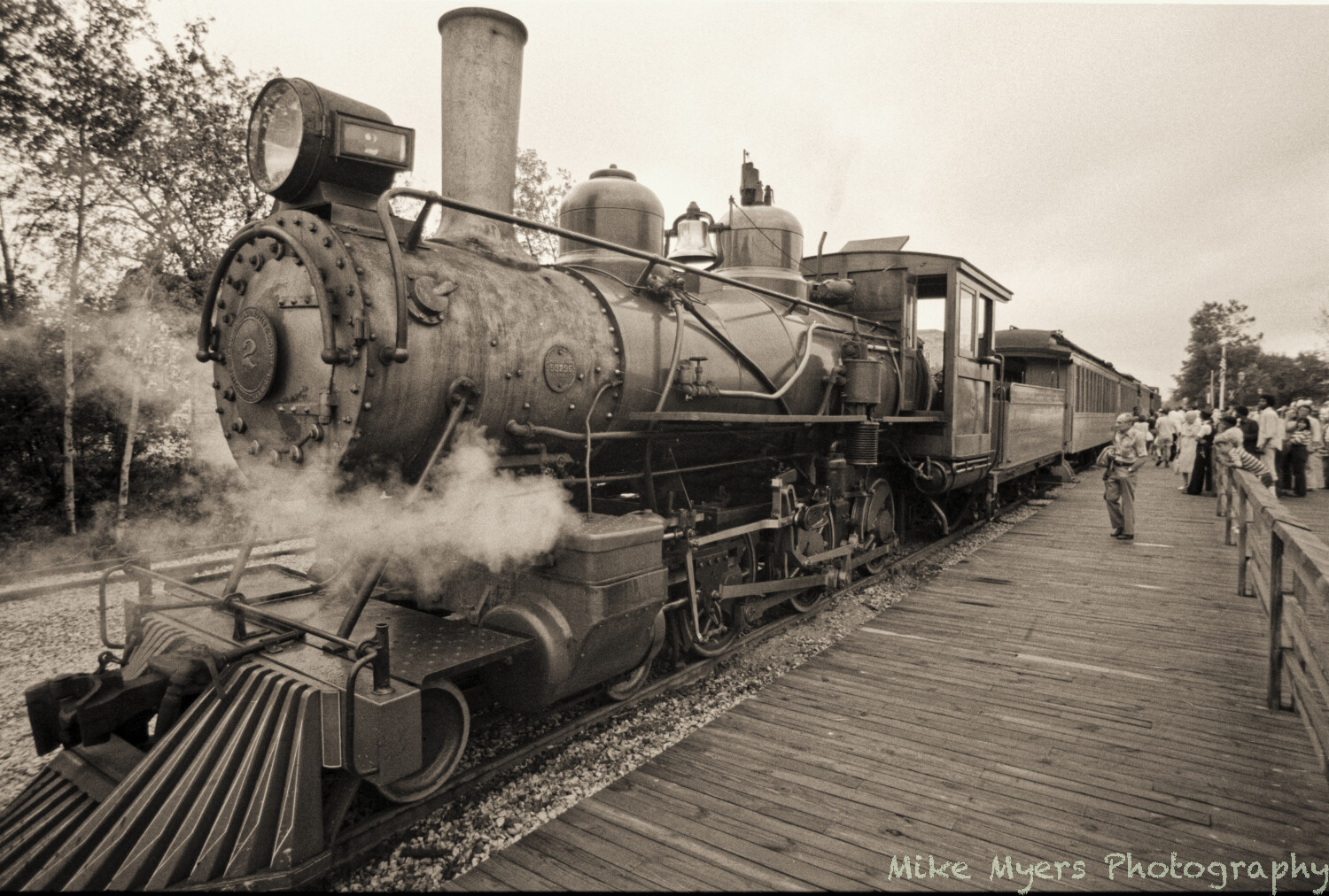
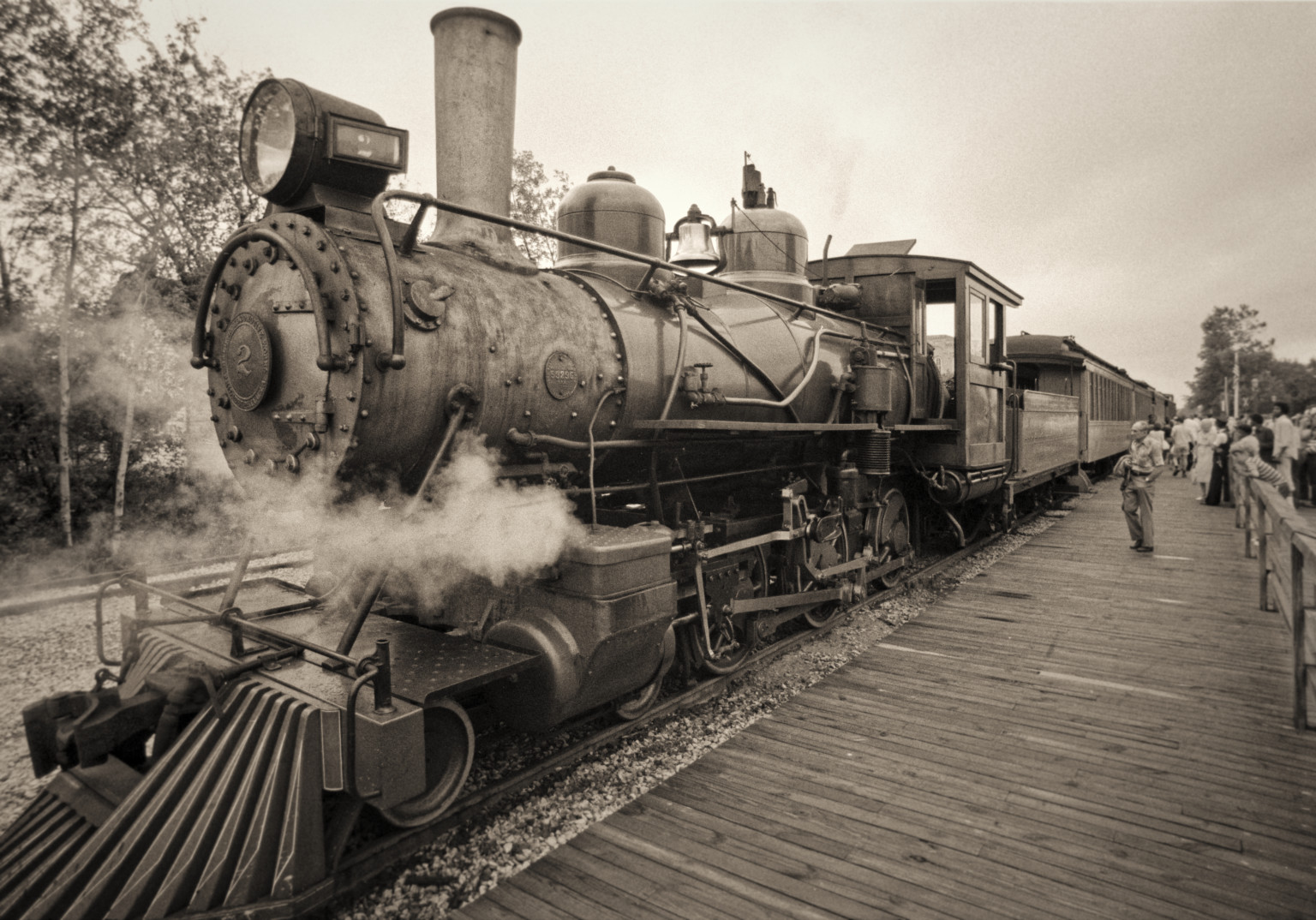
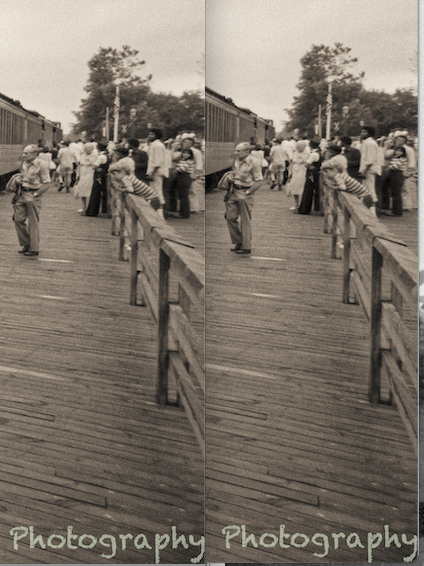
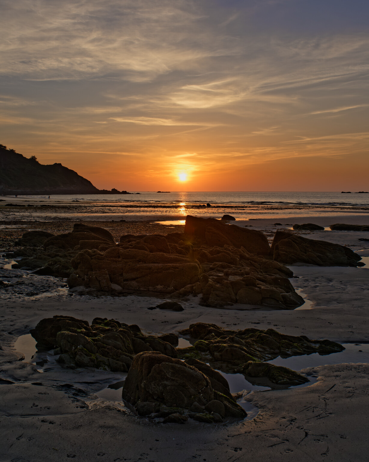
I think the answer is “it can’t be done”, but I’ll ask anyway. I took this photo almost certainly in the 60’s, but maybe in the70’s, most likely with my M2, but possibly with a Nikon F that I bought around that time. It’s a “tourist train”, and I wanted a photo of the engine, with all the “touristy” stuff to explain what was going on.

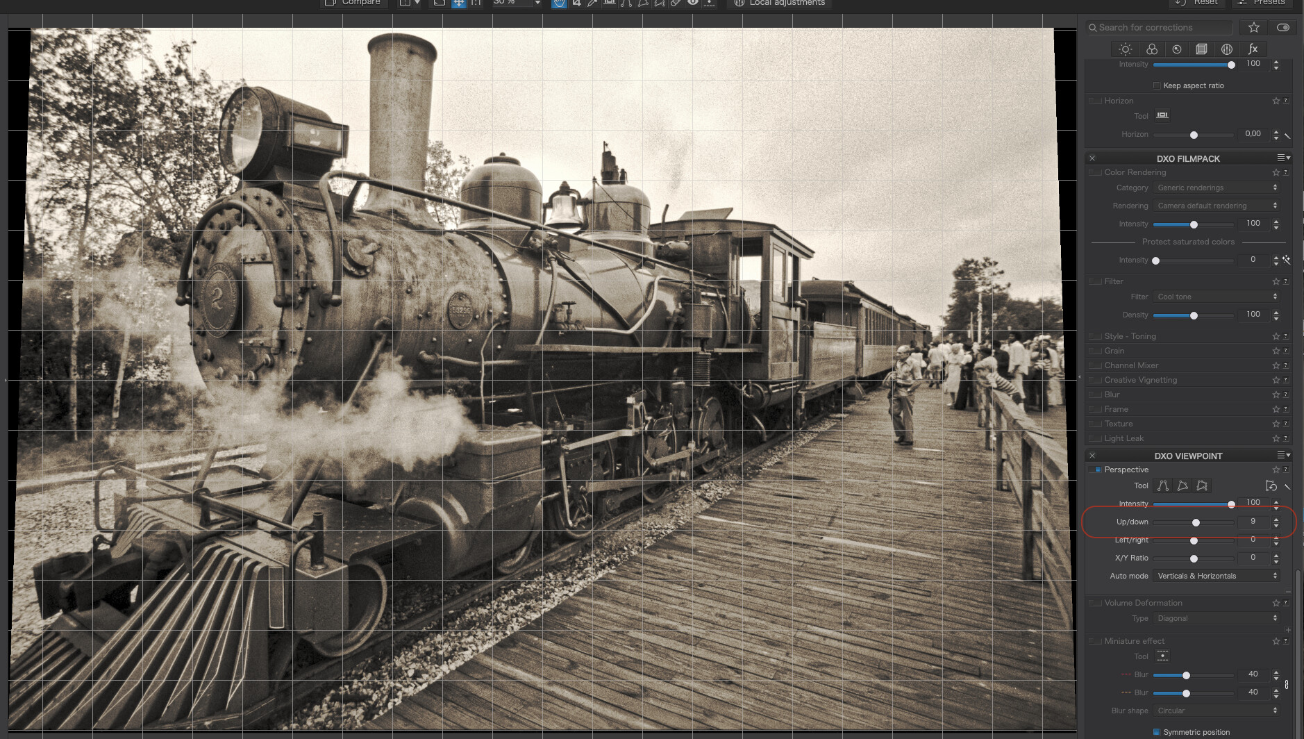
I almost certainly focused on the engine, towards the front, but I didn’t stop down the lens enough to get adequate depth of field. From looking at the photo now, I must have used a wider angle lens, most likely 35mm. Anyway, it’s obvious to me now that the front of the locomotive might be out of focus, but the trees behind it are also not sharp, so maybe the lens was “soft” around the corners?

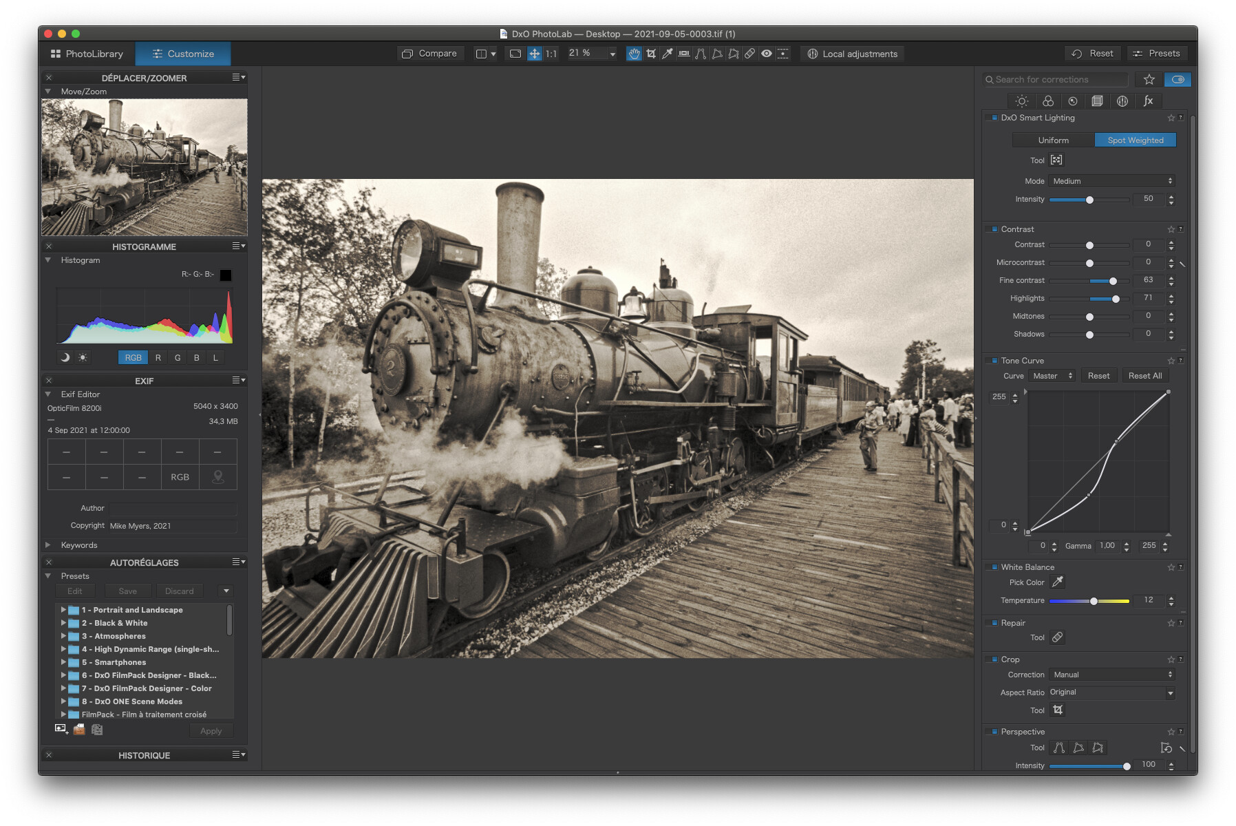
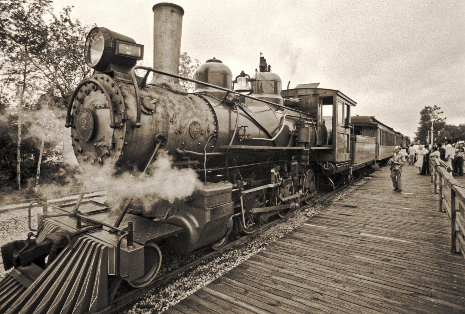
Regardless of why it looks this way, the best I could think of was to turn on “Clear View” which messed up the photo - so I used “Local Adjustments” and boosted both the “clear view” and the “micro contrast” only on the front of the engine… but then I added a correction over the trees in the top left. I left the people at the right blurry, as that adds to the image I think.

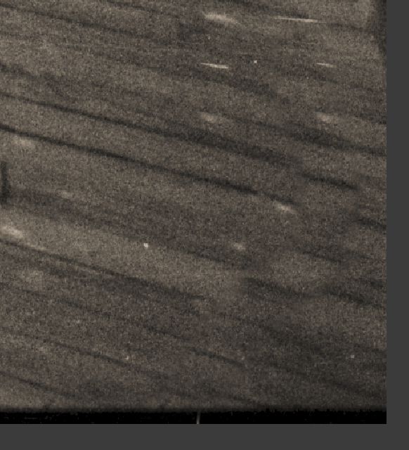
I think I’m “done” with the photo, but is there a better tool that can emphasize the sharpness, without creating horrible looking “noise” (I won’t call it grain)?

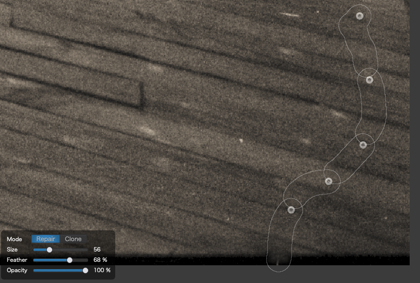
(Oh, and maybe I got more careful with the negatives, as there was minimal dust on the negatives - almost none.)

2021-09-05-0003.tif.dop (13.9 KB)

2021-09-05-0003.tif (32.7 MB)

Talk about a red rag to a bull :nerd_face:

I couldn’t resist “tinkering”, or should I say doing it all over “my way” :wink:

I didn’t find any focal softness, just lack of contrast.

If you had focused on the hyperfocal distance which, for a 35mm lens at f/11, is 13’10", that would give you a nearest sharp focus, without diffraction, of 7’0".

I would that, assuming you’d taken the focus from the centre of the frame, that wouldn’t be too far off 14ft and I reckon, allowing for a little diffraction, the front of the engine is “acceptably” sharp.


Here’s a screenshot showing all the tools I used…

And here’s an export of the finished result…


Things I did differently

First, I used the Forced Parallels tool to straighten out the posts on the right, applying a symmetrical and opposite adjustment on the left to keep the top of the frame from going skew whiff and forcing me to chop the top of the funnel.


Hiding behind your watermark was a very badly done repair :crazy_face:

You can see the problem if you look at the mask source and destination…

You’d done the repair with the clone tool with a fairly large brush and, by doing it all in one, you’d not allowed for perspective changing the distance between the planks and, I’m guessing, taken PL’s default source position, which didn’t follow the lines of the gaps between the planks and you’d also included some obvious repeats from the source.

Here’s what I did with the repair tool rather than the clone…

And, without the masks, virtually invisible…

If you look at the rest of what I did with the repair tool, you’ll see I zoomed in and used a very small brush to minimise “overspill”. There were quite a few very fine white lines, which reminded me of very fine fur. Being a bit OCD at times, they had to go :roll_eyes:


Virtually all of the “sharpening” I did with the fine contrast sliders and I used Spot Weighted Smart Lighting to place “zones” on the brightest and darkest areas to bring the tonal range under control, followed by tweaking the tone curve a bit.


Here’s the DOP

2021-09-05-0003.tif.dop (65,8 Ko)

1 Like

I would like to have the top bar buttons connected with the tools on the sidebar as in a way that they turn op at the top of the row when you activate one of the topbar tools.
Instead of that they choose the tabs and favorite stars to select your tools for viewability. (and thus quicker acces.)

If you have perspective tool of viewpoint, you can click on the + and find angle correction tools to manual change your position of view. Horizon shift and vertikal shift.

well, you may find out yourself → Active corrections … :slight_smile:

2021-09-05-0003.tif.dop (226,7 KB)

I’m not sure what to make of all this. I copied your .dop file to my computer, then did an export to disk. So things you are suggesting:
a) be more careful with repairing or cloning - after a while I need to stop, take a break, and then continue, so I don’t make sloppy mistakes.

b) be more careful in preventing a black border from showing at the bottom,

c) I know you worked on the fence, but I never thought of how you explained it before: “used the Forced Parallels tool to straighten out the posts on the right, applying a symmetrical and opposite adjustment on the left to keep the top of the frame from going skew whiff and forcing me to chop the top of the funnel.” I made a side by side photo - maybe my eyes aren’t good enough, but I never realized the fenceposts weren’t vertical.

d) I guess the sharpness in the locomotive was there all along.

I love your finished image - it jumps right out at me. In retrospect, I wish I had stepped back a step or two when I took it, but that’s OK.

I had no idea these old negatives would/could come out so nice! I’m trying so hard to keep up with you!!

Thanks again.

I do have Viewpoint - so maybe I need to look for those controls in Viewpoint?
Maybe once I get this other stuff under my belt…

Actually, if I had remembered to use it, Peter’s idea of using the Viewpoint palette, for this particular image, would have saved me the effort of trying to match the “tilt” on both sides manually :roll_eyes:

That saves losing the hoizontal top or bottom and makes it less likely to end up cropping out the top of the funnel.

In this screenshot, I used the grid to check the verticals and simply adjusted the Up/down slider until it look right for the posts on the right.

Perspective corrections can be used freely, depending on what you like as an output. Illustrating Joanna’s words:

Force parallels does the right thing…but will crop the top off the high building at right, due to the slight rotation that is necessary for a physically correct correction.

The four lines tool lets me choose to keep the top as in the original shot. Drag the horizontal lines to the upper and lower edges and adjust the vertical lines only.

Note that the second way skews the image a bit.

1 Like

Mostly, I do perspective corrections with activated grid and the 8-point-tool – even used some Volume
deformation in this case. Otherwise I tried to center on the nostalgia.

BTW, scanning (old) film introduces work. There were a lot of (fine) scratches.

1 Like

I bought Optics Pro and Filmpack long ago, but I couldn’t find any “Viewpoint” palette in PL4 that mentions it, and the included tools. I’ve searched several help pages on Google, none of which explain how to add it to my PL4 screens - which I think I did a year or two ago.

I changed my Workspace to “DxO Advanced”. Several new things appeared, including the Viewpoint palette.

As best I can recall, I was overwhelmed by the complexity of PL4, and turned off “stuff” so I could learn the basics, which I mostly did with help from all of you. Of course, I forgot all about having done so - maybe three years ago, when I was using PL3…

I think I’m back on the same page as all of you.

Next question - when I run DxO Viewpoint as a separate program, on the right I see a full set of controls that apply to Viewpoint. Can I add that entire column to PL4, or should I be opening the separate program Viewpoint to work on images? I think I would prefer to open one program, PL4, and have access to all this information just as it is shown in Viewpoint.

I now understand better what Joanna was saying, an I guess it’s better not to crop off part of my image that I don’t want to lose (such as the top) but the 4-lines tool stretches the image as if it was printed on rubber.

I’ve got concerns about this, but I think I will try from now on to add a bit more “space” around the image I want, so I don’t need to stretch it this way. With more space at the top, the parallel lines tool would work just fine (I think).

In the meantime, this is a very valuable tool, obviously!

Being a landscape photographer in the British tradition, I know that looming rocks in the foreground add interest to an otherwise ordinary shot.

Not having my LF camera with on that day, I took this image with my Nikon D810, expressly with the intention of “tilting” it to make the foreground rock “loom”

Then I applied an 8 point correction

To give me…

Without the extra space, I would have lost all sorts of stuff

1 Like

Unfortunately, I noticed that… Those really old negatives were in poor condition. Either I got better, or more careful, but the negatives from around ten years later had nothing more than a few dust specs, not scratches, no discoloration, no deterioration. Maybe I just learned how to do things better.

Tomorrow I pick up my third roll of developed film, this from my M2, and I’ll see how good or bad that is.

After doing so much with my old Leica cameras, I dug out my old Nikon F2. I bought a new battery for it, and it works fine - but I prefer my Leica M cameras. Then I dug out my Nikon F4. It’s been a long while since I last used it, and I had no idea of how it worked, or how to wind the film. Then I started reading about it, and finally watching some YouTube videos about it. A lot of people say it’s the best Nikon film camera Nikon has ever made, as there are physical controls for everything. It even got used by NASA. I put in six batteries, and it came to life. It still has a roll of Kodak “Gold” 400 ASA film in it, with five shots taken - so this morning I walked around with it, seeing how I liked it. I was overwhelmingly impressed by it. The only reason I stopped using it, was I followed the crowd, and went digital.

So, a week from now, I guess I will be trying to scan color negatives, assuming the camera is still working right, and the ancient color film is still useable…

Back to today. When I scan my old negatives, I find (or more likely, Joanna finds) lots of composition type things that could be improved, and the PL4 tools seem to be able to correct or enhance most of them - such as the lady sitting in the railroad control tower, where I aimed the camera down at her. My photo was “technically” correct, and the perspective looks accurate, but the changes you all have suggested make it into a much more pleasing image. My brain struggles to accept that, but as Joanna wrote, had I been using a view camera with a tilt lens, I would have done it and thought nothing of it - and apparently Ansel Adams moved all those controls at will, to get the composition he wanted. So, I now have accepted all this as “real” photography.

(I bought, and installed Luminar a year or two ago - but the only place I felt comfortable using it was in model railroad photography where I could add a “real” background to my model photos. Replacing a sky has no purpose to me for “photography”, but if I was in advertising, I’m sure I’d feel differently about it. …so, this leads me to DxO Viewpoint, and whether it is acceptable for photography, or does it go too far? With all the adjustments on a view camera, could Ansel, or now Joanna, do these things “in camera”?)

The only limitation to movements on a view camera is the coverage of the lens. But, with the right lens and the right bellows extension, you can duo some pretty weird things. And I wouldn’t be surprised if Ansel didn’t do most of them :nerd_face:

The difference between Ansel and most digital photographers was not just down to the equipment he used, he used to “previsualise” what the finished print would look like before he even pressed the shutter.

Then he would ensure that the exposure would fall in such as zone, and that would require push or pull development of so many stops, in order to get the best possible negative to print from.

Did the negative reflect what he saw? Only in his mind. If most photographers were to develop the neg in their usual way, without taking regard of whether it was deliberately over or under exposed to change the tonal range, it is doubtful they would be able to print it.

Even then, the finished print rarely reflected “reality” but what Ansel perceived to be what he experienced at the time of pressing the cable release.

And yet I don’t see many people damning Ansel for his lack of integrity.

By the way, here is a shot (yes it’s digital) by my dear friend Helen, who also uses view cameras. A sort of tribute to his “Moonrise, Hernandez”

Clearing storm and moonrise, Tréduder © 2021 Helen Summers

1 Like

Je vous suggère d’aller voir ce tutoriel :
http://tuto.dxo.free.fr/EN/ViewPoint/ViewPoint.html
Vous devriez y trouver les réponses à vos questions sur ViewPoint.
(Note : le site est en cours de modernisation)

I suggest you go see this tutorial:
http://tuto.dxo.free.fr/EN/ViewPoint/ViewPoint.html
You should find the answers to your questions about ViewPoint there.
(Note: the site is being modernized)

Sorry, I forgot the English version!

Photography, as an art form on one hand, does NOT impose limits, apart from what is technically feasible - and possibilities shift with every new release of every photo app out there…

On the other hand, and as a means of documentation, the difference between the print and the original scene should not be too large, but if you shoot the scene with a super-wide-angle lens, will the print look like anything you’d see as a human being? Will this shot still be documentation or will it be interpretation?

My “thing” in photography is not to create art all the time, but I don’t want to limit myself to what is “allowed” or not. There is a lot of grey between black and white!

I’m not very good at this. I often pre-visualize what I’d like to capture, but I don’t know the tools well enough to actually do so.

For example, I’ve taken photos with the moon showing up in them, but I’ve never been able to capture both detail in the moon (which essentially is in bright sunlight) and the rest of my screen where there is very little brightness. The best I can do, is take multiple photos, one for the moon, and one for the scene.

Ansel was looking for, and shooting, and processing with the end goal being ART.

I need to learn how to think that way.

I think if I learned how to create ART, none of that would apply.

I’m still “stuck” in documenting what I see.

I’m slowly learning to expand my photography, to be closer to what is posted here, and what Ansel did, which is ART.

Sorry, I should have written “…whether it is acceptable for documentary photography” which is what I wss thinking as I wrote that. Most of those limitations are gone, when thinking of photography as an art. Artistically speaking, everything Joanna does to my photos is “better” than what I did, but I need to switch hats, so I can do that too. I’ll try - I certainly now have all the tools I need.

Thank you - that is a goldmine of very useful information. I’ll try to read through it later today. I’m saving the link for future use.

Here’s an example of what the simple tone curve tool can do. No matter if the result is considered by someone as art or doings by a madman, it helps to get in touch with the tools, like a child, trying and trying again and again and again, until one knows what the tool can do - and when to use it…