So much to reply to, and so many questions… In order…
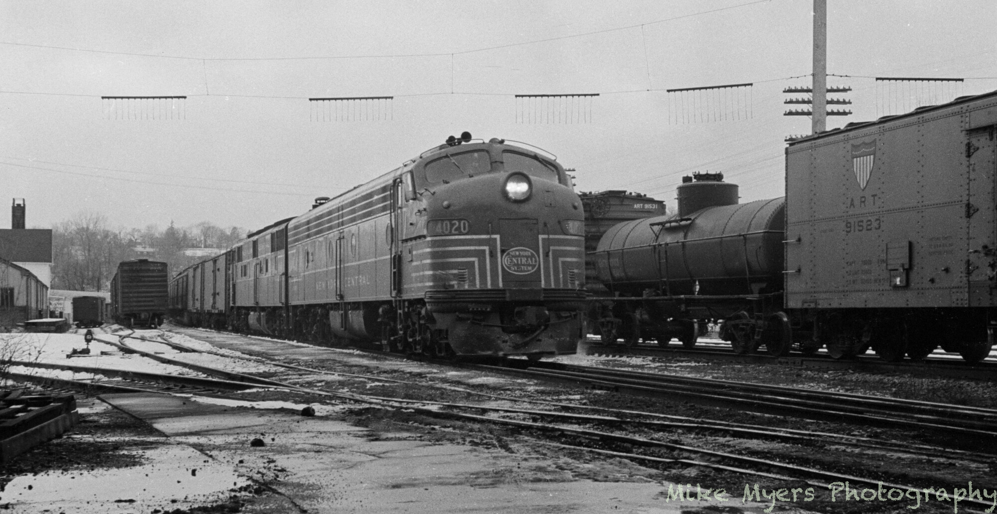
1 - I deliberately put the watermark in this location - nobody else does it this way, so what I did is “more unique”. I rather like it now, maybe because I’ve gotten used to it. It also leaves more of the image as-is, not being over-written. I’ve been doing it like this for about a year, and have never found anyone else doing it this way, which is a good thing.
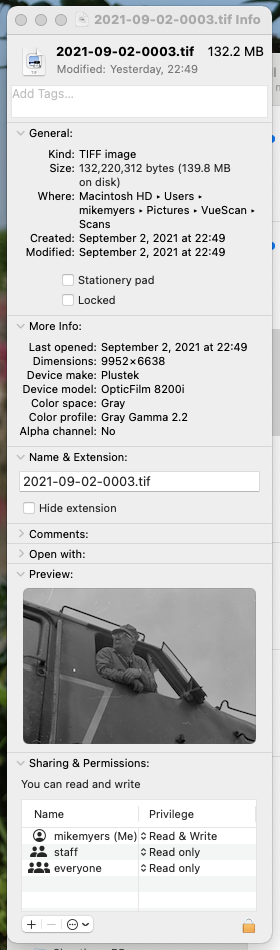
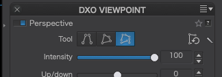
2 - Resolution - I don’t know what the eventual purpose for the image might be, so I decided to treat the negative as if I want to make a digital copy, and later I would decide what might be done to/with it. The scanner specs noted 7200dpi, so that’s what I started using, but the files were too big, so I went to 3600. My choices from the drop-down menu are Auto, Custom, 7200dpi, 3600dpi, 1800dpi, and 900dpi. Are there any good reasons not to set it at 3600 and forget it? You are suggesting 2400dpi. Maybe I should just select 2400 until/unless I might have a reason to do something unusual. Again, right now, I’d just like to make a digital copy of the negative, so I won’t need to go back to the film and do it again. The most likely use is to post the image on my SmugMug gallery, and people can select any size at which they want to view the image.
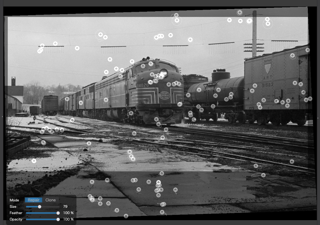
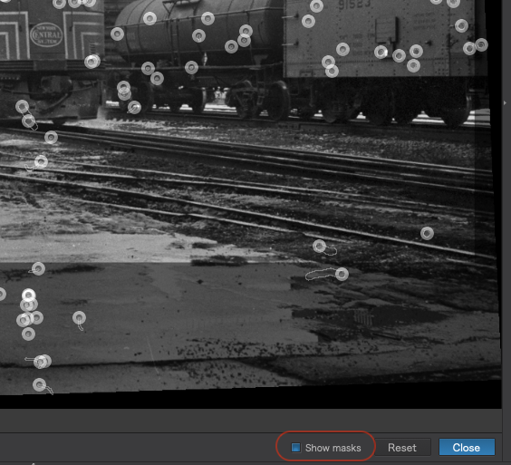
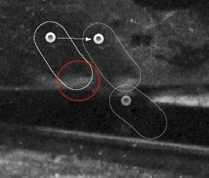
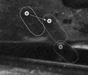
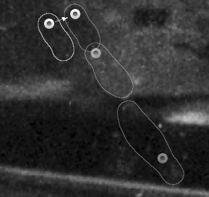
3 - How do I get to view the source of a repair, as you show in your image? That’s one of the questions I forgot to ask. With the information you show, it’s obvious. I undid mistakes when I noticed them, but obviously I missed some. Can I turn “on” those before/after circles?
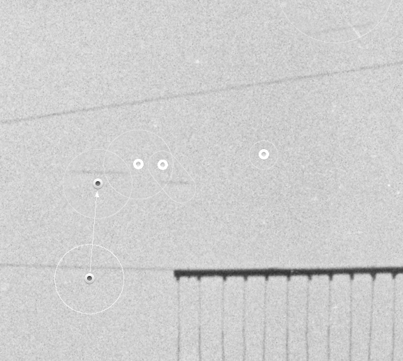
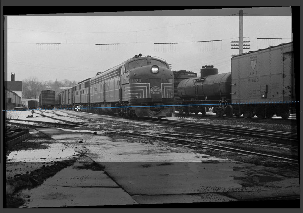
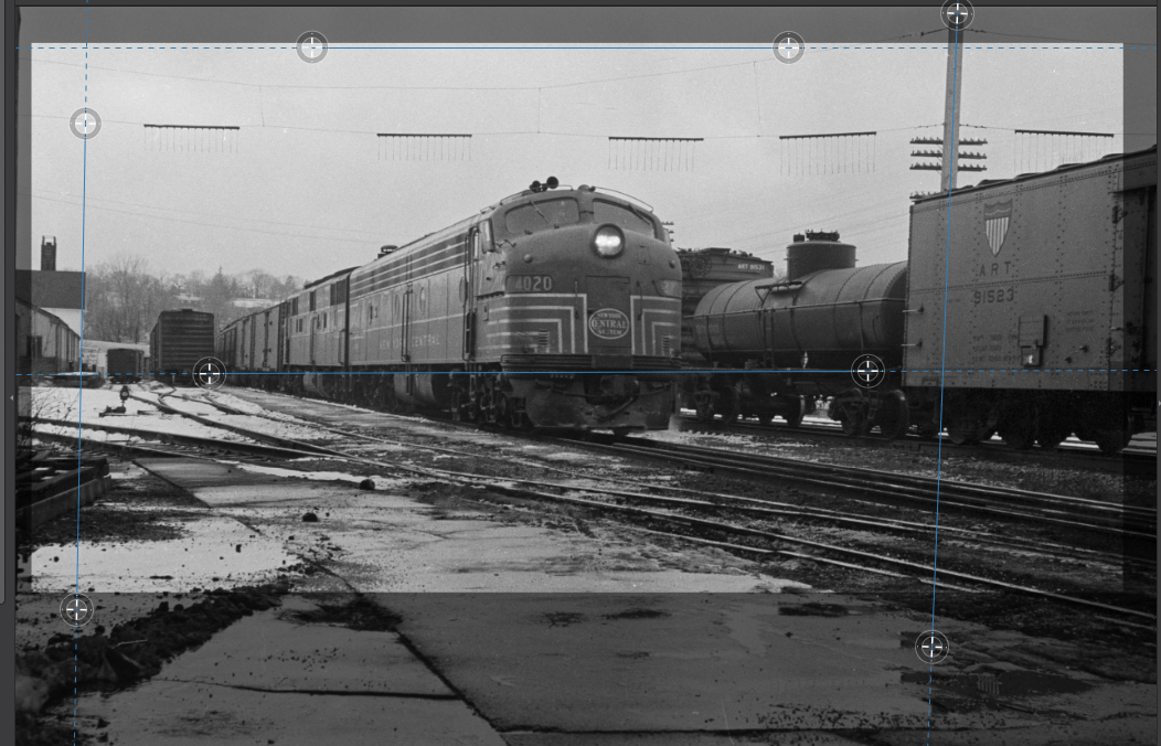
4 - In the original image the station at the left was leaning one way, and the pole at the right was leaning the other way. I tried using the “parallel” tools to make both of them vertical, and I used the horizon tool at some point to make the engine look “level”. The pole must have been at an angle, and what I paid the most attention to was the engine and freight cars. The final cropping at the bottom came much later, when I decided that area I cut away was too distracting.
5 - “It is well known that geometric corrections can displace repairs; and it also saves you a lot of time and effort not having to de-spot unnecessary areas.” ----- I had no idea. I’ll remember this for the future. Yes, I made a guesstimate of the horizon, but I didn’t trust the telegraph pole - I tried the telegraph pole, and the whole image was tilted as a result. Everything came down to a guesstimate. …but I was very wrong about this - without the telegraph pole, fixing the tilt from my camera would have been trivial. Had I realized then that the pole was tilted, that would have saved a lot of needless work. I’ll definitely remember this for the future, and maybe re-do the image from the beginning.
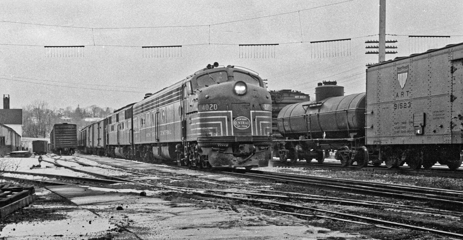
6 - Your “quick export” is a rather pleasing image, but it looks too “shiny”. Knowing the engines were anything but shiny, and especially the tank car, it looks “wrong” to me. On the other hand, the tilted telephone pole looks just like what it was, tilted. For most people, your “quick export” is a better image, but the “shiny-ness” bothers me. I dunno. For most people, what you did makes for a better image. How did you do this? …the tank car in my image looks realistic to me, and in the quick export it doesn’t, unless maybe it had been raining. Maybe I will split the difference.

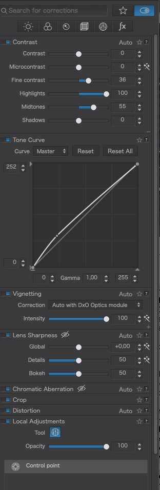

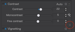
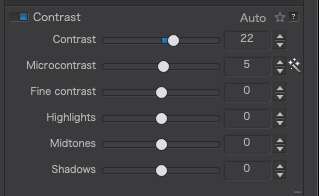
 My adjustments were only ideas but you might like to investigate the selective fine contrast tools a bit more.