I am photographing mostly small birds nowadays. They are fast, jumping back and forth between bright light and shadow, so time for searching the best exposure such as in landscape photography just does not exist!
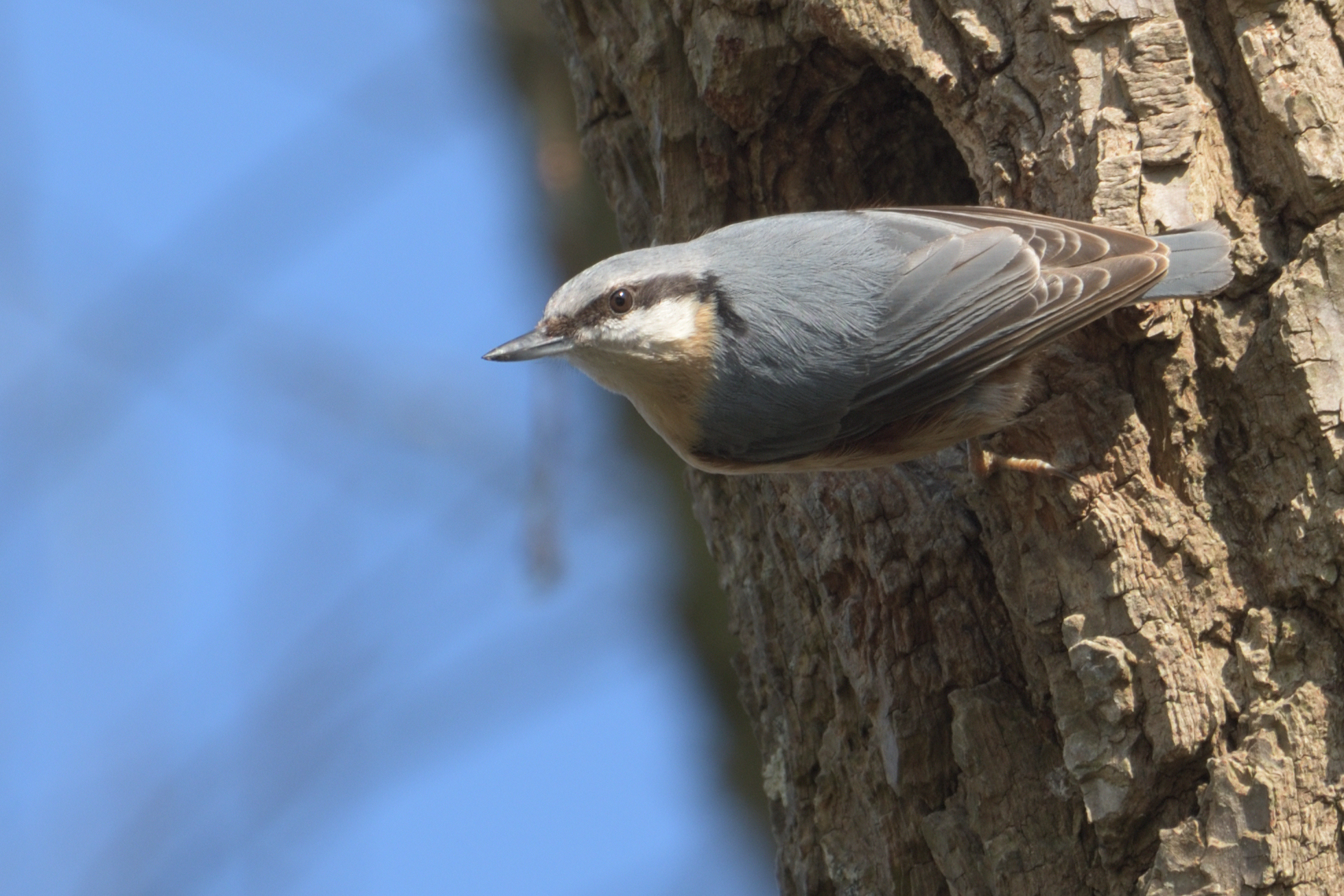
Unfortunately, those little birds always have bright feathers and I find it hard to recover details in those highlights using Photolab (P.S. I have read the topic about highlight recovery in PL). On the other hand, I find Nikon’s Capture NX-D better at highlight recovery as long as I start with a Flat Picture Control (Photo 1).
It seems to me like PL does more than just “demosaicing” the RAW file (may be sharpening or contrast or color correction or white balance …), therefore, the output image is not flat enough (I know flat picture is not for everybody but sometime is its very useful!).
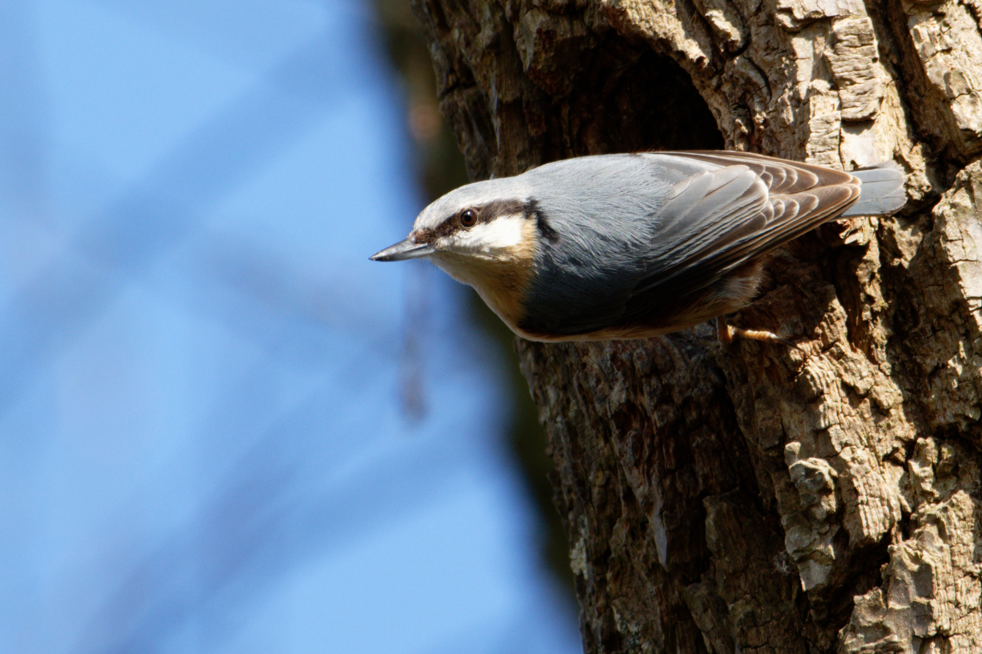
I tried as well PL’s “Neutral Colors Preset”. While the highlight starts to have details, it is still not as flat as the Nikon’s Flat picture (Photo 3).
One may asked why do I bother using PL if the free Nikon software does a better job? While, in small bird photography, shutter speed is very important which means the ISO is always high which increases the amount of noise. I have tried several denoising softwares and found PL’s Prime to be the best out there and that is the main reason why I bought Photolab Elite. Unfortunately, Prime only work on RAW file!
I am new to PL and maybe I missed something.
My question are:
is the “No Correction Presets” output a plain “demosaiced” RAW image or more than that?
if it does more than just “demosaicing”, is there a way to tell PL to just “demosaiced” the RAW file and to not do any adjustment at all!
In theory, no corrections means just that - just the RAW data demosaiced.
In which case, whichever in-camera setting you apply will be ignored as they only apply to jpeg images.
I would suggest you look at the contrast palette, especially the micro contrast to bring out fine detail. If you have the Elite version, you should also have three extra sliders (click on the +) for highlight, mid-tone and shadow contrast.
When you select “No Correction” as a preset, all of the palettes/sliders are off. However, some default settings are still applied, such as white balance and color rendering. The one I think you should learn to adjust is “Color rendering.” Generic/Generic (the default) applies quite a bit of contrast with some camera gear. Try lowering the Intensity slider or selecting a neutral color rendering instead of generic or factory.
I find “no correction” is a very good starting point for a JPEG or TIFF. Personally, I don’t find it useful for RAW.
Thanks, that makes sens! I knew there must have been something more than just the demosaicing.
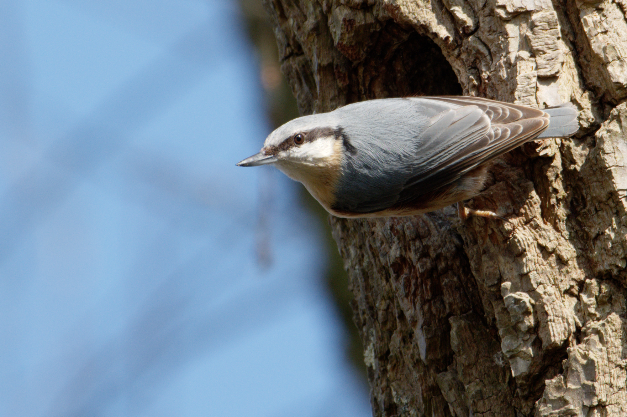
I played around a bit with the “Color rendering” and got a result as flat as the Nikon (can be even flatter with the slider !!!). The strange thing I noticed though is that increasing the intensity slider makes the image (1) more contrasty in the case of Camera default rending but makes it flatter in the case of Neutral color, realistic tonality. But as long as it get the job done !
Can I ask you a question, hijakely?
If I understand correctly you pick flat profile to preserve highlights.
And then? Do you leave the image flat as it is or do you apply the contrast locally to some areas?
The important thing to remember is that all presets are merely collections of adjustments that give you a “one-click” change to the image’s appearance, including selecting a colour rendering.
If you don’t like the appearance of any of the provided presets, then you are free to create your own “default” preset and apply that as and when required.
The “camera” colour renderings have been created to provide emulations of some of the camera’s “picture settings” but, as far as I can tell, do not read any of the RAW file’s settings.
When it comes to revealing detail, don’t rely on the “picture settings”; I suggest you look at adjusting settings on the contrast palette, especially micro-contrast, along with the highlights/mid-tone and shadow contrasts if you have the Elite version.
Then when you find a rendering that you like, simply make a new preset and possibly set that to be your default on opening files.
If you mean, which one you have selected, you can’t. But, in the preferences, you can select which one is applied when an image is opened for the first time.
Preset == a bunch of adjustments. Selecting one is just a shortcut to making those adjustments one after the other.
Yes, I use the flat profile then use “Selective tone” (more general) and/or “Tone Curve” (more precise) and or “Local adjustement” (very preceise and my favorite!).
Yes, they appear to. Which is not surprising since they are really just a collection of adjustments all done at the same time.
I sometimes use Partial Presets - for example I have created one to cope with a Nikon 28-200mm D lens that doesn’t have a module but that always needs Chromatic Aberration correction and a couple of other things. That way, I can simply select all files for that lens and apply the three or four common adjustments in one click.
Even the Reset button is stored in the, invisible, history list.
What I’ve figured out is that choosing a preset is preceded by a reset, so all your edits until that time are gone. Using Ctrl-Z is undoing that preset again and restoring the edits at the time before adjusting that preset.
A global, or complete preset, yes all settings are overwritten.
So the presets which are made for you are a reset en new startingpoint.
If you open a preset and edit it as a partial one, uncheck all tools which you don’t need for the effect of the preset. Safe it as preset name -partial.
Then it’s a selective pasting function.
I made one for portrets, skin correction, no micro conrtrast and lot’s of fine contrast to compensate.
And some others,
Mark made the filmpack film renderings as a partial so you can look at the previews in the upper right tab. “presets” to see the effect without actual applying them.
If you create a complete flat tonecurve image the clipping warnings arn’t effected by contrast and color settings. And your in full control of applying color saturation, vibrance and (micro)contrast by tonecurvetool and sliders. No “hidden” corrections by preset .
So by creating a partial preset which does a neutral color rendering you get a flat raw image.
The exposure as it is so to speak.
I didn’t camecup with this my self, @platypus told me why this can help.
Hello hajakely,
You wrote: “… jumping back and forth between bright light and shadow, so time for searching the best exposure such as in landscape photography just does not exist!”
I will assume you are speaking about the camera color presets - usually deals with your white balance. When I first read it I thought you were talking about specs of the RAW imagery after the shot. Some ways to compare and analyze your image information between settings, etc., and to do it fast. You may like to check out FastRawViewer by Libraw, LLC. ( http://www.fastrawviewer.com ). You can get down and dirty with your files and it will make adjustments in the raw format and then pass that on to DXO, PL, Capture One, PS, or whatever you want to use. It is handy and I have not found any RAW format it does not accept. It is great for culling photos before bringing them into your main editor due to its speed. It brings up a 20M NEF about like a 10K jpeg in the browser (offline). Sorry to be so off-topic guys.
In any RAW converter, a lot is going on, even if you uncheck every correction and choose the “neutral”, “flat” or whatever-it-is-called color profile.
This includes:
Demosaicing
Correcting white balance
Applying a color correction matrix
Optionnal : applying a LUT (LookUp Table) for further color corrections
Applying a tone cuve
Optionnal : applying gamut compression
Etc.
One may think that if he/she is shooting in daylight, no white balance correction is required. That’s not true, what “sees” the camera in daylight is completely greenish, so multipliers (gains) has to be applied to red and blue. (Note: it’s not because there are more green pixels on the sensor, it’s because of their sensitivity.)
One may thing that the color correction matrix might not be necessary. But it is, because spectral sensitivity of red, green and blue pixels. In practise, it means that the for example the red channel in the final image is not directly issued from the RAW red channel; its a combination of red, green and blue channels. (Note: I’m not talking about demosaicing here; that’s about colors, not about calculating missing pixel values.)
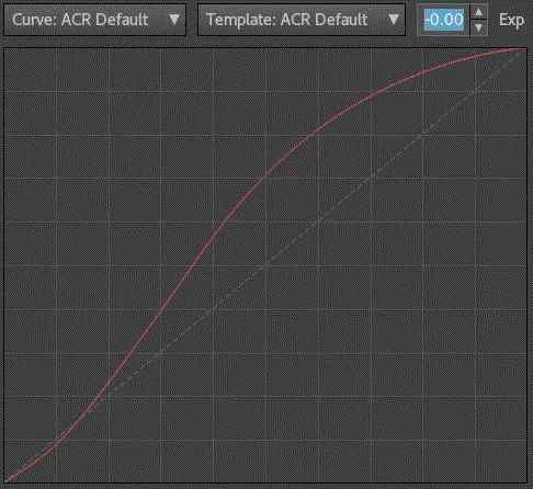
One may think that the tonal curve might be a straight line. But it’s not, because a balance has to be found between what was the input (that beautiful sunset image that covers tons of EV of dynamic range in real life) and the output (an sRGB image that will be displayed on an 8-bit LCD screen). For the record, here is what default Lightroom default tone curve looks like:
Not exactly a straight line…
During each step, clipping may occur: that’s what you’re seeing.
In your case, my guess is that the clipping may be caused by the profile tonal curve.
It’s important to understand that ‘neutral’ does not mean that the tonal curve has to be a straight line. Actually, if you use a straight line, you’re likely to get a very dull image. Something that may not appear faithfull to the real-life scene, but flatter.
indeed, the tone curve has to deal with the limitations of the ouput medium. Your monitor has limited dynamic range, minimum black level, maximum brightness, etc. So the tone curve tries to give you a picture that is faithful to the original scene, while dealing with these limitation. What involves compromises ; usually a tone curve that boosts midtones contrast at the expense of shwadows and higlights contrast. (See the ACR curve example.)
If you want a “flatter” rendering, maximising the dynamic range, I may suggest:
Simple method: using DxO 'Neutral color, realistic tonality (gamma 2.2)" profile, under ‘Color Rendering’ > ‘Generic renderings’.
Intermediate method: import a DCP profile in a profile editing software (I use 3D LUT Creator, but there are more easy to use and less expansive options out there) and simply replace the tone cuve by a straight line. To my knowledge, there is no way to access DxO built-in profiles and make them DCP files. So you’ll have to outsource them, for example from an Adobe software.
Advanced method: build your own custom from scratch, using a chart and a software like Lumariver. Honnestly, DxO built-in profiles are very good, so I would only do that if you have very specifi requirements. And don’t be fooled by “I want accurate color”. When you start digging out the subject (I’m painstakinly doing it at the moment…), it’s way more complex than that!
Dear Joanna,
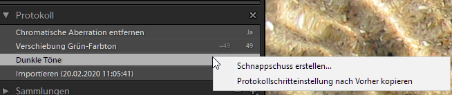
is there an undo list in DXOPL. In my windows DXO there is only “Rückgängig” (redo) but not a list, where you are possible to redo single steps not in one order.
Or is it again a Apple-microsoft thing
There is an Undo/Redo list in PhotoLab 3 and earlier versions, but it is hidden and only accessible by using the Undo/Redo keystrokes or menu options. There is no functionality in PhotoLab, regardless of the platform, where you can undo or redo steps out of order. In Windows you can undo multiple steps in order using Ctrl-Z and redo them using Ctrl-Y. It is the same on the Mac except for the keystrokes used.
I had asked Joanna if presets are in the undo list. Joanna indicated they were and I confirmed that for myself. I don’t recall ever having to undo presets in the middle of processing an image and as a result I was not sure. In retrospect it is not surprising, as Joanna pointed out, since a preset is just a combined group of adjustments. There is no reason why they should not be present in the Undo/Redo list.
What may have been confusing was the use of the word “appear”. In English the verb “to appear” is a synonym for “become available”. Lots of words in English have multiple meanings depending on context. Hope that helps.
Dear Mark,
thanks for explaination…that’s too bad, because I was hoping that the list of changes I’ve done is only one click away. Sometimes it would be helpfull to see the complete list of changes, like in some other programs
Nice an sunny weekend to you, Joanna and all the other members of the forum.
I’ve learned a lot since joining the forum

 !!!). The strange thing I noticed though is that increasing the intensity slider makes the image (1) more contrasty in the case of Camera default rending but makes it flatter in the case of Neutral color, realistic tonality. But as long as it get the job done
  !
!

 .
.