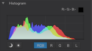
Sometimes pictures can be low contrast and with very little dynamic range, which means they can look dull and flat…
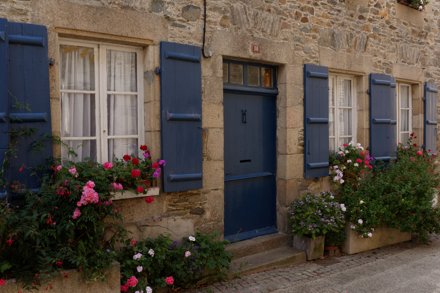
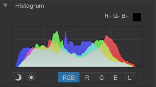
If you look at the histogram, you will see that either one or both ends have “spare” space; in this case, the highlight end…
PhotoLab seems to provide three methods of “filling” that wasted space to give us a wider range of tones, which we can then exploit to raise the contrast.
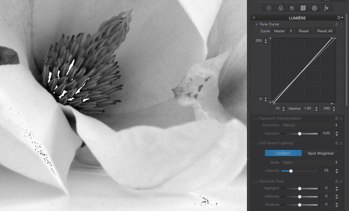
1. Move the high point of the tone curve…
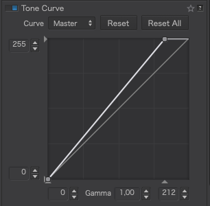
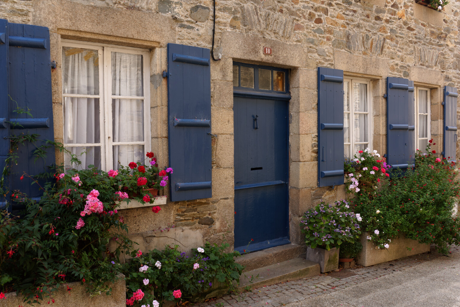
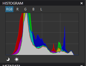
This is quick and easy to do and you can determine where to place it by switching on the over and under exposure warnings and watching for when the highlights start to blow. This is the result…
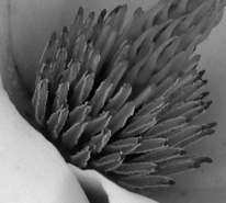
The first highlights to start blowing were the little white flowers.
The main problem with this method is that it makes the tone curve steeper and, thus, reduces the width of the tone curve available for manipulation.
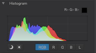
And here is the histogram…
2. Adjust the highlights selective tone slider…
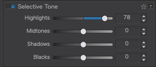
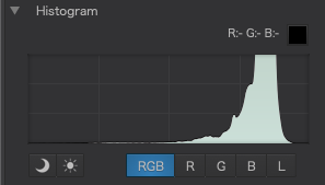
Doing this better fills the top end of the histogram but, this time, the tone curve remains full width, making it easier to manipulate it should the need arise. The difference between this and moving the tone curve is that the range of tones are not distributed in the same manner and give a slightly different feel to the image, which might mean having to bend the tone curve as well to manipulate the contrast.
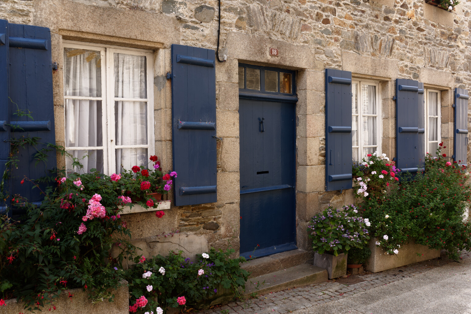
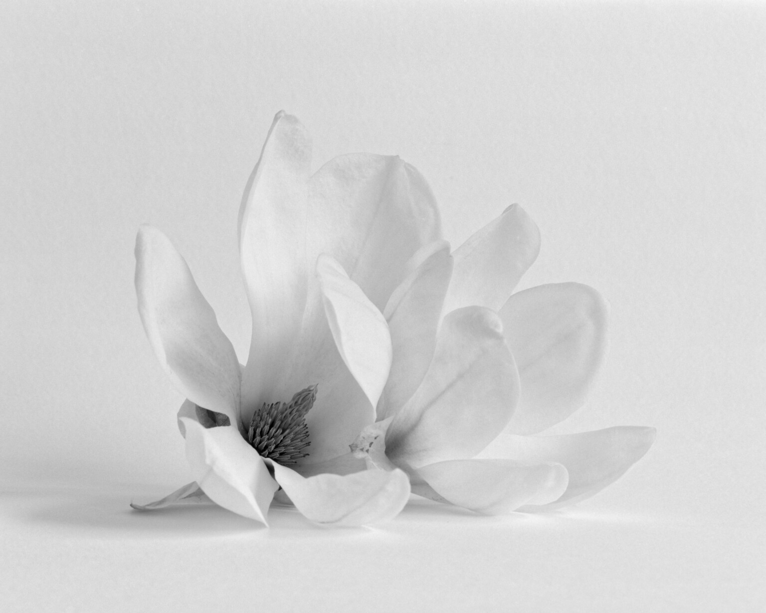
In this case, the first highlights to blow were the small pink flowers in the foreground. This is the result…
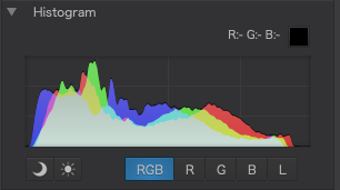
And here is the histogram…
3. Use Smart lighting
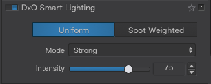
This really is magic. Even in the Uniform mode, it really does seem to know how to maximise the histogram without any fear of either blocking shadows or blowing highlights. All you need to do is decide on the intensity of the effect you want. This is the result of using Strong…
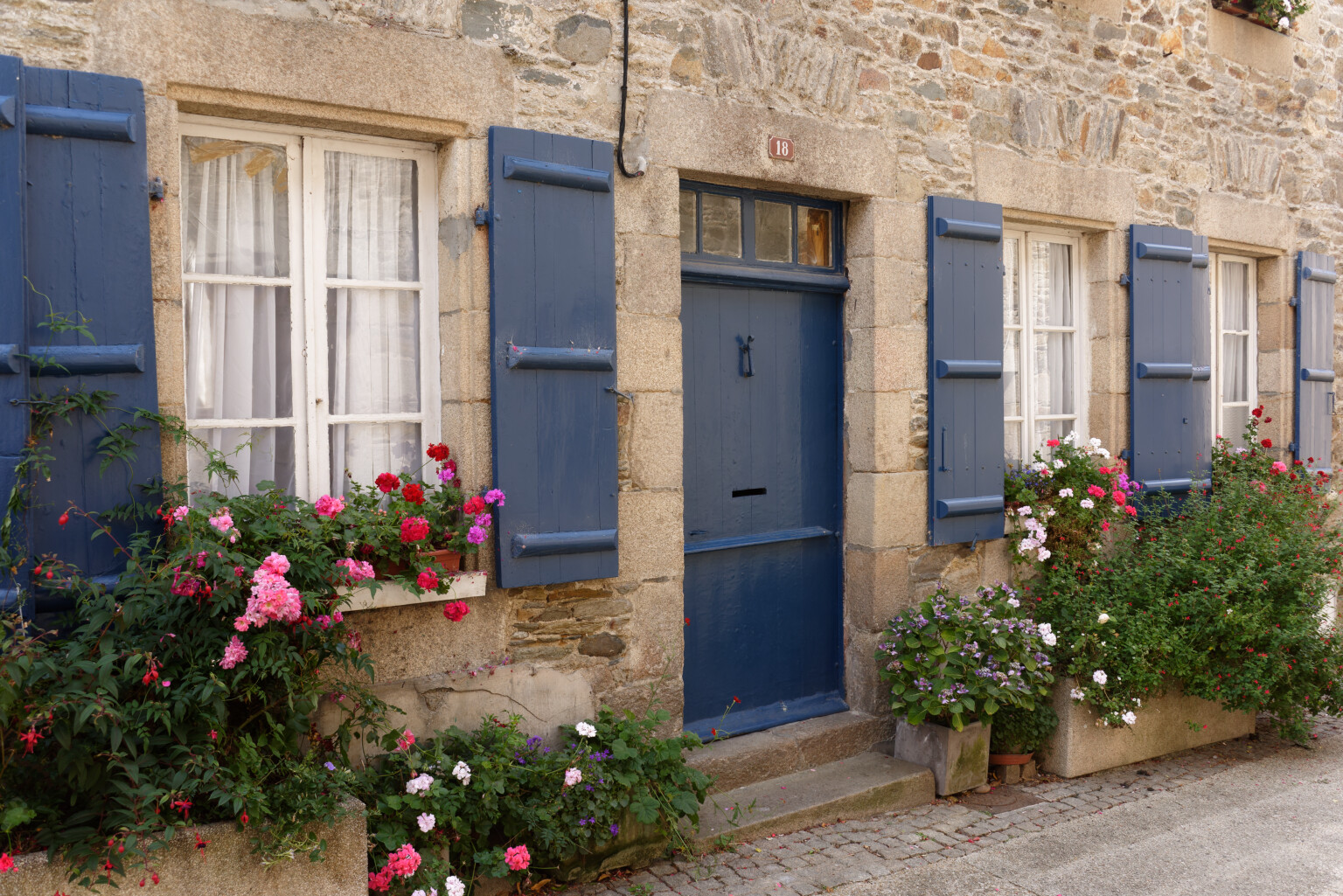
Now we have a well adjusted tonal range and the tone curve remains at full width, making manipulation easier.
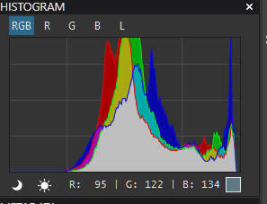
And here is the histogram…
There really isn’t that much difference in the effect that these different tools have on the image and, what difference there is is subtle.
I would be very interested to see what others think, your preferred method, or any other method you use instead.


 Works like a charm and you pass by the lag when completely switching. I mostly only compare to the original, (pressing “D”), but knowing this now is a game changer. Will use it for sure more in future.