That’s not correct. The point of DXO Wide Gamut color space is not to do what others have done, but to solve what others didn’t bother to do. Which is how do you work with colors you cannot see in a least destructive way, knowing you will have to eventually squeeze them in a smaller color space.
Why DxO PhotoLab 6 has moved to a wide gamut, official explanation
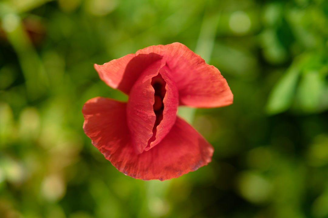
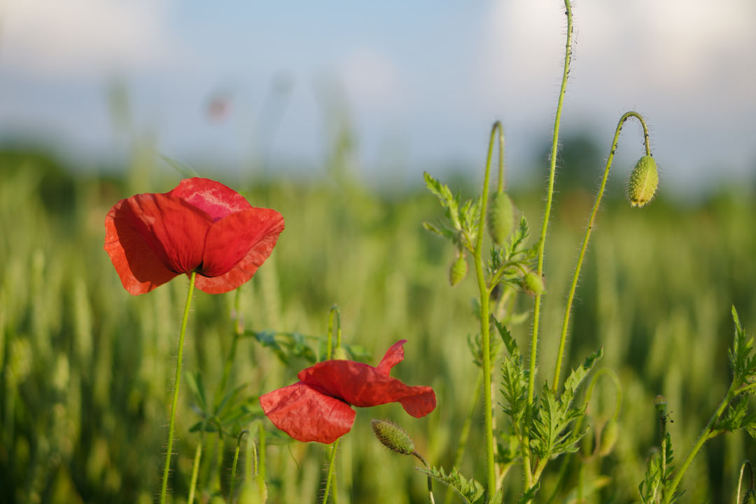
Wide gamut monitors can display more vivid color than those with a standard gamut like sRGB. Whether this is useful depends on the content of an image, because under normal lighting conditions, even objects that we perceive as a very colorful – for example red tomatoes or a blue sky — fit within sRGB.
However, there are a lot of colors that do not fit into sRGB. These are usually encountered on artificial objects such as brightly colored sportswear or from artificial lighting such as laser stage lights. On a wide-gamut monitor, these colors can be reproduced more accurately than on a regular monitor.
To fully exploit the capacity of a monitor, photo-editing software should use a working color space with a gamut which at least matches that of the monitor. When we created our first RAW converter almost two decades ago, it was safe to assume that monitors would be either sRGB or – for the high-end, color-critical models – AdobeRGB. Choosing AdobeRGB as our working color space seemed to cover all needs, so that is what we did.
Since then, technology has evolved and monitors have improved. With Display P3 monitors used in recent Apple computers, their native red is “redder” than the “reddest red” that DxO PhotoLab 5 could produce. In order to simulate pure AdobeRGB red on such a monitor, the color management system must dilute it slightly and make it less intense by adding a small amount of blue. The much wider working color space of DxO PhotoLab 6 — which comprises both AdobeRGB and Display P3 — solves this and can produce pure, native color on such a display.
The same applies to printing. Certain printers and printing services can produce colors that are outside of AdobeRGB, and DxO PhotoLab 6 allows you to harness their full potential.
At the other end of the imaging workflow is the camera. Camera sensors do not actually have a gamut. Instead, they’re sensitive to every wavelength in the visible part of the spectrum and high-end sensors only differ from low-end models in that they are better approximate the spectral sensitivity of the human eye. Thus, every color in a scene can be observed and recorded in the sensor native color space.
However, when converting from sensor native color into a working color space, as you do when developing RAW files, it may happen that a color cannot be represented. Essentially it has fallen outside of the working color space’s gamut. Having a working color space with a wider gamut therefore allows us to preserve more colors, just as they were recorded by a camera’s sensor. In combination with a wide gamut monitor and printer, the scene can then be captured, processed, and reproduced without losing its original intensity.
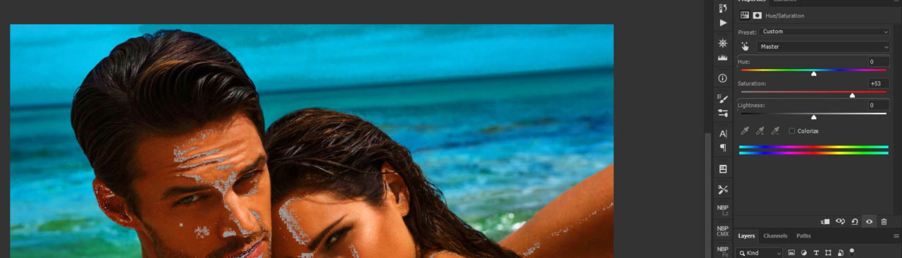
Finally, working in a wider color space gives photographers more headroom for adjusting the color in their images. For example, PhotoLab’s ClearView Plus tool can produce certain colors that do not fit within AdobeRGB. But with DxO Wide Gamut they are preserved. You can therefore use the ColorWheel or a Control Point to desaturate these colors, and bring them back into the gamut.
The problem of ‘clamping’ out-of-gamut colors
What does falling outside the color gamut mean precisely? Let’s start by going back to the idea of color values.
The simplest way to describe out-of-gamut colors and how they are managed is to think in terms of 8-bit images. In an 8-bit image, each of the red, green, and blue pixel values can range from 0 to 255. 255/0/0 would be the reddest possible red, while 128/128/128 is mid-gray.
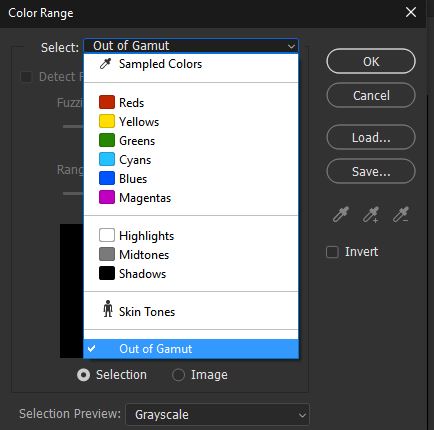
Mathematically, a color would be out of the gamut if at least one of the three RGB components had negative values. But obviously, this wouldn’t make sense as a monitor cannot emit negative light. A color could also be out of gamut if some of the values exceed the maximum. That, again, is not technically possible as a monitor cannot display values brighter than its limit.
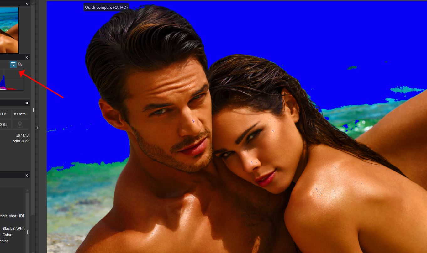
One way of handling out-of-gamut colors is to simply clamp them to the closest allowed values, for example, setting them to 0 if they’re below the low limit, or to 255 if they’re above it. This is what many color management systems do, but they can produce unwanted results.
What do we mean by unwanted results? This ‘clamping’, whereby one of the RGB components is altered while keeping the others unchanged, means altering the hue. A more sophisticated method involves preserving the hue while accepting a reduction in saturation, and this generally yields better results. Unfortunately, even this approach can cause some problems. For instance, textures flatten as the contrasting color within those areas falls completely out of the gamut.
How DxO’s Reimagined Color Processing Fixes the Problem
For DxO PhotoLab 6, we’ve worked to ensure that all of the luminance details captured by the sensor are maintained throughout your workflow. For the best possible quality, our reengineered algorithm is designed to act in two stages: first when converting from sensor native color to working color, and then when converting from working color to output color.
As the image moves from sensor native color to working color, in order to avoid losing any of the details originally captured, the algorithm smartly analyzes the colors in each image and then desaturates – only if necessary – highly saturated colors by a small amount. This applies even to those inside the gamut, and is done in order to make headroom for those outside the gamut. Thanks to this algorithm, we can therefore produce images that contain all luminance details that were captured by the sensor — and although they appear less colorful than in the original scene, all of the tonality and detail is maintained.
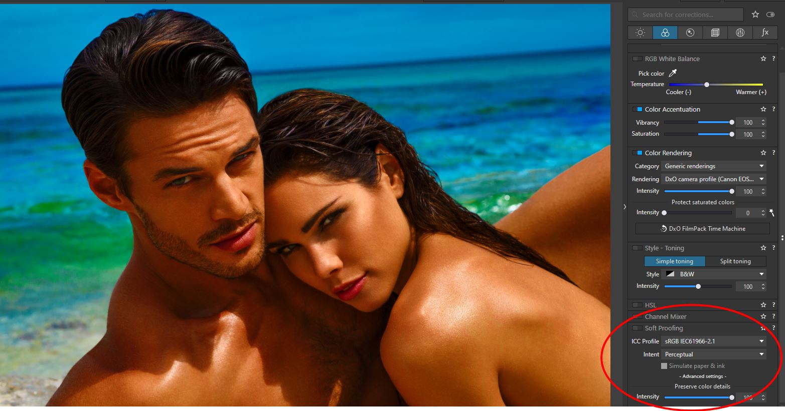
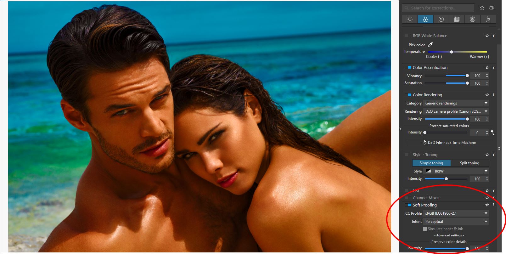
The first stage (Protect saturated colors in the Color Rendering palette) has been reworked and improved compared to PhotoLab 5, the second stage (Protect color details in the Soft Proofing palette) is entirely new.
Most of the time, photographers use wide-gamut monitors which, in combination with software such as DxO PhotoLab 6, allow accurate reproduction of most of the colors contained in images. But when it comes to sharing images, either online or as physical prints, these output media have different gamuts that are typically a lot smaller.
A smaller gamut means that colors can look different between what you see on your monitor and what you get in print, or after exporting to other devices. Those changes in color also mean that delicate textures can be lost. Wouldn’t it be better to take that output gamut into account during editing? This is where soft proofing comes into play.
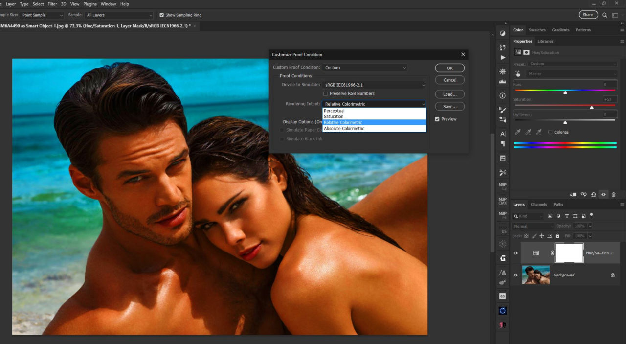
Soft proofing allows photographers to get an on-screen simulation of what an image will look like when displayed or printed on a certain device. It gives an overview of the outcome by emulating the less saturated primaries of a standard screen, or the inks of the printer and the way they physically react with paper.
The conversion properties are embedded in specific color profiles created for each combination of printers/inks/papers and are usually provided by printing services, device manufacturers, or are created for personal printers.
Once downloaded and installed, users can select a specific profile to be used as a soft-proofing base, and after activating the option in their application, can adapt their color adjustments according to the displayed results in order to achieve the desired image. This can include adjusting color casts, or contrast and luminance issues in areas such as shadows or highlights.
Though it cannot completely replace a hardcopy proof, soft proofing is crucial for saving time and money that would otherwise be wasted in the trial and error of getting a print acceptably close to the original image.
However, soft proofing isn’t a free pass to perfect output. It’s important to remember that soft proofing mode, as with any settings dedicated to color accuracy, requires editing on a calibrated monitor and in a consistent viewing environment.
The ProPhoto RGB color space on the right is far larger and easily contains all of the surface colors. However, while every RGB value in sRGB corresponds to some color, part of ProPhoto RGB lies outside of the spectral colors and corresponds to something that doesn’t exist. While fully saturated magenta, red, yellow, and cyan correspond to actual colors, fully saturated green and blue correspond to imaginary colors. This can make ProPhotoRGB counterintuitive when it comes to editing photographs.
For this reason we decided to design an RGB color space with the widest possible gamut that can be achieved utilizing spectral colors as primaries. The result is a color space that includes close to every color that can be reproduced on the best monitors and printers available today, and encompasses all of Pointer’s Gamut, the 4089 real-world surface color samples collected by scientist Doctor Michael R. Pointer at Kodak Research in 1980. link to https://onlinelibrary.wiley.com/doi/abs/10.1002/col.5080050308
The DxO PhotoLab 6 working color space uses spectral colors as its primaries. It is big enough to contain all real-world surface colors, and it achieves this without imaginary colors — i.e., every combination of R, G, and B in this color space represents an actual color.
DxO Wide Gamut: An intelligent compromise
We believe that this color space, which is quite similar to the television standard Rec. 2020, provides the best possible trade-off between preserving as much color as needed and allowing users to manipulate color in a way that feels natural and intuitive. Combined with our gamut-squeezing algorithm and soft proofing tools, it allows photographers to reproduce any color they may encounter, as closely as possible to the original, without ever losing details.
…
Adobe RGB 1998 as the name suggests was made long ago, and sRGB “s” for standard sRGB is a standard RGB (red, green, blue) color space that HP and Microsoft created cooperatively in 1996 to use on monitors, printers, and the World Wide Web. It was subsequently standardized by the International Electrotechnical Commission (IEC) as IEC 61966-2-1:1999. sRGB is the current defined standard color space for the web, and it is usually the assumed color space for images that are neither tagged for a color space nor have an embedded color profile.
The problem is that some wide gamut monitors and some wide gamut printers can reproduce more saturated colors that fall outside the gamut of both sRGB and even AdobeRGB, while ProPhoto RGB is a loose cannon when it comes to color since its way too wide. It was never meant to be a working color space per se, but more as a archival container for all the colors. Even those that don’t exists outside of mathematical abstractions.
Adobe tried to solve this problem of working with a wide gamut but still delivering for smaller gamut color spaces and working with monitors that have perhaps sRGB gamut. They tried to use modifed ProPhoto RGB for working with raw files. (Its prophets RGB primaries gamut + linear gamma), and while it was not as bad while you worked with such large color space, by the time you were forced to squeeze is for sRGB you had issues. You had to use perpetual or relative colorimetric or few more methods that have been around since sRGB which is so long ago, it’s a problem for modern hardware/software workflows.
Color Management “Lost Tapes” Part 5 – Introduction to color spaces

Color Management “Lost Tapes” Part 6 – RGB Working Spaces in ColorThink Pro

Color Management “Lost Tapes” Part 7 – RGB Working Spaces and monitor in ColorThink Pro

Color Management “Lost Tapes” Part 8 – RGB Working Spaces and Output Spaces in ColorThink Pro

ProPhoto RGB and Adobe version of RGB that was used in ACR/Lr, was big enough to allow color operations, but you couldn’t really see what you were doing since most monitors would not be able to display much of the colors and some are just mathematical abstractions. There are situations where this can be a limitation, as this tutorial I made long ago, demonstrates.
Color Management “Lost Tapes” Part 13 – Color Management in Adobe Camera Raw

As you can see from the tutorial, I have demonstrated the problem. While you could preview sRGB, AdobeRGB, ColorMatch and ProPhotoRGB, you couldn’t really account for other types of color profiles until you go to Photoshop and there you had to use tools to squeeze the larger color space into a smaller one in a very imprecise way. There was no dedicated tools for that, and only automated options for conversation between color spaces are outdated relative colorimetric and perceptual options.
And you would end up with the same problem how do you squeeze it into smaller color space. You could hard proof or soft proof it, but you had only two options in most programs. Relative color metric and perceptual. And there was no easy way, especially in RAW workflow to squeeze out of gamut colors into smaller color space. The closest thing to that was vibrancy slider, but it didn’t operate based on out of gamut colors relative to the color space you are working with or preparing to output to. It was just designed to tame some of the most saturated colors, especially in skin tones, based on some arbitrary criteria that is unrelated to color management.
When you work with for example Lightroom you are working in Melissa RGB… (its prophets RGB primaries gamut + gamma 2.2) you run into other problems that I’ve explained here.
Color Management “Lost Tapes” Part 14 – Color Management in Adobe Lightroom

Not only does DXO Wide Color Gamut space helps to overcome the limitations of Adobe RGB and ProPhotoRGB, it also helps to squeeze colors with more pleasing results. As they say: The first stage (Protect saturated colors in the Color Rendering palette) has been reworked and improved compared to PhotoLab 5, the second stage (Protect color details’ in the Soft Proofing palette) is entirely new.
That is new. A problem that only DXO managed to tackle in this way.