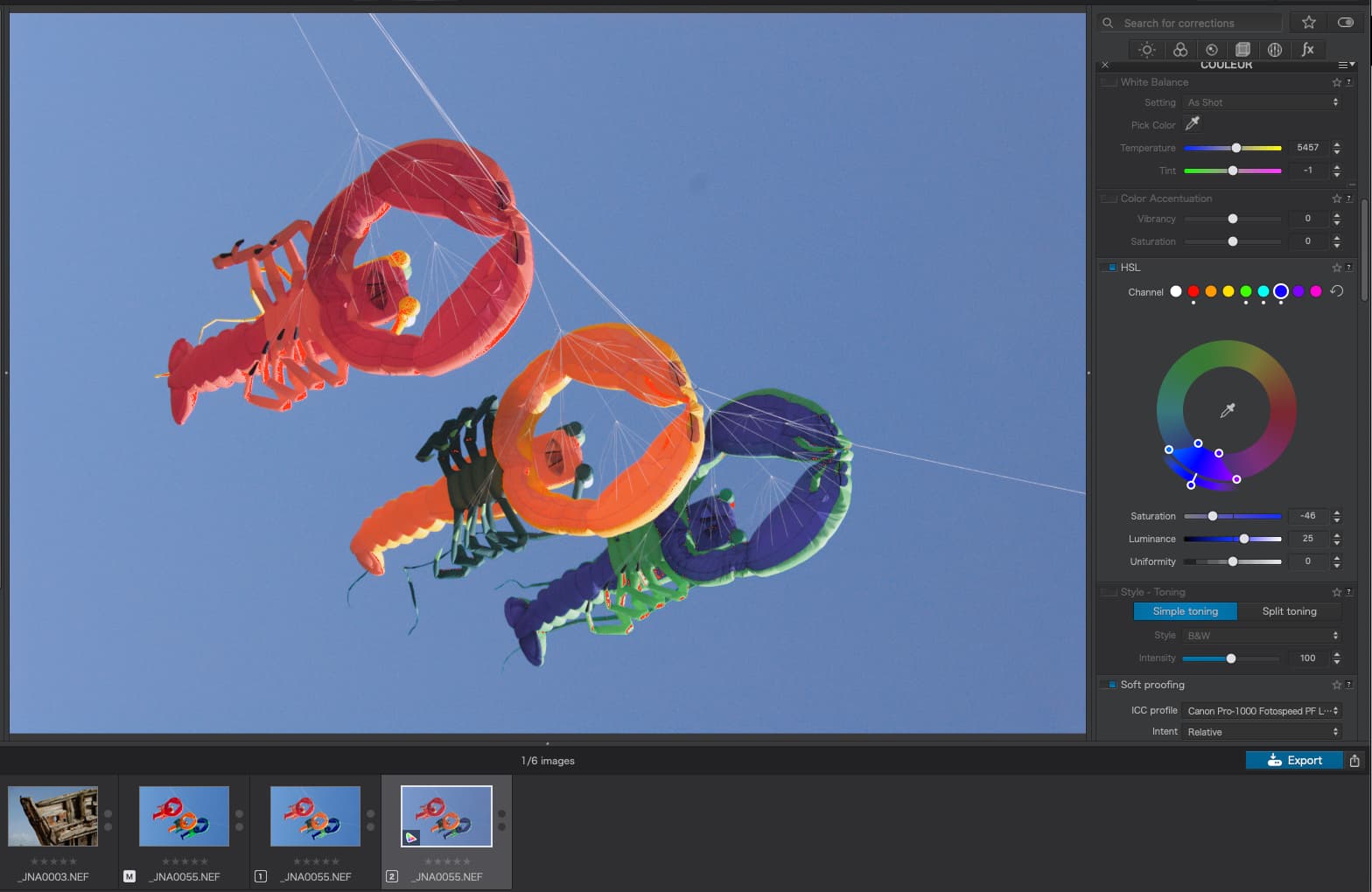
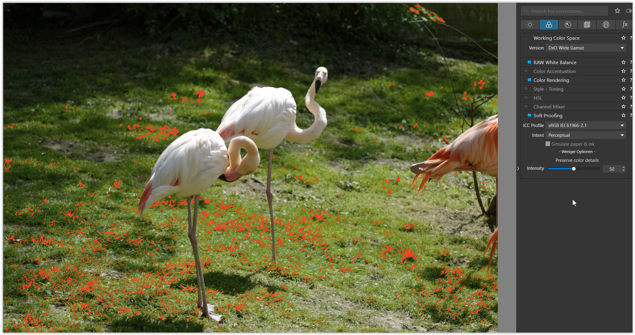
Thanks, that’s what I thought but, with a calibrated P3 monitor, all I get by playing with the colour wheel to get rid of warnings is a horribly pale image.
And, if I look at the printing soft proofing, things aren’t much better. Compare this with the original, unedited, screenshot…
That’s alerting you to areas of your image that contain colours from your camera’s sensor (now completely contained inside the Wide-Gamut color-space) that cannot be rendered by your monitor.
No surprise, given your example; The colours are very “bright” in parts of your image.
This would have been a LOT less apparent in PLv5 (as you can easily evaluate for yourself by switching the WCS to Classic/Legacy, and clicking on the "little monitor button) - because the the AdobeRGB WCS does not contain as much color detail as the DxO Wide Gamut WCS is able to represent.
And, we didn’t have the tools in PLv5 to evaluate the degree to which our monitors could not completely render the contents of the WCS … so, we were blissfully unaware !!
My advice is to treat this information as follows;
Mmmm - That’s interesting (sort of … for nerds)
Then ignore it !
Yes;
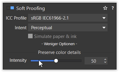
Activate Soft Proofing and select the ICC Profile for your intended target.
For the interwebs this will be sRGB~
Leave SP activated - and proceed with your editing/correction workflow exactly as you do/did with PLv5. By having SP activated, you will be sure to be seeing (on screen, within PL, while you work) the exact same result that you’ll get when you Export to Disk.
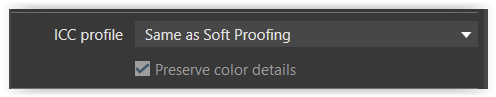
In the Export to Disk options dialogue, use the option “Same as Soft Proofing” - which ensures that the result you get from your export will be exactly the same as you saw on screen, within PL.
I don’t print - so, I’m not the best one to answer this question (@Wolfgang can probably advise better).
However, I’ll give it a shot from a theoretical perspective (FWIW !)
I don’t know what your starting point should be (@Wolfgang ??) - Perhaps as per above ??
Activate Soft Proofing and select an ICC Profile to match your target printer
The “Preserve Color Details” slider will be inactive for a printer profile - Instead, use the Intent option to select the manner by which Out-of-Gamut colours (from the WCS) are rendered; The options (Relative & Perceptual) use different means of doing so … Sorta like there are different sharpening algorithms ! … Just use the one you like best.
Click on the “Destination gamut warning” button (the one next to the “little monitor button”) - and this will show you the parts of your image where colours in the Working Color Space cannot be rendered by the target represented by the ICC Profile you have specified. Adjust accordingly.
OK. Done. It seems to make a barely perceptible difference to the main image preview but I start to get spikes at the low and high ends of the histogram.
Even with the SP activated, I really can’t see anything that needs changing to this image and when I have previously exported it, I didn’t think it looked particularly bad.
Just exported it with your suggested configuration…
Now, is it just me? I can’t see any problem, even though, if I activate either the little monitor icon or the SP icon, I get all sorts of warnings.
In effect, all I’ve done is opened the image, done absolutely no editing and then exported it to sRGB. Why did I need to use SP? Or is this image not “bad enough” to need any work?
I’m closely following these recent posts regarding OOG warnings and am also wondering what, if anything, to do with them. Using the Win PL6 version I am thinking about moving from my current aRGB TIFF print workflow to one that uses ProPhoto. My purely academic understanding of things is that John-M’s recommendations are spot on. Only some tests will tell if this is of any real value in our respective setups.
As an aside, I can’t help but notice how many problems Mac users have been having with PL6. By comparison, the Win version appears to offer fewer problems.
Also, in a couple of your posts, you show screen shots of generic color rendering settings, many of which no longer appear in the Win version. BHAYT and I have been posting about PL5 vs. PL6 comparisons of these settings, but these Win / Mac differences may have left Mac users scratching their heads about what we have been talking about.
John, does this actually mean that this warning is “just for your information” in DPL6?
Theoretically the same happened in DPL5 (Adobe RGB is bigger then sRGB), with the difference that DXO decided then not to inform its us and hence we didn’t ask any questions.
If above is correct then this additional piece of information, namely the oog warning, which we should NOT act upon, would need much better explanation by DOX what to do with that information. I guess it would have been better not to come up with this warning and do as in DPL5. This would have avoided a lot of confusion.
Hi Joanna,
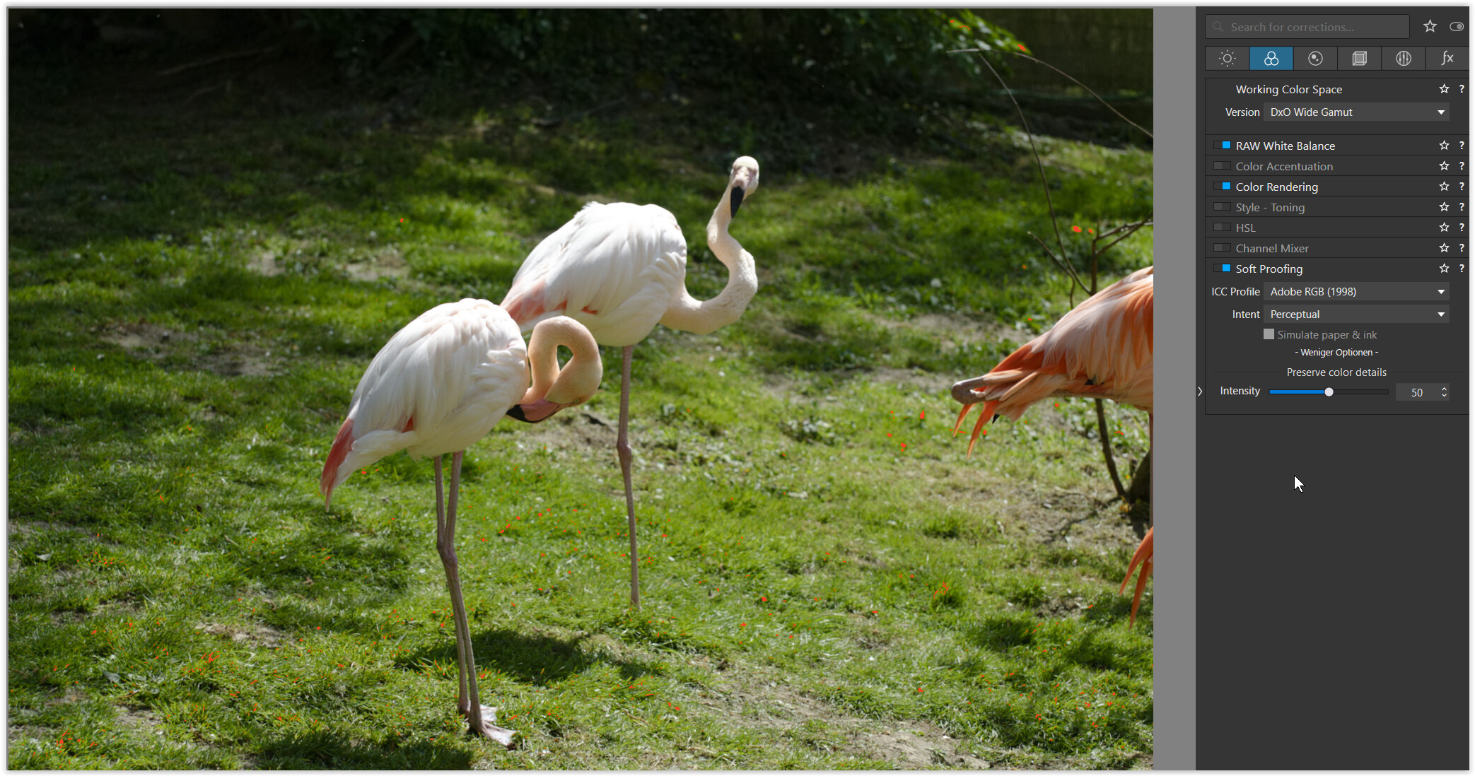
my screenshots show the same thing, but on a AdobeRGB screen (also optimized for printing). As already demonstrated, the AdobeRGB colour space is a bit different – covering less red but more blue-green, something like that …
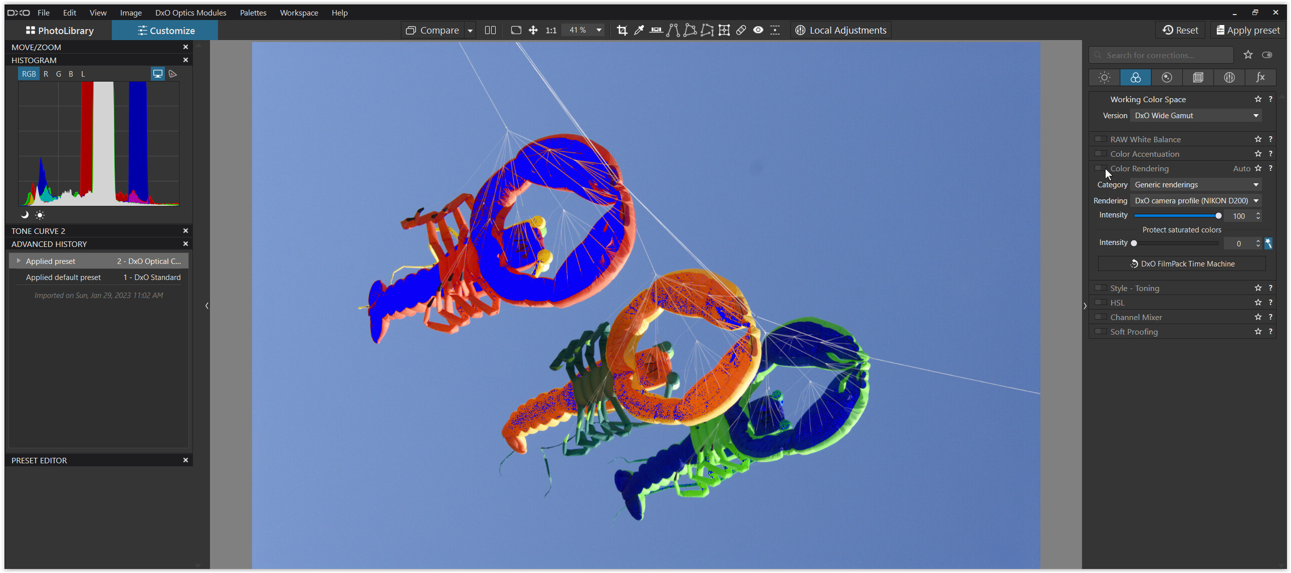
in DxO Classic-Legacy WCS with optical corretions only
#1
It’s easy to see, that the colours are way darker and more saturated than in #2 and #3.
The Monitor gamut warning (blue overlay) indicates the area, where the colours from the pic in question go beyond my monitor’s colour space.
Note – this warning only indicates, that they are out-of-gamut (of AdobeRGB),
but not by how far out they are.
It is NOT recommended to counter all the blue overlay to not getting all flat colours.
The online manual tells to adjust to your liking (of course w/ blue overlay OFF).
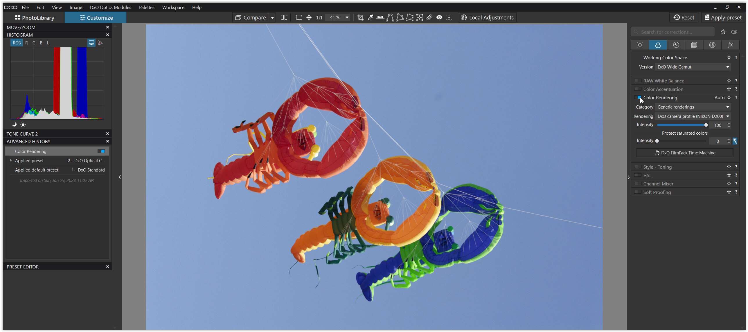
#2
The very same thing like in #1, but DxO’s standard rendering for the Nikon D200 obviously took care for those out-of-gamut colours.
#3
The same thing like in #1, but with DxO’s Classic-Legacy WCS.
Now, this shows PL6 CL / PL5 limitation to AdobeRGB colour space !!
The colours of the pic in question do not go beyond AdobeRGB anymore
– which is why we don’t see any blue overlay from my screen.
[ If I would have set my screen to sRGB colour space, we would see the blue overlay area
showing the difference between the monitor (sRGB) and the converted pic (ARGB). ]
if I am exporting to sRGB for posting to a website?
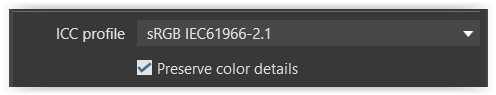
export with ( with checkbox on = SP / PCD at 50 )
or
use SP / Destination gamut warning (red overlay) to see the area with the affected colours,
switch the red overlay off and use Softproof / Preserve color detail
to simulate on your screen the to be expected result (which you can manipulate → use a VC).
.
Then export with
to ensure you get, what you did & have seen.
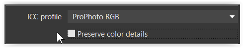
if I am exporting to ProPhotoRGB for printing?
export with ( with checkbox off = NO partly desaturation )
.
and continue printing as always with your paper profile …
final note
In PL6 CL & PL5 and before the colour space is & was limited to AdobeRGB.
That is, inspite of exporting to ProPhotoRGB no colour was beyond that limitation.
If you haven’t done so, export the same pic from PL6 WG in ProPhotoRGB colour space,
print it and compare both versions side by side.
And for everybody else, who was contented with how it used to be ( = without control ),
stick with PL6 CL.
You probably concentrate on the wrong colors. The oog colors are on the low side. A red color that’s oog is oog due to one of the other channels,
Saturisation is the ratio between 1 dominant color and the other two colors.
Since you are working in PL5 the image you are editing is in Adobe RGB colour space so why export to ProPhoto, which is a larger space? Moving to a larger space won’t give you more colours, it will just rearrange the ones you’ve already got so why not cut out that (pointless) conversion and export with the Adobe RGB profile?
For me the question is, what you use a pic for and how you want it to look like – brilliant colour or more (enough) detail / texture. Do as You like. PL allows all kind of manipulation.
The sky in this example has no texture to loose and I think on screen the lobsters will profit more from brilliant colour than detail. When printed, that might be different as they get scrutinized more intensively.
This action will show, which colours can’t be shown correctly on the monitor because the colours are out of the calibrated monitor gamut.
DPL 5 has no such button and simply displays “a red” that might or might not be correct.
Do you have to do anything? Either follow @John-M’s advice or simply ignore the OOGs. JPEGs will probably look differently on other monitors anyway and for printing, your usual routine should work…but will require some hard proofing to make sure that the colour management can cope with the new situation.
If there’s barely any perceptible difference (with having SP ON versus OFF) then that simply means there’s not much for the PCD algorithm to do in converting the colours captured by your camera (and now represented in the W-G WCS) into the specified target ICC-Profile (in this case, sRGB).
Fine. The point of having SP activated is to ensure that, if there was a significant difference, you’d see the result while working within PL - - and not only later, when you exported to disk … and then wondering why what-you-saw-in-PL is not what you’re now seeing when viewing the exported sRGB image.
Great. The point of having SP activated is simply to ensure that WYS-is-always-WYG.
The OoG warnings are there just for your information – For example, to highlight areas of the image that will be “treated” by the PCD algorithm when it’s converted; i) into the gamut of your monitor, and; ii) into the gamut of the target ICC Profile.
This might be handy to focus your attention on those areas … (not much obvious in your image).
and, perhaps, you may like to adjust the PCD slider to get a different degree of balance between saturation and detail in those area(s)
this is an example of the benefit of working with PLv6+ (and its new W-G WCS) … we did not have access to this insight with PLv5 … we were blissfully unaware - living in a simpler world !
If you have SP activated while you work in PL then you don’t really need to worry about the OoG warnings … 'cos what you’ll be seeing on your monitor IS what you’ll be seeing when you review the exported image (on the same monitor).
This allows you to work with your image in exactly the same way that you do/did with PLv5.
Yep - and that’s the beauty of having SP activated at all times (when working towards exporting an image for consumption on a monitor) … WYS-is-always-WYG.
Like a lot of other people. I’ve been following this topic very closely.
I hope I have got this right. I have a calibrated sRGB monitor and a calibrated aRGB printer. As I understand it, with SP on. My out of gamut colours which would be printed by the printer. Although I cannot see them on the monitor.
I’m rather confused as to how I can focus more attention on the out of gamut colours if I can only see them when it is printed. Maybe I have interpreted you wrong.
In @Joanna’s case. She has a aRGB monitor and a proRGB printer.
The warnings indicate the area with colours out of gamut,
a) monitor (blue) – where the screen is not capable of
b) destination (red) – where the chosen destination for export doesn’t hold
Judging highly satured pics on a sRGB screen is already difficult.
Then printing such a pic in a much wider colour space can be quite surprising.
Thanks Wolfgang and George. Whilst I understand what is being said. The results I am getting do not seem to tally up.
With working colour space set to classic (legacy). When clicking on the screen in the histogram I get one level of blue, i.e. my monitor is sRGB. So this should be showing me the difference between sRGB and aRGB and when I click on the destination gamut warning, I should not be seeing anything as my printer is aRGB, but I am seeing red areas. When I change the working colour space to DxO wide gamut I get less areas of blue and red compared to the classic working space, which does not appear correct.
With soft proofing switched on I’m getting less blue and red warnings in DxO wide gamut again, compared to the classic sitting, which does not seem right either. Then when John wrote:
I could not see the point of adjusting the colours to my screen as I am not going to see them anyway. And as far as the red warnings are concerned, I cannot see any adjustments anyway until I have printed.
You can click on the destination gamut warning only when you’ve activated soft proof. And then the question is what color gamut you use for softproofing.
If you’ve calibrated your monitor, then compare it with that profile.
Hi Prem,
your screen limits you to what you see → in sRGB colour space.
Activating the Destination gamut warning (the red overlay) while in softproof shows,
if you are going to expect out-of gamut colours depending on the chosen colour space.
#1 SP to sRGB IEC …
the red overlay shows the area with out-of-gamut colours for sRGB export
#2 SP to AdobeRGB
there are still of-of-gamut colours for AdobeRGB export
→ the pic’s colour space is wider than AdobeRGB ( see #3 )
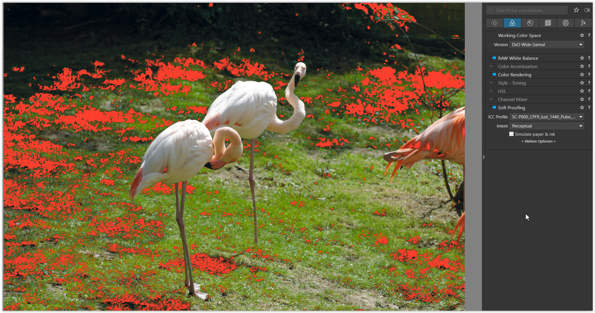
#3 SP to ProPhotoRGB
no more out-of-gamut colours for ProPhotoRGB export
#4 SP to printer-paper profile
showing the out-of gamut colours for these printing conditions
Turn the red overlay OFF and while still being in softproof mode you can adjust the colours to your liking, but better on a virtual copy.
Unfortunately you have to judge your ouput simulation on a sRGB screen and don’t see, what your printer actually will deliver. – If you don’t like surprises, convert your file to sRGB. Otherwise you need a ‘better’ screen.
When printing from PL6, you don’t need to export extra and set your paper-printer profile in the print module. To print externally, you export to the final size and apply the paper-printer profile in the application.
Before you make that decision, Prem - I suggest you consider your actual needs;
If you’d like to personally enjoy your images with a wider colour gamut (than your current sRGB monitor is capable of rendering) then a better-than-sRGB monitor is what you’ll need.
For example, see Wolfgang’s example #1 above; In the case of those areas highlighted in red, the Preserve Color Detail (PCD) algorithm will need to be applied in order to render those areas into the (smaller) sRGB color space … Whereas, as shown in example #2 they almost all fit naturally, with lot less need for the PCD-algorithm … and with an even better screen (#3) PCD is not needed at all.
If, however, your need is to be able to share images with others, post images to the interwebs, and/or enter images in camera club comps (where the requirement, typically, is to provide images in the sRGB color space), etc … then you’d be either; i) wasting the capability of your “better” monitor, or; ii) necessitating a 2-step process in your RAW conversions; rendering firstly for your “better” monitor - and then, again, for exporting to sRGB (which is the color space required for all those purposes).
If your need is for preparation for printing then, ideally, you’d certainly benefit from having a monitor whose capability is at least as good as the colour gamut of your target paper & ink - - However, that doesn’t necessarily mean that you’ll need a better-than-sRGB monitor.
Take Wolfgang’s scenario #3 for example. It shows that there are many more Out-of-Gamut (OoG) areas for that particular printer target than there is for the sRGB monitor (#1). That is, the color gamut of the printer target is (as far as I can tell) well within the color gamut of an sRGB monitor.
Therefore, I’d be quite confident/comfortable in using an sRGB monitor to soft-proof for that particular paper&ink target … and there’d be little benefit at all in using a better-than-sRGB monitor to do so.
Tho, of course, the paper&ink combination that you may be planning to use might have far more demanding requirements (?)
I’d be interested in your comments on this, @Wolfgang - as I’m (somewhat) “thinking aloud” here (!)