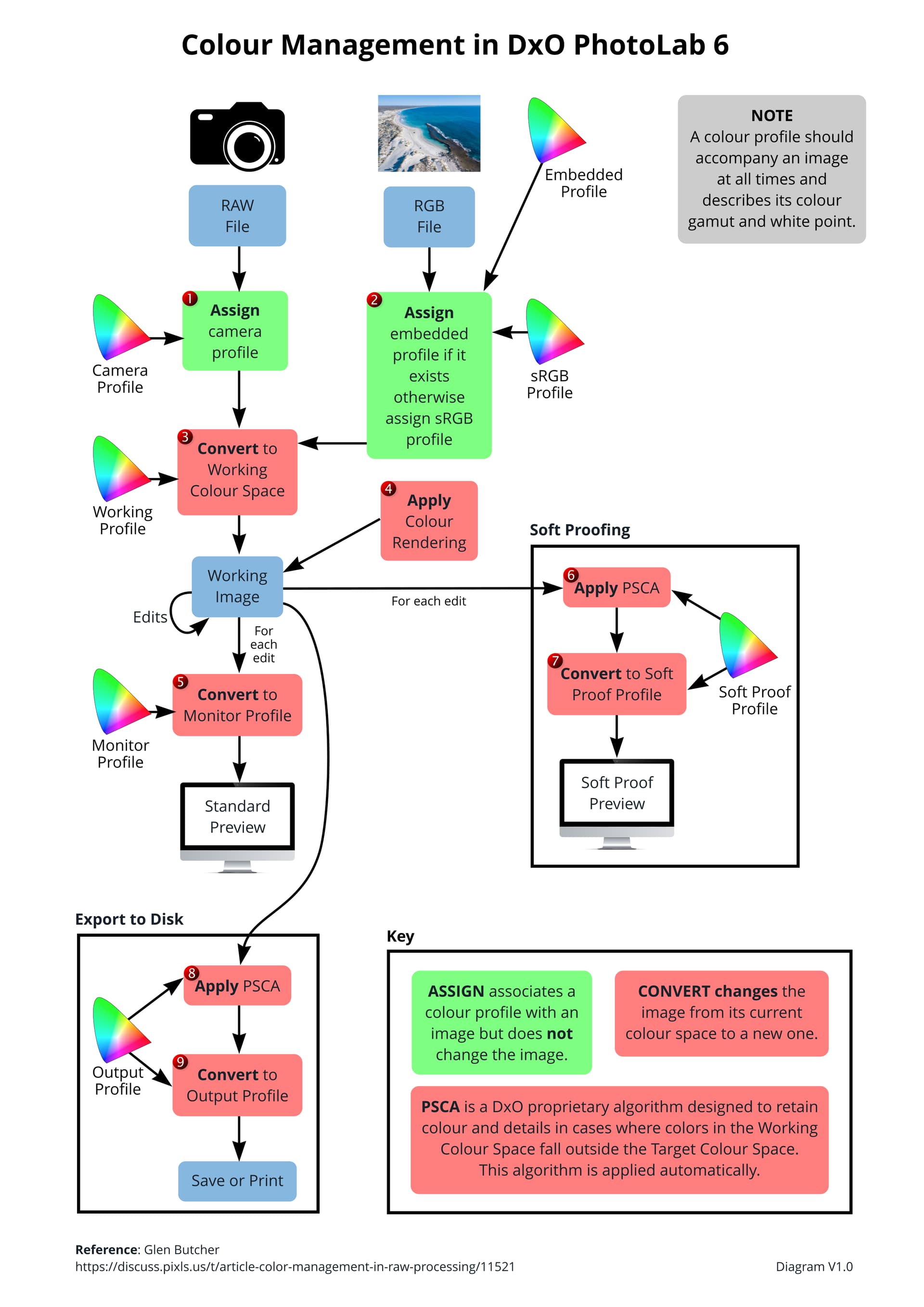
There has been a lot of confusion and misunderstanding around the new Colour Management features of PL6 and consequently I have been privately chatting to some forums members, most notably @John-M, to try and clear up our own understanding of what happens under the hood of PL6. Together we have experimented, discussed and debated various aspects of colour management and how PL6 works within our understanding of colour management in general and specifically how it works in PL6.
With a lack of concrete information from DxO, we have produced a diagram which we believe matches the colour management workflow of PL6 as close as we can deduce. This diagram is simply our understanding of how things work and may not even match what actually occurs in PL6.
We are publishing this diagram in the hopes that it will help forum members understand the concept of colour management so that you can adjust your personal workflows to suit your needs with the understanding of how it “works” in PL6.
The diagram is provided “as is” and we provide no guarantees that it is correct. Important parts of the diagram are numbered for reference should forum members wish to refer to these items in discussions in this forum.
We hope you find this diagram useful and we encourage constructive and sincere discussions here so that we can all benefit.
Some comments and thoughts though.
An applied Color profile for soft proofing or for monitoring is not - or should at least never be - a conversation.
A conversation is a hard applied transformation from one color space to another where values actually are changed.
Applying a profile for a display preview while working or applying soft proofing is just an applied soft preview. The original image color space and values are not changed - or should at least never be changed - they are displayed or showed in real time as conformed accordingly to the soft proofing or display profile.
Applying a profile for viewing is different than doing a hard conversation/transformation from one into another.
Exporting a photo into a specific colourspace like the sRGB is a hard conversion and a profile for that space should be embedded into the photo to inform the receiving device what colourspace the image have to ensure the correct display of its colours.
For those into printing one can send an aRGB image with embedded profile to the rip/printer and let it manage the conversion itself into the device space it have. Or a hard conversion from aRGB into CMYK specifically with and for the printers own device profiles. But such hard transformation will only be properly utilised on that specific printer for which it was profiled for.
I disagree, in order to display a photo on a screen with a MUCH lower gamut than the file then you have to convert the values to in-gamut values. That is the whole idea of soft proofing so you can see what happens when you do convert.
Remember that it is the out-of-gamut (OOG) values that get converted and maybe values adjacent to the OOG values get adjusted slightly so that the values produce a smoother transition from OOG to in gamut values.
Read up on the rendering intents (perceptual etc) to see that they support what I have said above.
Nice work! I would change the wording in the key to be clear about what actually happens.
ASSIGN associates a colour profile with an image. This does not change the image data, but may change how the data is interpreted.
CONVERT applies a mathematical translation to the image data such that the new data with the new colour space represents (within constraints of the two colour spaces) the same visual result of the old image data with the old colour space.
That second one is perhaps a bit wordy and could be more succinct. The concept of “changing the image” as currently used may be confusing because the image the user sees will potentially change for both ASSIGN and CONVERT.
I sometimes like to use spoken language as a corollary because it is more obvious. For instance the phrase “Sprichst du Deutsch?” has meaning if you know it’s German. However, if you proceed thinking it’s Dutch you’re going to have problems. By labelling it as German you know what you’re dealing with. If you actually want Dutch, you first change the data… “Spreek jij Duits”… and then label it as Dutch. So first German was assigned and then it was converted to Dutch.
*I am a native speaker of neither of these languages — blame Google.
Assign does NOT change the image whereas Convert changes the image. This is the message we need to get across. How the image is changed is a whole new discussion.
To translate color correction and profiles into a something understandable one could use the audio analogy.
Play an lossless audio stream > amplifier > speakers.
To compensate for any weaknesses or characteristics of the speakers, amplification or room - you might need to use an EQ or today a DSP to correct the audio.
This applies a “correctional profile” to the audio in real time. It does not convert the original audio on the CD or stream.
It simply applies a profile after the audio is played but before you hear it.
You could of course rip the CD or lossless audio, use an audio workstation and apply the same “corrections” onto the audio and the export it into a mp3. Containing that specific profile which now will sound perfect in your specific system in that specific room.
Not anywhere else. Not on any other system.
That’s a conversion.
In the soft proofing tab I miss one conversion: from soft proof profile to monitor profile. Have a look in the comment under the diagram I posted Soft Proofing - #27 by George.
The oog warnings are based on the conversion to the soft proof profile, what I see is based on the further conversion to the monitor profile.
I’m not sure if the PSCA is in the right place. According to me it shouldn’t.
Good to have graphs. It makes the discussion must easier. Thanks.
And I would also add, that Assign should NEVER be used, because it can lead to very wrong colours (you are forcing an image in a color space to be interpreted as belonging to a potentially very different one).
The issue I have is “the image”. Because what I see on screen is an image and that can/will change with an assign. What the assign does not change is the image data.
I think there is no conversion to working color space for RGB-images. I just tested it with PL4 because my trial version of PL6 expired.
I converted a RAW-file in PL4 into a sRGB version and also an Adobe RGB version of a TIFF file. If I open the TIFF files in PL4 first I cannot see a different.
But if I apply “Stil-Tonung sepia” to both images they look very different. I think it is a proof that there is no conversion to the color working space.
I am sure PL6 did the same. It was also not possible to use the wide color working space for RGB images (because there is no conversion to the working color spaces at all).
It’s the (DxO specific) PSCA that makes PLv6’s color management pipeline somewhat different to the diagram shown via your link, George.
During the EA/Beta testing stage, we were advised that the PSCA is applied in two specific cases;
impacting what we see on-screen, within PL, when SP=ON … See #6
– and –
impacting the result when Exporting-to-Disk … See #8
We were also told that this algorithm is applied automatically, without any ability for the user to adjust its “strength”, etc … and, it’s unrelated to the Protect Saturated Colors slider (for Color Rendering).
We don’t actually know for sure how any of this works, George - - but, for general understanding of the process, that seems like a reasonable assumption to me.
Although the diagram places the PSCA before conversion, I suspect the conversion is part of the PSCA itself and it is actually a single step.
I show the destination profile as being input to both the PSCA and the convert step as the profile is used to describe the output colour space used by both steps. It is for this reason I suspect the two steps are actually one.
My problem with being the psca being part of the conversion is that pl created its own conversion. That would be in conflict with a general color management system. But adding psca before a ‘normal’ conversion in both the export and soft proofing would remove that objection.
Thanks to you and the others for this diagram . It provides a clear view of what is happening as you move from an image in a camera to an output (monitor view, print or saved file) and where colour spaces and soft proofing kick in.
For me, the only thing I’d change is the way the steps are tagged. I know (or at least assume) they are just to give each one a tag to allow it to be referenced in any subsequent discussion / explanation, but once I see numbered steps I can’t stop myself expecting them to be followed in sequential order. So routes such as 1,2 or 2,4 to arrive at Working image, or from 3, via Working Image, to 6 Apply PCSA feel odd. This may well just be me, in which case please feel free to ignore my comment.