It’s a bit tricky when we uses different names and wordings for different or same things and processes.
One often uses the wording conversion when doing a hard change from one space to another for a file.
What soft proofing and any other color space changes does is a transformation of the space matrix, luts or tone curves from one to another.
Photo-DKO
(Dirk Offringa, Windows 10, RX570, PL6E-VP3-FP6, Fujifilm shooter)
183
PL6 (nor PL5 for that matter) doesn’t do correct colormanagement. I use a wide gamut monitor, calibrated and profiled, and I see SUBSTANTIAL difference in color (the reds, what else) between Classic colorspace and Wide Gamut colorspace, EVEN if I’m in softproof-to-sRGB mode.
I shouldn’t see any SUBSTANTIAL differences by switching workspaces. They should translate to the output device’s gamut (using the monitor profile and a connection space) so that the rendering is globally similar. A workspace is invisible (unless it’s ridiculously small, smaller than sRGB). A bigger workspace is useful for smoother gradients, higher latitude for editing. It doesn’t change the output. On my system, it does. As is, I can’t rely on PL6’s previews.
Yes, it can be irritating. A wide gamut pic is handled differently in PL5 / PL6 CL than in PL6 WG.
In the first case everything is limited to AdobeRGB working color space and further processed from that ‘starting point’. – With PL6 WG there is no such limit, that is, any conversion has to take in account the wider color space … resulting in some colour differencies and also visible in softproof, which indeed mirrors the output. *)
Well the classic color space is smaller than the wide gamut space. So there’s a larger space and wider range of colors which are to be compressed into a smaller matrix with a perceptual rendering.
If the result would be identical would be worse.
That said - please post some photos to compare the two results - this does not mean that there’s not a bug in the management anyway.
I don’t think your assumption is quite correct. If you change the colour processing pipeline then you would expect to see differences in output. The legacy workspace used AdobeRGB and on opening the file there was an automatic conversion of the raw colour space into AdobeRGB. Further editing is then carried out and you output an image into your defined colour space using whatever rendering intent you choose. In WG you are starting from a different place and so would expect a different result.This is why Legacy is still available for backward compatibility.
1 Like
Photo-DKO
(Dirk Offringa, Windows 10, RX570, PL6E-VP3-FP6, Fujifilm shooter)
187
This is already a very long thread which I didn’t read in it’s entirety, since I noticed not everone participating uses a fully colormanaged wide gamut workflow, which makes everything very confusing.
I should not see colors that weren’t there in the first place when switching from Classic to Wide Gamut workspace. The Classic workplace was too small, but also had the same issue, and I have filed tickets with support over a year ago, with example files to download and step-by-step instructions how to reproduce the issue. I hoped (and at first believed) that PL6 had adressed this major issue, but unfortunately it’s even more confusing. We now have to empirically shift back colors manually were they belong, especially when using the film simulaltions from DxO.
I have the impression that the notion of “working color space” is wrongly interpreted here on the forum, and that many confuse it with the “outputdevice color space”, presuming that the working color space is something “real” which it isn’t.
You get correct colors in Lightroom or Photoshop anytime, whatever your screen profile is when using the Profoto colorspace. The only issues you get are slight shifts due do the remapping of OOG colors into the output device colorspace according to the intent method employed (relative, perceptual…). IF THE OUTPUT DEVICE SPACE IS SMALLER THAN WHAT THE IMAGE CONTAINS. In no case ever should we get coulours that are more saturated than what they were originally, or hue shifts. This is the case here. Colormanagement is not there to invent colors that weren’t there.
Also lots of confusing between “color space” and “profile”.
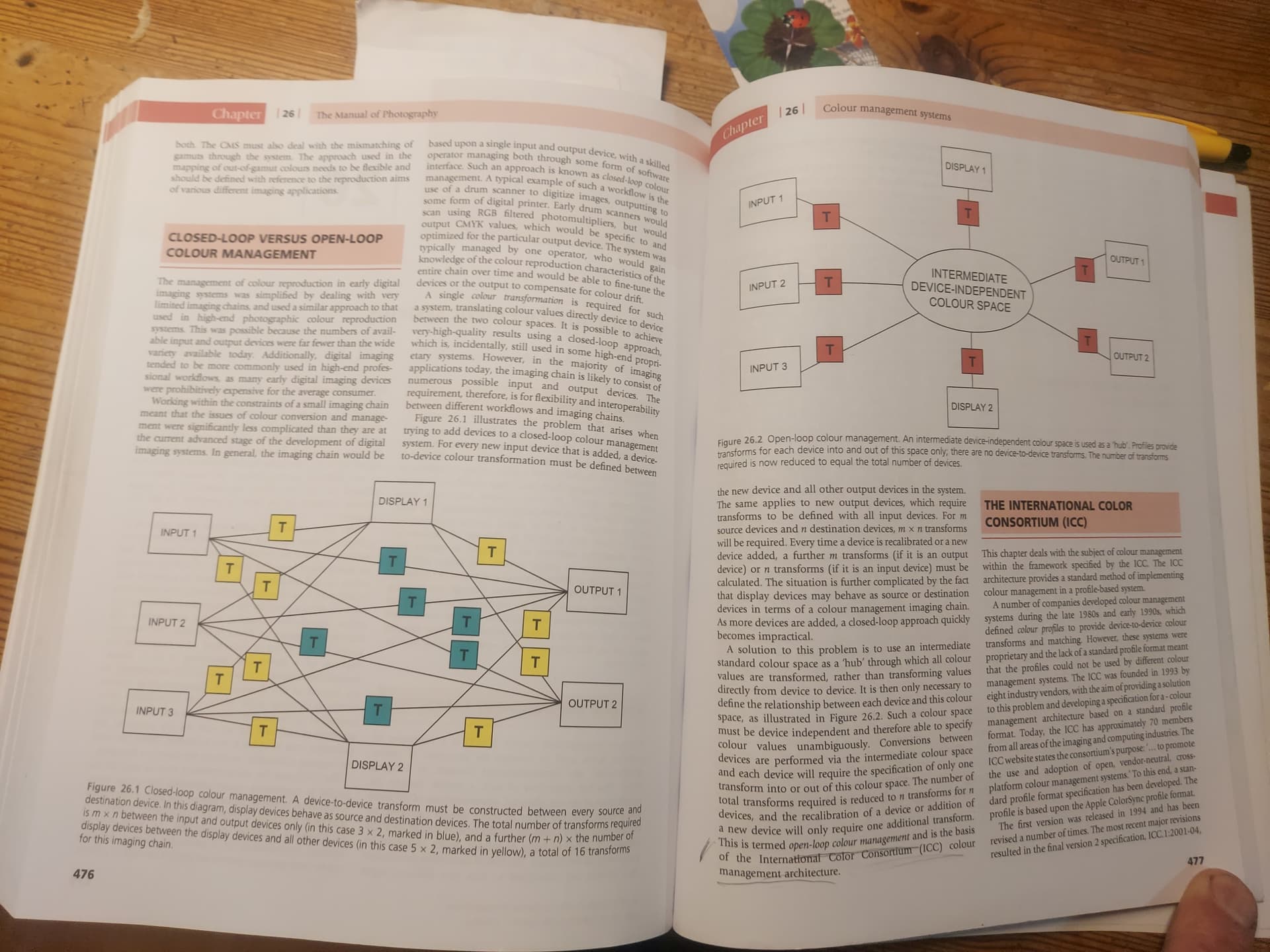
The diagram everyone is talking about misses the most important element of a colormanagment system which is the Profile Connection Space (PCS)
.
I’m not posting images here because I noticed that the forum software has issues with color rendering as well. It’s all a bit ridiculous for a company that has such a great reputation in color science. I can hardly believe it! But I will if asked.
“A key component of Color Management is a well-defined profile connection space. This standard color space is the interface which provides an unambiguous connection between the input and output profiles.”
From this definition you can deduce that what a lot of people call a PCS is what DxO calls the Working Color Space. The WCS is the connection between input and output devices and is well defined by DxO for use within PL6.
Photo-DKO
(Dirk Offringa, Windows 10, RX570, PL6E-VP3-FP6, Fujifilm shooter)
192
You think I was not polite? Towards whom? I found your reply very unpolite towards me to be honest. I took time to write my posts and do the tests. Your reply:
was totally gratuitious.
So see you next Black Friday, so I can report if PL7 has fixed it! (or not).
No. It’s a reference, intermediate, color space. See the image in a post of mine in your thread about color management. In stead of a conversion from a to be it’s done from a to pcs and than from pcs to to b. It’s just a method to go from a to b but not being limited to that.
@George Please explain how this would work in PL6 and what benefit it would provide. I see no benefit from adding another color space into the workflow with an additional two conversions to get from RAW file to final output.
I advise you to by the manual. It has a reputation to hold since 1890. First called The Ilford Manual of Photograpy and since 1971 The Manual of Photography.
So what benefit is there for an additional intermediary color space? I see absolutely NO benefit to that. The working color space is all that is needed.
Please also show me how all other software uses this intermediary color space?
it’s very exciting to read and follow the discussion.
I also took a look to Working Color Space - TuTo DxO by Pascal which for my skill explain a lot of terms.
Well I rest my case. The open loop color management described in the article very clearly states that there needs to be an intermediary color space between input and output devices. DxO’s Working color Space IS the intermediary color space, whether it is AdobeRGB or the new Wide Gamut Color space. This is how all the apps I have worked with work.