This was in one of the more recent posts. Two tags, one set to 1 means sRGB, if set for (can’t remember), the second tag names the profile.
This means that apps should check the second tag for the profile if the first tag is not set to 1
This was in one of the more recent posts. Two tags, one set to 1 means sRGB, if set for (can’t remember), the second tag names the profile.
This means that apps should check the second tag for the profile if the first tag is not set to 1
I fully agree with this statement and am very happy with my results.
EXACTLY! And don’t forget that it is only with your highly saturated photos that you will notice any difference in your rendering when using the new colour space.
What I do is as follows:
Like Greg, I find the colour rendering of PL6 more pleasing than previous versions along with the ability to work with a wider range of colours.
Everyone will develop their own way of working and I believe that photography is not an exact science and the result you produce is your own interpretation of the image you captured. If you achieve the result you are after then you should be happy. Use the tools you have to achieve the result you want. There is no right or wrong way as long as you achieve your desired result.
Finally, being aware of how PL6 and colour management works will help you achieve your results in a more consistent manner.
Yes, and that’s pretty much why I’ve been “banging on” for so long about this (and now, finally, I’m pleased that it’s getting some recognition) - That is;
We on this forum are interested in properly understanding how PL works, in order to get the best out of the new Wide Gamut WCS … Therefore, we make the time & effort to test, explore, debate, etc
However, I’m pretty sure that does not describe the majority of users(!!) - who expect PL to “just work” - and to just work “like it used to” (such that WYS-is-always-WYG).
But, with the DxO Standard preset now setting WCS = Wide Gamut by default for new images - these “innocent/naïve” users may not always enjoy the WYSIWYG experience they previously did.
Despite there being no direct involvement by DxO in this discussion, I’d be surprised if they’re not monitoring it - and, accordingly, we may see some refinements coming to PL to do as Mr. P suggests (?)
John
There are some other, related, things I reckon should be fixed too (again, in the spirit of protecting the “innocent/naïve” user from implications that they probably do not understand);
The DxO Standard preset (as applied to newly encountered images), assigns WCS=Wide Gamut - but leaves Soft Proofing un-activated … That’s setting-up unsuspecting users for possible surprises.
The default ICC Profile setting on Export-to-Disk is “As shot” … which comes from the camera setting, which an “innocent/naïve” user may have set to AdobeRGB (because someone told them that’s better than sRGB) … again, setting-up unsuspecting users for possible surprises.
Another export ICC Profile option is “Same as Soft Proofing” - - but, Soft Proofing is un-activated by default … which is rather confusing !!
I reckon the default should be “sRGB~~” - as that’s almost certainly what an “innocent/naïve” user would need… and the rest of us understand enough to know when/if we need to change it.
John
Haha - I like your Trademark, Joanna … ![]()
Actually, I don’t reckon all this is too complicated at all - - It’s just that, with PLv6’s current default behaviour, it can catch-out the “innocent/naïve” user … in which cohort I certainly do not include you, Joanna !
For the rest of us, it’s easy to deal with;
In this case, you know what you’re doing - just keep doing it … now, with the benefit of being able to apply your corrections with Soft Proofing = ICC Profile for your printer (and, “soon” too, ability to simulate the target paper and ink)
Again, no real difference - just have Soft Proofing activated, with ICC Profile = sRGB (probably)
I detailed four different Soft Proofing scenarios (that I could think of) up above.
John
That isn’t a bad choice to make. PL5 works well and is simpler. And then there are the bugs, which seem especially bad on Mac. While I am cheering the arrival of PL6 and am able to use it alright, I think it isn’t for everyone yet. Maybe when the bugs have been fixed and the remaining soft proofing features have been added. Then it will be rather straightforward, IMO.
I think maybe unsuspecting is a better word. DxO has apparently never heard of the principle of least surprise.
The itch is not in handling, but in the more or less subtle changes in colours that we see - if we compare version 6 vs. earlier versions. Even if we select legacy WCS, output can be slightly different.
I’ve seen apps change their colour handling over the years. Lightroom and Capture One have changed dramatically at times, while DxO has been less rough in this respect - until now.
Users licensing DPL6 as a first, will do whatever they do to get the results they want. Some might even read the manual. Habitués like us have been shoved off the couch, but should be able to adapt.
All we need is some decent communication about what has changed and what to do if we want to cling to our couch.
Update: @StevenL , is there a chance that DxO might address the topic in a white paper or blog entry? Something containing conclusive sentences like "if you want…, then set a)…, b)…, c)… and you’ll get as close as possible to what DPL<6 did.
Meanwhile, we’ll keep DPL5 up and running, carefully avoiding DPL6 to write DOP files automatically, should we use both DPL5 and DPL6…
Yet another pitfall for unsuspecting users which DxO could fix by either writing version-specific dop files or maintaining version-specific sections in a shared dop file. The versions shouldn’t be stepping on themselves the way they currently do.
This has been discussed in the past though, so nothing new.
PL6 loads images worked on in earlier versions of PL in the legacy working color space, to keep the rendering the same. Is this not sufficient?
No, because someone who trials a new version of PL and isn’t aware that it might write dop files that their existing version can’t interpret (and doesn’t know that they should have disabled dops before the trial) may be in for a surprise if they decide to stick with their existing version. You can go forward, but not necessarily back.
I agree completely. If DXO would produce some clear, and consistent documentation on the topic of color management specifically for DXO users, that would go a long way to clear up some of the confusion apparent at the moment. I know that I used to think of myself as semi-competent when it came to color management. But lately, I feel that I might be confused and not know it…haha.
Do you mean that even work done in PL<6 is being rendered differently in PL6? That is, just open an image that was edited in a previous version and get a slightly different rendering in an export and/or on the display?
That’s a real line in the sand for me since it invalidates editing done in previous versions.
I’ve seen slight differences when I stacked two exports (DPL5 and DPL6 at legacy WCS) in Photoshop and amplified the difference as shown in a post or two. Differences can exist but are really subtle in a way that they are well within any tolerance of involved gear/software/processing etc. Moreover, differences show in images with saturated colours mostly.
I’m not that obsessed with tiny differences, after all, we’re not feeling the same every day…
Interesting, and I agree. I know color rendering has changed a bit across previous versions of PL and its predecessor, too - sometimes significantly (and IMO for the better since OpticsPro became PhotoLab). Thinking about this, though… If the differences between PL5 and PL6 (Legacy WCS) are only measurable in export or with soft proofing, they can probably be attributed to the new algorithm meant to preserve detail in saturated colors (the PSCA). Otherwise, perhaps there’s more complex tweaking of the pipeline in PL6 or some difference in the ICC profiles used for export? Or even differences in the noise reduction algorithm or another part of the demosaicing process?
The default setting of Smart Lighting seems less reliable to me in PL6, for what it’s worth. Might just be how it handles the DxO Wide Gamut WCS, but I wonder if it could have been adjusted in a way that impacts results with the legacy WCS, too. One other thing that’s bitten me a couple of times now is that some lens correction profiles aren’t working properly in PL6. (Too much vignette correction or not enough.) And the FilmPack features keep being affected by new PhotoLab releases.
So there’s a lot to test if one wants to isolate the reason for rendering differences in PL6 vs. PL5. But I am guessing this really isn’t a worry.
Sure, but small differences over many versions will add up over several upgrades. I’m not keen on having to see PL as a tool that I have to continually export from to retain a rendering I’ve arrived at.
I remember Skylum Luminar 2018 (which I otherwise quite liked) being unusable across even minor updates.
While I can absolutely agree with your reluctance, I nevertheless have to say that processing in DPL is an ever evolving thing, unlike a TIFF or JPEG file, both of which are fairly old and tried formats.
Therefore, it might be wise to keep processed files of the few extraordinary shots we took, in order to preserve what we thought optimal at the time.
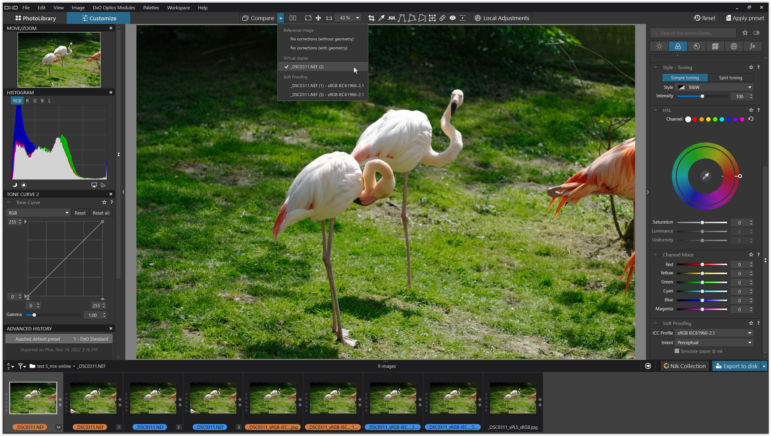
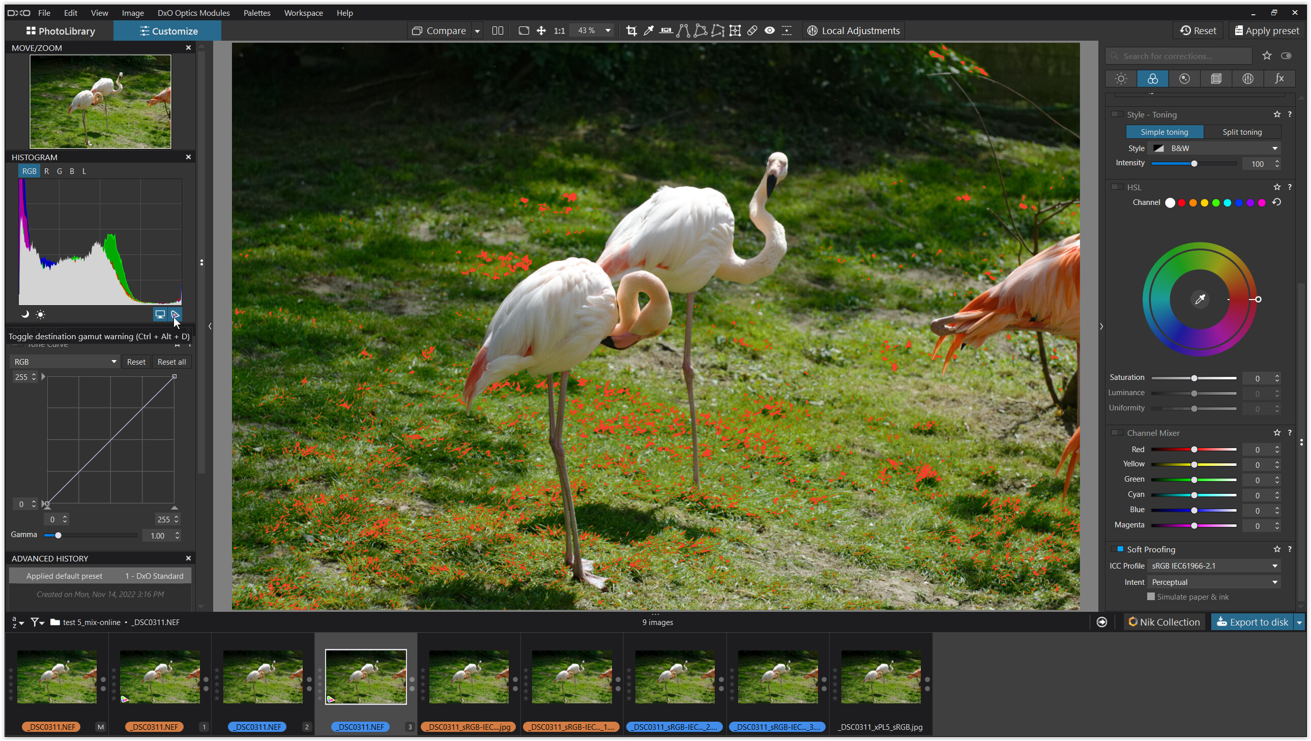
PL6 Wide Gamut vs. PL6 Classic-Legacy
Complementing my findings from post #31, I compared DxO’s Wide Gamut WCS with the Classic-Legacy and also included an export from the former PL5.
like before → DxO Standard, sRGB screen
_DSC0311.NEF (15,9 MB)
but new
_DSC0311.xmp (8,0 KB)
_DSC0311.NEF.dop (41,0 KB)
.
1.
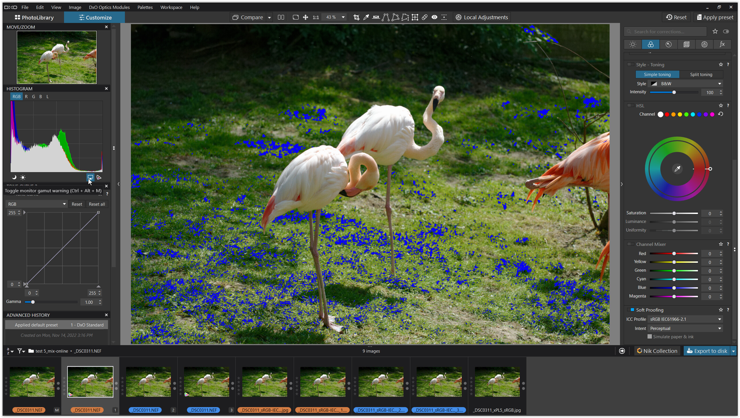
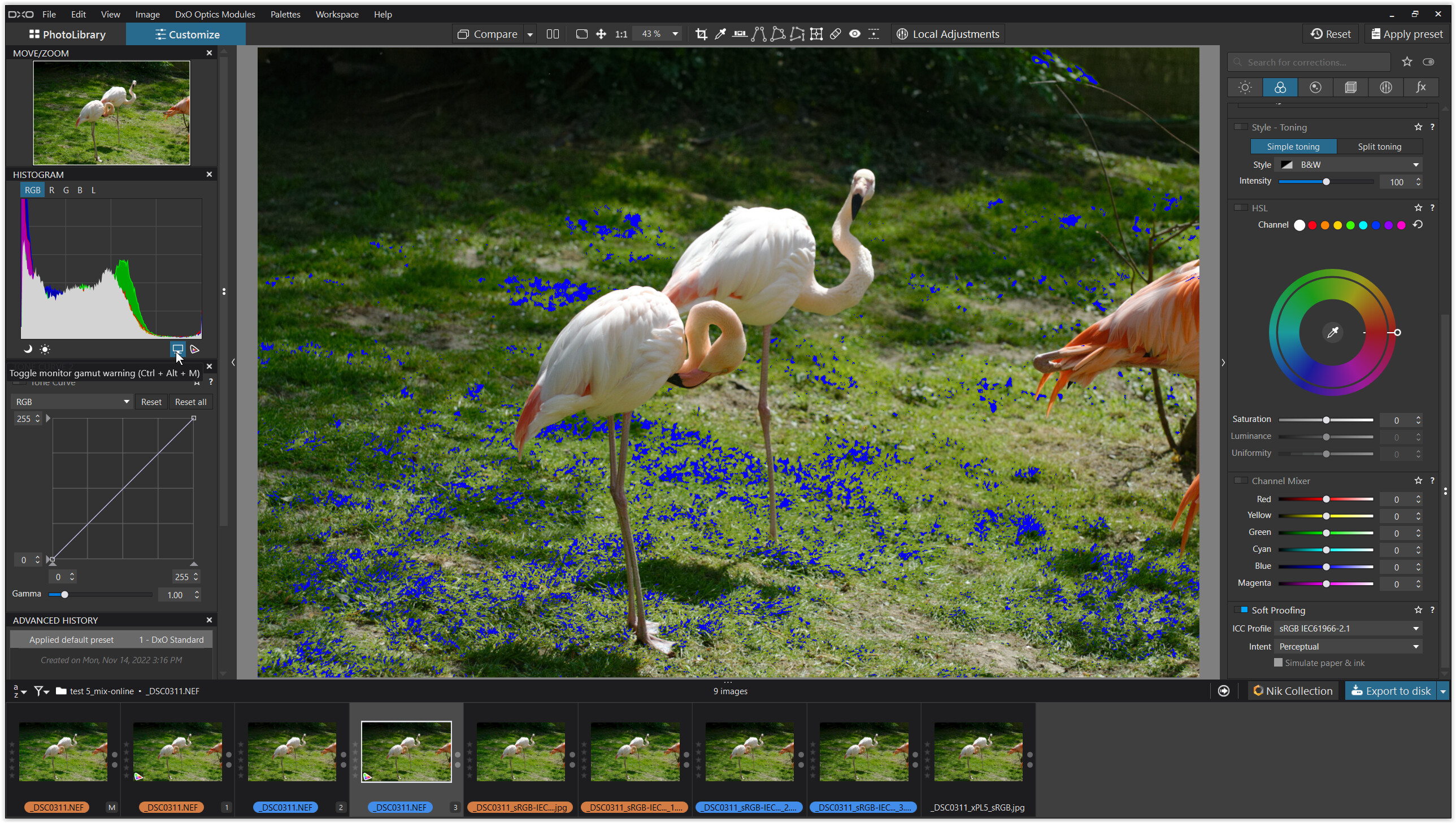
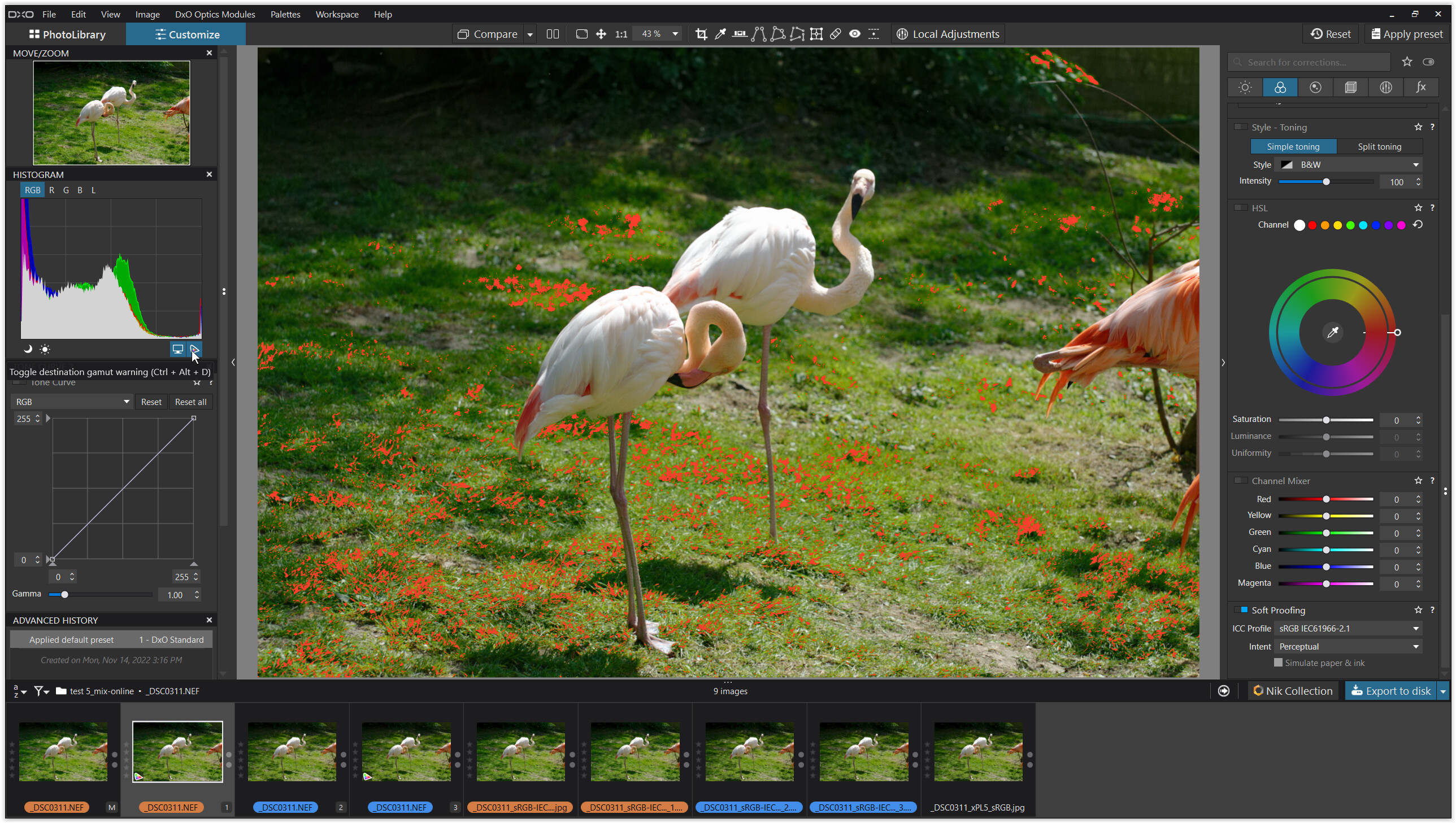
Wide Gamut = orange
Classic-Legacy = blue
softproof & export with sRGB IEC61996-2.1 profile
PL6
pic #1 = Wide Gamut
pic #2 = WG / softproof from pic #1
pic #3 = Classic-Legacy
pic #4 = CL / softproof from pic #3
.
pic #5 + 6 = WG / export from pic #1 + 2
pic #7 + 8 = CL / export from pic #3 + 4
PL5
pic #9 = export from PL5 with sRGB profile
.
2.
.
3.
.
4.
.
5.
.
comparing the screenshots
which means …
The PL6 Classic-Legacy mode reduces some of the out-of-gamut colours
and the export output from Wide Gamut is richer than from Classic-Legacy !
→ export from pic #1 or 2 (WG) and from pic #3 or 4 (CL) to compare them
→ add an export from PL5, which is identical to pic #7 and 8 (CL)
Make use of the softproof to get a “true” WYSIWYG → PL6.