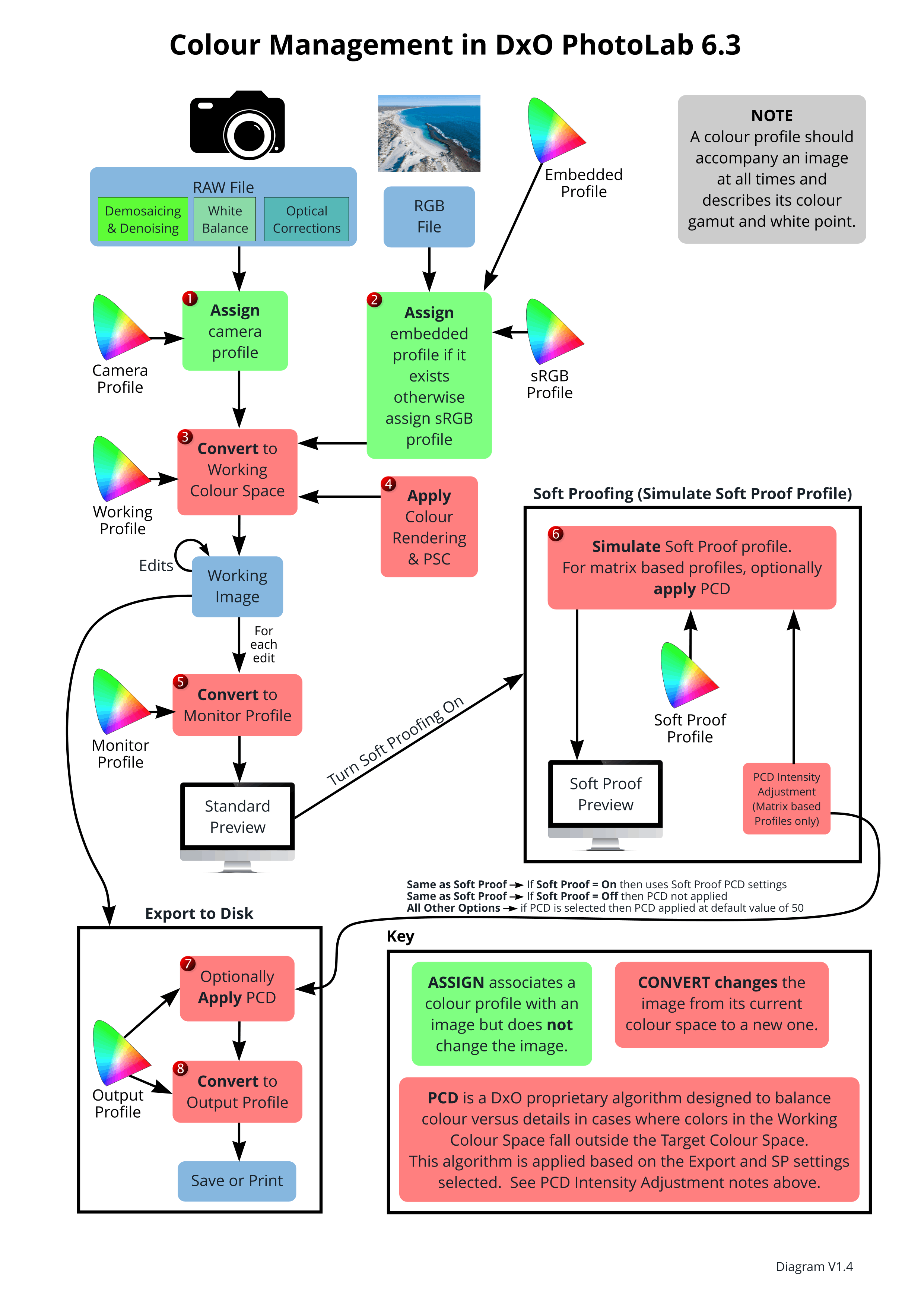
It comes close to what I tried to explain you for a long time. Simulation within the monitor profile is the same as converting to the monitor profile.
Assigning is a color profile to an image is the same as setting the dpi values in that image. It’s an info to the screen or printer saying ‘use me as if…’.
Assigning a color profile is only meaningful if that color profile is unknow/missing in the file. By example a jpg with no color profile. Standard sRGB is assigned to that one.
Conversion doesn’t mean that the values of that image are changed. It can be done on the fly too. What happens constant when you look on the monitor.
I have the PSC slider on auto. Magic want active.
So when i see that slider rising i know something got squeezed.
Then i can use monitor out of gamut warning to see which parts could be pinched.
And decide to correct manual or let dxo magic do its thing when i export.
The problem for most hobby people is the inconsistency of legacy switch to Wide Gamut.
Often things as golden hour colors get desaturated in the same settings when you switch from legacy to WG in order to gain some control in the darker saturated area’s, which is the “extra part” in the WG working space. The darker saturated bits of your rawfile.
So you raise the colors of the more brighter parts in order to get the same look in your monitor preview.
And when you export to sRGB al that work is squasted and compressed and can give you a nondesired outcome.
I think that’s the biggest problem for all not so into softproofing between colorspaces and profiles.
John, would it be constructive to move the soft proofing feature topic more towards printing for which it is primarily aimed? Most images for the web are in sRGB and when you save a raw image to sRGB, as we have all been doing for years, the default perceptual rendering intent does the job and most people have been fine with the result.
Given that with monitors the result everyone sees depends on their monitor, sRGB, aRGB, P3 etc this makes the discussion difficult.
I think once people start to use soft proofing in the way it was originally intended and everyone can see the results from their own printer, then the knowledge gained can be beneficially fed back into monitor soft proofing.
In an attempt to illustrate what i mean I took Joanne’s famous lobster image (extreme image) and soft proofed against a “plain paper” (extreme paper choice) icc profile I made to maximise the impact. The impact of soft proofing I believe is marked enough to show even with screen grabs of the soft proof:
I use primarily C1 and one of the biggest drawbacks for me with DXO was the colour management limitations (aRGB) and lack of soft proofing. This is why I have been so happy with DXO now that they use wide gamut and have soft proofing.
I fear that the huge improvement in DXO’s colour processing pipeline is not getting the credit it deserves while the focus is only on monitor profiles…
Just trying to help move these interesting discussions forward.
I’m fine with that emphasis, Ian … I don’t print myself, so it’s not particularly relevant for me, personally … But I’m always keen to learn something new.
An interesting point about your suggestion/proposal is that the reason I’ve been “promoting” the importance of understanding Soft Proofing for display purposes (as distinct from printing) is that, “traditionally”, it’s been associated specifically with preparation for printing (as you noted).
It was this image of mine (download link) that first made me realise the criticality of Soft Proofing, including for output to display devices - esp. for images, like this one, containing saturated colours that really push the envelope of target rendering capability (of sRGB devices).
That’s why I felt it important that we all better understood this conflation … and it seems suggestions are that I’ve been “too successful”
Just a point on this, too.(You may already be aware of this - but, allow me to “mansplain” regardless)
(In the context of PL), the means by which Out-of-Gamut colours are “squeezed” into smaller display color spaces (such as sRGB) is via the Preserve Color Details (PCD) algorithm;
During the beta testing stage, we were advised by a DxO staff member that the PCD-algorithm is “neither Perceptual OR Relative Intent - it’s something in-between, developed uniquely by DxO”
By default, the “strength” of application of the PCD-algorithm is a 50/50 split between retention of color saturation versus preservation of detail … and, as you observe, this generally does a very good job.
If we aren’t happy with the default, tho, Soft Proofing’s PCD slider allows us to shift this balance
– My saturated reds image (see link above) is a really good example for testing this with.
Altho it’s not at all obvious from the current (poorly designed) SP user-interface; the PCD slider is applied ONLY when the ICC Profile selected for Soft Proofing is one that applies to display devices (not for printing) … Conversely, the Intent and Paper&Ink simulation options apply ONLY when the ICC Profile selected for Soft Proofing is one that applies to printing (not for display devices)
– See here for my proposal for the Soft Proofing user-interface to be “fixed”.
Still no conversion from soft proof color space to monitor color space
I’ll show you something. I’ve a RGB monitor. When opening an image and turn the soft proof on, the histogram is based on the soft proof image. Choosing another ICC profile gives another histogram. But my image hardly changes. The soft proof image is converted to the monitor profile.
This is also the limitation of soft proofing.
We are on the same page John although I am shocked, I repeat shocked, that anyone doesn’t print and I am still trying to understand the concept:slight_smile:
DXO’s improvements to monitor soft proofing are welcome and add value. I agree with you that the SP UI needs further work to clarify what is a complex topic, as seen in the threads on this forum. DXO have done as excellent job so far but with so many users, UI clarity is difficult. In C1 you are always colour soft proofing although some users are unaware that that is what they are doing.
My point is this. Even if you don’t normally print, soft proof a matt paper profile and you will see the contrast and saturation go right down as well as colour changes. Everyone can easily see what is happening even if they only have a monitor with sRGB. So we get a “common” reference point. I hope it would then be easier to understand what’s happening with monitors and profiles. That’s what I tried to show with Joanne’s “lobster” image. That’s turned out to be a very useful image, thanks Joanne.
Understood, Guenterm … In my initial ignorance, I thought SP was necessary ONLY for printing - It took me a while to understand that it’s relevant (for specific images, particularly those with saturated colours) when exporting for display too.
And that’s what I constant shout out lately. You see the result in the monitors color space. The soft proof image is converted to the monitor’s color space. One should be aware of that.
Wile we are used to just let dxo smartypens PSC unit and the hidden rendering algorithm in export section do the trick of fitting all inside and we didn’t lnow any better it was as we wanted, know we can see a bit “under the hood” what’s need to be done.
And it’s same as any take “ill over the wheel” concept if you don’t grasp the theory and can’t manage the tools your end up with more problems then which you tried to avoid by taking over the wheel.
So in deed the user interface needs to be split in edit and screen “softproofing” the bit your always be looking in for general outcome towards a viewingscreen.
SRGB, AdobeRGB or P3. Take your pick.
And printing devices and papers.
The first must be usable in continues modes. Histogram, clipping (sun and moon icon) OOG icon. And (live) previewing switching between the edit screen and export screen.
Preverable a splitscreen toggle so you can see the probable difference.
The latter can be connected to the export /printing tab.
Precisely. Conversion actually changes data of the image. Assigning a profile only gives info about how other programs should interpret the colors. And soft proofing is as you said technically a conversion but its neither conversion in a sense that data in the image is changed, nor is is info about how of interpret color meant to be used outside of the soft proofing interface of the program. And since there is simulation of gamut as well as gamma, one need to be in that soft proofing mode inside a specific app to simulate the results. The term soft proof is not accident off course. Proof was actual print one would do to see what adjustments might need to be made before final print. Soft proof tries to save ink, paper and time by doing the process digitally, for the same basic purpose.
Converting from one color space to another or assigning a permanent profile to an image has very different use and its not the same as soft proofing.
Your explanation is best one yet. " Interpretation is technically equivalent to conversion but has no permanence."
No, it is not converted it is interpreted or simulated. Many, including myself in this threat have pointed out to you the distinct differences. Bottom line is that you are not correct in usage of the terms, but too stubborn to admit you are not correct.
Interpretation or simulation during soft proofing is technically equivalent to conversion but has no permanence. Since it neither changing the data in the image or assigning permanent color profile for the image. It only happens temporary inside the app for the explicit purpose of simulating output color space. It is not the same as hardcore conversion you keep yelling about, There is a distinction. An important one.
Furthermore, soft proofing is done with the use of other color profiles that can be loaded form external source and have no relation to the image itself, nor do they have to represent the device (monitor). They can be printer profiles. Hence there is no actual conversion being done, nor is the profile assigned to the image , it is a completely difference process of simulation. Technically conversion happens, a conversion of ones and zeros, as anything else in the digital space, but it is not a conversion of the data of the image, and that is what happens when term conversation is used. For this simulation purpose we use another term, soft proof. Not only does it avoid confusion, but it is more accurate description of hte process.
Except that conversion doesn’t mean that the source data must be changed. The output of a conversion can be somewhere else. That happens all the time when image data is send to the monitor. The source data is converted to the monitor’s color profile.
I’m sorry George, but I think you might have that wrong. In my case, I have an sRGB screen, and an aRGB printer. If the source data is converted for the screen, there is no way that it can replace lost data for the aRGB printer. I think what you may be meaning is that the image that is sent to the screen is converted to sRGB and the image sent to the printer is converted to aRGB. While the source image still remains at the colour gamut of the camera.
More precisely the data is converted to the output color space. Mostly the monitor but if you print the printer’s.
It doesn’t change anything.
The main thing is that what you see, the monitor, is in the monitor’s color space. Also the soft proof image.
The idea of introducing the third term — interpreting — was to avoid the confusion between converting the stored image versus converting to a temporary copy of the image.