Color space.... again

Can‘t agree more.

Same do I “begin with the end in mind”. The end could be hard copy print out or content for web. Spare budget for a very good color accuarcy monitor & calibration device. Using a $500 27“ 4K monitor for editing images which is taken by $5,000 camera gears is not good maths.

1 Like

How does one achieve that monitor setting, Joanna ?
Is it a “brightness” setting ?

John M

The only way is with a colorimeter. A color calibration tool like i1Display Pro. The hardware will measure your screen and the software will tell you the brightness and help you calibrate your screen to 80, 100, or 120 cd/m2 or whatever you want.

1 Like

… Yes it is. I calibrate with Datacolors latest equipment and their software has an excellent step where you set the brightness. So what I’m writing is about the sRBG vs Adobe RGB -problem. The problem that persists AFTER the brightness problem already is set.

After solving this problem in my workflow I don’t have these color cast problems anymore but many others have, because they print inages with a non suitable color space.

If you postprocess with an sRGB-monitor which a lot of people does it’s very easy to test what happens if you use Adobe RGB in the files.

The people using Adobe RGB in their workflow get a similar but different problem if they want to export images to be used by peapke viewing them on monitors.

I don’t suggest that standardising on sRGB should be the best for everyone but for me it’s a very convenient way to solve this problem that we always face when preparing prints with sRGB-monitors. I don’t ever need to think of this problem with filew in with different color soaces. If I should should use an Adobe RGB -monitor I ideally have to switch it to sRGB if the images should not be used for printing.

So Joanna, even if the brightness problem is taken care of the color space is still there to handle - even if it easily can be “converted at will”. The problem still for many ignorant users is that they don’t even understand they have a color space problem and many has no order in their file systems when it comes to their files color spaces.

Set your screen background to white, your camera to ISO 100, f/8, t=1/8 and change monitor brightness for a “normal” exposure, in which the histogram is centred. That gets you about 100cd/m².

If the screen looks too dim, the room is too bright.

1 Like

@Pompel if you have a few minutes to spend, here you have a well-made video explaining a lot of things about sRGB (and color management in general…). Spoiler alert: having a 100% sRGB workflow doesn’t ensure you that you’ll get accurate color from end to end sRGB urban legend/myths Part 2 - YouTube
@Guenterm have a look at the video, and you’ll see why most labs require you to provide them with sRGB files :wink:

Steven.

Agree completely.
What I would like to see in DXO is support for soft proofing.Ideally along the lines of Capture One where you are always soft proofing when editing an image using whatever profile you have selected.
This seems a very easy system to implement as it only requires a selection menu for the profile you want to use eg aRGB for editing, sRGB for web, a paper profile for printing etc.
C1 does have a “hard” soft proof where the image reflects the output size, sharpening etc but this is just icing on the cake and I would be happy to just have colour space soft proofing.

1 Like

Yes, soft proofing should be something to be considered…

1 Like

Hi Steven,
thanks for the link.

I will answer with this link

EIZO practical expertise | Colour management for photographers: 3. Differences between the RGB gamuts

and one short snippet from this article “… to the extent that even today many programs and printing companies can only work with sRGB. You should only use Adobe RGB if you are sure that your image processing programs and your printing companies can work with it.”

And that was also my experience by printing a book for a friend. I worked in ARGB and also send the photos in ARGB and for example Blue was very pale.

Since this time I always worked in sRGB and all my posters, books, calendars are fine.

Let me say I’m not a professional and all my work is for hobby only, but my two Eizos are calibrated.

Have fun

Edit: and softproofing is a long discussed term. The most time I will check my results from DXO development within the softproofing possibility in my old LR

1 Like

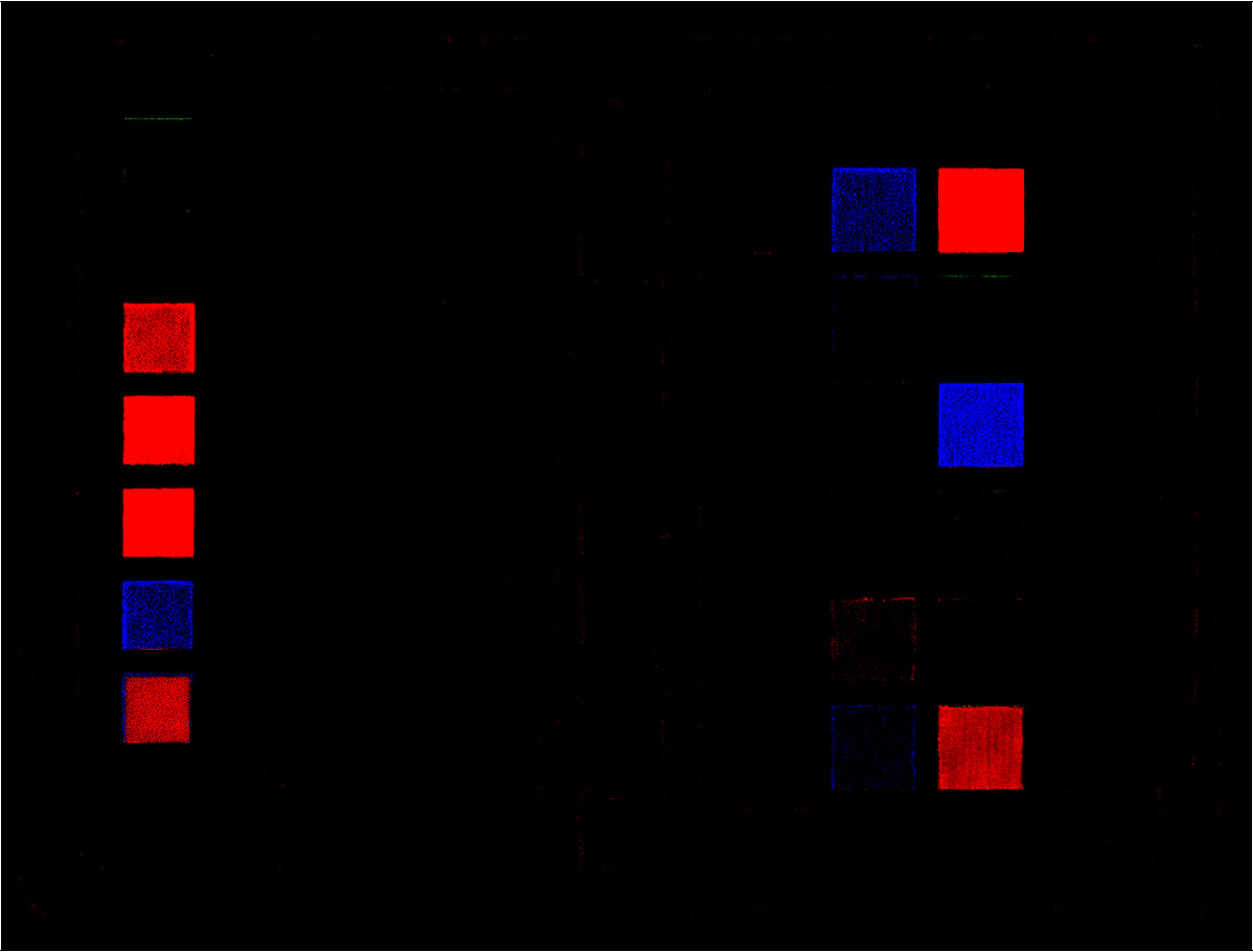
Here is a screenshot of the Quicklook panel, showing one shot taken, with my Nikon D850, with sRGB and the other taken with AdobeRGB. The difference is minimal with, possibly, the sRGB being slightly more saturated…

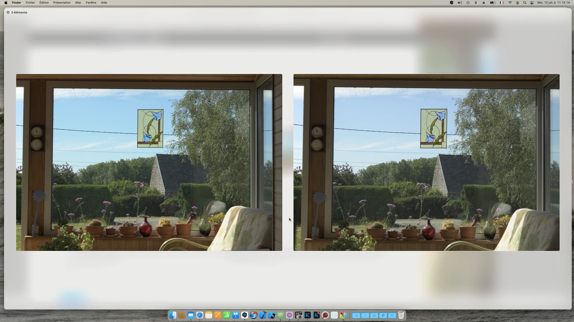
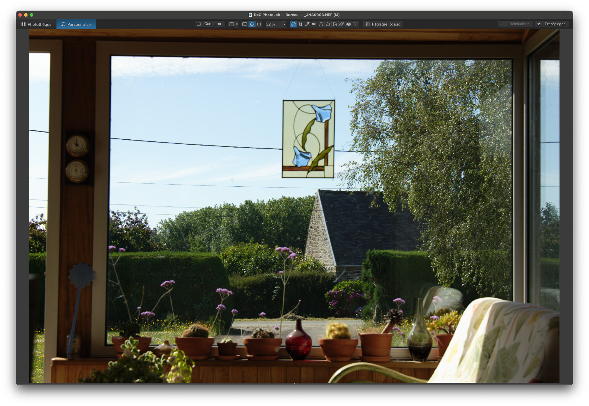
Here are two screenshots of both files opened in PL5…

I really can’t see any difference.

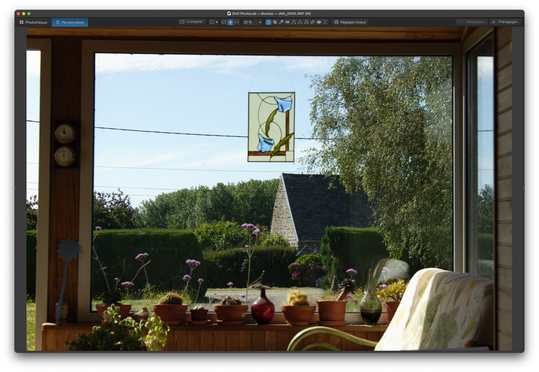
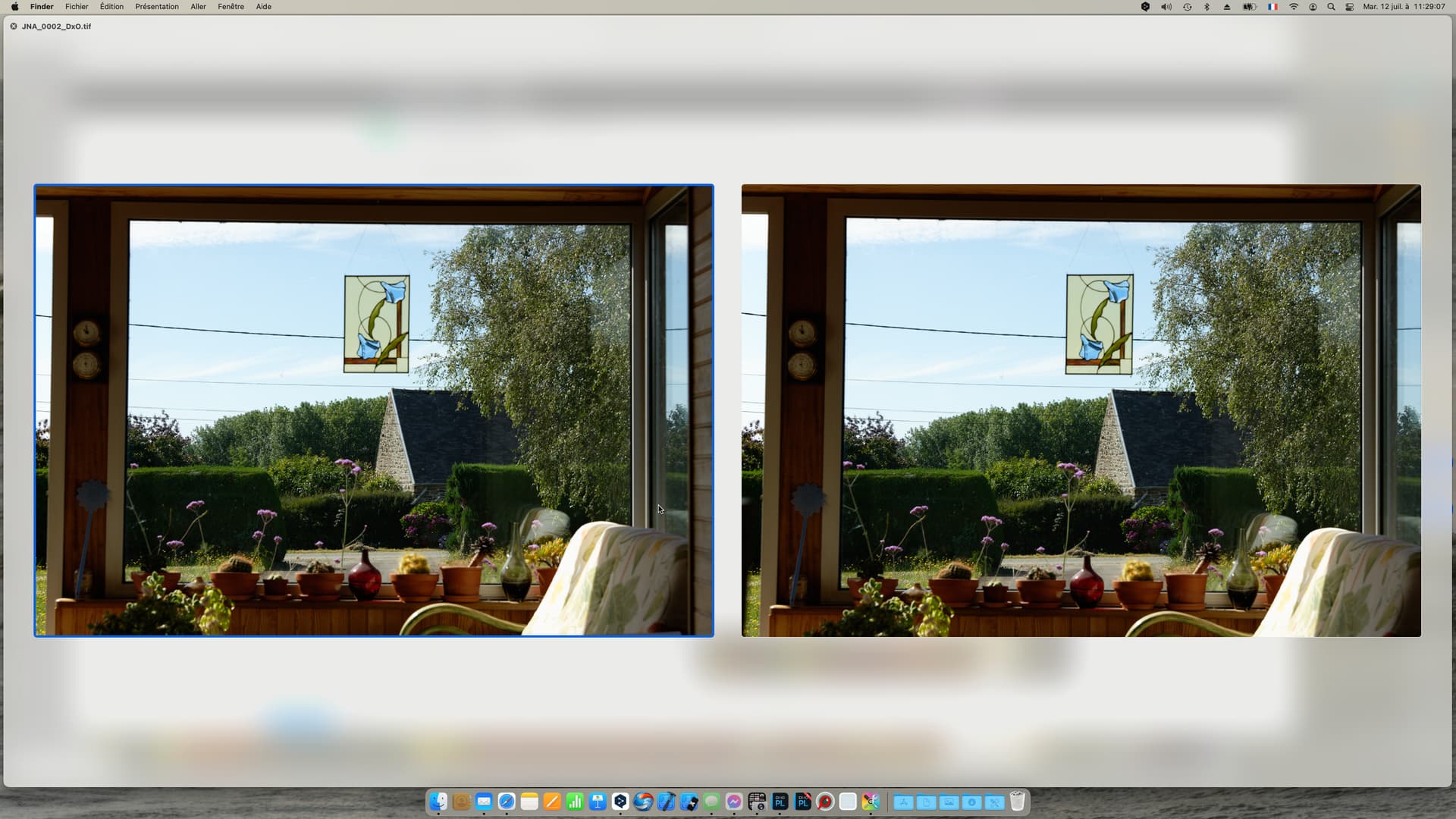
Then I exported both to TIFF, using the ProPhoto RGB profile…

Once again, if there is any difference, I can’t see it.

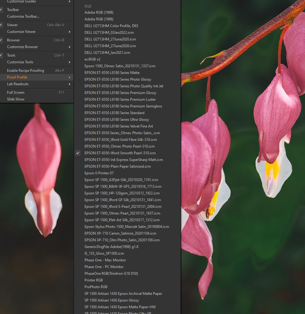
What will make a difference is the profiles I use:

  1. for the monitor
  2. to print them with.

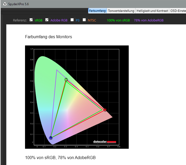
When calibrating the monitor, the i1Display software will start by asking you to adjust the screen brightness, then it will go on to calibrate the colours, contraste, etc, in order to create an ICC profile - it is this that then gets used to give you a balanced appearance, according of the “colour space” of your monitor.

I think you are using the wrong expression when you talk about color spaces. We usually talk about printing with an ICC profile, which translates between colour spaces.

This is totally unnecessary. As long as the monitor is calibrated and printing is done using an ICC profile that has been made for your printer/paper/ink combination, there is absolutely no need to mess around with “colour spaces” on your monitor.

I’m sorry but, the problem for most “ignorant” users is that they…

  1. haven’t profiled their monitors
  2. haven’t profiled the printer/paper/ink combination

Once both these steps are done, you will always print what you see on screen.

N.B. Don’t try and work in a bright room, otherwise the temptation to crank up the screen brightness in order to see the screen will completely de-calibrate your monitor.

Do ensure that the screen brightness is not being automatically changed to suit ambiant lighting before calibrating.

This is an excellent video, which completely debunks the “sRGB only” myth. I always thought it was wrong but now I know more why.

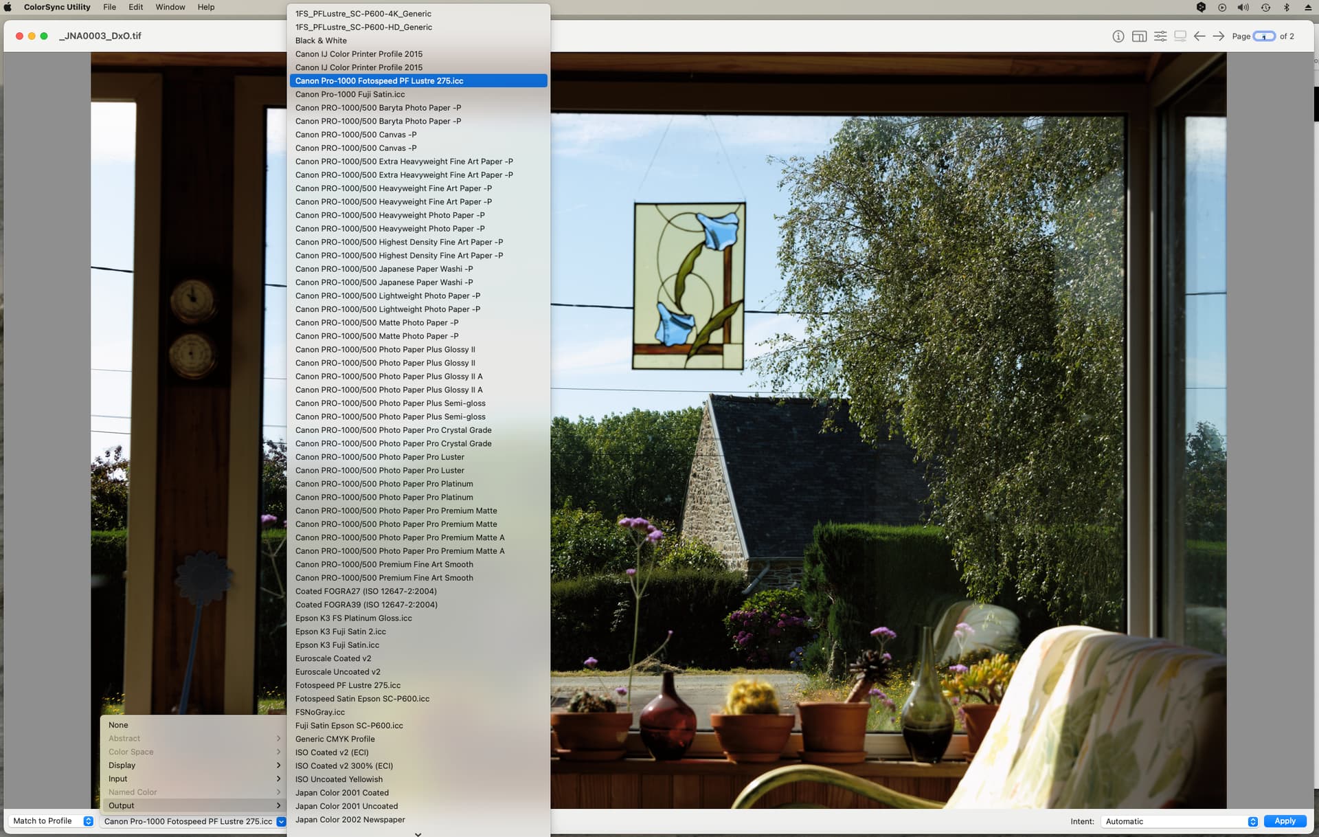
In the meanwhile, for us Mac users, we can use the ColorSync Utility that comes free with macOS…

It all depends on what profiles your screen and printer are calibrated to. What you may not notice is the clipping of certain colours, which may not matter to you for your workflow.

1 Like

Thank you,
and yes my monitors are working with the sRGB calibrated profiles, and for the printer/paper I’ve got the profiles from my dealer and use them with the softproof function in LR.

And I live in peace with the clipped colours

1 Like

Thank you for the video link

1 Like

I have been doing digital photography for over 20 years which started off by scanning my slides. This brought me to colour. I have developed what I believe is the easiest way to manage your photos from camera to print.

The most important thing to do is properly calibrate your monitor using a hardware device like the Spyder.

Once your monitor is calibrated simply stick to the defaults your editor uses for colour. Keep your editing environment relatively dark, not bright as that will affect your eyes and if the ambient light has a colour cast then that can affect how you perceive the photo on your screen. If you do use lights in your room then make sure they are pure white. My room lets in sunlight and at night I have a lamp with a pure white globe.

When you do test prints, take them outside and look at them in daylight but if the sun is shining then keep them shaded. This will give you the best idea of how good your prints are. In Australia we are blessed with lots of Sun so this is easy for us but maybe not for others.

I have published three editions of our book and I simply use sRBG as the output for my images and then generate a PDF for the final print source which is what our printer require. We do final checks at the printer to tweak the output slightly as required. I have had extremely good results by keeping it simple and following the above guidelines.

The two most important points I wish to make are:

  1. Calibrate your monitor properly
  2. If using artificial light, keep it dim and make sure it is pure white (as close to sunlight as possible).

Finally, your eyes can really play tricks on you as they adapt to your surrounding lighting conditions and can make things look fine when they are not. If you have never calibrated your screen and you do it the first time you will think your screen looks very yellow! This is because most standard monitors have a blue colour cast and your eyes have got used to this! Trust your hardware calibration and you will be fine.

2 Likes

Just for completeness if anyone is interested.

With DisplayCAL and ArgyllCMS there are more possibilities for professional users. I tried this about 18 months ago, but didn’t really notice much difference for my environment. That’s why I went back to the standard Spyder software.
I had found the info about this via
DisplayCAL und ArgyllCMS - Freie Software für anspruchsvolle Monitorkalibrierung (fotovideotec.de)

I’ve run a short test, exporting, with lightroom, an image of a color checker as 16 bit TIFF file with each of the following profiles: ProPhoto RGB (ROMM RGB), P3, Adobe RGB and sRGB. Then, I loaded the files as layers in photoshop and checked for differences. The most I got is this:

amplified with a steep tone curve (15in → 255 out)

Reference in sRGB:

Differences can be seen (as expected) in hues located near the blue-green and green-red edges of the respective gamuts. Images with more content in these areas should show bigger differences. Testing the same thing with JPEG files provided the same differences, but to much lesser extent.

One does not need to get religious about which color space is the best, but choosing the smallest space can be a limiting factor - depending on how good (in the sense of “ability to differentiate”) your process and gear are. If you use sRGB JPEG, it should be used at the very end of the process and not at the beginning…but we already knew that. :wink:

sRGB can be limiting in landscapes and portraits of people with yellow hair and cyan eyes, but skin colours should pass unharmed.

2 Likes

My understanding is that ProPhotoRGB is a wider Gamut than Adobe RGB. If that’s true and Adobe RGB is the working color space for PL what is the reason for Exporting in ProPhotoRGB?

I ask because in a few months I will buy a Canon Pro 300 printer and am trying to get organized on some of this confusing stuff.

Thanks very much, Rod.

Correct me if I’m wrong. But when I look at my monitor I see an image in the color space of my monitor. Keep it simple, it’s sRGB.
When the image has a wider gamut let’s say AdobeRGB then these colors has to be recalculated in the sRGB gamut. To gain that there are several rendering intents, each of them with there own characteristics.
So what do I compare when I compare an image with AdobeRGB and sRGB? What do I see?

George

Well, I think I’ve got it right if I say that the working space, that you see on screen, might be AdobeRGB, but when exporting, the RAW gets transformed into the colour space of your choice without passing through the screen profile.

Indeed, but that is why you should calibrate your screen, so that whatever colour space your image contains, the ICC profile converts it to sRGB or AdobeRGB on the fly.

Watch the video @StevenL linked to - he makes it clear.

To go even further, watch this one: Display to Print Color Matching, the missing part in the equation, Lighting! - YouTube
@KeithRJ this applies even to “sun-rich” Australia :sunny: :sunglasses:

Steven.

1 Like

As far as I know the ICC profile doesn’t do the conversion from sRGB to AdobeRGB. It’s fine tuning the output device.
In your example there’re no differences between the 2 images. That’s what I should expect. My question is more about images that want to proof something showing differences. That’s only possible with no conversion. See Jeffrey Friedl's Blog » Digital-Image Color Spaces, Page 2: Test Images. One can read the whole article too. It’s old but still valuable.
In my optics the pixel values are changed so the output device shows the same colors in different gamuts.

George