as far as i understand first step is creating by demosiacing r,g,b channels( amount of red green and blue saturation of the sensor) from the colorless grit of RGBG filters that would be the cameracolorspace right?(according to DxO’s explaination below they create just before r,g,b the whitebalance not after demosiacing so in that part i was mistaken)
Then the converter recalculates this channel data in to RGB pixel data with a whitebalance and lumination/brightnes included. preview of the jpeg to get this on your screen.
your Prophoto/aRG/sRGB colorspace. (The A2 in this is the r,g,b channels the raw colordata like FastRawViewer shows in the histogram( channels are fixed just exposurecharge, blown is blown and underexposed is underexposed)
The A3 is the colorspace in pixel modes and by shifting exposure you shift the raw data of the channels along the calculation of brightnes (like FastRawViewer visualise when you Plusses or minus EV.
the the channelline stays the same only the 0EV line shifts placing the centre of brightnes on a other level.
you say i would like "this point be my 0EV point and calculate the jpeg from this point. (simplistic spoken)
But my main point is as fas as i know of the actual demosiacing and setting WB and brightness level of the image is done when you hit export. there are a few things done after every change of contrast, color and EV:
PL’s engine: Vigneting is corrected first (optical correction CA, Denoising Prime, WB before demosiacing)(as it depends on calibrated data ), then exposure, smart lighting, selective tones, contrast, clearview, microcontrast and then custom tone curve
Every time you change a thing in the latter part it’s former part starts adjusting on that action.
You see the screens colorspace but you stire in the cameracolorspace soep. That’s why you see those delays all the time
(That’s what i remember from earlier diving in this matter.)
So nothing is lost as in gone imidiately when you work in a smaller colorspace only on export to tiff. or lineair DNG bytheway.
applying white balance before demosaicing makes sense as a good demosaicing should have in mind to avoid wrong color creation, hence it’s good to define what is grey before ; noise is structured by demosaicing, so it’s more efficient to remove noise before demosaicing and that’s what PRIME does ; removing chromatic aberration before demosaicing also makes perfectly sense because trying to interpolate a color channel based on information from others color channels that are shifted because of chromatic aberration is a mess ; etc. Light changes are mostly (ClearView excluded) done in linear RAW sensor color space (before color rendering) to be at the closest of how picture would have looked if you would just have increased or decreased light in the scene.
(from a dxo staff member i copy paste it in my own dxo technic explains folder)
And yes i use sRGB export only in jpeg.
i would be interested how people who print professionaly hand over the processed image to there printing store. as a DNG? tiff? (this would be max AdobeRGB in PL’s case i think) because soft proofing is done on type of printer and it’s printerdriver chosen profile right?
Nope. Neither the Nikon D810 nor the D850 create panoramas, focus stacks or other creative scenes.
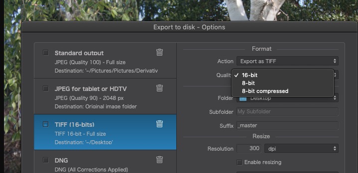
I only ever use my digital cameras to create RAW files, which I can then export from PL as TIFFs if I want to do anything “creative”
I print up to A2 on my own Canon printer, which I have profiled for whatever combination of paper and ink I am using. If I do have to use a lab, I send the files as TIFFs with the ProPhoto RGB profile - they then print using the appropriate profile fro their printer/paper/ink combination. Finally, I also send B&W TIFFs to a lab for laser printing via a Lambda printer onto silver halide paper.
Check with your lab depending on the print technology they may have a preference. (Bay photo specifies different colors spaces for different products if I remember correctly.) If so give them what they ask for. If they don’t specify a preference ask them. If they can’t answer the question find another lab.
Lots of interesting input. Realize there is a lot of knowledge out there.
Since my monitor / monitor does not support Adobe RGB, I find no reason to use it the time the end result (when the poster is printed) can be completely different from what is displayed on the monitor.
For me, the conclusion is the following:
I shoot in RAW (NEF) format so the camera settings in terms of color format are not that important.
As long as my screen / monitor does not show the color spectrum of Adobe RGB, I will process / adjust the images in sRGB (in PL with the settings that Wolfgang mentioned - current profile of the display / sRGB). Exports to TIF (sRGB) - finishing in Affinty and there after exporting to jpeg (sRGB).
Regarding the printouts, I will contact a professional actor / lab for any input from these. Both in terms of color format, but also which file format they want.
you did not wrote if your display is calibrated with X-rite or Spyder colorimeter.
Most notebook screens and/or external monitors are not calibrated by factory.
My Eizo’s for example are calibrated and have one factory setting for sRGB, but still benefit from a calibration with the Spyder x.
Without calibration you work in sRGB, but not sure if you see the correct colours.
You always edit in the working color space of PL. If you export the image to another editor you should use AdobeRGB, not for its colors but for its bit depth. Only the final export should be in the desired color space.
Hi Pompel,
sorry, I completely forgot about the colour depth(16bit vs 8bit),
which describes the amount of tonal values (= more or less steps/differencies)
within a certain colour range (ProPhotoRGB, AdobeRGB, sRGB …),
indicating the available colours in that given colour space → see the graphic above
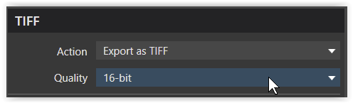
When exporting as TIFF to AP, always use 16bit
not to limit your editing capabilities (too early).
JPEG files come as 8bit only and could be considered as ‘end files’.
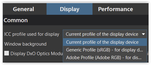
Hello Wolfgang. Where can I find that first screenshot you posted, inside PL? When opening “preferences” / either “General” or “Display” …I cannot see it.
Thank you.
By the way…I would be very glad to get 10-bit colour support in DXO PL (as I posted in another thread).
Thnxs Sigi! I know and I always use 16bit tiff export for printing. I meant the colour space setting tab that Wolfgang showed (couldn’t and can’t find that).
The mentioned setting in Windows seems to determine, how DPL will display the images. On a Mac, this possibility is controlled in the context of the system settings rather than per application, therefore, no such setting exists (because it is unnecessary) in DPL on Mac.
1 Like
Stenis
(Sten-Åke Sändh (Sony, Win 11, PL 6, CO 16, PM Plus 6, XnView))
34
There is a problem if you prepare JPEG-files using a sRGB-monitor that you save in Adobe RGB. If I do that I will end up with images with to much red and yellow normally. Since I use a 4K sRGB-monitor when I postprocess, I normally save my JPEG-files in sRGB and print in sRGB. That is the only way to get WYSIWYG. I don´t care about losing values in red, green and yellow that Adobe RGB would have covered. The important for me is to have a monotor in sync with the printer so I see what I get already in Photolab.
In a future i might invest in an Adobe RGB-monitor (or not because it would complicate things) and in that case i might save in Adobe RGB but I might not as well since that is to complicate things since I´m not just preparing images for printing. Then I will end up with JPEG-files of both kinds and that is to ask for problems. I think I will prefer to be able to know that my files will look the same printed or viewed on screen.
I have read many people complaining about prints that differed from how it looked on the screen when printed. Usually the reason has been that the photographer had forgot to save in a proper color space matching what he/she has seen on the screen. Either you stick to Adobe RGB through the entire workflow or vice versa.
…one of the most common mistake photographers make when editing for print, is that their monitor is too bright. The first reaction, after the sheet of paper comes our from the printer is: “Why it’s so dark? On screen it was good”. A monitor is a backlit surface while paper is a reflective material. With monitors selling their HDR and hundreds of nits (if not even more), it’s easy to fall into the trap…
Be sure to set your monitor anywhere between 80 and 100 cd/m while editing, to avoid surprises when printing.
The colour space of an image can be converted at will - that is not what causes most prints to not look like what is seen on screen.
I have said this before, but I will repeat it here… I print for exhibitions, using a Canon PRO-1000 A2 printer.
In order to get the contrast and dynamic range on screen to match that of the print, it is ultra-important that the screen brightness matches that of the printing paper when viewed under exhibition lighting (which is usually close to daylight).
This means that you must not set the screen to anything much more than 80cd/m², otherwise print will come out much darker than seen on screen. When it costs up to €5 per print for an A2 on good quality paper, you do not want to be getting it wrong.
My screen is calibrated using the X-rite i1Display Studio device and software. I create different ICC profiles for my printer, depending on the paper used, with the DataColor Spyder Pro calibration device and software. Only then can I be assured that what comes out of the printer.
No matter what the profile that PhotoLab uses, I always export for printing to a TIFF file using the ProPhotoRGB profile. In all the years I have been printing exhibitions, to critical acclaim, I have never found it necessary to get into all this colour space theory.
Just follow the advice that @StevenL gives - but, personally, I tend to stick to the 80cd/m² level because “it just works™”
As he says, don’t be suckered into all this “amazing” claims for monitors, especially when printing to paper that has a much smaller dynamic range. Think of an uncalibrated monitor having around 10 or more stops of range but paper having around 6-7 stops of range - that’s at least eight times as much range on screen than is possible to print.
Hmmm …
Sometimes I am asked for advice from people who want to start with photography. I often answer “get to know the camera”. Realize now that the answer must include: “get to know the monitor, get to know the printer”. Or best of all - marry an engineer .
Had a quick chat with a professional printer / lab. According to him, most printer labs use cmyk when printing and further that in most cases the prints will deviate from what is displayed on the monitor, regardless of which color format was used. (they prefer to get the file in PDF format for printing? Thought TIF might be the best).
This thread has taught me a lot, but also made me aware of things that I may not have been aware of at first. I am a simple man who likes to make things simple / basic, so for me I think the solution is to enter into an agreement with a professional and experiment / test different prints. But as Joanna mentions - it’s expensive, I may have to bribe them with a bottle of good wine or two.
Same do I “begin with the end in mind”. The end could be hard copy print out or content for web. Spare budget for a very good color accuarcy monitor & calibration device. Using a $500 27“ 4K monitor for editing images which is taken by $5,000 camera gears is not good maths.


