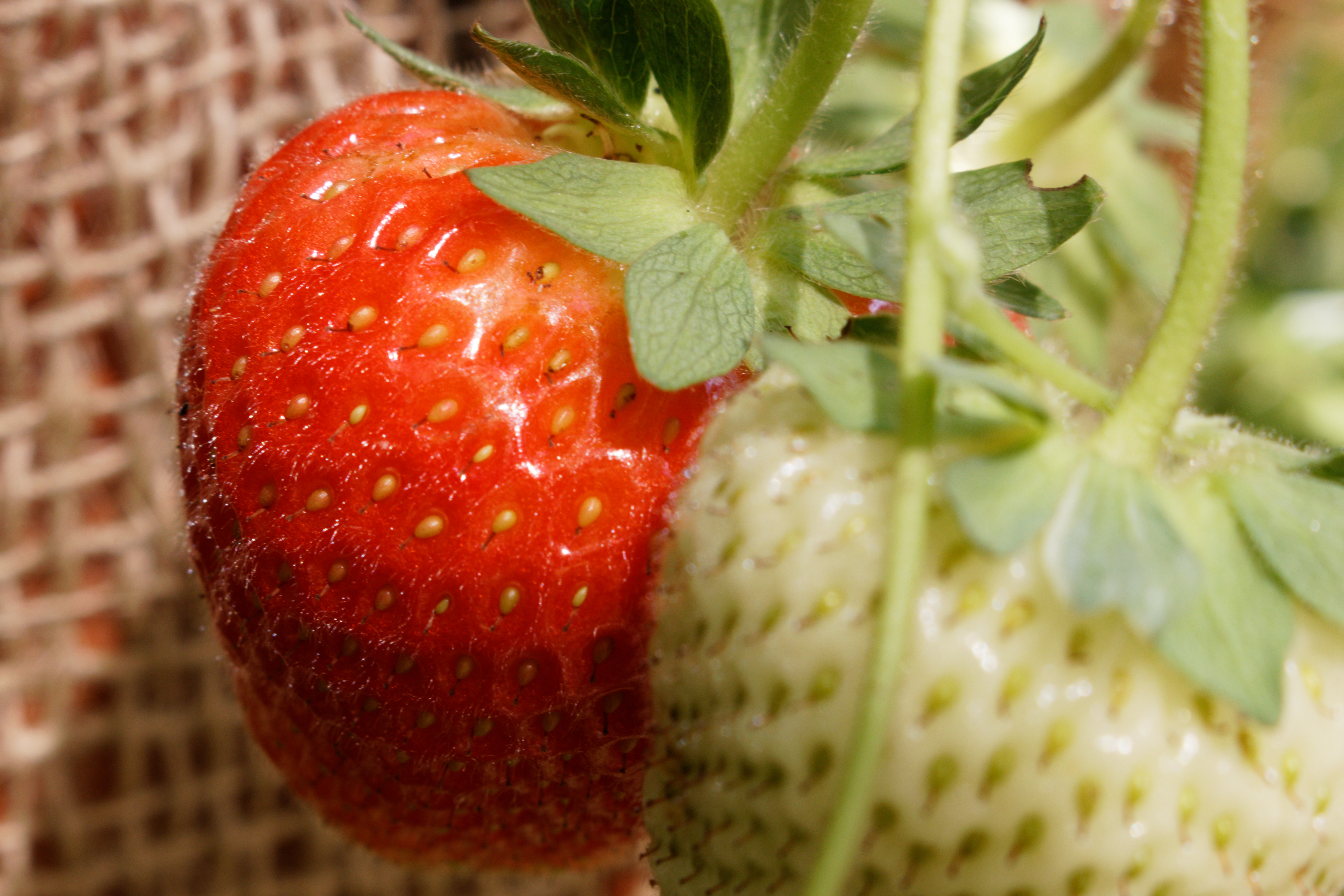
I recently got a new iMac which has a wide gamut display (P3) and started to experiment with it. I noticed that some of my pictures changed appearance when color rendering was set to default “Generic/Camera default rendering”.
I narrowed it down to the “Protect saturated colors” slider: When set to the “Magic Wand” (for the example picture this is 40) it tends to limit the colors so that even sRGB is not fully used. This means when I export in sRGB or AdobeRGB the result is identical.
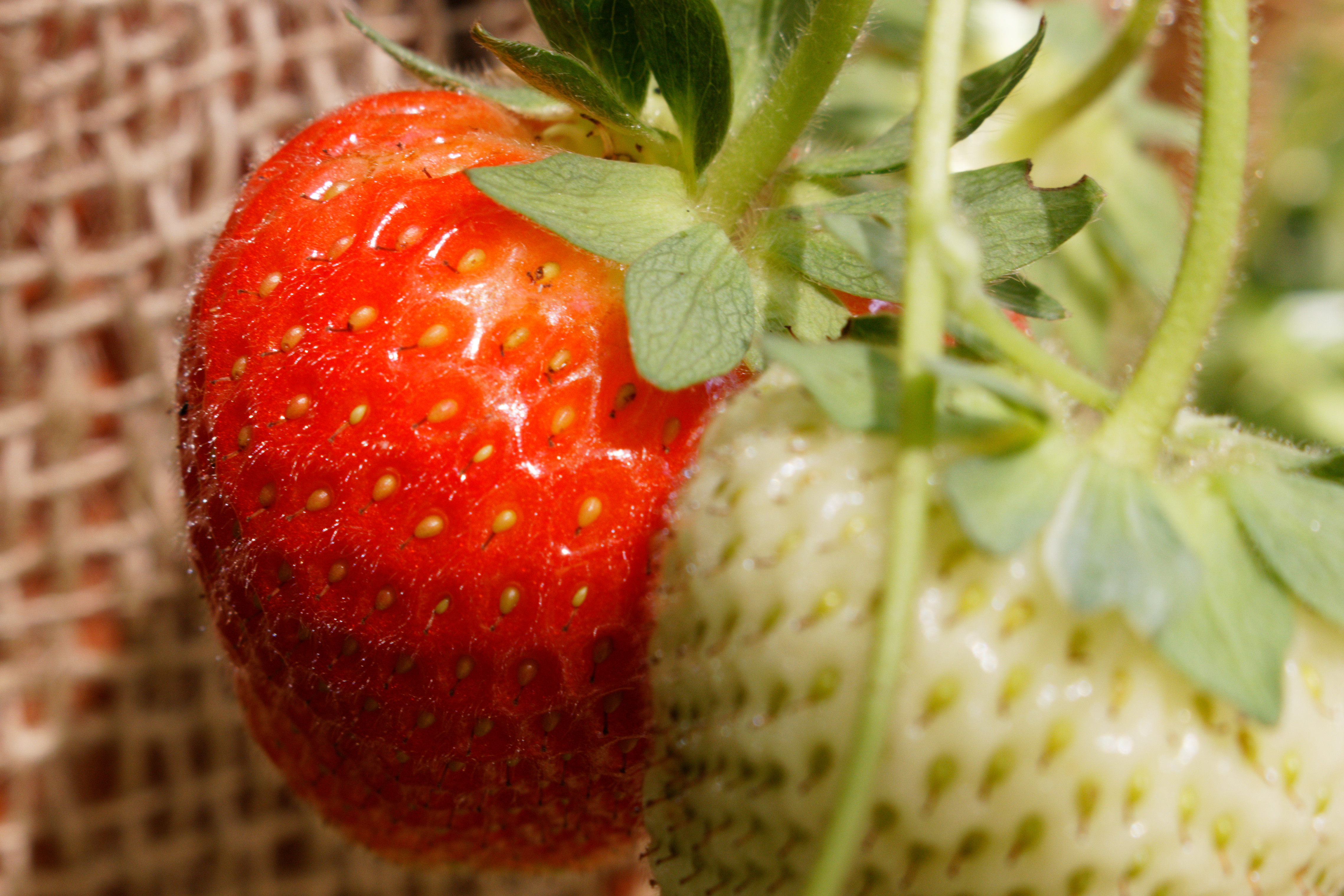
When I set the slider to 0 though the result looks much better in sRGB and even better in AdobeRGB. For the example below the difference in AdobeRGB is quite subtle. I had other pictures with much bigger differences in the reds and yellows.
The consequence for me is: I will set the “Protect saturated colors” slider to 0 in my presets. I haven’t seen a picture yet where it improves the result.
For the example picture I removed all other corrections and used only the color rendering at default with or without “Protect saturated colors”.
Unfortunately the upload destroys the color profile, so AdobeRGB pictures can’t be used.
#1 - With Protect Saturated Colors=40 (default magic wand), sRGB
I find it to be very camera-dependent as well as a matter of personal preference. When developing RAW from my Panasonic GX85, I usually like the default rendering very much. When developing RAW from my Olympus 16MP cameras, reds and yellows are often oversaturated, with yellow benefitting from a slight shift toward green. (FWIW, Adobe’s color profiles are different but not more correct in PhotoLab.) I typically set “Protect saturated colors” to 80 in this case and might also adjust the hue of yellow in HSL. Or I’ll simply select a color rendering other than generic/factory default and go from there. So far, I haven’t found a single rendering that is suitable for all Olympus images.
Personally, I prefer your sample #1 to sample #2 and would make a slight adjustment to the hue of red before increasing saturation. Maybe it looks better in Adobe RGB, though.
Thank you, Greg. I agree, there is no right or wrong, but rather a matter of taste. I use a Canon EOS 77D and nearly all times the colors produced by PL look great to me. Only now that I want to experiment with very saturated colors I see additional ways on how to influence the result.
Personally I overlooked the color rendering tool so far (unless for B/W conversion or similar) and didn’t think about those subtle changes, especially with the protection slider. Also I didn’t use the HSL tool a lot until recently because it sometimes has surprising effects and my screens weren’t really up to this task.
I tried to change the hue of red and you are right, the result is more pleasing when starting from image #1.