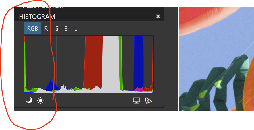
This area is where the oog colors occuren. A saturated red with oog colors has these oog colors due to the colors on the left side of the histogram. The bigger the difference in gamut, the bigger the difference in result.
Look at my former diagram. With sp is on the histogram and image are based on that sp-layer. The less difference between the used gamuts, the less difference between the images.
On a wide gamut screen you will see less differences.
Thanks for some more insight.
( had not watched the histogram so closely )
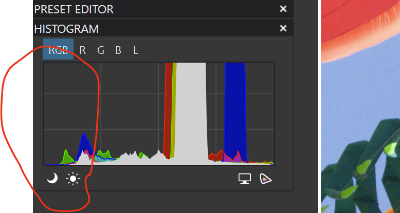
When toggling SP → sRGB on/off, I also could see a clear difference in the preview.
[ btw, to change the monitor’s colour space from AdobeRGB to sRGB, I choose one of the custom calibrated profiles and restart PL to ‘pick up’ … ]
Playing w/ available (and imported) SP profiles and Destination gamut warning on showed, that
SP is independent from not related to the monitor colour gamut, → which allows to work on a out-of-gamut pic (like the one in question) on a sRGB capable screen and export to the wider colour space, while of course the screen’s rendition limits what one sees.
Try your monitor icc profile. Then you will see no differences. Look at my diagram again.
In this photo of @Joanna it is said that the saturated colors cause an oog situation. I don’t know if you or the others know what saturation means. I must confess it’s new to me too. Saturation is the ratio between the dominant color and the other two colors. The bigger the difference between these, the more staturated the dominant color. But that also means that the other two colors are getting oog since the oog colors are on the lower side of the gamut.
Search for the formula of saturation.