What are the advantages of a wide gamut color space like Rec. 2020, over Adobe RGB?
Why use Rec. 2020 (made for the TV industry) or something very similar, and not the even larger ProPhoto RGB (made for the Photo industry)?
If DxO designed its own color space that is close but not identical to Rec. 2020, why not use that standard instead of a custom color space? Or, reversing that question: are there practical advantages in using standard color spaces like Rec. 2020 or ProPhoto RGB for PhotoLab’s internal calculations and exporting?
m-photo
( Marc (macOS Sonoma on MBP16" Intel))
72
To make it simple, DxO probably did sum up all it’s cameras sensors knowledge acquired over the years by it’s well known profiles into this new Wide gamut colour space.
In a nutshell: all sensor information from all the cameras DxO ever tested is inside this colour space. Whereas using a different colour space would already “truncate” some colour information when opening a raw file.
Disclaimer: not an engineer working with light. I’ve watched lectures on digital photography such as this one but all the math flies above my head, I just understand the analogies and the graphs. ^^
I’m not sure it’s that related to sensors. Sensor pixels measure an electrical signal produced by accumulating photons, and use a color filter array (with the most common patterns being a Bayer pattern with 1 “blue” filter, 1 “red” filter and 2 “green” filters). Then you have to analyze the value for a single pattern and try to figure out what its “blue” or “red” or “green” filtering means exactly, do some averages to produce a RGB color for each pixel, do some edge detection to avoid color artifacts from averages that use color data from a neighboring but different surface, etc.
I’m not sure how all that maps into color spaces, but I think you kinda have to decide on a target color space and map all the raw sensor data unto that color space; and every raw interpreting and demosaicing software — whether an external one like DxO PhotoLab or PureRaw, or the camera’s firmware — does whatever it wants here.
The color mapping algorithm used is probably different for each camera, and software publishers like DxO, Adobe and Phase One probably look at what the in-camera firmware does and compares the output of their own algorithm to the output of the camera’s firmware’s JPEGs to fine-tune their color mapping.
Ultimately I reckon that deciding to map to sRGB, to Adobe RGB, to ProPhoto RGB or something else is an arbitrary decision, and the target color space is picked not because of the input sensor data but because of other advantages, such as:
ability to represent more colors than sRGB can (which is only useful if your screen or print output is going to be able to render at least some of those colors);
when producing an JPEG or TIFF, if you’re going to need to map the image’s colors to a specific color space, it’s better to work in a large color space and map down to a smaller one like Adobe RGB or sRGB, than to work in a small space like sRGB and have to map that data to a wider space (kinda like resizing an image down gives better results than resizing an image up);
working in a larger color space might make some color manipulations a bit more accurate? (not sure about that).
Personally, I wonder if working with the larger color space is going to help for images with saturated colored highlights, like sunsets (especially close to the sun) and stage lights. Working with sRGB usually means that those colors get squished near the edges of the sRGB triangle, so you lose a lot of nuance (and if you don’t squish them near the edges they get muddy). Adobe RGB is a bit wider but I guess not wide enough if DxO, Affinity Photo and others are going for wider gamuts.
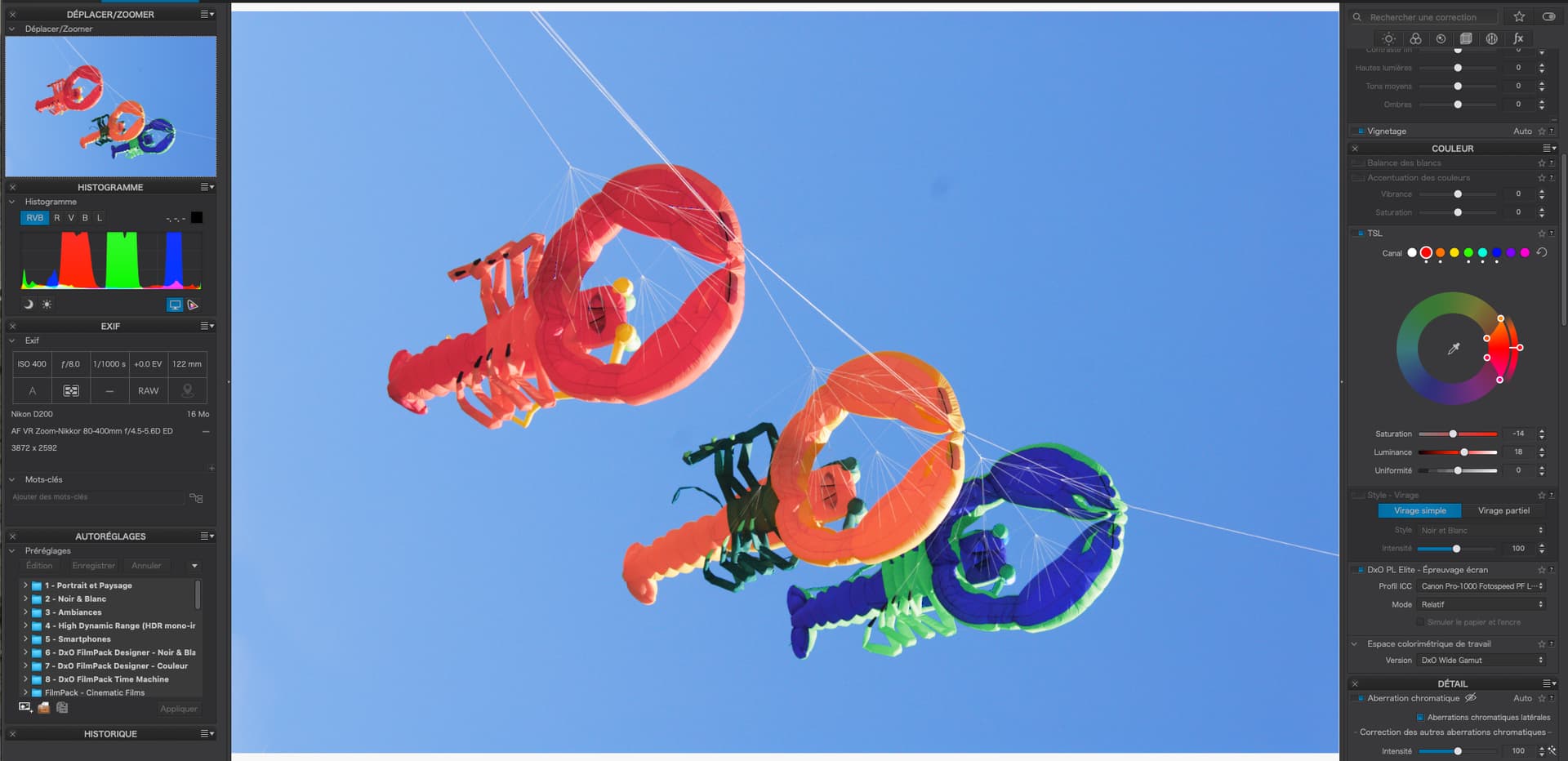
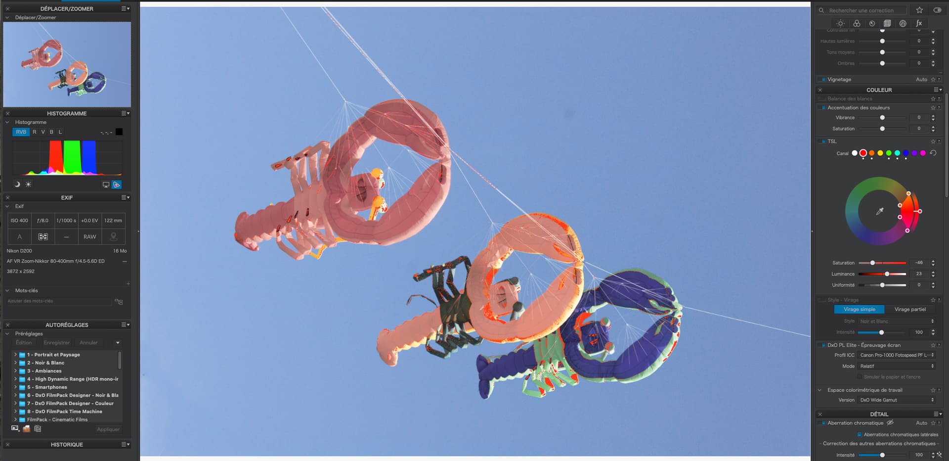
I take it the paper and ink simulation is not yet implemented but I would like to know if the is likely to affect how I get rid of OOG colours using the soft proofing, as in this picture.
Yes, that’s my understanding … I’ve seen this explained as follows;
If you have a sRGB monitor:
In PL5, colors outside AdobeRGB were modified so that they can fit in the AdobeRGB color space. Then, when converting them to sRGB, it was converting a modified version of the original color.
In PL6, colors outside AdobeRGB will be kept because it now uses the DxOWideGamut. Then, when converting them to sRGB, it converts the real original color (not the modified one).
That was my initial thinking too, George - but the info above encourages me to give it a go.
I have the same question. However I don’t think the OOG tones should be fixed by desaturation because it gives the image a very insipid rendering as you said.
How should these OOG tones be addressed?
Before DPL6, we simply did not know whether we had OOG colours or not. Today and with soft proofing, we know, that what we see on screen is not what’s in the file. We can still print whatever we like - and get slightly different hues depending on which working colour space we use.
We never see the colours as they are recorded in the RAW file. If we’ve been happy with that, we can still be happy now, but if we use a different WCS, we have to adapt. It’s like using a different RAW developer. We (simply) have to re-establish our way from the initial image to the print.
As if to me I mentioned to colour correct locally (talking about saturation), when to enhance texture visibiity. It’s something you decide for the individual pic – perferring brilliant colours, maybe at the cost of (some) oversaturation or less forceful to allow more texture visibility.
The oversaturation warning jumps in as soon ‘there is to report’ – btw, the same in PS.
It’s usefull as an indicator ‘to get noticed about possible problems’ and then I see, what I can or want to do about …
Usually I rely on the softproof for my paper profiles w/ the the paper specifics simulation visible → in PL6 the coming soon “Simulate paper and ink” (let’s see, what PL will bring to us in that regard) and adjust my print version accordingly to what I see on my monitor (for ease of use set to 5900K, 80 cd/m², max contrast 1:500).
Mostly like I do: by ignoring them. It’s good to know that some tones will not be reproduced faithfully when exporting to a smaller color space, and which areas will be affected. With PL5, you had no way of knowing.
And this may lead/entice the user to adopt a wider color space for export. I most often use sRGB for reasons of compatibility with customers/printing services (mostly books). But it’s good to know exactly where the limitations are, and to know how much improvement one could have by changing external printing service/personal inkjet printer/monitor with one that has a wider color space. But otherwise, don’t worry too much about it, and don’t desaturate your images to avoid “soft proofing warnings”: your images will look great even if (like I do!) you usually are forced to export to sRGB. It’s a simple warning that they would look even BETTER (and only in some very specific areas, shown by the blinkies, mind you) if you were able to export/print to a wider gamut.
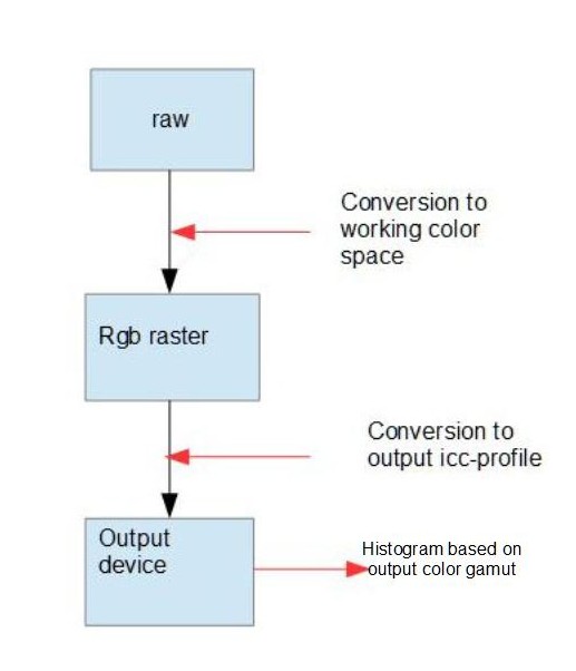
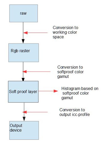
The main track leads from the Source Image to Live Screen output
Items in blue are more or less under control of DPL
Colour conversions take place in three places
C1a → colour conversion when the source file is copied to the latent image
C2a → colour conversion depending on WCS and Softproofing settings
P2a → display profile (calibration and native) DPL might know about it
The second track leads from the source image to the Target Image file
green dot → CM info based on export options
The third track corresponds to directly printing with DPL.
Histograms
I suppose that we can see histograms of target image, the direct print image and live screen image. Which histogram is displayed depends on how we set soft proofing
I suppose that what’s shown in the histogram is derived from the latent image, modified by softproofing settings…which means that the arrows pointing to the histograms are showing what the histogram represents rather than the actual data flow.
As of now DPL can not show the source histogram directly.
If by “output device” you mean the monitor being used when you’re working within PL (and you don’t mean the exported target file) then there’s a step missing for when SP=ON
there’s an additional (“hidden”) process included in your “Conversion to output ICC-Profile” step.
it’s an algorithm designed to “Protect Saturated Colors” in the conversion from W-G to the target ICC-Profile. Obviously, the “strength” (my term) of this alogorithm is specific to the target’s ICC-Profile.
This additional algorithm is applied when SP=ON - and when actually exporting to an external target.