ET as you call it has one unique tool. The local adj. List. That’s why i personalised the tool palettes.
And stil i would like a few changes.
1 in preference a checkbox to activate a connection between the icons on the topbar and the according tool in the pallete to open and close simultanisly. Even better if it’s appearing above the ET palette and disapear after closing. Kind of monomode.
This can leave the pallete’s as it is except for the click to close/open tools and doubleclick to collapse/expand.
Second : the floating action wil mount back to it’s original place and histgram window in floating modes size adjustable to make it bigger if i want.
It’s a mistake that I have pointed out.
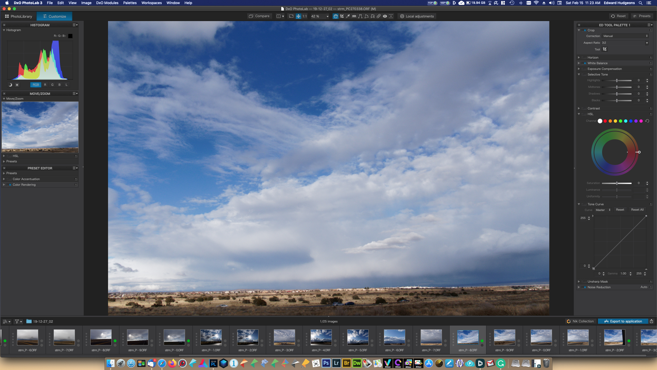
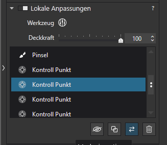
The Essential Tools palette is a extract for the master tools.
Each tool must be in a specialised palette.
Pascal
[quote=“geno, post:49, topic:11800”]
For me, as I found out that the ET palette is not always sufficient…but I have to leave it open to have access to the local adjustments.[/quote]
I’m not sure I understand this. I don’t even use the Essential Tools palette and I have no problem accessing Local Adjustments. What I am missing ?
This is what mine sort of looks like. It starts this way, but gets change almost everytime I use it. I have the HSL on both sides because I find it expanded state knocks other things below off screen. So I put it on both sides thinking I will remove one side or the other, and for some reason, that hasn’t happened. Enjoy. Cheers!
Just a question:
What is the main reason that made you create a custom palette (“ED TOOL PALETTE1”)? Just having the tools you use the most? Getting rid of duplicated tools (like Exposure Compensation or Selective Tone which are both available in the “Essential Tools” as well as in the “Light” palettes (by default).
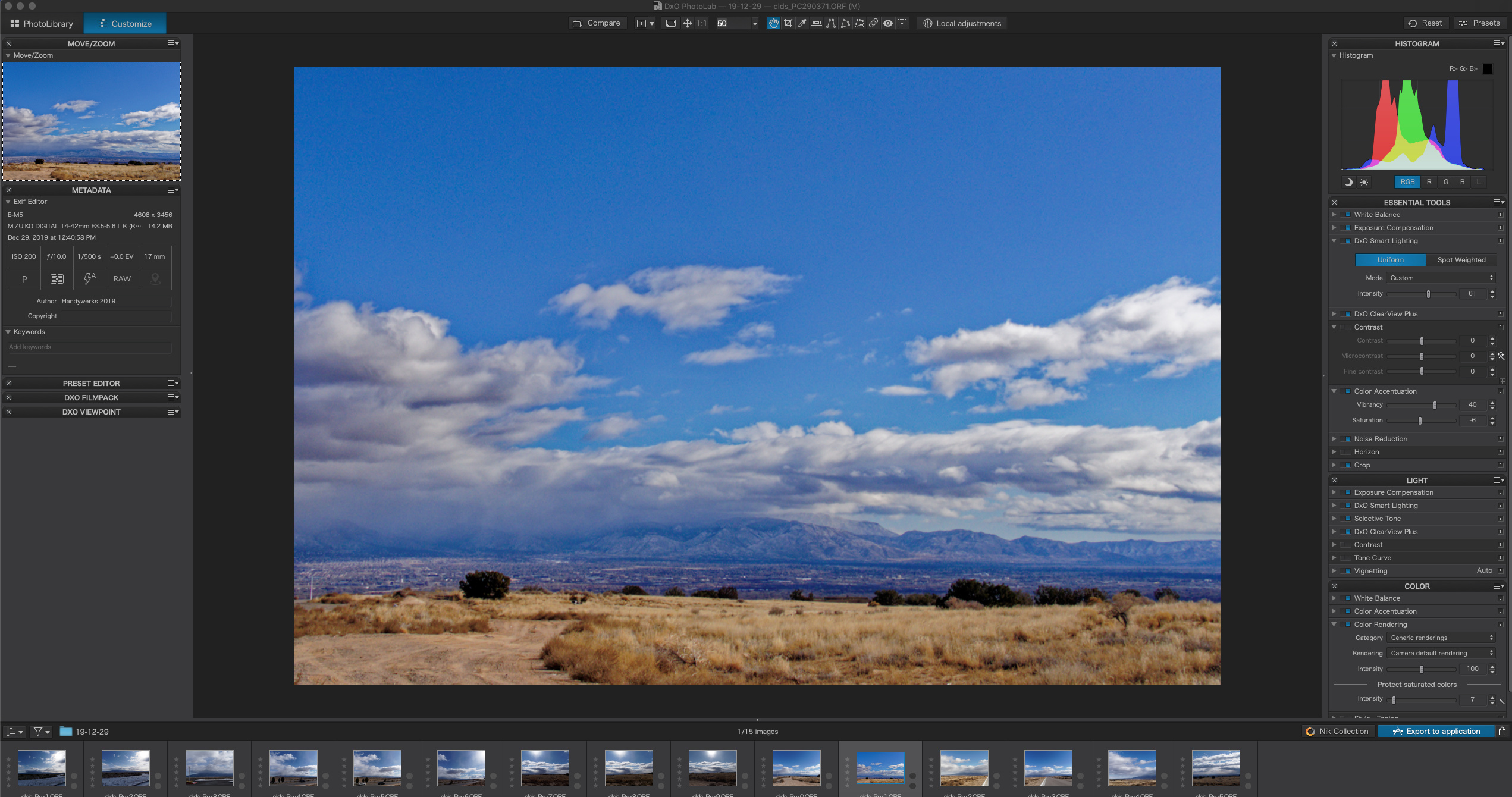
I will chip in. I always use a custom tool palette so that I can have the tools I USE, where I want them. Allows optimisation of whatever monitor space you have.
One of the great strengths of DXO and C1 Pro which is my other raw converter. One of the criticisms I have seen on photo forums of DXO is that they “don’t like the cluttered UI” . Obviously when just doing a quick test of alternative software they miss the customisable options possibly because they don’t exist on their current software eg LR.
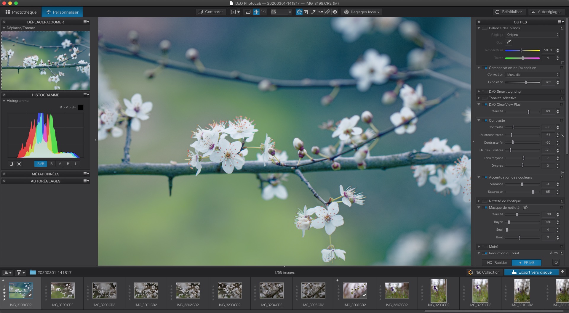
I haven’t been around for a while, but to answer the question, I made the workspace so it would pop up new work the same way every time. Convenience mostly. You may not see much in the difference of tools, etc., but that is an on-going task till I find just exactly what my workflow is. I do this on all my apps. It also saves the default from gettig corrupted. I hope that tells you what you wanted. Cheers!
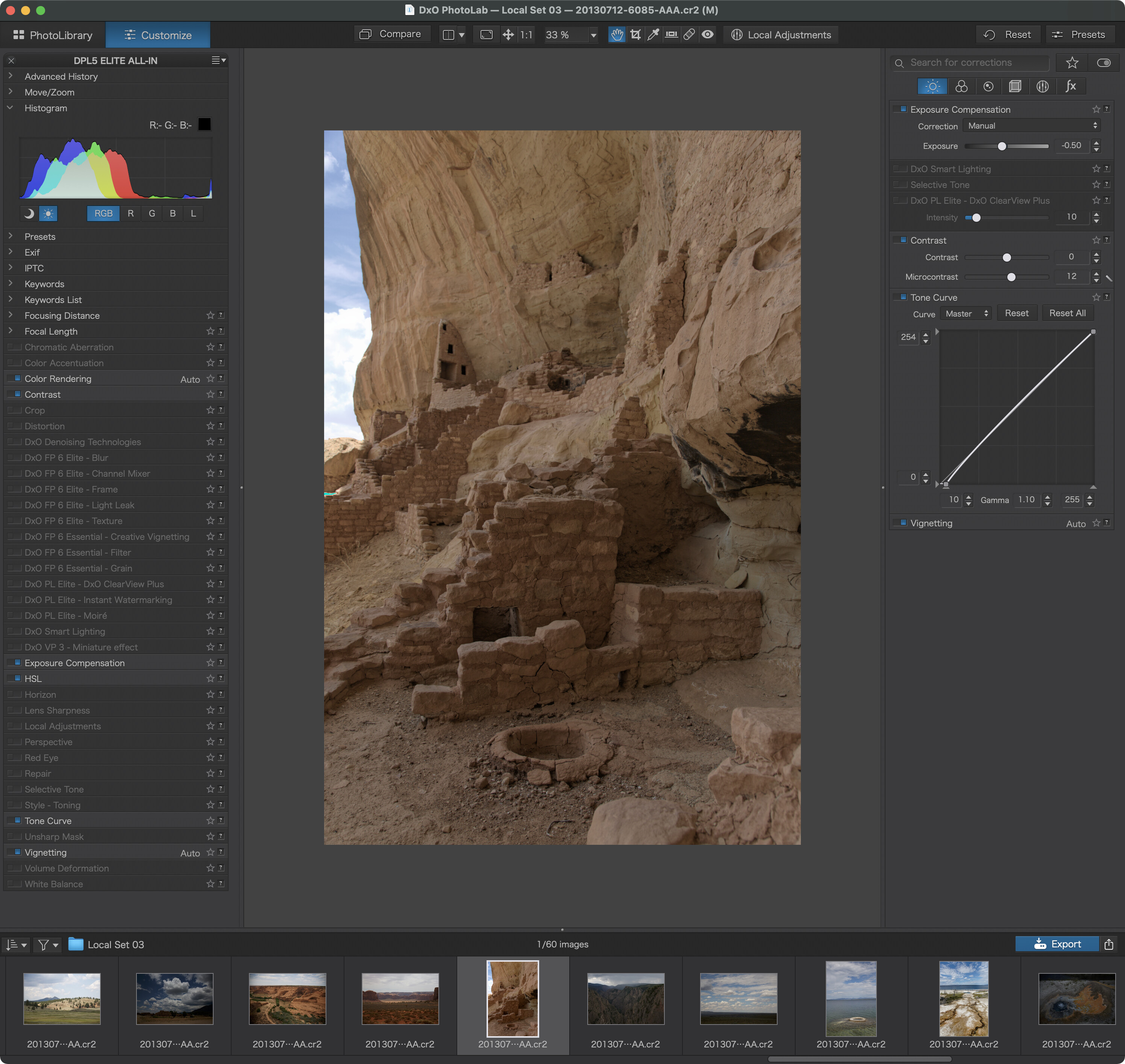
While the test was about what is shown in a DPL Elite trial without FP and VP, I found this configuration to be quite informative and easy to use without much scrolling…on a 27in 5K screen
Left Sidebar with a meta-view on tools
One palette with all the tools that can be loaded
All tools collapsed except for the histogram
One glance shows all active tools
Right Sidebar for tools at work
adjust image with tools according to the selectors at the upper end of the sidebar
No need to scroll
Not all tools available though - unless the selector switches could be customised
→ Feature request, vote!
 )
)