Hello,
I use DXO Photolab 4. When i want to apply a manual white balance with the pipette item, do i select a white colored area in the picture or a neutral grey one?
Best regards
Hello,
I use DXO Photolab 4. When i want to apply a manual white balance with the pipette item, do i select a white colored area in the picture or a neutral grey one?
Best regards
As long as you didn’t use a grey card it’s always a gamble. Usual a grey colored area is more effective, but sometime also a white colored. Just look at the result.
In my opinion as long as you don’t shoot paintings it’s more a matter of preference.
George
Thank you for your answer, although it sounds a bit weird to me. I mean it’s called “white” balance, so I assume i should pic a white area. But on several webpages i read that you should pic a neutral grey (cant remember the exact value). My goal is to have the colors “as they were” in the scene, and not to make it cold or warm, etc.
Using a white surface is possible as long as the white is not burned.That’s why I prefer to use a grey surface which will give me more reliable results. And if you are not happy with the result, you can look for another point in the image
Theoretical you can use any kind of gray, meaning equal values for R,G and B. That includes black and white. But as Dominique wrote, using something in the middle is best.
White is called white balance for it’s dealing with a correction of the colors due to non-white illumination so that white is white. Sometime you don’t want this like shooting sun rise or sun set.
Within limits it’s a personal taste.
A grey card has a color value of 127,127,127, well it should have. Shooting a grey card and viewing that card on the pc you can see the values of the grey card in your picture. When using the white balance picker these colors are averaged and so the whole image is corrected.
George
As always it depends on your needs.
If you want the most exact color reproduction you need a grey card with an untainted grey as mentioned before.
Often it is more than enough to have a “90%+x solution” and than you could pick any grey or unburned white in the picture. Sometimes it is a try and error situation - best done with a well calibrated monitor, of course. A good starting point for ex. is the white in the eye or any teeth.
I had once the situation to take photos from the Namib out of a plane with slightly greenish windows. Luckily the plane was white and I had one grey rock in one picture. Worked marvelous.
Holla
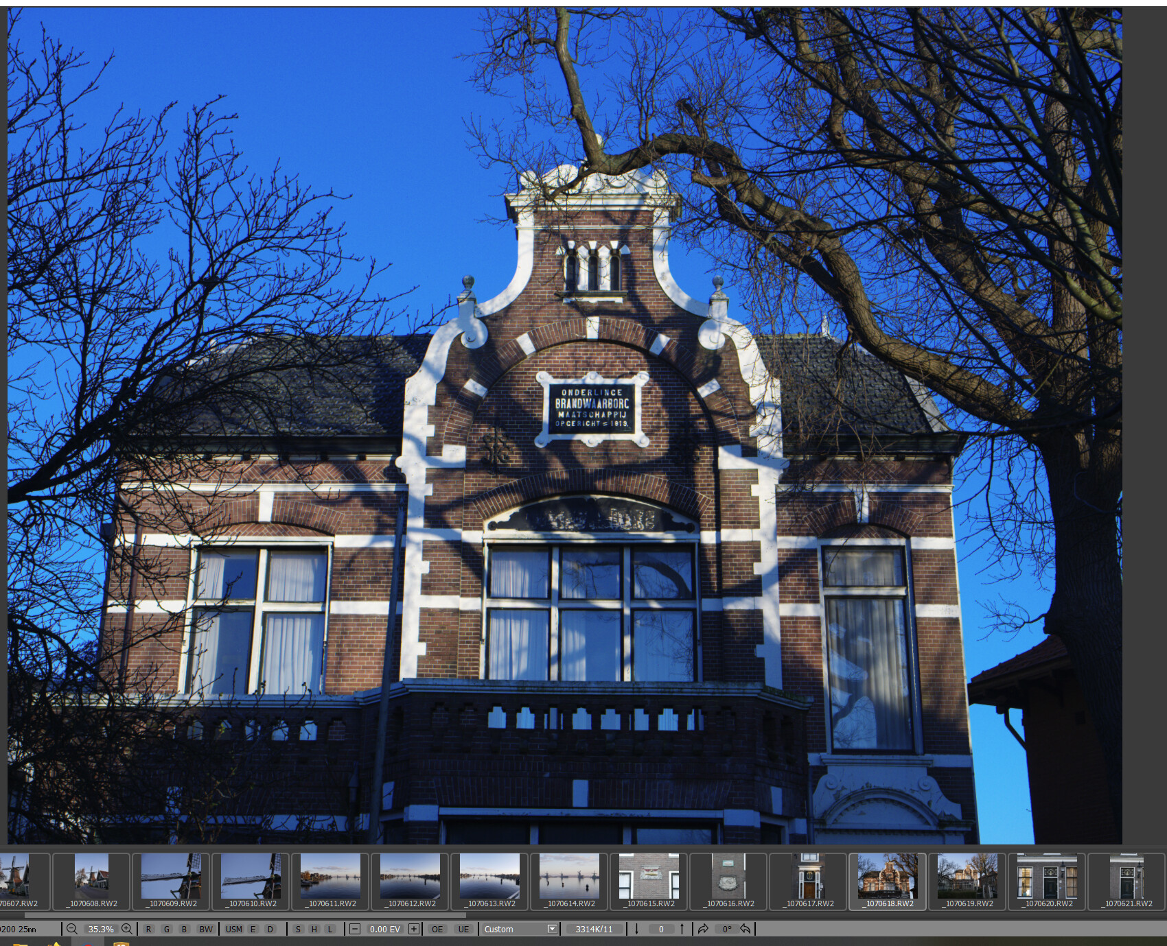
The trouble with picking grey is that it’s difficult to judge what is actually a neutral grey in many shots. I find it much easier to locate items which I know will be either pure white or very close to it. Signs, t-shirts, buildings, clouds, snow are common ones. You just have to check first that it’s not 255,255,255 under the pipette indicating a possibly blown hightlight.
Yes but @George 's comment is very true. Unles you setup a colorcard is always a gamble. Most camera’s are good enough to do a accurate gues. But it remains a gues.
Lots of things can change you mental view in the raw file.
Color reflection, casting by buildings, thermoglass is a welknown colorcaster. The glass is often tinted to ave better specs for the purpose , double surface breakingsindex.
Light shine through in fabrics. You can fill in lot more of this color changes.
Our brain can correct a lot of those, say you wear a yellow tinted sunglasses for few hours the world would be not looking more yellow then normal but some colors be just a bit more brighter then wearing a greyglass.
What i try to write is even your mental view of the scene is a gues of your brains.
That pointed out. A good WB is a “normal look” for the time of day.
Early morning would look more blueiscb. And if you correct that look the time stamp is gone
A golden hour is yellow amber redisch depending on the time of year and sundown and polution in the air.
The time between is between blue and red depending on clouds, ground surface color reflecting on the clouds…
When you use such a colorcard and you click on grey or white, all the “mood” is out the image.
So the answer is, pick white shirts, roadstrips,clouds, al things which would be white in “normal” classic daylight. And then warm up or cooldown accoording to the time of day.
Use a large zoom in to see if the spot is monocolor. Change eyedropper circle in size click a few time’s on the same spot. That would help to pinpoint the “right” WB
What also is a good correction tool is the use of a Automatic “natural” WB tool which scans the image and try’s to identify the common unified color, this would be the color of the light and it correct that to “white”.
DxOPL lacks such a tool unfortunaly.
Indeed. I’ve been using it to correct night-sky shots by using an area that should be black (I’ll usually zoom to 400% to make sure I’m between celestial objects).
Yes, I know that any long exposures of the night sky will normally have some “sky glow”. I’ve just have a preference for night skies that are black, as we’d experience with the mark-1 eyeball.
Agreed - but if you’re shooting in raw, you can let your camera do the work: shoot in AWB, and then, once in PL, you can get what the camera calculated by using “as shot”. If you’re using a custom WB so as to get more truthful histograms in raw, you’ll have to choose between the two.
yes i agree with you, i did a test in shooting for 5600k locked. (some people said that catches the light better, then you get the “lightcolor which is present at the time”) so sundown is red orange and bluelight is blue light. and if not nice change it to “camera auto WB” or use the picker
ended up with more “work” (your brain is correcting most of those light wile looking so the image looks “wierd”. Back to camera auto WB. much easier for most of the times.
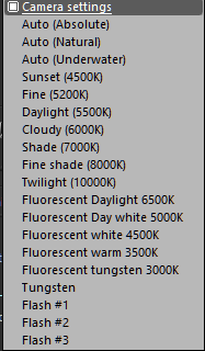
shooting sunsets or late afternoons warm light or the blue light in the evening or early morning then a 5600k fixed setting can help to remember the colors when home and use that as starting point. but i just place 5600k in the box and i have the same. So unless you shoot jpeg don’t bother to preset WB makes life much easier… 
When i have a strange WB outcome i use FRV’s WB Auto and Silkypix auto absolute and auto natural wb modes to get a sense of the temperature and tint which would be “normal”.
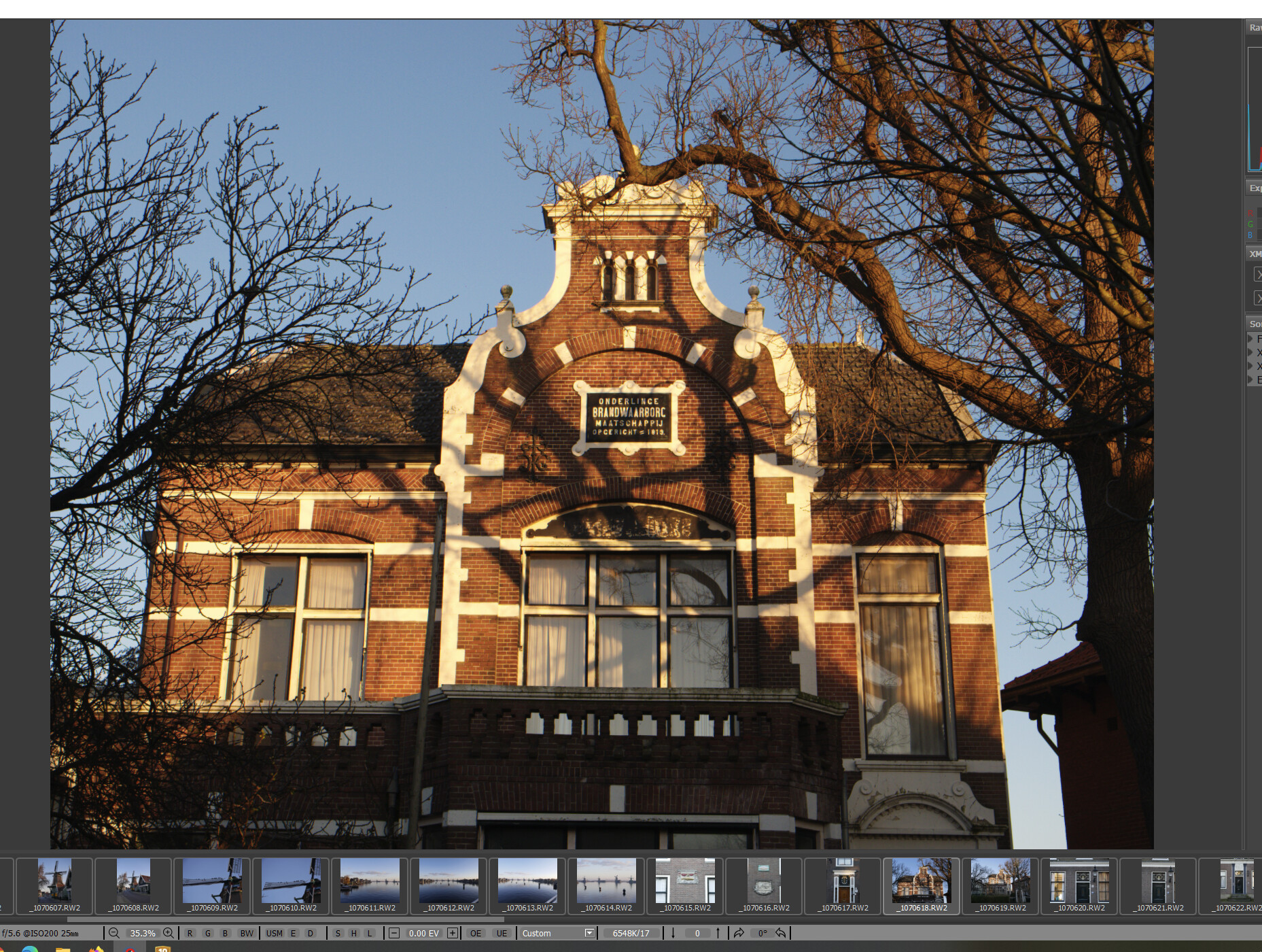
morning sun:
As Shot, it does a very good job getting the warm glow on the walls.
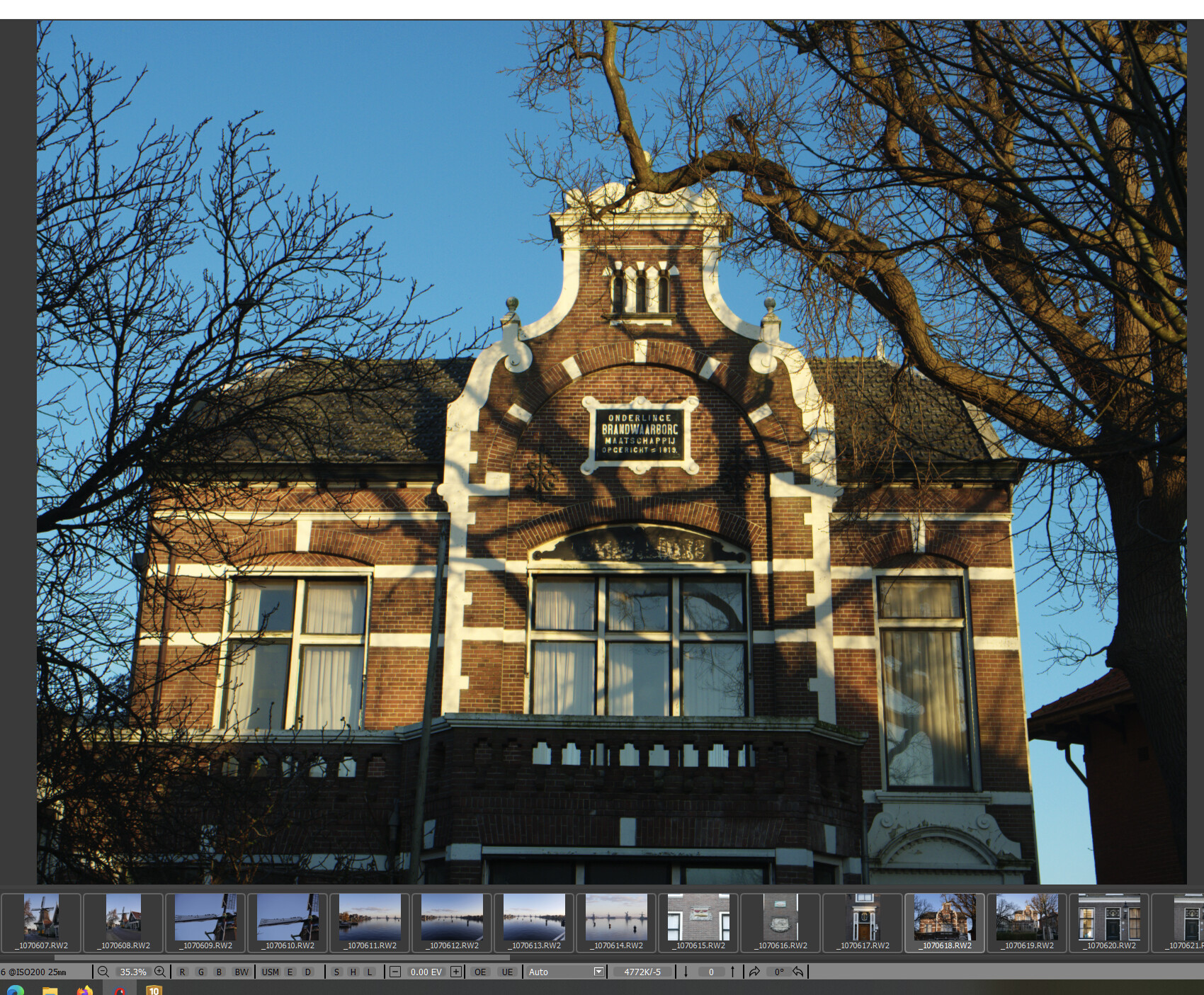
use white of the paint color picking:
As above shown a colorpicker isn’t alsways your lifeline.
auto modes does a clean job as it does a form of “average” and it steers towards a “dull” daylight like wb.
Auto Natural does end up in 6044k/2
wile auto in FRV does end up in 4772k/-5 so they both go different directions from the camera’s choice.
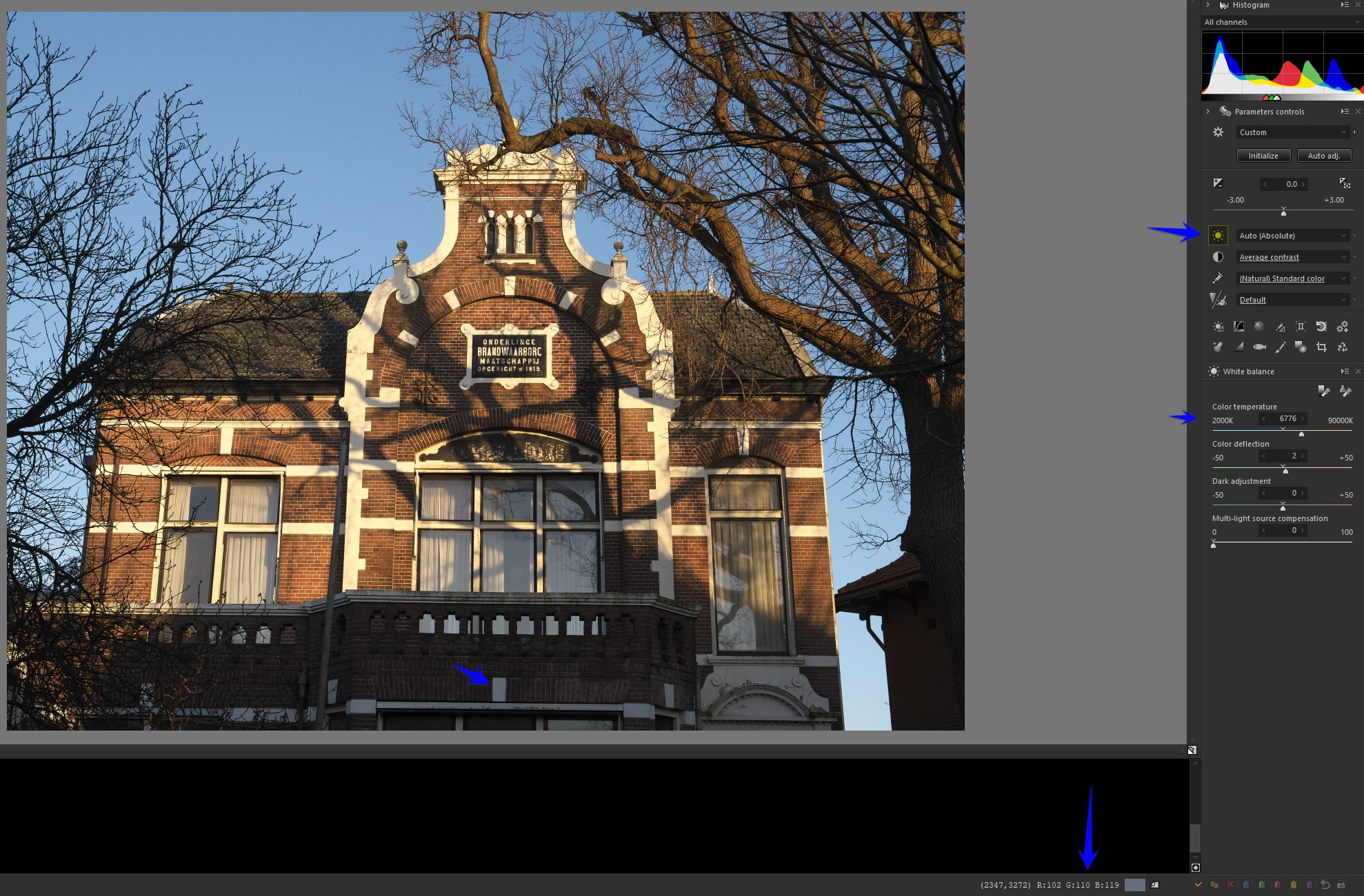
5103k/21 which DxOPL has as as shot 5679k/11 sp sees as shot 5969k/5
Well, accurate white balance? right out the window without a certified color card/greycard placed on the right spot. (not in the shadow wile the prime interest is in the sun and visa versa)
it’s always a gues and personal idea of whats correct.
(don’t forget your screen and screen driver icc bring it to this.)
So that said and written i still would like a more expended detailed list of WB choices in DxOPL.
how easy can it be?
Haha - Yes, that’s been my conclusion too !
John
Almost always I have set my camera to Auto WB with very few exceptions like sunset or copying. And for just in case there is a Mini ColorChecker in my photobag – what to pick … see aforesaid.
have fun, Wolfgang
Well, actually colors are a physical and individually perceived phenomenon depending on many many factors of influence. If you want perfection on this matter e.g. for paintings reproduction you need to use professional equipment, work end to end with Adobe RGB coolorspace and ideally have studied this in a University for many years.
If not there are many good proposals being given here already. 15% grey is optimal, white works also fine.
It was many years ago I learned digital colour basics on a BBC Microcomputer, where binary digits related directly to each of the red, blue, and green phosphor guns. Red + green = yellow did my head in for a while but I learned it. Then I moved up to higher bit depth colour, all the way to 24 bit, and I can still, usually, imagine roughly the colour that will be produced by a hex number, or guess at a hex number close to the colour I want.
Then came a tenuous understanding of CMYK for printing (via my brother, a graphic designer). Then came “wide colour space” like the P3 that Apple displays now have. Then slowly came an appreciation of just how limited camera sensors are compared to the human eye, as a result of trying to make sense of scenes that looked nothing like what I remembered and I could not close the gap.
And then I read this, which blows away the very foundation I started with. Colour is a science, but our perception of it is on a whole different plane of existence…
IMHO the issue breaks into two parts, technical and aesthetic.
It’s been a very long time since the last time I saw an (at least near) pro-sumer level display with color calibration. The best I can do is rely on my 20-whatever inch display’s colors, leavened with a sense of how close that is compared to what’ll come out of my Epson XP15000 printer. Very much “loosey goosey”, and hardly well calibrated, but there it is.
Aesthetically, I have no qualms about warming up colors, or cooling them off, to taste. It’s part of the process of producing an image that’s at least acceptable, if not pleasing. Balancing to getting a bit of gray to 127,127,127 and, one hopes, dragging everything else into conformance with that, is all well and good. I think more about “does this fit what I want to see here”.
The only area where all of this falls apart is archival work. There, getting the balance accurate Really Matters. I’ve got no suggestions about managing that.
Many thanks, informative and fun 
Richard, not much to add actually, you can of course do whatever you like with your equipment and as long as your pictures are to taste for your eyes everything is fine. But do not expect your pictures to look or to print the same as before from the day on you got a new monitor or printer. In this case you could of course adjust those to present your pictures as the ones before but this will let you end up in a total mess… And do not forget that even calibration gets outdated and inks are changing and whatever…
And nobody here but yourself can answer your question “does this fit what I want to see here”.
No surprise in anything you say. Without a reliable standard, it’s all by guess and by gosh. For anyone with less than a corporately backed budget, calibration remains in the eye of the beholder.
The technophile in me wishes it were otherwise, while the rest of me goes back to twiddling controls, and dumping gallons of ink on tons of paper, in hopes of finding what I really had mind.
Richard, get yourself a used Datacolor Spyder5 or x- pro for maybe 50 bucks at ebay and you‘re done for the monitor. No idea fo printing but your Epson should do well.