I’ve been processing a bunch of photos and making good use of the watermarking function in PhotoLab. I can always get it to do what I want, which is great. I love being able to tweak individual photos’ watermarks to suit their specific needs before doing a bulk export.
But… there are a few things I have to manually deal with and it would be nice if some enhancements could be made to address these. Also, while creating the screenshots below I uncovered a good old fashioned bug!
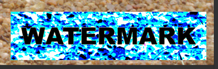
To start off, I created a simple 400x100 pixel block image for a watermark. This makes it easy to see what’s happening.

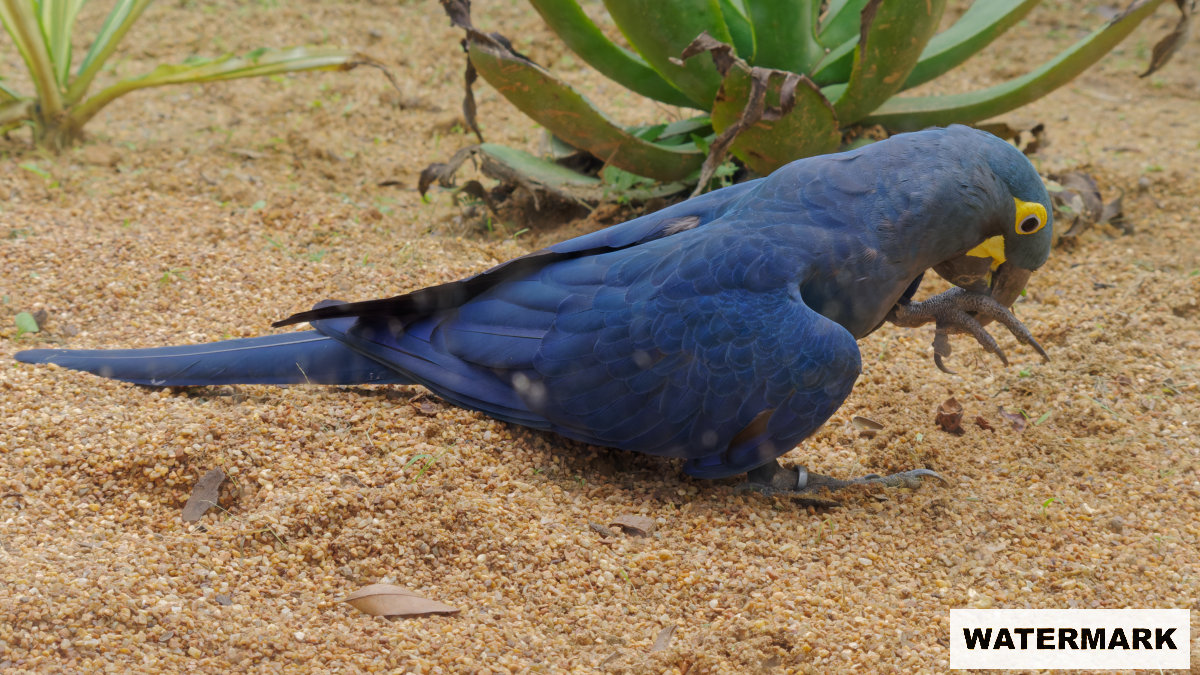
I then chose three images — landscape, square, and portrait — to illustrate what happens when the same watermark settings are applied.
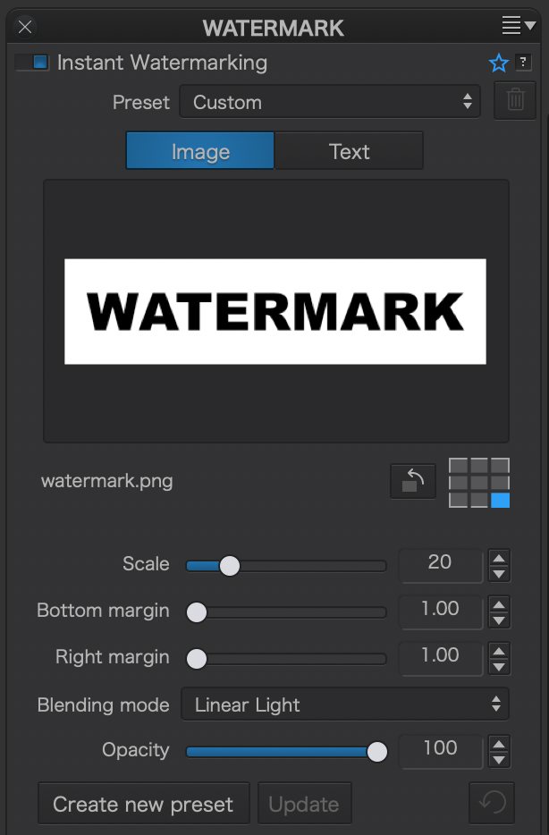
The actual opacity I used was less than 100 due to the bug I found. More on that in a bit. Say hello to the parrots of Jurong Bird Park, Singapore.
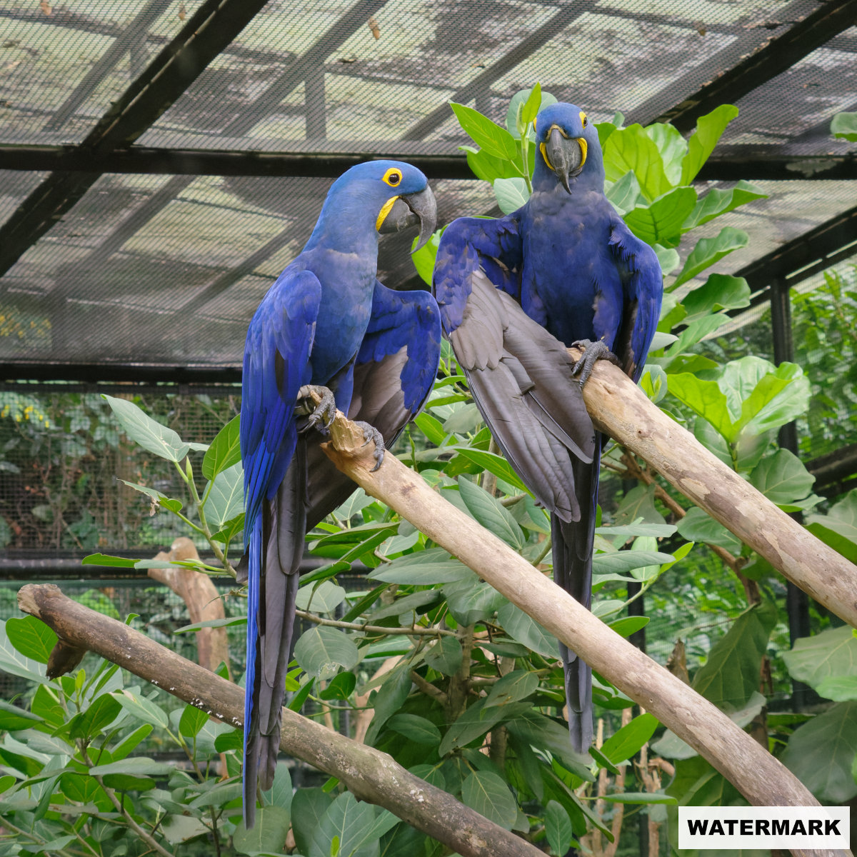
Note that on the landscape image, the watermark is clearly further away from the right edge than the bottom and likewise on the portrait image it is further away from the bottom than the right. I assume the offset is calculated based on the relevant dimension. I believe it should be calculated on either the shortest or longest dimension.
When it comes to the scale, the watermark is displayed in all cases at 20% of the size of the longest dimension. It would make sense, therefore, that the offset should also be calculated on the longest dimension.
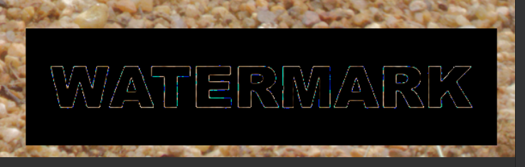
Now for the bug. As the opacity slider approaches 100, the transparency calculation seems to break down. Here it is on that landscape image at 99%
The amount of ‘interference’ seemed to vary based on the image content, but always at 100 it would do this. Note that this bug does not seem to affect the exported image.
Next I have some trouble with the behaviour of the panel itself, and this relates, I think, to the handling of those offsets as already described.
With the panel set as above, if I decide to change which corner I want the watermark in, the scale, opacity, and blending mode are retained, but the offsets go back to zero. I think these should be retained. Most sensible, in my view, would be to maintain the horizontal setting for left/right and the vertical setting for top/bottom. I’m not sure what should happen if it were to be changed from bottom right to bottom and then to bottom left, whether the right/left should be maintained even though neither was required in the interim ‘bottom’ setting.
The next issue is, I think, down to the general behaviour of the sidebar. I have the Watermark panel at the bottom of my sidebar. Because the image view of this panel is taller than the text view (due to the image preview window), if I switch from image to text the sidebar scrolls down a little so there is no empty space below. However if I switch from text to image, the bottom of the panel is now off the screen and I have to scroll to see all the sliders. In the case where the bottom panel is at the bottom of the screen and needs to expand, the scroll position should be adjusted so this is still the case after expansion.
Finally I will mention again here for completeness, the rendering quality of the watermarks. You can see the issue particularly in the landscape image above where the “W” is quite pixellated. Compare to the original watermark image at the top.
With the exception of the last point (render quality) all of this can be worked around, but with a few tweaks I think this panel would be so much better.