For anyone who’s been reading this thread and wondering “what the heck is DPP?” like I did, looks like it’s Canon’s raw development software, full name: Digital Photo Professional.
3 Likes
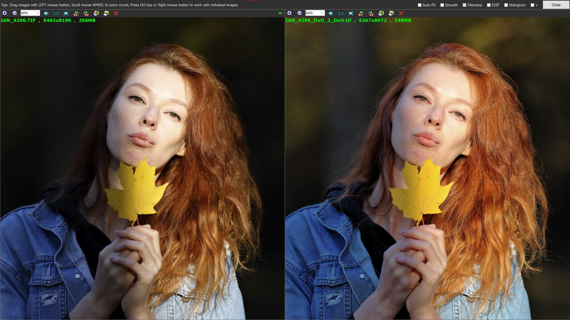
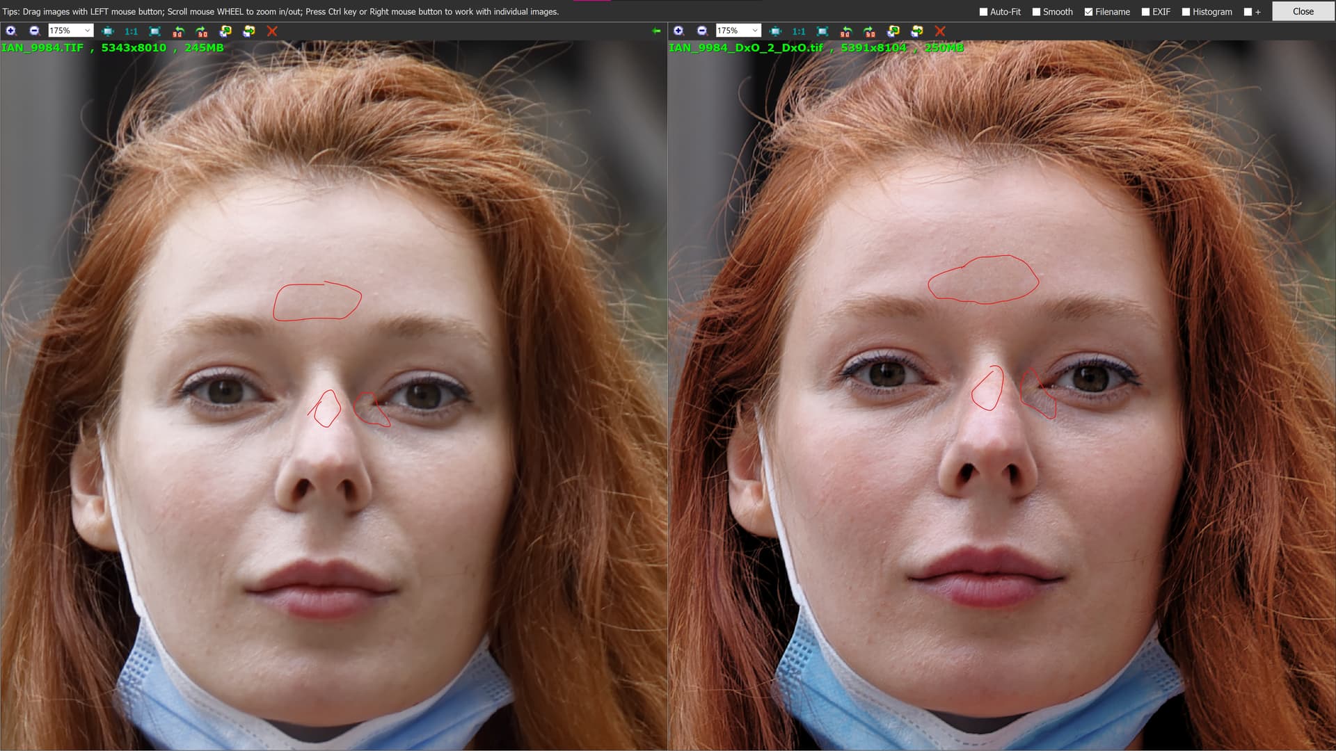
Here is my attempt to restore the lady’s skin tones, as well as brighten the images slightly. I didn’t try to make the two versions identical, I simply processed the photos as I would process my own portraits. The DPP version is more contrasty I toned that down some.
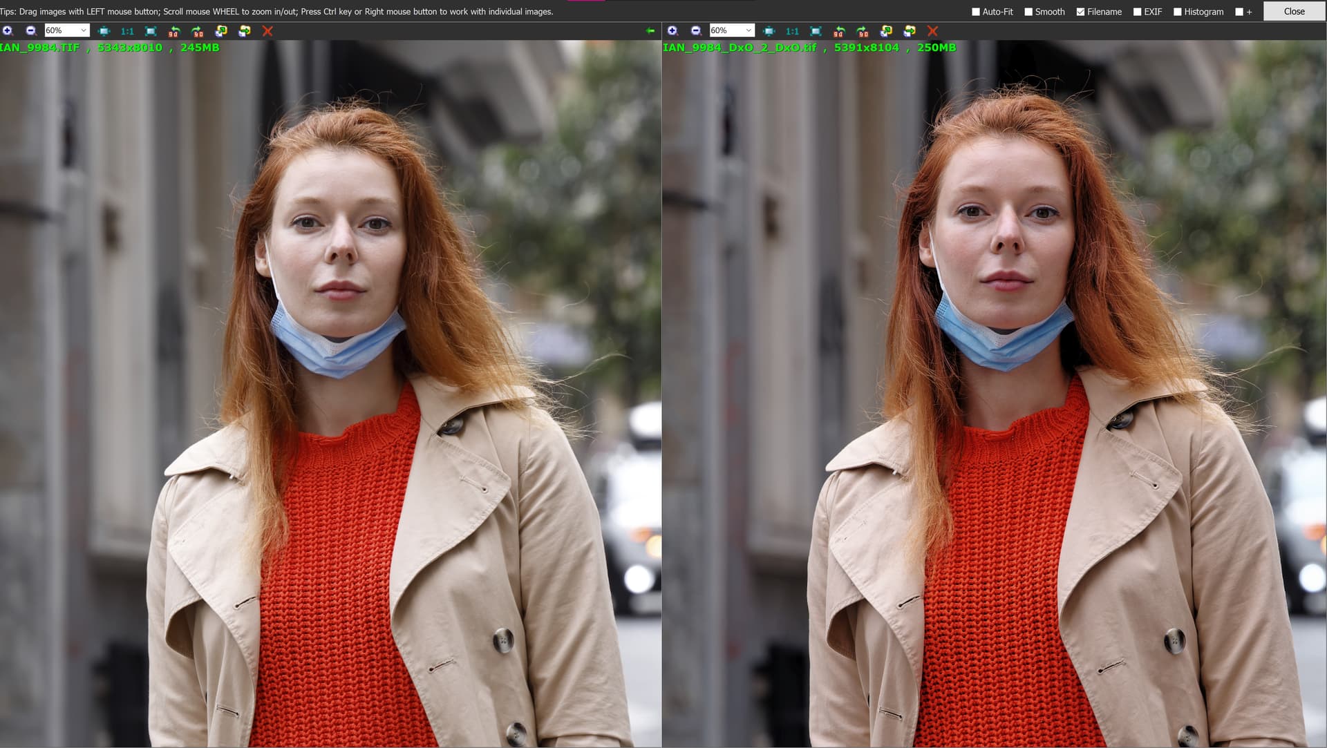
In both screenshots: Default DPP rendering using the camera’s settings on the left and my version of PL6 on the right as viewed in Faststone IV at 60% magnification.
I will say that DPP using the camera’s settings will certainly get you a nice JPG from RAW quicker than PL6 using manual corrections but overall IMO the PL6 rendering is superior.
4 Likes
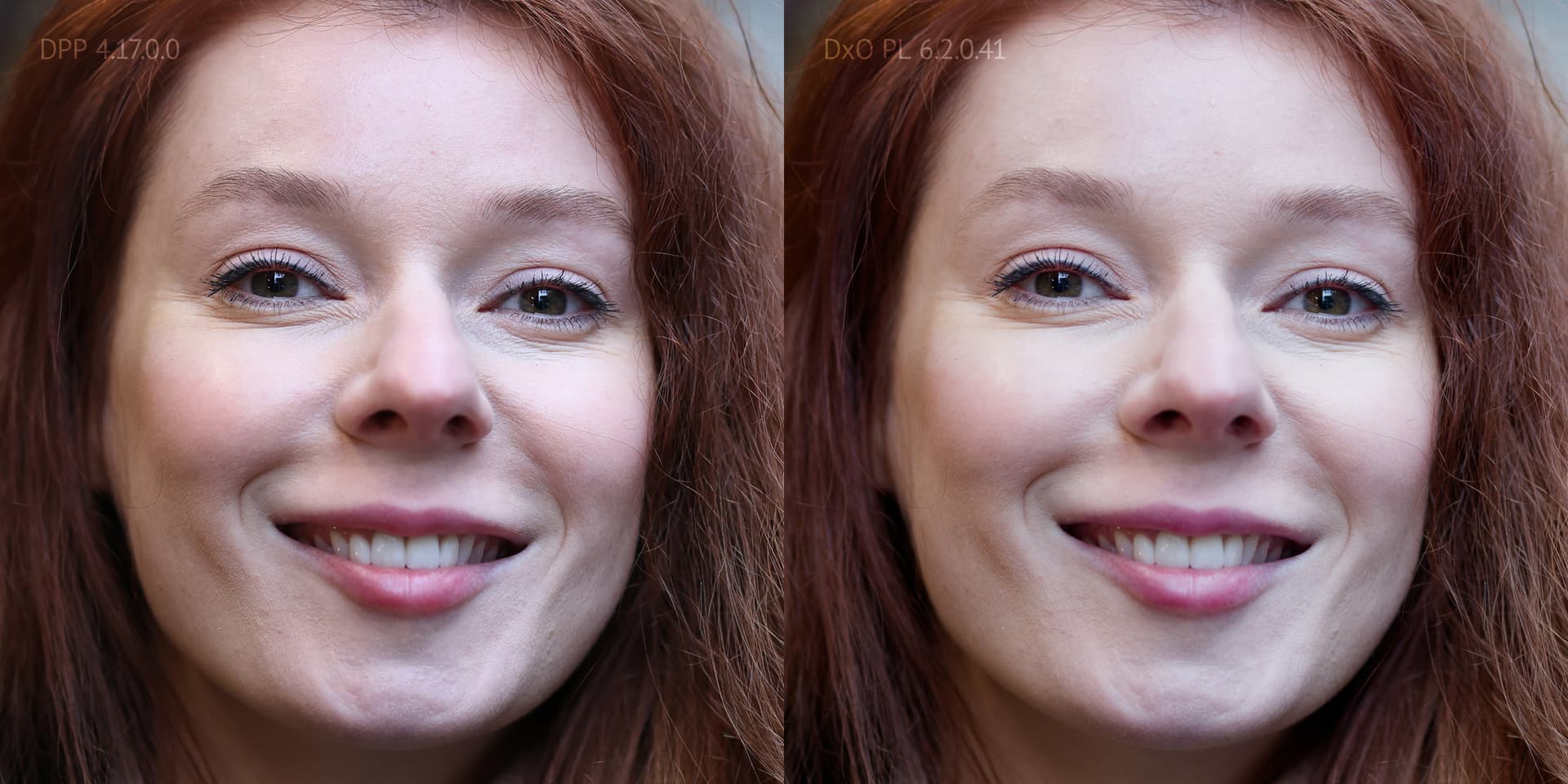
I almost never photograph people/portraits but I find Mark’s conversion with DXO more pleasant. Above all, the woman’s face no longer looks so “unhealthy” to me and the background of the first picture also looks more pleasant in terms of the lighting mood.
It was also important for me that the structure of the jumper was preserved. Above there was an example of a picture where the dark spaces were no longer recognisable as such because they had taken on the reddish colour of the jumper.
Good work Mark
2 Likes
Color tab, first tool :
= toggle between old and new color space.
When an image with a wider gamut is “squeezed” into a smaller gamut, colours change according to how the application handles the squeezing.
Different apps do things differently and that’s why images can look different in other apps.
It would be nice to know precisely how photolab manages color management now (the whole (seenable and hidden) pipeline from raw to screen and to files).
Is there a place to read those informations ?
There is no official statement about it, but a few ideas about how DPL manages colours have been set up down under.
1 Like
I did not make this experience. Mostly the default camera profile from Photolab has higher contrast and is very saturated. Only when you select a neutral color profile, the image becomes a bit flatter.
I tried to get similar results in Photolab to DPP and I agree with @ianzakharov, I can get the overall look of the image to be similar, but there is always less detail in the skin in Photolab compared to DPP. Look at that image. I even reduced the highlights, it still seems that the nose is blown out? But it actually is not, there are just colors missing. Also there is much less detail below the eye and on the chin. This has nothing to do with sharpening, lens sharpness, unsharp mask or other algorithms in other programs will not be able to recover this loss of detail. I reduced the luminance noise reduction to 0, which added a bit of detail, but it still seems that the Photolab algorithm is blurring the details. Using DeepPrime helped a tiny bit, but the problems did not disappear.
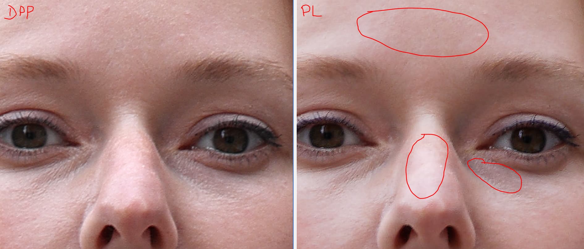
Can anyone try to recreate the same skin details please? Everyone has been writing that it’s just a question of settings, I doubt it.
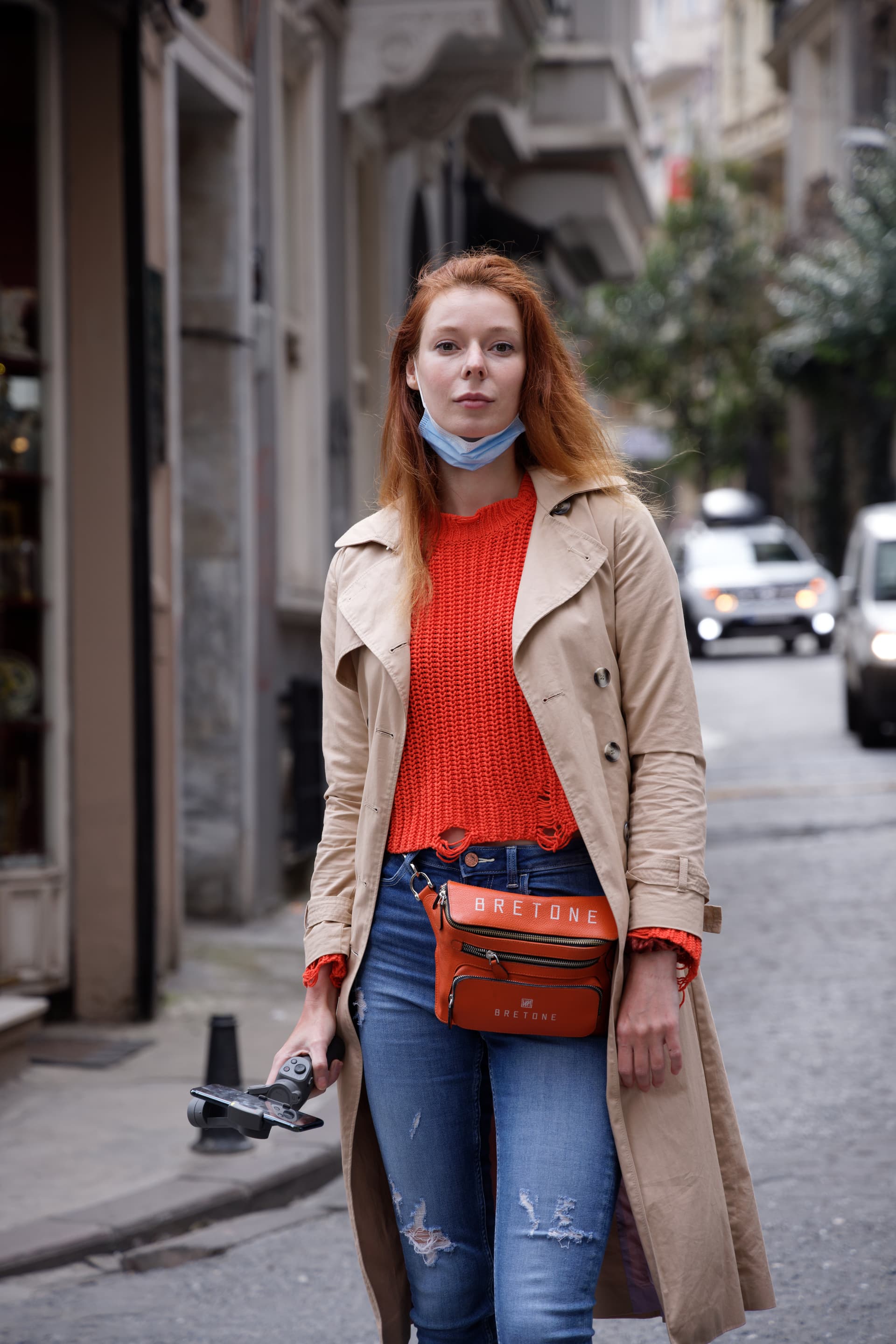
Here is the full image that I edited.
1 Like
I’m seeing the opposite. I used DeepPRIME XD instead of DeepPRIME, maybe that accounts for the difference.
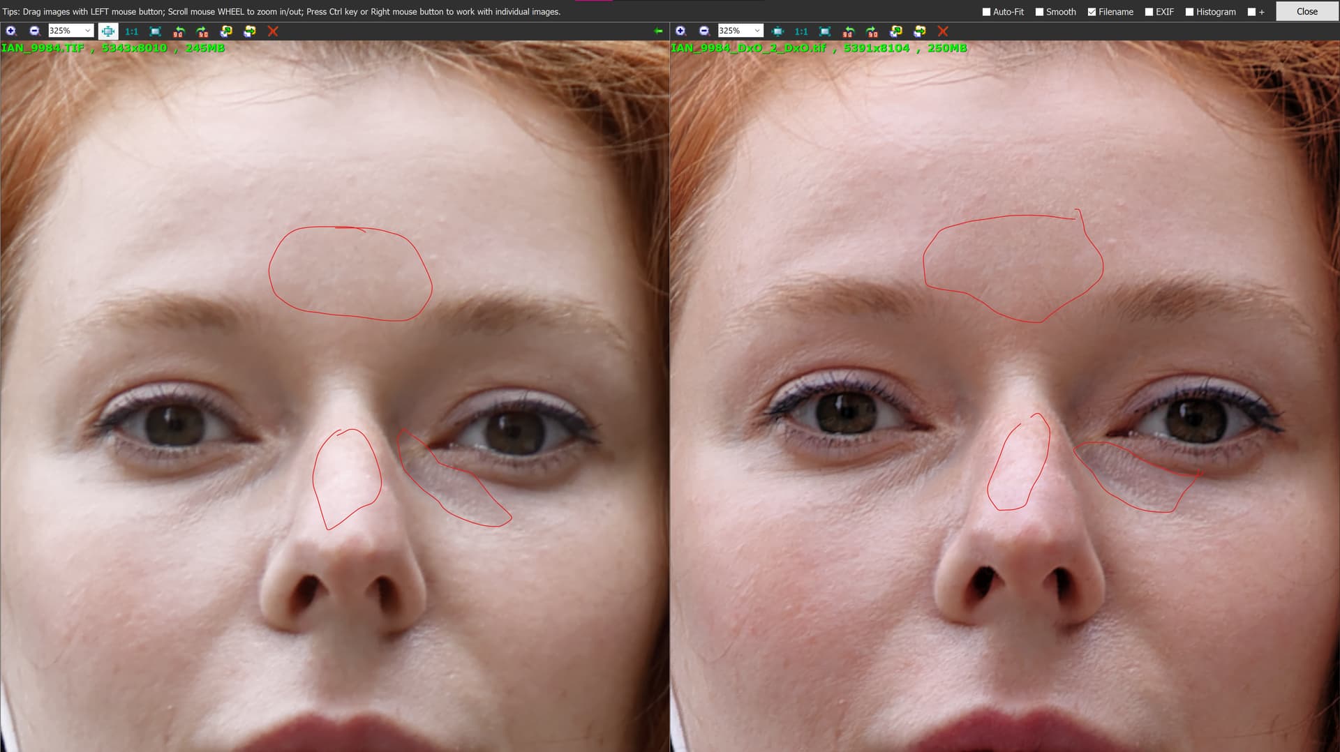
175%
325%
OK, I don’t have PL6. But it should be possible to achieve good result even without deepprime etc, no? We are just comparing against dpp, not some fancy AI software.
How come that our dpp images look different? I used the jpg provided on Dropbox.
As I understood it, the challenge was to restore the lady’s skin tones and details using PL6. I am allowed to use all of PL6’s tools at my disposal. No?
The DPP version that I am using is a TIFF that I created using DPP and the embedded camera settings that DPP reads but PL6 does not. My PL6 version is also a TIFF file, so that I am comparing apples to apples.
Yeah of course you are allowed to use deepprime XD, I was just wondering if those details come only from that algorithm? Do you get similar results when you deactivate the noise reduction? (I mean there is hardly any noise in the image). For example in my case, the advantage of deepprime was not much.
DeepPRIME and DeepPRIME XD are both more than just noise reduction. They are also completely different demosaicing algorithms. I use DeepPRIME XD on all photos regardless of ISO. I therefore have not tried PL6 on these photos without using DPXD. I was just trying to answer the challenge issued by the OP. ![]()
2 Likes
New photo in the folder (9113) CR3, DOP, Export from DPP 4 and DxO PL 6. (https://www.dropbox.com/scl/fo/qgwh7bot4kui2rxokboyr/h?dl=0&rlkey=jsn74bnqf6uzuhswjqcvn4dvg)
Again I like skin quality color rendering especially in out of focus area, the forehead color details looks more rich (yes I can do similar in DxO but still not so color detail punch)
And one more interesting notice. The light rendering is very different. DPP shows volume of oranges, you can see they are balls, DxO oranges are more flat. It is possible to play with HSL but can’t get same volume, CR3 example in the folder. I assume that DDP pictures has some charm, while DxO with very close colors and other characteristics look a bit snapshotish (https://www.dropbox.com/scl/fo/qgwh7bot4kui2rxokboyr/h?dl=0&rlkey=jsn74bnqf6uzuhswjqcvn4dvg)
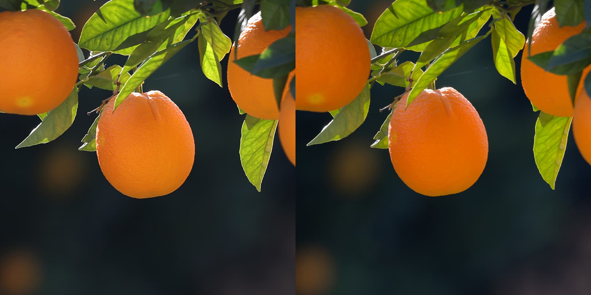
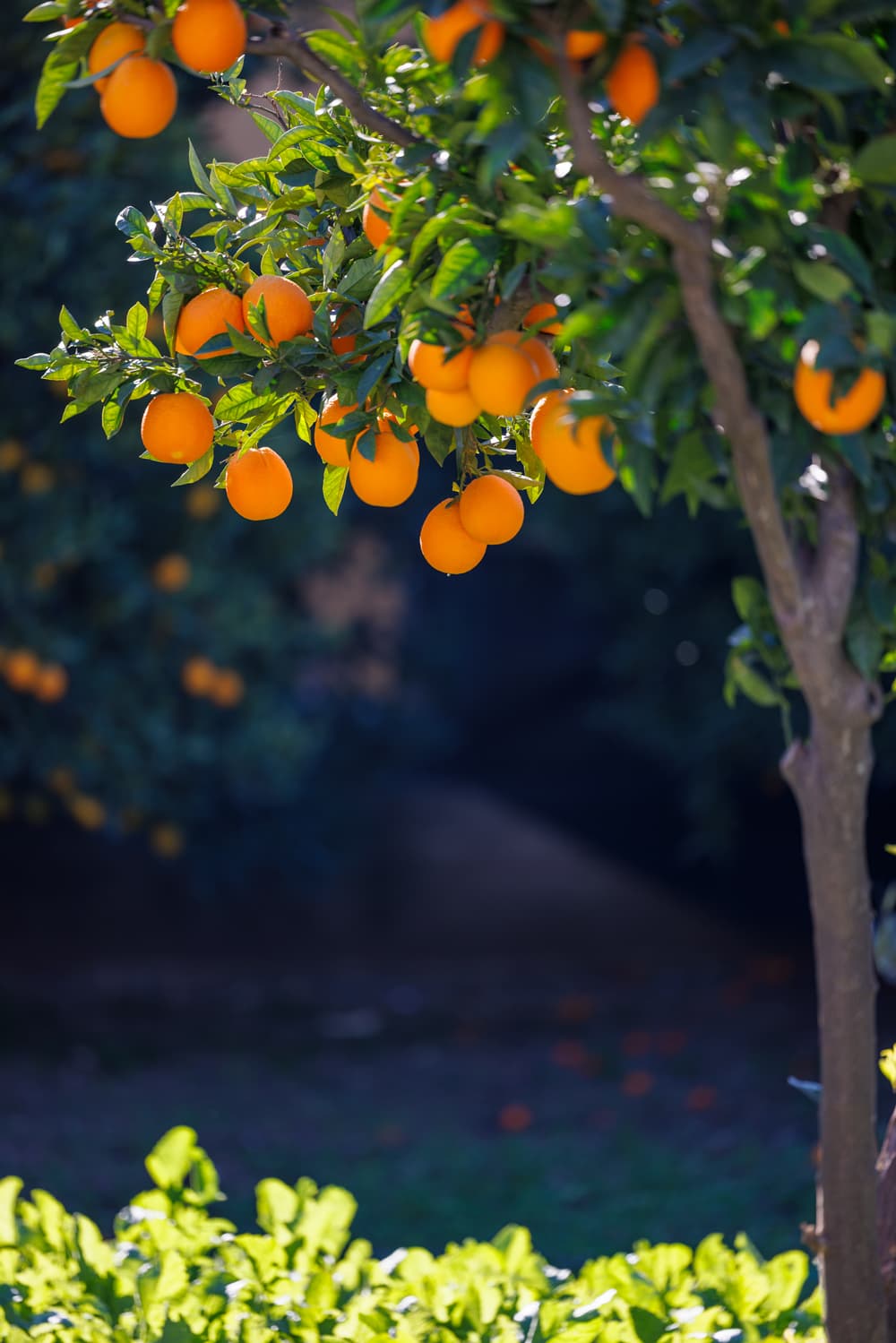
I would agree that both the oranges and the face look flatter in PL. Could you upload the raw file for the oranges, I would like to have a look. I had noticed the same with Nikon files, there are some small characteristics that I find hard to replicate in PL. But it depends on the picture. Sometimes there is not much difference, sometimes I prefer the PL output.
Raw file uploaded, check it out. I am reviewing my pictures now and can clearly see DPP wins in volume mostly every time. And you don’t have to pixel peep it, it’s substantial difference.
I still prefer PL look for noisy images. I use high ISO often, so PL remains my tool, but in low ISO and good light conditions DPP shows more interesting and rich look
1 Like
I can edit it to be very close, but there is always some detail and volume lacking. I noticed that when you zoom in extremely to the pixel level, the PL files are much more blotchy, while the gradations from the DPP file are still much finer.
1 Like
Since you continue to post more pictures where you prefer DPP over PL6 then I can only conclude that you are not interested in learning how to make your pictures better by using PL6.
Therefore I would suggest that you simply use DPP from now on. Better yet, since when no adjustment is made in DPP it merely uses the in-camera settings to recreate what the in-camera JPG would have looked like, you could just shoot JPG in camera and give up RAW processing altogether.
1 Like
I am Interested in that. Thats why I said I do something wrong. Just do not get it yet how to make it looks good everytime in DxO.