R5, 90% of my pictures are birds photo and I am happy how DxO get this work done. But when I compare portraits with DPP — it’s so bad. Am I doing something wrong? In examples you can find export from raw to JPEG with default DPP settings and DxO with DeepPrime on, Wide Gamut and lens sharpen profile on. I also attach raw with a link
Keep in mind, that DPP adds all the in-camera settings to their raw files by default, so your starting point for editing raw files looks just like a JPEG straight out of the camera, with in-camera contrast, sharpening and color tone included.
PhotoLab and most other raw editors do not use in-camera settings resulting in a starting point which tends to be less sharp with lower contrast and flatter colors… It is up to you to use PhotoLab’s tools to get the best out of your images. I was a Canon shooter for many years and was quite proficient using DPP. I never edited a photo in DPP that gave me better results than I could achieve in PhotoLab.
Mark
4 Likes
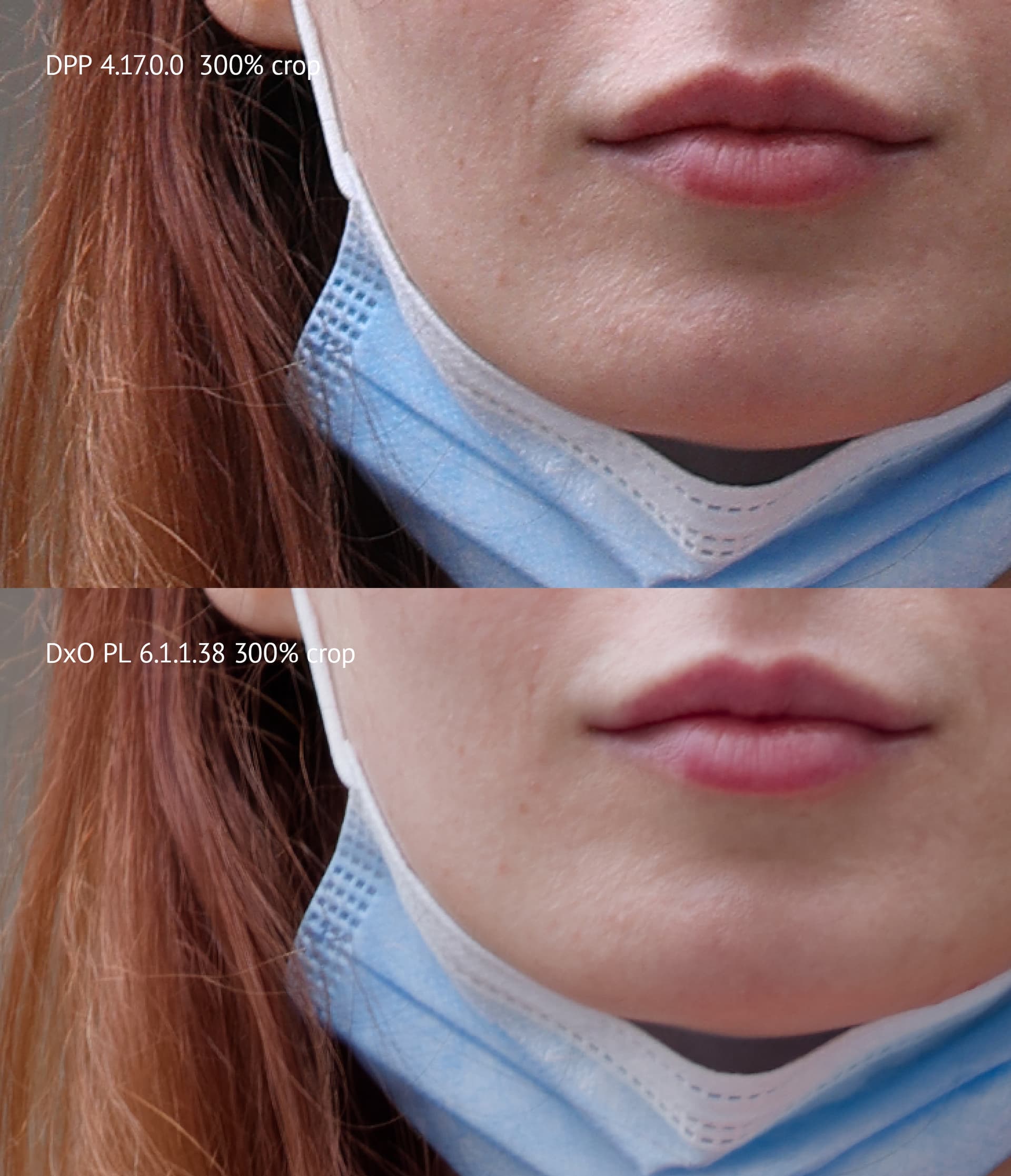
Yes Mark, I understand what you are saying. I was always Photoshop user (and DxO user for 3 years). The question here is not about how DPP renders color according to settings. Just look on the lips, it seems DxO lost a huge amount of different color tones. It’s like very simplified look now. I mean I can do a lot in PS, but can’t restore that color tone from DxO dng even on normally exposed image with ISO 100. Probably I do something wrong. If you have time, can you export that image with DxO in the best way (to make it equal to DPP in reach tones respect). Raw files attached with a link
Are you editing the original RAW file in PhotoLab or a DNG file? Are you using other software as well? Could you just briefly state your workflow? I unfortunately am not home right now, but if I get a chance I will try to look at your file later.
Mark
Yes sure, I edit raw file. The examples are in the dropbox. For this experiment no other software was used.
Hi Ian,
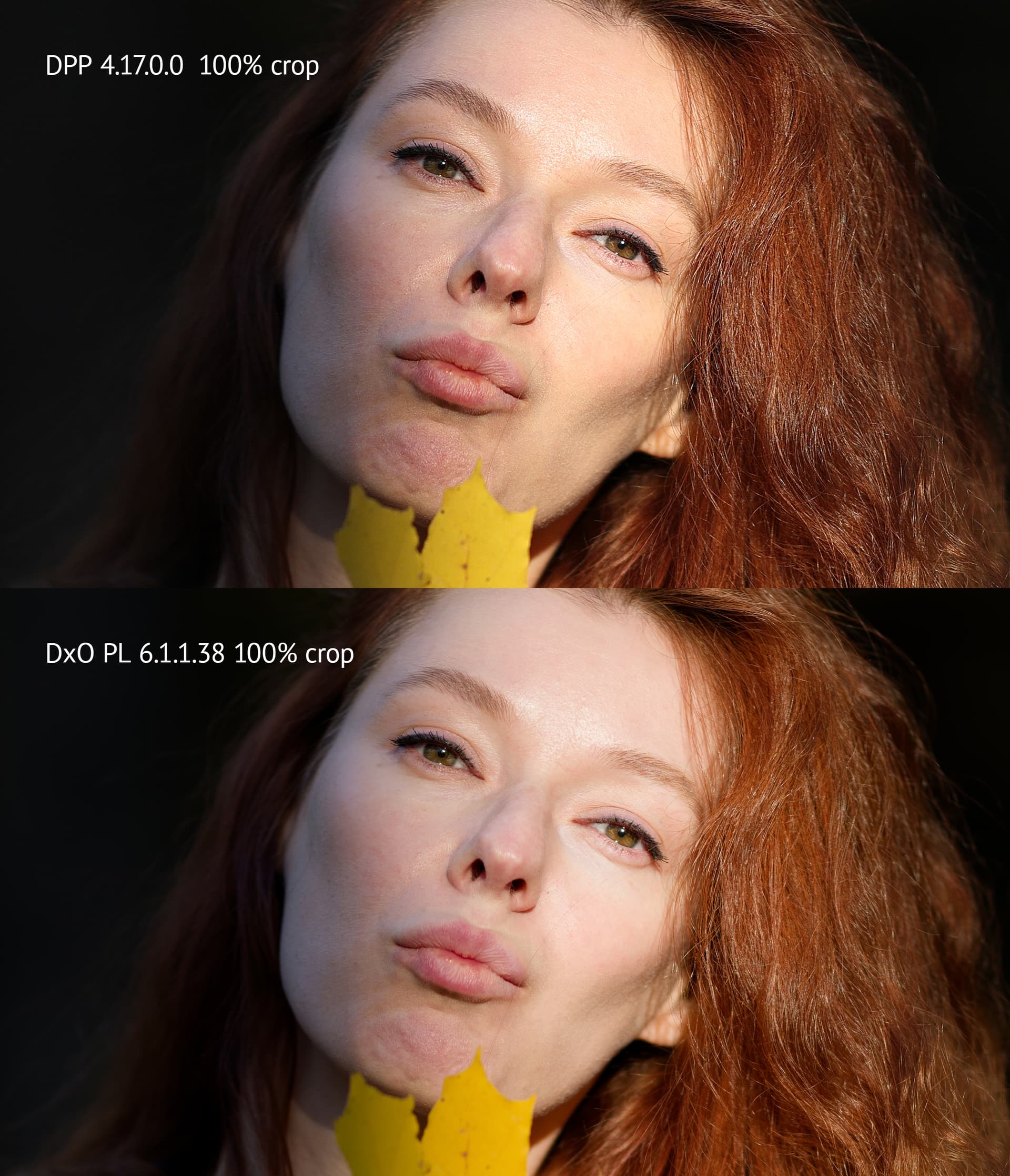
I had already checked the first pic you uploaded and that looked ok, but I noticed you had taken that photo with 1/125sec – too long for a high megagpixel count camera and then scrutinized at 300%. ![]()
The second pic is a bit too bright …
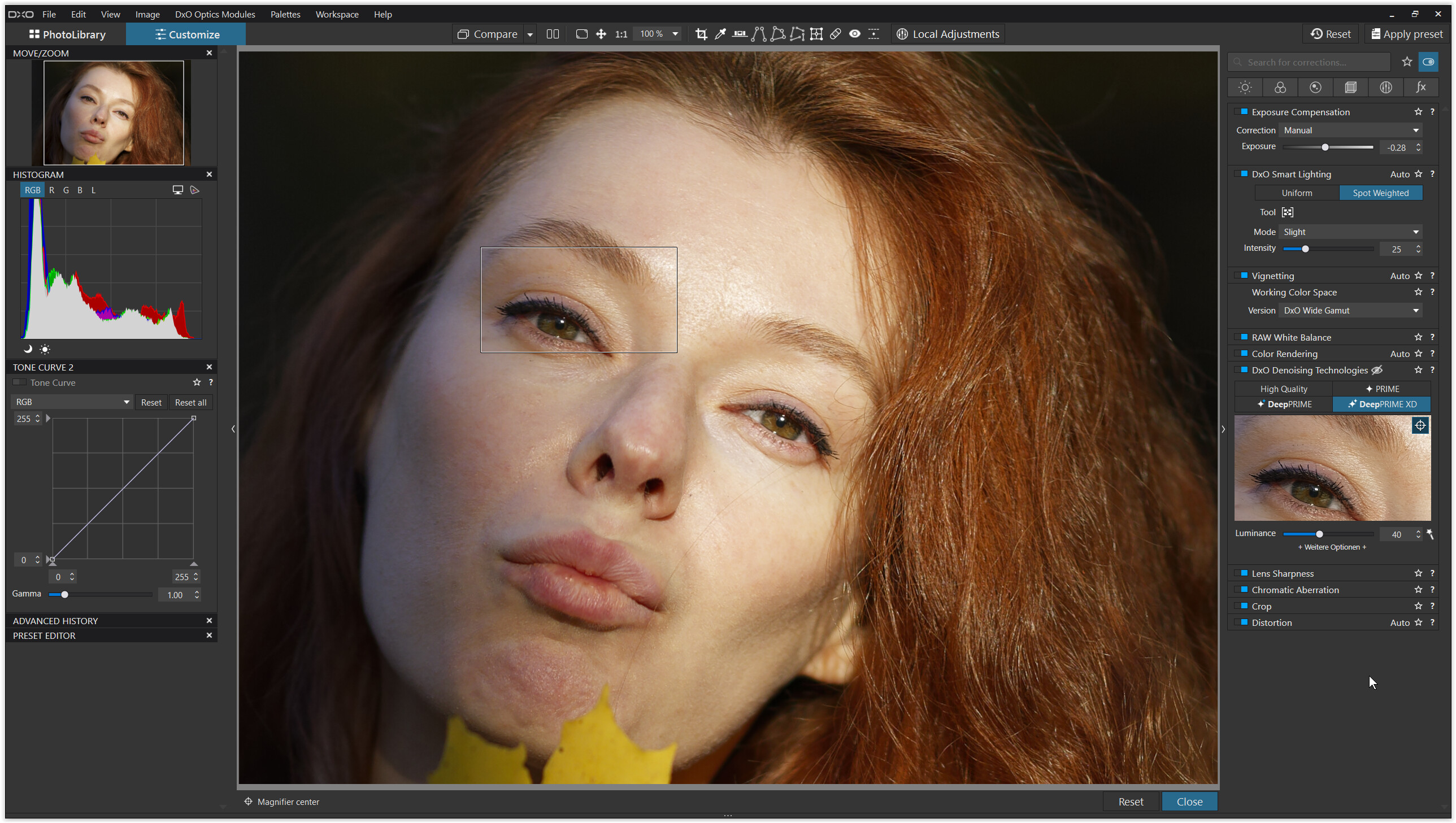
- camera / lens profile installed (I can see the sharpness difference when deactivating the profile)
- lowered the exposure by 1/3 f-stop
- used DxO Smart Lighting Spotweighted (several)
- DxO WideGamut working colour space
- DeepPrimeXD *)
*)
The little preview at the RHS shows, that the eyes and eyebrowses are pinsharp as well part of the cheek and hair. → DPXD works on those sharp details → try this yourself
At f1,2 / 85 mm and an estimated distance of 2m the depth of field is around 2 cm (or less).
I’m on Windows, but that should not make a difference.
(note – there were some problems reported with MacOS ‘Ventura’)
Wolfgang
2 Likes
Wolfgang thank you very much for your approach. I will try to do the same on my side
Had a look at your RAW files and exported them as 16 bit TIFFs to be compared in Lightroom.
Processing was “DxO Optical Corrections only” and DPP’s DLO with activated options for vignetting, sharpness and distortion. Here is what I got:
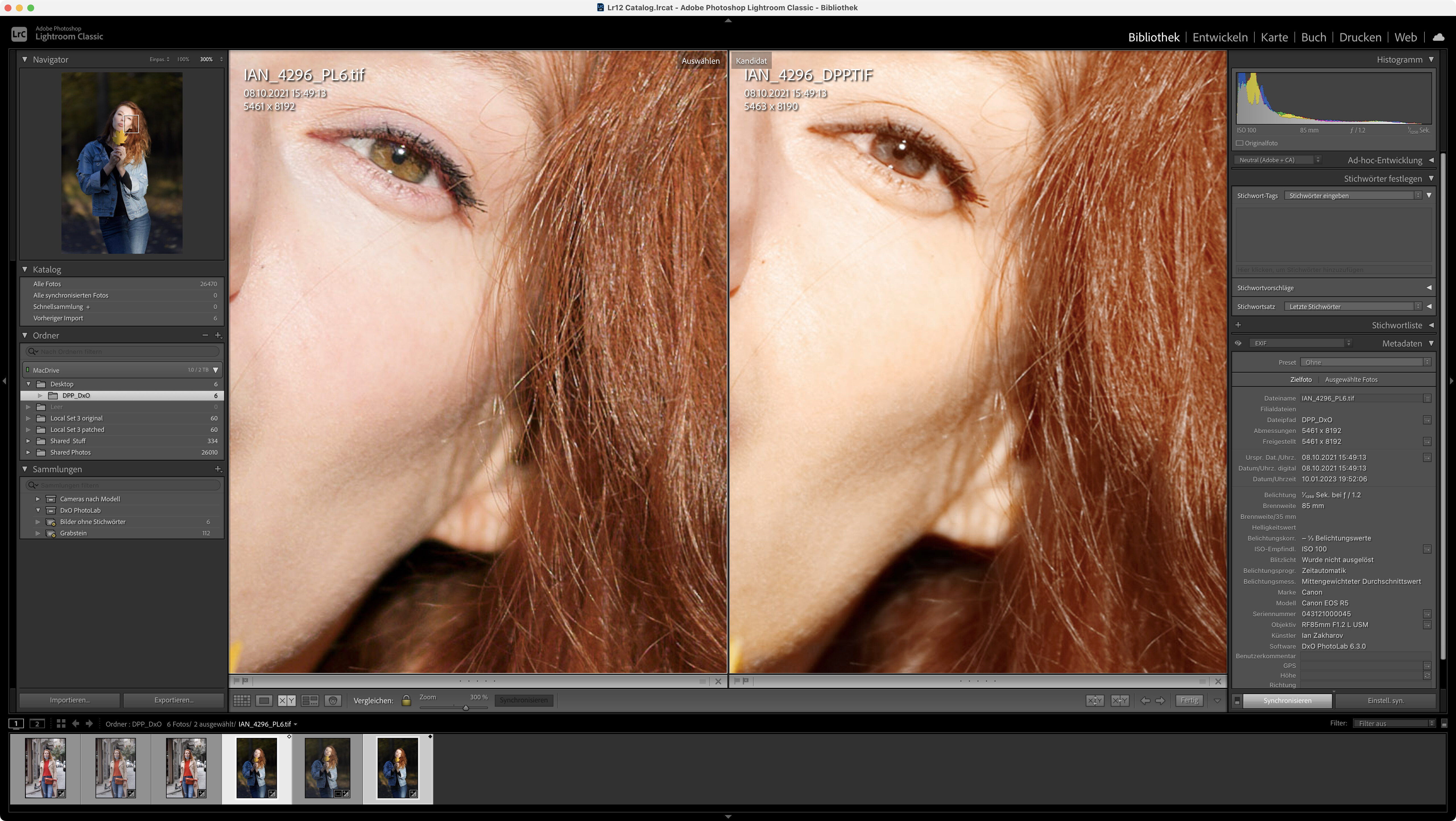
Apart from some colour shift, the images look sharp to me with a slightly sharper appearance of DPL’s output.
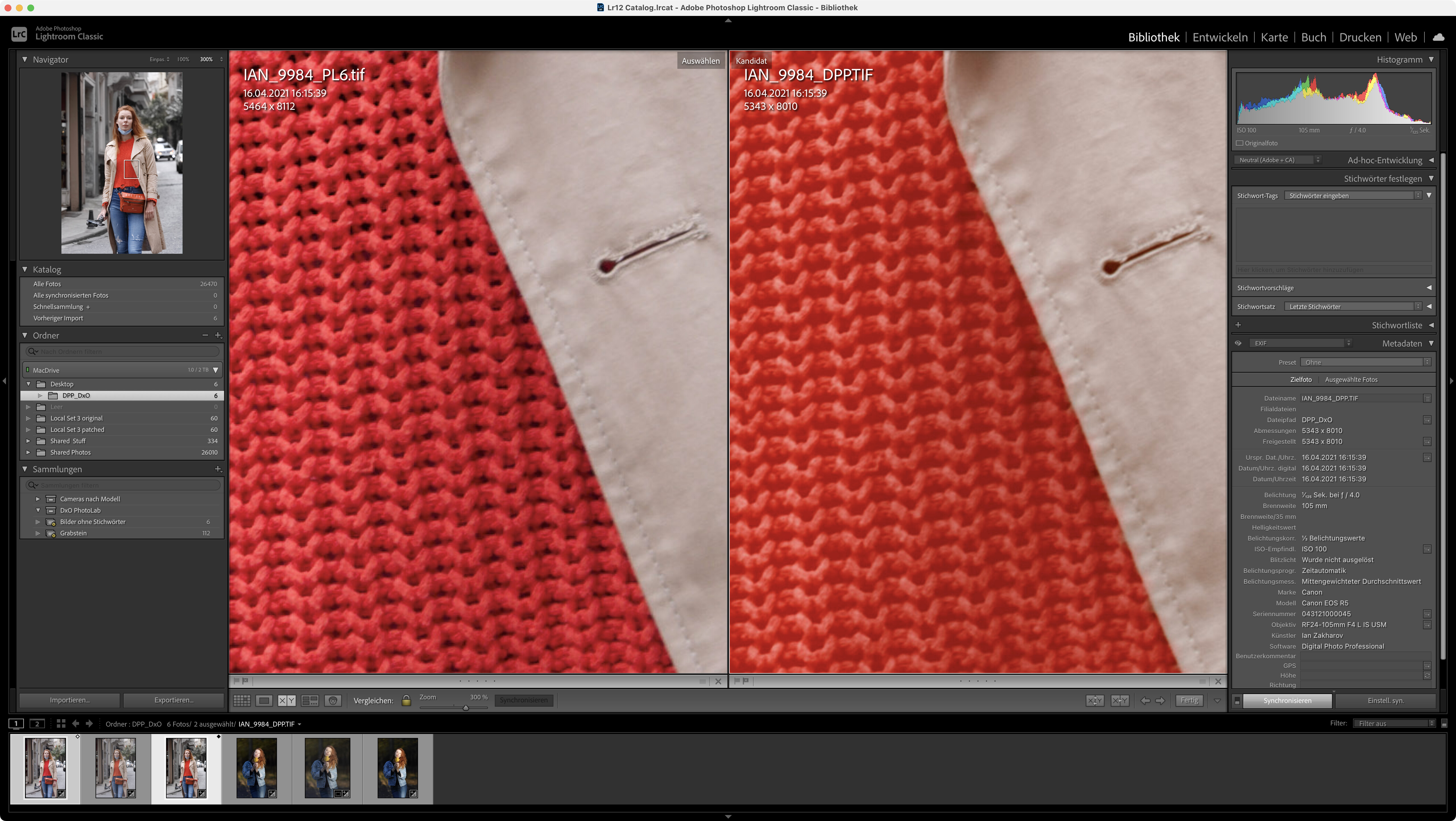
We get even more detailed rendition in the pullover.
All in all, I’d say that DPL provides more detail than DPP…but it pays to compare same with same. Comparing images that have undergone different processings does not provide any information that is useful imo.
1 Like
I did several revisions. Can you please take a look for blue mask corner perforations. They are absolutely washed out. I understand that its important to see the settings I use in DxO. I will do a screen recording and will share it on youtube. Probably I miss something.
Why not just upload the .dop fille If you already uploaded the raw file.
Mark
Had a look at these too. Comparing same with same provides no abbyss, the perforations are okay.
Please provide the corresponding .dop files.
DOP,s are in the same Dropbox folder, put them there a minute ago
I was talking about fabric
I would agree with @mwsilvers and @platypus that there is no point in comparing rendering between two different RAW processors.
Don’t forget that PL6 uses the new wide gamut colour space and this can make quite a difference to how certain colours are rendered, when compared with PL5.
Whatever you do don’t expect to get exactly the same rendering as DPP but do get used to playing with the colour rendering options in PL.
I totally agree with you and I am not trying to compare those processes directly. I just have noticed that skin has less color tones, like if you put gradient layer over, and it reduces the amount of colours. I don not know how to say it. It’s the same feeling when you take picture with RF 85/2 and RF 85/1.2L with the same aperture. Everything seems to be equal but you can see the difference
Do you have Lens Sharpening enabled in PhotoLab? The custom lens profiles often bring back quite a bit of detail. Try some Fine Contrast as well. DPP defaults are much closer to production than PhotoLab which expects the photographer to do more work to create the image from their vision and not the camera defaults.
Hi Alec, yes I have Lens Sharpening enabled. I reviewed a lot portraits with DxO last days. And can’t get the quality of color rendering close to DPP. I know DPP is awful in terms of noise reduction and sharpening quality, but the question is about portraits with ISO 100, so noise issues is not a big deal. I will upload more examples.
1 Like
@Joanna
Why should a new wider gamut necessarily change the way an image looks on the same monitor say a monitor supporting max sRGB?? Isn´t something wrong then? For sure I can see differences between images saved with an sRGB-profile and one saved as an Adobe RGB too. I don´t understand that either really nor accepting it either really despite I know how to handle it.
Shouldn´t that wider gamut just get mapped to the way my monitor is calibrated and adapt to the actual limitations of color support in for example a sRGB-monitor with that monitor ICC-profile that is active?
I can´t find a way to turn of the use of the wider gamut. Doesn´t it ought to be one?
As I said before, I have no problems doing my main subject pictures — birds. Pictures are good and I don’t complain about anything, sharpness and colours are great even with 2× TC IAN-2562-fs — ImgBB
I can clearly see missing tones in range of human skin. All I wanted to ask if the portrait could have same rich color render as in DPP. Before asking this question I did everything I could, and of cause I did render for camera body with different intensity. I don’t shot damsels, I take pictures of my wife, I don’t take pictures of people mostly.
UPD. Did not find out the way how to make Count Colours Filter run with PS 2023 unfortunately
1 Like
When I compared output from DPP and DPL, I found that I could get very similar tonality and richness thereof. Getting the same results was next to impossible because of each app’s individual way of demosaicing and colorization that happens before we can even see the preview.
PhotoLab’s smart functionality can work wonders, but I feel more comfortable without automatic settings and therefore disable smart tools and work with the more classical sliders - as well as with the tone curve and HSL tools. Using these, you might be able to find a set of settings that bring you close to what you want.
1 Like