OK. I admit it. I did try  But the results were definitely rubbish.
Whereas, @mikemyers this is a superb image given the limitations of the camera. Well done 

OK. I admit it. I did try But the results were definitely rubbish.
Whereas, @mikemyers this is a superb image given the limitations of the camera. Well done
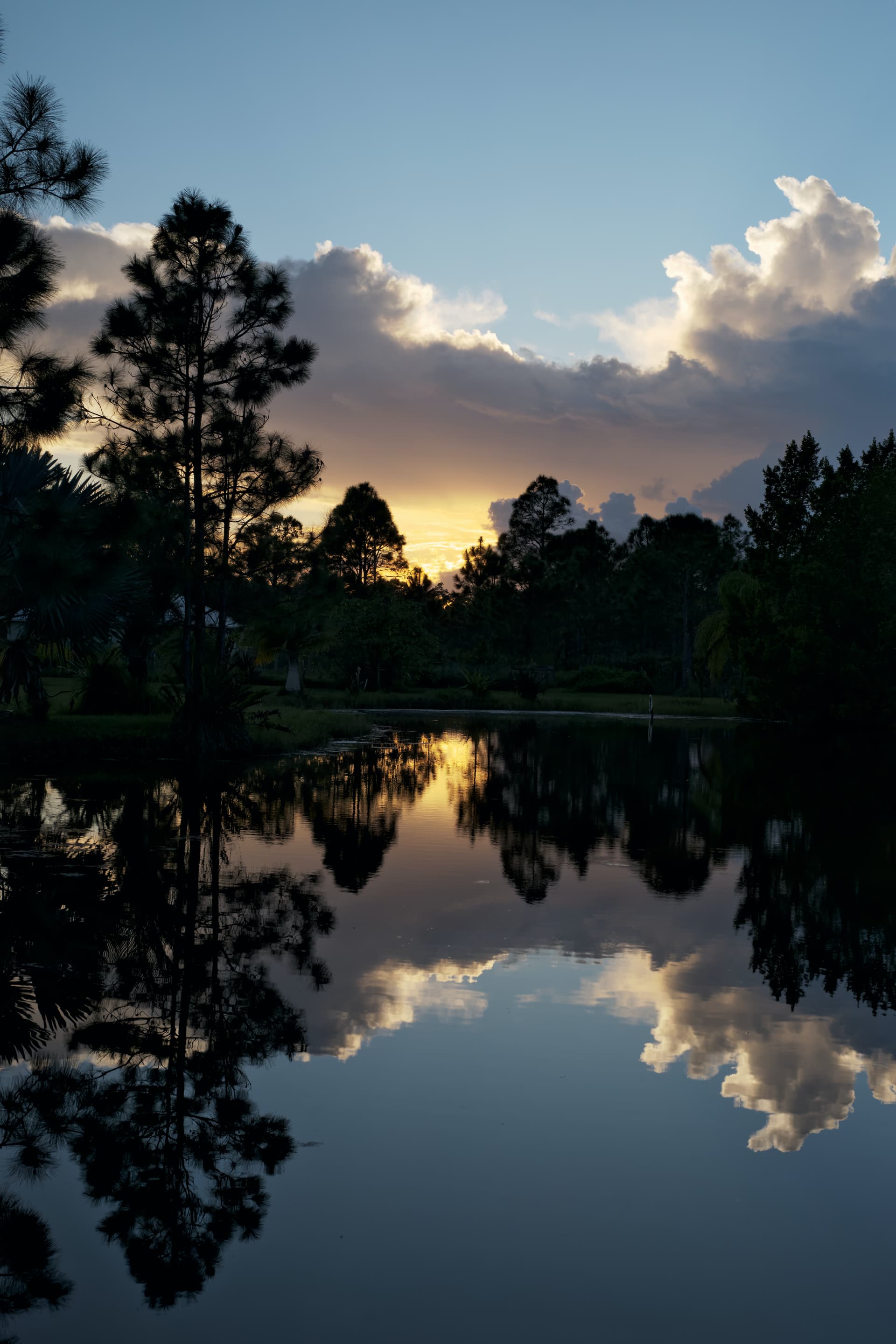
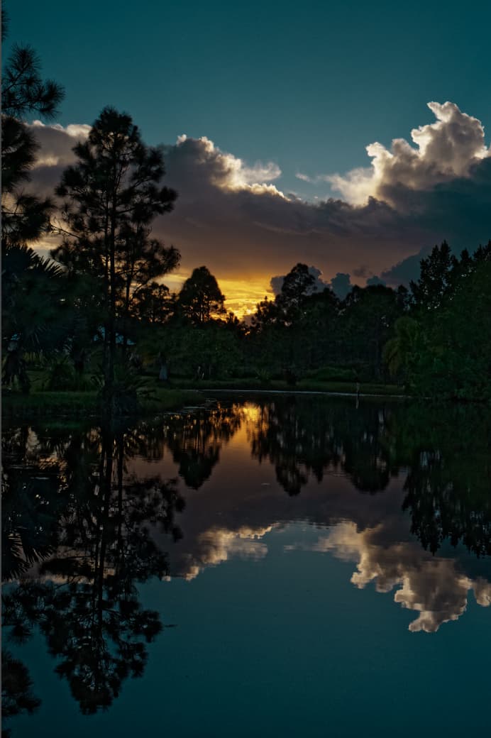
If this is a tripod image i would have used exposure bracketing on 1/2 stop difference 5 shots.
A -1/2 0 +1/2 +1 +11/2 +2ev.
Just to see which was reflecting the most the image i was seeing.
Now, with this image,
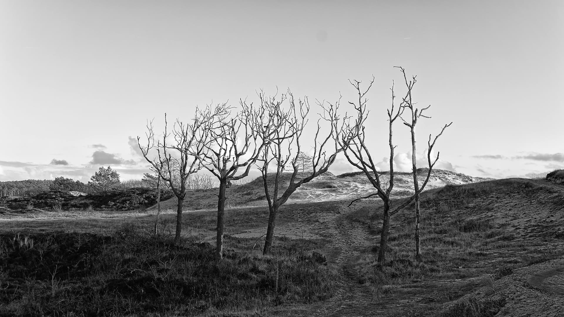
Maybe i would leave the trees dark, blackisch, and lifted the sky and water reflection blue, clouds and sunyellow for more contrast.
Or only that dark stripe which looks like vignetting on the bottom and top to equal it with the rest of the reflection. A bit, not all to support the sunshape rounding
Just to see if gets better or worse.
It’s in the base a good image so if you do non of this it’s fine also.
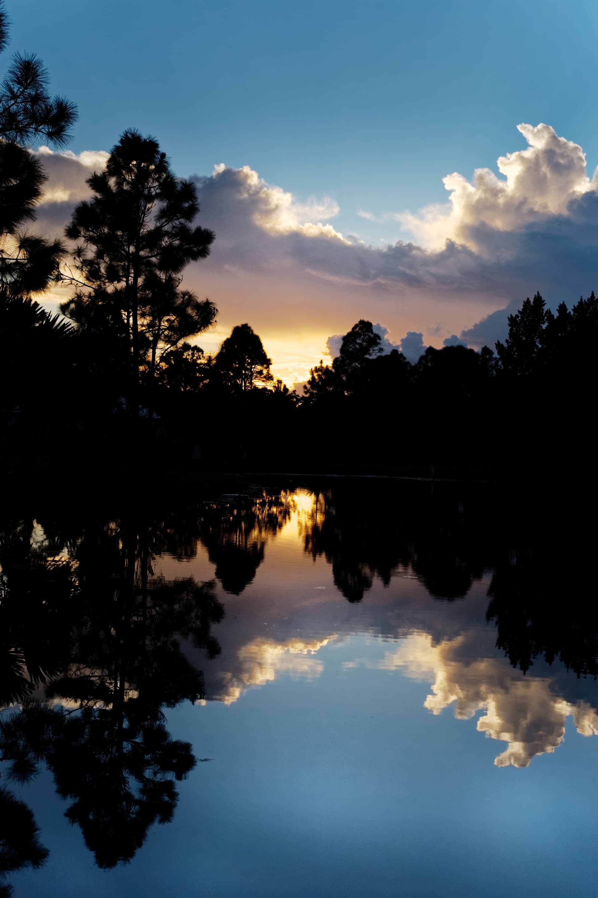
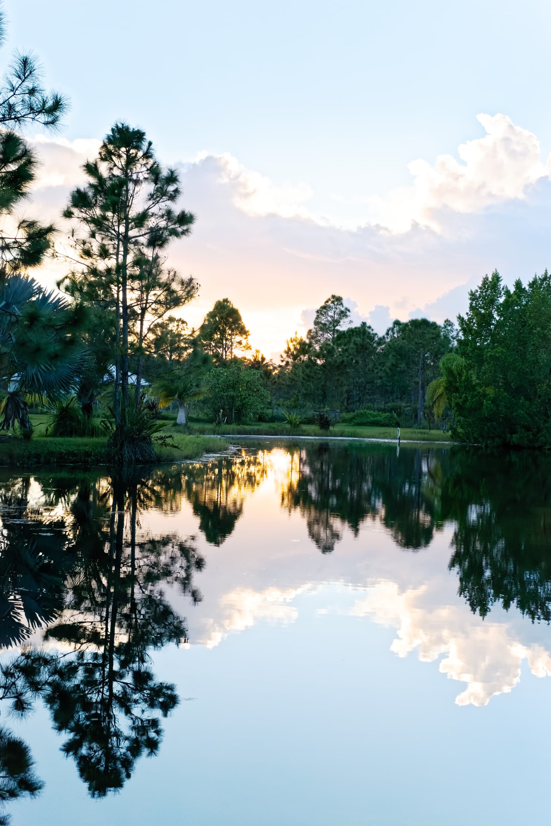
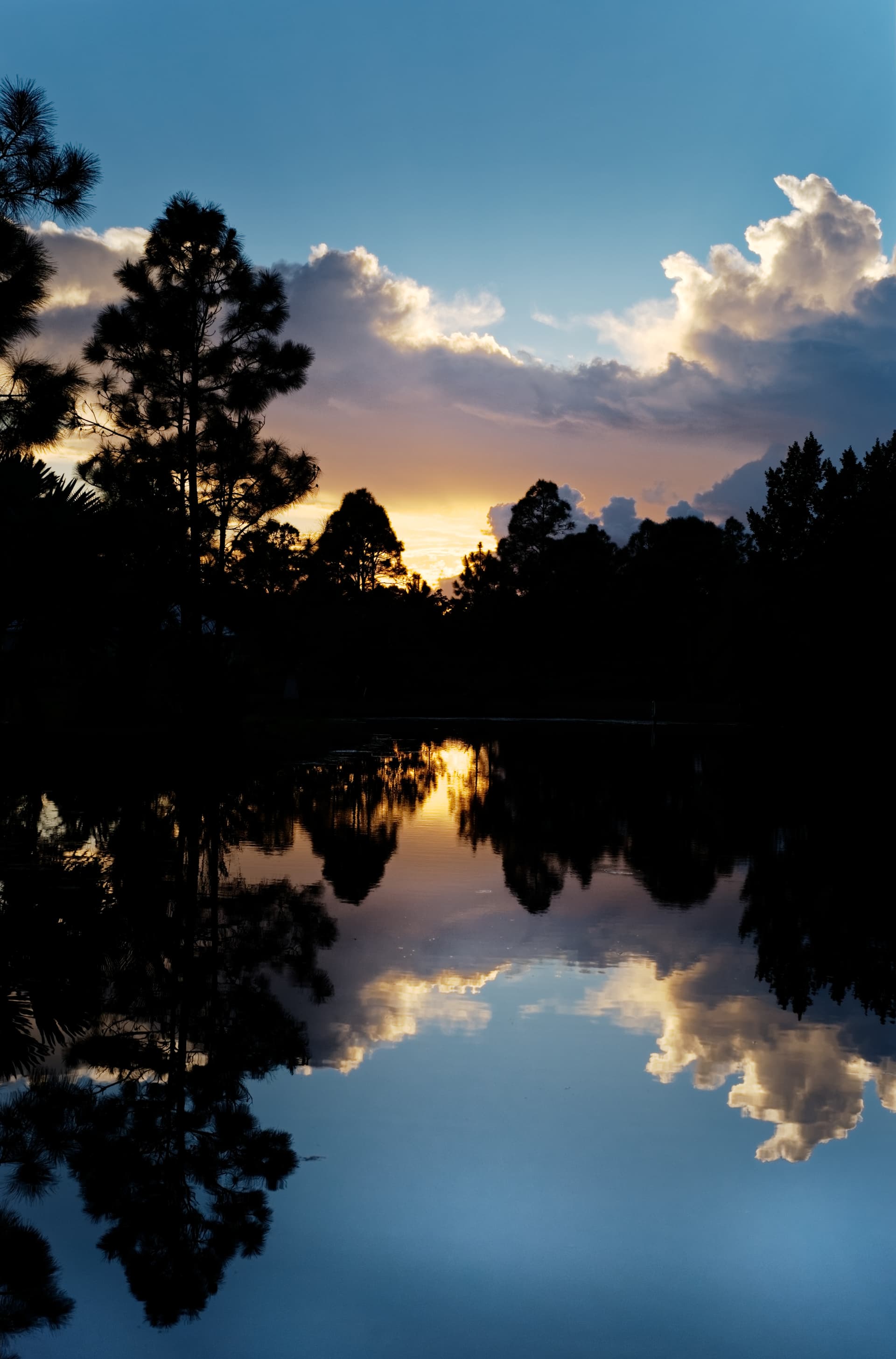
Watching the image again, i wonder if the image would be more balance and power if the symetric of reflection and upper section is made perfect in the middle.
Now the reflection has less room then the sky above.
Not at home so can’t see if it’s cropped or done in framing the shot.
If the image could be flipped top bottom and you don’t see the difference unless you look twice i mean.
I wanted to make a couple of suggestions but I didn’t want to spoil my congratulatory post.
I agree with Guenter about the dark spot in the lake.
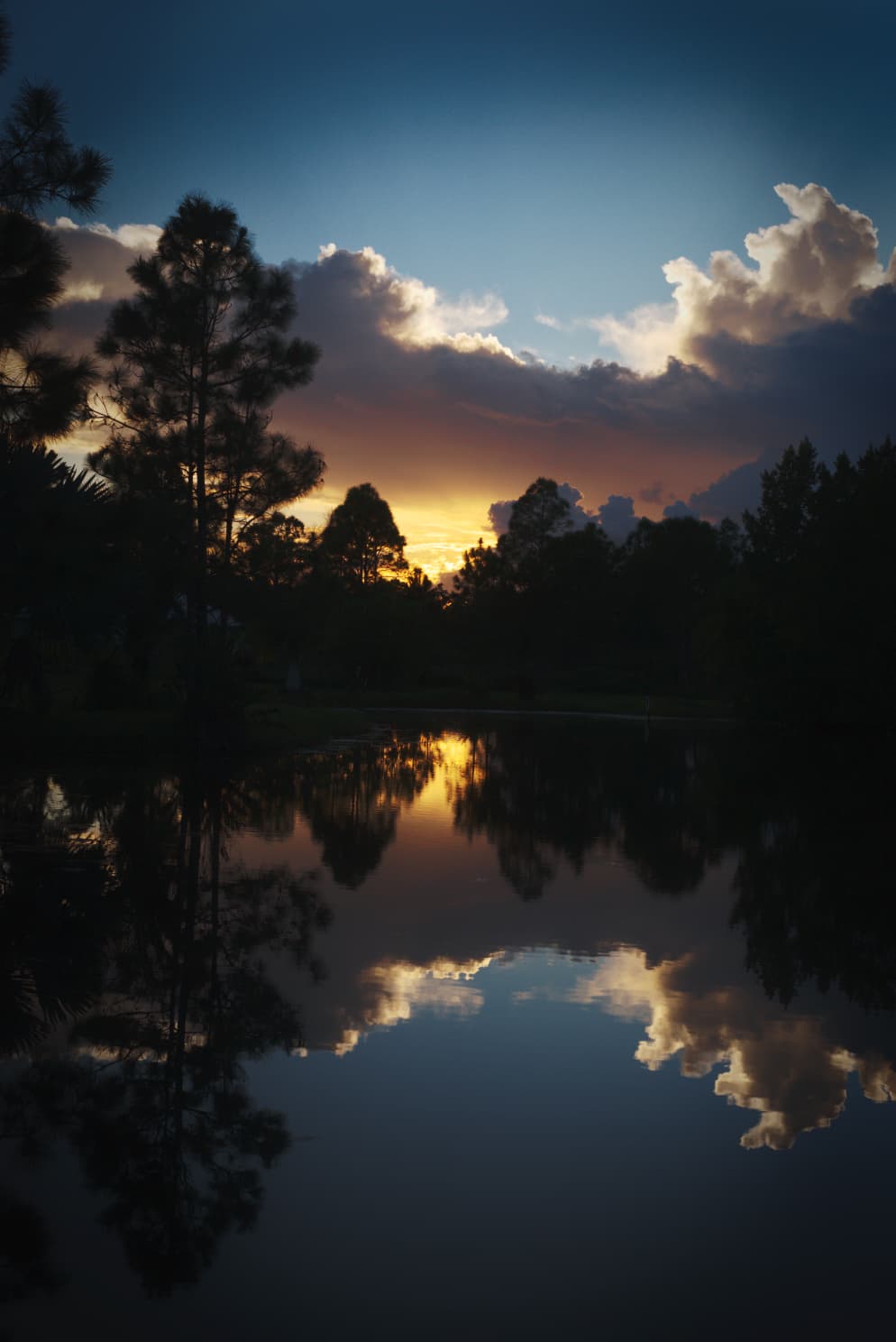
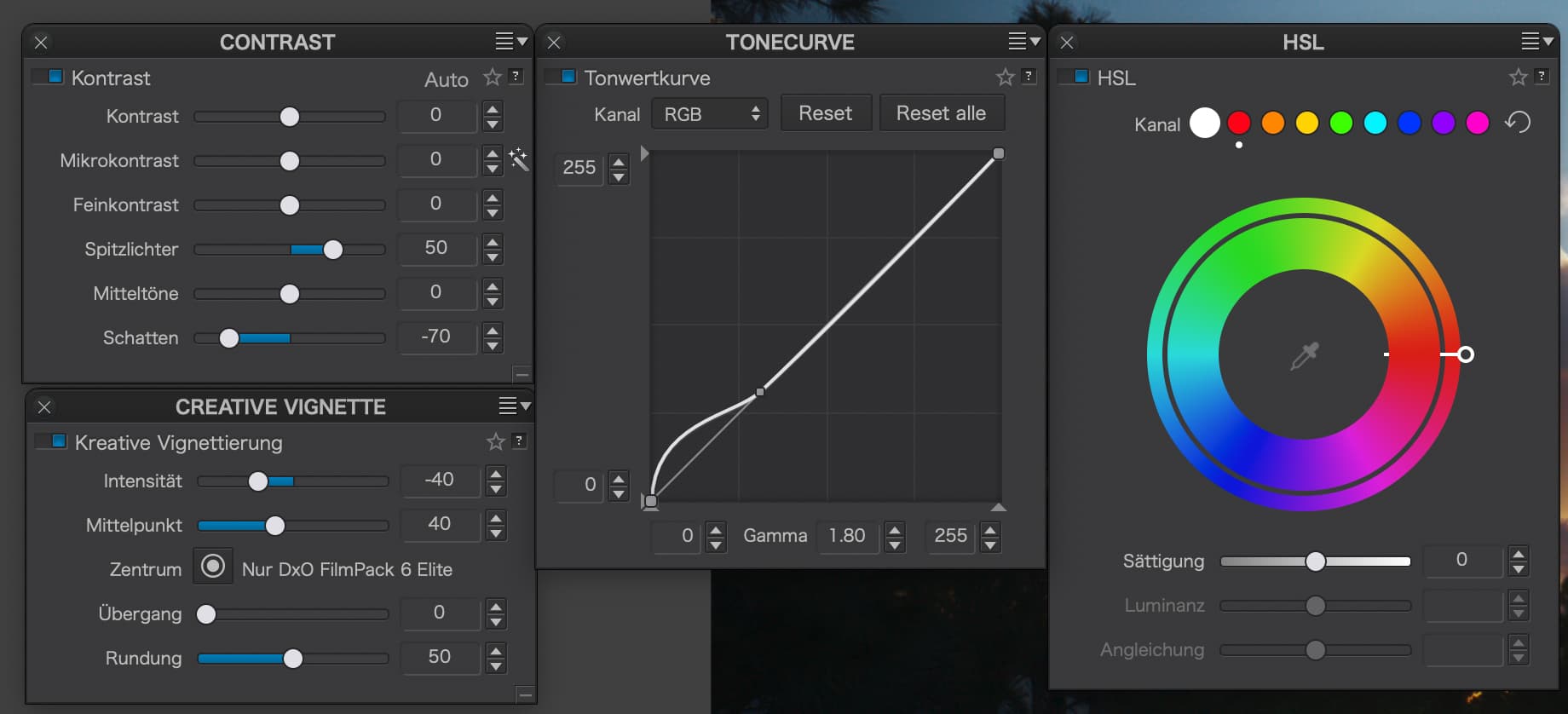
Without wanting to spoil the overall mood, I tried lifting the shadows by using the tone curve instead of lifting the blacks slider and I also added in DeepPRIME because there was an awful lot of noise in the shadows. I also added in a tiny bit of shadow detail by using the shadow fine contrast and a tad of unsharp mask overall.
Here are the changed settings…
And here is the resulting version, which you may either like or hate. I personally would need to review and play with it a few times before deciding. But, as I said, my version is no more right than yours apart from the DeepPRIME, it’s just there to give you some different possibilities.
I am still curious why Leica seems to attract some photographers and I found this snippet on the DxOMark review page for it…
the M10 offers similar proportions to those legendary M analog versions, revered by photojournalists and street photographers alike for their petite dimensions and simple controls
And this, I believe is where the Leica’s strength lies, rather than as a general purpose camera.
And, in conclusion of the review…
For pure sensor performance, the Leica M10’s 24Mp CMOS chip is in the same ballpark as recent Leica full-frame chips. Its odd behavior for both color and dynamic range is worth looking out for, and it’s fair to say that although sensor quality is good, it could be improved with better implementation. Compared to the top-performing full-frame sensors we’ve tested, the M10 lags a little behind at base ISO and throughout the sensitivity range, with image quality more in line with the best APS-C chips. So better image quality is available and the M10 isn’t cheap, but first-class engineering that meets the Leica standard never is. However, a digital camera with similar proportions to analog M cameras will be hugely appealing to Leica enthusiasts. Add to that compatibility with almost all Leica lenses ever made, as well as its simplicity of operation, and the M10 will be an attractive proposition to those who appreciate the quality of the Leica system
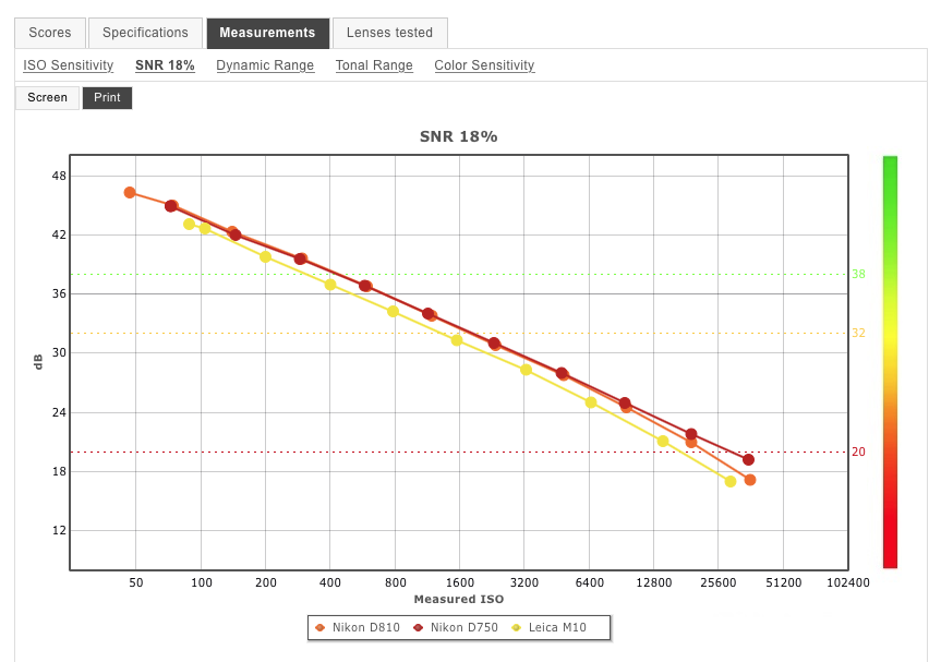
The measurements testing page of a comparison between your Nikon D750 and your Leica M10 is quite interesting.
Signal to Noise ratio…
… shows the Leica to have a slightly lower ratio and, therefore, not cope with shadow noise as well. This not only affects how much noise there is but, also, how well DeepPRIME can get rid of it. I found, with this image, that zooming in on the shadow details, quite a lot of it had turned to mush, which you may not worry about on a monitor but, if you were to want to print it, that would not be so pretty.
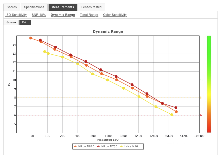
Dynamic Range…
Your D750 is significantly better on this score, even surpassing my D810  But, against the M10, the difference is quite marked with around 1 stop more range with the D750. This may not be a problem on “average” journalistic or street shots and other subjects where the contrast is easily manageable but, as soon as you try HDR shots like these, it can become quite a limiting factor.
Both the Tonal Range and Colour Sensitivity graphs once again show the D750 to be the better choice but, once again, this is not so much of a problem where the subject range is limited. However, all these factors combine, in my view, to the D750 being a far better choice for landscape and HDR work.
Mike, I think you’re going to have to keep the two and choose the most appropriate for the subject you are shooting
Although your image is well done, I had a look at it and came up with this interpretation, accentuating the looming character of the image.
This is what I did:
Raised deep shadows with the tonecurve
Lowered shadow contrast and raised highlight contrast
Accentuated the red with the HSL tool (increased S, decreased L)
Added a gradient to darken the upper LH corner, which was too bright imo
Added a creative vignette, which accentuates the centre with its colours
10-10-2021_L1003365.dng.dop (17.2 KB)
Because everybody is fighting with Mike’s photo, her is my interpretation
Thank’s for all the good input especially to Mike 
Guenter
If this were a tripod image, I would have set the ISO to 100 instead of 1600 and maximised the dynamic range. Instead of only 10 stops, Mike would have had 13.2 stops to play with and got much better shadow detail.
Ouch!!! I use PhotoMechanic for importing photos, and I made that change a few days ago, but I closed the window without doing an import, so the change didn’t stick. I did it again just now, and did an import, so from now on it will be “year first” which I wish I would have realized long, long ago. Anyway, from now on, it’s done. I need to do the same thing for my desktop computer when I get home.
That’s “stuff” floating on the surface of the pond. I agree, annoying, and useless. One more thing to be looking for in my reflection photos! Again, it’s my “photojournalism” tendencies, which don’t allow for this - although some rules are made to be broken, and I’m not a working photojournalist.
I should have had my tripod with me, and then I could have backed off on the ISO. As to bracketing, Joanna said not to do that - so now I study the exposure for anything over or under my limit, and on my camera,
My M10 has settings for exposure control - clipping.
I change it from 0 to 255, and am using 1 to 254.
Maybe this will help me avoid clipping.
I’ll have to think about this - I adjusted the horizon so it was straight, but didn’t really crop. Your change might have helped my “mirror image” idea.
No cropping, and I moved the camera up and down until it looked “balanced” to me. Since the top part is “real”, and the bottom is the “reflection”, that influenced my decision - but having them equal might have been a better choice. I did think about making them equal, and turning the image upside down, but didn’t post that here. 
I do see what you mean, but if I flipped it upside down, I suspect people would “feel” that something was wrong, but never guess what. I’ve done that before - it’s fun!
Mistake on my part - I meant to turn it on. On my small laptop screen it’s easier for me to miss things, but it’s on me, not the laptop. I should have gone down the whole menu, like I try to do, to make sure nothing is “on” that I want “off” and vice versa. Next time I work on any image, I need to select the right Preset before opening any image. That way I won’t need to be turning off things that I never wanted “on”.
I like your version, but it’s difficult to see the image properly on my 2015 15" MacBook Pro. At home, I can easily view what you’ve done, and why.
The Leica M3 came out in 1954. Back then I was using a Zeiss Ikon Contax II (introduced in 1936) which was mostly the same thing as the Leica, so I’ve grown up with 35mm rangefinder cameras.
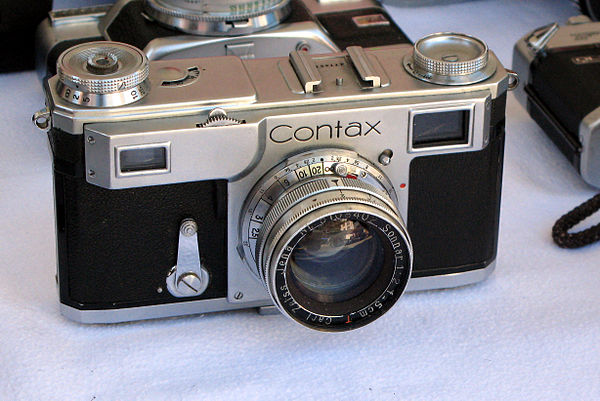
From the Contax II I moved up to the Contax IIa, then to the Nikon SP, and finally to the Leica M2, all of which were essentially the same (although Leica had several advantages). They all felt “at home” in my hands, as if they were part of me.
Then I went on to SLR cameras, then DSLR, and so on, but always kept my rangefinder cameras - I still have a Contax IIa, Contax IIIa, Nikon SP, Leica M3, Leica M2, Leica M8, and now my Leica M10 which was introduced in 2017. Leica has introduced newer and more powerful versions of the M10 series, but I never saw the need to update. Now a New Leica M11 is coming out on 11/11/2021. I know it will be “better”, but do I need it?
I realize my Nikon D750 has better specs, but if I want better, there’s the D780, D850, an upcoming D880 (I think) and the whole new Nikon Z series - if I accept everything you wrote as being important, I ought to skip over all of them and get the upcoming Nikon Z9, right?
That’s what I do with printing on matte paper , when to separate important deep shadows.
Please DO continue to “fight” over them! The more feedback I read, and try, and evaluate, the better I’ll do “next time”.
As for me, I’m pleased that the original file from my camera was acceptable, no “holes” or anything else to damage it. I’ve learned that I ought to:
bring out the detail in the very, very dark areas
remove any “debris” floating in the water, or otherwise interfering with the image
Consider making the “top” and “bottom” of reflection photos of equal size
Never forget to turn on “Deep Prime” (wish I could make it the default)
Consider using a tripod, which would allow me to use a nicer ISO speed.
If I’m shooting with the Leica, to always use the Visoflex and “live view” to eliminate mistakes in exposure or focusing.
Continue to strive for NO clipping.
Double-check my PL4 settings to be sure that everything I don’t want is turned off, and anything I do want is turned on.
don’t forget having fun.
keep an eye on your own style
most rules can be bent for creativity.
.
I dunno. I do know I’m enjoying doing all this, but I see photography as a series of challenges that I need to meet. I very much do enjoy it, but I wouldn’t call it “fun”. My style? I guess this means “what I like”. Rules? Yep, they ought to be called “guidelines” I guess.
I’m in my own little world while I’m trying to capture an image - a grizzly bear could sneak up on me, and I’d never know. I do draw the line at anything “dangerous” though, although my definitions have changed over the years. I used to take photos of sports car racing, and motorcycle racing, and I quickly got concerned with how “safe” my location was. If I was on an African Safari, photographing something, I’d like to think I would be aware of my surroundings, so I didn’t become “dinner” for one of the local critters. In India I was taking photos of a religious festival from a bridge, and realized the people around and behind me were pushing me so hard against the guardrail that I could lift both of my feet off the ground. That’s the last time I did anything like that!
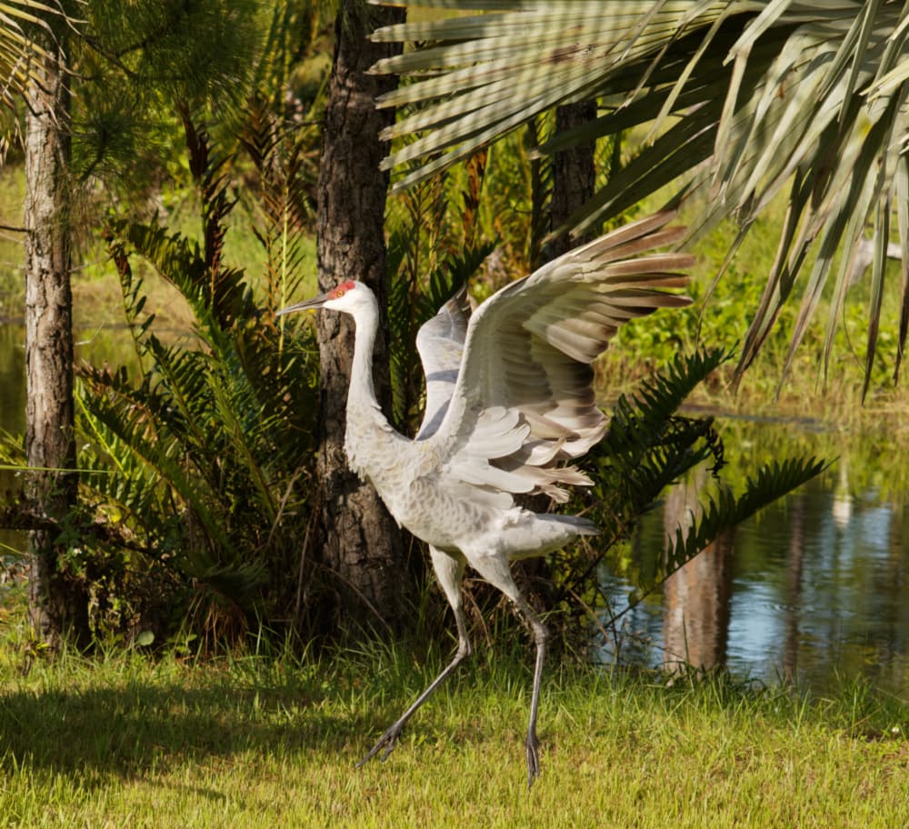
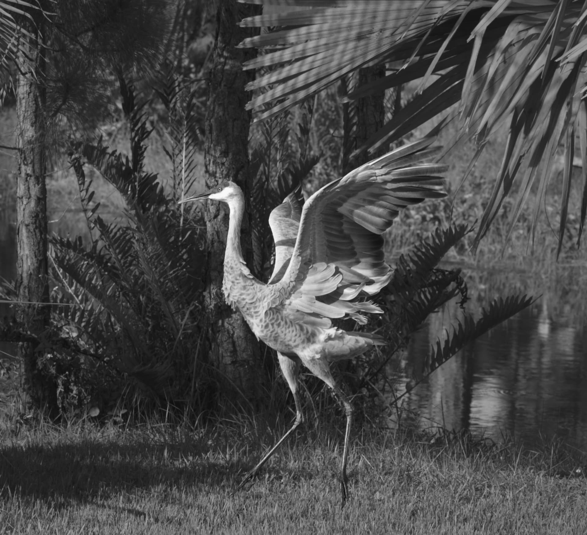
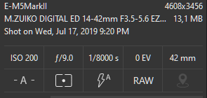
Next photo - this was taken a couple of days ago. A pair of Sandhill Cranes laded by the pond, and armed with a 135mm Tele Elmar I tried to get close enough to get a decent photo. The best photo was one of the first that I took, when the birds were acting the most “natural”, including jumping off the ground. The 135 wasn’t enough to get close (yet) but I loved what I was seeing. Exposure was based on the camera’s suggestions and especially looking at the histogram. No tripod, so I tried to keep my hands steady. If I was successful, the eye and feathers would be sharp.
I didn’t do much in PL4. I activated the no-corrections Preset, straightened the image a tiny amount, cropped a lot, used the repair tool to tone down a pesky bright yellow leaf at the bottom left, and corrected a tiny amount of clipping in the bird’s head.
If I tried to show more of the surroundings, the Crane got too small. If I made the Crane too large, the surroundings were lost. I compromised. Oh and I never applied the watermark.
I didn’t want to crop so much, but I figured the Crane was the subject, and I needed just enough around it to put it in its environment. The “focus assist” in the Visoflex was a huge help. This is probably NOT the type of photo the Leica was designed for - my D750 or Df should have been much easier to use, but the Leica was so quiet the Cranes ignored it, and it was easy to follow them wherever they wanted to go - in that sense, the M10 was great for my “hunting”.
10-09-2021_L1003315.dng.dop (11.9 KB)
10-09-2021_L1003315.dng (34.3 MB)
10-09-2021_L1003315.dng.dop (819,4 KB)
M = Mike
VC1 = Wolfgang (Colour - new version)
VC2 = Wolfgang (B&W)
some remarks
When I saw the pic (in PL, not the forum’s poor rendition),
I knew it’s getting difficult with this (distracting) background.
BTW, with this lens you are much more flexibel than with a 135mm prime.
→ https://www.bhphotovideo.com/c/product/1349415-REG/nikon_20068_af_p_nikkor_70_300mm_f_4_5_5_6e.html
It’s half the weight of your 2,8/80-200mm and comfortable to carry.
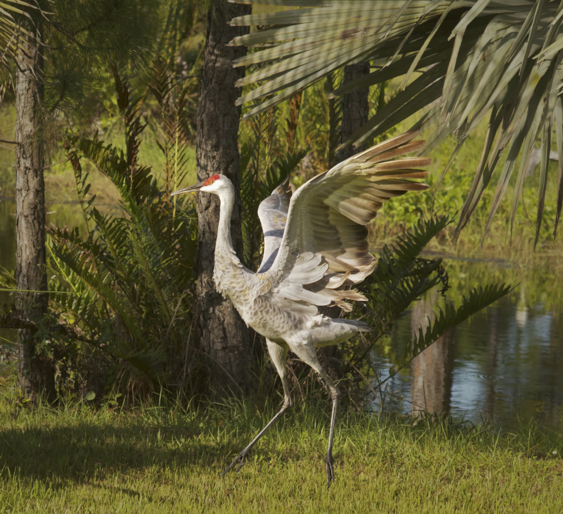
The most obvious difference to my eyes is that you brought out more detail in the bird, especially the neck and wings. That is a nice improvement, something I never even considered. There were also three annoying things intruding on the photo - I fixed the one at the left, and it looks like you made the two at the right a little darker, therefore less intrusive.
On the flip side, my version has this very bright bird that grabs my attention, and the “darker” version doesn’t attract my eye as strongly as before…
ive bin trying to use controlpoints only.
lots of negatives on the trees becaus i wanted those as dark as possible.
i did nothing on the crop.
a small amount of vigenting control.
touch of clearview in the upper clouds and a sniff of vibrance.
10-10-2021_L1003365.dng.dop (18,7 KB)


last one: on purpose shot for contrast B&W processing:

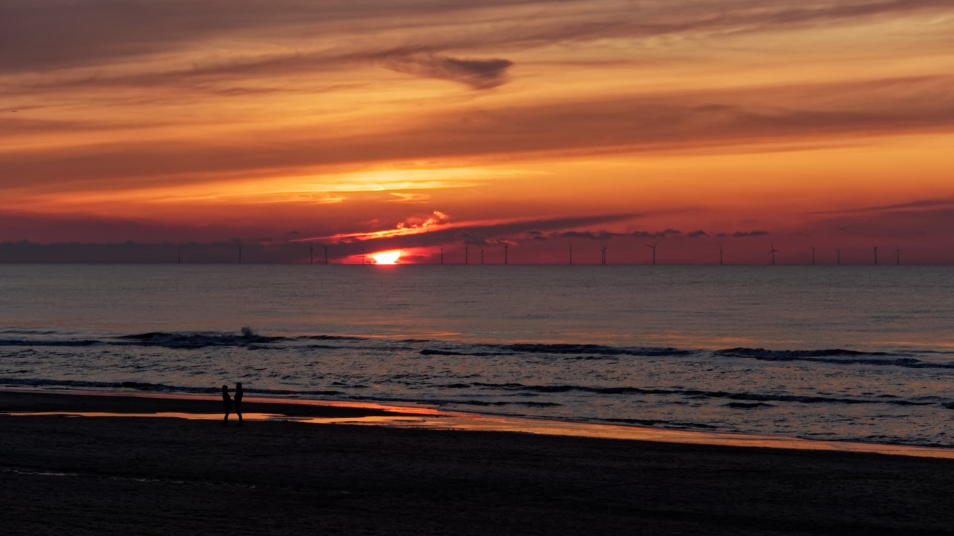
I think your photo right below this line would look fascinating if you cropped out the sides, and had the two people and the sun as the main points of interest. As it is now, I don’t know where to “look”, but that would make it more obvious.
Sort of like this:
I made those images for viewing on 16:9 tv. As most i make are cropped for tv viewing.
Thrn i have larger viewingplane wich means more details to see.
But your right, a crop can make it more powerfull.
Moin,
and it depends what*s the photo for, and what I want to express with the picture.
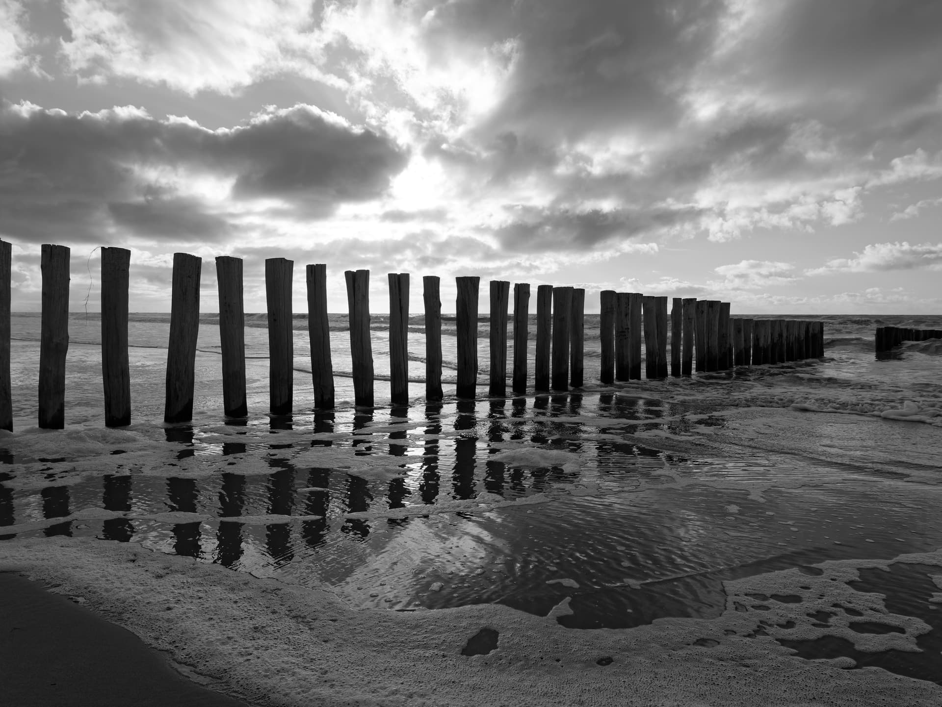
I’m always impressed of the vastness and loneliness of the North and Baltic Seas. My example is similar to Peter’s one, and I have only cropped it by height to show this. But that’s my mood and art is in the eye of the beholder

best regards
Guenter
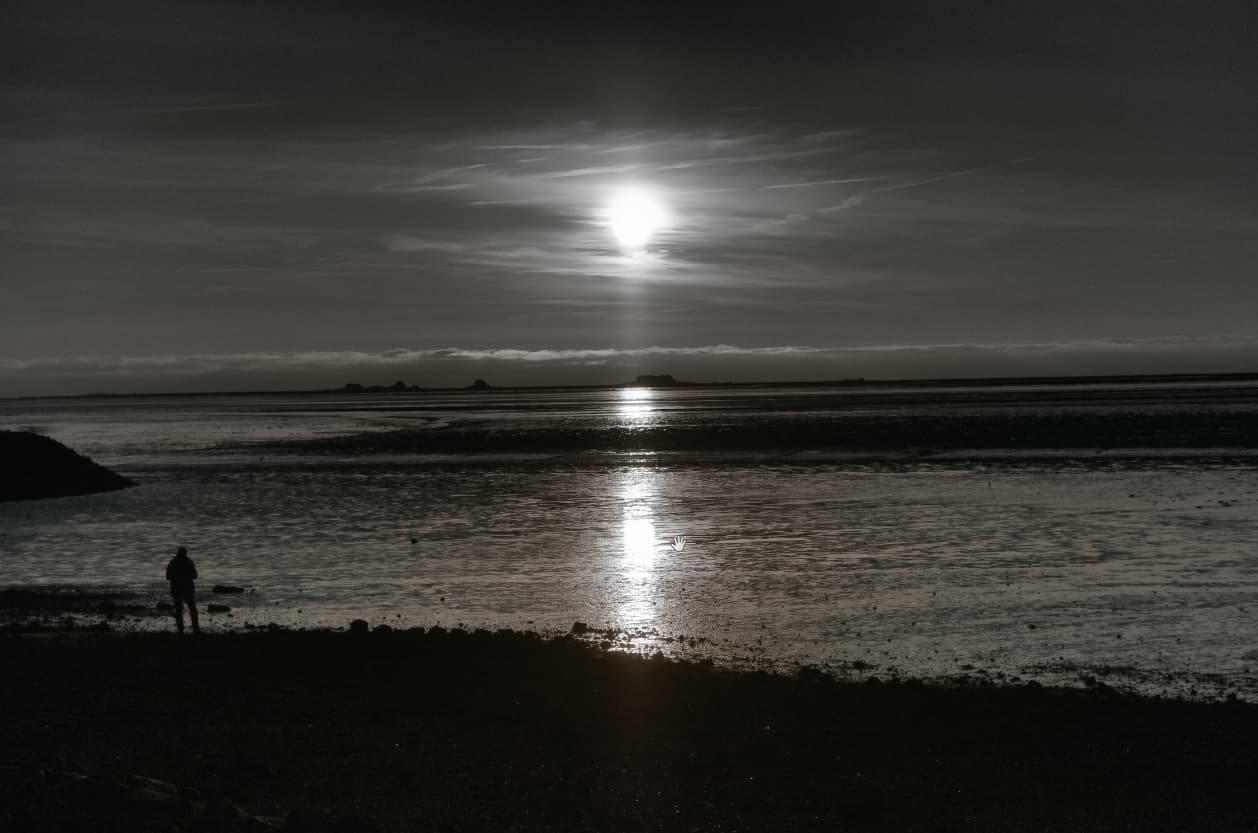
If I posted this photo here, I already know what people here would be suggesting I do differently, but especially with the fellow standing at the left, it brings out the mood, and the feeling, and makes me feel like I’m standing there, enjoying the scene.
That’s what I mean when I suggest “composition” is more important than all the technical details. A perfect image of a boring scene is, well, still boring. An imperfect image of such an interesting scene remains fascinating to me, regardless of the technical details! …and a perfect image of such an interesting scene means hitting the “jackpot”, as Ansel Adams did so often, and as Joanna does in her photographs - everything is perfect.